Fynn
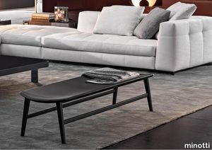
minotti > Styling
Scandinavian values meet Italian tradition in Fynn, a project created by combining fine cabinet-making in the wooden elements and sophisticated upholstering with fabric or saddle-hide. The signature element of the Fynn seats is the armrest, elongated and slightly curved, rounded and smooth to the touch, 100% handmade. Its precise, well-defined line identifies the whole family of seats, in the two Fynn and Fynn Saddle-Hide versions. Covered with the exclusive fabrics and saddle-hides in the collection, it fully expresses the high level of the elegant sartorial process which has always been Minotti’s distinguishing mark. The family comprises armchairs, lounge and dining little armchairs, benches, footstools and coffee tables. The Fynn armchair and little armchairs feature an ultra-lightweight aesthetic with a simple structure in ash wood with Liquorice colour stained finish. This hosts a padded seat and backrest cushion, designed as a single element. The informal rigour with which Fynn hosts the upholstered element designs a comfortable seat that almost cradles the body, wrapping it in the warmth of the wooden structure. In the Fynn Saddle-Hide version, a single saddle-hide element incorporates both the seat and backrest. The armchair and lounge little armchair have separate padded cushioning, which is optional in the dining little armchair. The saddle-hide covering comes in an extensive colour palette: Burgundy, Ash, Dove Grey, Sage, Mud, Moka, Black, Bulgarian Red, Moss Green, Green, Pewter, Corten, White and Grey. The Fynn conceived for the dining area includes the version with fully padded shell and, alternatively, the Saddle-Hide version with or without cushion. The Fynn family of seats is completed by a footstool and some benches of different sizes, all with a cushion except for the benches in the Saddle-Hide version, which have a structure with a slightly concave top, combined with a saddle-hide covering that envelopes it like exquisite leather. The coffee tables also share the same line as the wooden armrest, which designs a slight curve also found in the structural and side parts. The central part of the coffee table is enhanced by the presence of the top in Calacatta marble, creating a sophisticated combination of materials.
Kiruna Night blue
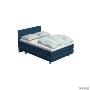
auping > Box spring
The Kiruna box spring is the most luxurious box spring. This is distinguished by the rich appearance and the use of natural materials. As soon as you lie down, you experience it for yourself. This adjustable 2-person Kiruna box spring 1M Night blue with Sami mattress and Sami headboard in Remix / Royal blue gives a luxurious look to your bedroom. For the Kiruna box spring you can choose from 95 different fabrics. They each differ in colour and structure. In our stores you can see, feel and give you advice on which one fits best on the box spring of your choice. There are five fabric groups. The luxurious Kiruna box spring has a refined design with attention to every detail and very high-quality finish. There are two headboards for the Kiruna: the slender and stylish Sami and the classic Unik. Or combine with one of the headboards of our Original box spring. To subtly add colour to the Kiruna box spring and your bedroom, you can choose 1 of the ten Auping colours for the legs. Discover the Kiruna box spring The unique Kiruna mattresses have no less than 7 zones so that your body is perfectly supported and you lie comfortably. The Sami mattress has a sleek finish, while the Unik mattress has an extra rich look due to graceful handles, a piping all around and refined side stitching. Our collection consists of 5 beds and 4 box springs that you can put together completely according to your wishes. Choose your own colours, materials and accessories. In total, there are 2.8 billion possibilities in our online configurator. Looking for inspiration for your own bedroom or do you want to know more about our Box springs? Then take a look at the online lookbooks.
Powell
minotti > Sofa
Powell, or the quintessential modern-day sofa as Minotti sees it: welcoming, refined and informal. A seating system with fixed and sectional seats, designed to cater to a natural desire to relax. The fine balance of proportions, sartorial craftsmanship, every detail in Powell harks back to the style that has become Minotti’s identity. The aluminum base is a detail that cannot go unnoticed also because of its extra-glossy finish in an exclusive range of colors - Sand, Bronze, Granite and Pewter - thus offering out-of-the ordinary and sophisticated color combinations that match with the upholstery. The sofa appears to be slightly raised from the ground, almost suspended. Comfort is a must-have in every Minotti sofa. And in order to make Powell even more comfortable, a saddle hide head-rest has been provided, that can easily be placed near the arm and backrest and used to support the cushion, to offer the right support and maximum comfort. The head-rest is available in Mud, Chestnut, Tobacco and Black. The master craftsmanship is shown to perfection in the detailing such as the sofa profile that forms a teardrop in the corner with a 45° joint. The relaxed elegance of the Powell project is expressed in its simple styling and stands out in a meticulous craftsmanship with down feather padding both for the single seating cushion and for the backrest cushions, which makes for a very comfortable sofa. The precision of the profile that runs along the upper side of the sofa base and the sleek aluminum frame define its design and highlight its lightness.
Allen
minotti > Sofa
The Allen sofa is a perfect example of what Minotti means by “sofa”: an object defined by its smooth lines and proportions, its added height from the floor, and the functionality of its dimensions, without sacrificing soft lines and rounded shapes, especially where the arms are concerned. Even though it’s a product of design, Allen is certainly not lacking in comfort, thanks to the high back that offers total support for the back and the head. Internal padding of the arms and back is molded, while the reversible seat cushion is covered in goose down. The feet, made of molded, die cast aluminium, describe a sinuous line, proof that the classical concept is inherent to Minotti’s DNA. Spotlight on feet: made of die cast aluminium, in Pewter colour (a shade created by Minotti Studio) they have sinuous lines and classic structure, in both proportions and materials. Molded, they are the result of technological research and reinforce the association between Minotti and uniqueness. In terms of foot placement, they’re seen in profile when the sofa is viewed from the front, while the flat surface is visible when the sofa is viewed from the back or side. A totally new design concept: unlike traditional chaise longues that form the end unit of a seating composition, this element already possesses a “hint” of the sofa in its shape. Thanks to its “L-shaped” design, it foreshadows the sofa and carries it forward. Minotti also solves the problem of overlapping feet in the corner, and preserves the purity of design. A sense of clarity enhances the value of this piece in a key area of home living - the place for socializing with friends and enjoying family companionship.
Pendula Pixel EcoSUND®
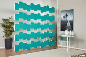
gotessons > Styling
Hanging from the ceiling, Pendula Pixel becomes an effective room divider that improves the acoustics in the room while also becoming a stylish interior detail. Design by o4i Design Studio.Material: EcoSUND. Colors: white, black, grey, light grey or dressed in Hush. Suspension: T24 bracket standard, T24 angled bracket, Roof bracket for other roofs, and cable for suspension. Distance package 150 is purchased separately. Consists of 2 hangers and 4 pins. 5-pack. Width 2400 mm. Thickness 50 mm. Total height 2170 mm including gaps.Pendula Pixel Room Divider Pixel-shaped vertical hanging sound absorber for ceilings made in EcoSUND. Installation: Optional roof bracket and distance package with pins and hooks. Total thickness: 50 mm. Width: 2400 mm. Total height 2170 mm. Distance 150 mm. Available as raw EcoSUND or dressed with Hush, same on both sides. Ex. 567 (67046).
Nature Mood PLANK 03
florim > Floor tile-stone
Marble and wood blend in a refined creative mood board. In line with the latest trends in housing evolution, Nature Mood conceives of Nature not only as a model, but also as a true mentor and gauge of human endeavor, something from which to acquire knowledge and with which to give life to increasingly environmentally friendly designs. <p>In this collection, Nature becomes an active component of design, mixing a palette of surfaces with warm hues that take their inspiration from the world of marbles and the material of wood, with clean, minimalist veining and an array of colors. The upshot is the attainment of elegant spaces that flow between interior and exterior, enhancing the presence of light so as to bestow a sensation of immersion in the natural environment at all times. The marble surfaces in the collection bring a new perspective to some of the most enchanting landscapes and natural binomials to be found on earth.</p> <p> </p> <p class="MsoNormal"><strong>COLORS AND DECORS</strong></p> <p class="MsoNormal"><span lang="EN-US" style="mso-ansi-language: EN-US;">The verdant backdrop of Rainforest is redolent of the vegetation of tropical woods, with thin brown veins that evoke the bark of a tree.</span></p> <p class="MsoNormal"><span lang="EN-US" style="mso-ansi-language: EN-US;">Glacier conjures up the whiteness of glaciers with delicate crests of light and dark gray.</span></p> <p class="MsoNormal"><span lang="EN-US" style="mso-ansi-language: EN-US;">Mountain Peak is inspired by the varied appearance and warm colors of mountain ranges in the summertime.</span></p> <p class="MsoNormal"><span lang="EN-US" style="mso-ansi-language: EN-US;">Tundra recalls the alternation of earth, shrubbery and snowfall that characterizes the homonymous Arctic polar environmental system.</span></p> <p class="MsoNormal"><span lang="EN-US" style="mso-ansi-language: EN-US;">And lastly, Riverbed is reminiscent of a gravelly river bottom with its multiplicity of stones smoothed by the flowing water.</span></p> <p class="MsoNormal"><span lang="EN-US" style="mso-ansi-language: EN-US;">The Planks 01, 02, 03, 04, 05 and 06 surfaces are the most combinable elements in the collection. Conceived as a color palette of woods with a clean, minimalist style, the Planks can generate different mood boards depending on the marble-effect surfaces with which they are juxtaposed, taking up the nuances of the veneers and affording the designer the option of personalizing both the interior spaces and the exterior shells of the buildings in accordance with his or her own creative taste.</span></p> <p class="MsoNormal"><span lang="EN-US" style="mso-ansi-language: EN-US;">The range of backgrounds is enriched by five 6 mm thick fine porcelain stoneware decors that combine the colors of different wood-inspired surfaces.</span></p> <p class="MsoNormal"><span lang="EN-US" style="mso-ansi-language: EN-US;">Hexagon offers a combination of 3 six-sided polygons, each of which in turn is divided into two different shades of wood. The composition is designed in two versions, the first combining the warm hues of Planks 01, 02 and 03, the second blending the cooler colors of Planks 04, 05 and 06.</span></p> <p class="MsoNormal"><span lang="EN-US" style="mso-ansi-language: EN-US;">French Herringbone immediately recalls the classic laying pattern for parquet flooring, in this case reformulated as an embellishment that alternates small slats in two colorings. The composition is available in two versions, one of which combines the amber shades of Planks 01 and 02, the other of which unites the gray tones of Planks 05 and 06.</span></p> <p class="MsoNormal"><span lang="EN-US" style="mso-ansi-language: EN-US;">Stripes offers an alternation of small strips in two colors. In this case, too, the range grants the designer the option of choosing between two variants, one that juxtaposes Planks 01 and 02, and one that combines Planks 05 and 06.</span></p> <p class="MsoNormal"><span lang="EN-US" style="mso-ansi-language: EN-US;">Strip consists of a plank with thin and elongated lines available in all the colors in the collection.</span></p> <p class="MsoNormal"><span lang="EN-US" style="mso-ansi-language: EN-US;">Finally, Chevron recalls the homonymous pattern of timeless charm. Here again the decor is offered in all 6 wood-effect colors of the collection.</span></p>
Araldica Base Corallo
florim > Wall Paint
The miscellany of bright, contrasting, pure colours. The manifest extroversion of decor. The solutions provided to complete the range are in a different tone: reflecting the desire to "stage" a clear contrast with the multicolour ceramic wall coverings, these slabs are in completely neutral shades, in the grey frequencies of concrete.<br /><br />«The collection is intended to create a struggle, a fight. Between something very stiff, which sees itself as governed by clear rules, and a variable, marbled paper, which aims to be completely free.»<br />Federico Pepe "Once upon a time, there was a Roman emperor who lived on a huge splinter in space, a spaceship of multi-coloured marble, where techno music played incessantly. That day he left his spaceship to go to dinner at the Sun King's home, riding his sinuous golden dragon with blood-red eyes."If there were a book with these opening words, Federico Pepe would have designed its cover. And if the book were made into a film, he would definitely be its writer and director. Federico is not an author, director or screenwriter, but this does not prevent him from drawing on his natural ability to create stories through flashes of imagination.Federico Pepe's career started in advertising, a family tradition, which he gradually transformed and built into many other things, in a constant, inevitable investigation of creativity in all its possible forms. He very soon understood that commission work was not enough for him, and he began to explore further afield. The first of these other fields was art, but the consolidated mechanisms on which galleries and gallery owners operate soon became a new limit from which he had to break free: this apparently expanding horizon turned out to be a restrictive cage, more a defining label than an infinite learning opportunity. And definitions are one of the things which least describe Federico: anyone trying to distil his work into two words would find its essence disappearing before their own eyes. He has occupied many roles and engaged in many professions to give shape to his ideas, and in all of them he has excelled, created and led teams, and won awards. Adman, creative director, graphic designer, printer, gallery owner, publisher, curator, performer, painter, designer, director: Pepe does, rather than is, all these.<br /> He works, builds and makes things happen because he is not led by instinct alone and does not succumb to idle whim; he does not rush aimlessly around and does not simply await the inspiration or idea of the century. Quite the opposite. His work comes about and produces results only thanks to strict self-discipline, a design method made up of constant verification, the precise sharing of tasks and roles, the compulsive exploration of unknown contexts, daily physical exercise, the carefully measured use of social media, and occasional spells of isolation in the mountains he loves. It is no coincidence that he created Le Dictateur, a dual-faced entity which may be both his child and his spiritual guide, both friend and boss, part madness and part dictator. Le Dictateur is not Federico's alter ego: it is his superpower. It is not a mask, since in it he actually transforms himself into an artistic project.Le Dictateur is both result and origin of Federico Pepe's work. "I think ideas are born from predisposition," Federico explained to me in 2014. "Not in the sense that "˜we are born predisposed,' but for daily preparation. In this domain I believe that discipline is pivotal. The real talents today are very rigorous people, those who work hard, exchange a lot, think a lot, and know how to apply and balance many different things." An approach which has made him the best-kept secret on the Italian creative scene, a fact well known not only to Pierpaolo Ferrari, Maurizio Cattelan, Nico Vascellari, Jacopo Benassi and Patricia Urquiola, but also to the companies, both large and small, which have turned to him over the years. He has worked and continues to work with them all, designing by laying the foundations of designs naturally expressed in episodes, in a serial pattern which not only gradually builds up Federico's own creative story, but also offers his clients designs so special that they would be virtually impossible without him.<br /> This self-discipline generates heat and energy in such quantities that "“ if it were not imprisoned within the geometrical grids of graphic design "“ it might generate a thermonuclear reaction. The blood running through the veins of his images is black as ink, red as sealing-wax, white as plaster and golden as lava. But there is more, too. His crystal-clear visions are able to break down the slender membrane which separates analogue from digital. He sees matter as absolutely central, but he makes it vibrate with an unusual two-dimensional quality. This can be seen in the way he carves marble with coloured squiggles, recollections of faces briefly sketched as vectors. It is discovered in the skill with which he invades plates and bowls of the finest, monitor-shiny porcelain with geometrical patterns. It becomes tangible in the love with which he brings to life the paper of his publishing projects, peopled with highly elegant, powerfully symmetrical, often kaleidoscopic graphics. It can be admired in the precision with which a metallic factory flooring becomes fabric on an ancient loom, after its resolution is decreased from 300 dpi to 8 bits. It is enjoyed in the hyperbolic repetition of faces and hands in acrylic on canvas in his painting studio, in which every work conserves copy and paste reminders of its predecessor. It amazes in the doors of exquisite metal sideboards, profane glass panels, hand-made but born through the glass of a screen.<br /> A career which has led almost naturally to an encounter with CEDIT, with whom he has created an aesthetically courageous collection, part punk and part aristocratic austerity. The Araldica project's very name evokes strength and nobility, and it is grounded in a past whose weight does not drag it backwards but rather catapults it forwards into the future. Here, Federico's digital geometries become the most solid of materials, taking shape in a graphic object, condensing stories and images into three or two dimensions. In Pepe's and CEDIT's space, Euclidean geometrical forms encounter the marble of Phidias, the intricate patterns of the floor of Milan Cathedral merge into the Baroque images of the marbles found in Roman art galleries, and private space opens out to the infinite space of a thousand possible universal histories.
Araldica Base Blu
florim > Wall Paint
The miscellany of bright, contrasting, pure colours. The manifest extroversion of decor. The solutions provided to complete the range are in a different tone: reflecting the desire to "stage" a clear contrast with the multicolour ceramic wall coverings, these slabs are in completely neutral shades, in the grey frequencies of concrete.<br /><br />«The collection is intended to create a struggle, a fight. Between something very stiff, which sees itself as governed by clear rules, and a variable, marbled paper, which aims to be completely free.»<br />Federico Pepe "Once upon a time, there was a Roman emperor who lived on a huge splinter in space, a spaceship of multi-coloured marble, where techno music played incessantly. That day he left his spaceship to go to dinner at the Sun King's home, riding his sinuous golden dragon with blood-red eyes."If there were a book with these opening words, Federico Pepe would have designed its cover. And if the book were made into a film, he would definitely be its writer and director. Federico is not an author, director or screenwriter, but this does not prevent him from drawing on his natural ability to create stories through flashes of imagination.Federico Pepe's career started in advertising, a family tradition, which he gradually transformed and built into many other things, in a constant, inevitable investigation of creativity in all its possible forms. He very soon understood that commission work was not enough for him, and he began to explore further afield. The first of these other fields was art, but the consolidated mechanisms on which galleries and gallery owners operate soon became a new limit from which he had to break free: this apparently expanding horizon turned out to be a restrictive cage, more a defining label than an infinite learning opportunity. And definitions are one of the things which least describe Federico: anyone trying to distil his work into two words would find its essence disappearing before their own eyes. He has occupied many roles and engaged in many professions to give shape to his ideas, and in all of them he has excelled, created and led teams, and won awards. Adman, creative director, graphic designer, printer, gallery owner, publisher, curator, performer, painter, designer, director: Pepe does, rather than is, all these.<br /> He works, builds and makes things happen because he is not led by instinct alone and does not succumb to idle whim; he does not rush aimlessly around and does not simply await the inspiration or idea of the century. Quite the opposite. His work comes about and produces results only thanks to strict self-discipline, a design method made up of constant verification, the precise sharing of tasks and roles, the compulsive exploration of unknown contexts, daily physical exercise, the carefully measured use of social media, and occasional spells of isolation in the mountains he loves. It is no coincidence that he created Le Dictateur, a dual-faced entity which may be both his child and his spiritual guide, both friend and boss, part madness and part dictator. Le Dictateur is not Federico's alter ego: it is his superpower. It is not a mask, since in it he actually transforms himself into an artistic project.Le Dictateur is both result and origin of Federico Pepe's work. "I think ideas are born from predisposition," Federico explained to me in 2014. "Not in the sense that "˜we are born predisposed,' but for daily preparation. In this domain I believe that discipline is pivotal. The real talents today are very rigorous people, those who work hard, exchange a lot, think a lot, and know how to apply and balance many different things." An approach which has made him the best-kept secret on the Italian creative scene, a fact well known not only to Pierpaolo Ferrari, Maurizio Cattelan, Nico Vascellari, Jacopo Benassi and Patricia Urquiola, but also to the companies, both large and small, which have turned to him over the years. He has worked and continues to work with them all, designing by laying the foundations of designs naturally expressed in episodes, in a serial pattern which not only gradually builds up Federico's own creative story, but also offers his clients designs so special that they would be virtually impossible without him.<br /> This self-discipline generates heat and energy in such quantities that "“ if it were not imprisoned within the geometrical grids of graphic design "“ it might generate a thermonuclear reaction. The blood running through the veins of his images is black as ink, red as sealing-wax, white as plaster and golden as lava. But there is more, too. His crystal-clear visions are able to break down the slender membrane which separates analogue from digital. He sees matter as absolutely central, but he makes it vibrate with an unusual two-dimensional quality. This can be seen in the way he carves marble with coloured squiggles, recollections of faces briefly sketched as vectors. It is discovered in the skill with which he invades plates and bowls of the finest, monitor-shiny porcelain with geometrical patterns. It becomes tangible in the love with which he brings to life the paper of his publishing projects, peopled with highly elegant, powerfully symmetrical, often kaleidoscopic graphics. It can be admired in the precision with which a metallic factory flooring becomes fabric on an ancient loom, after its resolution is decreased from 300 dpi to 8 bits. It is enjoyed in the hyperbolic repetition of faces and hands in acrylic on canvas in his painting studio, in which every work conserves copy and paste reminders of its predecessor. It amazes in the doors of exquisite metal sideboards, profane glass panels, hand-made but born through the glass of a screen.<br /> A career which has led almost naturally to an encounter with CEDIT, with whom he has created an aesthetically courageous collection, part punk and part aristocratic austerity. The Araldica project's very name evokes strength and nobility, and it is grounded in a past whose weight does not drag it backwards but rather catapults it forwards into the future. Here, Federico's digital geometries become the most solid of materials, taking shape in a graphic object, condensing stories and images into three or two dimensions. In Pepe's and CEDIT's space, Euclidean geometrical forms encounter the marble of Phidias, the intricate patterns of the floor of Milan Cathedral merge into the Baroque images of the marbles found in Roman art galleries, and private space opens out to the infinite space of a thousand possible universal histories.
Araldica Base Grigio
florim > Wall Paint
The miscellany of bright, contrasting, pure colours. The manifest extroversion of decor. The solutions provided to complete the range are in a different tone: reflecting the desire to "stage" a clear contrast with the multicolour ceramic wall coverings, these slabs are in completely neutral shades, in the grey frequencies of concrete.<br /><br />«The collection is intended to create a struggle, a fight. Between something very stiff, which sees itself as governed by clear rules, and a variable, marbled paper, which aims to be completely free.»<br />Federico Pepe "Once upon a time, there was a Roman emperor who lived on a huge splinter in space, a spaceship of multi-coloured marble, where techno music played incessantly. That day he left his spaceship to go to dinner at the Sun King's home, riding his sinuous golden dragon with blood-red eyes."If there were a book with these opening words, Federico Pepe would have designed its cover. And if the book were made into a film, he would definitely be its writer and director. Federico is not an author, director or screenwriter, but this does not prevent him from drawing on his natural ability to create stories through flashes of imagination.Federico Pepe's career started in advertising, a family tradition, which he gradually transformed and built into many other things, in a constant, inevitable investigation of creativity in all its possible forms. He very soon understood that commission work was not enough for him, and he began to explore further afield. The first of these other fields was art, but the consolidated mechanisms on which galleries and gallery owners operate soon became a new limit from which he had to break free: this apparently expanding horizon turned out to be a restrictive cage, more a defining label than an infinite learning opportunity. And definitions are one of the things which least describe Federico: anyone trying to distil his work into two words would find its essence disappearing before their own eyes. He has occupied many roles and engaged in many professions to give shape to his ideas, and in all of them he has excelled, created and led teams, and won awards. Adman, creative director, graphic designer, printer, gallery owner, publisher, curator, performer, painter, designer, director: Pepe does, rather than is, all these.<br /> He works, builds and makes things happen because he is not led by instinct alone and does not succumb to idle whim; he does not rush aimlessly around and does not simply await the inspiration or idea of the century. Quite the opposite. His work comes about and produces results only thanks to strict self-discipline, a design method made up of constant verification, the precise sharing of tasks and roles, the compulsive exploration of unknown contexts, daily physical exercise, the carefully measured use of social media, and occasional spells of isolation in the mountains he loves. It is no coincidence that he created Le Dictateur, a dual-faced entity which may be both his child and his spiritual guide, both friend and boss, part madness and part dictator. Le Dictateur is not Federico's alter ego: it is his superpower. It is not a mask, since in it he actually transforms himself into an artistic project.Le Dictateur is both result and origin of Federico Pepe's work. "I think ideas are born from predisposition," Federico explained to me in 2014. "Not in the sense that "˜we are born predisposed,' but for daily preparation. In this domain I believe that discipline is pivotal. The real talents today are very rigorous people, those who work hard, exchange a lot, think a lot, and know how to apply and balance many different things." An approach which has made him the best-kept secret on the Italian creative scene, a fact well known not only to Pierpaolo Ferrari, Maurizio Cattelan, Nico Vascellari, Jacopo Benassi and Patricia Urquiola, but also to the companies, both large and small, which have turned to him over the years. He has worked and continues to work with them all, designing by laying the foundations of designs naturally expressed in episodes, in a serial pattern which not only gradually builds up Federico's own creative story, but also offers his clients designs so special that they would be virtually impossible without him.<br /> This self-discipline generates heat and energy in such quantities that "“ if it were not imprisoned within the geometrical grids of graphic design "“ it might generate a thermonuclear reaction. The blood running through the veins of his images is black as ink, red as sealing-wax, white as plaster and golden as lava. But there is more, too. His crystal-clear visions are able to break down the slender membrane which separates analogue from digital. He sees matter as absolutely central, but he makes it vibrate with an unusual two-dimensional quality. This can be seen in the way he carves marble with coloured squiggles, recollections of faces briefly sketched as vectors. It is discovered in the skill with which he invades plates and bowls of the finest, monitor-shiny porcelain with geometrical patterns. It becomes tangible in the love with which he brings to life the paper of his publishing projects, peopled with highly elegant, powerfully symmetrical, often kaleidoscopic graphics. It can be admired in the precision with which a metallic factory flooring becomes fabric on an ancient loom, after its resolution is decreased from 300 dpi to 8 bits. It is enjoyed in the hyperbolic repetition of faces and hands in acrylic on canvas in his painting studio, in which every work conserves copy and paste reminders of its predecessor. It amazes in the doors of exquisite metal sideboards, profane glass panels, hand-made but born through the glass of a screen.<br /> A career which has led almost naturally to an encounter with CEDIT, with whom he has created an aesthetically courageous collection, part punk and part aristocratic austerity. The Araldica project's very name evokes strength and nobility, and it is grounded in a past whose weight does not drag it backwards but rather catapults it forwards into the future. Here, Federico's digital geometries become the most solid of materials, taking shape in a graphic object, condensing stories and images into three or two dimensions. In Pepe's and CEDIT's space, Euclidean geometrical forms encounter the marble of Phidias, the intricate patterns of the floor of Milan Cathedral merge into the Baroque images of the marbles found in Roman art galleries, and private space opens out to the infinite space of a thousand possible universal histories.
Araldica Base Azzurro
florim > Wall Paint
The miscellany of bright, contrasting, pure colours. The manifest extroversion of decor. The solutions provided to complete the range are in a different tone: reflecting the desire to "stage" a clear contrast with the multicolour ceramic wall coverings, these slabs are in completely neutral shades, in the grey frequencies of concrete.<br /><br />«The collection is intended to create a struggle, a fight. Between something very stiff, which sees itself as governed by clear rules, and a variable, marbled paper, which aims to be completely free.»<br />Federico Pepe "Once upon a time, there was a Roman emperor who lived on a huge splinter in space, a spaceship of multi-coloured marble, where techno music played incessantly. That day he left his spaceship to go to dinner at the Sun King's home, riding his sinuous golden dragon with blood-red eyes."If there were a book with these opening words, Federico Pepe would have designed its cover. And if the book were made into a film, he would definitely be its writer and director. Federico is not an author, director or screenwriter, but this does not prevent him from drawing on his natural ability to create stories through flashes of imagination.Federico Pepe's career started in advertising, a family tradition, which he gradually transformed and built into many other things, in a constant, inevitable investigation of creativity in all its possible forms. He very soon understood that commission work was not enough for him, and he began to explore further afield. The first of these other fields was art, but the consolidated mechanisms on which galleries and gallery owners operate soon became a new limit from which he had to break free: this apparently expanding horizon turned out to be a restrictive cage, more a defining label than an infinite learning opportunity. And definitions are one of the things which least describe Federico: anyone trying to distil his work into two words would find its essence disappearing before their own eyes. He has occupied many roles and engaged in many professions to give shape to his ideas, and in all of them he has excelled, created and led teams, and won awards. Adman, creative director, graphic designer, printer, gallery owner, publisher, curator, performer, painter, designer, director: Pepe does, rather than is, all these.<br /> He works, builds and makes things happen because he is not led by instinct alone and does not succumb to idle whim; he does not rush aimlessly around and does not simply await the inspiration or idea of the century. Quite the opposite. His work comes about and produces results only thanks to strict self-discipline, a design method made up of constant verification, the precise sharing of tasks and roles, the compulsive exploration of unknown contexts, daily physical exercise, the carefully measured use of social media, and occasional spells of isolation in the mountains he loves. It is no coincidence that he created Le Dictateur, a dual-faced entity which may be both his child and his spiritual guide, both friend and boss, part madness and part dictator. Le Dictateur is not Federico's alter ego: it is his superpower. It is not a mask, since in it he actually transforms himself into an artistic project.Le Dictateur is both result and origin of Federico Pepe's work. "I think ideas are born from predisposition," Federico explained to me in 2014. "Not in the sense that "˜we are born predisposed,' but for daily preparation. In this domain I believe that discipline is pivotal. The real talents today are very rigorous people, those who work hard, exchange a lot, think a lot, and know how to apply and balance many different things." An approach which has made him the best-kept secret on the Italian creative scene, a fact well known not only to Pierpaolo Ferrari, Maurizio Cattelan, Nico Vascellari, Jacopo Benassi and Patricia Urquiola, but also to the companies, both large and small, which have turned to him over the years. He has worked and continues to work with them all, designing by laying the foundations of designs naturally expressed in episodes, in a serial pattern which not only gradually builds up Federico's own creative story, but also offers his clients designs so special that they would be virtually impossible without him.<br /> This self-discipline generates heat and energy in such quantities that "“ if it were not imprisoned within the geometrical grids of graphic design "“ it might generate a thermonuclear reaction. The blood running through the veins of his images is black as ink, red as sealing-wax, white as plaster and golden as lava. But there is more, too. His crystal-clear visions are able to break down the slender membrane which separates analogue from digital. He sees matter as absolutely central, but he makes it vibrate with an unusual two-dimensional quality. This can be seen in the way he carves marble with coloured squiggles, recollections of faces briefly sketched as vectors. It is discovered in the skill with which he invades plates and bowls of the finest, monitor-shiny porcelain with geometrical patterns. It becomes tangible in the love with which he brings to life the paper of his publishing projects, peopled with highly elegant, powerfully symmetrical, often kaleidoscopic graphics. It can be admired in the precision with which a metallic factory flooring becomes fabric on an ancient loom, after its resolution is decreased from 300 dpi to 8 bits. It is enjoyed in the hyperbolic repetition of faces and hands in acrylic on canvas in his painting studio, in which every work conserves copy and paste reminders of its predecessor. It amazes in the doors of exquisite metal sideboards, profane glass panels, hand-made but born through the glass of a screen.<br /> A career which has led almost naturally to an encounter with CEDIT, with whom he has created an aesthetically courageous collection, part punk and part aristocratic austerity. The Araldica project's very name evokes strength and nobility, and it is grounded in a past whose weight does not drag it backwards but rather catapults it forwards into the future. Here, Federico's digital geometries become the most solid of materials, taking shape in a graphic object, condensing stories and images into three or two dimensions. In Pepe's and CEDIT's space, Euclidean geometrical forms encounter the marble of Phidias, the intricate patterns of the floor of Milan Cathedral merge into the Baroque images of the marbles found in Roman art galleries, and private space opens out to the infinite space of a thousand possible universal histories.
Storie Cascina
florim > Wall Paint
The faded wall fresco, damp stains in plaster. «Technological innovation enables us to reproduce on large-sized ceramic materials all the effects of wear and stratification that normally only time is able to create.» Giorgia Zanellato & Daniele Bortotto Children stare at the walls of a farmhouse, wondering what the cracks are, and whether every mark is a path and every path is a story. They think that miniature beings live in the air pockets that have formed, and the detaching plaster is like an avalanche cascading from a glacier. They don't ask why the colours are as they are, because they just had to be like that. And every square centimetre becomes the first page of an adventure that restarts at every break in the pattern. Could this be why we say that both textures and plots have twists, and stories are woven? As even children know, walls are tales. Not only do they contain adventures, emotions, moments, loves and hates and record them on their surfaces; their uneven, active surfaces generate new imaginary worlds, in which one can literally get lost. The "Storie" collection by Giorgia Zanellato and Daniele Bortotto brings this metaphor to three-dimensional life by expressing the moods, loves and hates and moments that the walls and floors of old Italian homes conserve, and capturing them in a frozen instant. The theme of time and the changes wrought in matter by the passing seasons, weather and human action have always been a strong source of inspiration for architects: some have tried to freeze it, while others have used sleight of hand to embrace it while resisting its effects, and yet others have accelerated, anticipated, directed and re-created it.<br /> Zanellato and Bortotto do all these things at once, engaging in a duel with History with a capital H, in which it is never clear who is winning: design or object, man or nature, culture or time. And it is probably this unresolved tension which makes the "Storie" designs so universal and meaningful, so intimate and yet familiar. The floor is the only thing we can be certain that everyone entering our home will touch, and at the same time it is the most intimate part, the most steeped in private happenings. They talk about having your "feet firmly on the ground". This image stands for common sense, but also a recognition of how things are, how things work. The wall is a synecdoche, too: it is the part of the home that expresses an idea of solidity, the layering of time, the passage of lives. "Storie" gives form to this metaphor by drawing a line that links the most classical of taste to a sophisticated modernity of taste and style. The two designers did a great deal of background work for this project: old Italian homes, country villas, noble palazzos, farmhouses and old factors, which become an unlimited source of motifs, colours, textures and materials. But, perhaps unconsciously, literature also re-emerges from this survey of locations, with its blend of aestheticism and decadence, with echoes of Wilde and D'Annunzio, Ruskin and Huysmans. "Storie" would be the ideal backdrop for Des Esseintes, the dandy in "A Rebours". And in fact the collection clearly has strong theatrical connections, arising partly from its storytelling connotations but also from its scene-setting potential.<br /> It represents life, which we are, have been and wish to continue to be. And it is thrilling to realise that this vision comes from the youngest designers in CEDIT's new era, who have successfully taken a confident, cultured, astute, sidelong approach to the most ancient of topics, with a persuasive effect which appears, at least, to be not at all intimidated by the many stories, the type of product they are dealing with, the catalogue in which they are included, the designers who have gone before them or, naturally, the adventures that lie concealed in the historic dwellings they reproduce. The reference to Italy, on the other hand, is in perfect harmony with the work of the brand and its past and present designers: it is intrinsic to the perfection of the production process that underlies the collection, the relationship with the brand's tradition and its local roots, and the intelligent, strategic use of its innovations in the treatment of this complex material.Child's play? Yes, but with the integrity and ability to enchant unique to specific designs, capable of an immediacy of vision and feeling that makes them little novels written in cement.
Storie Palazzo
florim > Wall Paint
The faded wall fresco, damp stains in plaster. «Technological innovation enables us to reproduce on large-sized ceramic materials all the effects of wear and stratification that normally only time is able to create.» Giorgia Zanellato & Daniele Bortotto Children stare at the walls of a farmhouse, wondering what the cracks are, and whether every mark is a path and every path is a story. They think that miniature beings live in the air pockets that have formed, and the detaching plaster is like an avalanche cascading from a glacier. They don't ask why the colours are as they are, because they just had to be like that. And every square centimetre becomes the first page of an adventure that restarts at every break in the pattern. Could this be why we say that both textures and plots have twists, and stories are woven? As even children know, walls are tales. Not only do they contain adventures, emotions, moments, loves and hates and record them on their surfaces; their uneven, active surfaces generate new imaginary worlds, in which one can literally get lost. The "Storie" collection by Giorgia Zanellato and Daniele Bortotto brings this metaphor to three-dimensional life by expressing the moods, loves and hates and moments that the walls and floors of old Italian homes conserve, and capturing them in a frozen instant. The theme of time and the changes wrought in matter by the passing seasons, weather and human action have always been a strong source of inspiration for architects: some have tried to freeze it, while others have used sleight of hand to embrace it while resisting its effects, and yet others have accelerated, anticipated, directed and re-created it.<br /> Zanellato and Bortotto do all these things at once, engaging in a duel with History with a capital H, in which it is never clear who is winning: design or object, man or nature, culture or time. And it is probably this unresolved tension which makes the "Storie" designs so universal and meaningful, so intimate and yet familiar. The floor is the only thing we can be certain that everyone entering our home will touch, and at the same time it is the most intimate part, the most steeped in private happenings. They talk about having your "feet firmly on the ground". This image stands for common sense, but also a recognition of how things are, how things work. The wall is a synecdoche, too: it is the part of the home that expresses an idea of solidity, the layering of time, the passage of lives. "Storie" gives form to this metaphor by drawing a line that links the most classical of taste to a sophisticated modernity of taste and style. The two designers did a great deal of background work for this project: old Italian homes, country villas, noble palazzos, farmhouses and old factors, which become an unlimited source of motifs, colours, textures and materials. But, perhaps unconsciously, literature also re-emerges from this survey of locations, with its blend of aestheticism and decadence, with echoes of Wilde and D'Annunzio, Ruskin and Huysmans. "Storie" would be the ideal backdrop for Des Esseintes, the dandy in "A Rebours". And in fact the collection clearly has strong theatrical connections, arising partly from its storytelling connotations but also from its scene-setting potential.<br /> It represents life, which we are, have been and wish to continue to be. And it is thrilling to realise that this vision comes from the youngest designers in CEDIT's new era, who have successfully taken a confident, cultured, astute, sidelong approach to the most ancient of topics, with a persuasive effect which appears, at least, to be not at all intimidated by the many stories, the type of product they are dealing with, the catalogue in which they are included, the designers who have gone before them or, naturally, the adventures that lie concealed in the historic dwellings they reproduce. The reference to Italy, on the other hand, is in perfect harmony with the work of the brand and its past and present designers: it is intrinsic to the perfection of the production process that underlies the collection, the relationship with the brand's tradition and its local roots, and the intelligent, strategic use of its innovations in the treatment of this complex material.Child's play? Yes, but with the integrity and ability to enchant unique to specific designs, capable of an immediacy of vision and feeling that makes them little novels written in cement.
Storie Masseria
florim > Wall Paint
The faded wall fresco, damp stains in plaster. «Technological innovation enables us to reproduce on large-sized ceramic materials all the effects of wear and stratification that normally only time is able to create.» Giorgia Zanellato & Daniele Bortotto Children stare at the walls of a farmhouse, wondering what the cracks are, and whether every mark is a path and every path is a story. They think that miniature beings live in the air pockets that have formed, and the detaching plaster is like an avalanche cascading from a glacier. They don't ask why the colours are as they are, because they just had to be like that. And every square centimetre becomes the first page of an adventure that restarts at every break in the pattern. Could this be why we say that both textures and plots have twists, and stories are woven? As even children know, walls are tales. Not only do they contain adventures, emotions, moments, loves and hates and record them on their surfaces; their uneven, active surfaces generate new imaginary worlds, in which one can literally get lost. The "Storie" collection by Giorgia Zanellato and Daniele Bortotto brings this metaphor to three-dimensional life by expressing the moods, loves and hates and moments that the walls and floors of old Italian homes conserve, and capturing them in a frozen instant. The theme of time and the changes wrought in matter by the passing seasons, weather and human action have always been a strong source of inspiration for architects: some have tried to freeze it, while others have used sleight of hand to embrace it while resisting its effects, and yet others have accelerated, anticipated, directed and re-created it.<br /> Zanellato and Bortotto do all these things at once, engaging in a duel with History with a capital H, in which it is never clear who is winning: design or object, man or nature, culture or time. And it is probably this unresolved tension which makes the "Storie" designs so universal and meaningful, so intimate and yet familiar. The floor is the only thing we can be certain that everyone entering our home will touch, and at the same time it is the most intimate part, the most steeped in private happenings. They talk about having your "feet firmly on the ground". This image stands for common sense, but also a recognition of how things are, how things work. The wall is a synecdoche, too: it is the part of the home that expresses an idea of solidity, the layering of time, the passage of lives. "Storie" gives form to this metaphor by drawing a line that links the most classical of taste to a sophisticated modernity of taste and style. The two designers did a great deal of background work for this project: old Italian homes, country villas, noble palazzos, farmhouses and old factors, which become an unlimited source of motifs, colours, textures and materials. But, perhaps unconsciously, literature also re-emerges from this survey of locations, with its blend of aestheticism and decadence, with echoes of Wilde and D'Annunzio, Ruskin and Huysmans. "Storie" would be the ideal backdrop for Des Esseintes, the dandy in "A Rebours". And in fact the collection clearly has strong theatrical connections, arising partly from its storytelling connotations but also from its scene-setting potential.<br /> It represents life, which we are, have been and wish to continue to be. And it is thrilling to realise that this vision comes from the youngest designers in CEDIT's new era, who have successfully taken a confident, cultured, astute, sidelong approach to the most ancient of topics, with a persuasive effect which appears, at least, to be not at all intimidated by the many stories, the type of product they are dealing with, the catalogue in which they are included, the designers who have gone before them or, naturally, the adventures that lie concealed in the historic dwellings they reproduce. The reference to Italy, on the other hand, is in perfect harmony with the work of the brand and its past and present designers: it is intrinsic to the perfection of the production process that underlies the collection, the relationship with the brand's tradition and its local roots, and the intelligent, strategic use of its innovations in the treatment of this complex material.Child's play? Yes, but with the integrity and ability to enchant unique to specific designs, capable of an immediacy of vision and feeling that makes them little novels written in cement.
Storie Villa
florim > Wall Paint
The faded wall fresco, damp stains in plaster. «Technological innovation enables us to reproduce on large-sized ceramic materials all the effects of wear and stratification that normally only time is able to create.» Giorgia Zanellato & Daniele Bortotto Children stare at the walls of a farmhouse, wondering what the cracks are, and whether every mark is a path and every path is a story. They think that miniature beings live in the air pockets that have formed, and the detaching plaster is like an avalanche cascading from a glacier. They don't ask why the colours are as they are, because they just had to be like that. And every square centimetre becomes the first page of an adventure that restarts at every break in the pattern. Could this be why we say that both textures and plots have twists, and stories are woven? As even children know, walls are tales. Not only do they contain adventures, emotions, moments, loves and hates and record them on their surfaces; their uneven, active surfaces generate new imaginary worlds, in which one can literally get lost. The "Storie" collection by Giorgia Zanellato and Daniele Bortotto brings this metaphor to three-dimensional life by expressing the moods, loves and hates and moments that the walls and floors of old Italian homes conserve, and capturing them in a frozen instant. The theme of time and the changes wrought in matter by the passing seasons, weather and human action have always been a strong source of inspiration for architects: some have tried to freeze it, while others have used sleight of hand to embrace it while resisting its effects, and yet others have accelerated, anticipated, directed and re-created it.<br /> Zanellato and Bortotto do all these things at once, engaging in a duel with History with a capital H, in which it is never clear who is winning: design or object, man or nature, culture or time. And it is probably this unresolved tension which makes the "Storie" designs so universal and meaningful, so intimate and yet familiar. The floor is the only thing we can be certain that everyone entering our home will touch, and at the same time it is the most intimate part, the most steeped in private happenings. They talk about having your "feet firmly on the ground". This image stands for common sense, but also a recognition of how things are, how things work. The wall is a synecdoche, too: it is the part of the home that expresses an idea of solidity, the layering of time, the passage of lives. "Storie" gives form to this metaphor by drawing a line that links the most classical of taste to a sophisticated modernity of taste and style. The two designers did a great deal of background work for this project: old Italian homes, country villas, noble palazzos, farmhouses and old factors, which become an unlimited source of motifs, colours, textures and materials. But, perhaps unconsciously, literature also re-emerges from this survey of locations, with its blend of aestheticism and decadence, with echoes of Wilde and D'Annunzio, Ruskin and Huysmans. "Storie" would be the ideal backdrop for Des Esseintes, the dandy in "A Rebours". And in fact the collection clearly has strong theatrical connections, arising partly from its storytelling connotations but also from its scene-setting potential.<br /> It represents life, which we are, have been and wish to continue to be. And it is thrilling to realise that this vision comes from the youngest designers in CEDIT's new era, who have successfully taken a confident, cultured, astute, sidelong approach to the most ancient of topics, with a persuasive effect which appears, at least, to be not at all intimidated by the many stories, the type of product they are dealing with, the catalogue in which they are included, the designers who have gone before them or, naturally, the adventures that lie concealed in the historic dwellings they reproduce. The reference to Italy, on the other hand, is in perfect harmony with the work of the brand and its past and present designers: it is intrinsic to the perfection of the production process that underlies the collection, the relationship with the brand's tradition and its local roots, and the intelligent, strategic use of its innovations in the treatment of this complex material.Child's play? Yes, but with the integrity and ability to enchant unique to specific designs, capable of an immediacy of vision and feeling that makes them little novels written in cement.
Storie Castello
florim > Wall Paint
The faded wall fresco, damp stains in plaster. «Technological innovation enables us to reproduce on large-sized ceramic materials all the effects of wear and stratification that normally only time is able to create.» Giorgia Zanellato & Daniele Bortotto Children stare at the walls of a farmhouse, wondering what the cracks are, and whether every mark is a path and every path is a story. They think that miniature beings live in the air pockets that have formed, and the detaching plaster is like an avalanche cascading from a glacier. They don't ask why the colours are as they are, because they just had to be like that. And every square centimetre becomes the first page of an adventure that restarts at every break in the pattern. Could this be why we say that both textures and plots have twists, and stories are woven? As even children know, walls are tales. Not only do they contain adventures, emotions, moments, loves and hates and record them on their surfaces; their uneven, active surfaces generate new imaginary worlds, in which one can literally get lost. The "Storie" collection by Giorgia Zanellato and Daniele Bortotto brings this metaphor to three-dimensional life by expressing the moods, loves and hates and moments that the walls and floors of old Italian homes conserve, and capturing them in a frozen instant. The theme of time and the changes wrought in matter by the passing seasons, weather and human action have always been a strong source of inspiration for architects: some have tried to freeze it, while others have used sleight of hand to embrace it while resisting its effects, and yet others have accelerated, anticipated, directed and re-created it.<br /> Zanellato and Bortotto do all these things at once, engaging in a duel with History with a capital H, in which it is never clear who is winning: design or object, man or nature, culture or time. And it is probably this unresolved tension which makes the "Storie" designs so universal and meaningful, so intimate and yet familiar. The floor is the only thing we can be certain that everyone entering our home will touch, and at the same time it is the most intimate part, the most steeped in private happenings. They talk about having your "feet firmly on the ground". This image stands for common sense, but also a recognition of how things are, how things work. The wall is a synecdoche, too: it is the part of the home that expresses an idea of solidity, the layering of time, the passage of lives. "Storie" gives form to this metaphor by drawing a line that links the most classical of taste to a sophisticated modernity of taste and style. The two designers did a great deal of background work for this project: old Italian homes, country villas, noble palazzos, farmhouses and old factors, which become an unlimited source of motifs, colours, textures and materials. But, perhaps unconsciously, literature also re-emerges from this survey of locations, with its blend of aestheticism and decadence, with echoes of Wilde and D'Annunzio, Ruskin and Huysmans. "Storie" would be the ideal backdrop for Des Esseintes, the dandy in "A Rebours". And in fact the collection clearly has strong theatrical connections, arising partly from its storytelling connotations but also from its scene-setting potential.<br /> It represents life, which we are, have been and wish to continue to be. And it is thrilling to realise that this vision comes from the youngest designers in CEDIT's new era, who have successfully taken a confident, cultured, astute, sidelong approach to the most ancient of topics, with a persuasive effect which appears, at least, to be not at all intimidated by the many stories, the type of product they are dealing with, the catalogue in which they are included, the designers who have gone before them or, naturally, the adventures that lie concealed in the historic dwellings they reproduce. The reference to Italy, on the other hand, is in perfect harmony with the work of the brand and its past and present designers: it is intrinsic to the perfection of the production process that underlies the collection, the relationship with the brand's tradition and its local roots, and the intelligent, strategic use of its innovations in the treatment of this complex material.Child's play? Yes, but with the integrity and ability to enchant unique to specific designs, capable of an immediacy of vision and feeling that makes them little novels written in cement.
Araldica Cemento
florim > Wallcovering
The miscellany of bright, contrasting, pure colours. The manifest extroversion of decor. The solutions provided to complete the range are in a different tone: reflecting the desire to "stage" a clear contrast with the multicolour ceramic wall coverings, these slabs are in completely neutral shades, in the grey frequencies of concrete.<br /><br />«The collection is intended to create a struggle, a fight. Between something very stiff, which sees itself as governed by clear rules, and a variable, marbled paper, which aims to be completely free.»<br />Federico Pepe "Once upon a time, there was a Roman emperor who lived on a huge splinter in space, a spaceship of multi-coloured marble, where techno music played incessantly. That day he left his spaceship to go to dinner at the Sun King's home, riding his sinuous golden dragon with blood-red eyes."If there were a book with these opening words, Federico Pepe would have designed its cover. And if the book were made into a film, he would definitely be its writer and director. Federico is not an author, director or screenwriter, but this does not prevent him from drawing on his natural ability to create stories through flashes of imagination.Federico Pepe's career started in advertising, a family tradition, which he gradually transformed and built into many other things, in a constant, inevitable investigation of creativity in all its possible forms. He very soon understood that commission work was not enough for him, and he began to explore further afield. The first of these other fields was art, but the consolidated mechanisms on which galleries and gallery owners operate soon became a new limit from which he had to break free: this apparently expanding horizon turned out to be a restrictive cage, more a defining label than an infinite learning opportunity. And definitions are one of the things which least describe Federico: anyone trying to distil his work into two words would find its essence disappearing before their own eyes. He has occupied many roles and engaged in many professions to give shape to his ideas, and in all of them he has excelled, created and led teams, and won awards. Adman, creative director, graphic designer, printer, gallery owner, publisher, curator, performer, painter, designer, director: Pepe does, rather than is, all these.<br /> He works, builds and makes things happen because he is not led by instinct alone and does not succumb to idle whim; he does not rush aimlessly around and does not simply await the inspiration or idea of the century. Quite the opposite. His work comes about and produces results only thanks to strict self-discipline, a design method made up of constant verification, the precise sharing of tasks and roles, the compulsive exploration of unknown contexts, daily physical exercise, the carefully measured use of social media, and occasional spells of isolation in the mountains he loves. It is no coincidence that he created Le Dictateur, a dual-faced entity which may be both his child and his spiritual guide, both friend and boss, part madness and part dictator. Le Dictateur is not Federico's alter ego: it is his superpower. It is not a mask, since in it he actually transforms himself into an artistic project.Le Dictateur is both result and origin of Federico Pepe's work. "I think ideas are born from predisposition," Federico explained to me in 2014. "Not in the sense that "˜we are born predisposed,' but for daily preparation. In this domain I believe that discipline is pivotal. The real talents today are very rigorous people, those who work hard, exchange a lot, think a lot, and know how to apply and balance many different things." An approach which has made him the best-kept secret on the Italian creative scene, a fact well known not only to Pierpaolo Ferrari, Maurizio Cattelan, Nico Vascellari, Jacopo Benassi and Patricia Urquiola, but also to the companies, both large and small, which have turned to him over the years. He has worked and continues to work with them all, designing by laying the foundations of designs naturally expressed in episodes, in a serial pattern which not only gradually builds up Federico's own creative story, but also offers his clients designs so special that they would be virtually impossible without him.<br /> This self-discipline generates heat and energy in such quantities that "“ if it were not imprisoned within the geometrical grids of graphic design "“ it might generate a thermonuclear reaction. The blood running through the veins of his images is black as ink, red as sealing-wax, white as plaster and golden as lava. But there is more, too. His crystal-clear visions are able to break down the slender membrane which separates analogue from digital. He sees matter as absolutely central, but he makes it vibrate with an unusual two-dimensional quality. This can be seen in the way he carves marble with coloured squiggles, recollections of faces briefly sketched as vectors. It is discovered in the skill with which he invades plates and bowls of the finest, monitor-shiny porcelain with geometrical patterns. It becomes tangible in the love with which he brings to life the paper of his publishing projects, peopled with highly elegant, powerfully symmetrical, often kaleidoscopic graphics. It can be admired in the precision with which a metallic factory flooring becomes fabric on an ancient loom, after its resolution is decreased from 300 dpi to 8 bits. It is enjoyed in the hyperbolic repetition of faces and hands in acrylic on canvas in his painting studio, in which every work conserves copy and paste reminders of its predecessor. It amazes in the doors of exquisite metal sideboards, profane glass panels, hand-made but born through the glass of a screen.<br /> A career which has led almost naturally to an encounter with CEDIT, with whom he has created an aesthetically courageous collection, part punk and part aristocratic austerity. The Araldica project's very name evokes strength and nobility, and it is grounded in a past whose weight does not drag it backwards but rather catapults it forwards into the future. Here, Federico's digital geometries become the most solid of materials, taking shape in a graphic object, condensing stories and images into three or two dimensions. In Pepe's and CEDIT's space, Euclidean geometrical forms encounter the marble of Phidias, the intricate patterns of the floor of Milan Cathedral merge into the Baroque images of the marbles found in Roman art galleries, and private space opens out to the infinite space of a thousand possible universal histories.
Storie Casale
florim > Wall Paint
The faded wall fresco, damp stains in plaster. «Technological innovation enables us to reproduce on large-sized ceramic materials all the effects of wear and stratification that normally only time is able to create.» Giorgia Zanellato & Daniele Bortotto Children stare at the walls of a farmhouse, wondering what the cracks are, and whether every mark is a path and every path is a story. They think that miniature beings live in the air pockets that have formed, and the detaching plaster is like an avalanche cascading from a glacier. They don't ask why the colours are as they are, because they just had to be like that. And every square centimetre becomes the first page of an adventure that restarts at every break in the pattern. Could this be why we say that both textures and plots have twists, and stories are woven? As even children know, walls are tales. Not only do they contain adventures, emotions, moments, loves and hates and record them on their surfaces; their uneven, active surfaces generate new imaginary worlds, in which one can literally get lost. The "Storie" collection by Giorgia Zanellato and Daniele Bortotto brings this metaphor to three-dimensional life by expressing the moods, loves and hates and moments that the walls and floors of old Italian homes conserve, and capturing them in a frozen instant. The theme of time and the changes wrought in matter by the passing seasons, weather and human action have always been a strong source of inspiration for architects: some have tried to freeze it, while others have used sleight of hand to embrace it while resisting its effects, and yet others have accelerated, anticipated, directed and re-created it.<br /> Zanellato and Bortotto do all these things at once, engaging in a duel with History with a capital H, in which it is never clear who is winning: design or object, man or nature, culture or time. And it is probably this unresolved tension which makes the "Storie" designs so universal and meaningful, so intimate and yet familiar. The floor is the only thing we can be certain that everyone entering our home will touch, and at the same time it is the most intimate part, the most steeped in private happenings. They talk about having your "feet firmly on the ground". This image stands for common sense, but also a recognition of how things are, how things work. The wall is a synecdoche, too: it is the part of the home that expresses an idea of solidity, the layering of time, the passage of lives. "Storie" gives form to this metaphor by drawing a line that links the most classical of taste to a sophisticated modernity of taste and style. The two designers did a great deal of background work for this project: old Italian homes, country villas, noble palazzos, farmhouses and old factors, which become an unlimited source of motifs, colours, textures and materials. But, perhaps unconsciously, literature also re-emerges from this survey of locations, with its blend of aestheticism and decadence, with echoes of Wilde and D'Annunzio, Ruskin and Huysmans. "Storie" would be the ideal backdrop for Des Esseintes, the dandy in "A Rebours". And in fact the collection clearly has strong theatrical connections, arising partly from its storytelling connotations but also from its scene-setting potential.<br /> It represents life, which we are, have been and wish to continue to be. And it is thrilling to realise that this vision comes from the youngest designers in CEDIT's new era, who have successfully taken a confident, cultured, astute, sidelong approach to the most ancient of topics, with a persuasive effect which appears, at least, to be not at all intimidated by the many stories, the type of product they are dealing with, the catalogue in which they are included, the designers who have gone before them or, naturally, the adventures that lie concealed in the historic dwellings they reproduce. The reference to Italy, on the other hand, is in perfect harmony with the work of the brand and its past and present designers: it is intrinsic to the perfection of the production process that underlies the collection, the relationship with the brand's tradition and its local roots, and the intelligent, strategic use of its innovations in the treatment of this complex material.Child's play? Yes, but with the integrity and ability to enchant unique to specific designs, capable of an immediacy of vision and feeling that makes them little novels written in cement.
