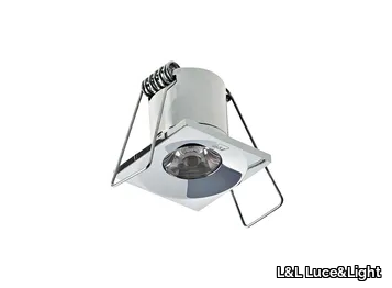
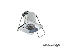
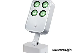
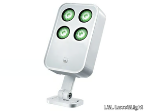
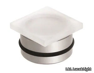
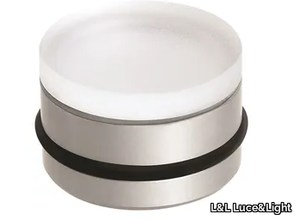
Eyes 2.9 - Recessed LED square spotlight _ L&L Luce&Light - 2d files - 3d files


SUPPLIER: L&L LUCE&LIGHT
TYPE: LIGHTING
OTHER SUPPLIERS
A wide range of product from near to 3,000 suppliers around the world.


Other Products From This Supplier
A wide range of product from furniture to finishes to meet the desire of all designers.
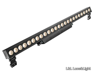
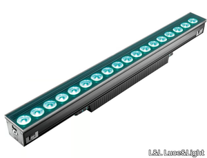
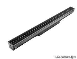
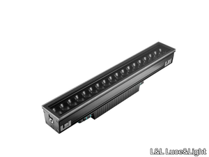
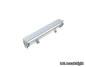
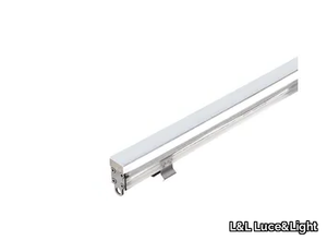
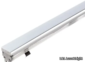
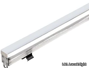
COLORADO 9.2 - Aluminium Outdoor linear profile _ L&L Luce&Light
L&L Luce&Light > Lighting accessories
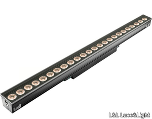
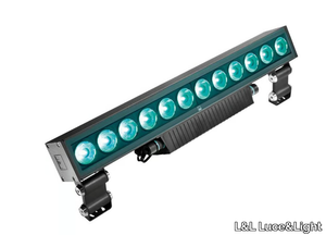
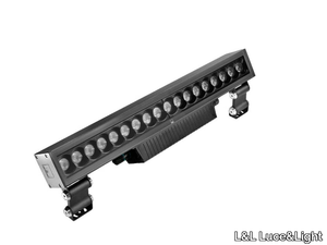
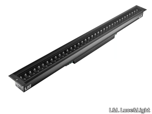
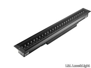
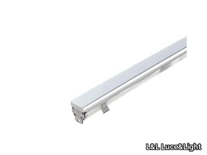
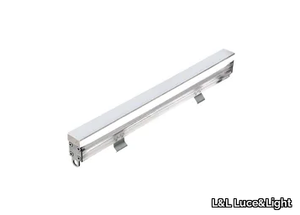
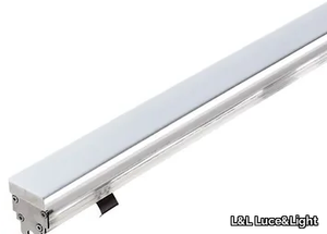
COLORADO 9.1 - Aluminium Outdoor linear profile _ L&L Luce&Light
L&L Luce&Light > Lighting accessories
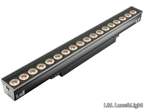
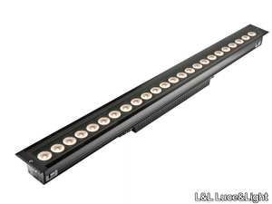
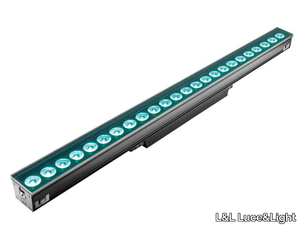
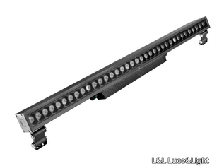
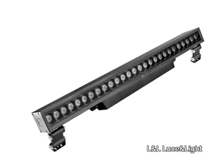
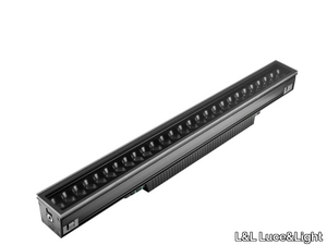
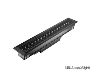
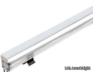
COLORADO 9.0 - Aluminium Outdoor linear profile _ L&L Luce&Light
L&L Luce&Light > Lighting accessories
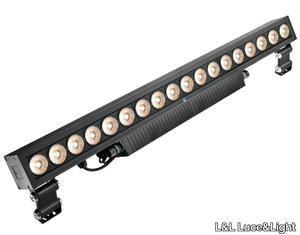
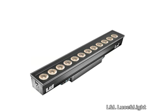
COLORADO 8.2 - Floor aluminium Outdoor linear profile _ L&L Luce&Light
L&L Luce&Light > Lighting accessories
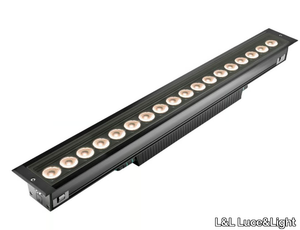
COLORADO 8.1 - Floor aluminium Outdoor linear profile _ L&L Luce&Light
L&L Luce&Light > Lighting accessories
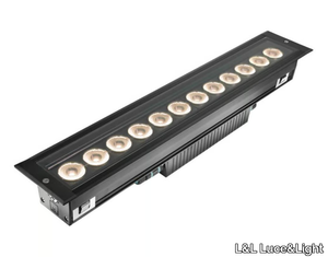
COLORADO 8.0 - Floor aluminium Outdoor linear profile _ L&L Luce&Light
L&L Luce&Light > Lighting accessories
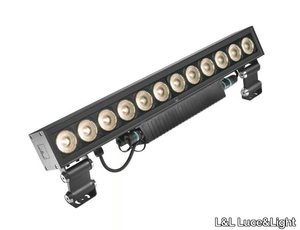
COLORADO 7.1 - Floor aluminium Outdoor linear profile _ L&L Luce&Light
L&L Luce&Light > Lighting accessories
COLORADO 7.2 - Floor aluminium Outdoor linear profile _ L&L Luce&Light
L&L Luce&Light > Lighting accessories
COLORADO 7.0 - Floor aluminium Outdoor linear profile _ L&L Luce&Light
L&L Luce&Light > Lighting accessories
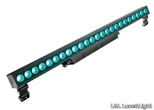
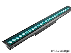
COLORADO 6.1 - RGB aluminium Outdoor linear profile _ L&L Luce&Light
L&L Luce&Light > Lighting accessories
COLORADO 6.2 - RGB aluminium Outdoor linear profile _ L&L Luce&Light
L&L Luce&Light > Lighting accessories
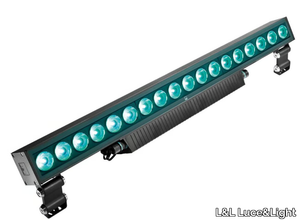
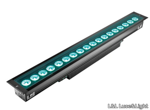
COLORADO 6.0 - RGB aluminium Outdoor linear profile _ L&L Luce&Light
L&L Luce&Light > Lighting accessories
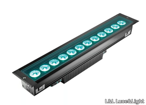
COLORADO 5.2 - Floor RGB aluminium Outdoor linear profile _ L&L Luce&Light
L&L Luce&Light > Lighting accessories
COLORADO 5.1 - Floor RGB aluminium Outdoor linear profile _ L&L Luce&Light
L&L Luce&Light > Lighting accessories
COLORADO 5.0 - Floor RGB aluminium Outdoor linear profile _ L&L Luce&Light
L&L Luce&Light > Lighting accessories
COLORADO 4.2 - Floor RGB aluminium Outdoor linear profile _ L&L Luce&Light
L&L Luce&Light > Lighting accessories
COLORADO 4.1 - Floor RGB aluminium Outdoor linear profile _ L&L Luce&Light
L&L Luce&Light > Lighting accessories
COLORADO 3.2 - Floor aluminium Outdoor linear profile _ L&L Luce&Light
L&L Luce&Light > Lighting accessories
COLORADO 4.0 - Floor RGB aluminium Outdoor linear profile _ L&L Luce&Light
L&L Luce&Light > Lighting accessories
COLORADO 3.1 - Floor aluminium Outdoor linear profile _ L&L Luce&Light
L&L Luce&Light > Lighting accessories
COLORADO 3.0 - Floor aluminium Outdoor linear profile _ L&L Luce&Light
L&L Luce&Light > Lighting accessories
COLORADO 2.2 - Floor aluminium Outdoor linear profile _ L&L Luce&Light
L&L Luce&Light > Lighting accessories
COLORADO 2.1 - Floor aluminium Outdoor linear profile _ L&L Luce&Light
L&L Luce&Light > Lighting accessories
COLORADO 1.2 - Floor aluminium Outdoor linear profile _ L&L Luce&Light
L&L Luce&Light > Lighting accessories
COLORADO 1.0 - Floor aluminium Outdoor linear profile _ L&L Luce&Light
L&L Luce&Light > Lighting accessories
COLORADO 2.0 - Floor aluminium Outdoor linear profile _ L&L Luce&Light
L&L Luce&Light > Lighting accessories
COLORADO 1.1 - Floor aluminium Outdoor linear profile _ L&L Luce&Light
L&L Luce&Light > Lighting accessories
Recently Viewed Products
A wide range of product from furniture to finishes to meet the desire of all designers.
PROLOGE 40 ON-KAGI FIXED LEVEL 2 - LED track-Light _ Kreon
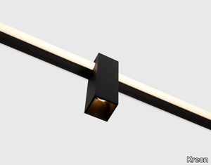
Kreon > Ceiling lamp
Here’s a refined and expanded product description with a concise supplier overview, including the 3D file availability: --- The **kreon kagi** system is an innovative and versatile lighting solution that seamlessly combines linear and accent lighting, ideal for architects and designers seeking both functionality and artistic expression. Its 24V profile can be recessed or surface-mounted and enhanced with 16mm or 26mm satinated light tubes for soft, continuous illumination. The system features an ingenious junction for perpendicular 90° connections, while round or square spotlights and wallwashers can be clamped onto the main profiles, allowing adjustable positioning along the track. Inspired by the Japanese word for "key" (reflecting its keyhole-shaped profile), the kagi system acts as a gateway to a three-dimensional lighting experience. Available in black or white, models include the **Prologue 40 ON-KAGI Fixed Level 2** (KR954032/KR954031) and **Prologue 40 ON-KAGI Wallwasher Level 2** (KR954072/KR954071). Wireless dimming is enabled via the Casambi app, and a **3D file of the product is available for download** to facilitate integration into design plans. **Supplier Overview**: Kreon, a Belgian leader in architectural lighting since 1982, is renowned for its cutting-edge, minimalist designs tailored for modern interiors. --- Let me know if you'd like any further adjustments!

Products From the Same Collection
A wide range of product from furniture to finishes to meet the desire of all designers.

Rio Sub 2.2 - LED RGB underwater lamp for fountains _ L&L Luce&Light
L&L Luce&Light > Outdoor lighting
Rio Sub 2.1 - LED RGB underwater lamp for fountains _ L&L Luce&Light
L&L Luce&Light > Outdoor lighting
Rio Sub 1.1 - LED RGB underwater lamp for fountains _ L&L Luce&Light
L&L Luce&Light > Outdoor lighting
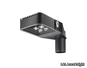
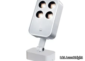
Siri 3.3 - LED adjustable die cast aluminium Outdoor floodlight _ L&L Luce&Light
L&L Luce&Light > Functional light
Siri 3.2 - LED adjustable die cast aluminium Outdoor floodlight _ L&L Luce&Light
L&L Luce&Light > Functional light
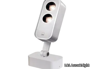
Siri 2.3 - LED adjustable die cast aluminium Outdoor floodlight _ L&L Luce&Light
L&L Luce&Light > Functional light
Siri 1.2 - LED adjustable die cast aluminium Outdoor floodlight _ L&L Luce&Light
L&L Luce&Light > Functional light
Step Outside 2.7 - LED wall-mounted outdoor steplight _ L&L Luce&Light
L&L Luce&Light > Functional light
Step Outside 2.6 - LED wall-mounted outdoor steplight _ L&L Luce&Light
L&L Luce&Light > Functional light
Recommended Products
A wide range of product from furniture to finishes to meet the desire of all designers.
Top Pendant Lamp
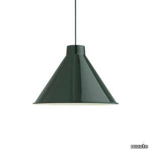
muuto > Ceiling lamp
With its universal and simple design, Top Pendant is a contemporary reinterpretation of the archetypical cone-shaped pendant. Its top is a striking feature designed to neatly fit its compact LED light source. Manufactured in spun steel with a graphic rolled hem, it is a versatile lighting family that offers an array of opportunities in color, size and function.
Ambit Rail Lamp
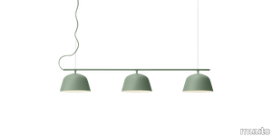
muuto > Ceiling lamp
The Ambit Rail Lamp is characterized by its simple lines and elegant shapes, bringing a refined light to any space. With its shades being made of handspun aluminum, the Ambit Rail Lamp features white interiors that provide a contrast to its outside shade while enhancing the light emitted into the room of any home, office or hospitality space.
Ambit Pendant Lamp
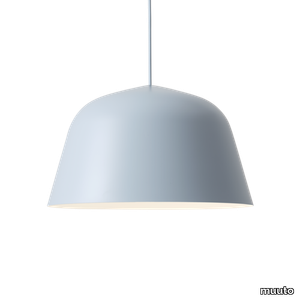
muuto > Ceiling lamp
Embodying the values of Scandinavian design, the Ambit Pendant Lamp is as timeless as it is contemporary. Made of hand-spun aluminum that has been hand-painted, the Ambit Pendant Lamp features clean lines and a white interior that heighten contrasts of its outside shade while enhancing the light emitted in any room of a home, office or commercial space. Use the design on its own or symmetric formations and vibrant clusters.
Fluid Pendant Lamp
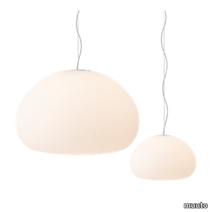
muuto > Ceiling lamp
Inspired by a resting drop of water, the Fluid Pendant Lamp shows how soft light can diffuse across a space for a cosy atmosphere. The frosted matte surface creates a glowing ambience that fits into any home or casual business setting. Present the design individually or in a group for an intimate atmosphere.
Khan metal
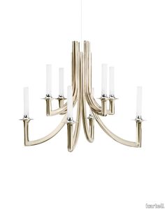
kartell > Ceiling lamp
Many different styles, from 18th century eclecticism to contemporary minimalism, come together in Philippe Starck’s KHAN chandelier to create a new icon of elegance and modernity. The symbolism of the design is complemented by the technological innovation of Kartell’s new polycarbonate 2.0 in the colours black, champagne and clear.
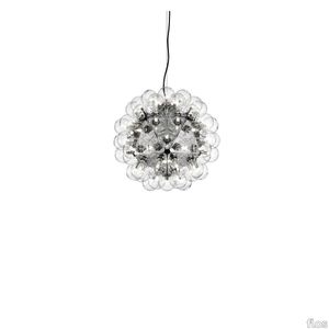
Small fl/y transparent
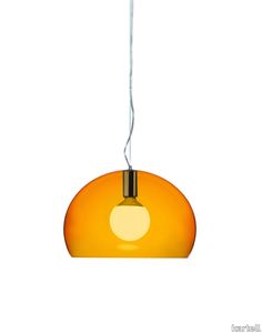
kartell > Ceiling lamp
FL/Y is an essentially-styled suspension lamp. The particular transparency of the material and the sheen of the colours recreate the idea of a soap bubble, shimmering iridiscently in the light. The shade is not perfectly hemispherical, with the cut-off falling just below the level of the diameter, offering greater concentration of the light. The lamp is available in three different sizes: Fl/Y (diameter 52cm, shade depth 33cm), Small Fl/Y (diameter 38cm, shade depth 28cm) and Big Fl/Y (diameter 83cm, shade depth 55cm).
Ge' metal
kartell > Ceiling lamp
Gè is a suspension lamp attached to the ceiling with a decorated rosette suggestive of antique Venetian chandeliers. It comes with a 37 cm diameter pleated lampshade. The cable can be adjusted in height from 45 to 230 cm.
Bloom hanging medium metal
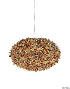
kartell > Ceiling lamp
Bloom is a tubular polycarbonate framework entirely covered by a structure of tiny transparent polycarbonate double corolla flowers. The result is an industrially produced lamp but with all the forms and stylistic complexity of a unique handcrafted piece.
Bloom hanging big
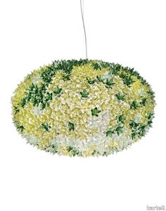
kartell > Ceiling lamp
Bloom is a tubular polycarbonate framework entirely covered by a structure of tiny transparent polycarbonate double corolla flowers. The result is an industrially produced lamp but with all the forms and stylistic complexity of a unique handcrafted piece.
Mist AP16
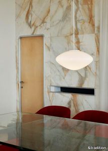
&tradition > Ceiling lamp
Mist is inspired by the warm, diffused light of morning rays shining through the haze, offering a modern take on the classic globe light silhouette. Crafted from mouth-blown opal glass with white coated aluminium details and a textile cord, the Mist pendant lamp is available in two sizes.
Taraxacum 88 Suspension 1
flos > Ceiling lamp
Suspension lamp providing direct and reflected lighting. Structure formed by 20 pressed, polished aluminum triangles. 60 clear Globolux lamps housed around the structure. Steel ceiling fitting and rose.
UPHOLSTERY
A wide range of Upholstery and materials provided by our suppliers to satisfy your needs.
auckland - 7071.18

Upholstery > vescom
auckland - 7071.28

Upholstery > vescom
harding - 7070.07

Upholstery > vescom
harding - 7070.08

Upholstery > vescom
furka plus - 7064.14

Upholstery > vescom
acton - 7062.20

Upholstery > vescom
leone plus - 7054.02

Upholstery > vescom
noss - 7058.13

Upholstery > vescom
lani - 7060.49

Upholstery > vescom
wolin - 7050.32

Upholstery > vescom
wolin - 7050.35

Upholstery > vescom
hestan - 7035.11

Upholstery > vescom
hestan - 7035.22

Upholstery > vescom
cyprus - 7038.15

Upholstery > vescom
lindau - 7028.01

Upholstery > vescom
lindau - 7028.09
Upholstery > vescom
dalma - 7024.13

Upholstery > vescom
dalma - 7024.14

Upholstery > vescom