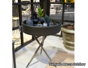
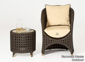
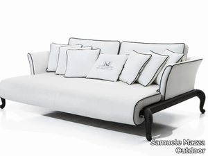
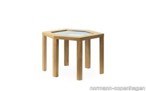
CANOPO - Round resin garden side table _ Samuele Mazza Outdoor - 2d files - 3d files


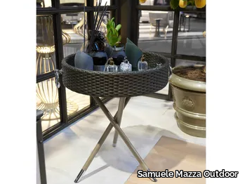
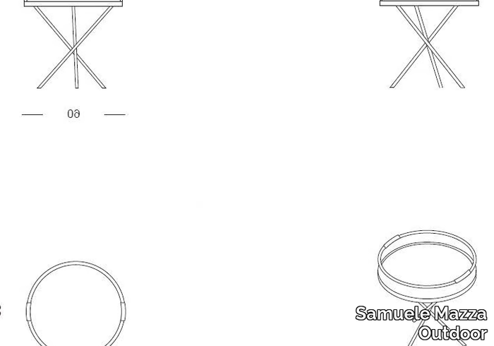

SUPPLIER: SAMUELE MAZZA OUTDOOR
COLLECTION: CANOPO
TYPE: FURNITURE

OTHER SUPPLIERS
A wide range of product from near to 3,000 suppliers around the world.


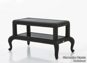
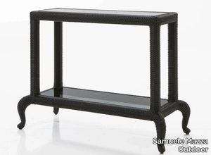
Other Products From This Supplier
A wide range of product from furniture to finishes to meet the desire of all designers.
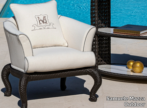
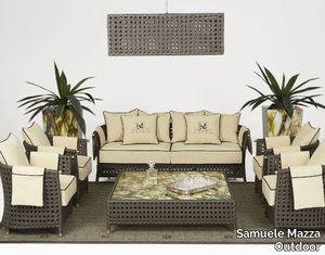
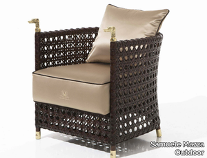
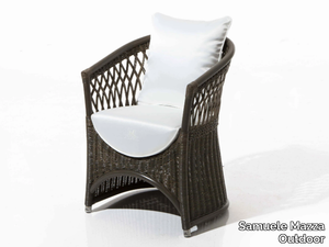
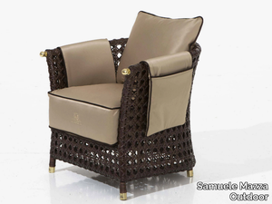
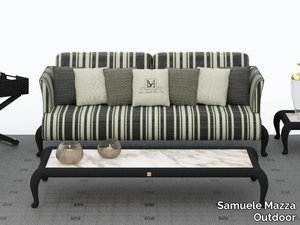
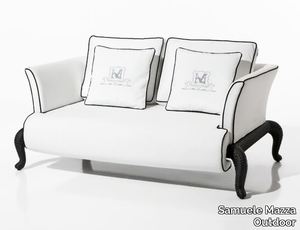
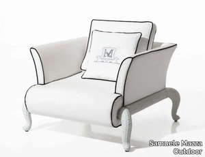
CANOPO T2 - Fabric garden armchair with armrests _ Samuele Mazza Outdoor
Samuele Mazza Outdoor > Armchair
CANOPO T2 - Fabric garden armchair with armrests _ Samuele Mazza Outdoor
Samuele Mazza Outdoor > Armchair
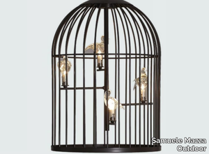
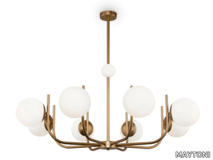
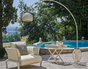
SIRIO - Halogen iron outdoor pendant lamp _ Samuele Mazza Outdoor
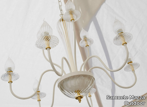
Samuele Mazza Outdoor > Ceiling lamp
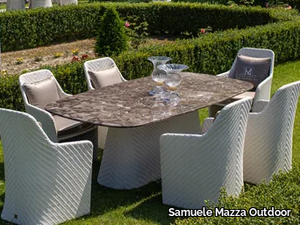
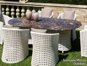
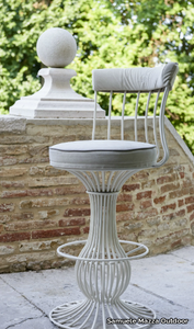
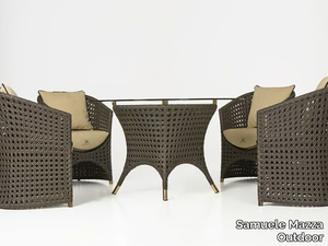
CANOPO BRIDGE - Medallion garden chair with armrests _ Samuele Mazza Outdoor
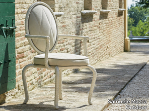
Samuele Mazza Outdoor > Chair
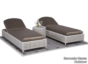
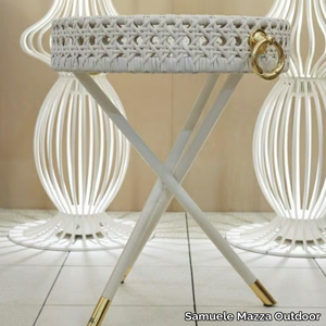
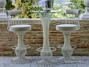
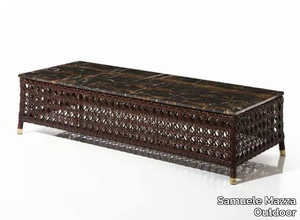
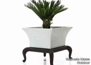
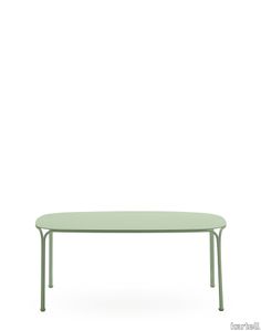
CANOPO - Height-adjustable garden side table _ Samuele Mazza Outdoor

Samuele Mazza Outdoor > Side table
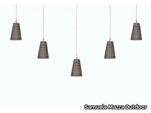
SOLE - Handmade iron outdoor pendant lamp _ Samuele Mazza Outdoor
Samuele Mazza Outdoor > Ceiling lamp
WEZEN - Handmade resin outdoor pendant lamp _ Samuele Mazza Outdoor
Samuele Mazza Outdoor > Ceiling lamp
WEZEN - Handmade synthetic material outdoor pendant lamp _ Samuele Mazza Outdoor
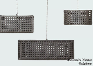
Samuele Mazza Outdoor > Ceiling lamp
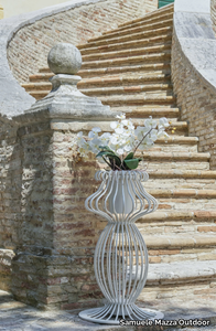
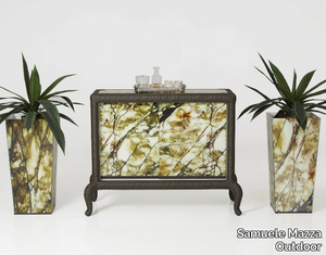
NAOS - High glass garden vase with Light _ Samuele Mazza Outdoor

Samuele Mazza Outdoor > Accessories
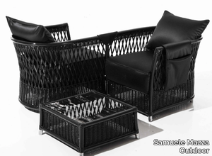
WEZEN BRIDGE - Garden resin easy chair with armrests _ Samuele Mazza Outdoor
Samuele Mazza Outdoor > Chair
WEZEN - Resin garden armchair with removable cover _ Samuele Mazza Outdoor
Samuele Mazza Outdoor > Armchair
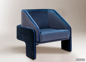
VEGA - Garden armchair with removable cover with armrests _ Samuele Mazza Outdoor
Samuele Mazza Outdoor > Armchair
VEGA - Garden woven wicker easy chair with armrests _ Samuele Mazza Outdoor
Samuele Mazza Outdoor > Chair
Recently Viewed Products
A wide range of product from furniture to finishes to meet the desire of all designers.
PLUS - Corner modular fabric sofa with removable cover _ Lapalma
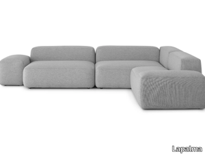
Lapalma > Sofa
Here’s your rephrased and expanded product description, including a concise supplier overview and mention of the 3D file availability: *"The PLUS collection’s corner sofa by Francesco Rota for Lapalma is a minimalist yet versatile design, perfect for both private homes and shared spaces. Crafted from fire-retardant injected foam with removable fabric upholstery, this modular system allows endless configurations—seats, backrests, and armrests can be combined with HPL or wooden tops using linking brackets. The collection now features curved elements, poufs, and partition panels, enabling sinuous layouts for larger interiors, while concave and convex forms create dynamic wave or face-to-face arrangements. A new low table in Fenix or wood finishes adds functionality, with open spaces to display books or objects. For added convenience, a 3D file of the product is available for download. Lapalma, the esteemed Italian design house behind this piece, has been crafting innovative, high-quality furniture since 1980. PLUS redefines relaxation with its eclectic, contemporary elegance—explore more at www.lapalma.it."* Let me know if you'd like any further refinements!
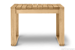
HYGGE - Round upholstered solid wood bench _ Karl Andersson
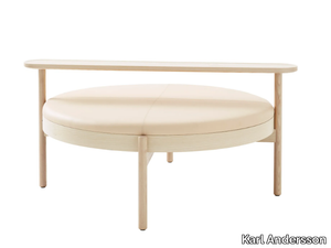
Karl Andersson > Bench
Here’s a rephrased and expanded product description, including a brief mention of the supplier and the availability of a 3D file: --- Inspired by a sailing trip to the Danish island of Læsø, Johan and Nina Kauppi designed **HYGGE**—a spacious, modular seating solution that fosters togetherness and the warm, convivial atmosphere the Danes call *hygge*. The **Kauppi & Kauppi** collection features versatile seating ‘islands’ built on a shared frame and cushion system, allowing for endless customization through interchangeable accessories. Choose from leg frames with armrests, a small round table, or a long rectangular table to adapt each unit to your space and needs. Crafted from solid oak or ash with stain or white glaze finishes, the frame supports plush cold-cured foam cushions upholstered in fabric or leather, with easy-to-change covers. Practical touches like an optional USB charger add functionality, while adjustable feet ensure stability on any surface. Delivered fully assembled, **HYGGE** is perfect for creating inviting lounge areas in hotels, lobbies, or residential spaces—whether as a standalone piece or grouped for larger gatherings. A downloadable 3D file of the product is available for planning and visualization. **Karl Andersson**, the Swedish manufacturer behind **HYGGE**, has been a trusted name in timeless, high-quality furniture since 1898, blending Scandinavian craftsmanship with contemporary design. --- This version keeps the supplier description concise while adding the 3D file detail and maintaining the product’s storytelling appeal. Let me know if you'd like any further refinements!
SANDER LOUNGE - Swivel trestle-based fabric chair with armrests _ Karl Andersson
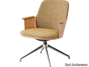
Karl Andersson > Chair
Here’s your rephrased and expanded product description, including a concise supplier overview and mention of the 3D file: *The Sander Lounge armchair (2021, 2023) revisits Karl Andersson & Söner’s 1950s heritage, when log-cabin furniture and Svensk Fur—inspired by German Bierstube styling—defined the era with sturdy pine constructions. This modern interpretation features a gracefully curved veneer back, soft lines, and solid wooden armrests meticulously machined for a smooth, tactile finish. Enhanced comfort comes with an optional covered back pad, while the undercarriage offers a choice of solid wood legs with felt feet or a sleek 4-star metal base (swivel-enabled, non-adjustable) in black powder-coated or matte polished finishes. Customize with oak or ash wood (including stained or white-glazed options) and select upholstery in fabric, real leather, or synthetic alternatives—though stretchable materials are recommended, avoiding checkered/striped patterns. For added versatility, a removable, washable seat cover with hospital-grade interliner is available. Designed for easy assembly and reupholstery, the Sander Lounge separates effortlessly into back shell and leg frame, making it adaptable for both homes and public spaces with two seat height options. A 3D file of the product is available for download. Crafted by Karl Andersson—a renowned Swedish design house founded in 1898, celebrated for its timeless Scandinavian craftsmanship—the chair arrives fully assembled, blending durability with understated elegance.*
MOCI - Rectangular oak table _ ASPLUND
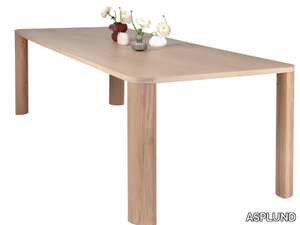
ASPLUND > Table
**MOCI Dining Table** The MOCI is a beautifully handcrafted dining or conference table, designed with a subtle minimalist aesthetic and Japanese influences. Featuring solid oak legs and an oak veneer top, it is available in two sizes and three elegant finishes: Natural Oak (PU1), White Stained Oak (PU2), and Chestnut Stained Oak (PU10). Designed by the talented Moa Sjöberg as part of her degree project at Carl Malmsten, the table was developed in collaboration with ASPLUND—a renowned Swedish design company celebrated for its contemporary, sustainable, and high-quality furniture. Awarded **Furniture of the Year 2022** by RUM magazine, the MOCI table balances bold design with soft elegance, praised for its harmonious blend of straight and rounded lines, strength and delicacy. A 3D file of the table is available for download, allowing for seamless integration into design plans. *"Working with ASPLUND to bring MOCI to life has been an inspiring journey—their expertise and commitment to sustainability elevated the design into a product I’m truly proud of."* — **Moa Sjöberg, Designer**
OTTO - Metal floor lamp _ Abrissi
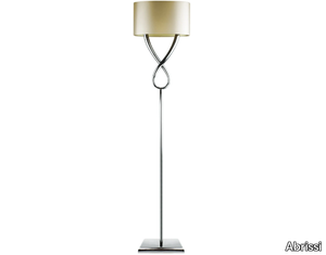
Abrissi > Floor lamp
**Product Description:** The Otto floor lamp features a sleek metal structure available in various finishes, paired with an elegant fabric lampshade to complement any interior style. Designed for versatility, it accommodates LED bulbs (not included) to suit different lighting needs—recommended specifications include a 220V E27 candle bulb (25W/40W max) for the UK and a 120V E26 candle bulb (40W max) for the USA. All lighting complies with CE standards, and UL listing is available upon request. For added convenience, a downloadable 3D file of the product is available for design planning. **Supplier Description:** Abrissi is a renowned interior design supplier offering high-quality furniture, lighting, and decor for residential and commercial spaces, with a focus on modern and timeless styles. Explore their collection at [http://abrissi.com](http://abrissi.com).
FOLIAGE OVAL - Metal pendant lamp _ Abrissi
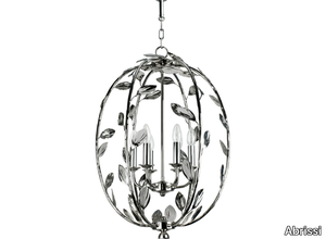
Abrissi > Ceiling lamp
Here’s a refined and expanded product description, including a concise supplier overview and mention of the 3D file: **Product Description:** The *Foliage Oval* is an elegantly hand-painted metal chandelier, available in a variety of finishes with matching candlesticks and chains to suit different décor styles. Lampshades are sold separately, and a ceiling hook is not included. **Technical Specifications:** - Bulbs not supplied - **UK:** 220V E14 candle bulb, 25W/40W max per arm - **USA:** 120V E12 candle bulb, 25W/40W max per arm - Complies with CE standards; UL listing available upon request - A downloadable 3D file of the product is available for visualization and planning. **Supplier Overview:** Abrissi is a renowned interior design supplier offering high-quality lighting, furniture, and décor for residential and commercial spaces. Explore their collection at [http://abrissi.com](http://abrissi.com). For more details, visit: **FOLIAGE OVAL | Pendant Lamp – Abrissi**.
Products From the Same Collection
A wide range of product from furniture to finishes to meet the desire of all designers.
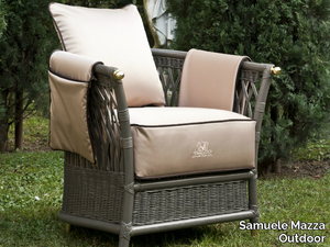
CANOPO BRIDGE - Medallion garden chair with armrests _ Samuele Mazza Outdoor
Samuele Mazza Outdoor > Chair
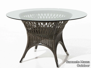
CANOPO - Height-adjustable garden side table _ Samuele Mazza Outdoor
Samuele Mazza Outdoor > Side table
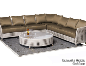
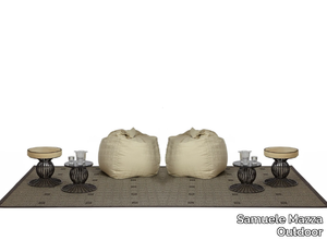
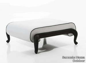
CANOPO - Upholstered matelassé fabric garden pouf _ Samuele Mazza Outdoor
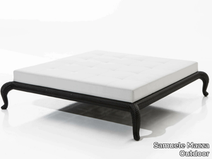
Samuele Mazza Outdoor > Pouf
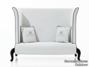
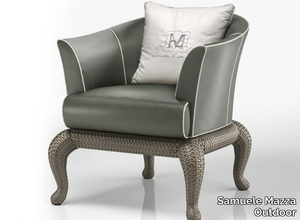
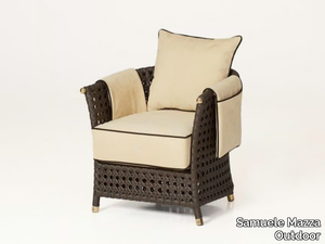
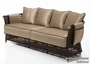
CANOPO - Fabric garden armchair with removable cover _ Samuele Mazza Outdoor
Samuele Mazza Outdoor > Armchair
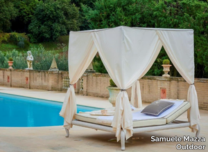
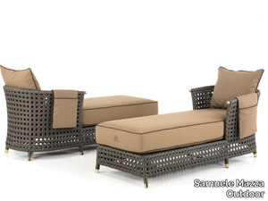
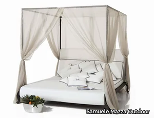
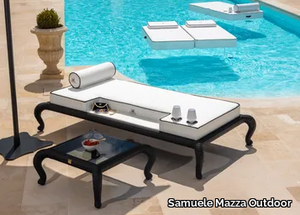
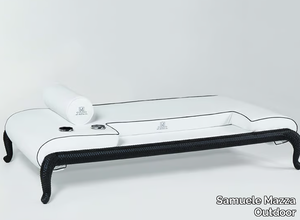
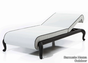
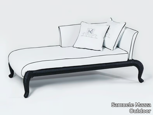
CANOPO - Recliner canopy garden bed with parasol _ Samuele Mazza Outdoor
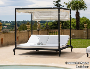
Samuele Mazza Outdoor > Bed frame
Recommended Products
A wide range of product from furniture to finishes to meet the desire of all designers.
Relate Side Table
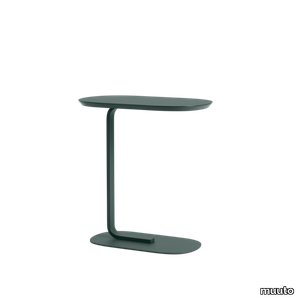
muuto > Side table
An elegant side table with two planes, connected through a graphic leg for a modern expression. Pull the Relate Side Table up to a sofa to use as a hot desk or place it in any space to hold various objects.
Hiray side table
kartell > Side table
HIRAY takes metal, one of the most important materials for the greening of the Kartell catalogue, and uses the welded wire process to shape it. The result is an essential and functional product that is nevertheless rich in emotion. Metal wires form well-defined yet lightweight structural parts of the collection’s chair, chair with arms, bistro table, armchair, divan and side table. The various articles come in white, Bordeaux, black and green.
Blast square
kartell > Side table
Blast is a side-table (available in square or rectangular versions with rounded corners) with transparent base and tops. The design is a development of the Sir Gio table, with the opportunity to associate and combine different coloured bases and tops. The central core of the base is available in chrome or copper metallic finishes.
Jolly
kartell > Side table
A completely transparent small side table in the perfect size: 40x40x40 cm. Colourful, practical, safe and functional, Jolly is a versatile and fun side table.
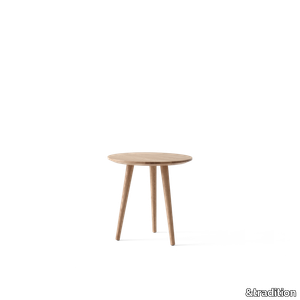
Rotate SC73
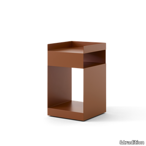
&tradition > Side table
Rotate’s unassuming appearance belies its highly functional design. Created to fulfil a wide variety of purposes – from an office trolley, to a bedside table or bathroom storage unit – this asymmetrical piece can be inserted into any space. To ensure maximum adaptability, it sits on discreet wheels to facilitate quick and simple manoeuvrability from one location to the next.
In Between SK13
&tradition > Side table
Sitting within the larger In Between series, this lounge table carefully echoes many aspects of the In Between chair, from its gentle curvature to the outward splay of its legs. It is available in two heights and comes in three finishes: black lacquered oak; oiled oak; and smoked oiled oak.
BK16 Side Table
carlhansen > Side table
The BK16 side table was designed in 1959 by Danish architect and professor Bodil Kjær. Part of a collection of beautifully crafted indoor-outdoor furniture in solid teak, its Cubist-inspired form echoes other designs in the series, all of which have a clean-lined and geometric quality. Perfectly proportioned to match the height of the collection’s lounge chair, the BK16 side table displays the same superior craftsmanship and striking simplicity that underpins the entire Indoor-Outdoor Series.
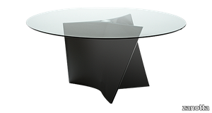
Tucano
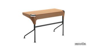
zanotta > Side table
Writing desk. Matt black varnished steel frame. Top covered with cowhide pigmentato 90.
Quaderna 2600
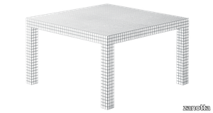
zanotta > Side table
Table. Honeycomb core structure coated with white plastic laminate, digitally printed with black squares at 3 cm spacing.
Elica
zanotta > Side table
Tables. Base in Cristalplant®, composite material based on polyester and acrylic resins, loaded with minerals and mass pigmented. For the version 2575, tempered, extraclear, acidated plate glass top painted in the shade of white or made of white Carrara marble only matching the matt white base; or Sahara Noir marble top, with stain-resistant clear matt polyester protective varnish, matching the matt black varnished base. For the version 2576, clear plate glass top, matching the matt white base or black glossy lacquered; or smoky grey plate glass top only matching the black glossy lacquered base.
Oscar
zanotta > Side table
Bedside table with drawer. Graphite painted steel frame. Handle in graphite painted aluminium. Drawer in medium density fiberboard veneered with natural oak or varnished grey or white.
Niobe 648
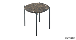
zanotta > Side table
Small table. Steel frame painted in the shades black or white. Tops available either in white Carrara marble, in black Marquinia marble or in Emperador marble, with stain-resistant protective varnish, in clear matt polyester.
UPHOLSTERY
A wide range of Upholstery and materials provided by our suppliers to satisfy your needs.
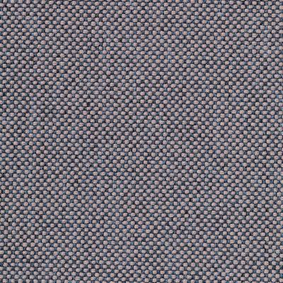
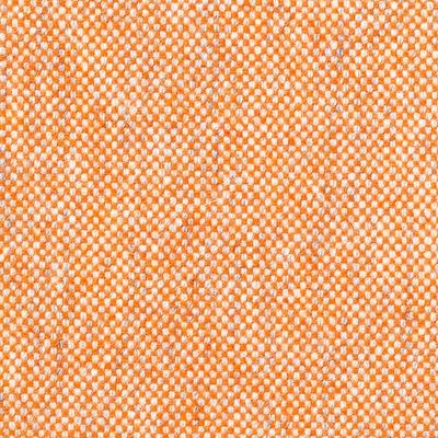
auckland - 7071.18
Upholstery > vescom
auckland - 7071.28
Upholstery > vescom
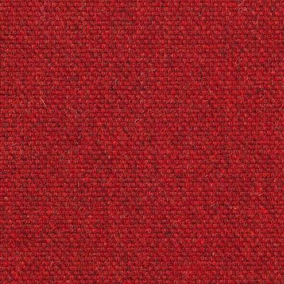
harding - 7070.07

Upholstery > vescom
harding - 7070.08
Upholstery > vescom
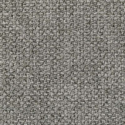
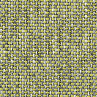
furka plus - 7064.14

Upholstery > vescom
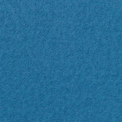
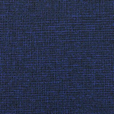
acton - 7062.20
Upholstery > vescom
leone plus - 7054.02
Upholstery > vescom
noss - 7058.13
Upholstery > vescom
lani - 7060.49
Upholstery > vescom
wolin - 7050.32
Upholstery > vescom
wolin - 7050.35
Upholstery > vescom
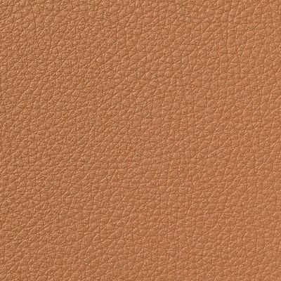
hestan - 7035.11

Upholstery > vescom
hestan - 7035.22
Upholstery > vescom
cyprus - 7038.15
Upholstery > vescom
lindau - 7028.01

Upholstery > vescom
lindau - 7028.09
Upholstery > vescom
dalma - 7024.13

Upholstery > vescom
dalma - 7024.14
Upholstery > vescom