Volta oktant-3 423 - 2d files - 3d files

PRODUCT DESCRIPTION
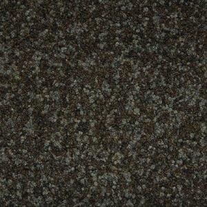
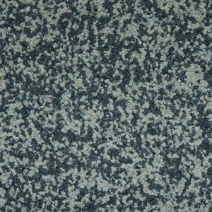
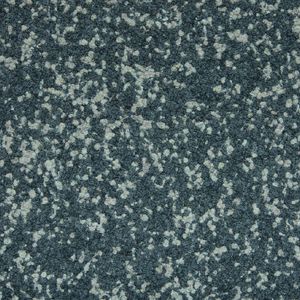
Oktant-3 423 – Moody Steel for Industrial Ambience Dark and assertive, Oktant-3 423 brings a dramatic steel tone to the floor. It's built for commercial interiors with edge—think fashion showrooms, cocktail lounges, or urban apartment lobbies. Bold, modern, and rich in personality.
SUPPLIER: FABROMONT
COLLECTION: VOLTA
TYPE: FINISHES
OTHER SUPPLIERS
A wide range of product from near to 3,000 suppliers around the world.


Other Products From This Supplier
A wide range of product from furniture to finishes to meet the desire of all designers.
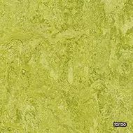
Reval asparagus 537
Fabromont > Synthetic Floor
Reval® Asparagus 537 brings a crisp, botanical green to the floor, echoing the vitality of spring foliage. Perfect for biophilic design lovers and nature-inspired interiors, this tone uplifts working environments, wellness spaces, and breakout lounges. Its fresh hue harmonises effortlessly with light woods, white walls, and Scandinavian aesthetics. Ideal for hospitality and office projects seeking an organic, rejuvenating ambience.
Reval beluga 536

Fabromont > Synthetic Floor
Reval® Beluga 536 – Sophisticated Depth in Urban Projects Deep, smoky, and confidently neutral, Reval® Beluga 536 lends a sense of modern elegance to high-traffic environments. Inspired by the deep grey tones of the beluga whale, this versatile colour is perfect for corporate offices, hotel corridors, and public libraries aiming for a clean, contemporary look. It pairs beautifully with concrete textures, glass partitions, and metal accents in industrial-chic interiors.
Reval borago 534

Fabromont > Synthetic Floor
Reval® Borago 534 – Muted Blue Calm for Focus and Serenity With a subtle nod to the soft petals of the borago flower, Reval® Borago 534 offers a desaturated blue that calms the mind—ideal for learning environments, open-plan workspaces, and serene hotel rooms. The dusty-blue hue pairs seamlessly with neutral furniture and warm beige tones, making it a refined choice for Scandinavian and Japandi-inspired interiors.
Reval cumin 531
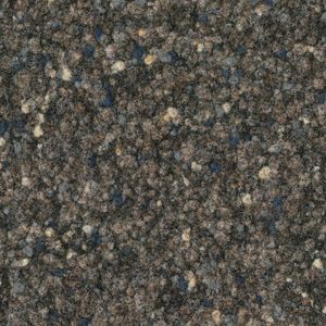
Fabromont > Synthetic Floor
Reval® Cumin 531 – Earthy Warmth for Cosy and Welcoming Interiors Reval® Cumin 531 delivers an earthy, sun-baked tone that adds an instant sense of warmth to interiors. Reminiscent of Mediterranean spice markets, this warm neutral works wonders in boutique hotels, restaurant seating areas, and relaxed co-working lounges. It complements terracotta walls, oak joinery, and linen upholstery for a grounded, homely atmosphere.
Reval beluga 533
Fabromont > Synthetic Floor
Reval® Kalamata 533 – Bold and Grounded for Character-Driven Spaces Taking cues from the richness of kalamata olives, Reval® Kalamata 533 introduces a bold, dark tone that commands presence. This intense, organic shade is a perfect anchor in hospitality interiors, bars, and cinema lounges. It provides a dramatic contrast against brass details, velvet furnishings, or burnt-orange accents—ideal for creating moody and luxurious zones.
Reval kardamom 530
Fabromont > Synthetic Floor
Reval® Kardamom 530 – Subtle Spice for Minimalist Harmony Inspired by the muted elegance of dried cardamom pods, Reval® Kardamom 530 offers a soft, beige-green undertone that’s made for minimalist, Japandi, and wellness-driven designs. It’s a natural fit in spa areas, yoga studios, hotel suites, and conference rooms, where calm and cohesion are essential. Layer it with pale timbers, organic cottons, and soft lighting for a tranquil palette.
Reval santolina 535
Fabromont > Synthetic Floor
Reval® Santolina 535 – Understated Elegance for Serene Interiors A quiet grey-green reminiscent of the santolina plant, Reval® Santolina 535 is a masterclass in subtle sophistication. Ideal for designers seeking a calming, understated backdrop in residential living rooms, hotel lobbies, and healthcare environments. This muted tone supports a palette of sage, ivory, and brushed nickel—perfect for timeless interiors with a modern edge.
Reval tamarind 532
Fabromont > Synthetic Floor
Reval® Tamarind 532 – Dark and Delicious for Statement Flooring Reval® Tamarind 532 offers a rich, dark brown with a hint of charcoal, inspired by the deep tone of tamarind fruit. It’s a grounding colour for large-scale spaces like auditoriums, restaurants, and executive suites. This shade brings luxurious depth and hides foot traffic well, making it practical and stylish for contract flooring. Pair with amber lighting and leather details for a refined aesthetic.
Volta aurora-1 431
Fabromont > Synthetic Floor
Aurora-1 431 – Light and Airy for Energising Interiors Aurora-1 431 is a pale, optimistic hue that brings freshness and daylight to interior floors. This light gradation is perfect for education spaces, wellness centres, and co-working areas where clarity and focus matter. Its barely-there tone pairs beautifully with bleached woods, glass walls, and minimalist furnishings.
Volta aurora-2 432
Fabromont > Synthetic Floor
Aurora-2 432 – Balanced Neutrals for Seamless Flow Aurora-2 432 offers a versatile mid-tone that transitions effortlessly between the light and dark of the Aurora family. Its calm presence suits open-plan offices, hotel rooms, or corridors where continuity and subtlety are key. Combine it with soft grey upholstery and textured textiles for a refined, Scandinavian look.
olta aurora-3 433
Fabromont > Synthetic Floor
Aurora-3 433 – Deep and Contemporary for Statement Floors Aurora-3 433 delivers a deep, stormy grey with a cool undertone—ideal for grounding busy spaces like meeting rooms, airport lounges, or art galleries. This bold gradation creates dramatic contrast in layered flooring designs, especially when paired with chrome or smoked glass accents.
Volta hercules-1 461

Fabromont > Synthetic Floor
Hercules-1 461 – Soft Silver for Calm Professionalism A gentle silver-grey, Hercules-1 461 is an excellent base for commercial interiors where neutrality is required without feeling sterile. Think accounting firms, dental clinics, or minimalist hotel corridors. This light tone brightens dark furniture schemes while keeping the look crisp and professional.
Volta hercules-2 462

Fabromont > Synthetic Floor
Hercules-2 462 – Reliable Mid-Grey for High-Traffic Spaces Hercules-2 462 strikes the perfect balance between practicality and elegance. With its neutral mid-grey finish, it's ideal for public buildings, libraries, and reception areas. Its tone hides foot traffic and dust well, making it a favourite for large-scale contract projects.
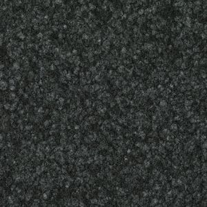
Volta hercules-3 463
Fabromont > Synthetic Floor
Hercules-3 463 – Charcoal Sophistication with Industrial Edge Dark, masculine, and modern—Hercules-3 463 adds depth and strength to any interior. This rich charcoal grey is perfect for creative studios, loft-style offices, or moody hotel lobbies. Pair it with matte black metal, industrial lighting, and raw textures for an urban atmosphere.
Volta leo-1 441
Fabromont > Synthetic Floor
Leo-1 441 – Sand-Toned Simplicity for Soft Interior Schemes Leo-1 441 introduces a sandy beige base that reflects natural light and brings warmth to minimalist interiors. Ideal for Nordic-style offices or calm learning environments, this tone supports open layouts and clean lines. It pairs beautifully with linen, rattan, and blonde oak furniture.
Volta leo-2 442
Fabromont > Synthetic Floor
Leo-2 442 – Classic Taupe for Understated Elegance Leo-2 442 is a timeless taupe that works in a variety of settings—be it legal offices, wellness hotels, or high-end residential developments. This middle tone supports a calm and cohesive palette, offering a solid base for layers of organic textures and soft neutrals.
Volta leo-3 443
Fabromont > Synthetic Floor
Leo-3 443 – Deep Mocha for Earthy, Elegant Interiors With its rich, earthy base, Leo-3 443 evokes dark chocolate and warm soil tones. Ideal for luxurious bars, moody lobbies, or fine dining spaces, this grounding shade adds instant drama to floor designs. Perfect with leather upholstery and brass details.
Volta libra-1 411
Fabromont > Synthetic Floor
Libra-1 411 – Gentle Grey-Green for Nature-Inspired Spaces Libra-1 411 leans into a delicate grey-green that soothes the eye and evokes indoor-outdoor harmony. Think medical waiting rooms, sustainable office spaces, or boutique wellness studios. It complements biophilic design and soft natural lighting beautifully.
Volta libra-2 412
Fabromont > Synthetic Floor
Libra-2 412 – Neutral Balance with a Hint of Olive Libra-2 412 offers an earthy, balanced tone with subtle olive undertones, suited for hospitality suites and modern educational interiors. It brings stability to a palette while maintaining visual interest. Ideal when paired with terracotta, navy, or muted sage accents.
Volta libra-3 413
Fabromont > Synthetic Floor
Libra-3 413 – Forest-Inspired for Deep, Calm Ambience Libra-3 413 brings a dark, grounded green that recalls forest shadows—perfect for introspective spaces like libraries, meditation rooms, or luxury hotel bedrooms. It adds richness without overpowering, making it a smart pick for moody, contemplative interiors.
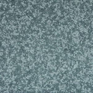
Volta oktant-1 421
Fabromont > Synthetic Floor
Oktant-1 421 – Misty Blue-Grey for Light-Filled Rooms Oktant-1 421 introduces a silvery-blue haze that’s ideal for Nordic interiors and coastal projects. This shade works well in modern beach hotels, creative coworking hubs, or tech offices. Use it to reflect daylight and create an uplifting interior tone.
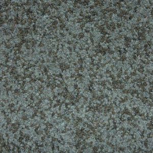
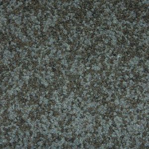
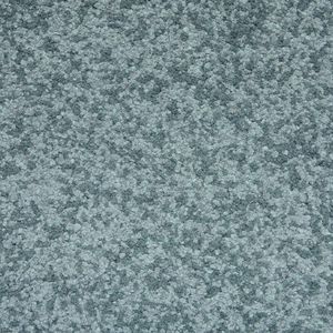
Volta oktant-2 422
Fabromont > Synthetic Floor
Oktant-2 422 – Cool Slate for Contemporary Interiors A true mid-grey with blue undertones, Oktant-2 422 is the go-to for crisp, modern spaces. It provides the perfect neutral backdrop in contemporary cafés, collaborative workspaces, or client-facing office zones. Clean, technical, and always current.
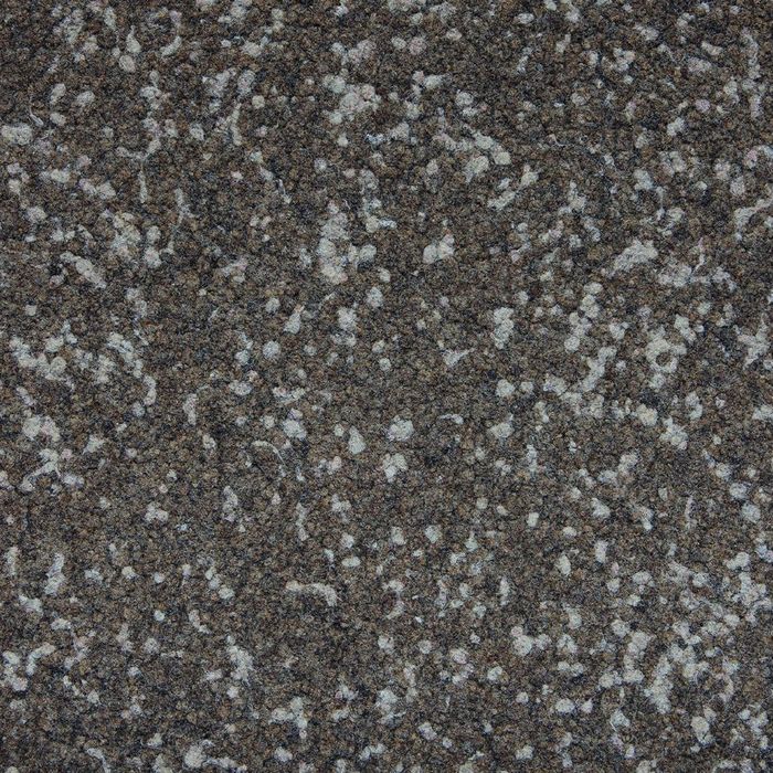
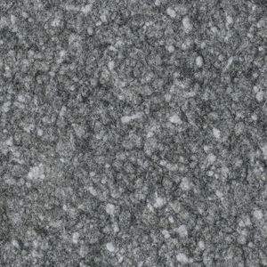
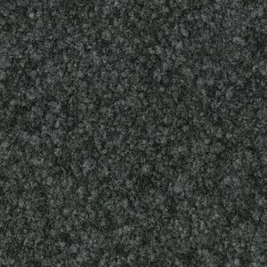
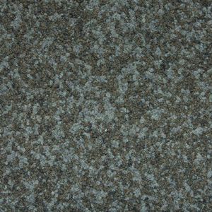
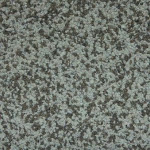
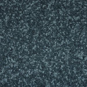
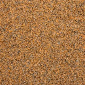
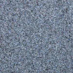
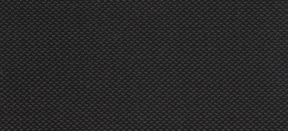
Volta oktant-3 423
Fabromont > Synthetic Floor
Oktant-3 423 – Moody Steel for Industrial Ambience Dark and assertive, Oktant-3 423 brings a dramatic steel tone to the floor. It's built for commercial interiors with edge—think fashion showrooms, cocktail lounges, or urban apartment lobbies. Bold, modern, and rich in personality.
Volta orion-1 451
Fabromont > Synthetic Floor
Orion-1 451 – Cool Ash for Minimalist Harmony Orion-1 451 sits in the palest grey spectrum, bordering on white, yet maintaining a gentle coolness. It's perfect for minimalist interiors where brightness and cleanliness matter—clinics, art studios, or open-plan working spaces. Fresh, functional, and unobtrusive.
Volta orion-2 452
Fabromont > Synthetic Floor
Orion-2 452 – Graphite Calm for Balanced Interiors A true graphite tone, Orion-2 452 delivers a calm and even base for layered contemporary interiors. Pair it with navy or ochre to create contrast or keep it monochrome for a sleek aesthetic. Excellent for working environments and upscale public spaces.
Volta orion-3 453
Fabromont > Synthetic Floor
Orion-3 453 – Night Sky Tone for Statement Floors Orion-3 453 evokes the deep, bluish-black of a clear night sky. It's rich and immersive, ideal for creating drama in cinema rooms, moody hotel lounges, or private boardrooms. For contrast, add soft lighting or brushed brass fixtures.
Volta phoenix-1 471
Fabromont > Synthetic Floor
Phoenix-1 471 – Pale Terracotta for Soft Warmth Phoenix-1 471 warms up interiors with a hint of clay-like blush. A refined alternative to beige, it’s ideal for healthcare reception spaces, spa environments, or transitional corridors in hospitality settings. Soft and comforting.
Volta phoenix-2 472
Fabromont > Synthetic Floor
Phoenix-2 472 – Burnt Peach for Inviting Interiors Phoenix-2 472 brings a soft terracotta depth that’s inviting and stylish. Use it in restaurants, hotel suites, or warm-toned co-working spaces. It adds personality without overwhelming—especially effective in Japandi or Mediterranean design themes.
Volta phoenix-3 473
Fabromont > Synthetic Floor
Phoenix-3 473 – Spiced Earth for Bold Visual Impact Phoenix-3 473 is a rich, earthen tone with the warmth of paprika and clay. Perfect for boutique cafés, dramatic stair landings, or branded retail floors. Adds character, heat, and a grounded confidence to any space.
Volta zodiac-1 481
Fabromont > Synthetic Floor
Zodiac-1 481 – Soft Beige for Light and Neutral Interiors Zodiac-1 481 offers a whisper of creamy beige—ideal for nursing homes, therapy centres, and understated luxury suites. It reflects natural light and brings a quiet charm to spaces where serenity matters.
Volta zodiac-2 482
Fabromont > Synthetic Floor
Zodiac-2 482 – Taupe-Grey for Flexible Design Schemes Zodiac-2 482 is a taupe-grey hybrid that fits seamlessly into any design narrative. This flexible tone is particularly good in multi-use buildings, from libraries to coworking zones. Understated and endlessly adaptable.
Volta zodiac-3 483
Fabromont > Synthetic Floor
Zodiac-3 483 – Espresso Depth for Rich Floor Accents Dark and delicious, Zodiac-3 483 brings espresso richness to the floor—elevating any scheme with confidence. Whether in cocktail bars, heritage hotels, or brand headquarters, this shade creates an opulent, grounded feel.
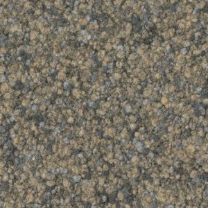
Atlas arnika 871
Fabromont > Synthetic Floor
Atlas Arnika 871 – Golden Warmth for Inviting Interiors Inspired by the golden petals of the arnica flower, Atlas Arnika 871 delivers a warm, yellow-beige tone that brings optimism and light into any space. Perfect for wellness centres, daycare facilities, and senior living environments, this tone enhances mood and adds a friendly, sun-kissed touch to interiors. Its soft brightness complements natural woods, creamy fabrics, and soft furnishings, making it ideal for healthcare and hospitality projects aiming for a homely and uplifting feel.
Atlas enzian 868
Fabromont > Synthetic Floor
Atlas Enzian 868 – Deep Blue Serenity for Focused Environments Drawing from the rich hues of the alpine gentian flower, Atlas Enzian 868 introduces a deep, contemplative blue that exudes calm and clarity. It’s an excellent choice for conference centres, learning environments, and therapy rooms, where mental focus and tranquillity are essential. This strong yet balanced colour is particularly effective when paired with cool greys, metallic finishes, or pale timber accents in contemporary and Scandinavian-style spaces.
Atlas holunder 863
Fabromont > Synthetic Floor
Atlas Holunder 863 – Earthy Comfort for Balanced Designs Atlas Holunder 863 features an earthy taupe tone reminiscent of elderberry stems and bark. This grounding colour offers a sense of stability and comfort, ideal for libraries, hotel corridors, or multifunctional spaces that benefit from a neutral but characterful base. It pairs seamlessly with olive greens, terracotta accents, or matte black hardware—making it suitable for biophilic, Japandi, or nature-
Atlas ingwer 865
Fabromont > Synthetic Floor
Atlas Ingwer 865 – Spicy Energy for Stimulating Spaces A vibrant ginger tone defines Atlas Ingwer 865, bringing a subtle reddish warmth and an energising undercurrent to interiors. It's ideal for creative workspaces, cafeterias, or transitional spaces where a boost of liveliness is welcome. This spicy hue complements mid-century modern designs, adding depth when contrasted with charcoal greys or brass highlights.
Atlas kornblume 869
Fabromont > Synthetic Floor
Atlas Kornblume 869 – Cornflower Blue for Soft and Uplifting Interiors Atlas Kornblume 869 introduces a delicate and breezy cornflower blue, evoking open skies and airy atmospheres. This gentle hue is ideal for patient rooms, nurseries, or hotel suites where a calm and inviting palette is required. Its softness supports restful environments and aligns well with natural fibres, sandy neutrals, and pale oak flooring.
Atlas mocca 870
Fabromont > Synthetic Floor
Atlas Mocca 870 – Coffee-Toned Sophistication for Executive Interiors Rich and elegant, Atlas Mocca 870 draws from the deep tones of roasted coffee beans. This luxurious dark brown adds visual weight and grounding to interiors, making it a strong choice for executive offices, cigar lounges, or hotel reception areas. It brings warmth and professionalism, especially when paired with leather furniture, walnut wood, or muted gold accents.
Atlas roggen 860
Fabromont > Synthetic Floor
Atlas Roggen 860 – Neutral Rye for Adaptable Commercial Floors Atlas Roggen 860 offers a clean, neutral beige inspired by the subtle tones of rye grain. Its understated and highly versatile look suits everything from open-plan offices to school corridors and conference halls. This shade is ideal for projects requiring a timeless, fuss-free base that lets furniture and fixtures take centre stage—especially within modern, contract-grade designs.
Atlas silberpappel 861
Fabromont > Synthetic Floor
Atlas Silberpappel 861 – Silvery Lightness for Bright and Open Spaces With its light, silver-grey finish, Atlas Silberpappel 861 brightens interiors while maintaining a cool, professional tone. Inspired by the shimmering underside of the silver poplar leaf, it’s perfect for design studios, labs, or any space that benefits from visual lightness. Use it to enhance spatial flow, especially in interiors that value transparency and cleanliness—like healthcare settings or minimalist workspaces.
Recently Viewed Products
A wide range of product from furniture to finishes to meet the desire of all designers.
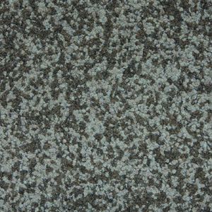
Volta oktant-3 423
Fabromont > Synthetic Floor
Oktant-3 423 – Moody Steel for Industrial Ambience Dark and assertive, Oktant-3 423 brings a dramatic steel tone to the floor. It's built for commercial interiors with edge—think fashion showrooms, cocktail lounges, or urban apartment lobbies. Bold, modern, and rich in personality.
Products From the Same Collection
A wide range of product from furniture to finishes to meet the desire of all designers.
Volta aurora-1 431
Fabromont > Synthetic Floor
Aurora-1 431 – Light and Airy for Energising Interiors Aurora-1 431 is a pale, optimistic hue that brings freshness and daylight to interior floors. This light gradation is perfect for education spaces, wellness centres, and co-working areas where clarity and focus matter. Its barely-there tone pairs beautifully with bleached woods, glass walls, and minimalist furnishings.
Volta aurora-2 432
Fabromont > Synthetic Floor
Aurora-2 432 – Balanced Neutrals for Seamless Flow Aurora-2 432 offers a versatile mid-tone that transitions effortlessly between the light and dark of the Aurora family. Its calm presence suits open-plan offices, hotel rooms, or corridors where continuity and subtlety are key. Combine it with soft grey upholstery and textured textiles for a refined, Scandinavian look.
olta aurora-3 433
Fabromont > Synthetic Floor
Aurora-3 433 – Deep and Contemporary for Statement Floors Aurora-3 433 delivers a deep, stormy grey with a cool undertone—ideal for grounding busy spaces like meeting rooms, airport lounges, or art galleries. This bold gradation creates dramatic contrast in layered flooring designs, especially when paired with chrome or smoked glass accents.
Volta hercules-1 461
Fabromont > Synthetic Floor
Hercules-1 461 – Soft Silver for Calm Professionalism A gentle silver-grey, Hercules-1 461 is an excellent base for commercial interiors where neutrality is required without feeling sterile. Think accounting firms, dental clinics, or minimalist hotel corridors. This light tone brightens dark furniture schemes while keeping the look crisp and professional.
Volta hercules-2 462
Fabromont > Synthetic Floor
Hercules-2 462 – Reliable Mid-Grey for High-Traffic Spaces Hercules-2 462 strikes the perfect balance between practicality and elegance. With its neutral mid-grey finish, it's ideal for public buildings, libraries, and reception areas. Its tone hides foot traffic and dust well, making it a favourite for large-scale contract projects.
Volta hercules-3 463
Fabromont > Synthetic Floor
Hercules-3 463 – Charcoal Sophistication with Industrial Edge Dark, masculine, and modern—Hercules-3 463 adds depth and strength to any interior. This rich charcoal grey is perfect for creative studios, loft-style offices, or moody hotel lobbies. Pair it with matte black metal, industrial lighting, and raw textures for an urban atmosphere.
Volta leo-1 441
Fabromont > Synthetic Floor
Leo-1 441 – Sand-Toned Simplicity for Soft Interior Schemes Leo-1 441 introduces a sandy beige base that reflects natural light and brings warmth to minimalist interiors. Ideal for Nordic-style offices or calm learning environments, this tone supports open layouts and clean lines. It pairs beautifully with linen, rattan, and blonde oak furniture.
Volta leo-2 442
Fabromont > Synthetic Floor
Leo-2 442 – Classic Taupe for Understated Elegance Leo-2 442 is a timeless taupe that works in a variety of settings—be it legal offices, wellness hotels, or high-end residential developments. This middle tone supports a calm and cohesive palette, offering a solid base for layers of organic textures and soft neutrals.
Volta leo-3 443
Fabromont > Synthetic Floor
Leo-3 443 – Deep Mocha for Earthy, Elegant Interiors With its rich, earthy base, Leo-3 443 evokes dark chocolate and warm soil tones. Ideal for luxurious bars, moody lobbies, or fine dining spaces, this grounding shade adds instant drama to floor designs. Perfect with leather upholstery and brass details.
Volta libra-1 411
Fabromont > Synthetic Floor
Libra-1 411 – Gentle Grey-Green for Nature-Inspired Spaces Libra-1 411 leans into a delicate grey-green that soothes the eye and evokes indoor-outdoor harmony. Think medical waiting rooms, sustainable office spaces, or boutique wellness studios. It complements biophilic design and soft natural lighting beautifully.
Volta libra-2 412
Fabromont > Synthetic Floor
Libra-2 412 – Neutral Balance with a Hint of Olive Libra-2 412 offers an earthy, balanced tone with subtle olive undertones, suited for hospitality suites and modern educational interiors. It brings stability to a palette while maintaining visual interest. Ideal when paired with terracotta, navy, or muted sage accents.
Volta libra-3 413
Fabromont > Synthetic Floor
Libra-3 413 – Forest-Inspired for Deep, Calm Ambience Libra-3 413 brings a dark, grounded green that recalls forest shadows—perfect for introspective spaces like libraries, meditation rooms, or luxury hotel bedrooms. It adds richness without overpowering, making it a smart pick for moody, contemplative interiors.
Volta oktant-1 421
Fabromont > Synthetic Floor
Oktant-1 421 – Misty Blue-Grey for Light-Filled Rooms Oktant-1 421 introduces a silvery-blue haze that’s ideal for Nordic interiors and coastal projects. This shade works well in modern beach hotels, creative coworking hubs, or tech offices. Use it to reflect daylight and create an uplifting interior tone.
Volta oktant-2 422
Fabromont > Synthetic Floor
Oktant-2 422 – Cool Slate for Contemporary Interiors A true mid-grey with blue undertones, Oktant-2 422 is the go-to for crisp, modern spaces. It provides the perfect neutral backdrop in contemporary cafés, collaborative workspaces, or client-facing office zones. Clean, technical, and always current.
Volta oktant-3 423
Fabromont > Synthetic Floor
Oktant-3 423 – Moody Steel for Industrial Ambience Dark and assertive, Oktant-3 423 brings a dramatic steel tone to the floor. It's built for commercial interiors with edge—think fashion showrooms, cocktail lounges, or urban apartment lobbies. Bold, modern, and rich in personality.
Volta orion-1 451
Fabromont > Synthetic Floor
Orion-1 451 – Cool Ash for Minimalist Harmony Orion-1 451 sits in the palest grey spectrum, bordering on white, yet maintaining a gentle coolness. It's perfect for minimalist interiors where brightness and cleanliness matter—clinics, art studios, or open-plan working spaces. Fresh, functional, and unobtrusive.
Volta orion-2 452
Fabromont > Synthetic Floor
Orion-2 452 – Graphite Calm for Balanced Interiors A true graphite tone, Orion-2 452 delivers a calm and even base for layered contemporary interiors. Pair it with navy or ochre to create contrast or keep it monochrome for a sleek aesthetic. Excellent for working environments and upscale public spaces.
Volta orion-3 453
Fabromont > Synthetic Floor
Orion-3 453 – Night Sky Tone for Statement Floors Orion-3 453 evokes the deep, bluish-black of a clear night sky. It's rich and immersive, ideal for creating drama in cinema rooms, moody hotel lounges, or private boardrooms. For contrast, add soft lighting or brushed brass fixtures.
Volta phoenix-1 471
Fabromont > Synthetic Floor
Phoenix-1 471 – Pale Terracotta for Soft Warmth Phoenix-1 471 warms up interiors with a hint of clay-like blush. A refined alternative to beige, it’s ideal for healthcare reception spaces, spa environments, or transitional corridors in hospitality settings. Soft and comforting.
Volta phoenix-2 472
Fabromont > Synthetic Floor
Phoenix-2 472 – Burnt Peach for Inviting Interiors Phoenix-2 472 brings a soft terracotta depth that’s inviting and stylish. Use it in restaurants, hotel suites, or warm-toned co-working spaces. It adds personality without overwhelming—especially effective in Japandi or Mediterranean design themes.
Volta phoenix-3 473
Fabromont > Synthetic Floor
Phoenix-3 473 – Spiced Earth for Bold Visual Impact Phoenix-3 473 is a rich, earthen tone with the warmth of paprika and clay. Perfect for boutique cafés, dramatic stair landings, or branded retail floors. Adds character, heat, and a grounded confidence to any space.
Volta zodiac-1 481
Fabromont > Synthetic Floor
Zodiac-1 481 – Soft Beige for Light and Neutral Interiors Zodiac-1 481 offers a whisper of creamy beige—ideal for nursing homes, therapy centres, and understated luxury suites. It reflects natural light and brings a quiet charm to spaces where serenity matters.
Volta zodiac-2 482
Fabromont > Synthetic Floor
Zodiac-2 482 – Taupe-Grey for Flexible Design Schemes Zodiac-2 482 is a taupe-grey hybrid that fits seamlessly into any design narrative. This flexible tone is particularly good in multi-use buildings, from libraries to coworking zones. Understated and endlessly adaptable.
Volta zodiac-3 483
Fabromont > Synthetic Floor
Zodiac-3 483 – Espresso Depth for Rich Floor Accents Dark and delicious, Zodiac-3 483 brings espresso richness to the floor—elevating any scheme with confidence. Whether in cocktail bars, heritage hotels, or brand headquarters, this shade creates an opulent, grounded feel.
Recommended Products
A wide range of product from furniture to finishes to meet the desire of all designers.
Buildtech/2.0 Midnight

florim > Synthetic Floor
Buildtech/2.0 assures the realization of ever-current projects To the four colors, White, Bone, Mud and Coal in Tinta Unita, Granigliata and Cemento, 10 solid bold colors are being added, only intensifying the "brutality".<br />
Crayons MIST
florim > Synthetic Floor
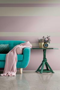
<p>Color and design through Contemporary Design's characteristic fresh and functional approach.</p> Eight pastel shades, designed to create both lively and balanced compositions, harmonize with each other and with the context. It moves from the dusty 1950s-inspired hues of dove-gray, hazelnut, pink, faded yellow and sky blue to the more decisive shades of dusty gray and moss green, all perfect for creating spaces with both retro style and contemporary character.
Neutra 6.0 11 melanzana

florim > Synthetic Floor
After a decade of success, the Neutra collection becomes a container of colors and increasingly advanced materials and transforms into Neutra 6.0. The surfaces thereby create scenery for pure sensory pleasure, where nothing is left to chance, but everything is always skillfully calibrated to the search for a new bon ton where the body and mind can be rejuvenated. The perfect integration between man and the space in which he lives is expressed through a simple architecture where you can spread your artistic sign on the surfaces, in the colors and in the furnishing for an unrepeatable result from which your own creative identity emerges.
Rawtech Raw-White
florim > Synthetic Floor
Where imperfection becomes a distinguishing sign and an essential prerequisite Rawtech is the worn cement effect fine porcelain stoneware where imperfection becomes the distinguishing character of a product with markedly industrial traits. The range of modern colors develops over modular sizes and surfaces that are resistant to the stress of the most complex building applications, meeting the needs of the most sophisticated dwellings with modern style and taste.
Studios Sand
florim > Synthetic Floor
<p>Studios, with its sophisticated but discrete personality, defines the evolutionary path of modern cement-inspired surfaces for interior architecture.</p> <p>The structure of the surfaces, delicately textured, suggests the effect of the manual skill and plasticity of the hand crafted finish. Essential but intense, it is highlighted by meeting natural or artificial light. </p>
marmoleum decibel moonstone

forbo > Synthetic Floor
Within our linoleum flooring range, Marmoleum Decibel provides the highest impact sound reduction of 18dB. This sustainable acoustic flooring consists of 2.5 mm Marmoleum laminated onto a 1 mm layer of polyolefin foam. Available in 27 colors selected from the Marmoleum Marbled and Solid collections.
marmoleum decibel volcanic ash

forbo > Synthetic Floor
Within our linoleum flooring range, Marmoleum Decibel provides the highest impact sound reduction of 18dB. This sustainable acoustic flooring consists of 2.5 mm Marmoleum laminated onto a 1 mm layer of polyolefin foam. Available in 27 colors selected from the Marmoleum Marbled and Solid collections.
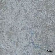
marmoleum decibel serene grey

forbo > Synthetic Floor
Within our linoleum flooring range, Marmoleum Decibel provides the highest impact sound reduction of 18dB. This sustainable acoustic flooring consists of 2.5 mm Marmoleum laminated onto a 1 mm layer of polyolefin foam. Available in 27 colors selected from the Marmoleum Marbled and Solid collections.
marmoleum decibel rosato

forbo > Synthetic Floor
Within our linoleum flooring range, Marmoleum Decibel provides the highest impact sound reduction of 18dB. This sustainable acoustic flooring consists of 2.5 mm Marmoleum laminated onto a 1 mm layer of polyolefin foam. Available in 27 colors selected from the Marmoleum Marbled and Solid collections.
marmoleum decibel liquid clay

forbo > Synthetic Floor
Within our linoleum flooring range, Marmoleum Decibel provides the highest impact sound reduction of 18dB. This sustainable acoustic flooring consists of 2.5 mm Marmoleum laminated onto a 1 mm layer of polyolefin foam. Available in 27 colors selected from the Marmoleum Marbled and Solid collections.
marmoleum decibel graphite

forbo > Synthetic Floor
Within our linoleum flooring range, Marmoleum Decibel provides the highest impact sound reduction of 18dB. This sustainable acoustic flooring consists of 2.5 mm Marmoleum laminated onto a 1 mm layer of polyolefin foam. Available in 27 colors selected from the Marmoleum Marbled and Solid collections.
marmoleum decibel Caribbean

forbo > Synthetic Floor
Within our linoleum flooring range, Marmoleum Decibel provides the highest impact sound reduction of 18dB. This sustainable acoustic flooring consists of 2.5 mm Marmoleum laminated onto a 1 mm layer of polyolefin foam. Available in 27 colors selected from the Marmoleum Marbled and Solid collections.
marmoleum decibel shrike

forbo > Synthetic Floor
Within our linoleum flooring range, Marmoleum Decibel provides the highest impact sound reduction of 18dB. This sustainable acoustic flooring consists of 2.5 mm Marmoleum laminated onto a 1 mm layer of polyolefin foam. Available in 27 colors selected from the Marmoleum Marbled and Solid collections.
marmoleum decibel meteorite

forbo > Synthetic Floor
Within our linoleum flooring range, Marmoleum Decibel provides the highest impact sound reduction of 18dB. This sustainable acoustic flooring consists of 2.5 mm Marmoleum laminated onto a 1 mm layer of polyolefin foam. Available in 27 colors selected from the Marmoleum Marbled and Solid collections.
marmoleum decibel dandelion

forbo > Synthetic Floor
Within our linoleum flooring range, Marmoleum Decibel provides the highest impact sound reduction of 18dB. This sustainable acoustic flooring consists of 2.5 mm Marmoleum laminated onto a 1 mm layer of polyolefin foam. Available in 27 colors selected from the Marmoleum Marbled and Solid collections.
marmoleum decibel dove blue
forbo > Synthetic Floor
Within our linoleum flooring range, Marmoleum Decibel provides the highest impact sound reduction of 18dB. This sustainable acoustic flooring consists of 2.5 mm Marmoleum laminated onto a 1 mm layer of polyolefin foam. Available in 27 colors selected from the Marmoleum Marbled and Solid collections.
marmoleum decibel chartreuse
forbo > Synthetic Floor
Within our linoleum flooring range, Marmoleum Decibel provides the highest impact sound reduction of 18dB. This sustainable acoustic flooring consists of 2.5 mm Marmoleum laminated onto a 1 mm layer of polyolefin foam. Available in 27 colors selected from the Marmoleum Marbled and Solid collections.
Reval beluga 536
Fabromont > Synthetic Floor
Reval® Beluga 536 – Sophisticated Depth in Urban Projects Deep, smoky, and confidently neutral, Reval® Beluga 536 lends a sense of modern elegance to high-traffic environments. Inspired by the deep grey tones of the beluga whale, this versatile colour is perfect for corporate offices, hotel corridors, and public libraries aiming for a clean, contemporary look. It pairs beautifully with concrete textures, glass partitions, and metal accents in industrial-chic interiors.
Reval borago 534
Fabromont > Synthetic Floor
Reval® Borago 534 – Muted Blue Calm for Focus and Serenity With a subtle nod to the soft petals of the borago flower, Reval® Borago 534 offers a desaturated blue that calms the mind—ideal for learning environments, open-plan workspaces, and serene hotel rooms. The dusty-blue hue pairs seamlessly with neutral furniture and warm beige tones, making it a refined choice for Scandinavian and Japandi-inspired interiors.
Reval beluga 533
Fabromont > Synthetic Floor
Reval® Kalamata 533 – Bold and Grounded for Character-Driven Spaces Taking cues from the richness of kalamata olives, Reval® Kalamata 533 introduces a bold, dark tone that commands presence. This intense, organic shade is a perfect anchor in hospitality interiors, bars, and cinema lounges. It provides a dramatic contrast against brass details, velvet furnishings, or burnt-orange accents—ideal for creating moody and luxurious zones.
Reval kardamom 530
Fabromont > Synthetic Floor
Reval® Kardamom 530 – Subtle Spice for Minimalist Harmony Inspired by the muted elegance of dried cardamom pods, Reval® Kardamom 530 offers a soft, beige-green undertone that’s made for minimalist, Japandi, and wellness-driven designs. It’s a natural fit in spa areas, yoga studios, hotel suites, and conference rooms, where calm and cohesion are essential. Layer it with pale timbers, organic cottons, and soft lighting for a tranquil palette.
Reval tamarind 532
Fabromont > Synthetic Floor
Reval® Tamarind 532 – Dark and Delicious for Statement Flooring Reval® Tamarind 532 offers a rich, dark brown with a hint of charcoal, inspired by the deep tone of tamarind fruit. It’s a grounding colour for large-scale spaces like auditoriums, restaurants, and executive suites. This shade brings luxurious depth and hides foot traffic well, making it practical and stylish for contract flooring. Pair with amber lighting and leather details for a refined aesthetic.
Volta hercules-1 461
Fabromont > Synthetic Floor
Hercules-1 461 – Soft Silver for Calm Professionalism A gentle silver-grey, Hercules-1 461 is an excellent base for commercial interiors where neutrality is required without feeling sterile. Think accounting firms, dental clinics, or minimalist hotel corridors. This light tone brightens dark furniture schemes while keeping the look crisp and professional.
Volta hercules-2 462
Fabromont > Synthetic Floor
Hercules-2 462 – Reliable Mid-Grey for High-Traffic Spaces Hercules-2 462 strikes the perfect balance between practicality and elegance. With its neutral mid-grey finish, it's ideal for public buildings, libraries, and reception areas. Its tone hides foot traffic and dust well, making it a favourite for large-scale contract projects.
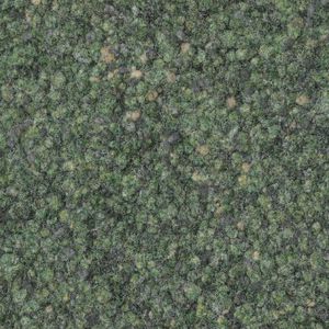
Impression gantrisch 240
Fabromont > Synthetic Floor
Impression® Gantrisch 240 – Muted Moss for Restful Environments Drawing from the quiet landscapes of Switzerland’s Gantrisch region, Impression® Gantrisch 240 brings a gentle mossy green to floors. This peaceful shade is ideal for care centres, therapy rooms, or educational spaces where calmness is essential. It complements neutral palettes and soft furnishings in Japandi and Scandinavian interiors.
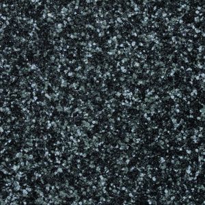
Impression island 248

Fabromont > Synthetic Floor
Impression® Island 248 – Volcanic Grey for Bold, Contemporary Floors Impression® Island 248 offers a deep charcoal tone reminiscent of Icelandic lava fields. This dramatic flooring choice is ideal for luxury hotels, creative studios, or moody restaurants where contrast and intensity are welcome. It works brilliantly with warm lighting, velvet textures, or brass and dark wood accents.
UPHOLSTERY
A wide range of Upholstery and materials provided by our suppliers to satisfy your needs.
auckland - 7071.18

Upholstery > vescom
auckland - 7071.28

Upholstery > vescom
harding - 7070.07

Upholstery > vescom
harding - 7070.08

Upholstery > vescom
furka plus - 7064.14

Upholstery > vescom
acton - 7062.20

Upholstery > vescom
leone plus - 7054.02

Upholstery > vescom
noss - 7058.13

Upholstery > vescom
lani - 7060.49

Upholstery > vescom
wolin - 7050.32

Upholstery > vescom
wolin - 7050.35

Upholstery > vescom
hestan - 7035.11

Upholstery > vescom
hestan - 7035.22

Upholstery > vescom
cyprus - 7038.15

Upholstery > vescom
lindau - 7028.01

Upholstery > vescom
lindau - 7028.09
Upholstery > vescom
dalma - 7024.13

Upholstery > vescom
dalma - 7024.14

Upholstery > vescom