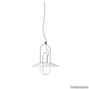
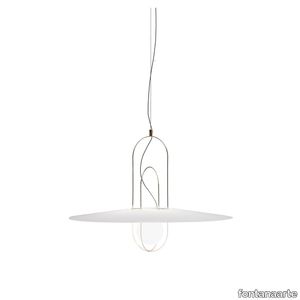
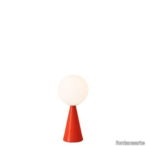
Maeve Suspension
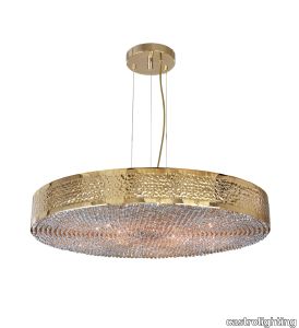
castrolighting > Ceiling lamp
Like the strong-willed, ambitious and warrior-queen Maeve of Ireland, whose passion led warriors to fight for her beliefs, the Maeve Suspension uses the same name and magnificence it offers. Conceived to incorporate traditional techniques and modern design influences, this lighting fixture has an enormous value due to its bespoke quality. The gold-plated brass structure is hammered by the hands of experienced lighting design artisans, delicate Crystals are also individually assembled by hand at the bottom of the lighting suspension. These characteristics make this luxurious suspension the perfect fit for any luxurious hospitality or residential project as it creates a prestigious ambience wherever it is placed. VIEW FULL FAMILY #vibranthome
ReForm Discovery Cliffs ocean blue
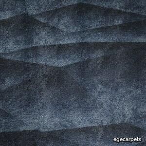
ege > Carpet
Seen from above, the Earth is a perfect system. On an individual level, the different natural phenomena may seem incompatible, but from a bird's eye view it’s clear that they’re closely related and very adaptable. ReForm Discovery interprets the integrated systems created by both humans and nature in 5 patterns: Planet, Earth, Network, Net and Cliffs. Each design is available in 5 colour groups that are carefully selected for their ability to create unique compositions. The Discovery wall-to-wall carpet is produced in regenerated and regenerable yarns – and since the collection is Cradle-to-Cradle Certified, it's the perfect choice for your more sustainable, aesthetically optimised project.
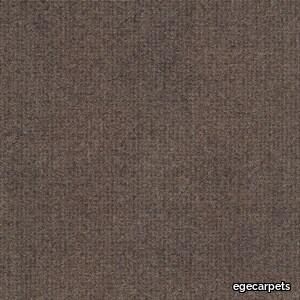
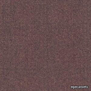
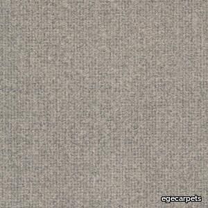
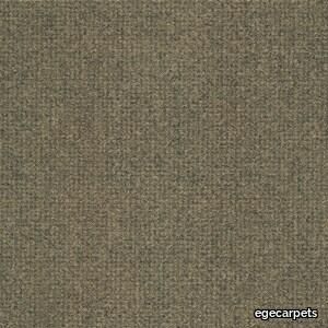
iron beige
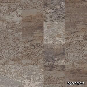
ege > Carpet
London – an eternal source of inspiration to Tom Dixon Available in 48x48 cm, 96x96 cm and 24x96 cm. Industrial Landscape mirrors the original London with all the raw, sometimes even rough, elements making up the city. Aged and patinated by the passage of time, through which the weather, people and industry have left their marks on the materials and thereby created a continuous development of new expressions. This is the essence of Industrial Landscape. Introducing the new designs, Coal and Iron, the collection interprets two important industrial pillars. While Coal reflects the dark and mysterious substance that powered the Industrial Revolution, the Iron design imitates the gradual disintegration of the oxidized metal surface that generates a random hued patination. Besides that, the collection consists of five other patterns: The Smoke design visualises the fumes from factories and workshops, while Wash is inspired by the white paste that temporarily covers shop windows during renovation. In Blur, the distorted city reflects in transient bits of water, while Tide shows the ever-changing sediments of the tidal River Thames.
iron blue
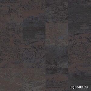
ege > Carpet
London – an eternal source of inspiration to Tom Dixon Available in 48x48 cm, 96x96 cm and 24x96 cm. Industrial Landscape mirrors the original London with all the raw, sometimes even rough, elements making up the city. Aged and patinated by the passage of time, through which the weather, people and industry have left their marks on the materials and thereby created a continuous development of new expressions. This is the essence of Industrial Landscape. Introducing the new designs, Coal and Iron, the collection interprets two important industrial pillars. While Coal reflects the dark and mysterious substance that powered the Industrial Revolution, the Iron design imitates the gradual disintegration of the oxidized metal surface that generates a random hued patination. Besides that, the collection consists of five other patterns: The Smoke design visualises the fumes from factories and workshops, while Wash is inspired by the white paste that temporarily covers shop windows during renovation. In Blur, the distorted city reflects in transient bits of water, while Tide shows the ever-changing sediments of the tidal River Thames.
SETAREH GLASS SMALL
fontanaarte > Ceiling lamp
This is the name of the family of lighting fixtures that Francesco Librizzi, a young Sicilian architect working in Milan, has designed for the first time for FontanaArte. Setareh was born of the idea of giving form to light. The lamp is composed of a sphere magically suspended within a thin metal structure. The play of circular masses and trajectories generates a balanced design of gravitational dynamics. The light from the sphere is diffused into the surrounding space, illuminating the frame. The reflections of the metal render the luminous field visible, space influenced by light, by its aura. The result is a collection of lighting elements, available in tabletop and suspension versions, of extraordinary poetic grace. Setareh takes on new dimensions: elongated, with either two or three spherical elements that work separately or together. Its vocation is the illumination of large spaces, with double-height ceilings or otherwise ample enough to accomodate expansive compositions of multiple elements. A firmament of Setareh, ‘star’ in the ancient Farsi language.
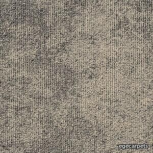
ReForm Maze brown wisdom
ege > Carpet
Available in 48x48 cm, 96x96 cm and 24x96 cm. ReForm Maze is an understated web of connected corridors. Like a complex maze, the pattern is built up of carefully selected tone-on-tone colours that create a subtle play in the soft carpet surface. The collection is available in 27 variants, ranging from light beige and grey shades to more saturated and warm colours. The wide range of colours makes it possible to design colour-combined solutions where several variants are put together to define quiet zones, common areas and paths that lead the way through the space or promote social distancing in busy spaces. Maze differs from the other collections in the ReForm concept by having a cut pile.
ReForm Discovery Planet light sand grey
ege > Carpet
Seen from above, the Earth is a perfect system. On an individual level, the different natural phenomena may seem incompatible, but from a bird's eye view it’s clear that they’re closely related and very adaptable. ReForm Discovery interprets the integrated systems created by both humans and nature in 5 patterns: Planet, Earth, Network, Net and Cliffs. Each design is available in 5 colour groups that are carefully selected for their ability to create unique compositions. The Discovery wall-to-wall carpet is produced in regenerated and regenerable yarns – and since the collection is Cradle-to-Cradle Certified, it's the perfect choice for your more sustainable, aesthetically optimised project.
Tape "Cord" Outdoor

minotti > Outdoor furniture
The Tape family of seats, which made its début in 2018, naturally evolves, incorporating items for the outdoor environment that maintain the undeniable elegance of the forms and concepts of the design, and add a few welcome variants that embrace the concept of outdoor living. The seats become deeper, larger and more relaxing, while the metal frame, in a new outdoor finish, is covered with the wicker-effect cords available in two colours: Mud and Liquorice. Here, the couture detail of Tape - the piece of ribbon that holds the feet on to the body - takes the form of a metal plate in Bronze colour, a finish that is the leitmotiv of all the outdoor seats of the 2019 Collection. The system offers many elements, ideal for creating relaxation areas also in small outdoor spaces or on urban rooftop terraces: from the armchair to the sofa, from the Paolina chaise longue to the original couch open at the back, from the chair to the coffee tables, up until the stool in two heights of 102 and 115 cm, in the collection from January 2020. The concept of the small tables in metal with Bronze finish is inspired by the distinctive Tape detail itself, which aesthetically secures the legs to the crown, inside which the top in Silver Beola or Corian® EC is inserted.
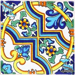
Andaluz Terra Nova Mediterraneo Riad: Light Green
casatile > Floor tile-stone
Terra Nova Mediterraneo Tiles are made using the Maiolica ceramic technique. First, a tin-glaze layer on a terracotta tile is applied, then the tile is decorated over the glazed surface with other color glazes, and lastly it is fired in a kiln until it reaches the desired finish. The name Maiolica is thought to come from the medieval Italian word for Majorca, an island in the Mediterranean on the route followed by ships bringing Hispano-Moresque wares from Valencia to Italy. Moorish potters from Majorca are reputed to have worked in Sicily and it has been suggested that their wares reached the Italian mainland from Caltagirone, a town in the island of Sicily. Terra Nova tile collection delivers the stunning design and aesthetic solutions of authentic, old-world handcrafted decorative tiles, and at the same time meets technical requirements for applications of greater stress.
Joy Suspension
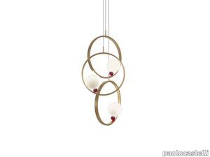
paolocastelli > Ceiling lamp
Joy Suspension was born of the idea of giving form to light. The lamp is composed of three brass rings, with variable height, and spheres in hand-blown white satin glass (big sphere) and red see-through, (small spehere) magically suspended within a thin metal structure. The play of circular masses and trajectories generates a balanced design of gravitational dynamics. The light from the sphere is diffused into the surrounding space, illuminating the frame. The reflections of the brass render the luminous field visible by its aura. Available in 2 versions: one ring, three rings.
Cromatica Cenere
florim > Synthetic Floor
A lexicon of colour shades for mixing. A large size and its submultiples. «This work represents a reflection on colour, and above all a proposal on how to transfer the multiplicity of shades typical of a hand-crafted piece into a project produced on a large scale.» Andrea Trimarchi & Simone Farresin Studio Formafantasma base their work in the design world on a strong vocation for research. Simone Farresin and Andrea Trimarchi view every project as an opportunity for study and the acquisition of new knowledge, and their love of speculation establishes a dialectic rapport with the situations offered by each new client. Whether it involves a material, a type or a production method, the first phase of their design process is the mapping of what the specific case places at their disposal. With Cedit, an analysis of the company's past and present was central to the inputs. Inevitably, since "Looking back to look forward" has been the design duo's mission statement for years. In this case, in particular, the company's history was a real treasure trove, a fine blend of memory and technology: on the one hand, the excellence of production technologies now extended with the added potential arising from the engineering of large-sized ceramic tiles, and on the other a wealth of experience build up with great designers of the past, from Zanuso to Noorda, through to <strong>Ettore Sottsass</strong>. Andrea and Simone decided to focus on Sottsass - who started designing for Cedit back in the late Seventies - and made an in-depth study of one of the colour charts he developed towards the end of the Nineties. A spread of colours which gave its name to the "41 Colors" collection, included in the catalogue of the period as a real alphabet for what has proved to be a lasting design language. Colour was much more than just a compulsory step in the dialogue between designer and producer, since Sottsass had already discovered the power of the mystery intrinsic to this universe of invention.<br /><br />With Cedit the master-designer, a long-established lover of ceramics and their crafted unpredictability, found a way of transferring his personal feeling for colour to a wide audience, through industrial mass production. And this assumption is another factor Formafantasma have inherited, interpreting it today with new, even more efficient technical resources just as capable of expressing the secrets of colour. «The concept of colour "in isolation" - Sottsass explained in a 1992 text - classified colour, Pantone, as they call it now, "scientific" colour, is something I still refuse to accept. (...) Colours, the idea of colour, are always intangible, they slip slowly away like words, that run through your fingers, like poetry, which you can never keep hold of, like a good story.» And Formafantasma seem to have chosen that distinction between colour "in isolation" and "intangible" yet ever-present colour as the basis of their work. However, their approach draws on their unique vocation for research and the technical resources of the third millennium. «This work - they explain to us - is a reflection on colour, and above all on <strong>how to bring the multiplicity of shades typical of a hand-crafted piece into a large-scale project</strong>.» The designers look at large, monochrome slabs and turn to the engineers for details of their secrets, their processing stages, the phases in their production. They appreciate that the colour of ceramic material, its ineffable secret, can still be present in the series and large tile sizes in which Cedit leads the way. They understand that this is, in itself, an expressive power which does not need channelling into forms, motifs and signs. But above all, they treat the surface as a large canvas on which they spread pure colour, which tends to be uniform but in fact is never really a "scientific", totally monochrome hue: it is not a Pantone. And this is the source of the fundamental insight, which only children of the transition from the analogue to the digital era could achieve, the reward for those who draw on the past to look to the future.<br /><br />The designers cut the slab into lots of regular pieces, not necessarily of the same size. They restore its identity as a "tile", a familiar name with something ancient about it, but which stands for a module, a unit of measurement, a building block. There is nothing nostalgic about this - on the contrary, the vision is completely new, and the portions of slab created can be reassembled with no restrictions, breaking down the unity of the whole and reviving its essence starting from its structure. As the cards in the pack are shuffled, what emerges is not a figure or motif but the representation of colour itself and its physical nature. It is live matter, born from the meeting of vibrating forces, the mixing of ever-varying percentages of the basic ingredients. And Formafantasma present us with the corpuscular, fragmented essence of these small frames of space and crystallised time, which reveal the code and formula of their composition. So Cromatica is a collection made up of six colours which actually have an infinite number of declinations and compositional possibilities. It is a "discrete" combination in the mathematical sense of the term, capable of generating multiple, variable subsets. At the same time, each slab can be used in its entirety, leaving the impression of analogue continuity unchanged. But what really amazes is the comparison and dialogue between the two approaches: a stroke of genius, laying clear the mysterious appeal the artificial reproduction of colour has always held for mankind. Because, as Sottsass said, «colours are language, a powerful, magical, intangible, flexible, continuous material, in which existence is made manifest, the existence that lives in time and space».
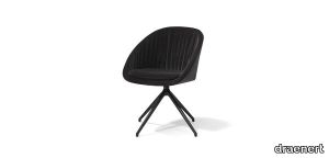
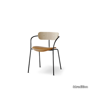
Pavilion AV1
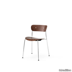
&tradition > Chair
Located on the castle grounds of Copenhagen’s Kastellet overlooking the waterfront promenade that is home to the Little Mermaid, The Langelinie Pavilion stands with a resilient spirit. The first Pavilion was built in 1885. Echoing its own ability to endure is the Pavilion chair by Andersen & Voll. Here the challenge was to design a stackable chair used for mass seating in this iconic, multi-purpose venue, the Langelinie Pavilion. The Pavilion chair has an airy feeling, with slim arms and legs that give it a light appearance. Now available in a contemporary chrome frame.
Andaluz Terra Nova Mediterraneo Riad: Snow White
casatile > Floor tile-stone
Terra Nova Mediterraneo Tiles are made using the Maiolica ceramic technique. First, a tin-glaze layer on a terracotta tile is applied, then the tile is decorated over the glazed surface with other color glazes, and lastly it is fired in a kiln until it reaches the desired finish. The name Maiolica is thought to come from the medieval Italian word for Majorca, an island in the Mediterranean on the route followed by ships bringing Hispano-Moresque wares from Valencia to Italy. Moorish potters from Majorca are reputed to have worked in Sicily and it has been suggested that their wares reached the Italian mainland from Caltagirone, a town in the island of Sicily. Terra Nova tile collection delivers the stunning design and aesthetic solutions of authentic, old-world handcrafted decorative tiles, and at the same time meets technical requirements for applications of greater stress.
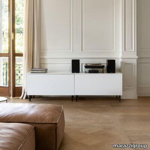
Intrecci
marazzi group > Floor tile-stone
Wood Effect Porcelain Stoneware coffered motif With an aristocratic personality and contemporary appeal, Intrecci is a wood-look stoneware collection that combines the classical coffered motif, in the large 120x120 size, with a 20x120 plank tile, to reconcile the timeless beauty of parquet with the versatility and variety required by architecture today. The outcome is a magical blend of the natural and the decorative, for design that blends the allure of history with an original modern touch.
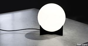
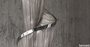
Doodle freehanddesign.
terzani > Table lamp
We no longer march in a straight line. Our lives are dynamic, intertwining collections of relationships, experiences and journeys. Reflecting the fluidity of our generation, designer Simone Micheli has created a new, contemporary light for Terzani, Doodle. Like us, each Doodle is unique, each pendant is handcrafted by artisans to resemble a randomised path. And, to give us control over the journey we want to take, each led bulb can be placed anywhere on the light, not only reflecting the choices we make in life, but giving Doodle a special flexibility. Available in nickel, black amethyst, gold andcopper plated finishes. Design Simone Micheli. Made in Italy.
Raphael "Dining"
minotti > Chair
The characteristic light and sophisticated style trait of Italian-Danish duo GamFratesi inspires Raphael: a new way of designing the living space thanks to the use of single furnishing pieces with refined tailoring, capable of becoming protagonists of the space, and expressing the same comfort as traditional modular seating systems. Three sofa variants, four types of armchairs, two dining little armchairs and two footstools, all conceived as adaptable to smaller domestic contexts, while still meeting the high demands of decorators and interior designers. Organic forms, with generous and cosy proportions, are enhanced by sophisticated upholstery that masterfully interprets its distinctive sinuous lines. The Raphael sofas and armchairs stands on the floor on modern feet in die-cast Bronze or polished Pewter aluminium or Licorice-stained ash, the design of which adapts to the morphology of the seating shapes. The result is a furnishing piece with classic forms reinterpreted in a modern key. The armchairs are also available with a swivel four-spoke die-cast aluminium base in Bronze or polished Pewter. Each individual element of the family has its own identity and silhouette. The sofas are available in three variants: linear, semi-curved and asymmetrical semi-curved, the latter animated by the series of sinuous lines given by the backrest, punctuated by a gentle change of heights. The armchairs are characterised by their comfortable seating, not only in the larger model, but also in the smaller version and in the dining version, which is available both fixed, with legs in Licorice-coloured ash, and with a swivel four-spoke die-cast aluminium base in Bronze or polished Pewter. The details, shapes and overall aesthetics of Raphael make it a contemporary furnishing piece with a timeless character, designed to meet the different situations of everyday life: from moments dedicated to relaxation to those conceived for conviviality, from hospitality occasions to the more intimate ones of domestic life.
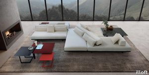
Cubi
illoft > Sofa
A sofa with a simple, essential look that conceals a rebellious spirit. Pure volumes playing in space, embodying the spirit of the Cubi sofa which looks stunning on its own or with other furniture. Blocks of back cushions rest on seat cushions just waiting to be freely moved around so each one can create its own space and its own kind of comfort. Rectangular or interlocking platforms create truly special compositions. A coloured metal bar runs along the lower part of the seating and the backrests, while the lightness of the overall look is accentuated by metal feet featuring a minimal design.
Callum Buffet
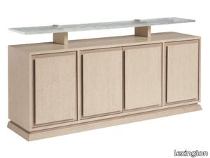
lexington > Cabinet
The buffet features four doors with dimensional overlay panels and borders in the Sand Drift finish with the contrasting Shadow finish to highlight the shadowing effect. There are two adjustable shelves behind each of the outside doors and one soft-close drawer and one adjustable shelf behind the center doors. The top features a floating ultra-clear wavy glass shelf supported by metal brackets in the brushed champagne finish. A canted plinth base reinforces the architectural lines of the design.
ReForm Maze purple rose
ege > Carpet
Available in 48x48 cm, 96x96 cm and 24x96 cm. ReForm Maze is an understated web of connected corridors. Like a complex maze, the pattern is built up of carefully selected tone-on-tone colours that create a subtle play in the soft carpet surface. The collection is available in 27 variants, ranging from light beige and grey shades to more saturated and warm colours. The wide range of colours makes it possible to design colour-combined solutions where several variants are put together to define quiet zones, common areas and paths that lead the way through the space or promote social distancing in busy spaces. Maze differs from the other collections in the ReForm concept by having a cut pile.
Courage

mitab > Table
SOFA COURAGE Courage is a modular based system with seating elements and backrests that can be endlessly combined. The graphic simplicity comes from the design brief asking for an archetypal product based on the golden ratio. The different elements have 2 sections of fabric, creating a “bottom line” which is intended to bond the different parts together, yet allowing for the upper part to be selected in different colours or fabrics creating a varied interior. Courage have a base frame of metal, different parts for different elements. There is no visible fittings or damage when Courage is built together. ADD ELECTRICS To support connected users on the move Courage can be specified with integrated electrical power outlets neatly fitted into the seat and easily accessible. PAIR WITH ORBIT The Orbit swivelling table perfectly compliments Courage’s form and function and has been designed to be natively mounted to Courage’s seat modules. VERSATILE MODULARITY Courage’s modular design comprising numerous elemental forms enables it to be configured in an almost infinite number of compositions. From small geometric islands to sprawling landmasses of comfort, Courage provides a much needed stopping place. COMMITTED Courage has been independently certified by Möbelfakta a widely respected certification scheme that assess and validate the sustainability credentials of furniture and products so consumers can make more informed choices. Modular sofa system with several seat, back and arm units. Base frame and connection fittings in powder coated metal frame in standard RAL (black). Seat with wood base and cold foam upholstered in standard fabrics or c.o.m. Backrests with optional one or two soft sides. Arm units with table top in ash natural. Multiple fabric configuration and electrical outlets available as add-on. (Electrical outlets is not possible with seats in H.36cm)
Nebra
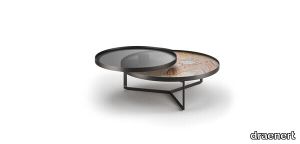
draenert > Coffee table
Do you know the famous "Nebra Sky Disc"? The bronze plate, discovered in 1999, is considered to be the oldest depiction of the firmament. Without any doubt, it is one of the most beautiful manmade objects ever. Formally, it plays with round shapes - just like the NEBRA coffee table which the Stuttgart designer Stephan Veit has designed for us. It is available as a circular, minimalist sculpture, but as well with a perfectly round additional swivel plate. In a sense, this is predetermined framework set by Veit. And now it's your turn! You can make the NEBRA your very own design with colored metals, woods and natural stone tops. Thus, the NEBRA becomes an eye-catcher with plenty of presentation space for books, magazines, vases and everything you love and want to have ready at hand. Sounds like heaven, right?
Terra Nova Mediterraneo Decorative Tile: Mosaico Azul
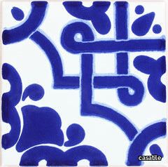
casatile > Floor tile-stone
Terra Nova Mediterraneo Tiles are made using the Maiolica ceramic technique. First, a tin-glaze layer on a terracotta tile is applied, then the tile is decorated over the glazed surface with other color glazes, and lastly it is fired in a kiln until it reaches the desired finish. The name Maiolica is thought to come from the medieval Italian word for Majorca, an island in the Mediterranean on the route followed by ships bringing Hispano-Moresque wares from Valencia to Italy. Moorish potters from Majorca are reputed to have worked in Sicily and it has been suggested that their wares reached the Italian mainland from Caltagirone, a town in the island of Sicily. Terra Nova tile collection delivers the stunning design and aesthetic solutions of authentic, old-world handcrafted decorative tiles, and at the same time meets technical requirements for applications of greater stress.
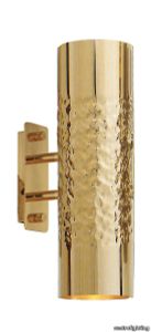
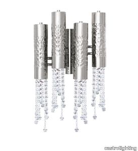
Maeve Wall Light
castrolighting > Wall lamp
Like the strong-willed, ambitious and warrior-queen Maeve of Ireland, who’s passion led warriors to fight for her beliefs, the Maeve Wall Light uses the same name and magnificence it offers. Conceived to incorporate traditional techniques and modern design influences, this lighting fixture has an enormous value due to its bespoke quality. The gold-plated brass structure is hammered by the hands of experienced lighting design artisans as beautiful delicate Crystals are also individually assembled by hand at the bottom of the wall lighting fixture. Let this dashing wall sconce inspire your projects, forging the most exquisite and elegant ambiances. VIEW FULL FAMILY
Marie Center Table
castrolighting > Coffee table
Marie was named after Marie Antoinette, the last Queen of France before the French Revolution. This table uses the same name and grandeur it offers. Marie Antoinette was well known for her extravagant and extremely luxurious lifestyle, extrovert personality and love for fashion, parties and fun. Marie table aims to express the burst of lavishness that once lived in the Versailles’ Palace, being a contemporary piece that would definitely be Queen’s choice if she lived in our times. Composed by either two levels, being the top one in glass and brass, Marie tables are the ultimate elegant and lavish accent to any décor. The combination of materials from this collection are the ideal recipe of perfection and sleek design, turning this collection into a desirable one. #moroccanriad #parisfw VIEW FULL FAMILY
Raphael
minotti > Armchair
The characteristic light and sophisticated style trait of Italian-Danish duo GamFratesi inspires Raphael: a new way of designing the living space thanks to the use of single furnishing pieces with refined tailoring, capable of becoming protagonists of the space, and expressing the same comfort as traditional modular seating systems. Three sofa variants, four types of armchairs, two dining little armchairs and two footstools, all conceived as adaptable to smaller domestic contexts, while still meeting the high demands of decorators and interior designers. Organic forms, with generous and cosy proportions, are enhanced by sophisticated upholstery that masterfully interprets its distinctive sinuous lines. The Raphael sofas and armchairs stands on the floor on modern feet in die-cast Bronze or polished Pewter aluminium or Licorice-stained ash, the design of which adapts to the morphology of the seating shapes. The result is a furnishing piece with classic forms reinterpreted in a modern key. The armchairs are also available with a swivel four-spoke die-cast aluminium base in Bronze or polished Pewter. Each individual element of the family has its own identity and silhouette. The sofas are available in three variants: linear, semi-curved and asymmetrical semi-curved, the latter animated by the series of sinuous lines given by the backrest, punctuated by a gentle change of heights. The armchairs are characterised by their comfortable seating, not only in the larger model, but also in the smaller version and in the dining version, which is available both fixed, with legs in Licorice-coloured ash, and with a swivel four-spoke die-cast aluminium base in Bronze or polished Pewter. The details, shapes and overall aesthetics of Raphael make it a contemporary furnishing piece with a timeless character, designed to meet the different situations of everyday life: from moments dedicated to relaxation to those conceived for conviviality, from hospitality occasions to the more intimate ones of domestic life.
Terra Nova Mediterraneo Decorative Tile: Bari
casatile > Floor tile-stone
Terra Nova Mediterraneo Tiles are made using the Maiolica ceramic technique. First, a tin-glaze layer on a terracotta tile is applied, then the tile is decorated over the glazed surface with other color glazes, and lastly it is fired in a kiln until it reaches the desired finish. The name Maiolica is thought to come from the medieval Italian word for Majorca, an island in the Mediterranean on the route followed by ships bringing Hispano-Moresque wares from Valencia to Italy. Moorish potters from Majorca are reputed to have worked in Sicily and it has been suggested that their wares reached the Italian mainland from Caltagirone, a town in the island of Sicily. Terra Nova tile collection delivers the stunning design and aesthetic solutions of authentic, old-world handcrafted decorative tiles, and at the same time meets technical requirements for applications of greater stress.
SETAREH GLASS LARGE
fontanaarte > Ceiling lamp
This is the name of the family of lighting fixtures that Francesco Librizzi, a young Sicilian architect working in Milan, has designed for the first time for FontanaArte. Setareh was born of the idea of giving form to light. The lamp is composed of a sphere magically suspended within a thin metal structure. The play of circular masses and trajectories generates a balanced design of gravitational dynamics. The light from the sphere is diffused into the surrounding space, illuminating the frame. The reflections of the metal render the luminous field visible, space influenced by light, by its aura. The result is a collection of lighting elements, available in tabletop and suspension versions, of extraordinary poetic grace. Setareh takes on new dimensions: elongated, with either two or three spherical elements that work separately or together. Its vocation is the illumination of large spaces, with double-height ceilings or otherwise ample enough to accomodate expansive compositions of multiple elements. A firmament of Setareh, ‘star’ in the ancient Farsi language.
Geo
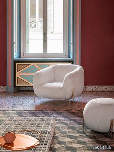
sabaitalia > Armchair
Sometimes a name can say a lot, sometimes it says everything. Geo is an all rounded armchair, the protagonist in a home. It’s generous without invading space, welcoming without being suffocating and soft without being informal. Thanks to its unique design Geo is voluminous yet light, like a nest suspended in air held up by small branches. The proportions have been designed with upmost attention. Every detail has been carefully studied to give life to a special object where the main volume of the seat and the very light volume of the legs find a unique harmony together. The metallic structure adds a luxurious feel to the object and is made for easy cleaning. Fully removable covers.
Terra Nova Mediterraneo Decorative Tile: Bellagio 1
casatile > Floor tile-stone
Terra Nova Mediterraneo Tiles are made using the Maiolica ceramic technique. First, a tin-glaze layer on a terracotta tile is applied, then the tile is decorated over the glazed surface with other color glazes, and lastly it is fired in a kiln until it reaches the desired finish. The name Maiolica is thought to come from the medieval Italian word for Majorca, an island in the Mediterranean on the route followed by ships bringing Hispano-Moresque wares from Valencia to Italy. Moorish potters from Majorca are reputed to have worked in Sicily and it has been suggested that their wares reached the Italian mainland from Caltagirone, a town in the island of Sicily. Terra Nova tile collection delivers the stunning design and aesthetic solutions of authentic, old-world handcrafted decorative tiles, and at the same time meets technical requirements for applications of greater stress.
Cromatica Verde
florim > Wall Paint
A lexicon of colour shades for mixing. A large size and its submultiples. «This work represents a reflection on colour, and above all a proposal on how to transfer the multiplicity of shades typical of a hand-crafted piece into a project produced on a large scale.» Andrea Trimarchi & Simone Farresin Studio Formafantasma base their work in the design world on a strong vocation for research. Simone Farresin and Andrea Trimarchi view every project as an opportunity for study and the acquisition of new knowledge, and their love of speculation establishes a dialectic rapport with the situations offered by each new client. Whether it involves a material, a type or a production method, the first phase of their design process is the mapping of what the specific case places at their disposal. With Cedit, an analysis of the company's past and present was central to the inputs. Inevitably, since "Looking back to look forward" has been the design duo's mission statement for years. In this case, in particular, the company's history was a real treasure trove, a fine blend of memory and technology: on the one hand, the excellence of production technologies now extended with the added potential arising from the engineering of large-sized ceramic tiles, and on the other a wealth of experience build up with great designers of the past, from Zanuso to Noorda, through to <strong>Ettore Sottsass</strong>. Andrea and Simone decided to focus on Sottsass - who started designing for Cedit back in the late Seventies - and made an in-depth study of one of the colour charts he developed towards the end of the Nineties. A spread of colours which gave its name to the "41 Colors" collection, included in the catalogue of the period as a real alphabet for what has proved to be a lasting design language. Colour was much more than just a compulsory step in the dialogue between designer and producer, since Sottsass had already discovered the power of the mystery intrinsic to this universe of invention.<br /><br />With Cedit the master-designer, a long-established lover of ceramics and their crafted unpredictability, found a way of transferring his personal feeling for colour to a wide audience, through industrial mass production. And this assumption is another factor Formafantasma have inherited, interpreting it today with new, even more efficient technical resources just as capable of expressing the secrets of colour. «The concept of colour "in isolation" - Sottsass explained in a 1992 text - classified colour, Pantone, as they call it now, "scientific" colour, is something I still refuse to accept. (...) Colours, the idea of colour, are always intangible, they slip slowly away like words, that run through your fingers, like poetry, which you can never keep hold of, like a good story.» And Formafantasma seem to have chosen that distinction between colour "in isolation" and "intangible" yet ever-present colour as the basis of their work. However, their approach draws on their unique vocation for research and the technical resources of the third millennium. «This work - they explain to us - is a reflection on colour, and above all on <strong>how to bring the multiplicity of shades typical of a hand-crafted piece into a large-scale project</strong>.» The designers look at large, monochrome slabs and turn to the engineers for details of their secrets, their processing stages, the phases in their production. They appreciate that the colour of ceramic material, its ineffable secret, can still be present in the series and large tile sizes in which Cedit leads the way. They understand that this is, in itself, an expressive power which does not need channelling into forms, motifs and signs. But above all, they treat the surface as a large canvas on which they spread pure colour, which tends to be uniform but in fact is never really a "scientific", totally monochrome hue: it is not a Pantone. And this is the source of the fundamental insight, which only children of the transition from the analogue to the digital era could achieve, the reward for those who draw on the past to look to the future.<br /><br />The designers cut the slab into lots of regular pieces, not necessarily of the same size. They restore its identity as a "tile", a familiar name with something ancient about it, but which stands for a module, a unit of measurement, a building block. There is nothing nostalgic about this - on the contrary, the vision is completely new, and the portions of slab created can be reassembled with no restrictions, breaking down the unity of the whole and reviving its essence starting from its structure. As the cards in the pack are shuffled, what emerges is not a figure or motif but the representation of colour itself and its physical nature. It is live matter, born from the meeting of vibrating forces, the mixing of ever-varying percentages of the basic ingredients. And Formafantasma present us with the corpuscular, fragmented essence of these small frames of space and crystallised time, which reveal the code and formula of their composition. So Cromatica is a collection made up of six colours which actually have an infinite number of declinations and compositional possibilities. It is a "discrete" combination in the mathematical sense of the term, capable of generating multiple, variable subsets. At the same time, each slab can be used in its entirety, leaving the impression of analogue continuity unchanged. But what really amazes is the comparison and dialogue between the two approaches: a stroke of genius, laying clear the mysterious appeal the artificial reproduction of colour has always held for mankind. Because, as Sottsass said, «colours are language, a powerful, magical, intangible, flexible, continuous material, in which existence is made manifest, the existence that lives in time and space».
ReForm Maze retro blue
ege > Carpet
Available in 48x48 cm, 96x96 cm and 24x96 cm. ReForm Maze is an understated web of connected corridors. Like a complex maze, the pattern is built up of carefully selected tone-on-tone colours that create a subtle play in the soft carpet surface. The collection is available in 27 variants, ranging from light beige and grey shades to more saturated and warm colours. The wide range of colours makes it possible to design colour-combined solutions where several variants are put together to define quiet zones, common areas and paths that lead the way through the space or promote social distancing in busy spaces. Maze differs from the other collections in the ReForm concept by having a cut pile.
Dan Star base
draenert > Chair
This shell chair leaves nothing to be desired in regard to the seating comfort. The slightly flexible backrest and an additionally inserted seat cushion provide comfortable snugness. The casual drapery guarantees relaxed seating pleasure and formal finesse. Thanks to the use of four different types of fabric collections, there are now even more design options, leather and fabric combined or completely in one material. The chair family has been comple-mented by another chair frame: in addition to the die-cast aluminum cross base and the four-legged chair, DAN is now also available with a rotatable star base.
ReForm Maze comfort grey
ege > Carpet
Available in 48x48 cm, 96x96 cm and 24x96 cm. ReForm Maze is an understated web of connected corridors. Like a complex maze, the pattern is built up of carefully selected tone-on-tone colours that create a subtle play in the soft carpet surface. The collection is available in 27 variants, ranging from light beige and grey shades to more saturated and warm colours. The wide range of colours makes it possible to design colour-combined solutions where several variants are put together to define quiet zones, common areas and paths that lead the way through the space or promote social distancing in busy spaces. Maze differs from the other collections in the ReForm concept by having a cut pile.
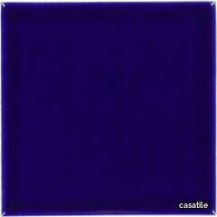
Terra Nova Mediterraneo Solid Tile: Turquoise
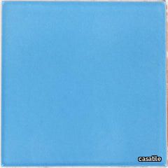
casatile > Floor tile-stone
Terra Nova Mediterraneo Tiles are made using the Maiolica ceramic technique. First, a tin-glaze layer on a terracotta tile is applied, then the tile is decorated over the glazed surface with other color glazes, and lastly it is fired in a kiln until it reaches the desired finish. The name Maiolica is thought to come from the medieval Italian word for Majorca, an island in the Mediterranean on the route followed by ships bringing Hispano-Moresque wares from Valencia to Italy. Moorish potters from Majorca are reputed to have worked in Sicily and it has been suggested that their wares reached the Italian mainland from Caltagirone, a town in the island of Sicily. Terra Nova tile collection delivers the stunning design and aesthetic solutions of authentic, old-world handcrafted decorative tiles, and at the same time meets technical requirements for applications of greater stress.
ReForm Maze harmony grey

ege > Carpet
Available in 48x48 cm, 96x96 cm and 24x96 cm. ReForm Maze is an understated web of connected corridors. Like a complex maze, the pattern is built up of carefully selected tone-on-tone colours that create a subtle play in the soft carpet surface. The collection is available in 27 variants, ranging from light beige and grey shades to more saturated and warm colours. The wide range of colours makes it possible to design colour-combined solutions where several variants are put together to define quiet zones, common areas and paths that lead the way through the space or promote social distancing in busy spaces. Maze differs from the other collections in the ReForm concept by having a cut pile.
Terra Nova Mediterraneo Solid Tile: Light Blue
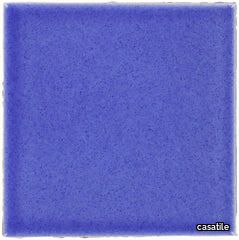
casatile > Floor tile-stone
Terra Nova Mediterraneo Tiles are made using the Maiolica ceramic technique. First, a tin-glaze layer on a terracotta tile is applied, then the tile is decorated over the glazed surface with other color glazes, and lastly it is fired in a kiln until it reaches the desired finish. The name Maiolica is thought to come from the medieval Italian word for Majorca, an island in the Mediterranean on the route followed by ships bringing Hispano-Moresque wares from Valencia to Italy. Moorish potters from Majorca are reputed to have worked in Sicily and it has been suggested that their wares reached the Italian mainland from Caltagirone, a town in the island of Sicily. Terra Nova tile collection delivers the stunning design and aesthetic solutions of authentic, old-world handcrafted decorative tiles, and at the same time meets technical requirements for applications of greater stress.
Marie Center Table
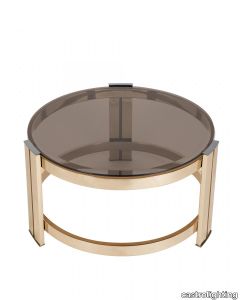
castrolighting > Coffee table
Marie was named after Marie Antoinette, the last Queen of France before the French Revolution. This table uses the same name and grandeur it offers. Marie Antoinette was well known for her extravagant and extremely luxurious lifestyle, extrovert personality and love for fashion, parties and fun. Marie Center Table aims to express the burst of lavishness that once lived in the Versailles’ Palace, being a contemporary piece that would definitely be Queen’s choice if she lived in our times. Composed by either two levels, being the top one in glass and brass, Marie tables are the ultimate elegant and lavish accent to any décor. The combination of materials from this collection are the ideal recipe of perfection and sleek design, turning this collection into a desirable one. VIEW FULL FAMILY
ReForm Discovery Net ash black
ege > Carpet
Seen from above, the Earth is a perfect system. On an individual level, the different natural phenomena may seem incompatible, but from a bird's eye view it’s clear that they’re closely related and very adaptable. ReForm Discovery interprets the integrated systems created by both humans and nature in 5 patterns: Planet, Earth, Network, Net and Cliffs. Each design is available in 5 colour groups that are carefully selected for their ability to create unique compositions. The Discovery wall-to-wall carpet is produced in regenerated and regenerable yarns – and since the collection is Cradle-to-Cradle Certified, it's the perfect choice for your more sustainable, aesthetically optimised project.
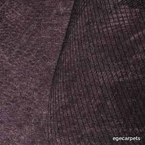
blur ll multicolour
ege > Carpet
London – an eternal source of inspiration to Tom Dixon Available in 48x48 cm, 96x96 cm and 24x96 cm. Industrial Landscape mirrors the original London with all the raw, sometimes even rough, elements making up the city. Aged and patinated by the passage of time, through which the weather, people and industry have left their marks on the materials and thereby created a continuous development of new expressions. This is the essence of Industrial Landscape. Introducing the new designs, Coal and Iron, the collection interprets two important industrial pillars. While Coal reflects the dark and mysterious substance that powered the Industrial Revolution, the Iron design imitates the gradual disintegration of the oxidized metal surface that generates a random hued patination. Besides that, the collection consists of five other patterns: The Smoke design visualises the fumes from factories and workshops, while Wash is inspired by the white paste that temporarily covers shop windows during renovation. In Blur, the distorted city reflects in transient bits of water, while Tide shows the ever-changing sediments of the tidal River Thames.
Oscar a tribute.
terzani > Table lamp
The great Brazilian architect Oscar Niemeyer once said about his work: “It’s not the right angle that attracts me, nor the straight line. Stiff, in exible, created by men. What really attracts me is the free, sensual curve. The curve I see on the sinuous course of our rivers, on the clouds in the sky, on your favorite woman’s body. The universe is entirely made of curves”. Inspired to pay tribute to one of the founders of modern architecture, designer Dodo Arslan has created a series of lights named “Oscar”, which pay homage through their adoption of Niemeyer’s signature sensuous curves. Oscar table lamp consists of a glass orb delicately held by curved brass. Available in nickel, brass, black, white, gold plated and rose gold finish. Design Dodo Arslan. Made in Italy.
Cromatica Opale
florim > Wall Paint
A lexicon of colour shades for mixing. A large size and its submultiples. «This work represents a reflection on colour, and above all a proposal on how to transfer the multiplicity of shades typical of a hand-crafted piece into a project produced on a large scale.» Andrea Trimarchi & Simone Farresin Studio Formafantasma base their work in the design world on a strong vocation for research. Simone Farresin and Andrea Trimarchi view every project as an opportunity for study and the acquisition of new knowledge, and their love of speculation establishes a dialectic rapport with the situations offered by each new client. Whether it involves a material, a type or a production method, the first phase of their design process is the mapping of what the specific case places at their disposal. With Cedit, an analysis of the company's past and present was central to the inputs. Inevitably, since "Looking back to look forward" has been the design duo's mission statement for years. In this case, in particular, the company's history was a real treasure trove, a fine blend of memory and technology: on the one hand, the excellence of production technologies now extended with the added potential arising from the engineering of large-sized ceramic tiles, and on the other a wealth of experience build up with great designers of the past, from Zanuso to Noorda, through to <strong>Ettore Sottsass</strong>. Andrea and Simone decided to focus on Sottsass - who started designing for Cedit back in the late Seventies - and made an in-depth study of one of the colour charts he developed towards the end of the Nineties. A spread of colours which gave its name to the "41 Colors" collection, included in the catalogue of the period as a real alphabet for what has proved to be a lasting design language. Colour was much more than just a compulsory step in the dialogue between designer and producer, since Sottsass had already discovered the power of the mystery intrinsic to this universe of invention.<br /><br />With Cedit the master-designer, a long-established lover of ceramics and their crafted unpredictability, found a way of transferring his personal feeling for colour to a wide audience, through industrial mass production. And this assumption is another factor Formafantasma have inherited, interpreting it today with new, even more efficient technical resources just as capable of expressing the secrets of colour. «The concept of colour "in isolation" - Sottsass explained in a 1992 text - classified colour, Pantone, as they call it now, "scientific" colour, is something I still refuse to accept. (...) Colours, the idea of colour, are always intangible, they slip slowly away like words, that run through your fingers, like poetry, which you can never keep hold of, like a good story.» And Formafantasma seem to have chosen that distinction between colour "in isolation" and "intangible" yet ever-present colour as the basis of their work. However, their approach draws on their unique vocation for research and the technical resources of the third millennium. «This work - they explain to us - is a reflection on colour, and above all on <strong>how to bring the multiplicity of shades typical of a hand-crafted piece into a large-scale project</strong>.» The designers look at large, monochrome slabs and turn to the engineers for details of their secrets, their processing stages, the phases in their production. They appreciate that the colour of ceramic material, its ineffable secret, can still be present in the series and large tile sizes in which Cedit leads the way. They understand that this is, in itself, an expressive power which does not need channelling into forms, motifs and signs. But above all, they treat the surface as a large canvas on which they spread pure colour, which tends to be uniform but in fact is never really a "scientific", totally monochrome hue: it is not a Pantone. And this is the source of the fundamental insight, which only children of the transition from the analogue to the digital era could achieve, the reward for those who draw on the past to look to the future.<br /><br />The designers cut the slab into lots of regular pieces, not necessarily of the same size. They restore its identity as a "tile", a familiar name with something ancient about it, but which stands for a module, a unit of measurement, a building block. There is nothing nostalgic about this - on the contrary, the vision is completely new, and the portions of slab created can be reassembled with no restrictions, breaking down the unity of the whole and reviving its essence starting from its structure. As the cards in the pack are shuffled, what emerges is not a figure or motif but the representation of colour itself and its physical nature. It is live matter, born from the meeting of vibrating forces, the mixing of ever-varying percentages of the basic ingredients. And Formafantasma present us with the corpuscular, fragmented essence of these small frames of space and crystallised time, which reveal the code and formula of their composition. So Cromatica is a collection made up of six colours which actually have an infinite number of declinations and compositional possibilities. It is a "discrete" combination in the mathematical sense of the term, capable of generating multiple, variable subsets. At the same time, each slab can be used in its entirety, leaving the impression of analogue continuity unchanged. But what really amazes is the comparison and dialogue between the two approaches: a stroke of genius, laying clear the mysterious appeal the artificial reproduction of colour has always held for mankind. Because, as Sottsass said, «colours are language, a powerful, magical, intangible, flexible, continuous material, in which existence is made manifest, the existence that lives in time and space».
Terra Nova Mediterraneo Solid Tile: Nocturnal Sea
casatile > Floor tile-stone
Terra Nova Mediterraneo Tiles are made using the Maiolica ceramic technique. First, a tin-glaze layer on a terracotta tile is applied, then the tile is decorated over the glazed surface with other color glazes, and lastly it is fired in a kiln until it reaches the desired finish. The name Maiolica is thought to come from the medieval Italian word for Majorca, an island in the Mediterranean on the route followed by ships bringing Hispano-Moresque wares from Valencia to Italy. Moorish potters from Majorca are reputed to have worked in Sicily and it has been suggested that their wares reached the Italian mainland from Caltagirone, a town in the island of Sicily. Terra Nova tile collection delivers the stunning design and aesthetic solutions of authentic, old-world handcrafted decorative tiles, and at the same time meets technical requirements for applications of greater stress.
Vienna Wall Light
castrolighting > Wall lamp
Annually held since the 19th century, the Vienna Opera Ball takes place in the auditorium of the Vienna State Opera. This auditorium is turned into a large ballroom, exquisitely decorated for the occasion. The Ball began as entertainment for the crowned heads of Europe and the aristocracy and throughout the years has kept its exclusivity and opulence. Vienna Wall Light maintains the sumptuousness and richness of the event, conferred by the combination of brass with the magnificent crystals. Its elegant and subtle design creates a unique and refined look. This crystal wall sconce incorporates a timeless grandiosity, full of luxurious details conferred by the use of noble materials such as brass, transparent glass, and crystals, involving the surrounding space with elegance. A six-arm version of the original Vienna Wall Light allowing extra lust and refinement through your interior design spaces. VIEW FULL FAMILY
ReForm Maze antique green
ege > Carpet
Available in 48x48 cm, 96x96 cm and 24x96 cm. ReForm Maze is an understated web of connected corridors. Like a complex maze, the pattern is built up of carefully selected tone-on-tone colours that create a subtle play in the soft carpet surface. The collection is available in 27 variants, ranging from light beige and grey shades to more saturated and warm colours. The wide range of colours makes it possible to design colour-combined solutions where several variants are put together to define quiet zones, common areas and paths that lead the way through the space or promote social distancing in busy spaces. Maze differs from the other collections in the ReForm concept by having a cut pile.
Epoque cyclicallight.
terzani > Ceiling lamp
Epoque is a light sculpture designed to study chiaroscuro and volumes. The result is a modern expression of these renaissance-era techniques in a stunning chandelier. Composed of curved, organic lines, Epoque’s frame is made of flexible and durable brass metal, suspended by metal chains. Two bands of metal, a central elongated section and an external band of wide arcs, allows the light to envelop a room in reflections of soft light. Epoque has attracted attention from those in the design community with discerning tastes. Epoque is available in nickel, black nickel, bronze and gold finish. Design Stefano Papi & Saviz Yaghmai. Made in Italy
ReForm Discovery Net wild berry
ege > Carpet
Seen from above, the Earth is a perfect system. On an individual level, the different natural phenomena may seem incompatible, but from a bird's eye view it’s clear that they’re closely related and very adaptable. ReForm Discovery interprets the integrated systems created by both humans and nature in 5 patterns: Planet, Earth, Network, Net and Cliffs. Each design is available in 5 colour groups that are carefully selected for their ability to create unique compositions. The Discovery wall-to-wall carpet is produced in regenerated and regenerable yarns – and since the collection is Cradle-to-Cradle Certified, it's the perfect choice for your more sustainable, aesthetically optimised project.
BILIA MINI
fontanaarte > Table lamp
Nothing more than a sphere, set in an apparently impossible feat of balance, upon a cone that serves as the base. One of Gio Ponti’s many compositional magic tricks, designed in 1932. The counterbalancing of two elementary geometric forms results in an original, perfectly proportioned object. An unpretentious composition, enriched by the extraordinary balance of its proportions and the stylish discretion of non-reflective materials.The light is diffused and valorized by the geometrical simplicity of the design. In designing Bilia, Gio Ponti imagined a smaller version in a range of “spray colours”. From those handwritten notes of the original project, FontanaArte presents Bilia Mini in new breathtaking chromatic variations.
Pavilion AV4
&tradition > Chair
Located on the castle grounds of Copenhagen’s Kastellet overlooking the waterfront promenade that is home to the Little Mermaid, The Langelinie Pavilion stands with a resilient spirit. The first Pavilion was built in 1885. Echoing its own ability to endure is the Pavilion chair by Anderssen & Voll. Here the challenge was to design a stackable chair used for mass seating in this iconic, multi-purpose venue, the Langelinie Pavilion. The Pavilion chair has an airy feeling, with slim arms and legs that give it a light appearance. Now available in a contemporary chrome frame.
Cromatica Bianco
florim > Wall Paint
A lexicon of colour shades for mixing. A large size and its submultiples. «This work represents a reflection on colour, and above all a proposal on how to transfer the multiplicity of shades typical of a hand-crafted piece into a project produced on a large scale.» Andrea Trimarchi & Simone Farresin Studio Formafantasma base their work in the design world on a strong vocation for research. Simone Farresin and Andrea Trimarchi view every project as an opportunity for study and the acquisition of new knowledge, and their love of speculation establishes a dialectic rapport with the situations offered by each new client. Whether it involves a material, a type or a production method, the first phase of their design process is the mapping of what the specific case places at their disposal. With Cedit, an analysis of the company's past and present was central to the inputs. Inevitably, since "Looking back to look forward" has been the design duo's mission statement for years. In this case, in particular, the company's history was a real treasure trove, a fine blend of memory and technology: on the one hand, the excellence of production technologies now extended with the added potential arising from the engineering of large-sized ceramic tiles, and on the other a wealth of experience build up with great designers of the past, from Zanuso to Noorda, through to <strong>Ettore Sottsass</strong>. Andrea and Simone decided to focus on Sottsass - who started designing for Cedit back in the late Seventies - and made an in-depth study of one of the colour charts he developed towards the end of the Nineties. A spread of colours which gave its name to the "41 Colors" collection, included in the catalogue of the period as a real alphabet for what has proved to be a lasting design language. Colour was much more than just a compulsory step in the dialogue between designer and producer, since Sottsass had already discovered the power of the mystery intrinsic to this universe of invention.<br /><br />With Cedit the master-designer, a long-established lover of ceramics and their crafted unpredictability, found a way of transferring his personal feeling for colour to a wide audience, through industrial mass production. And this assumption is another factor Formafantasma have inherited, interpreting it today with new, even more efficient technical resources just as capable of expressing the secrets of colour. «The concept of colour "in isolation" - Sottsass explained in a 1992 text - classified colour, Pantone, as they call it now, "scientific" colour, is something I still refuse to accept. (...) Colours, the idea of colour, are always intangible, they slip slowly away like words, that run through your fingers, like poetry, which you can never keep hold of, like a good story.» And Formafantasma seem to have chosen that distinction between colour "in isolation" and "intangible" yet ever-present colour as the basis of their work. However, their approach draws on their unique vocation for research and the technical resources of the third millennium. «This work - they explain to us - is a reflection on colour, and above all on <strong>how to bring the multiplicity of shades typical of a hand-crafted piece into a large-scale project</strong>.» The designers look at large, monochrome slabs and turn to the engineers for details of their secrets, their processing stages, the phases in their production. They appreciate that the colour of ceramic material, its ineffable secret, can still be present in the series and large tile sizes in which Cedit leads the way. They understand that this is, in itself, an expressive power which does not need channelling into forms, motifs and signs. But above all, they treat the surface as a large canvas on which they spread pure colour, which tends to be uniform but in fact is never really a "scientific", totally monochrome hue: it is not a Pantone. And this is the source of the fundamental insight, which only children of the transition from the analogue to the digital era could achieve, the reward for those who draw on the past to look to the future.<br /><br />The designers cut the slab into lots of regular pieces, not necessarily of the same size. They restore its identity as a "tile", a familiar name with something ancient about it, but which stands for a module, a unit of measurement, a building block. There is nothing nostalgic about this - on the contrary, the vision is completely new, and the portions of slab created can be reassembled with no restrictions, breaking down the unity of the whole and reviving its essence starting from its structure. As the cards in the pack are shuffled, what emerges is not a figure or motif but the representation of colour itself and its physical nature. It is live matter, born from the meeting of vibrating forces, the mixing of ever-varying percentages of the basic ingredients. And Formafantasma present us with the corpuscular, fragmented essence of these small frames of space and crystallised time, which reveal the code and formula of their composition. So Cromatica is a collection made up of six colours which actually have an infinite number of declinations and compositional possibilities. It is a "discrete" combination in the mathematical sense of the term, capable of generating multiple, variable subsets. At the same time, each slab can be used in its entirety, leaving the impression of analogue continuity unchanged. But what really amazes is the comparison and dialogue between the two approaches: a stroke of genius, laying clear the mysterious appeal the artificial reproduction of colour has always held for mankind. Because, as Sottsass said, «colours are language, a powerful, magical, intangible, flexible, continuous material, in which existence is made manifest, the existence that lives in time and space».
Easel
minotti > Cabinet
An upturned V, transformed from a structural support element into a strong decorative feature, characterises the Easel cabinets. With a frame in Moka-coloured ash and supports in glossy Pewter-coloured aluminium, Easel comes in three versions: cabinet for the living area, cabinet for the dining area and vertical cabinet, for use individually or in pairs. The element of surprise that distinguishes the design of Nendo is back: the true colours of what looks like a single front piece are slowly revealed in the form of doors or drawers with a sloping profile, following the lines of the decorative V shape. The look of the cabinets is enhanced by a top in Calacatta or Stone Grey marble with bevelled edges, expressing the characteristic ability of Minotti to combine different materials and create an original, distinctive design.