ALBERO DELLA VITA - Rectangular handmade rug _ Ghodrati Rug
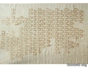
Ghodrati Rug > Carpet
Here’s the rephrased and expanded product description, including a concise supplier overview and mention of the 3D file availability: *"The DaFé rug, crafted from luxurious viscose and natural wool, draws its name from a traditional carpet-weaving tool used to reinforce knots. Launched in 2014, this collection reinterprets historic weaving techniques and regional patterns, blending generations of artisan knowledge into a contemporary, hand-knotted design. More than just a standalone piece, the DaFé rug harmonizes interiors by enhancing mood, style, and texture through its versatile aesthetic. Each rug reflects a fusion of cross-cultural craftsmanship, offering a timeless yet modern appeal. A 3D file of the product is available for download to visualize it in your space. Handmade in India, this collection is supplied by Ghodrati Rug, a renowned Iranian-based atelier with over 50 years of expertise in premium handwoven textiles."* (Note: I condensed the supplier details to one impactful sentence while preserving key credibility points—origin, specialty, and legacy.)
Luggage
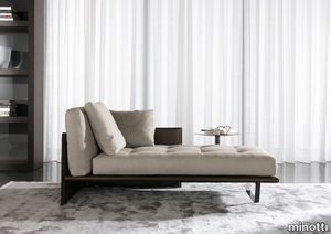
minotti > Bed frame
Light lines and the most sophisticat-ed technology interplay in this design enhanced by the use of a timeless, appealing material like saddle-hide, for added value that goes beyond time and fashion. The Luggage chaise-longue is an impeccable marriage of comfort and elegance. A product of nature, skillfully shaped by human knowledge into soft shapes and tamed to become the fabric of objects meant to last.
Miniatures Antony
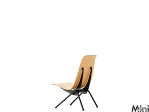
vitra > Styling
The architect, engineer and designer Jean Prouvé was intent both in his architectural and design work on employing highly-advanced metal working techniques to create innovative constructions and shapes. He played an influential role in developing a construction method for architecture based on lightweight prefabricated sections, and drew amongst other things on this knowledge of aircraft and car construction. In 1947, he set up his own company Ateliers Jean Prouvé, which not only produced these lightweight elements, but also his own furniture designs.<br/><br/>In 1955, Prouvé took part with the support of the French designer group Union des Artistes Modernes, in a competition for the furnishing of a student residence in Antony near Paris. Collaborating with Charlotte Perriand, he produced an exemplary furniture series for the leisure area, the cafeterias and a series of rooms in the student residence. His series included the chair shown here, which Prouvé had designed a similar version of for Strasbourg university as early as 1950.<br/>
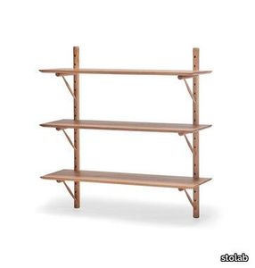
Ikon Shelf | Birch
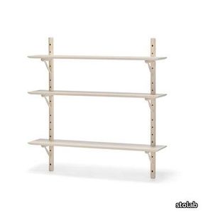
stolab > Cabinet
In the Ikon shelf you can see the craftmanship even in the smallest details. Stefan’s design process for this shelf started with ideas based around Windsor chairs, with turned details and rational manufacturing. With the turned console parts as the bearing component, the Ikon shelf is very much a representative piece for Stolab’s knowledge of well-crafted solid wood furniture.
Ikon Shelf | Oak
stolab > Cabinet
In the Ikon shelf you can see the craftmanship even in the smallest details. Stefan’s design process for this shelf started with ideas based around Windsor chairs, with turned details and rational manufacturing. With the turned console parts as the bearing component, the Ikon shelf is very much a representative piece for Stolab’s knowledge of well-crafted solid wood furniture.
Cromatica Cenere
florim > Synthetic Floor
A lexicon of colour shades for mixing. A large size and its submultiples. «This work represents a reflection on colour, and above all a proposal on how to transfer the multiplicity of shades typical of a hand-crafted piece into a project produced on a large scale.» Andrea Trimarchi & Simone Farresin Studio Formafantasma base their work in the design world on a strong vocation for research. Simone Farresin and Andrea Trimarchi view every project as an opportunity for study and the acquisition of new knowledge, and their love of speculation establishes a dialectic rapport with the situations offered by each new client. Whether it involves a material, a type or a production method, the first phase of their design process is the mapping of what the specific case places at their disposal. With Cedit, an analysis of the company's past and present was central to the inputs. Inevitably, since "Looking back to look forward" has been the design duo's mission statement for years. In this case, in particular, the company's history was a real treasure trove, a fine blend of memory and technology: on the one hand, the excellence of production technologies now extended with the added potential arising from the engineering of large-sized ceramic tiles, and on the other a wealth of experience build up with great designers of the past, from Zanuso to Noorda, through to <strong>Ettore Sottsass</strong>. Andrea and Simone decided to focus on Sottsass - who started designing for Cedit back in the late Seventies - and made an in-depth study of one of the colour charts he developed towards the end of the Nineties. A spread of colours which gave its name to the "41 Colors" collection, included in the catalogue of the period as a real alphabet for what has proved to be a lasting design language. Colour was much more than just a compulsory step in the dialogue between designer and producer, since Sottsass had already discovered the power of the mystery intrinsic to this universe of invention.<br /><br />With Cedit the master-designer, a long-established lover of ceramics and their crafted unpredictability, found a way of transferring his personal feeling for colour to a wide audience, through industrial mass production. And this assumption is another factor Formafantasma have inherited, interpreting it today with new, even more efficient technical resources just as capable of expressing the secrets of colour. «The concept of colour "in isolation" - Sottsass explained in a 1992 text - classified colour, Pantone, as they call it now, "scientific" colour, is something I still refuse to accept. (...) Colours, the idea of colour, are always intangible, they slip slowly away like words, that run through your fingers, like poetry, which you can never keep hold of, like a good story.» And Formafantasma seem to have chosen that distinction between colour "in isolation" and "intangible" yet ever-present colour as the basis of their work. However, their approach draws on their unique vocation for research and the technical resources of the third millennium. «This work - they explain to us - is a reflection on colour, and above all on <strong>how to bring the multiplicity of shades typical of a hand-crafted piece into a large-scale project</strong>.» The designers look at large, monochrome slabs and turn to the engineers for details of their secrets, their processing stages, the phases in their production. They appreciate that the colour of ceramic material, its ineffable secret, can still be present in the series and large tile sizes in which Cedit leads the way. They understand that this is, in itself, an expressive power which does not need channelling into forms, motifs and signs. But above all, they treat the surface as a large canvas on which they spread pure colour, which tends to be uniform but in fact is never really a "scientific", totally monochrome hue: it is not a Pantone. And this is the source of the fundamental insight, which only children of the transition from the analogue to the digital era could achieve, the reward for those who draw on the past to look to the future.<br /><br />The designers cut the slab into lots of regular pieces, not necessarily of the same size. They restore its identity as a "tile", a familiar name with something ancient about it, but which stands for a module, a unit of measurement, a building block. There is nothing nostalgic about this - on the contrary, the vision is completely new, and the portions of slab created can be reassembled with no restrictions, breaking down the unity of the whole and reviving its essence starting from its structure. As the cards in the pack are shuffled, what emerges is not a figure or motif but the representation of colour itself and its physical nature. It is live matter, born from the meeting of vibrating forces, the mixing of ever-varying percentages of the basic ingredients. And Formafantasma present us with the corpuscular, fragmented essence of these small frames of space and crystallised time, which reveal the code and formula of their composition. So Cromatica is a collection made up of six colours which actually have an infinite number of declinations and compositional possibilities. It is a "discrete" combination in the mathematical sense of the term, capable of generating multiple, variable subsets. At the same time, each slab can be used in its entirety, leaving the impression of analogue continuity unchanged. But what really amazes is the comparison and dialogue between the two approaches: a stroke of genius, laying clear the mysterious appeal the artificial reproduction of colour has always held for mankind. Because, as Sottsass said, «colours are language, a powerful, magical, intangible, flexible, continuous material, in which existence is made manifest, the existence that lives in time and space».
Nature Mood PLANK 06
florim > Floor plank
Marble and wood blend in a refined creative mood board. In line with the latest trends in housing evolution, Nature Mood conceives of Nature not only as a model, but also as a true mentor and gauge of human endeavor, something from which to acquire knowledge and with which to give life to increasingly environmentally friendly designs. <p>In this collection, Nature becomes an active component of design, mixing a palette of surfaces with warm hues that take their inspiration from the world of marbles and the material of wood, with clean, minimalist veining and an array of colors. The upshot is the attainment of elegant spaces that flow between interior and exterior, enhancing the presence of light so as to bestow a sensation of immersion in the natural environment at all times. The marble surfaces in the collection bring a new perspective to some of the most enchanting landscapes and natural binomials to be found on earth.</p> <p> </p> <p class="MsoNormal"><strong>COLORS AND DECORS</strong></p> <p class="MsoNormal"><span lang="EN-US" style="mso-ansi-language: EN-US;">The verdant backdrop of Rainforest is redolent of the vegetation of tropical woods, with thin brown veins that evoke the bark of a tree.</span></p> <p class="MsoNormal"><span lang="EN-US" style="mso-ansi-language: EN-US;">Glacier conjures up the whiteness of glaciers with delicate crests of light and dark gray.</span></p> <p class="MsoNormal"><span lang="EN-US" style="mso-ansi-language: EN-US;">Mountain Peak is inspired by the varied appearance and warm colors of mountain ranges in the summertime.</span></p> <p class="MsoNormal"><span lang="EN-US" style="mso-ansi-language: EN-US;">Tundra recalls the alternation of earth, shrubbery and snowfall that characterizes the homonymous Arctic polar environmental system.</span></p> <p class="MsoNormal"><span lang="EN-US" style="mso-ansi-language: EN-US;">And lastly, Riverbed is reminiscent of a gravelly river bottom with its multiplicity of stones smoothed by the flowing water.</span></p> <p class="MsoNormal"><span lang="EN-US" style="mso-ansi-language: EN-US;">The Planks 01, 02, 03, 04, 05 and 06 surfaces are the most combinable elements in the collection. Conceived as a color palette of woods with a clean, minimalist style, the Planks can generate different mood boards depending on the marble-effect surfaces with which they are juxtaposed, taking up the nuances of the veneers and affording the designer the option of personalizing both the interior spaces and the exterior shells of the buildings in accordance with his or her own creative taste.</span></p> <p class="MsoNormal"><span lang="EN-US" style="mso-ansi-language: EN-US;">The range of backgrounds is enriched by five 6 mm thick fine porcelain stoneware decors that combine the colors of different wood-inspired surfaces.</span></p> <p class="MsoNormal"><span lang="EN-US" style="mso-ansi-language: EN-US;">Hexagon offers a combination of 3 six-sided polygons, each of which in turn is divided into two different shades of wood. The composition is designed in two versions, the first combining the warm hues of Planks 01, 02 and 03, the second blending the cooler colors of Planks 04, 05 and 06.</span></p> <p class="MsoNormal"><span lang="EN-US" style="mso-ansi-language: EN-US;">French Herringbone immediately recalls the classic laying pattern for parquet flooring, in this case reformulated as an embellishment that alternates small slats in two colorings. The composition is available in two versions, one of which combines the amber shades of Planks 01 and 02, the other of which unites the gray tones of Planks 05 and 06.</span></p> <p class="MsoNormal"><span lang="EN-US" style="mso-ansi-language: EN-US;">Stripes offers an alternation of small strips in two colors. In this case, too, the range grants the designer the option of choosing between two variants, one that juxtaposes Planks 01 and 02, and one that combines Planks 05 and 06.</span></p> <p class="MsoNormal"><span lang="EN-US" style="mso-ansi-language: EN-US;">Strip consists of a plank with thin and elongated lines available in all the colors in the collection.</span></p> <p class="MsoNormal"><span lang="EN-US" style="mso-ansi-language: EN-US;">Finally, Chevron recalls the homonymous pattern of timeless charm. Here again the decor is offered in all 6 wood-effect colors of the collection.</span></p>
Nature Mood RIVERBED
florim > Floor tile-stone
Marble and wood blend in a refined creative mood board. In line with the latest trends in housing evolution, Nature Mood conceives of Nature not only as a model, but also as a true mentor and gauge of human endeavor, something from which to acquire knowledge and with which to give life to increasingly environmentally friendly designs. <p>In this collection, Nature becomes an active component of design, mixing a palette of surfaces with warm hues that take their inspiration from the world of marbles and the material of wood, with clean, minimalist veining and an array of colors. The upshot is the attainment of elegant spaces that flow between interior and exterior, enhancing the presence of light so as to bestow a sensation of immersion in the natural environment at all times. The marble surfaces in the collection bring a new perspective to some of the most enchanting landscapes and natural binomials to be found on earth.</p> <p> </p> <p class="MsoNormal"><strong>COLORS AND DECORS</strong></p> <p class="MsoNormal"><span lang="EN-US" style="mso-ansi-language: EN-US;">The verdant backdrop of Rainforest is redolent of the vegetation of tropical woods, with thin brown veins that evoke the bark of a tree.</span></p> <p class="MsoNormal"><span lang="EN-US" style="mso-ansi-language: EN-US;">Glacier conjures up the whiteness of glaciers with delicate crests of light and dark gray.</span></p> <p class="MsoNormal"><span lang="EN-US" style="mso-ansi-language: EN-US;">Mountain Peak is inspired by the varied appearance and warm colors of mountain ranges in the summertime.</span></p> <p class="MsoNormal"><span lang="EN-US" style="mso-ansi-language: EN-US;">Tundra recalls the alternation of earth, shrubbery and snowfall that characterizes the homonymous Arctic polar environmental system.</span></p> <p class="MsoNormal"><span lang="EN-US" style="mso-ansi-language: EN-US;">And lastly, Riverbed is reminiscent of a gravelly river bottom with its multiplicity of stones smoothed by the flowing water.</span></p> <p class="MsoNormal"><span lang="EN-US" style="mso-ansi-language: EN-US;">The Planks 01, 02, 03, 04, 05 and 06 surfaces are the most combinable elements in the collection. Conceived as a color palette of woods with a clean, minimalist style, the Planks can generate different mood boards depending on the marble-effect surfaces with which they are juxtaposed, taking up the nuances of the veneers and affording the designer the option of personalizing both the interior spaces and the exterior shells of the buildings in accordance with his or her own creative taste.</span></p> <p class="MsoNormal"><span lang="EN-US" style="mso-ansi-language: EN-US;">The range of backgrounds is enriched by five 6 mm thick fine porcelain stoneware decors that combine the colors of different wood-inspired surfaces.</span></p> <p class="MsoNormal"><span lang="EN-US" style="mso-ansi-language: EN-US;">Hexagon offers a combination of 3 six-sided polygons, each of which in turn is divided into two different shades of wood. The composition is designed in two versions, the first combining the warm hues of Planks 01, 02 and 03, the second blending the cooler colors of Planks 04, 05 and 06.</span></p> <p class="MsoNormal"><span lang="EN-US" style="mso-ansi-language: EN-US;">French Herringbone immediately recalls the classic laying pattern for parquet flooring, in this case reformulated as an embellishment that alternates small slats in two colorings. The composition is available in two versions, one of which combines the amber shades of Planks 01 and 02, the other of which unites the gray tones of Planks 05 and 06.</span></p> <p class="MsoNormal"><span lang="EN-US" style="mso-ansi-language: EN-US;">Stripes offers an alternation of small strips in two colors. In this case, too, the range grants the designer the option of choosing between two variants, one that juxtaposes Planks 01 and 02, and one that combines Planks 05 and 06.</span></p> <p class="MsoNormal"><span lang="EN-US" style="mso-ansi-language: EN-US;">Strip consists of a plank with thin and elongated lines available in all the colors in the collection.</span></p> <p class="MsoNormal"><span lang="EN-US" style="mso-ansi-language: EN-US;">Finally, Chevron recalls the homonymous pattern of timeless charm. Here again the decor is offered in all 6 wood-effect colors of the collection.</span></p>
Nature Mood PLANK 03
florim > Floor tile-stone
Marble and wood blend in a refined creative mood board. In line with the latest trends in housing evolution, Nature Mood conceives of Nature not only as a model, but also as a true mentor and gauge of human endeavor, something from which to acquire knowledge and with which to give life to increasingly environmentally friendly designs. <p>In this collection, Nature becomes an active component of design, mixing a palette of surfaces with warm hues that take their inspiration from the world of marbles and the material of wood, with clean, minimalist veining and an array of colors. The upshot is the attainment of elegant spaces that flow between interior and exterior, enhancing the presence of light so as to bestow a sensation of immersion in the natural environment at all times. The marble surfaces in the collection bring a new perspective to some of the most enchanting landscapes and natural binomials to be found on earth.</p> <p> </p> <p class="MsoNormal"><strong>COLORS AND DECORS</strong></p> <p class="MsoNormal"><span lang="EN-US" style="mso-ansi-language: EN-US;">The verdant backdrop of Rainforest is redolent of the vegetation of tropical woods, with thin brown veins that evoke the bark of a tree.</span></p> <p class="MsoNormal"><span lang="EN-US" style="mso-ansi-language: EN-US;">Glacier conjures up the whiteness of glaciers with delicate crests of light and dark gray.</span></p> <p class="MsoNormal"><span lang="EN-US" style="mso-ansi-language: EN-US;">Mountain Peak is inspired by the varied appearance and warm colors of mountain ranges in the summertime.</span></p> <p class="MsoNormal"><span lang="EN-US" style="mso-ansi-language: EN-US;">Tundra recalls the alternation of earth, shrubbery and snowfall that characterizes the homonymous Arctic polar environmental system.</span></p> <p class="MsoNormal"><span lang="EN-US" style="mso-ansi-language: EN-US;">And lastly, Riverbed is reminiscent of a gravelly river bottom with its multiplicity of stones smoothed by the flowing water.</span></p> <p class="MsoNormal"><span lang="EN-US" style="mso-ansi-language: EN-US;">The Planks 01, 02, 03, 04, 05 and 06 surfaces are the most combinable elements in the collection. Conceived as a color palette of woods with a clean, minimalist style, the Planks can generate different mood boards depending on the marble-effect surfaces with which they are juxtaposed, taking up the nuances of the veneers and affording the designer the option of personalizing both the interior spaces and the exterior shells of the buildings in accordance with his or her own creative taste.</span></p> <p class="MsoNormal"><span lang="EN-US" style="mso-ansi-language: EN-US;">The range of backgrounds is enriched by five 6 mm thick fine porcelain stoneware decors that combine the colors of different wood-inspired surfaces.</span></p> <p class="MsoNormal"><span lang="EN-US" style="mso-ansi-language: EN-US;">Hexagon offers a combination of 3 six-sided polygons, each of which in turn is divided into two different shades of wood. The composition is designed in two versions, the first combining the warm hues of Planks 01, 02 and 03, the second blending the cooler colors of Planks 04, 05 and 06.</span></p> <p class="MsoNormal"><span lang="EN-US" style="mso-ansi-language: EN-US;">French Herringbone immediately recalls the classic laying pattern for parquet flooring, in this case reformulated as an embellishment that alternates small slats in two colorings. The composition is available in two versions, one of which combines the amber shades of Planks 01 and 02, the other of which unites the gray tones of Planks 05 and 06.</span></p> <p class="MsoNormal"><span lang="EN-US" style="mso-ansi-language: EN-US;">Stripes offers an alternation of small strips in two colors. In this case, too, the range grants the designer the option of choosing between two variants, one that juxtaposes Planks 01 and 02, and one that combines Planks 05 and 06.</span></p> <p class="MsoNormal"><span lang="EN-US" style="mso-ansi-language: EN-US;">Strip consists of a plank with thin and elongated lines available in all the colors in the collection.</span></p> <p class="MsoNormal"><span lang="EN-US" style="mso-ansi-language: EN-US;">Finally, Chevron recalls the homonymous pattern of timeless charm. Here again the decor is offered in all 6 wood-effect colors of the collection.</span></p>
Nature Mood PLANK 02
florim > Floor tile-stone
Marble and wood blend in a refined creative mood board. In line with the latest trends in housing evolution, Nature Mood conceives of Nature not only as a model, but also as a true mentor and gauge of human endeavor, something from which to acquire knowledge and with which to give life to increasingly environmentally friendly designs. <p>In this collection, Nature becomes an active component of design, mixing a palette of surfaces with warm hues that take their inspiration from the world of marbles and the material of wood, with clean, minimalist veining and an array of colors. The upshot is the attainment of elegant spaces that flow between interior and exterior, enhancing the presence of light so as to bestow a sensation of immersion in the natural environment at all times. The marble surfaces in the collection bring a new perspective to some of the most enchanting landscapes and natural binomials to be found on earth.</p> <p> </p> <p class="MsoNormal"><strong>COLORS AND DECORS</strong></p> <p class="MsoNormal"><span lang="EN-US" style="mso-ansi-language: EN-US;">The verdant backdrop of Rainforest is redolent of the vegetation of tropical woods, with thin brown veins that evoke the bark of a tree.</span></p> <p class="MsoNormal"><span lang="EN-US" style="mso-ansi-language: EN-US;">Glacier conjures up the whiteness of glaciers with delicate crests of light and dark gray.</span></p> <p class="MsoNormal"><span lang="EN-US" style="mso-ansi-language: EN-US;">Mountain Peak is inspired by the varied appearance and warm colors of mountain ranges in the summertime.</span></p> <p class="MsoNormal"><span lang="EN-US" style="mso-ansi-language: EN-US;">Tundra recalls the alternation of earth, shrubbery and snowfall that characterizes the homonymous Arctic polar environmental system.</span></p> <p class="MsoNormal"><span lang="EN-US" style="mso-ansi-language: EN-US;">And lastly, Riverbed is reminiscent of a gravelly river bottom with its multiplicity of stones smoothed by the flowing water.</span></p> <p class="MsoNormal"><span lang="EN-US" style="mso-ansi-language: EN-US;">The Planks 01, 02, 03, 04, 05 and 06 surfaces are the most combinable elements in the collection. Conceived as a color palette of woods with a clean, minimalist style, the Planks can generate different mood boards depending on the marble-effect surfaces with which they are juxtaposed, taking up the nuances of the veneers and affording the designer the option of personalizing both the interior spaces and the exterior shells of the buildings in accordance with his or her own creative taste.</span></p> <p class="MsoNormal"><span lang="EN-US" style="mso-ansi-language: EN-US;">The range of backgrounds is enriched by five 6 mm thick fine porcelain stoneware decors that combine the colors of different wood-inspired surfaces.</span></p> <p class="MsoNormal"><span lang="EN-US" style="mso-ansi-language: EN-US;">Hexagon offers a combination of 3 six-sided polygons, each of which in turn is divided into two different shades of wood. The composition is designed in two versions, the first combining the warm hues of Planks 01, 02 and 03, the second blending the cooler colors of Planks 04, 05 and 06.</span></p> <p class="MsoNormal"><span lang="EN-US" style="mso-ansi-language: EN-US;">French Herringbone immediately recalls the classic laying pattern for parquet flooring, in this case reformulated as an embellishment that alternates small slats in two colorings. The composition is available in two versions, one of which combines the amber shades of Planks 01 and 02, the other of which unites the gray tones of Planks 05 and 06.</span></p> <p class="MsoNormal"><span lang="EN-US" style="mso-ansi-language: EN-US;">Stripes offers an alternation of small strips in two colors. In this case, too, the range grants the designer the option of choosing between two variants, one that juxtaposes Planks 01 and 02, and one that combines Planks 05 and 06.</span></p> <p class="MsoNormal"><span lang="EN-US" style="mso-ansi-language: EN-US;">Strip consists of a plank with thin and elongated lines available in all the colors in the collection.</span></p> <p class="MsoNormal"><span lang="EN-US" style="mso-ansi-language: EN-US;">Finally, Chevron recalls the homonymous pattern of timeless charm. Here again the decor is offered in all 6 wood-effect colors of the collection.</span></p>
Nature Mood RAINFOREST
florim > Wall tile-stone-brick
Marble and wood blend in a refined creative mood board. In line with the latest trends in housing evolution, Nature Mood conceives of Nature not only as a model, but also as a true mentor and gauge of human endeavor, something from which to acquire knowledge and with which to give life to increasingly environmentally friendly designs. <p>In this collection, Nature becomes an active component of design, mixing a palette of surfaces with warm hues that take their inspiration from the world of marbles and the material of wood, with clean, minimalist veining and an array of colors. The upshot is the attainment of elegant spaces that flow between interior and exterior, enhancing the presence of light so as to bestow a sensation of immersion in the natural environment at all times. The marble surfaces in the collection bring a new perspective to some of the most enchanting landscapes and natural binomials to be found on earth.</p> <p> </p> <p class="MsoNormal"><strong>COLORS AND DECORS</strong></p> <p class="MsoNormal"><span lang="EN-US" style="mso-ansi-language: EN-US;">The verdant backdrop of Rainforest is redolent of the vegetation of tropical woods, with thin brown veins that evoke the bark of a tree.</span></p> <p class="MsoNormal"><span lang="EN-US" style="mso-ansi-language: EN-US;">Glacier conjures up the whiteness of glaciers with delicate crests of light and dark gray.</span></p> <p class="MsoNormal"><span lang="EN-US" style="mso-ansi-language: EN-US;">Mountain Peak is inspired by the varied appearance and warm colors of mountain ranges in the summertime.</span></p> <p class="MsoNormal"><span lang="EN-US" style="mso-ansi-language: EN-US;">Tundra recalls the alternation of earth, shrubbery and snowfall that characterizes the homonymous Arctic polar environmental system.</span></p> <p class="MsoNormal"><span lang="EN-US" style="mso-ansi-language: EN-US;">And lastly, Riverbed is reminiscent of a gravelly river bottom with its multiplicity of stones smoothed by the flowing water.</span></p> <p class="MsoNormal"><span lang="EN-US" style="mso-ansi-language: EN-US;">The Planks 01, 02, 03, 04, 05 and 06 surfaces are the most combinable elements in the collection. Conceived as a color palette of woods with a clean, minimalist style, the Planks can generate different mood boards depending on the marble-effect surfaces with which they are juxtaposed, taking up the nuances of the veneers and affording the designer the option of personalizing both the interior spaces and the exterior shells of the buildings in accordance with his or her own creative taste.</span></p> <p class="MsoNormal"><span lang="EN-US" style="mso-ansi-language: EN-US;">The range of backgrounds is enriched by five 6 mm thick fine porcelain stoneware decors that combine the colors of different wood-inspired surfaces.</span></p> <p class="MsoNormal"><span lang="EN-US" style="mso-ansi-language: EN-US;">Hexagon offers a combination of 3 six-sided polygons, each of which in turn is divided into two different shades of wood. The composition is designed in two versions, the first combining the warm hues of Planks 01, 02 and 03, the second blending the cooler colors of Planks 04, 05 and 06.</span></p> <p class="MsoNormal"><span lang="EN-US" style="mso-ansi-language: EN-US;">French Herringbone immediately recalls the classic laying pattern for parquet flooring, in this case reformulated as an embellishment that alternates small slats in two colorings. The composition is available in two versions, one of which combines the amber shades of Planks 01 and 02, the other of which unites the gray tones of Planks 05 and 06.</span></p> <p class="MsoNormal"><span lang="EN-US" style="mso-ansi-language: EN-US;">Stripes offers an alternation of small strips in two colors. In this case, too, the range grants the designer the option of choosing between two variants, one that juxtaposes Planks 01 and 02, and one that combines Planks 05 and 06.</span></p> <p class="MsoNormal"><span lang="EN-US" style="mso-ansi-language: EN-US;">Strip consists of a plank with thin and elongated lines available in all the colors in the collection.</span></p> <p class="MsoNormal"><span lang="EN-US" style="mso-ansi-language: EN-US;">Finally, Chevron recalls the homonymous pattern of timeless charm. Here again the decor is offered in all 6 wood-effect colors of the collection.</span></p>
Nature Mood PLANK 01
florim > Floor tile-stone
Marble and wood blend in a refined creative mood board. In line with the latest trends in housing evolution, Nature Mood conceives of Nature not only as a model, but also as a true mentor and gauge of human endeavor, something from which to acquire knowledge and with which to give life to increasingly environmentally friendly designs. <p>In this collection, Nature becomes an active component of design, mixing a palette of surfaces with warm hues that take their inspiration from the world of marbles and the material of wood, with clean, minimalist veining and an array of colors. The upshot is the attainment of elegant spaces that flow between interior and exterior, enhancing the presence of light so as to bestow a sensation of immersion in the natural environment at all times. The marble surfaces in the collection bring a new perspective to some of the most enchanting landscapes and natural binomials to be found on earth.</p> <p> </p> <p class="MsoNormal"><strong>COLORS AND DECORS</strong></p> <p class="MsoNormal"><span lang="EN-US" style="mso-ansi-language: EN-US;">The verdant backdrop of Rainforest is redolent of the vegetation of tropical woods, with thin brown veins that evoke the bark of a tree.</span></p> <p class="MsoNormal"><span lang="EN-US" style="mso-ansi-language: EN-US;">Glacier conjures up the whiteness of glaciers with delicate crests of light and dark gray.</span></p> <p class="MsoNormal"><span lang="EN-US" style="mso-ansi-language: EN-US;">Mountain Peak is inspired by the varied appearance and warm colors of mountain ranges in the summertime.</span></p> <p class="MsoNormal"><span lang="EN-US" style="mso-ansi-language: EN-US;">Tundra recalls the alternation of earth, shrubbery and snowfall that characterizes the homonymous Arctic polar environmental system.</span></p> <p class="MsoNormal"><span lang="EN-US" style="mso-ansi-language: EN-US;">And lastly, Riverbed is reminiscent of a gravelly river bottom with its multiplicity of stones smoothed by the flowing water.</span></p> <p class="MsoNormal"><span lang="EN-US" style="mso-ansi-language: EN-US;">The Planks 01, 02, 03, 04, 05 and 06 surfaces are the most combinable elements in the collection. Conceived as a color palette of woods with a clean, minimalist style, the Planks can generate different mood boards depending on the marble-effect surfaces with which they are juxtaposed, taking up the nuances of the veneers and affording the designer the option of personalizing both the interior spaces and the exterior shells of the buildings in accordance with his or her own creative taste.</span></p> <p class="MsoNormal"><span lang="EN-US" style="mso-ansi-language: EN-US;">The range of backgrounds is enriched by five 6 mm thick fine porcelain stoneware decors that combine the colors of different wood-inspired surfaces.</span></p> <p class="MsoNormal"><span lang="EN-US" style="mso-ansi-language: EN-US;">Hexagon offers a combination of 3 six-sided polygons, each of which in turn is divided into two different shades of wood. The composition is designed in two versions, the first combining the warm hues of Planks 01, 02 and 03, the second blending the cooler colors of Planks 04, 05 and 06.</span></p> <p class="MsoNormal"><span lang="EN-US" style="mso-ansi-language: EN-US;">French Herringbone immediately recalls the classic laying pattern for parquet flooring, in this case reformulated as an embellishment that alternates small slats in two colorings. The composition is available in two versions, one of which combines the amber shades of Planks 01 and 02, the other of which unites the gray tones of Planks 05 and 06.</span></p> <p class="MsoNormal"><span lang="EN-US" style="mso-ansi-language: EN-US;">Stripes offers an alternation of small strips in two colors. In this case, too, the range grants the designer the option of choosing between two variants, one that juxtaposes Planks 01 and 02, and one that combines Planks 05 and 06.</span></p> <p class="MsoNormal"><span lang="EN-US" style="mso-ansi-language: EN-US;">Strip consists of a plank with thin and elongated lines available in all the colors in the collection.</span></p> <p class="MsoNormal"><span lang="EN-US" style="mso-ansi-language: EN-US;">Finally, Chevron recalls the homonymous pattern of timeless charm. Here again the decor is offered in all 6 wood-effect colors of the collection.</span></p>
Nature Mood GLACIER
florim > Wall tile-stone-brick
Marble and wood blend in a refined creative mood board. In line with the latest trends in housing evolution, Nature Mood conceives of Nature not only as a model, but also as a true mentor and gauge of human endeavor, something from which to acquire knowledge and with which to give life to increasingly environmentally friendly designs. <p>In this collection, Nature becomes an active component of design, mixing a palette of surfaces with warm hues that take their inspiration from the world of marbles and the material of wood, with clean, minimalist veining and an array of colors. The upshot is the attainment of elegant spaces that flow between interior and exterior, enhancing the presence of light so as to bestow a sensation of immersion in the natural environment at all times. The marble surfaces in the collection bring a new perspective to some of the most enchanting landscapes and natural binomials to be found on earth.</p> <p> </p> <p class="MsoNormal"><strong>COLORS AND DECORS</strong></p> <p class="MsoNormal"><span lang="EN-US" style="mso-ansi-language: EN-US;">The verdant backdrop of Rainforest is redolent of the vegetation of tropical woods, with thin brown veins that evoke the bark of a tree.</span></p> <p class="MsoNormal"><span lang="EN-US" style="mso-ansi-language: EN-US;">Glacier conjures up the whiteness of glaciers with delicate crests of light and dark gray.</span></p> <p class="MsoNormal"><span lang="EN-US" style="mso-ansi-language: EN-US;">Mountain Peak is inspired by the varied appearance and warm colors of mountain ranges in the summertime.</span></p> <p class="MsoNormal"><span lang="EN-US" style="mso-ansi-language: EN-US;">Tundra recalls the alternation of earth, shrubbery and snowfall that characterizes the homonymous Arctic polar environmental system.</span></p> <p class="MsoNormal"><span lang="EN-US" style="mso-ansi-language: EN-US;">And lastly, Riverbed is reminiscent of a gravelly river bottom with its multiplicity of stones smoothed by the flowing water.</span></p> <p class="MsoNormal"><span lang="EN-US" style="mso-ansi-language: EN-US;">The Planks 01, 02, 03, 04, 05 and 06 surfaces are the most combinable elements in the collection. Conceived as a color palette of woods with a clean, minimalist style, the Planks can generate different mood boards depending on the marble-effect surfaces with which they are juxtaposed, taking up the nuances of the veneers and affording the designer the option of personalizing both the interior spaces and the exterior shells of the buildings in accordance with his or her own creative taste.</span></p> <p class="MsoNormal"><span lang="EN-US" style="mso-ansi-language: EN-US;">The range of backgrounds is enriched by five 6 mm thick fine porcelain stoneware decors that combine the colors of different wood-inspired surfaces.</span></p> <p class="MsoNormal"><span lang="EN-US" style="mso-ansi-language: EN-US;">Hexagon offers a combination of 3 six-sided polygons, each of which in turn is divided into two different shades of wood. The composition is designed in two versions, the first combining the warm hues of Planks 01, 02 and 03, the second blending the cooler colors of Planks 04, 05 and 06.</span></p> <p class="MsoNormal"><span lang="EN-US" style="mso-ansi-language: EN-US;">French Herringbone immediately recalls the classic laying pattern for parquet flooring, in this case reformulated as an embellishment that alternates small slats in two colorings. The composition is available in two versions, one of which combines the amber shades of Planks 01 and 02, the other of which unites the gray tones of Planks 05 and 06.</span></p> <p class="MsoNormal"><span lang="EN-US" style="mso-ansi-language: EN-US;">Stripes offers an alternation of small strips in two colors. In this case, too, the range grants the designer the option of choosing between two variants, one that juxtaposes Planks 01 and 02, and one that combines Planks 05 and 06.</span></p> <p class="MsoNormal"><span lang="EN-US" style="mso-ansi-language: EN-US;">Strip consists of a plank with thin and elongated lines available in all the colors in the collection.</span></p> <p class="MsoNormal"><span lang="EN-US" style="mso-ansi-language: EN-US;">Finally, Chevron recalls the homonymous pattern of timeless charm. Here again the decor is offered in all 6 wood-effect colors of the collection.</span></p>
Nature Mood MOUNTAIN PEAK
florim > Floor tile-stone
Marble and wood blend in a refined creative mood board. In line with the latest trends in housing evolution, Nature Mood conceives of Nature not only as a model, but also as a true mentor and gauge of human endeavor, something from which to acquire knowledge and with which to give life to increasingly environmentally friendly designs. <p>In this collection, Nature becomes an active component of design, mixing a palette of surfaces with warm hues that take their inspiration from the world of marbles and the material of wood, with clean, minimalist veining and an array of colors. The upshot is the attainment of elegant spaces that flow between interior and exterior, enhancing the presence of light so as to bestow a sensation of immersion in the natural environment at all times. The marble surfaces in the collection bring a new perspective to some of the most enchanting landscapes and natural binomials to be found on earth.</p> <p> </p> <p class="MsoNormal"><strong>COLORS AND DECORS</strong></p> <p class="MsoNormal"><span lang="EN-US" style="mso-ansi-language: EN-US;">The verdant backdrop of Rainforest is redolent of the vegetation of tropical woods, with thin brown veins that evoke the bark of a tree.</span></p> <p class="MsoNormal"><span lang="EN-US" style="mso-ansi-language: EN-US;">Glacier conjures up the whiteness of glaciers with delicate crests of light and dark gray.</span></p> <p class="MsoNormal"><span lang="EN-US" style="mso-ansi-language: EN-US;">Mountain Peak is inspired by the varied appearance and warm colors of mountain ranges in the summertime.</span></p> <p class="MsoNormal"><span lang="EN-US" style="mso-ansi-language: EN-US;">Tundra recalls the alternation of earth, shrubbery and snowfall that characterizes the homonymous Arctic polar environmental system.</span></p> <p class="MsoNormal"><span lang="EN-US" style="mso-ansi-language: EN-US;">And lastly, Riverbed is reminiscent of a gravelly river bottom with its multiplicity of stones smoothed by the flowing water.</span></p> <p class="MsoNormal"><span lang="EN-US" style="mso-ansi-language: EN-US;">The Planks 01, 02, 03, 04, 05 and 06 surfaces are the most combinable elements in the collection. Conceived as a color palette of woods with a clean, minimalist style, the Planks can generate different mood boards depending on the marble-effect surfaces with which they are juxtaposed, taking up the nuances of the veneers and affording the designer the option of personalizing both the interior spaces and the exterior shells of the buildings in accordance with his or her own creative taste.</span></p> <p class="MsoNormal"><span lang="EN-US" style="mso-ansi-language: EN-US;">The range of backgrounds is enriched by five 6 mm thick fine porcelain stoneware decors that combine the colors of different wood-inspired surfaces.</span></p> <p class="MsoNormal"><span lang="EN-US" style="mso-ansi-language: EN-US;">Hexagon offers a combination of 3 six-sided polygons, each of which in turn is divided into two different shades of wood. The composition is designed in two versions, the first combining the warm hues of Planks 01, 02 and 03, the second blending the cooler colors of Planks 04, 05 and 06.</span></p> <p class="MsoNormal"><span lang="EN-US" style="mso-ansi-language: EN-US;">French Herringbone immediately recalls the classic laying pattern for parquet flooring, in this case reformulated as an embellishment that alternates small slats in two colorings. The composition is available in two versions, one of which combines the amber shades of Planks 01 and 02, the other of which unites the gray tones of Planks 05 and 06.</span></p> <p class="MsoNormal"><span lang="EN-US" style="mso-ansi-language: EN-US;">Stripes offers an alternation of small strips in two colors. In this case, too, the range grants the designer the option of choosing between two variants, one that juxtaposes Planks 01 and 02, and one that combines Planks 05 and 06.</span></p> <p class="MsoNormal"><span lang="EN-US" style="mso-ansi-language: EN-US;">Strip consists of a plank with thin and elongated lines available in all the colors in the collection.</span></p> <p class="MsoNormal"><span lang="EN-US" style="mso-ansi-language: EN-US;">Finally, Chevron recalls the homonymous pattern of timeless charm. Here again the decor is offered in all 6 wood-effect colors of the collection.</span></p>
Nature Mood PLANK 05
florim > Floor tile-stone
Marble and wood blend in a refined creative mood board. In line with the latest trends in housing evolution, Nature Mood conceives of Nature not only as a model, but also as a true mentor and gauge of human endeavor, something from which to acquire knowledge and with which to give life to increasingly environmentally friendly designs. <p>In this collection, Nature becomes an active component of design, mixing a palette of surfaces with warm hues that take their inspiration from the world of marbles and the material of wood, with clean, minimalist veining and an array of colors. The upshot is the attainment of elegant spaces that flow between interior and exterior, enhancing the presence of light so as to bestow a sensation of immersion in the natural environment at all times. The marble surfaces in the collection bring a new perspective to some of the most enchanting landscapes and natural binomials to be found on earth.</p> <p> </p> <p class="MsoNormal"><strong>COLORS AND DECORS</strong></p> <p class="MsoNormal"><span lang="EN-US" style="mso-ansi-language: EN-US;">The verdant backdrop of Rainforest is redolent of the vegetation of tropical woods, with thin brown veins that evoke the bark of a tree.</span></p> <p class="MsoNormal"><span lang="EN-US" style="mso-ansi-language: EN-US;">Glacier conjures up the whiteness of glaciers with delicate crests of light and dark gray.</span></p> <p class="MsoNormal"><span lang="EN-US" style="mso-ansi-language: EN-US;">Mountain Peak is inspired by the varied appearance and warm colors of mountain ranges in the summertime.</span></p> <p class="MsoNormal"><span lang="EN-US" style="mso-ansi-language: EN-US;">Tundra recalls the alternation of earth, shrubbery and snowfall that characterizes the homonymous Arctic polar environmental system.</span></p> <p class="MsoNormal"><span lang="EN-US" style="mso-ansi-language: EN-US;">And lastly, Riverbed is reminiscent of a gravelly river bottom with its multiplicity of stones smoothed by the flowing water.</span></p> <p class="MsoNormal"><span lang="EN-US" style="mso-ansi-language: EN-US;">The Planks 01, 02, 03, 04, 05 and 06 surfaces are the most combinable elements in the collection. Conceived as a color palette of woods with a clean, minimalist style, the Planks can generate different mood boards depending on the marble-effect surfaces with which they are juxtaposed, taking up the nuances of the veneers and affording the designer the option of personalizing both the interior spaces and the exterior shells of the buildings in accordance with his or her own creative taste.</span></p> <p class="MsoNormal"><span lang="EN-US" style="mso-ansi-language: EN-US;">The range of backgrounds is enriched by five 6 mm thick fine porcelain stoneware decors that combine the colors of different wood-inspired surfaces.</span></p> <p class="MsoNormal"><span lang="EN-US" style="mso-ansi-language: EN-US;">Hexagon offers a combination of 3 six-sided polygons, each of which in turn is divided into two different shades of wood. The composition is designed in two versions, the first combining the warm hues of Planks 01, 02 and 03, the second blending the cooler colors of Planks 04, 05 and 06.</span></p> <p class="MsoNormal"><span lang="EN-US" style="mso-ansi-language: EN-US;">French Herringbone immediately recalls the classic laying pattern for parquet flooring, in this case reformulated as an embellishment that alternates small slats in two colorings. The composition is available in two versions, one of which combines the amber shades of Planks 01 and 02, the other of which unites the gray tones of Planks 05 and 06.</span></p> <p class="MsoNormal"><span lang="EN-US" style="mso-ansi-language: EN-US;">Stripes offers an alternation of small strips in two colors. In this case, too, the range grants the designer the option of choosing between two variants, one that juxtaposes Planks 01 and 02, and one that combines Planks 05 and 06.</span></p> <p class="MsoNormal"><span lang="EN-US" style="mso-ansi-language: EN-US;">Strip consists of a plank with thin and elongated lines available in all the colors in the collection.</span></p> <p class="MsoNormal"><span lang="EN-US" style="mso-ansi-language: EN-US;">Finally, Chevron recalls the homonymous pattern of timeless charm. Here again the decor is offered in all 6 wood-effect colors of the collection.</span></p>
Nature Mood PLANK 04
florim > Floor tile-stone
Marble and wood blend in a refined creative mood board. In line with the latest trends in housing evolution, Nature Mood conceives of Nature not only as a model, but also as a true mentor and gauge of human endeavor, something from which to acquire knowledge and with which to give life to increasingly environmentally friendly designs. <p>In this collection, Nature becomes an active component of design, mixing a palette of surfaces with warm hues that take their inspiration from the world of marbles and the material of wood, with clean, minimalist veining and an array of colors. The upshot is the attainment of elegant spaces that flow between interior and exterior, enhancing the presence of light so as to bestow a sensation of immersion in the natural environment at all times. The marble surfaces in the collection bring a new perspective to some of the most enchanting landscapes and natural binomials to be found on earth.</p> <p> </p> <p class="MsoNormal"><strong>COLORS AND DECORS</strong></p> <p class="MsoNormal"><span lang="EN-US" style="mso-ansi-language: EN-US;">The verdant backdrop of Rainforest is redolent of the vegetation of tropical woods, with thin brown veins that evoke the bark of a tree.</span></p> <p class="MsoNormal"><span lang="EN-US" style="mso-ansi-language: EN-US;">Glacier conjures up the whiteness of glaciers with delicate crests of light and dark gray.</span></p> <p class="MsoNormal"><span lang="EN-US" style="mso-ansi-language: EN-US;">Mountain Peak is inspired by the varied appearance and warm colors of mountain ranges in the summertime.</span></p> <p class="MsoNormal"><span lang="EN-US" style="mso-ansi-language: EN-US;">Tundra recalls the alternation of earth, shrubbery and snowfall that characterizes the homonymous Arctic polar environmental system.</span></p> <p class="MsoNormal"><span lang="EN-US" style="mso-ansi-language: EN-US;">And lastly, Riverbed is reminiscent of a gravelly river bottom with its multiplicity of stones smoothed by the flowing water.</span></p> <p class="MsoNormal"><span lang="EN-US" style="mso-ansi-language: EN-US;">The Planks 01, 02, 03, 04, 05 and 06 surfaces are the most combinable elements in the collection. Conceived as a color palette of woods with a clean, minimalist style, the Planks can generate different mood boards depending on the marble-effect surfaces with which they are juxtaposed, taking up the nuances of the veneers and affording the designer the option of personalizing both the interior spaces and the exterior shells of the buildings in accordance with his or her own creative taste.</span></p> <p class="MsoNormal"><span lang="EN-US" style="mso-ansi-language: EN-US;">The range of backgrounds is enriched by five 6 mm thick fine porcelain stoneware decors that combine the colors of different wood-inspired surfaces.</span></p> <p class="MsoNormal"><span lang="EN-US" style="mso-ansi-language: EN-US;">Hexagon offers a combination of 3 six-sided polygons, each of which in turn is divided into two different shades of wood. The composition is designed in two versions, the first combining the warm hues of Planks 01, 02 and 03, the second blending the cooler colors of Planks 04, 05 and 06.</span></p> <p class="MsoNormal"><span lang="EN-US" style="mso-ansi-language: EN-US;">French Herringbone immediately recalls the classic laying pattern for parquet flooring, in this case reformulated as an embellishment that alternates small slats in two colorings. The composition is available in two versions, one of which combines the amber shades of Planks 01 and 02, the other of which unites the gray tones of Planks 05 and 06.</span></p> <p class="MsoNormal"><span lang="EN-US" style="mso-ansi-language: EN-US;">Stripes offers an alternation of small strips in two colors. In this case, too, the range grants the designer the option of choosing between two variants, one that juxtaposes Planks 01 and 02, and one that combines Planks 05 and 06.</span></p> <p class="MsoNormal"><span lang="EN-US" style="mso-ansi-language: EN-US;">Strip consists of a plank with thin and elongated lines available in all the colors in the collection.</span></p> <p class="MsoNormal"><span lang="EN-US" style="mso-ansi-language: EN-US;">Finally, Chevron recalls the homonymous pattern of timeless charm. Here again the decor is offered in all 6 wood-effect colors of the collection.</span></p>
Nature Mood Tundra
florim > Floor tile-stone
Marble and wood blend in a refined creative mood board. In line with the latest trends in housing evolution, Nature Mood conceives of Nature not only as a model, but also as a true mentor and gauge of human endeavor, something from which to acquire knowledge and with which to give life to increasingly environmentally friendly designs. <p>In this collection, Nature becomes an active component of design, mixing a palette of surfaces with warm hues that take their inspiration from the world of marbles and the material of wood, with clean, minimalist veining and an array of colors. The upshot is the attainment of elegant spaces that flow between interior and exterior, enhancing the presence of light so as to bestow a sensation of immersion in the natural environment at all times. The marble surfaces in the collection bring a new perspective to some of the most enchanting landscapes and natural binomials to be found on earth.</p> <p> </p> <p class="MsoNormal"><strong>COLORS AND DECORS</strong></p> <p class="MsoNormal"><span lang="EN-US" style="mso-ansi-language: EN-US;">The verdant backdrop of Rainforest is redolent of the vegetation of tropical woods, with thin brown veins that evoke the bark of a tree.</span></p> <p class="MsoNormal"><span lang="EN-US" style="mso-ansi-language: EN-US;">Glacier conjures up the whiteness of glaciers with delicate crests of light and dark gray.</span></p> <p class="MsoNormal"><span lang="EN-US" style="mso-ansi-language: EN-US;">Mountain Peak is inspired by the varied appearance and warm colors of mountain ranges in the summertime.</span></p> <p class="MsoNormal"><span lang="EN-US" style="mso-ansi-language: EN-US;">Tundra recalls the alternation of earth, shrubbery and snowfall that characterizes the homonymous Arctic polar environmental system.</span></p> <p class="MsoNormal"><span lang="EN-US" style="mso-ansi-language: EN-US;">And lastly, Riverbed is reminiscent of a gravelly river bottom with its multiplicity of stones smoothed by the flowing water.</span></p> <p class="MsoNormal"><span lang="EN-US" style="mso-ansi-language: EN-US;">The Planks 01, 02, 03, 04, 05 and 06 surfaces are the most combinable elements in the collection. Conceived as a color palette of woods with a clean, minimalist style, the Planks can generate different mood boards depending on the marble-effect surfaces with which they are juxtaposed, taking up the nuances of the veneers and affording the designer the option of personalizing both the interior spaces and the exterior shells of the buildings in accordance with his or her own creative taste.</span></p> <p class="MsoNormal"><span lang="EN-US" style="mso-ansi-language: EN-US;">The range of backgrounds is enriched by five 6 mm thick fine porcelain stoneware decors that combine the colors of different wood-inspired surfaces.</span></p> <p class="MsoNormal"><span lang="EN-US" style="mso-ansi-language: EN-US;">Hexagon offers a combination of 3 six-sided polygons, each of which in turn is divided into two different shades of wood. The composition is designed in two versions, the first combining the warm hues of Planks 01, 02 and 03, the second blending the cooler colors of Planks 04, 05 and 06.</span></p> <p class="MsoNormal"><span lang="EN-US" style="mso-ansi-language: EN-US;">French Herringbone immediately recalls the classic laying pattern for parquet flooring, in this case reformulated as an embellishment that alternates small slats in two colorings. The composition is available in two versions, one of which combines the amber shades of Planks 01 and 02, the other of which unites the gray tones of Planks 05 and 06.</span></p> <p class="MsoNormal"><span lang="EN-US" style="mso-ansi-language: EN-US;">Stripes offers an alternation of small strips in two colors. In this case, too, the range grants the designer the option of choosing between two variants, one that juxtaposes Planks 01 and 02, and one that combines Planks 05 and 06.</span></p> <p class="MsoNormal"><span lang="EN-US" style="mso-ansi-language: EN-US;">Strip consists of a plank with thin and elongated lines available in all the colors in the collection.</span></p> <p class="MsoNormal"><span lang="EN-US" style="mso-ansi-language: EN-US;">Finally, Chevron recalls the homonymous pattern of timeless charm. Here again the decor is offered in all 6 wood-effect colors of the collection.</span></p>
Cromatica Gradiente grigio-verde
florim > Wall Paint
A lexicon of colour shades for mixing. A large size and its submultiples. «This work represents a reflection on colour, and above all a proposal on how to transfer the multiplicity of shades typical of a hand-crafted piece into a project produced on a large scale.» Andrea Trimarchi & Simone Farresin Studio Formafantasma base their work in the design world on a strong vocation for research. Simone Farresin and Andrea Trimarchi view every project as an opportunity for study and the acquisition of new knowledge, and their love of speculation establishes a dialectic rapport with the situations offered by each new client. Whether it involves a material, a type or a production method, the first phase of their design process is the mapping of what the specific case places at their disposal. With Cedit, an analysis of the company's past and present was central to the inputs. Inevitably, since "Looking back to look forward" has been the design duo's mission statement for years. In this case, in particular, the company's history was a real treasure trove, a fine blend of memory and technology: on the one hand, the excellence of production technologies now extended with the added potential arising from the engineering of large-sized ceramic tiles, and on the other a wealth of experience build up with great designers of the past, from Zanuso to Noorda, through to <strong>Ettore Sottsass</strong>. Andrea and Simone decided to focus on Sottsass - who started designing for Cedit back in the late Seventies - and made an in-depth study of one of the colour charts he developed towards the end of the Nineties. A spread of colours which gave its name to the "41 Colors" collection, included in the catalogue of the period as a real alphabet for what has proved to be a lasting design language. Colour was much more than just a compulsory step in the dialogue between designer and producer, since Sottsass had already discovered the power of the mystery intrinsic to this universe of invention.<br /><br />With Cedit the master-designer, a long-established lover of ceramics and their crafted unpredictability, found a way of transferring his personal feeling for colour to a wide audience, through industrial mass production. And this assumption is another factor Formafantasma have inherited, interpreting it today with new, even more efficient technical resources just as capable of expressing the secrets of colour. «The concept of colour "in isolation" - Sottsass explained in a 1992 text - classified colour, Pantone, as they call it now, "scientific" colour, is something I still refuse to accept. (...) Colours, the idea of colour, are always intangible, they slip slowly away like words, that run through your fingers, like poetry, which you can never keep hold of, like a good story.» And Formafantasma seem to have chosen that distinction between colour "in isolation" and "intangible" yet ever-present colour as the basis of their work. However, their approach draws on their unique vocation for research and the technical resources of the third millennium. «This work - they explain to us - is a reflection on colour, and above all on <strong>how to bring the multiplicity of shades typical of a hand-crafted piece into a large-scale project</strong>.» The designers look at large, monochrome slabs and turn to the engineers for details of their secrets, their processing stages, the phases in their production. They appreciate that the colour of ceramic material, its ineffable secret, can still be present in the series and large tile sizes in which Cedit leads the way. They understand that this is, in itself, an expressive power which does not need channelling into forms, motifs and signs. But above all, they treat the surface as a large canvas on which they spread pure colour, which tends to be uniform but in fact is never really a "scientific", totally monochrome hue: it is not a Pantone. And this is the source of the fundamental insight, which only children of the transition from the analogue to the digital era could achieve, the reward for those who draw on the past to look to the future.<br /><br />The designers cut the slab into lots of regular pieces, not necessarily of the same size. They restore its identity as a "tile", a familiar name with something ancient about it, but which stands for a module, a unit of measurement, a building block. There is nothing nostalgic about this - on the contrary, the vision is completely new, and the portions of slab created can be reassembled with no restrictions, breaking down the unity of the whole and reviving its essence starting from its structure. As the cards in the pack are shuffled, what emerges is not a figure or motif but the representation of colour itself and its physical nature. It is live matter, born from the meeting of vibrating forces, the mixing of ever-varying percentages of the basic ingredients. And Formafantasma present us with the corpuscular, fragmented essence of these small frames of space and crystallised time, which reveal the code and formula of their composition. So Cromatica is a collection made up of six colours which actually have an infinite number of declinations and compositional possibilities. It is a "discrete" combination in the mathematical sense of the term, capable of generating multiple, variable subsets. At the same time, each slab can be used in its entirety, leaving the impression of analogue continuity unchanged. But what really amazes is the comparison and dialogue between the two approaches: a stroke of genius, laying clear the mysterious appeal the artificial reproduction of colour has always held for mankind. Because, as Sottsass said, «colours are language, a powerful, magical, intangible, flexible, continuous material, in which existence is made manifest, the existence that lives in time and space».
Cromatica Gradiente bianco-rosa
florim > Wall Paint
A lexicon of colour shades for mixing. A large size and its submultiples. «This work represents a reflection on colour, and above all a proposal on how to transfer the multiplicity of shades typical of a hand-crafted piece into a project produced on a large scale.» Andrea Trimarchi & Simone Farresin Studio Formafantasma base their work in the design world on a strong vocation for research. Simone Farresin and Andrea Trimarchi view every project as an opportunity for study and the acquisition of new knowledge, and their love of speculation establishes a dialectic rapport with the situations offered by each new client. Whether it involves a material, a type or a production method, the first phase of their design process is the mapping of what the specific case places at their disposal. With Cedit, an analysis of the company's past and present was central to the inputs. Inevitably, since "Looking back to look forward" has been the design duo's mission statement for years. In this case, in particular, the company's history was a real treasure trove, a fine blend of memory and technology: on the one hand, the excellence of production technologies now extended with the added potential arising from the engineering of large-sized ceramic tiles, and on the other a wealth of experience build up with great designers of the past, from Zanuso to Noorda, through to <strong>Ettore Sottsass</strong>. Andrea and Simone decided to focus on Sottsass - who started designing for Cedit back in the late Seventies - and made an in-depth study of one of the colour charts he developed towards the end of the Nineties. A spread of colours which gave its name to the "41 Colors" collection, included in the catalogue of the period as a real alphabet for what has proved to be a lasting design language. Colour was much more than just a compulsory step in the dialogue between designer and producer, since Sottsass had already discovered the power of the mystery intrinsic to this universe of invention.<br /><br />With Cedit the master-designer, a long-established lover of ceramics and their crafted unpredictability, found a way of transferring his personal feeling for colour to a wide audience, through industrial mass production. And this assumption is another factor Formafantasma have inherited, interpreting it today with new, even more efficient technical resources just as capable of expressing the secrets of colour. «The concept of colour "in isolation" - Sottsass explained in a 1992 text - classified colour, Pantone, as they call it now, "scientific" colour, is something I still refuse to accept. (...) Colours, the idea of colour, are always intangible, they slip slowly away like words, that run through your fingers, like poetry, which you can never keep hold of, like a good story.» And Formafantasma seem to have chosen that distinction between colour "in isolation" and "intangible" yet ever-present colour as the basis of their work. However, their approach draws on their unique vocation for research and the technical resources of the third millennium. «This work - they explain to us - is a reflection on colour, and above all on <strong>how to bring the multiplicity of shades typical of a hand-crafted piece into a large-scale project</strong>.» The designers look at large, monochrome slabs and turn to the engineers for details of their secrets, their processing stages, the phases in their production. They appreciate that the colour of ceramic material, its ineffable secret, can still be present in the series and large tile sizes in which Cedit leads the way. They understand that this is, in itself, an expressive power which does not need channelling into forms, motifs and signs. But above all, they treat the surface as a large canvas on which they spread pure colour, which tends to be uniform but in fact is never really a "scientific", totally monochrome hue: it is not a Pantone. And this is the source of the fundamental insight, which only children of the transition from the analogue to the digital era could achieve, the reward for those who draw on the past to look to the future.<br /><br />The designers cut the slab into lots of regular pieces, not necessarily of the same size. They restore its identity as a "tile", a familiar name with something ancient about it, but which stands for a module, a unit of measurement, a building block. There is nothing nostalgic about this - on the contrary, the vision is completely new, and the portions of slab created can be reassembled with no restrictions, breaking down the unity of the whole and reviving its essence starting from its structure. As the cards in the pack are shuffled, what emerges is not a figure or motif but the representation of colour itself and its physical nature. It is live matter, born from the meeting of vibrating forces, the mixing of ever-varying percentages of the basic ingredients. And Formafantasma present us with the corpuscular, fragmented essence of these small frames of space and crystallised time, which reveal the code and formula of their composition. So Cromatica is a collection made up of six colours which actually have an infinite number of declinations and compositional possibilities. It is a "discrete" combination in the mathematical sense of the term, capable of generating multiple, variable subsets. At the same time, each slab can be used in its entirety, leaving the impression of analogue continuity unchanged. But what really amazes is the comparison and dialogue between the two approaches: a stroke of genius, laying clear the mysterious appeal the artificial reproduction of colour has always held for mankind. Because, as Sottsass said, «colours are language, a powerful, magical, intangible, flexible, continuous material, in which existence is made manifest, the existence that lives in time and space».
Cromatica Opale
florim > Wall Paint
A lexicon of colour shades for mixing. A large size and its submultiples. «This work represents a reflection on colour, and above all a proposal on how to transfer the multiplicity of shades typical of a hand-crafted piece into a project produced on a large scale.» Andrea Trimarchi & Simone Farresin Studio Formafantasma base their work in the design world on a strong vocation for research. Simone Farresin and Andrea Trimarchi view every project as an opportunity for study and the acquisition of new knowledge, and their love of speculation establishes a dialectic rapport with the situations offered by each new client. Whether it involves a material, a type or a production method, the first phase of their design process is the mapping of what the specific case places at their disposal. With Cedit, an analysis of the company's past and present was central to the inputs. Inevitably, since "Looking back to look forward" has been the design duo's mission statement for years. In this case, in particular, the company's history was a real treasure trove, a fine blend of memory and technology: on the one hand, the excellence of production technologies now extended with the added potential arising from the engineering of large-sized ceramic tiles, and on the other a wealth of experience build up with great designers of the past, from Zanuso to Noorda, through to <strong>Ettore Sottsass</strong>. Andrea and Simone decided to focus on Sottsass - who started designing for Cedit back in the late Seventies - and made an in-depth study of one of the colour charts he developed towards the end of the Nineties. A spread of colours which gave its name to the "41 Colors" collection, included in the catalogue of the period as a real alphabet for what has proved to be a lasting design language. Colour was much more than just a compulsory step in the dialogue between designer and producer, since Sottsass had already discovered the power of the mystery intrinsic to this universe of invention.<br /><br />With Cedit the master-designer, a long-established lover of ceramics and their crafted unpredictability, found a way of transferring his personal feeling for colour to a wide audience, through industrial mass production. And this assumption is another factor Formafantasma have inherited, interpreting it today with new, even more efficient technical resources just as capable of expressing the secrets of colour. «The concept of colour "in isolation" - Sottsass explained in a 1992 text - classified colour, Pantone, as they call it now, "scientific" colour, is something I still refuse to accept. (...) Colours, the idea of colour, are always intangible, they slip slowly away like words, that run through your fingers, like poetry, which you can never keep hold of, like a good story.» And Formafantasma seem to have chosen that distinction between colour "in isolation" and "intangible" yet ever-present colour as the basis of their work. However, their approach draws on their unique vocation for research and the technical resources of the third millennium. «This work - they explain to us - is a reflection on colour, and above all on <strong>how to bring the multiplicity of shades typical of a hand-crafted piece into a large-scale project</strong>.» The designers look at large, monochrome slabs and turn to the engineers for details of their secrets, their processing stages, the phases in their production. They appreciate that the colour of ceramic material, its ineffable secret, can still be present in the series and large tile sizes in which Cedit leads the way. They understand that this is, in itself, an expressive power which does not need channelling into forms, motifs and signs. But above all, they treat the surface as a large canvas on which they spread pure colour, which tends to be uniform but in fact is never really a "scientific", totally monochrome hue: it is not a Pantone. And this is the source of the fundamental insight, which only children of the transition from the analogue to the digital era could achieve, the reward for those who draw on the past to look to the future.<br /><br />The designers cut the slab into lots of regular pieces, not necessarily of the same size. They restore its identity as a "tile", a familiar name with something ancient about it, but which stands for a module, a unit of measurement, a building block. There is nothing nostalgic about this - on the contrary, the vision is completely new, and the portions of slab created can be reassembled with no restrictions, breaking down the unity of the whole and reviving its essence starting from its structure. As the cards in the pack are shuffled, what emerges is not a figure or motif but the representation of colour itself and its physical nature. It is live matter, born from the meeting of vibrating forces, the mixing of ever-varying percentages of the basic ingredients. And Formafantasma present us with the corpuscular, fragmented essence of these small frames of space and crystallised time, which reveal the code and formula of their composition. So Cromatica is a collection made up of six colours which actually have an infinite number of declinations and compositional possibilities. It is a "discrete" combination in the mathematical sense of the term, capable of generating multiple, variable subsets. At the same time, each slab can be used in its entirety, leaving the impression of analogue continuity unchanged. But what really amazes is the comparison and dialogue between the two approaches: a stroke of genius, laying clear the mysterious appeal the artificial reproduction of colour has always held for mankind. Because, as Sottsass said, «colours are language, a powerful, magical, intangible, flexible, continuous material, in which existence is made manifest, the existence that lives in time and space».
Cromatica Cobalto
florim > Wall Paint
A lexicon of colour shades for mixing. A large size and its submultiples. «This work represents a reflection on colour, and above all a proposal on how to transfer the multiplicity of shades typical of a hand-crafted piece into a project produced on a large scale.» Andrea Trimarchi & Simone Farresin Studio Formafantasma base their work in the design world on a strong vocation for research. Simone Farresin and Andrea Trimarchi view every project as an opportunity for study and the acquisition of new knowledge, and their love of speculation establishes a dialectic rapport with the situations offered by each new client. Whether it involves a material, a type or a production method, the first phase of their design process is the mapping of what the specific case places at their disposal. With Cedit, an analysis of the company's past and present was central to the inputs. Inevitably, since "Looking back to look forward" has been the design duo's mission statement for years. In this case, in particular, the company's history was a real treasure trove, a fine blend of memory and technology: on the one hand, the excellence of production technologies now extended with the added potential arising from the engineering of large-sized ceramic tiles, and on the other a wealth of experience build up with great designers of the past, from Zanuso to Noorda, through to <strong>Ettore Sottsass</strong>. Andrea and Simone decided to focus on Sottsass - who started designing for Cedit back in the late Seventies - and made an in-depth study of one of the colour charts he developed towards the end of the Nineties. A spread of colours which gave its name to the "41 Colors" collection, included in the catalogue of the period as a real alphabet for what has proved to be a lasting design language. Colour was much more than just a compulsory step in the dialogue between designer and producer, since Sottsass had already discovered the power of the mystery intrinsic to this universe of invention.<br /><br />With Cedit the master-designer, a long-established lover of ceramics and their crafted unpredictability, found a way of transferring his personal feeling for colour to a wide audience, through industrial mass production. And this assumption is another factor Formafantasma have inherited, interpreting it today with new, even more efficient technical resources just as capable of expressing the secrets of colour. «The concept of colour "in isolation" - Sottsass explained in a 1992 text - classified colour, Pantone, as they call it now, "scientific" colour, is something I still refuse to accept. (...) Colours, the idea of colour, are always intangible, they slip slowly away like words, that run through your fingers, like poetry, which you can never keep hold of, like a good story.» And Formafantasma seem to have chosen that distinction between colour "in isolation" and "intangible" yet ever-present colour as the basis of their work. However, their approach draws on their unique vocation for research and the technical resources of the third millennium. «This work - they explain to us - is a reflection on colour, and above all on <strong>how to bring the multiplicity of shades typical of a hand-crafted piece into a large-scale project</strong>.» The designers look at large, monochrome slabs and turn to the engineers for details of their secrets, their processing stages, the phases in their production. They appreciate that the colour of ceramic material, its ineffable secret, can still be present in the series and large tile sizes in which Cedit leads the way. They understand that this is, in itself, an expressive power which does not need channelling into forms, motifs and signs. But above all, they treat the surface as a large canvas on which they spread pure colour, which tends to be uniform but in fact is never really a "scientific", totally monochrome hue: it is not a Pantone. And this is the source of the fundamental insight, which only children of the transition from the analogue to the digital era could achieve, the reward for those who draw on the past to look to the future.<br /><br />The designers cut the slab into lots of regular pieces, not necessarily of the same size. They restore its identity as a "tile", a familiar name with something ancient about it, but which stands for a module, a unit of measurement, a building block. There is nothing nostalgic about this - on the contrary, the vision is completely new, and the portions of slab created can be reassembled with no restrictions, breaking down the unity of the whole and reviving its essence starting from its structure. As the cards in the pack are shuffled, what emerges is not a figure or motif but the representation of colour itself and its physical nature. It is live matter, born from the meeting of vibrating forces, the mixing of ever-varying percentages of the basic ingredients. And Formafantasma present us with the corpuscular, fragmented essence of these small frames of space and crystallised time, which reveal the code and formula of their composition. So Cromatica is a collection made up of six colours which actually have an infinite number of declinations and compositional possibilities. It is a "discrete" combination in the mathematical sense of the term, capable of generating multiple, variable subsets. At the same time, each slab can be used in its entirety, leaving the impression of analogue continuity unchanged. But what really amazes is the comparison and dialogue between the two approaches: a stroke of genius, laying clear the mysterious appeal the artificial reproduction of colour has always held for mankind. Because, as Sottsass said, «colours are language, a powerful, magical, intangible, flexible, continuous material, in which existence is made manifest, the existence that lives in time and space».
Cromatica Rosa
florim > Wall Paint
A lexicon of colour shades for mixing. A large size and its submultiples. «This work represents a reflection on colour, and above all a proposal on how to transfer the multiplicity of shades typical of a hand-crafted piece into a project produced on a large scale.» Andrea Trimarchi & Simone Farresin Studio Formafantasma base their work in the design world on a strong vocation for research. Simone Farresin and Andrea Trimarchi view every project as an opportunity for study and the acquisition of new knowledge, and their love of speculation establishes a dialectic rapport with the situations offered by each new client. Whether it involves a material, a type or a production method, the first phase of their design process is the mapping of what the specific case places at their disposal. With Cedit, an analysis of the company's past and present was central to the inputs. Inevitably, since "Looking back to look forward" has been the design duo's mission statement for years. In this case, in particular, the company's history was a real treasure trove, a fine blend of memory and technology: on the one hand, the excellence of production technologies now extended with the added potential arising from the engineering of large-sized ceramic tiles, and on the other a wealth of experience build up with great designers of the past, from Zanuso to Noorda, through to <strong>Ettore Sottsass</strong>. Andrea and Simone decided to focus on Sottsass - who started designing for Cedit back in the late Seventies - and made an in-depth study of one of the colour charts he developed towards the end of the Nineties. A spread of colours which gave its name to the "41 Colors" collection, included in the catalogue of the period as a real alphabet for what has proved to be a lasting design language. Colour was much more than just a compulsory step in the dialogue between designer and producer, since Sottsass had already discovered the power of the mystery intrinsic to this universe of invention.<br /><br />With Cedit the master-designer, a long-established lover of ceramics and their crafted unpredictability, found a way of transferring his personal feeling for colour to a wide audience, through industrial mass production. And this assumption is another factor Formafantasma have inherited, interpreting it today with new, even more efficient technical resources just as capable of expressing the secrets of colour. «The concept of colour "in isolation" - Sottsass explained in a 1992 text - classified colour, Pantone, as they call it now, "scientific" colour, is something I still refuse to accept. (...) Colours, the idea of colour, are always intangible, they slip slowly away like words, that run through your fingers, like poetry, which you can never keep hold of, like a good story.» And Formafantasma seem to have chosen that distinction between colour "in isolation" and "intangible" yet ever-present colour as the basis of their work. However, their approach draws on their unique vocation for research and the technical resources of the third millennium. «This work - they explain to us - is a reflection on colour, and above all on <strong>how to bring the multiplicity of shades typical of a hand-crafted piece into a large-scale project</strong>.» The designers look at large, monochrome slabs and turn to the engineers for details of their secrets, their processing stages, the phases in their production. They appreciate that the colour of ceramic material, its ineffable secret, can still be present in the series and large tile sizes in which Cedit leads the way. They understand that this is, in itself, an expressive power which does not need channelling into forms, motifs and signs. But above all, they treat the surface as a large canvas on which they spread pure colour, which tends to be uniform but in fact is never really a "scientific", totally monochrome hue: it is not a Pantone. And this is the source of the fundamental insight, which only children of the transition from the analogue to the digital era could achieve, the reward for those who draw on the past to look to the future.<br /><br />The designers cut the slab into lots of regular pieces, not necessarily of the same size. They restore its identity as a "tile", a familiar name with something ancient about it, but which stands for a module, a unit of measurement, a building block. There is nothing nostalgic about this - on the contrary, the vision is completely new, and the portions of slab created can be reassembled with no restrictions, breaking down the unity of the whole and reviving its essence starting from its structure. As the cards in the pack are shuffled, what emerges is not a figure or motif but the representation of colour itself and its physical nature. It is live matter, born from the meeting of vibrating forces, the mixing of ever-varying percentages of the basic ingredients. And Formafantasma present us with the corpuscular, fragmented essence of these small frames of space and crystallised time, which reveal the code and formula of their composition. So Cromatica is a collection made up of six colours which actually have an infinite number of declinations and compositional possibilities. It is a "discrete" combination in the mathematical sense of the term, capable of generating multiple, variable subsets. At the same time, each slab can be used in its entirety, leaving the impression of analogue continuity unchanged. But what really amazes is the comparison and dialogue between the two approaches: a stroke of genius, laying clear the mysterious appeal the artificial reproduction of colour has always held for mankind. Because, as Sottsass said, «colours are language, a powerful, magical, intangible, flexible, continuous material, in which existence is made manifest, the existence that lives in time and space».
Cromatica Verde
florim > Wall Paint
A lexicon of colour shades for mixing. A large size and its submultiples. «This work represents a reflection on colour, and above all a proposal on how to transfer the multiplicity of shades typical of a hand-crafted piece into a project produced on a large scale.» Andrea Trimarchi & Simone Farresin Studio Formafantasma base their work in the design world on a strong vocation for research. Simone Farresin and Andrea Trimarchi view every project as an opportunity for study and the acquisition of new knowledge, and their love of speculation establishes a dialectic rapport with the situations offered by each new client. Whether it involves a material, a type or a production method, the first phase of their design process is the mapping of what the specific case places at their disposal. With Cedit, an analysis of the company's past and present was central to the inputs. Inevitably, since "Looking back to look forward" has been the design duo's mission statement for years. In this case, in particular, the company's history was a real treasure trove, a fine blend of memory and technology: on the one hand, the excellence of production technologies now extended with the added potential arising from the engineering of large-sized ceramic tiles, and on the other a wealth of experience build up with great designers of the past, from Zanuso to Noorda, through to <strong>Ettore Sottsass</strong>. Andrea and Simone decided to focus on Sottsass - who started designing for Cedit back in the late Seventies - and made an in-depth study of one of the colour charts he developed towards the end of the Nineties. A spread of colours which gave its name to the "41 Colors" collection, included in the catalogue of the period as a real alphabet for what has proved to be a lasting design language. Colour was much more than just a compulsory step in the dialogue between designer and producer, since Sottsass had already discovered the power of the mystery intrinsic to this universe of invention.<br /><br />With Cedit the master-designer, a long-established lover of ceramics and their crafted unpredictability, found a way of transferring his personal feeling for colour to a wide audience, through industrial mass production. And this assumption is another factor Formafantasma have inherited, interpreting it today with new, even more efficient technical resources just as capable of expressing the secrets of colour. «The concept of colour "in isolation" - Sottsass explained in a 1992 text - classified colour, Pantone, as they call it now, "scientific" colour, is something I still refuse to accept. (...) Colours, the idea of colour, are always intangible, they slip slowly away like words, that run through your fingers, like poetry, which you can never keep hold of, like a good story.» And Formafantasma seem to have chosen that distinction between colour "in isolation" and "intangible" yet ever-present colour as the basis of their work. However, their approach draws on their unique vocation for research and the technical resources of the third millennium. «This work - they explain to us - is a reflection on colour, and above all on <strong>how to bring the multiplicity of shades typical of a hand-crafted piece into a large-scale project</strong>.» The designers look at large, monochrome slabs and turn to the engineers for details of their secrets, their processing stages, the phases in their production. They appreciate that the colour of ceramic material, its ineffable secret, can still be present in the series and large tile sizes in which Cedit leads the way. They understand that this is, in itself, an expressive power which does not need channelling into forms, motifs and signs. But above all, they treat the surface as a large canvas on which they spread pure colour, which tends to be uniform but in fact is never really a "scientific", totally monochrome hue: it is not a Pantone. And this is the source of the fundamental insight, which only children of the transition from the analogue to the digital era could achieve, the reward for those who draw on the past to look to the future.<br /><br />The designers cut the slab into lots of regular pieces, not necessarily of the same size. They restore its identity as a "tile", a familiar name with something ancient about it, but which stands for a module, a unit of measurement, a building block. There is nothing nostalgic about this - on the contrary, the vision is completely new, and the portions of slab created can be reassembled with no restrictions, breaking down the unity of the whole and reviving its essence starting from its structure. As the cards in the pack are shuffled, what emerges is not a figure or motif but the representation of colour itself and its physical nature. It is live matter, born from the meeting of vibrating forces, the mixing of ever-varying percentages of the basic ingredients. And Formafantasma present us with the corpuscular, fragmented essence of these small frames of space and crystallised time, which reveal the code and formula of their composition. So Cromatica is a collection made up of six colours which actually have an infinite number of declinations and compositional possibilities. It is a "discrete" combination in the mathematical sense of the term, capable of generating multiple, variable subsets. At the same time, each slab can be used in its entirety, leaving the impression of analogue continuity unchanged. But what really amazes is the comparison and dialogue between the two approaches: a stroke of genius, laying clear the mysterious appeal the artificial reproduction of colour has always held for mankind. Because, as Sottsass said, «colours are language, a powerful, magical, intangible, flexible, continuous material, in which existence is made manifest, the existence that lives in time and space».
Cromatica Grigio
florim > Wall Paint
A lexicon of colour shades for mixing. A large size and its submultiples. «This work represents a reflection on colour, and above all a proposal on how to transfer the multiplicity of shades typical of a hand-crafted piece into a project produced on a large scale.» Andrea Trimarchi & Simone Farresin Studio Formafantasma base their work in the design world on a strong vocation for research. Simone Farresin and Andrea Trimarchi view every project as an opportunity for study and the acquisition of new knowledge, and their love of speculation establishes a dialectic rapport with the situations offered by each new client. Whether it involves a material, a type or a production method, the first phase of their design process is the mapping of what the specific case places at their disposal. With Cedit, an analysis of the company's past and present was central to the inputs. Inevitably, since "Looking back to look forward" has been the design duo's mission statement for years. In this case, in particular, the company's history was a real treasure trove, a fine blend of memory and technology: on the one hand, the excellence of production technologies now extended with the added potential arising from the engineering of large-sized ceramic tiles, and on the other a wealth of experience build up with great designers of the past, from Zanuso to Noorda, through to <strong>Ettore Sottsass</strong>. Andrea and Simone decided to focus on Sottsass - who started designing for Cedit back in the late Seventies - and made an in-depth study of one of the colour charts he developed towards the end of the Nineties. A spread of colours which gave its name to the "41 Colors" collection, included in the catalogue of the period as a real alphabet for what has proved to be a lasting design language. Colour was much more than just a compulsory step in the dialogue between designer and producer, since Sottsass had already discovered the power of the mystery intrinsic to this universe of invention.<br /><br />With Cedit the master-designer, a long-established lover of ceramics and their crafted unpredictability, found a way of transferring his personal feeling for colour to a wide audience, through industrial mass production. And this assumption is another factor Formafantasma have inherited, interpreting it today with new, even more efficient technical resources just as capable of expressing the secrets of colour. «The concept of colour "in isolation" - Sottsass explained in a 1992 text - classified colour, Pantone, as they call it now, "scientific" colour, is something I still refuse to accept. (...) Colours, the idea of colour, are always intangible, they slip slowly away like words, that run through your fingers, like poetry, which you can never keep hold of, like a good story.» And Formafantasma seem to have chosen that distinction between colour "in isolation" and "intangible" yet ever-present colour as the basis of their work. However, their approach draws on their unique vocation for research and the technical resources of the third millennium. «This work - they explain to us - is a reflection on colour, and above all on <strong>how to bring the multiplicity of shades typical of a hand-crafted piece into a large-scale project</strong>.» The designers look at large, monochrome slabs and turn to the engineers for details of their secrets, their processing stages, the phases in their production. They appreciate that the colour of ceramic material, its ineffable secret, can still be present in the series and large tile sizes in which Cedit leads the way. They understand that this is, in itself, an expressive power which does not need channelling into forms, motifs and signs. But above all, they treat the surface as a large canvas on which they spread pure colour, which tends to be uniform but in fact is never really a "scientific", totally monochrome hue: it is not a Pantone. And this is the source of the fundamental insight, which only children of the transition from the analogue to the digital era could achieve, the reward for those who draw on the past to look to the future.<br /><br />The designers cut the slab into lots of regular pieces, not necessarily of the same size. They restore its identity as a "tile", a familiar name with something ancient about it, but which stands for a module, a unit of measurement, a building block. There is nothing nostalgic about this - on the contrary, the vision is completely new, and the portions of slab created can be reassembled with no restrictions, breaking down the unity of the whole and reviving its essence starting from its structure. As the cards in the pack are shuffled, what emerges is not a figure or motif but the representation of colour itself and its physical nature. It is live matter, born from the meeting of vibrating forces, the mixing of ever-varying percentages of the basic ingredients. And Formafantasma present us with the corpuscular, fragmented essence of these small frames of space and crystallised time, which reveal the code and formula of their composition. So Cromatica is a collection made up of six colours which actually have an infinite number of declinations and compositional possibilities. It is a "discrete" combination in the mathematical sense of the term, capable of generating multiple, variable subsets. At the same time, each slab can be used in its entirety, leaving the impression of analogue continuity unchanged. But what really amazes is the comparison and dialogue between the two approaches: a stroke of genius, laying clear the mysterious appeal the artificial reproduction of colour has always held for mankind. Because, as Sottsass said, «colours are language, a powerful, magical, intangible, flexible, continuous material, in which existence is made manifest, the existence that lives in time and space».
Cromatica Bianco
florim > Wall Paint
A lexicon of colour shades for mixing. A large size and its submultiples. «This work represents a reflection on colour, and above all a proposal on how to transfer the multiplicity of shades typical of a hand-crafted piece into a project produced on a large scale.» Andrea Trimarchi & Simone Farresin Studio Formafantasma base their work in the design world on a strong vocation for research. Simone Farresin and Andrea Trimarchi view every project as an opportunity for study and the acquisition of new knowledge, and their love of speculation establishes a dialectic rapport with the situations offered by each new client. Whether it involves a material, a type or a production method, the first phase of their design process is the mapping of what the specific case places at their disposal. With Cedit, an analysis of the company's past and present was central to the inputs. Inevitably, since "Looking back to look forward" has been the design duo's mission statement for years. In this case, in particular, the company's history was a real treasure trove, a fine blend of memory and technology: on the one hand, the excellence of production technologies now extended with the added potential arising from the engineering of large-sized ceramic tiles, and on the other a wealth of experience build up with great designers of the past, from Zanuso to Noorda, through to <strong>Ettore Sottsass</strong>. Andrea and Simone decided to focus on Sottsass - who started designing for Cedit back in the late Seventies - and made an in-depth study of one of the colour charts he developed towards the end of the Nineties. A spread of colours which gave its name to the "41 Colors" collection, included in the catalogue of the period as a real alphabet for what has proved to be a lasting design language. Colour was much more than just a compulsory step in the dialogue between designer and producer, since Sottsass had already discovered the power of the mystery intrinsic to this universe of invention.<br /><br />With Cedit the master-designer, a long-established lover of ceramics and their crafted unpredictability, found a way of transferring his personal feeling for colour to a wide audience, through industrial mass production. And this assumption is another factor Formafantasma have inherited, interpreting it today with new, even more efficient technical resources just as capable of expressing the secrets of colour. «The concept of colour "in isolation" - Sottsass explained in a 1992 text - classified colour, Pantone, as they call it now, "scientific" colour, is something I still refuse to accept. (...) Colours, the idea of colour, are always intangible, they slip slowly away like words, that run through your fingers, like poetry, which you can never keep hold of, like a good story.» And Formafantasma seem to have chosen that distinction between colour "in isolation" and "intangible" yet ever-present colour as the basis of their work. However, their approach draws on their unique vocation for research and the technical resources of the third millennium. «This work - they explain to us - is a reflection on colour, and above all on <strong>how to bring the multiplicity of shades typical of a hand-crafted piece into a large-scale project</strong>.» The designers look at large, monochrome slabs and turn to the engineers for details of their secrets, their processing stages, the phases in their production. They appreciate that the colour of ceramic material, its ineffable secret, can still be present in the series and large tile sizes in which Cedit leads the way. They understand that this is, in itself, an expressive power which does not need channelling into forms, motifs and signs. But above all, they treat the surface as a large canvas on which they spread pure colour, which tends to be uniform but in fact is never really a "scientific", totally monochrome hue: it is not a Pantone. And this is the source of the fundamental insight, which only children of the transition from the analogue to the digital era could achieve, the reward for those who draw on the past to look to the future.<br /><br />The designers cut the slab into lots of regular pieces, not necessarily of the same size. They restore its identity as a "tile", a familiar name with something ancient about it, but which stands for a module, a unit of measurement, a building block. There is nothing nostalgic about this - on the contrary, the vision is completely new, and the portions of slab created can be reassembled with no restrictions, breaking down the unity of the whole and reviving its essence starting from its structure. As the cards in the pack are shuffled, what emerges is not a figure or motif but the representation of colour itself and its physical nature. It is live matter, born from the meeting of vibrating forces, the mixing of ever-varying percentages of the basic ingredients. And Formafantasma present us with the corpuscular, fragmented essence of these small frames of space and crystallised time, which reveal the code and formula of their composition. So Cromatica is a collection made up of six colours which actually have an infinite number of declinations and compositional possibilities. It is a "discrete" combination in the mathematical sense of the term, capable of generating multiple, variable subsets. At the same time, each slab can be used in its entirety, leaving the impression of analogue continuity unchanged. But what really amazes is the comparison and dialogue between the two approaches: a stroke of genius, laying clear the mysterious appeal the artificial reproduction of colour has always held for mankind. Because, as Sottsass said, «colours are language, a powerful, magical, intangible, flexible, continuous material, in which existence is made manifest, the existence that lives in time and space».
Aeron Graphite/Graphite Office Chair

hermanmiller > Office Chair
Description The Aeron office chair revolutionised office seating with its defining design qualities: the pioneering Pellicle suspension material and its patented PostureFit SL back support, which affords the ideal sit — chest open, shoulders back, pelvis tilted slightly forward. Combining a deep knowledge of human-centered design with cutting-edge technology, the classic Aeron chair is engineered with state-of-the-art adjustability, from the arms, seat height, depth and recline, to help you maintain the optimal seating posture so you can focus on the task at hand. And it comes available in three chair sizes, offering the most comfort to the largest range of users. Features Available in Three Sizes (A, B and C) Available in Three Colours (Onyx, Graphite and Mineral) Harmonic™ 2 Tilt Fixed or Adjustable PostureFit® Multi-surface Castors Fixed, Height Adjustable or Fully Adjustable Arms Standard or Leather Arm Pads Overall Dimensions (mm) Size A - 953 (H) x 635 (W) x 567 mm (D)Size B - 1090 (H) x 658 (W) x 598 mm (D)Size C - 1128 (H) x 695 (W) x 664 mm (D) Max Capacity (kg) Size A - 136 kgSize B - 159 kgSize C - 159 kg Product Weight (kg) Size A - 18.1 kgSize B - 18.6 kgSize C - 19.5 kg Assembly Comes fully assembled Warranty 12 Years
Aeron Mineral/Satin Office Chair

hermanmiller > Office Chair
Description The Aeron office chair revolutionised office seating with its defining design qualities: the pioneering Pellicle suspension material and its patented PostureFit SL back support, which affords the ideal sit — chest open, shoulders back, pelvis tilted slightly forward. Combining a deep knowledge of human-centered design with cutting-edge technology, the classic Aeron chair is engineered with state-of-the-art adjustability, from the arms, seat height, depth and recline, to help you maintain the optimal seating posture so you can focus on the task at hand. And it comes available in three chair sizes, offering the most comfort to the largest range of users. Features Available in Three Sizes (A, B and C) Available in Three Colours (Onyx, Graphite and Mineral) Harmonic™ 2 Tilt Fixed or Adjustable PostureFit® Multi-surface Castors Fixed, Height Adjustable or Fully Adjustable Arms Standard or Leather Arm Pads Overall Dimensions (mm) Size A - 953 (H) x 635 (W) x 567 mm (D)Size B - 1090 (H) x 658 (W) x 598 mm (D)Size C - 1128 (H) x 695 (W) x 664 mm (D) Max Capacity (kg) Size A - 136 kgSize B - 159 kgSize C - 159 kg Product Weight (kg) Size A - 18.1 kgSize B - 18.6 kgSize C - 19.5 kg Assembly Comes fully assembled Warranty 12 Years
Aeron Onyx/Onyx Office Chair

hermanmiller > Office Chair
Description The Aeron office chair revolutionised office seating with its defining design qualities: the pioneering Pellicle suspension material and its patented PostureFit SL back support, which affords the ideal sit — chest open, shoulders back, pelvis tilted slightly forward. Combining a deep knowledge of human-centered design with cutting-edge technology, the classic Aeron chair is engineered with state-of-the-art adjustability, from the arms, seat height, depth and recline, to help you maintain the optimal seating posture so you can focus on the task at hand. And it comes available in three chair sizes, offering the most comfort to the largest range of users. Features Available in Three Sizes (A, B and C) Available in Three Colours (Onyx, Graphite and Mineral) Harmonic™ 2 Tilt Fixed or Adjustable PostureFit® Multi-surface Castors Fixed, Height Adjustable or Fully Adjustable Arms Standard or Leather Arm Pads Overall Dimensions (mm) Size A - 953 (H) x 635 (W) x 567 mm (D)Size B - 1090 (H) x 658 (W) x 598 mm (D)Size C - 1128 (H) x 695 (W) x 664 mm (D) Max Capacity (kg) Size A - 136 kgSize B - 159 kgSize C - 159 kg Product Weight (kg) Size A - 18.1 kgSize B - 18.6 kgSize C - 19.5 kg Assembly Comes fully assembled Warranty 12 Years
Aeron Graphite/Polished Office Chair
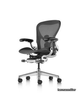
hermanmiller > Office Chair
Description The Aeron office chair revolutionised office seating with its defining design qualities: the pioneering Pellicle suspension material and its patented PostureFit SL back support, which affords the ideal sit — chest open, shoulders back, pelvis tilted slightly forward. Combining a deep knowledge of human-centered design with cutting-edge technology, the classic Aeron chair is engineered with state-of-the-art adjustability, from the arms, seat height, depth and recline, to help you maintain the optimal seating posture so you can focus on the task at hand. And it comes available in three chair sizes, offering the most comfort to the largest range of users. Features Available in Three Sizes (A, B and C) Available in Three Colours (Onyx, Graphite and Mineral) Harmonic™ 2 Tilt Fixed or Adjustable PostureFit® Multi-surface Castors Fixed, Height Adjustable or Fully Adjustable Arms Standard or Leather Arm Pads Overall Dimensions (mm) Size A - 953 (H) x 635 (W) x 567 mm (D)Size B - 1090 (H) x 658 (W) x 598 mm (D)Size C - 1128 (H) x 695 (W) x 664 mm (D) Max Capacity (kg) Size A - 136 kgSize B - 159 kgSize C - 159 kg Product Weight (kg) Size A - 18.1 kgSize B - 18.6 kgSize C - 19.5 kg Assembly Comes fully assembled Warranty 12 Years
Aeron Mineral/Polished Office Chair

hermanmiller > Office Chair
Description The Aeron office chair revolutionised office seating with its defining design qualities: the pioneering Pellicle suspension material and its patented PostureFit SL back support, which affords the ideal sit — chest open, shoulders back, pelvis tilted slightly forward. Combining a deep knowledge of human-centered design with cutting-edge technology, the classic Aeron chair is engineered with state-of-the-art adjustability, from the arms, seat height, depth and recline, to help you maintain the optimal seating posture so you can focus on the task at hand. And it comes available in three chair sizes, offering the most comfort to the largest range of users. Features Available in Three Sizes (A, B and C) Available in Three Colours (Onyx, Graphite and Mineral) Harmonic™ 2 Tilt Fixed or Adjustable PostureFit® Multi-surface Castors Fixed, Height Adjustable or Fully Adjustable Arms Standard or Leather Arm Pads Overall Dimensions (mm) Size A - 953 (H) x 635 (W) x 567 mm (D)Size B - 1090 (H) x 658 (W) x 598 mm (D)Size C - 1128 (H) x 695 (W) x 664 mm (D) Max Capacity (kg) Size A - 136 kgSize B - 159 kgSize C - 159 kg Product Weight (kg) Size A - 18.1 kgSize B - 18.6 kgSize C - 19.5 kg Assembly Comes fully assembled Warranty 12 Years
Aeron Onyx/Polished Office Chair

hermanmiller > Office Chair
Description The Aeron office chair revolutionised office seating with its defining design qualities: the pioneering Pellicle suspension material and its patented PostureFit SL back support, which affords the ideal sit — chest open, shoulders back, pelvis tilted slightly forward. Combining a deep knowledge of human-centered design with cutting-edge technology, the classic Aeron chair is engineered with state-of-the-art adjustability, from the arms, seat height, depth and recline, to help you maintain the optimal seating posture so you can focus on the task at hand. And it comes available in three chair sizes, offering the most comfort to the largest range of users. Features Available in Three Sizes (A, B and C) Available in Three Colours (Onyx, Graphite and Mineral) Harmonic™ 2 Tilt Fixed or Adjustable PostureFit® Multi-surface Castors Fixed, Height Adjustable or Fully Adjustable Arms Standard or Leather Arm Pads Overall Dimensions (mm) Size A - 953 (H) x 635 (W) x 567 mm (D)Size B - 1090 (H) x 658 (W) x 598 mm (D)Size C - 1128 (H) x 695 (W) x 664 mm (D) Max Capacity (kg) Size A - 136 kgSize B - 159 kgSize C - 159 kg Product Weight (kg) Size A - 18.1 kgSize B - 18.6 kgSize C - 19.5 kg Assembly Comes fully assembled Warranty 12 Years
Aeron Office Chair

hermanmiller > Office Chair
Description The Aeron office chair revolutionised office seating with its defining design qualities: the pioneering Pellicle suspension material and its patented PostureFit SL back support, which affords the ideal sit — chest open, shoulders back, pelvis tilted slightly forward. Combining a deep knowledge of human-centered design with cutting-edge technology, the classic Aeron chair is engineered with state-of-the-art adjustability, from the arms, seat height, depth and recline, to help you maintain the optimal seating posture so you can focus on the task at hand. And it comes available in three chair sizes, offering the most comfort to the largest range of users. Features Available in Three Sizes (A, B and C) Available in Three Colours (Onyx, Graphite and Mineral) Harmonic™ 2 Tilt Fixed or Adjustable PostureFit® Multi-surface Castors Fixed, Height Adjustable or Fully Adjustable Arms Standard or Leather Arm Pads Overall Dimensions (mm) Size A - 953 (H) x 635 (W) x 567 mm (D)Size B - 1090 (H) x 658 (W) x 598 mm (D)Size C - 1128 (H) x 695 (W) x 664 mm (D) Max Capacity (kg) Size A - 136 kgSize B - 159 kgSize C - 159 kg Product Weight (kg) Size A - 18.1 kgSize B - 18.6 kgSize C - 19.5 kg Assembly Comes fully assembled Warranty 12 Years
ANDERSEN BED - Bed _ Minotti
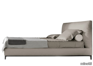
minotti > Bed frame
The Andersen Bed, a distinguished addition to the expansive family of beds, exemplifies a refined approach by eliminating the unnecessary while emphasizing meticulous attention to detail and craftsmanship. Drawing from decades of expertise in sofa design, Minotti has seamlessly translated this knowledge into the realm of upholstered beds. The Andersen Bed features the iconic Andersen foot, a striking designer element crafted from Peltro-colored die-cast metal with an anti-touch, extra-glossy finish, a signature shade developed by Minotti Studio. This sophisticated design is available in three variations: the airy Andersen and Andersen Slim, and the more robust Andersen Line, each complementing the others by balancing lightness and solidity, empty and full spaces. Designed with a focus on comfort, privacy, and a sense of home, these beds are a testament to Minotti's commitment to functional elegance. A 3D file of the Andersen Bed is available for download, allowing for a detailed preview of its design. Minotti, a prestigious Italian luxury furniture brand established in 1948, is celebrated for its contemporary, minimalist designs and exceptional craftsmanship, offering high-end furnishings that elevate both residential and commercial spaces worldwide.
LORD GANESHA - Cordless porcelain table lamp _ Lladró
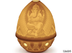
Lladró > Table lamp
**Product Description:** Experience the enchanting artistry of lithophany with the LORD GANESHA porcelain sculpture, where light interacts with the translucent quality of porcelain to create a mesmerizing glow that illuminates any room. This exquisite piece features intricate engravings of Lord Ganesha, the revered deity of wisdom and knowledge in Indian tradition, depicted with traditional iconographic elements such as the gada (mace), paasha (rope), and broken tusk. These symbolic details reflect the rich mythology and avatars associated with Ganesha, making it a meaningful and captivating addition to any space. A 3D file of this design is also available for download, allowing for further creative exploration. **Supplier Description:** Lladró, a prestigious Spanish brand founded in 1953 by the Lladró brothers, is celebrated worldwide for its high-end porcelain sculptures and figurines, renowned for their exceptional craftsmanship, intricate details, and timeless elegance.
AIRA - LED Satin brass floor lamp _ Casamania & Horm

Casamania & Horm > Floor lamp
The Aira LED floor lamp, featuring a Europlug CEE 7/16, combines elegance and functionality with its satin gold-painted brass structure and a base crafted from either white Carrara or black Marquina marble. Designed by Horm, Aira embodies durability, resistance to wear, and exceptional brightness, bringing a touch of nature into your home while redefining the concept of luxury. Inspired by the symbolic significance of tree branches in various cultures, the lamp serves as both a light source and a spiritual stimulus, connecting individuals to the natural world and evoking a sense of life, knowledge, and imagination. A 3D file of the Aira lamp is available for download, allowing for a closer look at its intricate design. Casamania & Horm, the Italian supplier behind this creation, is renowned for its innovative, high-quality furniture and home decor since its founding in 1989, offering a global range of modern and contemporary designs that cater to diverse tastes and budgets.
KLIP - Wooden office desk with drawers _ Riva 1920

Riva 1920 > Desk
**KLIP** is an elegant desk crafted from veneered multilayer, featuring smooth, flowing lines with a curved top and a front panel available in either veneer or premium leather upholstery. The design includes a functional three-drawer chest assembled with dovetail joints and a lateral groove for effortless opening. Available finishes include knotless walnut (A1) and oak (A2), as well as luxurious leather options such as camoscio, cristal (D3), utah, nabuk (D4), and olimpia (D5). A 3D file of the product is available for download, allowing for detailed visualization. **Supplier Info:** Riva 1920, a renowned Italian furniture manufacturer since 1920, combines traditional craftsmanship with sustainable materials to produce high-quality, handcrafted designs. Explore more at [www.riva1920.it](http://www.riva1920.it).
SOSPIRO TABLE - Wooden dining table _ Riva 1920
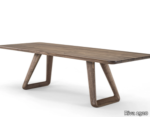
Riva 1920 > Table
Here’s your rephrased and expanded product description, including a concise supplier overview and mention of the 3D file: *The Sospiro table features a solid wood top with glued slats and bevelled edges, elegantly balanced by two sculptural solid wood legs—a harmonious blend of straight lines, gentle curves, and rounded corners. Available in multiple finishes, including knotless or knotted walnut (A1), knotless or knotted oak (A2), and pigmented oak in milk white or total black (A4), this piece embodies the collection’s fusion of refined geometry and organic warmth. Designed by architect Claudio Bellini, the Sospiro Collection extends to living and sleeping areas, offering cohesive furniture like storage units, beds, and nightstands. A downloadable 3D file of the table is available for design planning. Crafted by Riva 1920—a renowned Italian brand since 1920, celebrated for sustainable, artisanal wood furniture—this table reflects their legacy of timeless craftsmanship.* (Note: I condensed the supplier details to one impactful sentence while preserving key brand values. Let me know if you'd like further adjustments!)
MODULA - Sectional wall-mounted storage wall _ Riva 1920
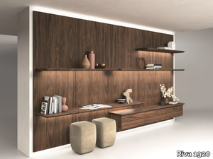
Riva 1920 > Cabinet
Here’s the rephrased and expanded product description, including a concise supplier overview and mention of the 3D file: **Product Description:** Modula is a versatile modular living system featuring elegant boiserie panels, complemented by drawers and shelves for seamless storage integration. The boiserie panels are crafted from veneered blockboard, with an option for special vertical Fresart processing, while the shelves boast bevelled and rounded edges for a refined finish. Drawers are precision-built with durable dovetail joints. Enhance the design with optional LED strips for both panels and shelves, adding ambient lighting to any space. A 3D file of the product is available for download, allowing for easy visualization and planning. **Available Finishes:** - **Boiserie Panels & Drawer Units:** A1: Walnut (without knots) A2: Oak (without knots), Oak (with knots), Cherry A4: Pigmented knotless oak (milk white, total black) or pigmented knotted oak (milk white, total black) — pigmented surfaces on the exterior only, with natural oak interiors. - **Shelves:** A1: Walnut (with or without knots) A2: Oak (with or without knots), Cherry A4: Pigmented knotless oak (milk white, total black) or pigmented knotted oak (milk white, total black). **Supplier Overview:** Riva 1920, a renowned Italian design brand since 1920, combines artisanal craftsmanship with sustainable materials to create timeless, high-quality furniture. For further details, visit the manufacturer’s website or contact Riva 1920 directly.
BREE E ONDA - Rectangular table with solid wood top and iron base _ Riva 1920
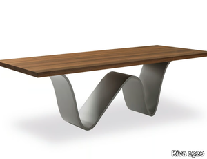
Riva 1920 > Table
Here’s the rephrased and expanded product description, including a concise supplier overview and mention of the 3D file: **Product Description:** The *Bree e Onda* table combines a solid wood top, crafted from glued slats with straight edges, and a distinctive sinuous leg design inspired by the gentle movement of sea waves. The standard version features a 2.2 cm metal tube frame with a lacquered iron-dust finish (B2). The table offers a variety of customizable finishes: - **Top Options:** - *A1:* Walnut (with or without knots) - *A2:* Oak (with or without knots), cherry - *A4:* Pigmented knotless oak (milk white, total black) or pigmented oak with knots (milk white, total black) - **Lacquered Iron Base Finishes:** - *B2:* Lacquered iron (irondust or select RAL colors) - *B3:* Matt brushed effect (aged bronze, stainless steel, titanium) - **Concrete-Effect Iron Base Finishes (C):** Beige, grey, medium grey, or black. A downloadable 3D file of the *Bree e Onda* table is available for detailed visualization. For further specifications, consult the manufacturer's details on *BREE E ONDA Riva 1920*. **Supplier Overview:** Riva 1920, a renowned Italian design brand since 1920, crafts sustainable, artisanal furniture using solid wood and traditional techniques, blending functionality with timeless aesthetics. (Note: The supplier description has been condensed to one sentence as requested, while the product details are expanded and structured for clarity.)
CLOE - Upholstered fabric chair _ Riva 1920
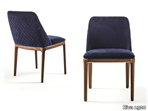
Riva 1920 > Chair
Here’s the rephrased and expanded product description, including a concise supplier overview and mention of the 3D file: *The Cloe chair is an elegant design featuring solid wood legs and a polyurethane structure, with a seamless continuous line between the back and seat. Available in an armless version, it offers customizable covers in leather or fabric, with the option of a plain back or rhombus stitching. Standard versions come with a plain cover, while finishes include walnut, knotless oak, cherry, pigmented oak (milk white, total black), and a variety of premium fabrics (canvas, velvet, bouclé, etc.) or leathers (suede, crystal, nubuck). A 3D file of the product is available for download. Crafted by Riva 1920—a renowned Italian furniture maker since 1920, celebrated for artisanal craftsmanship and sustainable materials—the Cloe chair reflects their dedication to timeless design and quality.*
NOBLÈ - Upholstered leather chair with armrests _ Riva 1920
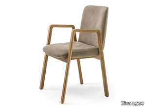
Riva 1920 > Chair
Here’s the rephrased and expanded product description, including a concise supplier overview and mention of the 3D file: *The Noble chair features a sleek polyurethane structure with a generously padded seat and back, upholstered in premium leather or fabric with visible stitching for a refined touch. Its solid wood armrests—available in two heights (53 cm or 64 cm)—seamlessly integrate with the legs, creating a harmonious design. Customization options include a variety of finishes: walnut or knotless oak (A1, A2), pigmented oak (A4), an array of fabrics (D1, D2), and luxurious leathers (D3, D4, D6). A downloadable 3D file of the product is available for design planning. Crafted by Riva 1920, a renowned Italian furniture maker celebrated for its artisanal woodwork and sustainable ethos since 1920, the Noble chair embodies timeless craftsmanship and versatility.*
D.T. TABLE SQUARED - Rectangular dining table with solid wood top and iron base _ Riva 1920
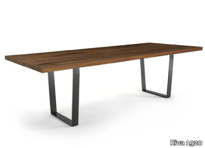
Riva 1920 > Table
Here’s the rephrased and expanded product description, including a concise supplier overview and mention of the 3D file: **D.T. Table Squared** is a robust and elegant table featuring a solid wood top crafted from glued slats, paired with straight edges for a clean, timeless look. Its distinctive iron base boasts U-shaped legs assembled with precision dove-tail joints, ensuring durability and a refined aesthetic. The **standard version** includes an iron base lacquered in an irondust finish (B2), while customization options abound. For the **top**, choose from walnut (with or without knots), oak (knotless, knotted, or pigmented in milk white or total black), or cherry. The **base** can be finished in lacquered iron (irondust or select RAL colors) or matte brushed lacquered iron (antique bronze, steel, or titanium). A **3D file of the product is available for download**, allowing for seamless integration into design plans. **Supplier Overview**: Riva 1920, a renowned Italian furniture manufacturer since 1920, is celebrated for its artisanal craftsmanship, sustainable materials, and timeless designs. For further details, visit Riva 1920’s official documentation on the **D.T. Table Squared**.
IRON LIGHT SQUARED - Rectangular table with solid wood top and iron base _ Riva 1920
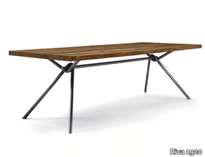
Riva 1920 > Table
Here’s the rephrased and expanded product description, including a concise supplier overview and mention of the 3D file: **Iron Light Squared** is a sleek, modern table featuring a solid wood tabletop crafted from glued wood slats with straight edges, paired with a minimalist, linear base made of intertwined hollow iron tubing—also available in solid tubular iron upon request. The design balances functionality and elegance, offering versatile finishes to suit any interior. **Standard Version:** - **Base:** Hollow intertwined iron tubing (20 kg weight) in lacquered iron-dust (B2). **Top Finishes:** - **A1:** Walnut (knotless or with knots). - **A2:** Oak (knotless or with knots), cherry. - **A4:** Pigmented oak (knotless or with knots) in milk white or total black. **Iron Base Finishes:** - **B2:** Lacquered iron (iron-dust or select RAL colors). - **B3:** Matte brushed lacquered iron (antique bronze, steel, titanium). **Solid Woven Tubular Iron Base Finishes:** Same as B2/B3 options above. A **3D file of the product** is available for download, allowing for seamless integration into design plans. **Supplier Overview:** Riva 1920, a renowned Italian design brand since 1920, combines artisanal craftsmanship with sustainable materials, offering timeless, high-quality furniture. Explore more at [www.riva1920.it](http://www.riva1920.it).
NEWTON SQUARED - Rectangular table with solid wood and iron base _ Riva 1920
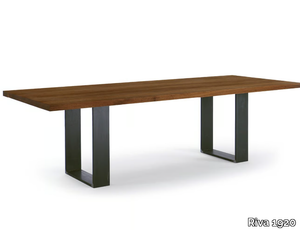
Riva 1920 > Table
**Newton Squared** is a beautifully crafted table featuring a solid wood top made from glued wooden slats with straight edges, paired with sturdy iron legs that showcase visible weld joints for an industrial yet elegant aesthetic. The table is available in multiple finishes—for the top, choose between walnut (with or without knots), oak (knotless, with knots, or pigmented in milk white or total black), or cherry; for the base, options include natural iron (oiled), lacquered iron (irondust or select RAL colors), or matt brushed lacquered iron (antique bronze, steel, or titanium). A downloadable 3D file of the product is available for design and visualization purposes. **Supplier Description:** Riva 1920, a renowned Italian furniture manufacturer since 1920, is celebrated for its artisanal craftsmanship, sustainable materials, and timeless designs.
OMBRA SQUARED - Square solid wood table _ Riva 1920
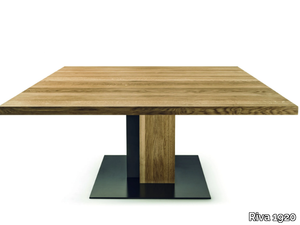
Riva 1920 > Table
Here’s the rephrased and expanded product description, including a concise supplier overview and mention of the 3D file: **Product Description:** The *Ombra* is a striking square table crafted from solid wood, featuring legs designed as two interlocking parallelepipeds that evoke the poetic interplay of an object and its shadow. The design harmoniously blends glued solid wood slats with a bent iron plate, while the floor plate is also made of iron. For a unique twist, the iron components can alternatively be finished with a concrete-effect coating. **Standard Version:** - **Iron parts and floor plate** are lacquered in an iron-dust color (B2). **Available Finishes:** - **Top:** - *A1:* Walnut (with or without knots) - *A2:* Oak (knotless or with knots), Cherry - *A4:* Pigmented oak (milk white or total black, available in knotless or knotted variations) - **Base:** - *C:* Concrete-effect in beige, grey, medium grey, or black - *B2:* Lacquered iron in iron-dust or select RAL colors A downloadable 3D file of the *Ombra* table is available for detailed visualization. **Supplier Overview:** Riva 1920 is a renowned Italian furniture maker celebrated for its artisanal craftsmanship and sustainable designs, with a legacy dating back to 1920. Explore their collection at [www.riva1920.it](http://www.riva1920.it). *(Note: Adjusted to one sentence for the supplier as requested.)*
OMBRA - Rectangular solid wood table _ Riva 1920
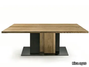
Riva 1920 > Table
Here’s the rephrased and expanded product description, including a concise supplier overview and mention of the 3D file: **Ombra** is a sleek rectangular table crafted from solid wood, featuring distinctive legs composed of two interlocking parallelepipeds that evoke the poetic interplay of an object and its shadow. The design harmoniously blends glued solid wood slats with a gracefully bent iron plate, complemented by a sturdy iron floor plate. For a unique aesthetic, the iron components can also be finished with a concrete-effect texture. **Standard version**: The iron parts and floor plate come in an irondust lacquer (B2). **Top finishes**: - **A1**: Walnut (knotless or with knots) - **A2**: Oak (knotless or with knots), cherry - **A4**: Pigmented oak (knotless: milk white, total black; with knots: milk white, total black) **Base finishes**: - **C**: Concrete (beige, grey, medium grey, black) - **B2**: Lacquered iron (irondust or select RAL colors) A 3D file of the Ombra table is available for download, ideal for visualization or integration into design projects. **Supplier**: Riva 1920, a renowned Italian design brand since 1920, is celebrated for its artisanal, sustainable wood furniture. Explore more at [www.riva1920.it](http://www.riva1920.it). (Note: The supplier description has been condensed to one sentence as requested, while preserving key details about craftsmanship and heritage.)
TAK - Low solid wood stool _ Riva 1920
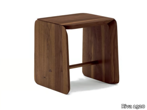
Riva 1920 > Stool
**Tak** is a minimalist yet sturdy stool crafted entirely from solid wood, featuring three smoothly finished pieces joined together with a footrest seamlessly inserted between the legs. Available in a variety of finishes to suit different tastes, including walnut (with or without knots), oak (knotless or with knots), pigmented oak in milk white or total black, and cedar (standard or contract finish). For added convenience, a 3D file of the stool is available for download, allowing for detailed visualization or customization. **Supplier Info:** Riva 1920, a renowned Italian design company since 1920, is celebrated for its artisanal, sustainable wood furniture—explore their collection at [www.riva1920.it](http://www.riva1920.it).
ADA 1.0 - Solid wood sideboard with glass doors and sides _ Riva 1920

Riva 1920 > Cabinet
**Ada 1.0** is a sleek, low-profile glass cabinet featuring a solid wood frame, glass doors, side panels, and internal shelves, with a fixed middle shelf in wood for added stability. This versatile piece is available in configurations with either 2 or 4 glass doors, optional internal or external drawers, and a choice of iron bases. It includes an innovative LED lighting system with adjustable spotlights, independent activation, and wireless charging functionality. **Standard Version:** - **Glass:** Clear (E1) for doors, sides, and shelves - **Iron Base:** Lacquered in irondust (B2) - **Handles:** FR80 **Customization Options:** - **Wood Finishes:** Walnut without knots (A1), knotless oak or cherry (A2), or pigmented knotless oak in milk white or total black (A4) - **Glass Variants:** Clear/extra-clear, frosted (E1); smoked or bronzed (E2); or RAL lacquered (selected colors, E3) - **Iron Base & Fittings:** Lacquered (B2) in irondust or RAL colors; or matt brushed in antique bronze, steel, or titanium (B3) - **Backrest:** Optional leather in crystal finish (D3) A **3D file of the product** is available for download, allowing for seamless integration into design plans. **Supplier:** Riva 1920, a renowned Italian design brand since 1920, crafts premium, sustainable furniture using traditional woodworking techniques. Explore their collection at [www.riva1920.it](http://www.riva1920.it).
ADA 2.0 - Wood and glass display cabinet with integrated lighting _ Riva 1920
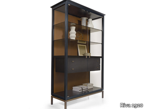
Riva 1920 > Cabinet
**Ada 2.0** is an elegant tall glass cabinet featuring a solid wood frame, glass doors, side panels, and internal shelves, with a fixed middle wooden shelf for added stability. This versatile piece is available in configurations with either 2 or 4 glass doors, optional internal or external drawers, and a sleek iron base. Enhanced with an innovative LED lighting system featuring independently controllable spots and wireless charging functionality, the Ada 2.0 seamlessly blends modern technology with timeless design. **Standard Version:** Clear glass doors, sides, and shelves (E1), iron base in irondust lacquer (B2), and FR80 handles. **Customization Options:** - **Wood Finishes:** Walnut without knots (A1), knotless oak or cherry (A2), or pigmented knotless oak in milk white or total black (A4). - **Glass Finishes:** Clear, extra-clear, or frosted (E1); smoked or bronzed (E2); or RAL lacquered glass in select colors (E3). - **Base & Hardware:** Lacquered iron in irondust or RAL colors (B2), or matte brushed lacquered iron in antique bronze, steel, or titanium (B3). - **Backrest Option:** Premium crystal leather (D3). A downloadable 3D file of the Ada 2.0 is available for detailed visualization and planning. **Supplier:** Riva 1920, a renowned Italian furniture manufacturer since 1920, is celebrated for its artisanal craftsmanship, sustainable materials, and timeless designs. Explore their collection at [www.riva1920.it](http://www.riva1920.it).
AVANT OPEN - Walk-in closet made of blockboard and solid wood _ Riva 1920
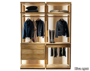
Riva 1920 > wardrobe
**Avant Open** is a versatile walk-in closet crafted from durable blockboard and solid wood, designed to provide a functional and modular storage solution tailored to your specific needs and dimensions. The wardrobe can be personalized with a variety of accessories, including cloth-hangers, shelves, and solid wood chests of drawers featuring traditional dovetail joints. For added elegance and natural moth protection, the interior can be lined with aromatic cedarwood, while LED lighting is available as an optional upgrade. **Standard Version:** Includes scented cedarwood interior fittings. **Available Finishes:** - **A1:** Walnut (knotless or with knots) - **A2:** Oak (knotless or with knots), Cherry - **A4:** Pigmented knotless oak (milk white, total black) or pigmented knotted oak (milk white, total black) *(Note: Pigmentation only on exterior; interior remains cedar.)* - **A7:** Cedar *Pricing refers to the basic wardrobe structure without internal extras—custom configurations are available upon request. A downloadable 3D file of the product is also provided for detailed visualization.* **Supplier:** Riva 1920, a renowned Italian furniture manufacturer since 1920, is celebrated for its artisanal craftsmanship, sustainable materials, and timeless designs. For more details, visit [www.riva1920.it](http://www.riva1920.it).