


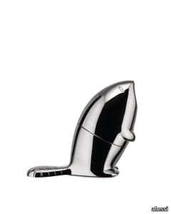
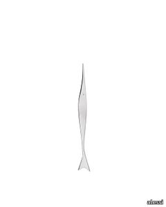
PRODUCT DESCRIPTION
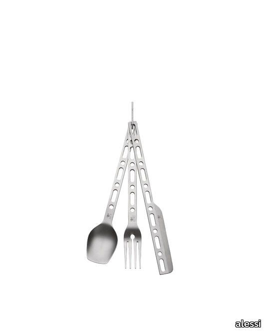
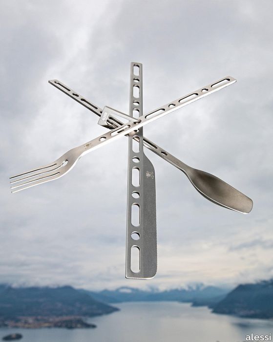
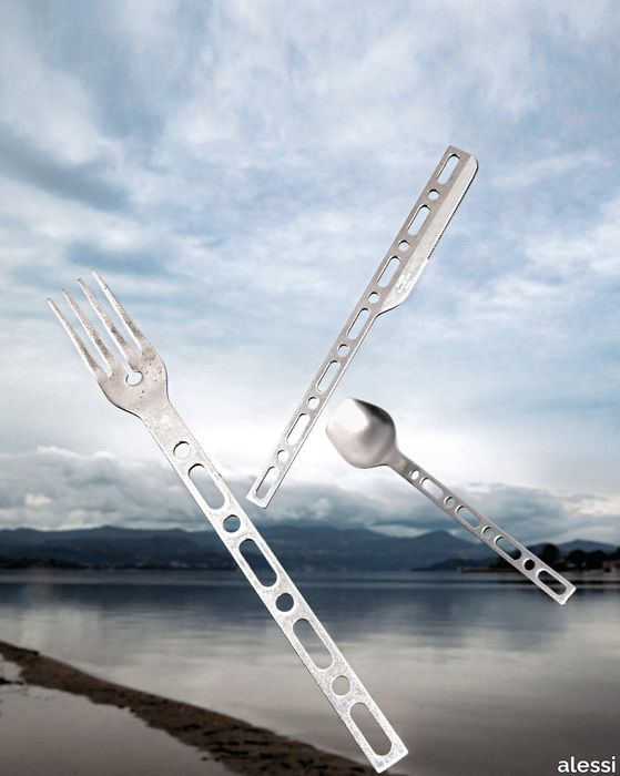
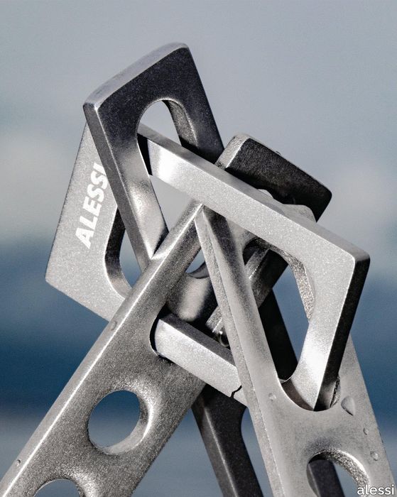
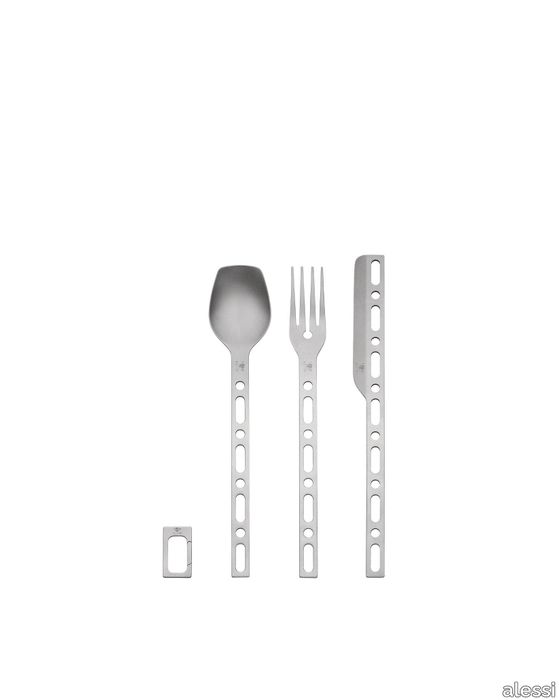
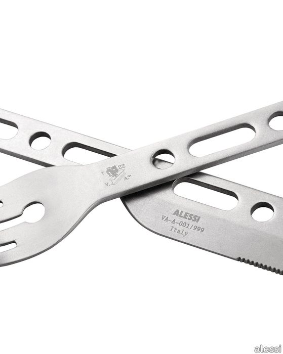
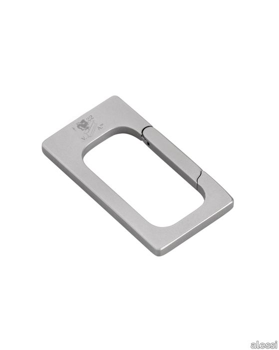
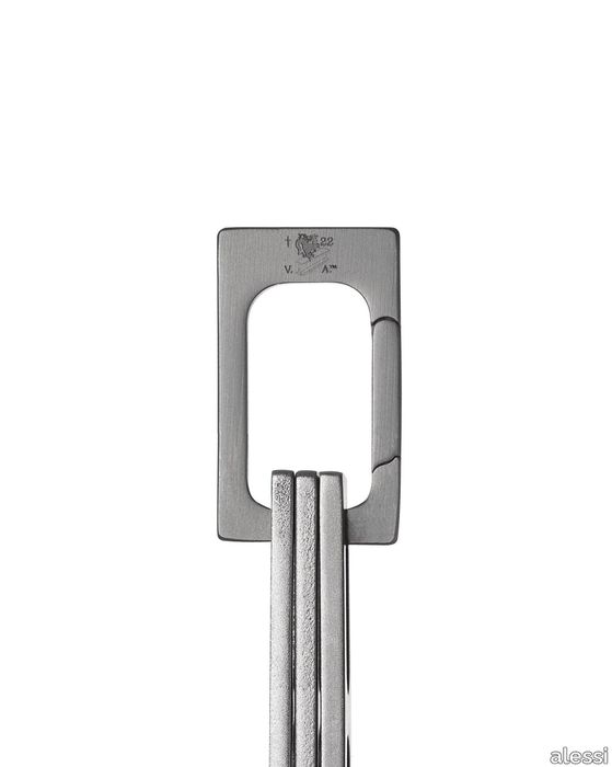
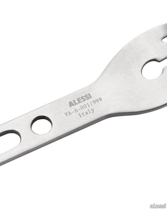
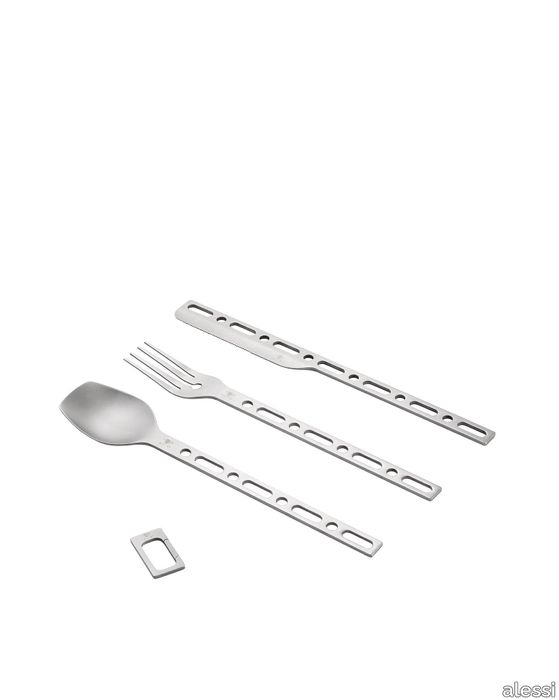
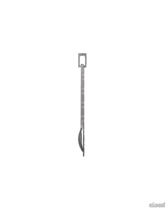
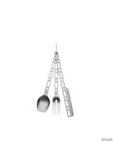
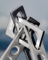
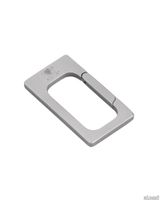
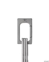
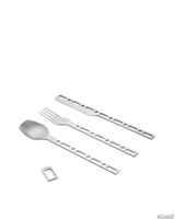
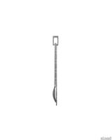
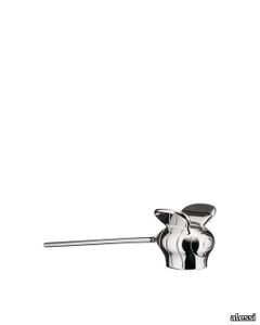
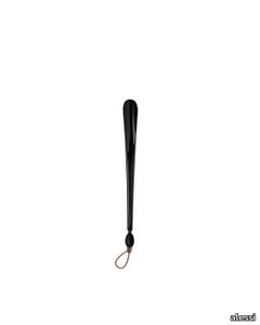
Cutlery set: spoon, fork, knife with carabiner in 18/10 stainless steel. Limited edition of 999 numbered copies and 3 artist's proofs.
SUPPLIER: ALESSI
TYPE: STYLING

OTHER SUPPLIERS
A wide range of product from near to 3,000 suppliers around the world.


Other Products From This Supplier
A wide range of product from furniture to finishes to meet the desire of all designers.
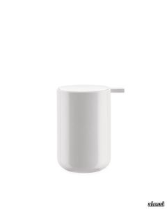

The Five Seasons
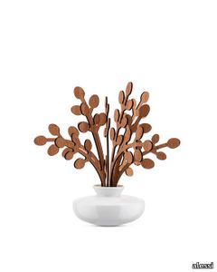
alessi > Styling
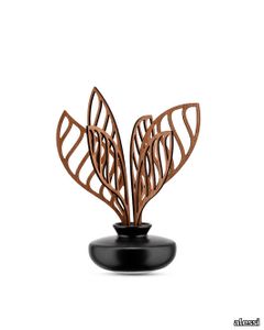
Leaf fragrance diffuser in porcelain. Leaves in mahogany wood. Brrr.
The Five Seasons
alessi > Styling
Leaf fragrance diffuser in porcelain. Leaves in mahogany wood. Brrr.

Recently Viewed Products
A wide range of product from furniture to finishes to meet the desire of all designers.
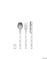
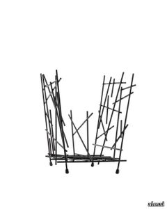
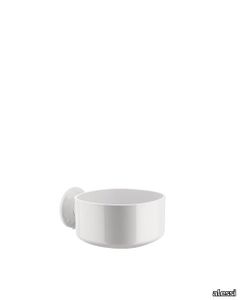
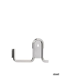
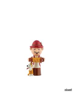
Occasional Object

alessi > Styling
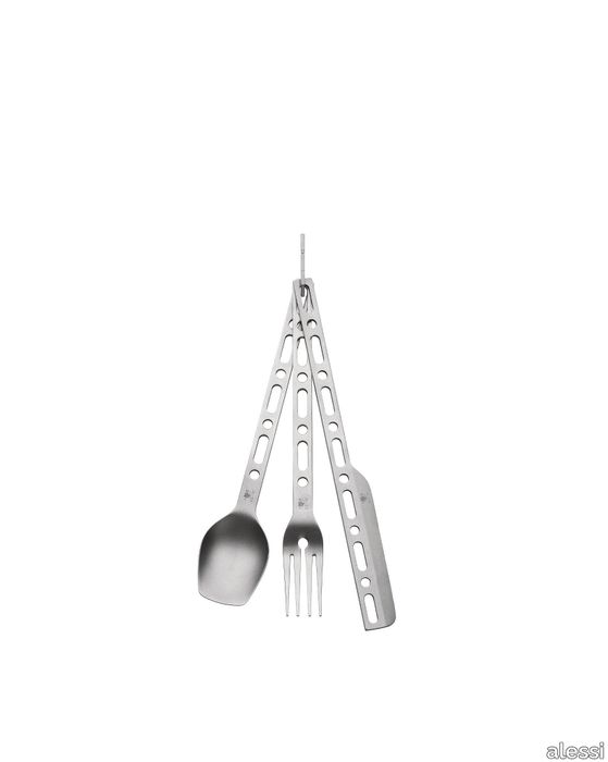
Cutlery set: spoon, fork, knife with carabiner in 18/10 stainless steel. Limited edition of 999 numbered copies and 3 artist's proofs.
INNESTI - Round table _ Bonaldo
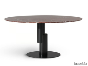
bonaldo > Table
The Innesti round table, designed by Paolo Grasselli for Bonaldo, is a striking piece of furniture that captivates with its unique optical illusion, creating the impression of a floating tabletop. The base and top are seamlessly connected by an unexpected yet harmonious joint, giving the table a sculptural presence that becomes the focal point of any living space. Customization options allow for a variety of materials, including marble, wood, and ceramic for the top, paired with different metal finishes for the base, ensuring it complements any interior style. A 3D file of the product is available for download, making it easier for designers and architects to visualize and integrate this masterpiece into their projects. Bonaldo, a prestigious Italian furniture brand founded in 1936 and based in Padua, is celebrated for its innovative, high-quality designs that blend cutting-edge technology with timeless Italian craftsmanship, offering a wide range of luxury furniture for residential, hospitality, and commercial spaces.
Recommended Products
A wide range of product from furniture to finishes to meet the desire of all designers.
Silent Vase
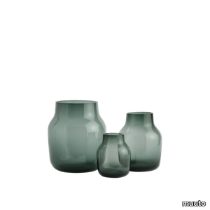
muuto > Styling
A form in mouth blown glass, the Silent Vase is Scandinavian design at its subtlest. Available in three sizes and multiple colors, the Silent Vase is a humble yet decorative addition to any space.
Avail Coat Rack
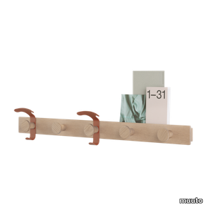
muuto > Styling
Designed with Scandinavian materiality at its heart, the Avail Coat Rack brings the ideas of simplicity and functionality into the modern home. The design features 2 metal hooks that can be rearranged forever while also bringing hints of color to the form, allowing for the Avail Coat Rack to evolve as time passes while holding smaller objects on its minute plateau.
Story Pinboard
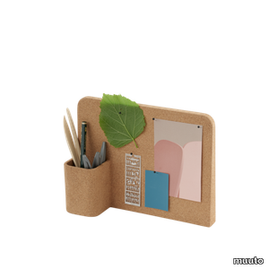
muuto > Styling
The Story Pinboard brings subtle feelings of Scandinavian design into any work or creative context, whether in the home office, in a kids room or within the workplace. Produced in cork, a material that is sourced from the renewable bark of cork oak trees, the Story Pinboard is recyclable in its entirety.
Dots Ceramic
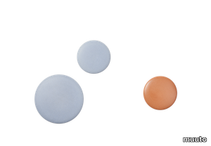
muuto > Styling
The Dots Ceramic bring an artful expression to a Muuto icon, made in earthenware with a reactive glaze for a unique look, giving each single piece a distinct look while referencing the ideas of traditional craftsmanship. Combine the design across various colors and sizes along with the Dots Wood and Dots Metal for a unique expression.
Jellies coat hangers (2 pieces)
kartell > Styling
The Jellies coat hangers draw their inspiration from the tableware collection of the same name designed by Patricia Urquiola for Kartell. This accessory is available in three different sizes, each with its own specific texture.
Shanghai
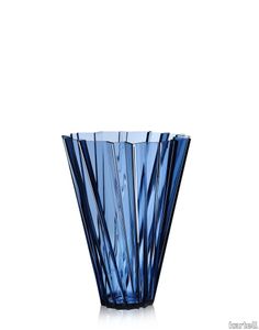
kartell > Styling
A multi-faceted vase widening from the base to the top in a swirling motion. Shanghai is like refracted light radiating from prism-like crystals with an alternating play of flashes and shadows, creating irregular geometric forms.
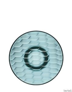
Matelasse'
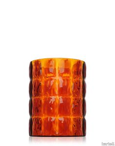
kartell > Styling
The distinctive feature and special allure of these original vases lie in their particular conformation, suggestive of a wafed fabric with irregular sinuosities caused by the different surface thicknesses.
Jelly
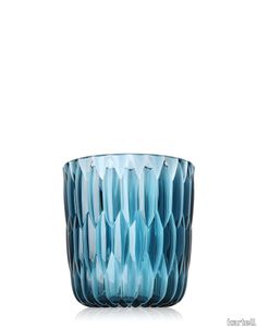
kartell > Styling
The special feature of this series lies in the conformation of the surface material which enhances the core that looks like jelly, just as the name suggests, evocative of the forms used in pastry-making.
All saints
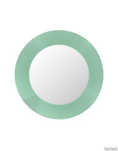
kartell > Styling
Round mirror with a transparent or coloured frame, with a unique pleated effect.
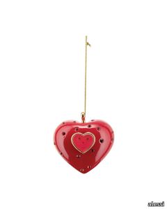
H-45 Red Heart

Elica Studio > Styling
H-45 Red Heart Material Porcelain, glaze Finishing Matte Sizes (cm) 24X26X17 Weight (g) 1150 Designed in 2017 Collection In alto i Cuori The H-45 Red Heart is an expressive sculptural object meticulously crafted from high-quality porcelain and finished with a lustrous red glaze. Part of Elica Studio’s evocative In alto i Cuori collection, this piece stands at 45 cm tall, offering a bold yet refined statement for interior designers seeking meaningful styling objects. The design is anatomically inspired, presenting the human heart not as a clinical model but as an artistic symbol of emotion, passion, and vitality. The intense red surface is glossy and light-reactive, accentuating every curve, vessel, and contour. These anatomical details are stylised yet recognisable—merging precision with abstraction in a way that invites closer inspection and interpretation. Its vibrant hue and dynamic form create immediate visual tension and emotional impact, making it an ideal focal point in a wide range of interiors. Whether used as a standalone piece in a minimal setting or incorporated into a curated display with eclectic artworks and design elements, the H-45 Red Heart commands presence without overwhelming the space. Weighing approximately 3 kilograms, this porcelain piece is both substantial and manageable. It can be placed on shelves, pedestals, or feature walls in residential or commercial projects. Ideal placements include living rooms, hospitality lounges, wellness areas, or even medical-themed interiors, where the symbolism of the heart resonates deeply with the function of the space. For designers working with narrative-driven environments, the H-45 Red Heart becomes more than an object—it’s a storytelling device. It evokes themes of love, resilience, fragility, and life itself. The handcrafted nature of the piece ensures that no two are identical, bringing a layer of authenticity and uniqueness to every project. This object exemplifies Elica Studio’s approach to design: blending the precision of Italian craftsmanship with conceptual depth and visual drama. It’s not merely decor—it’s a sculptural artefact with emotional gravity, designed to provoke thought and enhance atmosphere. The In alto i Cuori collection continues to be a vital source of inspiration for designers seeking objects that transcend trends and engage with timeless human themes. The H-45 Red Heart is a prime example—an unforgettable styling piece for interior professionals who value narrative, materiality, and presence.
UPHOLSTERY
A wide range of Upholstery and materials provided by our suppliers to satisfy your needs.
auckland - 7071.18

Upholstery > vescom
auckland - 7071.28

Upholstery > vescom
harding - 7070.07

Upholstery > vescom
harding - 7070.08

Upholstery > vescom
furka plus - 7064.14

Upholstery > vescom
acton - 7062.20

Upholstery > vescom
leone plus - 7054.02

Upholstery > vescom
noss - 7058.13

Upholstery > vescom
lani - 7060.49

Upholstery > vescom
wolin - 7050.32

Upholstery > vescom
wolin - 7050.35

Upholstery > vescom
hestan - 7035.11

Upholstery > vescom
hestan - 7035.22

Upholstery > vescom
cyprus - 7038.15

Upholstery > vescom
lindau - 7028.01

Upholstery > vescom
lindau - 7028.09
Upholstery > vescom
dalma - 7024.13

Upholstery > vescom
dalma - 7024.14

Upholstery > vescom