Buildtech/2.0 Build Coal TU

florim > Wallcovering
Buildtech/2.0 assures the realization of ever-current projects To the four colors, White, Bone, Mud and Coal in Tinta Unita, Granigliata and Cemento, 10 solid bold colors are being added, only intensifying the "brutality".<br />
Buildtech/2.0 Build Coal CE
florim > Wallcovering
Buildtech/2.0 assures the realization of ever-current projects To the four colors, White, Bone, Mud and Coal in Tinta Unita, Granigliata and Cemento, 10 solid bold colors are being added, only intensifying the "brutality".<br />
Buildtech/2.0 Build Mud CE
florim > Wallcovering
Buildtech/2.0 assures the realization of ever-current projects To the four colors, White, Bone, Mud and Coal in Tinta Unita, Granigliata and Cemento, 10 solid bold colors are being added, only intensifying the "brutality".<br />
Buildtech/2.0 Build Mud GG
florim > Wallcovering
Buildtech/2.0 assures the realization of ever-current projects To the four colors, White, Bone, Mud and Coal in Tinta Unita, Granigliata and Cemento, 10 solid bold colors are being added, only intensifying the "brutality".<br />
Buildtech/2.0 Build Mud TU
florim > Wallcovering
Buildtech/2.0 assures the realization of ever-current projects To the four colors, White, Bone, Mud and Coal in Tinta Unita, Granigliata and Cemento, 10 solid bold colors are being added, only intensifying the "brutality".<br />
Buildtech/2.0 Build Bone CE
florim > Wallcovering
Buildtech/2.0 assures the realization of ever-current projects To the four colors, White, Bone, Mud and Coal in Tinta Unita, Granigliata and Cemento, 10 solid bold colors are being added, only intensifying the "brutality".<br />
Buildtech/2.0 Build White CE
florim > Wallcovering
Buildtech/2.0 assures the realization of ever-current projects To the four colors, White, Bone, Mud and Coal in Tinta Unita, Granigliata and Cemento, 10 solid bold colors are being added, only intensifying the "brutality".<br />
Buildtech/2.0 Build Bone GG
florim > Wallcovering
Buildtech/2.0 assures the realization of ever-current projects To the four colors, White, Bone, Mud and Coal in Tinta Unita, Granigliata and Cemento, 10 solid bold colors are being added, only intensifying the "brutality".<br />
Buildtech/2.0 Build Bone TU
florim > Wallcovering
Buildtech/2.0 assures the realization of ever-current projects To the four colors, White, Bone, Mud and Coal in Tinta Unita, Granigliata and Cemento, 10 solid bold colors are being added, only intensifying the "brutality".<br />
Buildtech/2.0 Build White GG
florim > Wallcovering
Buildtech/2.0 assures the realization of ever-current projects To the four colors, White, Bone, Mud and Coal in Tinta Unita, Granigliata and Cemento, 10 solid bold colors are being added, only intensifying the "brutality".<br />
Buildtech/2.0 Build White TU
florim > Wallcovering
Buildtech/2.0 assures the realization of ever-current projects To the four colors, White, Bone, Mud and Coal in Tinta Unita, Granigliata and Cemento, 10 solid bold colors are being added, only intensifying the "brutality".<br />
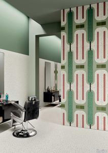
Chimera Radici Beige
florim > Wallcovering
In <em>Chimera,</em> Elena Salmistraro merges rigour with self-expression, in a graphic grammar laden with symbolic meaning. <em>Empatia </em>speaks to the emotions with graphics that interpret, through a highly individual abstract code, the stage make-up of a clown, with the aid of superimposed geometric forms and images. <em>Radici </em>is a tribal statement, a tribute to primitive ritual custom, evoked by the interplay between a sequence of triangles and rectangles and a set of figurative fragments. <em>Ritmo</em> is inspired by fabrics, suggesting the rhythmic alternation of woven yarns through a largely linear pattern. In <em>Colore, </em>the upheaval of a background of small isolated spots generated by a parametric digital program is combined with densely packed repeated forms. "The Chimera collection is rather like a book with four different chapters: I set out to differentiate these graphic motifs to create four totally different stories."<br></br>Elena Salmistraro It all starts with drawing. A <em>passion</em> for drawing. An <em>obsession</em> with drawing. Drawings like spider-webs, obsessively filling spaces, in a kind of manual choreography or gymnastics, a continuous flow. Elena Salmistraro draws all the time. She draws everywhere. Mostly on loose sheets or random surfaces. First and foremost with pen and pencil. Her drawings only acquire colour at a later stage. Often - just like Alessandro Mendini used to do - she draws "monsters": fascinating yet disturbing, subversive forms. The denser, more contorted the shape, the more obvious its underlying truth. For Elena, drawing is an intimate act. It is relaxing. And therapeutic. With an unrivalled communicative strength. Because drawing gives shape to ideas: you both give form to the world and reveal yourself. This passion, combined with natural graphic talent, has guided Elena Salmistraro in her project for Cedit: an experimental series of ceramic slabs produced using a high-definition 3D decorative technique. The explicit aim is to transform surfaces beyond their original flatness so that a new, visual and tactile, three-dimensional personality emerges, sweeping aside the coldness and uniformity that ceramic objects often inevitably convey.Elena Salmistraro has always viewed ceramics as a democratic material, in view of their accessibility, and the infinite potentials for shaping matter that they provide. She began working and experimenting with ceramics very early in her career, just after she graduated from the Milan Politecnico in 2008. She came into contact with small artistic craft firms specialising in smallproduction lots, and cut her teeth on projects that demanded the hand-processing of every detail, and finishes of high artistic value, for the high end of the market. The large corporations and galleries came later, but here again Elena kept faith with her desire to make mass-produced pieces unique, and to combine artistic value with specifically industrial characteristics. The monkey-shaped <em>Primates</em> vases reflect this method and intention, aiming to excite, surprise and charm. Antiminimalist and hyper-figurative, playful, ironic and a rich image-maker, often drawing on anthropology and magic, over the years Salmistraro has built up her own fantastic universe, inhabited by ceramic bestiaries, painted jungles and a cabinet like a one-eyed cyclops , always finding inspiration and inputs in nature and always aiming to reveal the extraordinary in the everyday. Given this background, it was almost inevitable she would work with Cedit: constantly seeking new talents and new approaches, as well as designs that break down the boundaries of ceramics and release them into the realm of art and innovation, the Modena company has recognised Elena Salmistraro as a leading contemporary creative spirit and involved her in a project intended to experiment with fresh ideas in materials and synaesthetics.Salmistraro's collection for Cedit is entitled <em>Chimera</em> and consists of large ceramic slabs, which can be enjoyed not only visually, through their patterns and colours, but also on a tactile level. Like the chimera in the "grotesque" tradition, monstrous in the etymological sense of the word with its merging of hybrid animal and vegetable shapes, the Cedit project attempts to originate a synaesthetic form of ceramics, through a three-dimensional development that exactly reproduces the texture of leathers and fabrics, creating an absolutely new kind of layered effect, with a tactile awareness that recalls the passion of grand master Ettore Sottsass for "surfaces that talk". And the surfaces of the slabs Salmistraro has created really seem to talk: in <em>Empatia </em>clown faces add theatricality to the cold gleam of marbles, interspersed with references to Art Déco graphics; <em>Radici</em> uses the textures of leathers and hide as if to re-establish a link between ceramics and other materials at the origins of human activity and creativity; in <em>Ritmo</em> the texture of cloth dialogues with pottery, almost in homage to the tactile rationalism of warp and weft, of which Bauhaus pioneer Anni Albers was one of the most expressive past interpreters ; finally, <em>Colore</em> has a spotted base generated by computer to underline the contrast between analogue and digital, the graphic sign and the matter into which it is impressed. It is an aesthetic of superimposition and mixing, and especially of synaesthesia: as in her drawings, in the <em>Chimera </em>slabs Elena Salmistraro's art is one of movement and acceleration. A process not of representation but of exploration. Of the world and of oneself. Almost a kind of Zen, for distancing oneself from the world to understand it more fully. In every sense.
Chimera Ritmo Beige
florim > Wallcovering
In <em>Chimera,</em> Elena Salmistraro merges rigour with self-expression, in a graphic grammar laden with symbolic meaning. <em>Empatia </em>speaks to the emotions with graphics that interpret, through a highly individual abstract code, the stage make-up of a clown, with the aid of superimposed geometric forms and images. <em>Radici </em>is a tribal statement, a tribute to primitive ritual custom, evoked by the interplay between a sequence of triangles and rectangles and a set of figurative fragments. <em>Ritmo</em> is inspired by fabrics, suggesting the rhythmic alternation of woven yarns through a largely linear pattern. In <em>Colore, </em>the upheaval of a background of small isolated spots generated by a parametric digital program is combined with densely packed repeated forms. "The Chimera collection is rather like a book with four different chapters: I set out to differentiate these graphic motifs to create four totally different stories."<br></br>Elena Salmistraro It all starts with drawing. A <em>passion</em> for drawing. An <em>obsession</em> with drawing. Drawings like spider-webs, obsessively filling spaces, in a kind of manual choreography or gymnastics, a continuous flow. Elena Salmistraro draws all the time. She draws everywhere. Mostly on loose sheets or random surfaces. First and foremost with pen and pencil. Her drawings only acquire colour at a later stage. Often - just like Alessandro Mendini used to do - she draws "monsters": fascinating yet disturbing, subversive forms. The denser, more contorted the shape, the more obvious its underlying truth. For Elena, drawing is an intimate act. It is relaxing. And therapeutic. With an unrivalled communicative strength. Because drawing gives shape to ideas: you both give form to the world and reveal yourself. This passion, combined with natural graphic talent, has guided Elena Salmistraro in her project for Cedit: an experimental series of ceramic slabs produced using a high-definition 3D decorative technique. The explicit aim is to transform surfaces beyond their original flatness so that a new, visual and tactile, three-dimensional personality emerges, sweeping aside the coldness and uniformity that ceramic objects often inevitably convey.Elena Salmistraro has always viewed ceramics as a democratic material, in view of their accessibility, and the infinite potentials for shaping matter that they provide. She began working and experimenting with ceramics very early in her career, just after she graduated from the Milan Politecnico in 2008. She came into contact with small artistic craft firms specialising in smallproduction lots, and cut her teeth on projects that demanded the hand-processing of every detail, and finishes of high artistic value, for the high end of the market. The large corporations and galleries came later, but here again Elena kept faith with her desire to make mass-produced pieces unique, and to combine artistic value with specifically industrial characteristics. The monkey-shaped <em>Primates</em> vases reflect this method and intention, aiming to excite, surprise and charm. Antiminimalist and hyper-figurative, playful, ironic and a rich image-maker, often drawing on anthropology and magic, over the years Salmistraro has built up her own fantastic universe, inhabited by ceramic bestiaries, painted jungles and a cabinet like a one-eyed cyclops , always finding inspiration and inputs in nature and always aiming to reveal the extraordinary in the everyday. Given this background, it was almost inevitable she would work with Cedit: constantly seeking new talents and new approaches, as well as designs that break down the boundaries of ceramics and release them into the realm of art and innovation, the Modena company has recognised Elena Salmistraro as a leading contemporary creative spirit and involved her in a project intended to experiment with fresh ideas in materials and synaesthetics.Salmistraro's collection for Cedit is entitled <em>Chimera</em> and consists of large ceramic slabs, which can be enjoyed not only visually, through their patterns and colours, but also on a tactile level. Like the chimera in the "grotesque" tradition, monstrous in the etymological sense of the word with its merging of hybrid animal and vegetable shapes, the Cedit project attempts to originate a synaesthetic form of ceramics, through a three-dimensional development that exactly reproduces the texture of leathers and fabrics, creating an absolutely new kind of layered effect, with a tactile awareness that recalls the passion of grand master Ettore Sottsass for "surfaces that talk". And the surfaces of the slabs Salmistraro has created really seem to talk: in <em>Empatia </em>clown faces add theatricality to the cold gleam of marbles, interspersed with references to Art Déco graphics; <em>Radici</em> uses the textures of leathers and hide as if to re-establish a link between ceramics and other materials at the origins of human activity and creativity; in <em>Ritmo</em> the texture of cloth dialogues with pottery, almost in homage to the tactile rationalism of warp and weft, of which Bauhaus pioneer Anni Albers was one of the most expressive past interpreters ; finally, <em>Colore</em> has a spotted base generated by computer to underline the contrast between analogue and digital, the graphic sign and the matter into which it is impressed. It is an aesthetic of superimposition and mixing, and especially of synaesthesia: as in her drawings, in the <em>Chimera </em>slabs Elena Salmistraro's art is one of movement and acceleration. A process not of representation but of exploration. Of the world and of oneself. Almost a kind of Zen, for distancing oneself from the world to understand it more fully. In every sense.
Chimera Radici Grigio
florim > Wallcovering
In <em>Chimera,</em> Elena Salmistraro merges rigour with self-expression, in a graphic grammar laden with symbolic meaning. <em>Empatia </em>speaks to the emotions with graphics that interpret, through a highly individual abstract code, the stage make-up of a clown, with the aid of superimposed geometric forms and images. <em>Radici </em>is a tribal statement, a tribute to primitive ritual custom, evoked by the interplay between a sequence of triangles and rectangles and a set of figurative fragments. <em>Ritmo</em> is inspired by fabrics, suggesting the rhythmic alternation of woven yarns through a largely linear pattern. In <em>Colore, </em>the upheaval of a background of small isolated spots generated by a parametric digital program is combined with densely packed repeated forms. "The Chimera collection is rather like a book with four different chapters: I set out to differentiate these graphic motifs to create four totally different stories."<br></br>Elena Salmistraro It all starts with drawing. A <em>passion</em> for drawing. An <em>obsession</em> with drawing. Drawings like spider-webs, obsessively filling spaces, in a kind of manual choreography or gymnastics, a continuous flow. Elena Salmistraro draws all the time. She draws everywhere. Mostly on loose sheets or random surfaces. First and foremost with pen and pencil. Her drawings only acquire colour at a later stage. Often - just like Alessandro Mendini used to do - she draws "monsters": fascinating yet disturbing, subversive forms. The denser, more contorted the shape, the more obvious its underlying truth. For Elena, drawing is an intimate act. It is relaxing. And therapeutic. With an unrivalled communicative strength. Because drawing gives shape to ideas: you both give form to the world and reveal yourself. This passion, combined with natural graphic talent, has guided Elena Salmistraro in her project for Cedit: an experimental series of ceramic slabs produced using a high-definition 3D decorative technique. The explicit aim is to transform surfaces beyond their original flatness so that a new, visual and tactile, three-dimensional personality emerges, sweeping aside the coldness and uniformity that ceramic objects often inevitably convey.Elena Salmistraro has always viewed ceramics as a democratic material, in view of their accessibility, and the infinite potentials for shaping matter that they provide. She began working and experimenting with ceramics very early in her career, just after she graduated from the Milan Politecnico in 2008. She came into contact with small artistic craft firms specialising in smallproduction lots, and cut her teeth on projects that demanded the hand-processing of every detail, and finishes of high artistic value, for the high end of the market. The large corporations and galleries came later, but here again Elena kept faith with her desire to make mass-produced pieces unique, and to combine artistic value with specifically industrial characteristics. The monkey-shaped <em>Primates</em> vases reflect this method and intention, aiming to excite, surprise and charm. Antiminimalist and hyper-figurative, playful, ironic and a rich image-maker, often drawing on anthropology and magic, over the years Salmistraro has built up her own fantastic universe, inhabited by ceramic bestiaries, painted jungles and a cabinet like a one-eyed cyclops , always finding inspiration and inputs in nature and always aiming to reveal the extraordinary in the everyday. Given this background, it was almost inevitable she would work with Cedit: constantly seeking new talents and new approaches, as well as designs that break down the boundaries of ceramics and release them into the realm of art and innovation, the Modena company has recognised Elena Salmistraro as a leading contemporary creative spirit and involved her in a project intended to experiment with fresh ideas in materials and synaesthetics.Salmistraro's collection for Cedit is entitled <em>Chimera</em> and consists of large ceramic slabs, which can be enjoyed not only visually, through their patterns and colours, but also on a tactile level. Like the chimera in the "grotesque" tradition, monstrous in the etymological sense of the word with its merging of hybrid animal and vegetable shapes, the Cedit project attempts to originate a synaesthetic form of ceramics, through a three-dimensional development that exactly reproduces the texture of leathers and fabrics, creating an absolutely new kind of layered effect, with a tactile awareness that recalls the passion of grand master Ettore Sottsass for "surfaces that talk". And the surfaces of the slabs Salmistraro has created really seem to talk: in <em>Empatia </em>clown faces add theatricality to the cold gleam of marbles, interspersed with references to Art Déco graphics; <em>Radici</em> uses the textures of leathers and hide as if to re-establish a link between ceramics and other materials at the origins of human activity and creativity; in <em>Ritmo</em> the texture of cloth dialogues with pottery, almost in homage to the tactile rationalism of warp and weft, of which Bauhaus pioneer Anni Albers was one of the most expressive past interpreters ; finally, <em>Colore</em> has a spotted base generated by computer to underline the contrast between analogue and digital, the graphic sign and the matter into which it is impressed. It is an aesthetic of superimposition and mixing, and especially of synaesthesia: as in her drawings, in the <em>Chimera </em>slabs Elena Salmistraro's art is one of movement and acceleration. A process not of representation but of exploration. Of the world and of oneself. Almost a kind of Zen, for distancing oneself from the world to understand it more fully. In every sense.
Chimera Ritmo Azzurro
florim > Wallcovering
In <em>Chimera,</em> Elena Salmistraro merges rigour with self-expression, in a graphic grammar laden with symbolic meaning. <em>Empatia </em>speaks to the emotions with graphics that interpret, through a highly individual abstract code, the stage make-up of a clown, with the aid of superimposed geometric forms and images. <em>Radici </em>is a tribal statement, a tribute to primitive ritual custom, evoked by the interplay between a sequence of triangles and rectangles and a set of figurative fragments. <em>Ritmo</em> is inspired by fabrics, suggesting the rhythmic alternation of woven yarns through a largely linear pattern. In <em>Colore, </em>the upheaval of a background of small isolated spots generated by a parametric digital program is combined with densely packed repeated forms. "The Chimera collection is rather like a book with four different chapters: I set out to differentiate these graphic motifs to create four totally different stories."<br></br>Elena Salmistraro It all starts with drawing. A <em>passion</em> for drawing. An <em>obsession</em> with drawing. Drawings like spider-webs, obsessively filling spaces, in a kind of manual choreography or gymnastics, a continuous flow. Elena Salmistraro draws all the time. She draws everywhere. Mostly on loose sheets or random surfaces. First and foremost with pen and pencil. Her drawings only acquire colour at a later stage. Often - just like Alessandro Mendini used to do - she draws "monsters": fascinating yet disturbing, subversive forms. The denser, more contorted the shape, the more obvious its underlying truth. For Elena, drawing is an intimate act. It is relaxing. And therapeutic. With an unrivalled communicative strength. Because drawing gives shape to ideas: you both give form to the world and reveal yourself. This passion, combined with natural graphic talent, has guided Elena Salmistraro in her project for Cedit: an experimental series of ceramic slabs produced using a high-definition 3D decorative technique. The explicit aim is to transform surfaces beyond their original flatness so that a new, visual and tactile, three-dimensional personality emerges, sweeping aside the coldness and uniformity that ceramic objects often inevitably convey.Elena Salmistraro has always viewed ceramics as a democratic material, in view of their accessibility, and the infinite potentials for shaping matter that they provide. She began working and experimenting with ceramics very early in her career, just after she graduated from the Milan Politecnico in 2008. She came into contact with small artistic craft firms specialising in smallproduction lots, and cut her teeth on projects that demanded the hand-processing of every detail, and finishes of high artistic value, for the high end of the market. The large corporations and galleries came later, but here again Elena kept faith with her desire to make mass-produced pieces unique, and to combine artistic value with specifically industrial characteristics. The monkey-shaped <em>Primates</em> vases reflect this method and intention, aiming to excite, surprise and charm. Antiminimalist and hyper-figurative, playful, ironic and a rich image-maker, often drawing on anthropology and magic, over the years Salmistraro has built up her own fantastic universe, inhabited by ceramic bestiaries, painted jungles and a cabinet like a one-eyed cyclops , always finding inspiration and inputs in nature and always aiming to reveal the extraordinary in the everyday. Given this background, it was almost inevitable she would work with Cedit: constantly seeking new talents and new approaches, as well as designs that break down the boundaries of ceramics and release them into the realm of art and innovation, the Modena company has recognised Elena Salmistraro as a leading contemporary creative spirit and involved her in a project intended to experiment with fresh ideas in materials and synaesthetics.Salmistraro's collection for Cedit is entitled <em>Chimera</em> and consists of large ceramic slabs, which can be enjoyed not only visually, through their patterns and colours, but also on a tactile level. Like the chimera in the "grotesque" tradition, monstrous in the etymological sense of the word with its merging of hybrid animal and vegetable shapes, the Cedit project attempts to originate a synaesthetic form of ceramics, through a three-dimensional development that exactly reproduces the texture of leathers and fabrics, creating an absolutely new kind of layered effect, with a tactile awareness that recalls the passion of grand master Ettore Sottsass for "surfaces that talk". And the surfaces of the slabs Salmistraro has created really seem to talk: in <em>Empatia </em>clown faces add theatricality to the cold gleam of marbles, interspersed with references to Art Déco graphics; <em>Radici</em> uses the textures of leathers and hide as if to re-establish a link between ceramics and other materials at the origins of human activity and creativity; in <em>Ritmo</em> the texture of cloth dialogues with pottery, almost in homage to the tactile rationalism of warp and weft, of which Bauhaus pioneer Anni Albers was one of the most expressive past interpreters ; finally, <em>Colore</em> has a spotted base generated by computer to underline the contrast between analogue and digital, the graphic sign and the matter into which it is impressed. It is an aesthetic of superimposition and mixing, and especially of synaesthesia: as in her drawings, in the <em>Chimera </em>slabs Elena Salmistraro's art is one of movement and acceleration. A process not of representation but of exploration. Of the world and of oneself. Almost a kind of Zen, for distancing oneself from the world to understand it more fully. In every sense.
Earthtech CARBON_GROUND
florim > Wallcovering
From an ancient past to a responsible future <p>The collection injects new life into the earth through a sustainable production process, with a strong focus on green management, to offer the architect an exceptional technical and aesthetic performance in compliance with the socio-environmental context and the latest eco-friendly building needs. With EARTHTECH earth becomes “technical earth” with a highly innovative content, offering new solutions to green architecture and fulfilling the new frontiers of circular economy in construction, guaranteeing a sustainable future. <br />EARTHTECH offers a choice of organic textures to observe and touch, thanks to the wide range of finishes (Comfort, Glossy-Bright and structured) which add a tactile and unexpected perceptive dimension for use in all types of application. <br /><a class="btn arrow" href="https://www.florim.com/en/surfaces/the-new-comfort-surface/"> Discover the new Comfort surface </a></p> <p>EARTHTECH/ is also a return to the origins of the Florim brand through a full body technical product that blends surface and thickness and derives from the spontaneous mixing of carefully pre-selected fragments and pigments of different shades which give the material a unique, one-of-a-kind visual effect in each slab, mimicking the amazing variety of colours and elements in nature. The result is a composite product with a textured design, in which the flakes and aggregate grains create an original mélange effect that is vitrified during firing, producing a robust, high-quality and exceptionally strong and wear-resistant product; one which can be used in any type of building setting and weather conditions, even the harshest.</p>
Earthtech OUTBACK_GROUND
florim > Wallcovering
From an ancient past to a responsible future <p>The collection injects new life into the earth through a sustainable production process, with a strong focus on green management, to offer the architect an exceptional technical and aesthetic performance in compliance with the socio-environmental context and the latest eco-friendly building needs. With EARTHTECH earth becomes “technical earth” with a highly innovative content, offering new solutions to green architecture and fulfilling the new frontiers of circular economy in construction, guaranteeing a sustainable future. <br />EARTHTECH offers a choice of organic textures to observe and touch, thanks to the wide range of finishes (Comfort, Glossy-Bright and structured) which add a tactile and unexpected perceptive dimension for use in all types of application. <br /><a class="btn arrow" href="https://www.florim.com/en/surfaces/the-new-comfort-surface/"> Discover the new Comfort surface </a></p> <p>EARTHTECH/ is also a return to the origins of the Florim brand through a full body technical product that blends surface and thickness and derives from the spontaneous mixing of carefully pre-selected fragments and pigments of different shades which give the material a unique, one-of-a-kind visual effect in each slab, mimicking the amazing variety of colours and elements in nature. The result is a composite product with a textured design, in which the flakes and aggregate grains create an original mélange effect that is vitrified during firing, producing a robust, high-quality and exceptionally strong and wear-resistant product; one which can be used in any type of building setting and weather conditions, even the harshest.</p>
Earthtech SAVANNAH_GROUND
florim > Wallcovering
From an ancient past to a responsible future <p>The collection injects new life into the earth through a sustainable production process, with a strong focus on green management, to offer the architect an exceptional technical and aesthetic performance in compliance with the socio-environmental context and the latest eco-friendly building needs. With EARTHTECH earth becomes “technical earth” with a highly innovative content, offering new solutions to green architecture and fulfilling the new frontiers of circular economy in construction, guaranteeing a sustainable future. <br />EARTHTECH offers a choice of organic textures to observe and touch, thanks to the wide range of finishes (Comfort, Glossy-Bright and structured) which add a tactile and unexpected perceptive dimension for use in all types of application. <br /><a class="btn arrow" href="https://www.florim.com/en/surfaces/the-new-comfort-surface/"> Discover the new Comfort surface </a></p> <p>EARTHTECH/ is also a return to the origins of the Florim brand through a full body technical product that blends surface and thickness and derives from the spontaneous mixing of carefully pre-selected fragments and pigments of different shades which give the material a unique, one-of-a-kind visual effect in each slab, mimicking the amazing variety of colours and elements in nature. The result is a composite product with a textured design, in which the flakes and aggregate grains create an original mélange effect that is vitrified during firing, producing a robust, high-quality and exceptionally strong and wear-resistant product; one which can be used in any type of building setting and weather conditions, even the harshest.</p>
Earthtech PUMICE_GROUND
florim > Wallcovering
From an ancient past to a responsible future <p>The collection injects new life into the earth through a sustainable production process, with a strong focus on green management, to offer the architect an exceptional technical and aesthetic performance in compliance with the socio-environmental context and the latest eco-friendly building needs. With EARTHTECH earth becomes “technical earth” with a highly innovative content, offering new solutions to green architecture and fulfilling the new frontiers of circular economy in construction, guaranteeing a sustainable future. <br />EARTHTECH offers a choice of organic textures to observe and touch, thanks to the wide range of finishes (Comfort, Glossy-Bright and structured) which add a tactile and unexpected perceptive dimension for use in all types of application. <br /><a class="btn arrow" href="https://www.florim.com/en/surfaces/the-new-comfort-surface/"> Discover the new Comfort surface </a></p> <p>EARTHTECH/ is also a return to the origins of the Florim brand through a full body technical product that blends surface and thickness and derives from the spontaneous mixing of carefully pre-selected fragments and pigments of different shades which give the material a unique, one-of-a-kind visual effect in each slab, mimicking the amazing variety of colours and elements in nature. The result is a composite product with a textured design, in which the flakes and aggregate grains create an original mélange effect that is vitrified during firing, producing a robust, high-quality and exceptionally strong and wear-resistant product; one which can be used in any type of building setting and weather conditions, even the harshest.</p>
Earthtech FOG_GROUND
florim > Wallcovering
From an ancient past to a responsible future <p>The collection injects new life into the earth through a sustainable production process, with a strong focus on green management, to offer the architect an exceptional technical and aesthetic performance in compliance with the socio-environmental context and the latest eco-friendly building needs. With EARTHTECH earth becomes “technical earth” with a highly innovative content, offering new solutions to green architecture and fulfilling the new frontiers of circular economy in construction, guaranteeing a sustainable future. <br />EARTHTECH offers a choice of organic textures to observe and touch, thanks to the wide range of finishes (Comfort, Glossy-Bright and structured) which add a tactile and unexpected perceptive dimension for use in all types of application. <br /><a class="btn arrow" href="https://www.florim.com/en/surfaces/the-new-comfort-surface/"> Discover the new Comfort surface </a></p> <p>EARTHTECH/ is also a return to the origins of the Florim brand through a full body technical product that blends surface and thickness and derives from the spontaneous mixing of carefully pre-selected fragments and pigments of different shades which give the material a unique, one-of-a-kind visual effect in each slab, mimicking the amazing variety of colours and elements in nature. The result is a composite product with a textured design, in which the flakes and aggregate grains create an original mélange effect that is vitrified during firing, producing a robust, high-quality and exceptionally strong and wear-resistant product; one which can be used in any type of building setting and weather conditions, even the harshest.</p>
Earthtech DESERT_GROUND
florim > Wallcovering
From an ancient past to a responsible future <p>The collection injects new life into the earth through a sustainable production process, with a strong focus on green management, to offer the architect an exceptional technical and aesthetic performance in compliance with the socio-environmental context and the latest eco-friendly building needs. With EARTHTECH earth becomes “technical earth” with a highly innovative content, offering new solutions to green architecture and fulfilling the new frontiers of circular economy in construction, guaranteeing a sustainable future. <br />EARTHTECH offers a choice of organic textures to observe and touch, thanks to the wide range of finishes (Comfort, Glossy-Bright and structured) which add a tactile and unexpected perceptive dimension for use in all types of application. <br /><a class="btn arrow" href="https://www.florim.com/en/surfaces/the-new-comfort-surface/"> Discover the new Comfort surface </a></p> <p>EARTHTECH/ is also a return to the origins of the Florim brand through a full body technical product that blends surface and thickness and derives from the spontaneous mixing of carefully pre-selected fragments and pigments of different shades which give the material a unique, one-of-a-kind visual effect in each slab, mimicking the amazing variety of colours and elements in nature. The result is a composite product with a textured design, in which the flakes and aggregate grains create an original mélange effect that is vitrified during firing, producing a robust, high-quality and exceptionally strong and wear-resistant product; one which can be used in any type of building setting and weather conditions, even the harshest.</p>
Euridice Tela
florim > Wallcovering
The mystery and poetry of painting. Art that inhabits space. «In the past, art was expected to transfer the object, or work of art, from the inanimate to the animate world. Now, since we know that the whole world is animate, the task of the artist is to interact with the intelligence of matter.» Giorgio Griffa Born in Turin in 1936, Giorgio Griffa is now ranked as one of Italy's most important abstract painters of the Twentieth Century. He began to paint when he was very young, just 10 years old, and for two decades his work was figurative, fairly traditional in subjects and style. His mature work developed later, in the mid Sixties, in the context of the abstract-expressionist and tachiste movements, which based their language on a concept of painting as a sequence of actions, like a repeated sign or form of writing. Rather than a representation, painting became the direct expression of a mental state, a precise psychic temperature, an internal beat.Historically, his work has been classified as part of this "analytical painting" movement, which concentrated on analysing itself and its internal mechanisms: surface, substrate, colour and sign. However, Giorgio Griffa's work seems to stand apart from that of his fellow artists, and nowadays it is difficult to place it firmly within the historic analytical and conceptual painting movements. His abstract works, consisting of simple signs repeated on the canvas, seem to be not so much an analysis of the act of painting as a homage to painting itself and its history. And this is one of the delightful, central paradox's of Griffa's work: in spite of their conceptual approach, his paintings have <strong>a fascinating lyrical component, a radiant musicality, very different from the cold, unemotional mood of the neo-avantgardes</strong>.<br /> In this sense his works are something of a mystery for the art world, as lovely as they are indefinable, because in them everything seems to be at once both simple and complex. The types of canvas the artist uses (jute, hemp, cotton or linen) are simple. His painted signs are also simple, or even anonymous: a series of vertical or horizontal lines and - only from the Eighties onwards - stylised floral motifs, friezes and spirals. Yet Griffa entrusts this apparent simplicity with the task of saying what is unsayable by its very nature; of plumbing the depths of the mystery of creation and the unknown. Seemingly banal and obvious at first glance, Griffa's work is actually layered with references to the history of art, Stone Age painting, Zen philosophy, music and "“ as we have seen "“ the artistic avantgarde of his own age.All these characteristics are very much to the fore in the artist's works for CEDIT Ceramiche. For this historic brand, Griffa has created five works involving a series of lyrical, minimalist signs, which recall the motifs current in the late Sixties and Seventies. The range of colours in which these signs are presented, with complementary colours and half-tones, seem to be drawn from the Renaissance and the art of Venice and its region in the Sixteenth and Seventeenth Centuries. The other fundamental point of reference is Matisse, the painter who rejoiced in colour and in whose images signs and colours are nicely balanced.<br /> Griffa's collection for CEDIT sets out to use <strong>modular repetition of signs</strong> to build up genuine spatial environments for everyday living. The partnership with a ceramics manufacturer is a particularly fertile one for the Turin-born artist. In fact, his pictorial language "“ based on the concept of an anonymous sign open to potentially infinite repetition "“ seems to be ideally suited to large-scale reproduction and the decoration of entire interiors. The concepts of fragmentation and incompletion can be easily applied to the decoration of living-spaces of varying sizes, as if they were "portions" of a larger whole, an expanding universe. All Griffa's works use a repertoire of timeless signs, actions repeated over the millennia, on a complex trajectory that combines art, craftsmanship and decoration. In the project for CEDIT, this ancient story of experimentation with the potentialities of sign, colour and matter comes to a kind of natural, fascinating fruition.
Industrial Moka

florim > Wallcovering
A cementitious material in its purest and most rigorous form The proposed decorative system defines balanced compositions of eye-catching organic shapes where the fragmentation of the material becomes an element of creative expression.
Industrial TAUPE
florim > Wallcovering
A cementitious material in its purest and most rigorous form The proposed decorative system defines balanced compositions of eye-catching organic shapes where the fragmentation of the material becomes an element of creative expression.
Industrial Plomb
florim > Wallcovering
A cementitious material in its purest and most rigorous form The proposed decorative system defines balanced compositions of eye-catching organic shapes where the fragmentation of the material becomes an element of creative expression.
Industrial Steel
florim > Wallcovering
A cementitious material in its purest and most rigorous form The proposed decorative system defines balanced compositions of eye-catching organic shapes where the fragmentation of the material becomes an element of creative expression.
Industrial Sage
florim > Wallcovering
A cementitious material in its purest and most rigorous form The proposed decorative system defines balanced compositions of eye-catching organic shapes where the fragmentation of the material becomes an element of creative expression.
Industrial Ivory
florim > Wallcovering
A cementitious material in its purest and most rigorous form The proposed decorative system defines balanced compositions of eye-catching organic shapes where the fragmentation of the material becomes an element of creative expression.

Match-Up Liquorice

florim > Wallcovering
The union of two different materials has resulted in a contemporary, trendy project that mixes surfaces, colours and languages to offer original combinations. <p>There are two basic surfaces that can be used to create multiple combinations in line with fashions and lifestyle trends: a concrete effect with an urban and industrial aesthetic and an original marble agglomerate effect that blends tone-on- tone tactile elements with irregular shapes and varying sizes. Two seemingly very different materials – the first a symbol of modernity and innovation, the second of authenticity and tradition – coexist in a unique project that promotes and encourages combinations not only between the surfaces and colour shades in the range, but also with all the other elements that contribute to defining the space: colours, paints, fabrics, furnishings and various materials. <br />The collection offers 3 finishes - Comfort, Glossy and Grip. <br /><a class="btn arrow" href="https://www.florim.com/en/surfaces/the-new-comfort-surface/"> Discover the new Comfort surface </a></p>
Match-Up Blueberry
florim > Wallcovering
The union of two different materials has resulted in a contemporary, trendy project that mixes surfaces, colours and languages to offer original combinations. <p>There are two basic surfaces that can be used to create multiple combinations in line with fashions and lifestyle trends: a concrete effect with an urban and industrial aesthetic and an original marble agglomerate effect that blends tone-on- tone tactile elements with irregular shapes and varying sizes. Two seemingly very different materials – the first a symbol of modernity and innovation, the second of authenticity and tradition – coexist in a unique project that promotes and encourages combinations not only between the surfaces and colour shades in the range, but also with all the other elements that contribute to defining the space: colours, paints, fabrics, furnishings and various materials. <br />The collection offers 3 finishes - Comfort, Glossy and Grip. <br /><a class="btn arrow" href="https://www.florim.com/en/surfaces/the-new-comfort-surface/"> Discover the new Comfort surface </a></p>
Match-Up Coffee
florim > Wallcovering
The union of two different materials has resulted in a contemporary, trendy project that mixes surfaces, colours and languages to offer original combinations. <p>There are two basic surfaces that can be used to create multiple combinations in line with fashions and lifestyle trends: a concrete effect with an urban and industrial aesthetic and an original marble agglomerate effect that blends tone-on- tone tactile elements with irregular shapes and varying sizes. Two seemingly very different materials – the first a symbol of modernity and innovation, the second of authenticity and tradition – coexist in a unique project that promotes and encourages combinations not only between the surfaces and colour shades in the range, but also with all the other elements that contribute to defining the space: colours, paints, fabrics, furnishings and various materials. <br />The collection offers 3 finishes - Comfort, Glossy and Grip. <br /><a class="btn arrow" href="https://www.florim.com/en/surfaces/the-new-comfort-surface/"> Discover the new Comfort surface </a></p>
Match-Up Cinnamon
florim > Wallcovering
The union of two different materials has resulted in a contemporary, trendy project that mixes surfaces, colours and languages to offer original combinations. <p>There are two basic surfaces that can be used to create multiple combinations in line with fashions and lifestyle trends: a concrete effect with an urban and industrial aesthetic and an original marble agglomerate effect that blends tone-on- tone tactile elements with irregular shapes and varying sizes. Two seemingly very different materials – the first a symbol of modernity and innovation, the second of authenticity and tradition – coexist in a unique project that promotes and encourages combinations not only between the surfaces and colour shades in the range, but also with all the other elements that contribute to defining the space: colours, paints, fabrics, furnishings and various materials. <br />The collection offers 3 finishes - Comfort, Glossy and Grip. <br /><a class="btn arrow" href="https://www.florim.com/en/surfaces/the-new-comfort-surface/"> Discover the new Comfort surface </a></p>
Match-Up Cookie
florim > Wallcovering
The union of two different materials has resulted in a contemporary, trendy project that mixes surfaces, colours and languages to offer original combinations. <p>There are two basic surfaces that can be used to create multiple combinations in line with fashions and lifestyle trends: a concrete effect with an urban and industrial aesthetic and an original marble agglomerate effect that blends tone-on- tone tactile elements with irregular shapes and varying sizes. Two seemingly very different materials – the first a symbol of modernity and innovation, the second of authenticity and tradition – coexist in a unique project that promotes and encourages combinations not only between the surfaces and colour shades in the range, but also with all the other elements that contribute to defining the space: colours, paints, fabrics, furnishings and various materials. <br />The collection offers 3 finishes - Comfort, Glossy and Grip. <br /><a class="btn arrow" href="https://www.florim.com/en/surfaces/the-new-comfort-surface/"> Discover the new Comfort surface </a></p>
Match-Up Earl Grey
florim > Wallcovering
The union of two different materials has resulted in a contemporary, trendy project that mixes surfaces, colours and languages to offer original combinations. <p>There are two basic surfaces that can be used to create multiple combinations in line with fashions and lifestyle trends: a concrete effect with an urban and industrial aesthetic and an original marble agglomerate effect that blends tone-on- tone tactile elements with irregular shapes and varying sizes. Two seemingly very different materials – the first a symbol of modernity and innovation, the second of authenticity and tradition – coexist in a unique project that promotes and encourages combinations not only between the surfaces and colour shades in the range, but also with all the other elements that contribute to defining the space: colours, paints, fabrics, furnishings and various materials. <br />The collection offers 3 finishes - Comfort, Glossy and Grip. <br /><a class="btn arrow" href="https://www.florim.com/en/surfaces/the-new-comfort-surface/"> Discover the new Comfort surface </a></p>
Match-Up Sugar
florim > Wallcovering
The union of two different materials has resulted in a contemporary, trendy project that mixes surfaces, colours and languages to offer original combinations. <p>There are two basic surfaces that can be used to create multiple combinations in line with fashions and lifestyle trends: a concrete effect with an urban and industrial aesthetic and an original marble agglomerate effect that blends tone-on- tone tactile elements with irregular shapes and varying sizes. Two seemingly very different materials – the first a symbol of modernity and innovation, the second of authenticity and tradition – coexist in a unique project that promotes and encourages combinations not only between the surfaces and colour shades in the range, but also with all the other elements that contribute to defining the space: colours, paints, fabrics, furnishings and various materials. <br />The collection offers 3 finishes - Comfort, Glossy and Grip. <br /><a class="btn arrow" href="https://www.florim.com/en/surfaces/the-new-comfort-surface/"> Discover the new Comfort surface </a></p>
Matrice Forma
florim > Wallcovering
An atlas of modular signs to be combined in a wide variety of layouts. «We love concrete as a material, its versatility and its plain, austere look. We have completed our carefully designed surfaces with graphic patterning inspired by the human actions of weaving and embroidering.» Barbara Brondi & Marco Rainò To appreciate the profundity of the design project undertaken by Barbara Brondi and Marco Rainò for Cedit, it is both necessary and explanatory to start from the title the collection bears. In modern usage the term Matrice, in Italian, refers to a die or mould used to reproduce an object, but its origins are much more remote, with a meaning closer to the English “matrix”, meaning the underlying basis of something. The root of the word is related to Mater or mother: the name Matrice thus relates to the origin or cause of something. This dichotomy is expressed in several levels within the work of these architects, who study the world from a sophisticated conceptual approach and then transform it into a design. Starting from the idea of ceramic coverings, which have always been a tool not so much of architecture as of interior design, the artists work back to the origin of the surface and its decoration within their own discipline: they look at what we used to call the modern age, where modernity has also brought an uncompromising brutality, and where the use of bare concrete became the statement of an attitude to life with no time to spare for manners. Concrete is originally a liquid material, intended for shaping, which can therefore absorb and retain any type of mark created by the material and mould used to form it. Architects midway between rationalism and brutalism have used the rough-and-ready language of concrete combined with a last, elegant, anthropic decorative motif impressed on the material, that makes the concept of covering superfluous, because its place, in its older meaning of decoration rather than functional cladding, is taken by the regular patterning created in the material itself. There are therefore various grounds for believing that, in this collection, the artists are once again working in architectural terms. Firstly, with a simplicity typical of BRH+, they reduce the initial concepts to their minimal terms. So although this is a collection of coverings for walls, indoor floors, outdoor pavings and curtain walls, a great deal of time was spent on destructuring the idea of the ceramic covering itself. Unfortunately, nowadays there is no space in the contemporary construction sector for the radical approach of the past, so the cladding designed for the building actually lays bare the interior, using the choice of material – accurately interpreted (with shade variation) on the basis of an assortment of various types – to restore visual elegance and a fundamental severity. Attention to scale is another architectural feature: Matrice offers modules with architectural dimensions and different sizes through the development of “large slabs”, eliminating the visual regular grid effect. Thanks to this visual reset, geographic forms are perceived to emerge from dense, grey concrete surfaces decorated as in bygone days by special processes and by weathering during drying. The various types of slab, each an atlas of subtle, vibrant signs on the surfaces, comprise finishes that reproduce the visual effect of reinforced concrete – with the aggregates in the cement more clearly visible, of formwork – with the signs impressed on the concrete by the timber used, of a structured surface resembling bare cement plaster, of ridged and streaked surfaces – with patterning resembling some kinds of linear surface finishing processes – and finally a smooth, or basic version, over which Matrice exercises the dichotomy referred to earlier. It is on these surfaces that Brondi and Rainò have imagined additional design reverberations, a figurative code that rejects the concept of the grid, previously inseparable from that of the module: by means of a vocabulary of graphic marks cut into the slabs with a depth of 3 mm (the width of the gap left between modules during installation), they provide a framework for infinite combinations of possible dialogues. Just as in embroidery, which is based on grids of stitches and geometric repetitions, and where every stitch is at right-angles to another one to construct forms and decorations. Also taken from embroidery is the idea of introducing a degree of “softness” to reduce the stiffness of intentionally deaf surfaces. There is the impression of patterns that can continue for infinity, as in textile weaving, and a scale that, unlike the surface being worked on, is imagined as suspended and lightweight. They may not admit it, but BRH+ know a lot about music, including electronic music, and it appears to me that this organised tangle of infinite signs – unidentifiable without an overview – is rather like the representations of synthesized sounds. Sounds that are produced by machines, and thus “woven” by sampling and overlapping sounds of the most unlikely origins, combined to form jingles which, once heard, are imprinted indelibly on the brain. This may be why I am so interested in the space between this “melodic film” and its deaf, damp substrate. The eyes can navigate this suspended reality without fear of disturbance. So we are faced with different surfaces, different sizes and different graphic signs. But only one colour (surprise!) to prevent a cacophony not just of signs but also of possible interpretations: the artists retain their radical principles (and their generosity), and as curators, a role in which they are skilled, they leave the players (architects and installers) to add their own interpretations. In their hands this colour, expressed in Matrice, will produce motifs on surfaces in living spaces for someone else. This stylish covering and its workmanship will be left to the hands of someone who will probably never read this, but will be on a building site, with the radio playing on a stereo system, concentrating on installing the very pieces we describe. So a radical, apparently silent, design project like this has repercussions for the real world we live in. Matrice has no form of its own but merely acquires the ornamentation drawn on its surfaces by a second group of artists. And here this routine action, standardised by the form approved for production and workmanlike efficiency, is the origin and cause of change, generating a variability of choices and interpretations, on that dusty building site where music plays and mortar flows.
Matrice Rilievo
florim > Wallcovering
An atlas of modular signs to be combined in a wide variety of layouts. «We love concrete as a material, its versatility and its plain, austere look. We have completed our carefully designed surfaces with graphic patterning inspired by the human actions of weaving and embroidering.» Barbara Brondi & Marco Rainò To appreciate the profundity of the design project undertaken by Barbara Brondi and Marco Rainò for Cedit, it is both necessary and explanatory to start from the title the collection bears. In modern usage the term Matrice, in Italian, refers to a die or mould used to reproduce an object, but its origins are much more remote, with a meaning closer to the English “matrix”, meaning the underlying basis of something. The root of the word is related to Mater or mother: the name Matrice thus relates to the origin or cause of something. This dichotomy is expressed in several levels within the work of these architects, who study the world from a sophisticated conceptual approach and then transform it into a design. Starting from the idea of ceramic coverings, which have always been a tool not so much of architecture as of interior design, the artists work back to the origin of the surface and its decoration within their own discipline: they look at what we used to call the modern age, where modernity has also brought an uncompromising brutality, and where the use of bare concrete became the statement of an attitude to life with no time to spare for manners. Concrete is originally a liquid material, intended for shaping, which can therefore absorb and retain any type of mark created by the material and mould used to form it. Architects midway between rationalism and brutalism have used the rough-and-ready language of concrete combined with a last, elegant, anthropic decorative motif impressed on the material, that makes the concept of covering superfluous, because its place, in its older meaning of decoration rather than functional cladding, is taken by the regular patterning created in the material itself. There are therefore various grounds for believing that, in this collection, the artists are once again working in architectural terms. Firstly, with a simplicity typical of BRH+, they reduce the initial concepts to their minimal terms. So although this is a collection of coverings for walls, indoor floors, outdoor pavings and curtain walls, a great deal of time was spent on destructuring the idea of the ceramic covering itself. Unfortunately, nowadays there is no space in the contemporary construction sector for the radical approach of the past, so the cladding designed for the building actually lays bare the interior, using the choice of material – accurately interpreted (with shade variation) on the basis of an assortment of various types – to restore visual elegance and a fundamental severity. Attention to scale is another architectural feature: Matrice offers modules with architectural dimensions and different sizes through the development of “large slabs”, eliminating the visual regular grid effect. Thanks to this visual reset, geographic forms are perceived to emerge from dense, grey concrete surfaces decorated as in bygone days by special processes and by weathering during drying. The various types of slab, each an atlas of subtle, vibrant signs on the surfaces, comprise finishes that reproduce the visual effect of reinforced concrete – with the aggregates in the cement more clearly visible, of formwork – with the signs impressed on the concrete by the timber used, of a structured surface resembling bare cement plaster, of ridged and streaked surfaces – with patterning resembling some kinds of linear surface finishing processes – and finally a smooth, or basic version, over which Matrice exercises the dichotomy referred to earlier. It is on these surfaces that Brondi and Rainò have imagined additional design reverberations, a figurative code that rejects the concept of the grid, previously inseparable from that of the module: by means of a vocabulary of graphic marks cut into the slabs with a depth of 3 mm (the width of the gap left between modules during installation), they provide a framework for infinite combinations of possible dialogues. Just as in embroidery, which is based on grids of stitches and geometric repetitions, and where every stitch is at right-angles to another one to construct forms and decorations. Also taken from embroidery is the idea of introducing a degree of “softness” to reduce the stiffness of intentionally deaf surfaces. There is the impression of patterns that can continue for infinity, as in textile weaving, and a scale that, unlike the surface being worked on, is imagined as suspended and lightweight. They may not admit it, but BRH+ know a lot about music, including electronic music, and it appears to me that this organised tangle of infinite signs – unidentifiable without an overview – is rather like the representations of synthesized sounds. Sounds that are produced by machines, and thus “woven” by sampling and overlapping sounds of the most unlikely origins, combined to form jingles which, once heard, are imprinted indelibly on the brain. This may be why I am so interested in the space between this “melodic film” and its deaf, damp substrate. The eyes can navigate this suspended reality without fear of disturbance. So we are faced with different surfaces, different sizes and different graphic signs. But only one colour (surprise!) to prevent a cacophony not just of signs but also of possible interpretations: the artists retain their radical principles (and their generosity), and as curators, a role in which they are skilled, they leave the players (architects and installers) to add their own interpretations. In their hands this colour, expressed in Matrice, will produce motifs on surfaces in living spaces for someone else. This stylish covering and its workmanship will be left to the hands of someone who will probably never read this, but will be on a building site, with the radio playing on a stereo system, concentrating on installing the very pieces we describe. So a radical, apparently silent, design project like this has repercussions for the real world we live in. Matrice has no form of its own but merely acquires the ornamentation drawn on its surfaces by a second group of artists. And here this routine action, standardised by the form approved for production and workmanlike efficiency, is the origin and cause of change, generating a variability of choices and interpretations, on that dusty building site where music plays and mortar flows.
Matrice Traccia
florim > Wallcovering
An atlas of modular signs to be combined in a wide variety of layouts. «We love concrete as a material, its versatility and its plain, austere look. We have completed our carefully designed surfaces with graphic patterning inspired by the human actions of weaving and embroidering.» Barbara Brondi & Marco Rainò To appreciate the profundity of the design project undertaken by Barbara Brondi and Marco Rainò for Cedit, it is both necessary and explanatory to start from the title the collection bears. In modern usage the term Matrice, in Italian, refers to a die or mould used to reproduce an object, but its origins are much more remote, with a meaning closer to the English “matrix”, meaning the underlying basis of something. The root of the word is related to Mater or mother: the name Matrice thus relates to the origin or cause of something. This dichotomy is expressed in several levels within the work of these architects, who study the world from a sophisticated conceptual approach and then transform it into a design. Starting from the idea of ceramic coverings, which have always been a tool not so much of architecture as of interior design, the artists work back to the origin of the surface and its decoration within their own discipline: they look at what we used to call the modern age, where modernity has also brought an uncompromising brutality, and where the use of bare concrete became the statement of an attitude to life with no time to spare for manners. Concrete is originally a liquid material, intended for shaping, which can therefore absorb and retain any type of mark created by the material and mould used to form it. Architects midway between rationalism and brutalism have used the rough-and-ready language of concrete combined with a last, elegant, anthropic decorative motif impressed on the material, that makes the concept of covering superfluous, because its place, in its older meaning of decoration rather than functional cladding, is taken by the regular patterning created in the material itself. There are therefore various grounds for believing that, in this collection, the artists are once again working in architectural terms. Firstly, with a simplicity typical of BRH+, they reduce the initial concepts to their minimal terms. So although this is a collection of coverings for walls, indoor floors, outdoor pavings and curtain walls, a great deal of time was spent on destructuring the idea of the ceramic covering itself. Unfortunately, nowadays there is no space in the contemporary construction sector for the radical approach of the past, so the cladding designed for the building actually lays bare the interior, using the choice of material – accurately interpreted (with shade variation) on the basis of an assortment of various types – to restore visual elegance and a fundamental severity. Attention to scale is another architectural feature: Matrice offers modules with architectural dimensions and different sizes through the development of “large slabs”, eliminating the visual regular grid effect. Thanks to this visual reset, geographic forms are perceived to emerge from dense, grey concrete surfaces decorated as in bygone days by special processes and by weathering during drying. The various types of slab, each an atlas of subtle, vibrant signs on the surfaces, comprise finishes that reproduce the visual effect of reinforced concrete – with the aggregates in the cement more clearly visible, of formwork – with the signs impressed on the concrete by the timber used, of a structured surface resembling bare cement plaster, of ridged and streaked surfaces – with patterning resembling some kinds of linear surface finishing processes – and finally a smooth, or basic version, over which Matrice exercises the dichotomy referred to earlier. It is on these surfaces that Brondi and Rainò have imagined additional design reverberations, a figurative code that rejects the concept of the grid, previously inseparable from that of the module: by means of a vocabulary of graphic marks cut into the slabs with a depth of 3 mm (the width of the gap left between modules during installation), they provide a framework for infinite combinations of possible dialogues. Just as in embroidery, which is based on grids of stitches and geometric repetitions, and where every stitch is at right-angles to another one to construct forms and decorations. Also taken from embroidery is the idea of introducing a degree of “softness” to reduce the stiffness of intentionally deaf surfaces. There is the impression of patterns that can continue for infinity, as in textile weaving, and a scale that, unlike the surface being worked on, is imagined as suspended and lightweight. They may not admit it, but BRH+ know a lot about music, including electronic music, and it appears to me that this organised tangle of infinite signs – unidentifiable without an overview – is rather like the representations of synthesized sounds. Sounds that are produced by machines, and thus “woven” by sampling and overlapping sounds of the most unlikely origins, combined to form jingles which, once heard, are imprinted indelibly on the brain. This may be why I am so interested in the space between this “melodic film” and its deaf, damp substrate. The eyes can navigate this suspended reality without fear of disturbance. So we are faced with different surfaces, different sizes and different graphic signs. But only one colour (surprise!) to prevent a cacophony not just of signs but also of possible interpretations: the artists retain their radical principles (and their generosity), and as curators, a role in which they are skilled, they leave the players (architects and installers) to add their own interpretations. In their hands this colour, expressed in Matrice, will produce motifs on surfaces in living spaces for someone else. This stylish covering and its workmanship will be left to the hands of someone who will probably never read this, but will be on a building site, with the radio playing on a stereo system, concentrating on installing the very pieces we describe. So a radical, apparently silent, design project like this has repercussions for the real world we live in. Matrice has no form of its own but merely acquires the ornamentation drawn on its surfaces by a second group of artists. And here this routine action, standardised by the form approved for production and workmanlike efficiency, is the origin and cause of change, generating a variability of choices and interpretations, on that dusty building site where music plays and mortar flows.
Matrice Struttura
florim > Wallcovering
An atlas of modular signs to be combined in a wide variety of layouts. «We love concrete as a material, its versatility and its plain, austere look. We have completed our carefully designed surfaces with graphic patterning inspired by the human actions of weaving and embroidering.» Barbara Brondi & Marco Rainò To appreciate the profundity of the design project undertaken by Barbara Brondi and Marco Rainò for Cedit, it is both necessary and explanatory to start from the title the collection bears. In modern usage the term Matrice, in Italian, refers to a die or mould used to reproduce an object, but its origins are much more remote, with a meaning closer to the English “matrix”, meaning the underlying basis of something. The root of the word is related to Mater or mother: the name Matrice thus relates to the origin or cause of something. This dichotomy is expressed in several levels within the work of these architects, who study the world from a sophisticated conceptual approach and then transform it into a design. Starting from the idea of ceramic coverings, which have always been a tool not so much of architecture as of interior design, the artists work back to the origin of the surface and its decoration within their own discipline: they look at what we used to call the modern age, where modernity has also brought an uncompromising brutality, and where the use of bare concrete became the statement of an attitude to life with no time to spare for manners. Concrete is originally a liquid material, intended for shaping, which can therefore absorb and retain any type of mark created by the material and mould used to form it. Architects midway between rationalism and brutalism have used the rough-and-ready language of concrete combined with a last, elegant, anthropic decorative motif impressed on the material, that makes the concept of covering superfluous, because its place, in its older meaning of decoration rather than functional cladding, is taken by the regular patterning created in the material itself. There are therefore various grounds for believing that, in this collection, the artists are once again working in architectural terms. Firstly, with a simplicity typical of BRH+, they reduce the initial concepts to their minimal terms. So although this is a collection of coverings for walls, indoor floors, outdoor pavings and curtain walls, a great deal of time was spent on destructuring the idea of the ceramic covering itself. Unfortunately, nowadays there is no space in the contemporary construction sector for the radical approach of the past, so the cladding designed for the building actually lays bare the interior, using the choice of material – accurately interpreted (with shade variation) on the basis of an assortment of various types – to restore visual elegance and a fundamental severity. Attention to scale is another architectural feature: Matrice offers modules with architectural dimensions and different sizes through the development of “large slabs”, eliminating the visual regular grid effect. Thanks to this visual reset, geographic forms are perceived to emerge from dense, grey concrete surfaces decorated as in bygone days by special processes and by weathering during drying. The various types of slab, each an atlas of subtle, vibrant signs on the surfaces, comprise finishes that reproduce the visual effect of reinforced concrete – with the aggregates in the cement more clearly visible, of formwork – with the signs impressed on the concrete by the timber used, of a structured surface resembling bare cement plaster, of ridged and streaked surfaces – with patterning resembling some kinds of linear surface finishing processes – and finally a smooth, or basic version, over which Matrice exercises the dichotomy referred to earlier. It is on these surfaces that Brondi and Rainò have imagined additional design reverberations, a figurative code that rejects the concept of the grid, previously inseparable from that of the module: by means of a vocabulary of graphic marks cut into the slabs with a depth of 3 mm (the width of the gap left between modules during installation), they provide a framework for infinite combinations of possible dialogues. Just as in embroidery, which is based on grids of stitches and geometric repetitions, and where every stitch is at right-angles to another one to construct forms and decorations. Also taken from embroidery is the idea of introducing a degree of “softness” to reduce the stiffness of intentionally deaf surfaces. There is the impression of patterns that can continue for infinity, as in textile weaving, and a scale that, unlike the surface being worked on, is imagined as suspended and lightweight. They may not admit it, but BRH+ know a lot about music, including electronic music, and it appears to me that this organised tangle of infinite signs – unidentifiable without an overview – is rather like the representations of synthesized sounds. Sounds that are produced by machines, and thus “woven” by sampling and overlapping sounds of the most unlikely origins, combined to form jingles which, once heard, are imprinted indelibly on the brain. This may be why I am so interested in the space between this “melodic film” and its deaf, damp substrate. The eyes can navigate this suspended reality without fear of disturbance. So we are faced with different surfaces, different sizes and different graphic signs. But only one colour (surprise!) to prevent a cacophony not just of signs but also of possible interpretations: the artists retain their radical principles (and their generosity), and as curators, a role in which they are skilled, they leave the players (architects and installers) to add their own interpretations. In their hands this colour, expressed in Matrice, will produce motifs on surfaces in living spaces for someone else. This stylish covering and its workmanship will be left to the hands of someone who will probably never read this, but will be on a building site, with the radio playing on a stereo system, concentrating on installing the very pieces we describe. So a radical, apparently silent, design project like this has repercussions for the real world we live in. Matrice has no form of its own but merely acquires the ornamentation drawn on its surfaces by a second group of artists. And here this routine action, standardised by the form approved for production and workmanlike efficiency, is the origin and cause of change, generating a variability of choices and interpretations, on that dusty building site where music plays and mortar flows.
Matrice Aura
florim > Wallcovering
An atlas of modular signs to be combined in a wide variety of layouts. «We love concrete as a material, its versatility and its plain, austere look. We have completed our carefully designed surfaces with graphic patterning inspired by the human actions of weaving and embroidering.» Barbara Brondi & Marco Rainò To appreciate the profundity of the design project undertaken by Barbara Brondi and Marco Rainò for Cedit, it is both necessary and explanatory to start from the title the collection bears. In modern usage the term Matrice, in Italian, refers to a die or mould used to reproduce an object, but its origins are much more remote, with a meaning closer to the English “matrix”, meaning the underlying basis of something. The root of the word is related to Mater or mother: the name Matrice thus relates to the origin or cause of something. This dichotomy is expressed in several levels within the work of these architects, who study the world from a sophisticated conceptual approach and then transform it into a design. Starting from the idea of ceramic coverings, which have always been a tool not so much of architecture as of interior design, the artists work back to the origin of the surface and its decoration within their own discipline: they look at what we used to call the modern age, where modernity has also brought an uncompromising brutality, and where the use of bare concrete became the statement of an attitude to life with no time to spare for manners. Concrete is originally a liquid material, intended for shaping, which can therefore absorb and retain any type of mark created by the material and mould used to form it. Architects midway between rationalism and brutalism have used the rough-and-ready language of concrete combined with a last, elegant, anthropic decorative motif impressed on the material, that makes the concept of covering superfluous, because its place, in its older meaning of decoration rather than functional cladding, is taken by the regular patterning created in the material itself. There are therefore various grounds for believing that, in this collection, the artists are once again working in architectural terms. Firstly, with a simplicity typical of BRH+, they reduce the initial concepts to their minimal terms. So although this is a collection of coverings for walls, indoor floors, outdoor pavings and curtain walls, a great deal of time was spent on destructuring the idea of the ceramic covering itself. Unfortunately, nowadays there is no space in the contemporary construction sector for the radical approach of the past, so the cladding designed for the building actually lays bare the interior, using the choice of material – accurately interpreted (with shade variation) on the basis of an assortment of various types – to restore visual elegance and a fundamental severity. Attention to scale is another architectural feature: Matrice offers modules with architectural dimensions and different sizes through the development of “large slabs”, eliminating the visual regular grid effect. Thanks to this visual reset, geographic forms are perceived to emerge from dense, grey concrete surfaces decorated as in bygone days by special processes and by weathering during drying. The various types of slab, each an atlas of subtle, vibrant signs on the surfaces, comprise finishes that reproduce the visual effect of reinforced concrete – with the aggregates in the cement more clearly visible, of formwork – with the signs impressed on the concrete by the timber used, of a structured surface resembling bare cement plaster, of ridged and streaked surfaces – with patterning resembling some kinds of linear surface finishing processes – and finally a smooth, or basic version, over which Matrice exercises the dichotomy referred to earlier. It is on these surfaces that Brondi and Rainò have imagined additional design reverberations, a figurative code that rejects the concept of the grid, previously inseparable from that of the module: by means of a vocabulary of graphic marks cut into the slabs with a depth of 3 mm (the width of the gap left between modules during installation), they provide a framework for infinite combinations of possible dialogues. Just as in embroidery, which is based on grids of stitches and geometric repetitions, and where every stitch is at right-angles to another one to construct forms and decorations. Also taken from embroidery is the idea of introducing a degree of “softness” to reduce the stiffness of intentionally deaf surfaces. There is the impression of patterns that can continue for infinity, as in textile weaving, and a scale that, unlike the surface being worked on, is imagined as suspended and lightweight. They may not admit it, but BRH+ know a lot about music, including electronic music, and it appears to me that this organised tangle of infinite signs – unidentifiable without an overview – is rather like the representations of synthesized sounds. Sounds that are produced by machines, and thus “woven” by sampling and overlapping sounds of the most unlikely origins, combined to form jingles which, once heard, are imprinted indelibly on the brain. This may be why I am so interested in the space between this “melodic film” and its deaf, damp substrate. The eyes can navigate this suspended reality without fear of disturbance. So we are faced with different surfaces, different sizes and different graphic signs. But only one colour (surprise!) to prevent a cacophony not just of signs but also of possible interpretations: the artists retain their radical principles (and their generosity), and as curators, a role in which they are skilled, they leave the players (architects and installers) to add their own interpretations. In their hands this colour, expressed in Matrice, will produce motifs on surfaces in living spaces for someone else. This stylish covering and its workmanship will be left to the hands of someone who will probably never read this, but will be on a building site, with the radio playing on a stereo system, concentrating on installing the very pieces we describe. So a radical, apparently silent, design project like this has repercussions for the real world we live in. Matrice has no form of its own but merely acquires the ornamentation drawn on its surfaces by a second group of artists. And here this routine action, standardised by the form approved for production and workmanlike efficiency, is the origin and cause of change, generating a variability of choices and interpretations, on that dusty building site where music plays and mortar flows.
Matrice Sostanza
florim > Wallcovering
An atlas of modular signs to be combined in a wide variety of layouts. «We love concrete as a material, its versatility and its plain, austere look. We have completed our carefully designed surfaces with graphic patterning inspired by the human actions of weaving and embroidering.» Barbara Brondi & Marco Rainò To appreciate the profundity of the design project undertaken by Barbara Brondi and Marco Rainò for Cedit, it is both necessary and explanatory to start from the title the collection bears. In modern usage the term Matrice, in Italian, refers to a die or mould used to reproduce an object, but its origins are much more remote, with a meaning closer to the English “matrix”, meaning the underlying basis of something. The root of the word is related to Mater or mother: the name Matrice thus relates to the origin or cause of something. This dichotomy is expressed in several levels within the work of these architects, who study the world from a sophisticated conceptual approach and then transform it into a design. Starting from the idea of ceramic coverings, which have always been a tool not so much of architecture as of interior design, the artists work back to the origin of the surface and its decoration within their own discipline: they look at what we used to call the modern age, where modernity has also brought an uncompromising brutality, and where the use of bare concrete became the statement of an attitude to life with no time to spare for manners. Concrete is originally a liquid material, intended for shaping, which can therefore absorb and retain any type of mark created by the material and mould used to form it. Architects midway between rationalism and brutalism have used the rough-and-ready language of concrete combined with a last, elegant, anthropic decorative motif impressed on the material, that makes the concept of covering superfluous, because its place, in its older meaning of decoration rather than functional cladding, is taken by the regular patterning created in the material itself. There are therefore various grounds for believing that, in this collection, the artists are once again working in architectural terms. Firstly, with a simplicity typical of BRH+, they reduce the initial concepts to their minimal terms. So although this is a collection of coverings for walls, indoor floors, outdoor pavings and curtain walls, a great deal of time was spent on destructuring the idea of the ceramic covering itself. Unfortunately, nowadays there is no space in the contemporary construction sector for the radical approach of the past, so the cladding designed for the building actually lays bare the interior, using the choice of material – accurately interpreted (with shade variation) on the basis of an assortment of various types – to restore visual elegance and a fundamental severity. Attention to scale is another architectural feature: Matrice offers modules with architectural dimensions and different sizes through the development of “large slabs”, eliminating the visual regular grid effect. Thanks to this visual reset, geographic forms are perceived to emerge from dense, grey concrete surfaces decorated as in bygone days by special processes and by weathering during drying. The various types of slab, each an atlas of subtle, vibrant signs on the surfaces, comprise finishes that reproduce the visual effect of reinforced concrete – with the aggregates in the cement more clearly visible, of formwork – with the signs impressed on the concrete by the timber used, of a structured surface resembling bare cement plaster, of ridged and streaked surfaces – with patterning resembling some kinds of linear surface finishing processes – and finally a smooth, or basic version, over which Matrice exercises the dichotomy referred to earlier. It is on these surfaces that Brondi and Rainò have imagined additional design reverberations, a figurative code that rejects the concept of the grid, previously inseparable from that of the module: by means of a vocabulary of graphic marks cut into the slabs with a depth of 3 mm (the width of the gap left between modules during installation), they provide a framework for infinite combinations of possible dialogues. Just as in embroidery, which is based on grids of stitches and geometric repetitions, and where every stitch is at right-angles to another one to construct forms and decorations. Also taken from embroidery is the idea of introducing a degree of “softness” to reduce the stiffness of intentionally deaf surfaces. There is the impression of patterns that can continue for infinity, as in textile weaving, and a scale that, unlike the surface being worked on, is imagined as suspended and lightweight. They may not admit it, but BRH+ know a lot about music, including electronic music, and it appears to me that this organised tangle of infinite signs – unidentifiable without an overview – is rather like the representations of synthesized sounds. Sounds that are produced by machines, and thus “woven” by sampling and overlapping sounds of the most unlikely origins, combined to form jingles which, once heard, are imprinted indelibly on the brain. This may be why I am so interested in the space between this “melodic film” and its deaf, damp substrate. The eyes can navigate this suspended reality without fear of disturbance. So we are faced with different surfaces, different sizes and different graphic signs. But only one colour (surprise!) to prevent a cacophony not just of signs but also of possible interpretations: the artists retain their radical principles (and their generosity), and as curators, a role in which they are skilled, they leave the players (architects and installers) to add their own interpretations. In their hands this colour, expressed in Matrice, will produce motifs on surfaces in living spaces for someone else. This stylish covering and its workmanship will be left to the hands of someone who will probably never read this, but will be on a building site, with the radio playing on a stereo system, concentrating on installing the very pieces we describe. So a radical, apparently silent, design project like this has repercussions for the real world we live in. Matrice has no form of its own but merely acquires the ornamentation drawn on its surfaces by a second group of artists. And here this routine action, standardised by the form approved for production and workmanlike efficiency, is the origin and cause of change, generating a variability of choices and interpretations, on that dusty building site where music plays and mortar flows.
Matrice Essenza
florim > Wallcovering
An atlas of modular signs to be combined in a wide variety of layouts. «We love concrete as a material, its versatility and its plain, austere look. We have completed our carefully designed surfaces with graphic patterning inspired by the human actions of weaving and embroidering.» Barbara Brondi & Marco Rainò To appreciate the profundity of the design project undertaken by Barbara Brondi and Marco Rainò for Cedit, it is both necessary and explanatory to start from the title the collection bears. In modern usage the term Matrice, in Italian, refers to a die or mould used to reproduce an object, but its origins are much more remote, with a meaning closer to the English “matrix”, meaning the underlying basis of something. The root of the word is related to Mater or mother: the name Matrice thus relates to the origin or cause of something. This dichotomy is expressed in several levels within the work of these architects, who study the world from a sophisticated conceptual approach and then transform it into a design. Starting from the idea of ceramic coverings, which have always been a tool not so much of architecture as of interior design, the artists work back to the origin of the surface and its decoration within their own discipline: they look at what we used to call the modern age, where modernity has also brought an uncompromising brutality, and where the use of bare concrete became the statement of an attitude to life with no time to spare for manners. Concrete is originally a liquid material, intended for shaping, which can therefore absorb and retain any type of mark created by the material and mould used to form it. Architects midway between rationalism and brutalism have used the rough-and-ready language of concrete combined with a last, elegant, anthropic decorative motif impressed on the material, that makes the concept of covering superfluous, because its place, in its older meaning of decoration rather than functional cladding, is taken by the regular patterning created in the material itself. There are therefore various grounds for believing that, in this collection, the artists are once again working in architectural terms. Firstly, with a simplicity typical of BRH+, they reduce the initial concepts to their minimal terms. So although this is a collection of coverings for walls, indoor floors, outdoor pavings and curtain walls, a great deal of time was spent on destructuring the idea of the ceramic covering itself. Unfortunately, nowadays there is no space in the contemporary construction sector for the radical approach of the past, so the cladding designed for the building actually lays bare the interior, using the choice of material – accurately interpreted (with shade variation) on the basis of an assortment of various types – to restore visual elegance and a fundamental severity. Attention to scale is another architectural feature: Matrice offers modules with architectural dimensions and different sizes through the development of “large slabs”, eliminating the visual regular grid effect. Thanks to this visual reset, geographic forms are perceived to emerge from dense, grey concrete surfaces decorated as in bygone days by special processes and by weathering during drying. The various types of slab, each an atlas of subtle, vibrant signs on the surfaces, comprise finishes that reproduce the visual effect of reinforced concrete – with the aggregates in the cement more clearly visible, of formwork – with the signs impressed on the concrete by the timber used, of a structured surface resembling bare cement plaster, of ridged and streaked surfaces – with patterning resembling some kinds of linear surface finishing processes – and finally a smooth, or basic version, over which Matrice exercises the dichotomy referred to earlier. It is on these surfaces that Brondi and Rainò have imagined additional design reverberations, a figurative code that rejects the concept of the grid, previously inseparable from that of the module: by means of a vocabulary of graphic marks cut into the slabs with a depth of 3 mm (the width of the gap left between modules during installation), they provide a framework for infinite combinations of possible dialogues. Just as in embroidery, which is based on grids of stitches and geometric repetitions, and where every stitch is at right-angles to another one to construct forms and decorations. Also taken from embroidery is the idea of introducing a degree of “softness” to reduce the stiffness of intentionally deaf surfaces. There is the impression of patterns that can continue for infinity, as in textile weaving, and a scale that, unlike the surface being worked on, is imagined as suspended and lightweight. They may not admit it, but BRH+ know a lot about music, including electronic music, and it appears to me that this organised tangle of infinite signs – unidentifiable without an overview – is rather like the representations of synthesized sounds. Sounds that are produced by machines, and thus “woven” by sampling and overlapping sounds of the most unlikely origins, combined to form jingles which, once heard, are imprinted indelibly on the brain. This may be why I am so interested in the space between this “melodic film” and its deaf, damp substrate. The eyes can navigate this suspended reality without fear of disturbance. So we are faced with different surfaces, different sizes and different graphic signs. But only one colour (surprise!) to prevent a cacophony not just of signs but also of possible interpretations: the artists retain their radical principles (and their generosity), and as curators, a role in which they are skilled, they leave the players (architects and installers) to add their own interpretations. In their hands this colour, expressed in Matrice, will produce motifs on surfaces in living spaces for someone else. This stylish covering and its workmanship will be left to the hands of someone who will probably never read this, but will be on a building site, with the radio playing on a stereo system, concentrating on installing the very pieces we describe. So a radical, apparently silent, design project like this has repercussions for the real world we live in. Matrice has no form of its own but merely acquires the ornamentation drawn on its surfaces by a second group of artists. And here this routine action, standardised by the form approved for production and workmanlike efficiency, is the origin and cause of change, generating a variability of choices and interpretations, on that dusty building site where music plays and mortar flows.
Neutra 6.0 06 grafite

florim > Wallcovering
After a decade of success, the Neutra collection becomes a container of colors and increasingly advanced materials and transforms into Neutra 6.0. The surfaces thereby create scenery for pure sensory pleasure, where nothing is left to chance, but everything is always skillfully calibrated to the search for a new bon ton where the body and mind can be rejuvenated. The perfect integration between man and the space in which he lives is expressed through a simple architecture where you can spread your artistic sign on the surfaces, in the colors and in the furnishing for an unrepeatable result from which your own creative identity emerges.
Neutra 6.0 05 quarzo
florim > Wallcovering
After a decade of success, the Neutra collection becomes a container of colors and increasingly advanced materials and transforms into Neutra 6.0. The surfaces thereby create scenery for pure sensory pleasure, where nothing is left to chance, but everything is always skillfully calibrated to the search for a new bon ton where the body and mind can be rejuvenated. The perfect integration between man and the space in which he lives is expressed through a simple architecture where you can spread your artistic sign on the surfaces, in the colors and in the furnishing for an unrepeatable result from which your own creative identity emerges.
Neutra 6.0 04 ferro
florim > Wallcovering
After a decade of success, the Neutra collection becomes a container of colors and increasingly advanced materials and transforms into Neutra 6.0. The surfaces thereby create scenery for pure sensory pleasure, where nothing is left to chance, but everything is always skillfully calibrated to the search for a new bon ton where the body and mind can be rejuvenated. The perfect integration between man and the space in which he lives is expressed through a simple architecture where you can spread your artistic sign on the surfaces, in the colors and in the furnishing for an unrepeatable result from which your own creative identity emerges.