Mirror VU
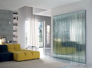
tonellidesign > Styling
The VU mirror is a project of Giovanni Tommaso Garattoni, a three-dimensional texture obtained by placing next to each other different thicknesses of glass slabs. Each element can be used individually or with other elements to create custom composition that can be adapted to any project’s necessities. Therefore, a furnishing element that leaves ample margin of interpretation. 22 are the extra clear glass modules of different thicknesses that compose the VU mirror, glued through UV lamps onto a mirrored base that allows the wall fixing. We are dealing with a mirror of great artistic value, that results specially adapt for the decoration of wide spaces such as lounges and offices or passageways.
Pandarine 3 Seater Chaise Longue Right
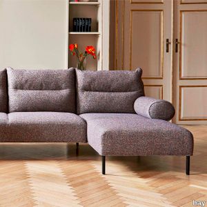
hay > Sofa
Inga Semps Pandarine fuses the luxurious comfort of a bed with the versatility of a modular sofa in an elegant and versatile design. The armrests come either in a cylindrical form or with a reclining design that can be adjusted individually in the same way as the metal-hinged backrests. This gives Pandarine the ability to transform into a unified mattress-like surface where the backrests serve as huge soft pillows. Constructed using a combination of Nozag springs foam and wadding Pandarine is designed to provide exceptional comfort in any number of sitting or lying positions. Available in two- and three-seater versions with options for additional chaise longues and corner modules its range of textiles and configurations give it great flexibility for use in a variety of private and public contexts.
Gap Meeting easy chair
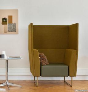
swedese > Armchair
Gap meeting is a modular system that can be built according to your wishes and needs. Meeting is the model with a high back that allows you to screen off and create a room in the room. The name Gap is derived from the gap between the seat and back/armrest and makes Gap a winner from a cleaning point of view. The Gap family is known for its straight lines and plain colors. Flexibility is the keyword and only the imagination sets limits to what formations can be built with Gap. With a mix of round and straight parts that can be connected together, armrests and tables that can be added. The small details make a big difference. The system is available in a number of standard modules, but it is also possible to order bespoke in desired lengths. The sofas are available with metal stands in the colors chrome, white or black, other colors on request. It is also possible to get wooden legs in oak or ash. The meeting sofas have a seat height of 45 cm and are optimal for tables with a height of 60-72 cm.
Anodine Wall
paolocastelli > Wall lamp
Anodine Wall is a delicate wall lamp that transforms light into a painting evoking the concept of “shape non-shape” of the light, which adds an artistic touch to the ambience. It comprises 11 shiny metal leaves, all asymmetrical and hand-made by expert artisans, with a matt gold finish. In the fixed eight-element module, three leaves are lighted by 2W LED each. The composition is completed by 3 single elements, to be installed by choice in order to create endless combinations. Thanks to hand-made manufacturing techniques, each piece of the collection is unique.
Goodman
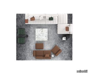
minotti > Sofa
A detail that becomes volume is the essence of Goodman, the modular seating system by Rodolfo Dordoni. The 1970s inspiration behind this design is the strong graphic character of those years, and its ability to stratify and cross marks, reducing the complexity into a few distinctive features. Thus, in Goodman the matelassé stitching, typical of Minotti's tailoring processes, draws shadows and light on the seat, creating the sensation of a quilted cross-padding. Compactness and softness come together in the same concept, making it suitable for environments that inspire extreme relaxation and spaces conceived for a more formal use. The more traditional linear configurations are joined by more dynamic compositions with curved and tilted elements, the latter characterised by pronounced angles with widths of 30, 75 and 90 degrees. Unexpected rounded shapes that also give a sinuous aesthetic to the compositions created along with the linear modules, for a brand new way of furnishing the living space. A flexible, ever-evolving system, inspired by the most diverse human needs and tastes, as well as the constant transformations of contemporary living. The volume of the one-piece seat is particularly ergonomic and comfortable thanks to the innovative technology used: the system of pocket springs is combined with a layer of polyurethane padding in layered densities to give a consistent sensation of softness and cosiness. Goodman is lifted off the floor by refined Bronze or Polished Chrome metal feet set back from the edge, combined with a frame in the same finishes. A contoured tray covered in saddle-hide clings perfectly to the volume of the armrest just like a saddle, also making the seating system fully versatile, since the cushioning can be turned into a functional coffee table, always at hand.
Melt LED Chandelier Small
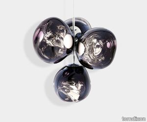
tomdixon > Ceiling lamp
A swarm, huddle, herd, cluster or bunch; there are a thousand ways of configuring our lamps to produce an extraordinary lighting arrangement. The latest additions to the Melt family include the Melt Small Chandelier featuring four orbs protruding from steel tubes and measuring one metre high. Fitted with our new LED module, our Melt Chandeliers are our attempt to rethink the contemporary chandelier. More Information The LED module offers three key benefits - longer life expectancy, energy efficiency and improved performance including dimmability and light control. Our integrated LED module is fully serviceable and replacement components and individual drivers are available if needed.Melt also comes as a Ceiling, Wall, Table and Floor Light.
Beat LED Tall Pendant
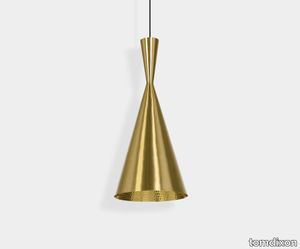
tomdixon > Ceiling lamp
Beat Tall is a medium ceiling light which features a contrasting warm, golden interior. Made from hand spun brass sculpted by artisan craftsmen in Northern India, the creation of this Beat light is part of an ancient process that takes four days to complete. The beaten interior is re-purposed to refract and reflect a soft and warm luminosity and the architectural scale gives off a greater light output. More Information Bearing the mark of its maker, Beat is a celebration of the beauty of things created by hand. Hand-raised, welded, beaten and finally skimmed on a lathe, the Beat shades retain hammer marks from their forming. The collection includes Wall, Floor, Table and Ceiling lights.The LED module offers three key benefits - longer life expectancy, energy efficiency and improved performance including dimmability and light control. Our integrated LED module is fully serviceable and replacement components and individual drivers are available if needed.
Globe 25cm LED Copper
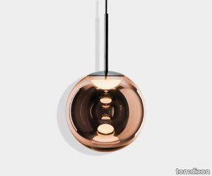
tomdixon > Ceiling lamp
You can probably tell that we are obsessed with spherical objects. In our perpetual quest for the purest forms, Globe stands out as the most minimal of the lot. A spherical orb, highly mirrored and perfectly reflective during the day, when switched on reveals a multiplicity of internal reflections from the integral LED. Also available in a non metallised opalescent finish. More Information The LED module offers three key benefits - longer life expectancy, energy efficiency and improved performance including dimmability and light control. Our integrated LED module is fully serviceable and replacement components and individual drivers are available if needed.
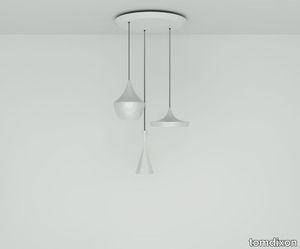
Beat LED Black Trio Round Pendant System
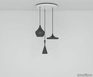
tomdixon > Ceiling lamp
Beat is an extraordinary round chandelier featuring three individual Beat Tall, Beat Fat and Beat Wide ceiling lights in a matte black finish which contrasts with the warm, golden interior. Each Beat light is made from hand spun brass sculpted by artisan craftsmen in Northern India. The creation of the Beat light is part of an ancient process that takes four days to complete and its beaten interior is re-purposed to refract and reflect a soft and warm luminosity. More Information Bearing the mark of its maker, Beat is a celebration of the beauty of things created by hand. Hand-raised, welded, beaten and finally skimmed on a lathe, the Beat shades retain hammer marks from their forming. Also available in a Brass and White finish. Our integrated LED module is fully serviceable and replacement components and individual drivers are available if needed.
Beat LED Fat Pendant Black
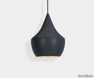
tomdixon > Ceiling lamp
Beat Fat is a medium-sized ceiling light in matte black and features a contrasting warm, golden interior. Made from hand spun brass sculpted by artisan craftsmen in Northern India, the creation of this Beat light is part of an ancient process that takes four days to complete. The beaten interior is re-purposed to refract and reflect a soft and warm luminosity. More Information Bearing the mark of its maker, Beat is a celebration of the beauty of things created by hand. Hand-raised, welded, beaten and finally skimmed on a lathe, the Beat shades retain hammer marks from their forming. The collection includes Wall, Floor, Table and Ceiling lights.The LED module offers three key benefits - longer life expectancy, energy efficiency and improved performance including dimmability and light control. Our integrated LED module is fully serviceable and replacement components and individual drivers are available if needed.
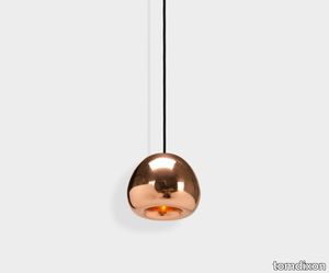
Melt Mini LED Pendant
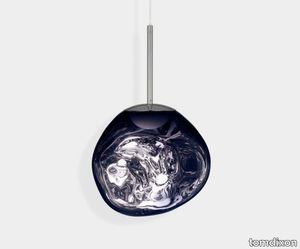
tomdixon > Ceiling lamp
Melt Mini is a beautifully distorted pendant light in a modern finish. Emitting an attractive, mildly hallucinogenic light, this Tom Dixon ceiling light creates a mesmerizing melting hot-blown glass effect when on and a mirror-finish effect when off. Made in Germany using a high tech manufacturing technique to achieve the perfect melted orb. More Information The LED module offers three key benefits - longer life expectancy, energy efficiency and improved performance including dimmability and light control. Our integrated LED module is fully serviceable and replacement components and individual drivers are available if needed.
Melt Mini LED Pendant
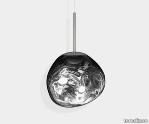
tomdixon > Ceiling lamp
Melt Mini is a beautifully distorted pendant light in a modern finish. Emitting an attractive, mildly hallucinogenic light, this Tom Dixon ceiling light creates a mesmerizing melting hot-blown glass effect when on and a mirror-finish effect when off. Made in Germany using a high tech manufacturing technique to achieve the perfect melted orb. More Information The LED module offers three key benefits - longer life expectancy, energy efficiency and improved performance including dimmability and light control. Our integrated LED module is fully serviceable and replacement components and individual drivers are available if needed.
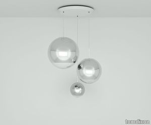
Mirror Ball LED Gold Range Round Pendant System
tomdixon > Ceiling lamp
Each light is a bold statement in its own right but our lighting often sits best in multiples. Endless reflections, spatial play and graphic arrangements showcase the extraordinary in our range. We have carefully curated a series of pendant systems from our best-selling collections. Each is unique and easy to install with a round or linear ceiling canopy. More Information The LED module offers three key benefits - longer life expectancy, energy efficiency and improved performance including dimmability and light control. Our integrated LED module is fully serviceable and replacement components and individual drivers are available if needed.
Mirror Ball LED Gold 40cm Round Pendant System
tomdixon > Ceiling lamp
Each light is a bold statement in its own right but our lighting often sits best in multiples. Endless reflections, spatial play and graphic arrangements showcase the extraordinary in our range. We have carefully curated a series of pendant systems from our best-selling collections. Each is unique and easy to install with a round or linear ceiling canopy. More Information The LED module offers three key benefits - longer life expectancy, energy efficiency and improved performance including dimmability and light control. Our integrated LED module is fully serviceable and replacement components and individual drivers are available if needed.
Spring Pendant Brass Large
tomdixon > Ceiling lamp
A large ceiling light made from multiple bands of high-performance stainless steel in a brass finish. Pliant ribbons of stainless steel have been arranged like a whisk around our custom-made dimmable Tom Dixon LED disc. The semi-transparent shape thus created can be adjusted to a variety of silhouettes. More Information The LED module offers three key benefits - longer life expectancy, energy efficiency and improved performance including dimmability and light control. Our integrated LED module is fully serviceable and replacement components and individual drivers are available if needed. Available in Medium and Small, and in a white finish.
Spring Pendant Silver Small
tomdixon > Ceiling lamp
A small ceiling light made from multiple bands of high-performance stainless steel in a Silver finish. Pliant ribbons of stainless steel have been arranged like a whisk around our custom-made dimmable Tom Dixon LED disc. The semi-transparent shape thus created can be adjusted to a variety of silhouettes. More Information The LED module offers three key benefits - longer life expectancy, energy efficiency and improved performance including dimmability and light control. Our integrated LED module is fully serviceable and replacement components and individual drivers are available if needed. Also available in Medium and Large, and in a white and brass finish.
Beat LED Trio Round Pendant System
tomdixon > Ceiling lamp
Beat is an extraordinary round chandelier featuring three individual Beat Tall, Beat Fat and Beat Wide ceiling lights. Each Beat light is made from hand spun brass sculpted by artisan craftsmen in Northern India. The creation of the Beat light is part of an ancient process that takes four days to complete and its beaten interior is re-purposed to refract and reflect a soft and warm luminosity. More Information Bearing the mark of its maker, Beat is a celebration of the beauty of things created by hand. Hand-raised, welded, beaten and finally skimmed on a lathe, the Beat shades retain hammer marks from their forming. The collection includes Wall, Floor, Table and Ceiling lights.The LED module offers three key benefits - longer life expectancy, energy efficiency and improved performance including dimmability and light control. Our integrated LED module is fully serviceable and replacement components and individual drivers are available if needed.
Void LED Pendant Brass
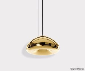
tomdixon > Ceiling lamp
Available as a medium or mini pendant Void is perfect to hang a dining table or in multiples using a Pendant System. The Void collection includes Stainless Steel and Copper and a Mini 15.5cm size. More Information The process of creating Void is complex. Cut from a sheet of pure metal, each light is pressed and spun, then brazed at the end to form a double-walled shade. The high-shine reflectivity achieved with lathing, polishing and caring for base metals is a bold finish that carries across Void.The LED module offers three key benefits - longer life expectancy, energy efficiency and improved performance including dimmability and light control. Our integrated LED module is fully serviceable and replacement components and individual drivers are available if needed.
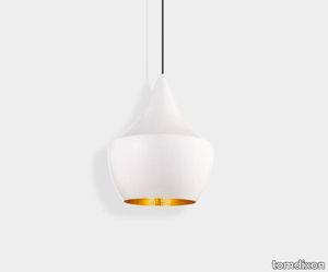
Beat LED Fat Pendant White
tomdixon > Ceiling lamp
Beat Fat is a medium-sized ceiling light in a glossy white finish and features a contrasting warm, golden interior. Made from hand spun brass sculpted by artisan craftsmen in Northern India, the creation of this Beat light is part of an ancient process that takes four days to complete. The beaten interior is re-purposed to refract and reflect a soft and warm luminosity. More Information Bearing the mark of its maker, Beat is a celebration of the beauty of things created by hand. Hand-raised, welded, beaten and finally skimmed on a lathe, the Beat shades retain hammer marks from their forming. The collection includes Wall, Floor, Table and Ceiling lights.The LED module offers three key benefits - longer life expectancy, energy efficiency and improved performance including dimmability and light control. Our integrated LED module is fully serviceable and replacement components and individual drivers are available if needed.
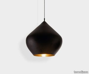
Beat LED Stout Pendant Black
tomdixon > Ceiling lamp
Beat Stout is a large matte black ceiling light which features a contrasting warm, golden interior. Made from hand spun brass sculpted by artisan craftsmen in Northern India, the creation of this Beat light is part of an ancient process that takes four days to complete. The beaten interior is re-purposed to refract and reflect a soft and warm luminosity and the architectural scale gives off a greater light output. More Information Bearing the mark of its maker, Beat is a celebration of the beauty of things created by hand. Hand-raised, welded, beaten and finally skimmed on a lathe, the Beat shades retain hammer marks from their forming. The collection includes Wall, Floor, Table and Ceiling lights.The LED module offers three key benefits - longer life expectancy, energy efficiency and improved performance including dimmability and light control. Our integrated LED module is fully serviceable and replacement components and individual drivers are available if needed.
Void LED Pendant
tomdixon > Ceiling lamp
Available as a medium or mini pendant, Void is perfect to hang over a dining table or in multiples using a Pendant System. More Information The process of creating Void is complex. Cut from a sheet of pure metal, each light is pressed and spun, then brazed at the end to form a double-walled shade. The high-shine reflectivity achieved with lathing, polishing and caring for base metals is a bold finish that carries across Void.The LED module offers three key benefits - longer life expectancy, energy efficiency and improved performance including dimmability and light control. Our integrated LED module is fully serviceable and replacement components and individual drivers are available if needed.
Mirror Ball LED Range Round Pendant System
tomdixon > Ceiling lamp
Each light is a bold statement in its own right but our lighting often sits best in multiples. Endless reflections, spatial play and graphic arrangements showcase the extraordinary in our range. We have carefully curated a series of pendant systems from our best-selling collections. Each is unique and easy to install with a round or linear ceiling canopy. More Information The LED module offers three key benefits - longer life expectancy, energy efficiency and improved performance including dimmability and light control. Our integrated LED module is fully serviceable and replacement components and individual drivers are available if needed.
round control (mini)
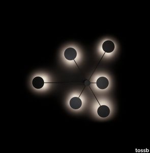
tossb > Wall lamp
‘Round control’ is designed as a ceiling- and wall surface mounted system. During the installation, it can be adapted to any architectural concept due to countless variations in the design. The graphic character of the minimalistic design reveals its functions very honestly. Round control is devised for lighting rooms in commercial areas, board rooms and lounge areas as well as residential rooms. The indirect lighting – with high power LED modules - creates a soft and comfortable atmosphere when dimmed and provides a functional lighting at full power.
Abacus multiplyingluminescence.
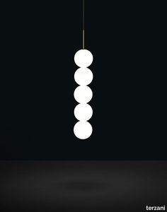
terzani > Ceiling lamp
Used for centuries as the tool to both teach and communicate mathematics, the abacus was found in one form or another across the ancient world. At Terzani, we saw the beauty in the abacus’ mathematical purity and clean, functional design. In the hands of Terzani’s craftsmen, we’ve turned this inspiration into a new collection of modular pendant lamps whose flexibility allows for complex and beautiful configurations. Each module, or strand, of Abacus, made of a custom set of round, hand-blown opal glass which emit a soft and uniform light. And, as the original abacus was used to calculate everything from simple addition to complex formulas, we’ve retained the same scalability. Due to its customization, our Abacus light is just as suitable in a home as a commercial space, and its almost infinite configurations makes sure you always come up with the right solution. Design Draw. Made in Italy.
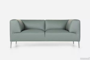
Blues sofa

turri > Sofa
Even as a 2 or 3-seater, the Blues sofa is outstanding for its minimalist design and at the same time for the richness of its details : the walnut wood base, linear and uniform is supported by tubular metal legs. Thanks to an ample choice of modules, starting from the central ones up to the end pieces and the chaise longue, including the corner units and the poufs, the modular compositions are several and satisfy most requirements. The Blues sofa is available in different finishes as per sample book.
Mystone Berici
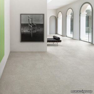
marazzi group > Wall tile-stone-brick
Porcelain stoneware inspired by stone, neutral tones, and exclusive decorations The wide range of sizes, from the most traditional variants to the slab size, enables many different installation solutions, thanks also to the availability of surfaces with R9, R10 and R11 anti-slip coefficients and the 20 mm version in the 60x120 size. The Mystone Berici range comprises 4 colours with a very natural, neutral look – Bianco, Beige, Cenere and Grigio – produced in all sizes. The collection’s potentials are enhanced by the Righe 3D structure in 60x120 size with a light relief pattern on a background rich in elements inspired by the calcareous rock, the Flora decor in 60x120 size featuring chiaroscuro and material effects that mitigate the severity of the original stone, and the Strip mosaic in 60x180 size, only for use on walls, offering 3 modules with titanium-colour metallic inserts. The resulting collection is ideal for defining the personality of design schemes with different looks, both classical and contemporary.
Sofa So Good
moooi > Sofa
Sofa So Good by Marcel Wanders is a modular sofa system made of generous proportions and feather-like softness. Its made from the highest quality materials and combines smart design and ultimate comfort. A story of contrasts with its linear framework and curvy softness.The sofa system includes eight different upholstered modules two tables and three shelves. The tables and shelves are available in six different wood finishes. An eclectic range of fabrics to choose fromlike the newly added colours in the Extinct Animals fabric collectioncompletes the set-up. Sofa So Good is endlessly versatile and is suitable for any interior. In our online configurator you dont just create a sofa you create a personal space tailored to your needs.
Bloc by Ronan & Erwan Bouroullec
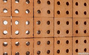
mutina > Floor tile-stone
Bloc is a terracotta brick produced with the artisanship extrusion process. It’s a three-dimensional element conceived to build architectural and decorative structures. It features a Natural version and a palette of four shades – Pearl, Blue, Red and Grey – declined in both Matt and Glossy finishes. The glazed matt modules are obtained by using some paints from Mutina Accents, while the glossed ones came about from the application of a bright transparent ceramic glaze.
Mistral by Barber & Osgerby
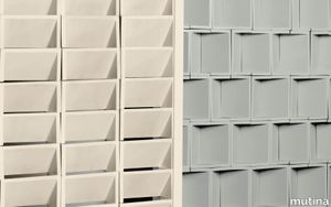
mutina > Floor tile-stone
With Mistral, Mutina continues its research on three-dimensional elements, abandoning what is the classic perception, in favor of a contemporary and innovative project. The collection was born from a reminiscence of the ancient architecture typical of the Italian countryside, from which the designers drew inspiration to design extremely innovative and highly functional elements. Mistral is composed of a single terracotta module handcrafted for casting, geometrically refined and proportioned, available in 12,5x25,5x12,5 cm sizes.
JOINTEC GRL modular structural joints
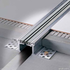
profilitec > Accessories
JOINTEC GRL modular structural joints Modular structural joints with rotation movement between the metal wings and the synthetic rubber insert. Designed to withstand structural movements of large or compound buildings. They must be installed at the spaces existing between two semi-attached parts making up the same building or between two different spans. They are able to connect these spaces allowing vertical, horizontal and transversal movements, depending on the settlements of the building, be they cyclic or permanent. Within the modules created by the structural joints, however, a further fractionation of the surface with a lattice of fraction joints must always be provided, depending on the type of passage provided on the surface. How to install joints JOINTEC GRL INSTALLATION: • Slide the central metal insert into the side flanges. • Snap the synthetic rubber insert into the profile before aligning and positioning the expansion joint on site. • If necessary, protect the rubber insert with masking tape. • Anchor the side flanges with appropriate screws, 30cm on center, on both sides of the profile. • Lay mortar bed over the side flanges, and install the tiles as normal.
BORDERTEC BTR profiles for tiled terraces
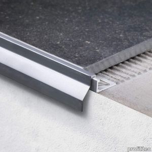
profilitec > Accessories
BORDERTEC BTR profiles for tiled terraces BORDERTEC BTR is an innovative, patented, modular system composed of a perimeter profile for balconies and tiled balconies that interlocks onto TRIMTEC TR profiles. Together they form an integrated profile with a protruding drip edge that matches most outdoor tile thicknesses and finishes on the market. Clip System = tile thickness - 2mm. How to assembly BORDER BTR profiles for balconies Bordertec BTR si compone con i moduli aggiuntivi Art. serie TR che si infilano all’interno del modulo base realizzando l’altezza richiesta dallo spessore della piastrella. Clip system: altezza piastrella ridotta di 2 mm. To build up BORDERTEC BTR is necessary to combine BTR Border + TR Trimtec. For 10 mm Tile BORDERTEC profile use TR80 (Tile Height = TR Dimension + 2 mm)
Nivå Wall
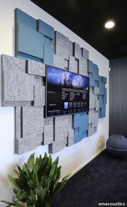
amacoustics > Panels
NIVÅ is a sound absorbing contrast wall produced in cooperation with three designers – Camilla Tillberg, Gill Weibull and Maria Holmgren. The idea was to create a sound absorbent where the design was just as important as the function. The result is an exciting, varying wall module of polyester fibre with a flocked surface on different levels. NIVÅ is available in black, white or gray RAW edition or laminated with Hush fabric on the front. Marking: Sundahus | BIM Object | Acoustic facts | pCon Planner | Byggkatalogen
The Lightning
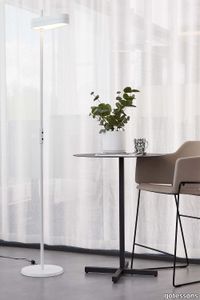
gotessons > Table lamp
With its stylish design as well as a good and ergonomically correct lighting, The Lightning is an excellent choice for all types of spaces. Available as floor and desk variant.Uplight/downlight function. Touch buttons. Light strength, 3 positions. LED module. Cable 3,5 m. Unearthed plug. The desk version can be mounted straight through the desk (Ø 25 mm) or in a Table Top with hole for the lamp. Wattage (Whole Lamp):30+30 LED. Voltage: AC 100-240V DC 24V. Lumens: ≥4400LM. Colour Temp: 3500K. LUX: 1500/900/200 mm. CRI:>80. Design by Tomas Stringdahl.THE LIGHTNING DESK LED-lamp for desk mounting. Uplight and downlight adjusted with touch buttons. Mounting: mounted in a 25 mm hole if Table Top is not chosen. Optional: Table Top for mounting together with 2 electricity and 2 USB. Colour: white or black. ______________________________________________________________________________________________ THE LIGHTNING FLOOR LED-lamp for floor. Uplight and downlight adjusted with touch buttons. Colour: white or black. ________________________________________________________________________ For updated information, see https://www.gotessons.com/en/products/lighting/the-lightning-desk-lamp Wattage (Whole Lamp):30+30 LED Voltage: AC 100-240V DC 24V Lumens: ≥4400LM Color Temp:3500K LUX: 1500/900/200 mm CRI:>80
Lady Galala

martinelliluce > Ceiling lamp
Unleash your creativityModularity, colour, transformation, these are the key words to describe at best this pendant lamp with direct and diffused LED light, for indoor and outdoor use. It takes its name from the area of Mount Galala in Egypt where it was hosted a Contract project. Infact this light was conceived for the project and carries in its DNA the changing conformation of this territory. Lady Galala is an elegant, colourful, modular lamp that changes according to your needs. You can have fun composing and combining the three modules in satin methacrylate in several colours to have a lamp that is always different in your environment.
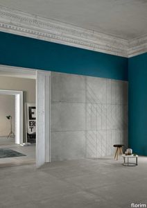
Plimatech Plimawhite/03
florim > Wall tile-stone-brick
<p>The inspiration for Florim's Plimatech Architectural design comes from high up in the Martell Valley of the Alto Adige region.</p> <p>The aesthetic heterogeneity characteristic of natural stone is captured in the collection through three graphic variants. 01, the most minimalist is softly veined and, especially in the large format, is particularly appropriate to confer character on architecture of more essential taste. 02 has a more variegated appearance, with slight shading tending towards white, designed to add a rough, textural touch to spaces. Finally, 03 is characterized by a high number of crystalline formations that give it a wavier line, ideal for design contexts that, between interior and exterior spaces, pursue a dialogue with the surrounding natural environment.</p> <p> </p> <p>In addition to this, the range of decorations is completed with the 30x60 wall module and 30x60 3D wall module, both proposed for the graphic variant 02 in all colors.</p>
Lune™
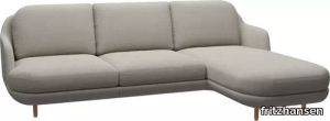
fritzhansen > Sofa
The sculptural, curvaceous Lune™ sofa is characteristic of designer Jaime Hayon and sits at the intersection of clean Nordic aesthetics and southern elegance. Lune is a functional, modular sofa that offers a myriad of possibilities: from a straight two-seater to larger L-shapes with chaise longue options. The result: a flexible sofa that is not only cosy and comfortable but also inherently beautiful from every angle. A chaise module on the three-seater sofa extends Lune’s soft, laid-back profile and creates an enhanced lounging experience. The chaise extension in on the right.
Barococo
abcworldwidestone > Floor tile-stone
Websters defines Barococo as “excessively ornate or fussy in artistic or architectural style”. One of Borrowed Earth’s more ornate series, these modular surfaces are ideal for the facades and other accent walls. The Barococo series is designed to be played with, as a combination with carved and field tiles, or with the various modules or materials available.
Graffiti arbol 354
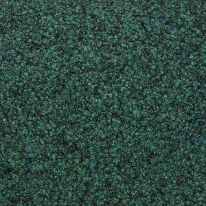
Fabromont > Synthetic Floor
Graffiti Arbol 354 – Organic Green for Biophilic and Sustainable Spaces Graffiti Arbol 354 brings an earthy green tone inspired by forest canopies, adding vitality to coworking zones, care centres, or school corridors. The Kugelgarn® structure features high-performance polyamide fibres, resistance to chair castors, and excellent acoustic absorption when installed as modules or acoustic backing. Its GuT and TÜV certifications guarantee sustainability and indoor air quality.
Creation basalt 319
Fabromont > Synthetic Floor
Creation Basalt 319 – Volcanic Tone for Bold Hospitality Interiors Dark and grounding, Basalt 319 offers a rich volcanic tone perfect for dramatic hotel lobbies, bar lounges, or executive boardrooms. The medium-coarse spherical texture of this flooring enhances underfoot comfort (LC2 rating) while resisting abrasion, dirt, and wear. Available in both sheeting and self-laying modules, it meets the highest standards of fire safety (CE and VKF) and acoustics when paired with woolwave® backing.
Matrice Traccia
florim > Wallcovering
An atlas of modular signs to be combined in a wide variety of layouts. «We love concrete as a material, its versatility and its plain, austere look. We have completed our carefully designed surfaces with graphic patterning inspired by the human actions of weaving and embroidering.» Barbara Brondi & Marco Rainò To appreciate the profundity of the design project undertaken by Barbara Brondi and Marco Rainò for Cedit, it is both necessary and explanatory to start from the title the collection bears. In modern usage the term Matrice, in Italian, refers to a die or mould used to reproduce an object, but its origins are much more remote, with a meaning closer to the English “matrix”, meaning the underlying basis of something. The root of the word is related to Mater or mother: the name Matrice thus relates to the origin or cause of something. This dichotomy is expressed in several levels within the work of these architects, who study the world from a sophisticated conceptual approach and then transform it into a design. Starting from the idea of ceramic coverings, which have always been a tool not so much of architecture as of interior design, the artists work back to the origin of the surface and its decoration within their own discipline: they look at what we used to call the modern age, where modernity has also brought an uncompromising brutality, and where the use of bare concrete became the statement of an attitude to life with no time to spare for manners. Concrete is originally a liquid material, intended for shaping, which can therefore absorb and retain any type of mark created by the material and mould used to form it. Architects midway between rationalism and brutalism have used the rough-and-ready language of concrete combined with a last, elegant, anthropic decorative motif impressed on the material, that makes the concept of covering superfluous, because its place, in its older meaning of decoration rather than functional cladding, is taken by the regular patterning created in the material itself. There are therefore various grounds for believing that, in this collection, the artists are once again working in architectural terms. Firstly, with a simplicity typical of BRH+, they reduce the initial concepts to their minimal terms. So although this is a collection of coverings for walls, indoor floors, outdoor pavings and curtain walls, a great deal of time was spent on destructuring the idea of the ceramic covering itself. Unfortunately, nowadays there is no space in the contemporary construction sector for the radical approach of the past, so the cladding designed for the building actually lays bare the interior, using the choice of material – accurately interpreted (with shade variation) on the basis of an assortment of various types – to restore visual elegance and a fundamental severity. Attention to scale is another architectural feature: Matrice offers modules with architectural dimensions and different sizes through the development of “large slabs”, eliminating the visual regular grid effect. Thanks to this visual reset, geographic forms are perceived to emerge from dense, grey concrete surfaces decorated as in bygone days by special processes and by weathering during drying. The various types of slab, each an atlas of subtle, vibrant signs on the surfaces, comprise finishes that reproduce the visual effect of reinforced concrete – with the aggregates in the cement more clearly visible, of formwork – with the signs impressed on the concrete by the timber used, of a structured surface resembling bare cement plaster, of ridged and streaked surfaces – with patterning resembling some kinds of linear surface finishing processes – and finally a smooth, or basic version, over which Matrice exercises the dichotomy referred to earlier. It is on these surfaces that Brondi and Rainò have imagined additional design reverberations, a figurative code that rejects the concept of the grid, previously inseparable from that of the module: by means of a vocabulary of graphic marks cut into the slabs with a depth of 3 mm (the width of the gap left between modules during installation), they provide a framework for infinite combinations of possible dialogues. Just as in embroidery, which is based on grids of stitches and geometric repetitions, and where every stitch is at right-angles to another one to construct forms and decorations. Also taken from embroidery is the idea of introducing a degree of “softness” to reduce the stiffness of intentionally deaf surfaces. There is the impression of patterns that can continue for infinity, as in textile weaving, and a scale that, unlike the surface being worked on, is imagined as suspended and lightweight. They may not admit it, but BRH+ know a lot about music, including electronic music, and it appears to me that this organised tangle of infinite signs – unidentifiable without an overview – is rather like the representations of synthesized sounds. Sounds that are produced by machines, and thus “woven” by sampling and overlapping sounds of the most unlikely origins, combined to form jingles which, once heard, are imprinted indelibly on the brain. This may be why I am so interested in the space between this “melodic film” and its deaf, damp substrate. The eyes can navigate this suspended reality without fear of disturbance. So we are faced with different surfaces, different sizes and different graphic signs. But only one colour (surprise!) to prevent a cacophony not just of signs but also of possible interpretations: the artists retain their radical principles (and their generosity), and as curators, a role in which they are skilled, they leave the players (architects and installers) to add their own interpretations. In their hands this colour, expressed in Matrice, will produce motifs on surfaces in living spaces for someone else. This stylish covering and its workmanship will be left to the hands of someone who will probably never read this, but will be on a building site, with the radio playing on a stereo system, concentrating on installing the very pieces we describe. So a radical, apparently silent, design project like this has repercussions for the real world we live in. Matrice has no form of its own but merely acquires the ornamentation drawn on its surfaces by a second group of artists. And here this routine action, standardised by the form approved for production and workmanlike efficiency, is the origin and cause of change, generating a variability of choices and interpretations, on that dusty building site where music plays and mortar flows.
Matrice Forma
florim > Wallcovering
An atlas of modular signs to be combined in a wide variety of layouts. «We love concrete as a material, its versatility and its plain, austere look. We have completed our carefully designed surfaces with graphic patterning inspired by the human actions of weaving and embroidering.» Barbara Brondi & Marco Rainò To appreciate the profundity of the design project undertaken by Barbara Brondi and Marco Rainò for Cedit, it is both necessary and explanatory to start from the title the collection bears. In modern usage the term Matrice, in Italian, refers to a die or mould used to reproduce an object, but its origins are much more remote, with a meaning closer to the English “matrix”, meaning the underlying basis of something. The root of the word is related to Mater or mother: the name Matrice thus relates to the origin or cause of something. This dichotomy is expressed in several levels within the work of these architects, who study the world from a sophisticated conceptual approach and then transform it into a design. Starting from the idea of ceramic coverings, which have always been a tool not so much of architecture as of interior design, the artists work back to the origin of the surface and its decoration within their own discipline: they look at what we used to call the modern age, where modernity has also brought an uncompromising brutality, and where the use of bare concrete became the statement of an attitude to life with no time to spare for manners. Concrete is originally a liquid material, intended for shaping, which can therefore absorb and retain any type of mark created by the material and mould used to form it. Architects midway between rationalism and brutalism have used the rough-and-ready language of concrete combined with a last, elegant, anthropic decorative motif impressed on the material, that makes the concept of covering superfluous, because its place, in its older meaning of decoration rather than functional cladding, is taken by the regular patterning created in the material itself. There are therefore various grounds for believing that, in this collection, the artists are once again working in architectural terms. Firstly, with a simplicity typical of BRH+, they reduce the initial concepts to their minimal terms. So although this is a collection of coverings for walls, indoor floors, outdoor pavings and curtain walls, a great deal of time was spent on destructuring the idea of the ceramic covering itself. Unfortunately, nowadays there is no space in the contemporary construction sector for the radical approach of the past, so the cladding designed for the building actually lays bare the interior, using the choice of material – accurately interpreted (with shade variation) on the basis of an assortment of various types – to restore visual elegance and a fundamental severity. Attention to scale is another architectural feature: Matrice offers modules with architectural dimensions and different sizes through the development of “large slabs”, eliminating the visual regular grid effect. Thanks to this visual reset, geographic forms are perceived to emerge from dense, grey concrete surfaces decorated as in bygone days by special processes and by weathering during drying. The various types of slab, each an atlas of subtle, vibrant signs on the surfaces, comprise finishes that reproduce the visual effect of reinforced concrete – with the aggregates in the cement more clearly visible, of formwork – with the signs impressed on the concrete by the timber used, of a structured surface resembling bare cement plaster, of ridged and streaked surfaces – with patterning resembling some kinds of linear surface finishing processes – and finally a smooth, or basic version, over which Matrice exercises the dichotomy referred to earlier. It is on these surfaces that Brondi and Rainò have imagined additional design reverberations, a figurative code that rejects the concept of the grid, previously inseparable from that of the module: by means of a vocabulary of graphic marks cut into the slabs with a depth of 3 mm (the width of the gap left between modules during installation), they provide a framework for infinite combinations of possible dialogues. Just as in embroidery, which is based on grids of stitches and geometric repetitions, and where every stitch is at right-angles to another one to construct forms and decorations. Also taken from embroidery is the idea of introducing a degree of “softness” to reduce the stiffness of intentionally deaf surfaces. There is the impression of patterns that can continue for infinity, as in textile weaving, and a scale that, unlike the surface being worked on, is imagined as suspended and lightweight. They may not admit it, but BRH+ know a lot about music, including electronic music, and it appears to me that this organised tangle of infinite signs – unidentifiable without an overview – is rather like the representations of synthesized sounds. Sounds that are produced by machines, and thus “woven” by sampling and overlapping sounds of the most unlikely origins, combined to form jingles which, once heard, are imprinted indelibly on the brain. This may be why I am so interested in the space between this “melodic film” and its deaf, damp substrate. The eyes can navigate this suspended reality without fear of disturbance. So we are faced with different surfaces, different sizes and different graphic signs. But only one colour (surprise!) to prevent a cacophony not just of signs but also of possible interpretations: the artists retain their radical principles (and their generosity), and as curators, a role in which they are skilled, they leave the players (architects and installers) to add their own interpretations. In their hands this colour, expressed in Matrice, will produce motifs on surfaces in living spaces for someone else. This stylish covering and its workmanship will be left to the hands of someone who will probably never read this, but will be on a building site, with the radio playing on a stereo system, concentrating on installing the very pieces we describe. So a radical, apparently silent, design project like this has repercussions for the real world we live in. Matrice has no form of its own but merely acquires the ornamentation drawn on its surfaces by a second group of artists. And here this routine action, standardised by the form approved for production and workmanlike efficiency, is the origin and cause of change, generating a variability of choices and interpretations, on that dusty building site where music plays and mortar flows.
Matrice Rilievo
florim > Wallcovering
An atlas of modular signs to be combined in a wide variety of layouts. «We love concrete as a material, its versatility and its plain, austere look. We have completed our carefully designed surfaces with graphic patterning inspired by the human actions of weaving and embroidering.» Barbara Brondi & Marco Rainò To appreciate the profundity of the design project undertaken by Barbara Brondi and Marco Rainò for Cedit, it is both necessary and explanatory to start from the title the collection bears. In modern usage the term Matrice, in Italian, refers to a die or mould used to reproduce an object, but its origins are much more remote, with a meaning closer to the English “matrix”, meaning the underlying basis of something. The root of the word is related to Mater or mother: the name Matrice thus relates to the origin or cause of something. This dichotomy is expressed in several levels within the work of these architects, who study the world from a sophisticated conceptual approach and then transform it into a design. Starting from the idea of ceramic coverings, which have always been a tool not so much of architecture as of interior design, the artists work back to the origin of the surface and its decoration within their own discipline: they look at what we used to call the modern age, where modernity has also brought an uncompromising brutality, and where the use of bare concrete became the statement of an attitude to life with no time to spare for manners. Concrete is originally a liquid material, intended for shaping, which can therefore absorb and retain any type of mark created by the material and mould used to form it. Architects midway between rationalism and brutalism have used the rough-and-ready language of concrete combined with a last, elegant, anthropic decorative motif impressed on the material, that makes the concept of covering superfluous, because its place, in its older meaning of decoration rather than functional cladding, is taken by the regular patterning created in the material itself. There are therefore various grounds for believing that, in this collection, the artists are once again working in architectural terms. Firstly, with a simplicity typical of BRH+, they reduce the initial concepts to their minimal terms. So although this is a collection of coverings for walls, indoor floors, outdoor pavings and curtain walls, a great deal of time was spent on destructuring the idea of the ceramic covering itself. Unfortunately, nowadays there is no space in the contemporary construction sector for the radical approach of the past, so the cladding designed for the building actually lays bare the interior, using the choice of material – accurately interpreted (with shade variation) on the basis of an assortment of various types – to restore visual elegance and a fundamental severity. Attention to scale is another architectural feature: Matrice offers modules with architectural dimensions and different sizes through the development of “large slabs”, eliminating the visual regular grid effect. Thanks to this visual reset, geographic forms are perceived to emerge from dense, grey concrete surfaces decorated as in bygone days by special processes and by weathering during drying. The various types of slab, each an atlas of subtle, vibrant signs on the surfaces, comprise finishes that reproduce the visual effect of reinforced concrete – with the aggregates in the cement more clearly visible, of formwork – with the signs impressed on the concrete by the timber used, of a structured surface resembling bare cement plaster, of ridged and streaked surfaces – with patterning resembling some kinds of linear surface finishing processes – and finally a smooth, or basic version, over which Matrice exercises the dichotomy referred to earlier. It is on these surfaces that Brondi and Rainò have imagined additional design reverberations, a figurative code that rejects the concept of the grid, previously inseparable from that of the module: by means of a vocabulary of graphic marks cut into the slabs with a depth of 3 mm (the width of the gap left between modules during installation), they provide a framework for infinite combinations of possible dialogues. Just as in embroidery, which is based on grids of stitches and geometric repetitions, and where every stitch is at right-angles to another one to construct forms and decorations. Also taken from embroidery is the idea of introducing a degree of “softness” to reduce the stiffness of intentionally deaf surfaces. There is the impression of patterns that can continue for infinity, as in textile weaving, and a scale that, unlike the surface being worked on, is imagined as suspended and lightweight. They may not admit it, but BRH+ know a lot about music, including electronic music, and it appears to me that this organised tangle of infinite signs – unidentifiable without an overview – is rather like the representations of synthesized sounds. Sounds that are produced by machines, and thus “woven” by sampling and overlapping sounds of the most unlikely origins, combined to form jingles which, once heard, are imprinted indelibly on the brain. This may be why I am so interested in the space between this “melodic film” and its deaf, damp substrate. The eyes can navigate this suspended reality without fear of disturbance. So we are faced with different surfaces, different sizes and different graphic signs. But only one colour (surprise!) to prevent a cacophony not just of signs but also of possible interpretations: the artists retain their radical principles (and their generosity), and as curators, a role in which they are skilled, they leave the players (architects and installers) to add their own interpretations. In their hands this colour, expressed in Matrice, will produce motifs on surfaces in living spaces for someone else. This stylish covering and its workmanship will be left to the hands of someone who will probably never read this, but will be on a building site, with the radio playing on a stereo system, concentrating on installing the very pieces we describe. So a radical, apparently silent, design project like this has repercussions for the real world we live in. Matrice has no form of its own but merely acquires the ornamentation drawn on its surfaces by a second group of artists. And here this routine action, standardised by the form approved for production and workmanlike efficiency, is the origin and cause of change, generating a variability of choices and interpretations, on that dusty building site where music plays and mortar flows.
Matrice Sostanza
florim > Wallcovering
An atlas of modular signs to be combined in a wide variety of layouts. «We love concrete as a material, its versatility and its plain, austere look. We have completed our carefully designed surfaces with graphic patterning inspired by the human actions of weaving and embroidering.» Barbara Brondi & Marco Rainò To appreciate the profundity of the design project undertaken by Barbara Brondi and Marco Rainò for Cedit, it is both necessary and explanatory to start from the title the collection bears. In modern usage the term Matrice, in Italian, refers to a die or mould used to reproduce an object, but its origins are much more remote, with a meaning closer to the English “matrix”, meaning the underlying basis of something. The root of the word is related to Mater or mother: the name Matrice thus relates to the origin or cause of something. This dichotomy is expressed in several levels within the work of these architects, who study the world from a sophisticated conceptual approach and then transform it into a design. Starting from the idea of ceramic coverings, which have always been a tool not so much of architecture as of interior design, the artists work back to the origin of the surface and its decoration within their own discipline: they look at what we used to call the modern age, where modernity has also brought an uncompromising brutality, and where the use of bare concrete became the statement of an attitude to life with no time to spare for manners. Concrete is originally a liquid material, intended for shaping, which can therefore absorb and retain any type of mark created by the material and mould used to form it. Architects midway between rationalism and brutalism have used the rough-and-ready language of concrete combined with a last, elegant, anthropic decorative motif impressed on the material, that makes the concept of covering superfluous, because its place, in its older meaning of decoration rather than functional cladding, is taken by the regular patterning created in the material itself. There are therefore various grounds for believing that, in this collection, the artists are once again working in architectural terms. Firstly, with a simplicity typical of BRH+, they reduce the initial concepts to their minimal terms. So although this is a collection of coverings for walls, indoor floors, outdoor pavings and curtain walls, a great deal of time was spent on destructuring the idea of the ceramic covering itself. Unfortunately, nowadays there is no space in the contemporary construction sector for the radical approach of the past, so the cladding designed for the building actually lays bare the interior, using the choice of material – accurately interpreted (with shade variation) on the basis of an assortment of various types – to restore visual elegance and a fundamental severity. Attention to scale is another architectural feature: Matrice offers modules with architectural dimensions and different sizes through the development of “large slabs”, eliminating the visual regular grid effect. Thanks to this visual reset, geographic forms are perceived to emerge from dense, grey concrete surfaces decorated as in bygone days by special processes and by weathering during drying. The various types of slab, each an atlas of subtle, vibrant signs on the surfaces, comprise finishes that reproduce the visual effect of reinforced concrete – with the aggregates in the cement more clearly visible, of formwork – with the signs impressed on the concrete by the timber used, of a structured surface resembling bare cement plaster, of ridged and streaked surfaces – with patterning resembling some kinds of linear surface finishing processes – and finally a smooth, or basic version, over which Matrice exercises the dichotomy referred to earlier. It is on these surfaces that Brondi and Rainò have imagined additional design reverberations, a figurative code that rejects the concept of the grid, previously inseparable from that of the module: by means of a vocabulary of graphic marks cut into the slabs with a depth of 3 mm (the width of the gap left between modules during installation), they provide a framework for infinite combinations of possible dialogues. Just as in embroidery, which is based on grids of stitches and geometric repetitions, and where every stitch is at right-angles to another one to construct forms and decorations. Also taken from embroidery is the idea of introducing a degree of “softness” to reduce the stiffness of intentionally deaf surfaces. There is the impression of patterns that can continue for infinity, as in textile weaving, and a scale that, unlike the surface being worked on, is imagined as suspended and lightweight. They may not admit it, but BRH+ know a lot about music, including electronic music, and it appears to me that this organised tangle of infinite signs – unidentifiable without an overview – is rather like the representations of synthesized sounds. Sounds that are produced by machines, and thus “woven” by sampling and overlapping sounds of the most unlikely origins, combined to form jingles which, once heard, are imprinted indelibly on the brain. This may be why I am so interested in the space between this “melodic film” and its deaf, damp substrate. The eyes can navigate this suspended reality without fear of disturbance. So we are faced with different surfaces, different sizes and different graphic signs. But only one colour (surprise!) to prevent a cacophony not just of signs but also of possible interpretations: the artists retain their radical principles (and their generosity), and as curators, a role in which they are skilled, they leave the players (architects and installers) to add their own interpretations. In their hands this colour, expressed in Matrice, will produce motifs on surfaces in living spaces for someone else. This stylish covering and its workmanship will be left to the hands of someone who will probably never read this, but will be on a building site, with the radio playing on a stereo system, concentrating on installing the very pieces we describe. So a radical, apparently silent, design project like this has repercussions for the real world we live in. Matrice has no form of its own but merely acquires the ornamentation drawn on its surfaces by a second group of artists. And here this routine action, standardised by the form approved for production and workmanlike efficiency, is the origin and cause of change, generating a variability of choices and interpretations, on that dusty building site where music plays and mortar flows.
Matrice Aura
florim > Wallcovering
An atlas of modular signs to be combined in a wide variety of layouts. «We love concrete as a material, its versatility and its plain, austere look. We have completed our carefully designed surfaces with graphic patterning inspired by the human actions of weaving and embroidering.» Barbara Brondi & Marco Rainò To appreciate the profundity of the design project undertaken by Barbara Brondi and Marco Rainò for Cedit, it is both necessary and explanatory to start from the title the collection bears. In modern usage the term Matrice, in Italian, refers to a die or mould used to reproduce an object, but its origins are much more remote, with a meaning closer to the English “matrix”, meaning the underlying basis of something. The root of the word is related to Mater or mother: the name Matrice thus relates to the origin or cause of something. This dichotomy is expressed in several levels within the work of these architects, who study the world from a sophisticated conceptual approach and then transform it into a design. Starting from the idea of ceramic coverings, which have always been a tool not so much of architecture as of interior design, the artists work back to the origin of the surface and its decoration within their own discipline: they look at what we used to call the modern age, where modernity has also brought an uncompromising brutality, and where the use of bare concrete became the statement of an attitude to life with no time to spare for manners. Concrete is originally a liquid material, intended for shaping, which can therefore absorb and retain any type of mark created by the material and mould used to form it. Architects midway between rationalism and brutalism have used the rough-and-ready language of concrete combined with a last, elegant, anthropic decorative motif impressed on the material, that makes the concept of covering superfluous, because its place, in its older meaning of decoration rather than functional cladding, is taken by the regular patterning created in the material itself. There are therefore various grounds for believing that, in this collection, the artists are once again working in architectural terms. Firstly, with a simplicity typical of BRH+, they reduce the initial concepts to their minimal terms. So although this is a collection of coverings for walls, indoor floors, outdoor pavings and curtain walls, a great deal of time was spent on destructuring the idea of the ceramic covering itself. Unfortunately, nowadays there is no space in the contemporary construction sector for the radical approach of the past, so the cladding designed for the building actually lays bare the interior, using the choice of material – accurately interpreted (with shade variation) on the basis of an assortment of various types – to restore visual elegance and a fundamental severity. Attention to scale is another architectural feature: Matrice offers modules with architectural dimensions and different sizes through the development of “large slabs”, eliminating the visual regular grid effect. Thanks to this visual reset, geographic forms are perceived to emerge from dense, grey concrete surfaces decorated as in bygone days by special processes and by weathering during drying. The various types of slab, each an atlas of subtle, vibrant signs on the surfaces, comprise finishes that reproduce the visual effect of reinforced concrete – with the aggregates in the cement more clearly visible, of formwork – with the signs impressed on the concrete by the timber used, of a structured surface resembling bare cement plaster, of ridged and streaked surfaces – with patterning resembling some kinds of linear surface finishing processes – and finally a smooth, or basic version, over which Matrice exercises the dichotomy referred to earlier. It is on these surfaces that Brondi and Rainò have imagined additional design reverberations, a figurative code that rejects the concept of the grid, previously inseparable from that of the module: by means of a vocabulary of graphic marks cut into the slabs with a depth of 3 mm (the width of the gap left between modules during installation), they provide a framework for infinite combinations of possible dialogues. Just as in embroidery, which is based on grids of stitches and geometric repetitions, and where every stitch is at right-angles to another one to construct forms and decorations. Also taken from embroidery is the idea of introducing a degree of “softness” to reduce the stiffness of intentionally deaf surfaces. There is the impression of patterns that can continue for infinity, as in textile weaving, and a scale that, unlike the surface being worked on, is imagined as suspended and lightweight. They may not admit it, but BRH+ know a lot about music, including electronic music, and it appears to me that this organised tangle of infinite signs – unidentifiable without an overview – is rather like the representations of synthesized sounds. Sounds that are produced by machines, and thus “woven” by sampling and overlapping sounds of the most unlikely origins, combined to form jingles which, once heard, are imprinted indelibly on the brain. This may be why I am so interested in the space between this “melodic film” and its deaf, damp substrate. The eyes can navigate this suspended reality without fear of disturbance. So we are faced with different surfaces, different sizes and different graphic signs. But only one colour (surprise!) to prevent a cacophony not just of signs but also of possible interpretations: the artists retain their radical principles (and their generosity), and as curators, a role in which they are skilled, they leave the players (architects and installers) to add their own interpretations. In their hands this colour, expressed in Matrice, will produce motifs on surfaces in living spaces for someone else. This stylish covering and its workmanship will be left to the hands of someone who will probably never read this, but will be on a building site, with the radio playing on a stereo system, concentrating on installing the very pieces we describe. So a radical, apparently silent, design project like this has repercussions for the real world we live in. Matrice has no form of its own but merely acquires the ornamentation drawn on its surfaces by a second group of artists. And here this routine action, standardised by the form approved for production and workmanlike efficiency, is the origin and cause of change, generating a variability of choices and interpretations, on that dusty building site where music plays and mortar flows.
Hamilton
minotti > Sofa
Elegance, uniqueness and innovation. Hamilton embodies timeless Minotti design. This wide range of modular seating systems by Rodolfo Dordoni offers great fl exibility and many customisation options, guaranteeing original interior design and highly versatile use. Its minimal linear design, compact volumes and characteristic metal base sitting close to the floor are the factors that have made Hamilton such a huge worldwide success since its launch in 2004. Its unmistakable metal base in particular, like a frame outlining the perimeter of the elements, has become one of Minotti’s distinctive features and subsequently appeared in other forms and fi nishes, setting a real sector trend. The Hamilton family of seats has never stopped evolving with time, hand in hand with the ongoing study of function, ergonomics and materials promoted by the company and highlighting its strong vocation for tailoring, inherent in the brand’s DNA. There are three versions available in the collection, making Hamilton totally versatile: Hamilton, Hamilton Sofà and Hamilton Modulo. Over the years, Hamilton has become an icon, the perfect protagonist of living areas with both traditional and more modern interior, thanks to its modular fl exibility and wide range of upholstery. A system attentive to aesthetic and function evolutions in contemporary lifestyles, which see living areas invested with a wide range of functions, such as relaxing, working, entertaining, and conversation.
Phenomenon by Tokujin Yoshioka

mutina > Floor tile-stone
Phenomenon stems from the desire to incorporate natural phenomena and the laws of nature into a contemporary design project, not simply for reproducing their aspect but to evoke an emotion. The collection reminds of different expressions of natural patterns such as honeycombs, snowflakes, sticks of ice, plant cells, evoking memories of natural sceneries and individual experiences of the natural world. With the new edition of Phenomenon, the range is enriched with 3 new colours – Blu, Rosa and Verde – which join the 4 historical ones – Bianco, Grigio, Fango and Nero –, each of which is offered on all the available elements: Honeycomb A, Honeycomb B, Rock, Air, Wind, Rain A, Rain B e Rain C. The range also includes the new Phenomenon Glossy: the Honeycomb B, Rock and Rain A modules have been chosen to experiment the glossy finish for the first time, featuring the Bianco, Nero, Oro and Argento shades. The extremely small size of the tesserae has made it necessary to set up a new production process that combines industrial and craft approaches with the objective of making the finish stand out as much as possible.
Matrice Essenza
florim > Wallcovering
An atlas of modular signs to be combined in a wide variety of layouts. «We love concrete as a material, its versatility and its plain, austere look. We have completed our carefully designed surfaces with graphic patterning inspired by the human actions of weaving and embroidering.» Barbara Brondi & Marco Rainò To appreciate the profundity of the design project undertaken by Barbara Brondi and Marco Rainò for Cedit, it is both necessary and explanatory to start from the title the collection bears. In modern usage the term Matrice, in Italian, refers to a die or mould used to reproduce an object, but its origins are much more remote, with a meaning closer to the English “matrix”, meaning the underlying basis of something. The root of the word is related to Mater or mother: the name Matrice thus relates to the origin or cause of something. This dichotomy is expressed in several levels within the work of these architects, who study the world from a sophisticated conceptual approach and then transform it into a design. Starting from the idea of ceramic coverings, which have always been a tool not so much of architecture as of interior design, the artists work back to the origin of the surface and its decoration within their own discipline: they look at what we used to call the modern age, where modernity has also brought an uncompromising brutality, and where the use of bare concrete became the statement of an attitude to life with no time to spare for manners. Concrete is originally a liquid material, intended for shaping, which can therefore absorb and retain any type of mark created by the material and mould used to form it. Architects midway between rationalism and brutalism have used the rough-and-ready language of concrete combined with a last, elegant, anthropic decorative motif impressed on the material, that makes the concept of covering superfluous, because its place, in its older meaning of decoration rather than functional cladding, is taken by the regular patterning created in the material itself. There are therefore various grounds for believing that, in this collection, the artists are once again working in architectural terms. Firstly, with a simplicity typical of BRH+, they reduce the initial concepts to their minimal terms. So although this is a collection of coverings for walls, indoor floors, outdoor pavings and curtain walls, a great deal of time was spent on destructuring the idea of the ceramic covering itself. Unfortunately, nowadays there is no space in the contemporary construction sector for the radical approach of the past, so the cladding designed for the building actually lays bare the interior, using the choice of material – accurately interpreted (with shade variation) on the basis of an assortment of various types – to restore visual elegance and a fundamental severity. Attention to scale is another architectural feature: Matrice offers modules with architectural dimensions and different sizes through the development of “large slabs”, eliminating the visual regular grid effect. Thanks to this visual reset, geographic forms are perceived to emerge from dense, grey concrete surfaces decorated as in bygone days by special processes and by weathering during drying. The various types of slab, each an atlas of subtle, vibrant signs on the surfaces, comprise finishes that reproduce the visual effect of reinforced concrete – with the aggregates in the cement more clearly visible, of formwork – with the signs impressed on the concrete by the timber used, of a structured surface resembling bare cement plaster, of ridged and streaked surfaces – with patterning resembling some kinds of linear surface finishing processes – and finally a smooth, or basic version, over which Matrice exercises the dichotomy referred to earlier. It is on these surfaces that Brondi and Rainò have imagined additional design reverberations, a figurative code that rejects the concept of the grid, previously inseparable from that of the module: by means of a vocabulary of graphic marks cut into the slabs with a depth of 3 mm (the width of the gap left between modules during installation), they provide a framework for infinite combinations of possible dialogues. Just as in embroidery, which is based on grids of stitches and geometric repetitions, and where every stitch is at right-angles to another one to construct forms and decorations. Also taken from embroidery is the idea of introducing a degree of “softness” to reduce the stiffness of intentionally deaf surfaces. There is the impression of patterns that can continue for infinity, as in textile weaving, and a scale that, unlike the surface being worked on, is imagined as suspended and lightweight. They may not admit it, but BRH+ know a lot about music, including electronic music, and it appears to me that this organised tangle of infinite signs – unidentifiable without an overview – is rather like the representations of synthesized sounds. Sounds that are produced by machines, and thus “woven” by sampling and overlapping sounds of the most unlikely origins, combined to form jingles which, once heard, are imprinted indelibly on the brain. This may be why I am so interested in the space between this “melodic film” and its deaf, damp substrate. The eyes can navigate this suspended reality without fear of disturbance. So we are faced with different surfaces, different sizes and different graphic signs. But only one colour (surprise!) to prevent a cacophony not just of signs but also of possible interpretations: the artists retain their radical principles (and their generosity), and as curators, a role in which they are skilled, they leave the players (architects and installers) to add their own interpretations. In their hands this colour, expressed in Matrice, will produce motifs on surfaces in living spaces for someone else. This stylish covering and its workmanship will be left to the hands of someone who will probably never read this, but will be on a building site, with the radio playing on a stereo system, concentrating on installing the very pieces we describe. So a radical, apparently silent, design project like this has repercussions for the real world we live in. Matrice has no form of its own but merely acquires the ornamentation drawn on its surfaces by a second group of artists. And here this routine action, standardised by the form approved for production and workmanlike efficiency, is the origin and cause of change, generating a variability of choices and interpretations, on that dusty building site where music plays and mortar flows.
Matrice Struttura
florim > Wallcovering
An atlas of modular signs to be combined in a wide variety of layouts. «We love concrete as a material, its versatility and its plain, austere look. We have completed our carefully designed surfaces with graphic patterning inspired by the human actions of weaving and embroidering.» Barbara Brondi & Marco Rainò To appreciate the profundity of the design project undertaken by Barbara Brondi and Marco Rainò for Cedit, it is both necessary and explanatory to start from the title the collection bears. In modern usage the term Matrice, in Italian, refers to a die or mould used to reproduce an object, but its origins are much more remote, with a meaning closer to the English “matrix”, meaning the underlying basis of something. The root of the word is related to Mater or mother: the name Matrice thus relates to the origin or cause of something. This dichotomy is expressed in several levels within the work of these architects, who study the world from a sophisticated conceptual approach and then transform it into a design. Starting from the idea of ceramic coverings, which have always been a tool not so much of architecture as of interior design, the artists work back to the origin of the surface and its decoration within their own discipline: they look at what we used to call the modern age, where modernity has also brought an uncompromising brutality, and where the use of bare concrete became the statement of an attitude to life with no time to spare for manners. Concrete is originally a liquid material, intended for shaping, which can therefore absorb and retain any type of mark created by the material and mould used to form it. Architects midway between rationalism and brutalism have used the rough-and-ready language of concrete combined with a last, elegant, anthropic decorative motif impressed on the material, that makes the concept of covering superfluous, because its place, in its older meaning of decoration rather than functional cladding, is taken by the regular patterning created in the material itself. There are therefore various grounds for believing that, in this collection, the artists are once again working in architectural terms. Firstly, with a simplicity typical of BRH+, they reduce the initial concepts to their minimal terms. So although this is a collection of coverings for walls, indoor floors, outdoor pavings and curtain walls, a great deal of time was spent on destructuring the idea of the ceramic covering itself. Unfortunately, nowadays there is no space in the contemporary construction sector for the radical approach of the past, so the cladding designed for the building actually lays bare the interior, using the choice of material – accurately interpreted (with shade variation) on the basis of an assortment of various types – to restore visual elegance and a fundamental severity. Attention to scale is another architectural feature: Matrice offers modules with architectural dimensions and different sizes through the development of “large slabs”, eliminating the visual regular grid effect. Thanks to this visual reset, geographic forms are perceived to emerge from dense, grey concrete surfaces decorated as in bygone days by special processes and by weathering during drying. The various types of slab, each an atlas of subtle, vibrant signs on the surfaces, comprise finishes that reproduce the visual effect of reinforced concrete – with the aggregates in the cement more clearly visible, of formwork – with the signs impressed on the concrete by the timber used, of a structured surface resembling bare cement plaster, of ridged and streaked surfaces – with patterning resembling some kinds of linear surface finishing processes – and finally a smooth, or basic version, over which Matrice exercises the dichotomy referred to earlier. It is on these surfaces that Brondi and Rainò have imagined additional design reverberations, a figurative code that rejects the concept of the grid, previously inseparable from that of the module: by means of a vocabulary of graphic marks cut into the slabs with a depth of 3 mm (the width of the gap left between modules during installation), they provide a framework for infinite combinations of possible dialogues. Just as in embroidery, which is based on grids of stitches and geometric repetitions, and where every stitch is at right-angles to another one to construct forms and decorations. Also taken from embroidery is the idea of introducing a degree of “softness” to reduce the stiffness of intentionally deaf surfaces. There is the impression of patterns that can continue for infinity, as in textile weaving, and a scale that, unlike the surface being worked on, is imagined as suspended and lightweight. They may not admit it, but BRH+ know a lot about music, including electronic music, and it appears to me that this organised tangle of infinite signs – unidentifiable without an overview – is rather like the representations of synthesized sounds. Sounds that are produced by machines, and thus “woven” by sampling and overlapping sounds of the most unlikely origins, combined to form jingles which, once heard, are imprinted indelibly on the brain. This may be why I am so interested in the space between this “melodic film” and its deaf, damp substrate. The eyes can navigate this suspended reality without fear of disturbance. So we are faced with different surfaces, different sizes and different graphic signs. But only one colour (surprise!) to prevent a cacophony not just of signs but also of possible interpretations: the artists retain their radical principles (and their generosity), and as curators, a role in which they are skilled, they leave the players (architects and installers) to add their own interpretations. In their hands this colour, expressed in Matrice, will produce motifs on surfaces in living spaces for someone else. This stylish covering and its workmanship will be left to the hands of someone who will probably never read this, but will be on a building site, with the radio playing on a stereo system, concentrating on installing the very pieces we describe. So a radical, apparently silent, design project like this has repercussions for the real world we live in. Matrice has no form of its own but merely acquires the ornamentation drawn on its surfaces by a second group of artists. And here this routine action, standardised by the form approved for production and workmanlike efficiency, is the origin and cause of change, generating a variability of choices and interpretations, on that dusty building site where music plays and mortar flows.
Bookcase Hemingway
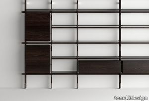
tonellidesign > Cabinet
The bookcase Hemingway with its refined and strong shapes was created by architect Massimo Castagna. It is a bookcase with frame in solid wood, made of uprights and beams, wall or ceiling fixing. The uprights are made lighter by frontal and lateral fissures and are characterised by inserts in polished metal. The horizontal beams physically and visually define the shape and rhythm of this bookcase. The structure supports the shelves and storage units available in different functions and dimensions. The bookcase Hemingway can accommodate horizontal storage units with flap opening and vertical units with hinge door, made of glass and wood. It also has a wooden desk top. The glass shelves and their peculiar side slots, are fixed to the uprights through interlocking pins, each shelf is provided with fall arrest security system. Vertical uprights and horizontal beams in solid wood complete the structure and are available in Siberian Ash or Eucalipto, with inserts and supports in polished chrome or gold. The shelves are in extra clear or smoked glass and the feet are height adjustable. Standard heights are 260 and 300cm, also available in custom size, and Tonelli Design proposes shelves in standard size 60 and 100cm. Storage units with flap opening and hinge door with structure in smoked glass and wooden door. Wooden desk top in 100cm, can be fitted out with cable entry. TV module with open storage unit in wood, size 160cm, to accommodate TVs up to 65 inches.
ARI 1320 - Upholstered fabric chair with armrests _ Et al.
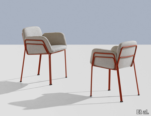
Et al. > Chair
Ari 1320 Armchair: Outdoor Elegance with Modular Flexibility The Ari 1320 armchair, designed by Philippe Nigro for Et al., exemplifies minimalist design and modular functionality. As a standout piece in the Ari outdoor collection, it seamlessly integrates into various environments, including residential patios, hotel terraces, restaurant courtyards, and office outdoor lounges. Design and Dimensions The Ari 1320 features a sleek steel frame supporting upholstered seat, back, and armrests, offering both comfort and durability. Its modular nature allows it to function independently or as part of a larger seating arrangement. While specific dimensions are not provided in the available information, the design emphasizes comfort and adaptability, fitting seamlessly into diverse spatial configurations. Materials and Finishes Crafted with precision, the Ari 1320 offers a range of customization options to suit various design aesthetics: Frame: Constructed from durable steel tubing, ensuring stability and longevity. Upholstery: Available in a selection of high-quality outdoor fabrics, including Panarea (+4 colors), Reviva Hero (+5 colors), Reviva Iris (+7 colors), Reviva Amelia (+5 colors), and Fabthirty (+6 colors), each offering multiple color choices to complement different styles. Frame Finishes: The steel frame can be customized in various finishes, such as White Aluminium (NCS S4000-N VR), Jet Black (NCS S9000-N VR), Coral Red (NCS S3060-Y80R), Matt Jet Black (NCS S9000-N VR), Rough Metallic Bronze (VR), Curry (NCS S3060-Y), Olive Green (NCS S7020-G50Y), Water Blue (NCS S4050-B40G), Capri Blue (NCS S6030-B), Brown (NCS S8005-Y20R), Traffic White (NCS S0502-B VR), Marsala (NCS S4040-R), and Anthracite Grey (NCS S7502-B VR), allowing for seamless integration into any outdoor color scheme. Applications and Versatility The Ari 1320's design makes it suitable for a variety of outdoor settings: Residential Spaces: Ideal for patios, gardens, and terraces, adding a touch of modern elegance. Hospitality Environments: Perfect for hotel courtyards, poolside areas, and outdoor lounges, offering comfort and style to guests. Restaurants and Cafés: Enhances outdoor dining areas with its sleek design and durability. Office Outdoor Areas: Suitable for creating comfortable outdoor break spaces for employees. Complementary Products The Ari collection includes various modules that can be paired with the 1320 armchair to create cohesive seating arrangements. Options include the Ari 1300 linear module, the Ari 1311 corner module, and the Ari 1313 pouf, allowing for flexible configurations to suit different spaces and requirements. Key Features Outdoor Durability: Designed to withstand outdoor conditions, ensuring longevity and sustained aesthetic appeal. Modular Design: Allows for customizable seating arrangements to fit various spaces. Modern Aesthetic: Clean lines and minimalist design contribute to a contemporary look. Customizable Finishes: Wide range of upholstery fabrics and frame finishes to match specific design requirements.