Komo chair

gautierFurniture > Chair
Looking for a simple, timeless chair? Go for the KOMO chair. Its high-quality, wraparound backrest and generously padded seat provide you with maximum comfort. Its very Seventies retro design is accentuated by the rounded seat and backrest as well as its small size. But the sharp, contemporary lines of the rest of its structure and legs strike the perfect balance for this highly decorative chair, making it the epitome of contemporary carpentry. Our tip: choose a vibrant colour to brighten up your home!
Wall Panels - PlantPanel
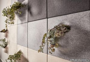
amacoustics > Styling
PlantPanel vertical hanging panels for wall. Mounted on wall with strip, suspension included. Pot included. Available in several colours. Delivered individually. Designed by o4i Design Studio.
Sky Dune
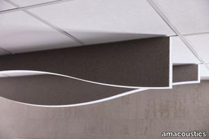
amacoustics > Panels
Sky effectively absorbs sound waves that spread in a room, as well as creating a furnished feeling in the room. Through its design, you can create nice patterns and the absorbents can be added to endlessly. Sky is available in 4-pack. Suspension is added. Note that selection of attachment type must be specified. Designed by o4i Design Studio.
Sky Cloud
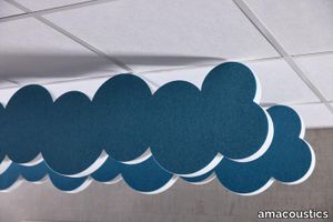
amacoustics > Panels
Sky effectively absorbs sound waves that spread in a room, as well as creating a furnished feeling in the room. Through its design, you can create nice patterns and the absorbents can be added to endlessly. SHORELINE is available in 4-pack. Suspension is added. Note that selection of attachment type must be specified. Designed by o4i Design Studio.
Sky Pixel
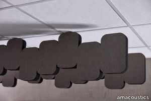
amacoustics > Panels
Sky effectively absorbs sound waves that spread in a room, as well as creating a furnished feeling in the room. Through its design, you can create nice patterns and the absorbents can be added to endlessly. SHORELINE is available in 4-pack. Suspension is added. Note that selection of attachment type must be specified. Designed by o4i Design Studio.
Yang
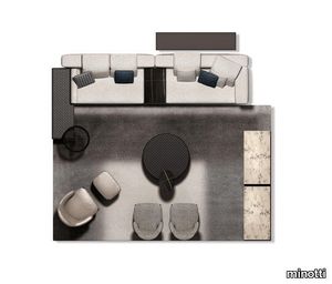
minotti > Sofa
A young, dynamic seating system where geometric lines form an original mix of soft volumes in an unconventional rhythm of full and empty spaces. The streamlined aesthetic style juxtaposes with the wide freedom of seating arrangements, which makes for very original design ideas. The Yang seating system is intended for a young public and can be used to create soft, cozy domestic islands where you can spend your leisure time indulging in your favorite pastimes or enjoying all-out relaxation. A defining feature of Yang is its particular “Offset” elements with the backrest offset from the seat, and which, along with its ottomans and Close side tables, add to its versatility. The various elements can be combined in a multitude of ways thanks to the ottomans which can be placed in various positions: to either extend the seating or to provide a practical table-like surface. The rigorous architectural concept of the Yang seating system is also strengthened by the design of the base: the front section is a simple Pewter-colored aluminum bar, a finish that lends flexibility to the Yang seating system when interpreting the most different styles. The Yang headrest is specifically designed to offer vertical support and encourages the right posture when reading and relaxing. The fine “Cambré” stitching has been used here too, for a functional element that is not only something to lean on but also an extra touch that gives an added value to the sofa.
Byron Floor Lamp
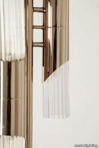
castrolighting > Floor lamp
Allow yourself to unfold the sophisticated aesthetic of lighting creation that this unique accessory will bring to your interior. The Byron Floor Lamp is an absolutely stunning statement piece capable to elevate any space, residential or hospitality. Crafted by the hands of the most qualified professionals, this design is constituted by short gold-plated brass tubes embellished with engraved glass, creating a piece of artwork, unlike anything you have seen before. Inspired by the influential British romantic poet, this floor lamp is a beautiful lighting element to adorn the most demanding space so one can enjoy a moment with a book along with a drink of choice or a celebration with guests who will certainly notice the elegance of this masterpiece. Byron spent a significant portion of his life traveling and exploring the wonders of the world, which was reflected in his poetry and personality, capturing Europe's imagination. Ignited by this, the strong character of this decorative lighting element will not let it go unnoticed. This luxurious floor lamp transports us back to the XVIII century, unveiling a rich historical context. Unified with a modern accent, it perfectly balances past and present. In parallel with having a very versatile character, this luxury lighting design can fit harmoniously in any space and complement your current decoration. #seasideliving
Matrice Traccia
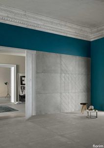
florim > Wallcovering
An atlas of modular signs to be combined in a wide variety of layouts. «We love concrete as a material, its versatility and its plain, austere look. We have completed our carefully designed surfaces with graphic patterning inspired by the human actions of weaving and embroidering.» Barbara Brondi & Marco Rainò To appreciate the profundity of the design project undertaken by Barbara Brondi and Marco Rainò for Cedit, it is both necessary and explanatory to start from the title the collection bears. In modern usage the term Matrice, in Italian, refers to a die or mould used to reproduce an object, but its origins are much more remote, with a meaning closer to the English “matrix”, meaning the underlying basis of something. The root of the word is related to Mater or mother: the name Matrice thus relates to the origin or cause of something. This dichotomy is expressed in several levels within the work of these architects, who study the world from a sophisticated conceptual approach and then transform it into a design. Starting from the idea of ceramic coverings, which have always been a tool not so much of architecture as of interior design, the artists work back to the origin of the surface and its decoration within their own discipline: they look at what we used to call the modern age, where modernity has also brought an uncompromising brutality, and where the use of bare concrete became the statement of an attitude to life with no time to spare for manners. Concrete is originally a liquid material, intended for shaping, which can therefore absorb and retain any type of mark created by the material and mould used to form it. Architects midway between rationalism and brutalism have used the rough-and-ready language of concrete combined with a last, elegant, anthropic decorative motif impressed on the material, that makes the concept of covering superfluous, because its place, in its older meaning of decoration rather than functional cladding, is taken by the regular patterning created in the material itself. There are therefore various grounds for believing that, in this collection, the artists are once again working in architectural terms. Firstly, with a simplicity typical of BRH+, they reduce the initial concepts to their minimal terms. So although this is a collection of coverings for walls, indoor floors, outdoor pavings and curtain walls, a great deal of time was spent on destructuring the idea of the ceramic covering itself. Unfortunately, nowadays there is no space in the contemporary construction sector for the radical approach of the past, so the cladding designed for the building actually lays bare the interior, using the choice of material – accurately interpreted (with shade variation) on the basis of an assortment of various types – to restore visual elegance and a fundamental severity. Attention to scale is another architectural feature: Matrice offers modules with architectural dimensions and different sizes through the development of “large slabs”, eliminating the visual regular grid effect. Thanks to this visual reset, geographic forms are perceived to emerge from dense, grey concrete surfaces decorated as in bygone days by special processes and by weathering during drying. The various types of slab, each an atlas of subtle, vibrant signs on the surfaces, comprise finishes that reproduce the visual effect of reinforced concrete – with the aggregates in the cement more clearly visible, of formwork – with the signs impressed on the concrete by the timber used, of a structured surface resembling bare cement plaster, of ridged and streaked surfaces – with patterning resembling some kinds of linear surface finishing processes – and finally a smooth, or basic version, over which Matrice exercises the dichotomy referred to earlier. It is on these surfaces that Brondi and Rainò have imagined additional design reverberations, a figurative code that rejects the concept of the grid, previously inseparable from that of the module: by means of a vocabulary of graphic marks cut into the slabs with a depth of 3 mm (the width of the gap left between modules during installation), they provide a framework for infinite combinations of possible dialogues. Just as in embroidery, which is based on grids of stitches and geometric repetitions, and where every stitch is at right-angles to another one to construct forms and decorations. Also taken from embroidery is the idea of introducing a degree of “softness” to reduce the stiffness of intentionally deaf surfaces. There is the impression of patterns that can continue for infinity, as in textile weaving, and a scale that, unlike the surface being worked on, is imagined as suspended and lightweight. They may not admit it, but BRH+ know a lot about music, including electronic music, and it appears to me that this organised tangle of infinite signs – unidentifiable without an overview – is rather like the representations of synthesized sounds. Sounds that are produced by machines, and thus “woven” by sampling and overlapping sounds of the most unlikely origins, combined to form jingles which, once heard, are imprinted indelibly on the brain. This may be why I am so interested in the space between this “melodic film” and its deaf, damp substrate. The eyes can navigate this suspended reality without fear of disturbance. So we are faced with different surfaces, different sizes and different graphic signs. But only one colour (surprise!) to prevent a cacophony not just of signs but also of possible interpretations: the artists retain their radical principles (and their generosity), and as curators, a role in which they are skilled, they leave the players (architects and installers) to add their own interpretations. In their hands this colour, expressed in Matrice, will produce motifs on surfaces in living spaces for someone else. This stylish covering and its workmanship will be left to the hands of someone who will probably never read this, but will be on a building site, with the radio playing on a stereo system, concentrating on installing the very pieces we describe. So a radical, apparently silent, design project like this has repercussions for the real world we live in. Matrice has no form of its own but merely acquires the ornamentation drawn on its surfaces by a second group of artists. And here this routine action, standardised by the form approved for production and workmanlike efficiency, is the origin and cause of change, generating a variability of choices and interpretations, on that dusty building site where music plays and mortar flows.
Compatta Limo
florim > Wall tile-stone-brick
<p>A passion for earth as a natural material and for rammed earth, an ancient construction technique.</p> <p>The combination of these patterns evolves into the concept of Pisé Inserti, more slabs of immense decorative impact, generated by the two-dimensional criss-crossing of exquisite, rounded geometrical forms: the designer combines the natural earthen shades with apparently random curved lines that evoke the uneven trapezia with rounded corners used by Gio Ponti.</p> <p>These are also available in the large 120x280 cm size and 6 mm thickness in three variants: Pisé Inserti A, Pisé Inserti B and Pisé Inserti C. COMPATTA’s potential is further enhanced by three-dimensional subjects of varying shapes, which can be built up into mesh-backed mosaics to create sculptural forms on walls. These extensions to the collection are called Inserti Melange, Inserti Sabbia-Argilla and Inserti Limo-Ghiaia and are produced in 9 mm thickness and 30x30 cm size.</p> <p>The collection is born from a sustainable and virtuous approach and is part of <a href="https://www.florim.com/en/company/sustainability/carbonzero-florim/">CarbonZero</a>, Florim's range of Carbon Neutral surfaces.</p> <p>The COMPATTA collection, designed by Federico Peri, combines a passion for earth as a natural material and an interest in a very ancient construction technique.<br>The primary inspiration derives from close observation of the many strata within the ground and the mixtures of elementary particles of which it consists. The design concept is completed by reference to the age-old rammed earth construction technique, used in northern Jordan since the eighth millennium BCE and widely applied in Yemen in many other desert or rural settings until the mid 19thC.<br>In this method, the raw earth is compacted inside wooden formwork to construct continuous structural walls, bearing walls or partitions inside homes, with a natural decorative effect due to the layering of the different shades of clay used. When creating his project for CEDIT, Peri was also influenced by several design inputs: from rural African homes to the clear, simple geometric forms and curved lines typical of the work of Gio Ponti, the curves central to the modernist gardens of Brazilian landscape artist Roberto Burle Marx, and the three-dimensional mosaics of English sculptor William Mitchell. In his murals in concrete, glass and recycled materials, Mitchell seems to combine some of the typical features of a variety of artistic movements, from Modernism to Brutalism, and also shows awareness of the issues concerning the structure of the landscape and the relationship with nature at the heart of Land Art. COMPATTA thus embodies strong links to the world of art and architecture, while bringing natural impressions with a remote, primitive flavour into modern living-spaces.</p>
Compatta Pisé Melange
florim > Wall tile-stone-brick
<p>A passion for earth as a natural material and for rammed earth, an ancient construction technique.</p> <p>The combination of these patterns evolves into the concept of Pisé Inserti, more slabs of immense decorative impact, generated by the two-dimensional criss-crossing of exquisite, rounded geometrical forms: the designer combines the natural earthen shades with apparently random curved lines that evoke the uneven trapezia with rounded corners used by Gio Ponti.</p> <p>These are also available in the large 120x280 cm size and 6 mm thickness in three variants: Pisé Inserti A, Pisé Inserti B and Pisé Inserti C. COMPATTA’s potential is further enhanced by three-dimensional subjects of varying shapes, which can be built up into mesh-backed mosaics to create sculptural forms on walls. These extensions to the collection are called Inserti Melange, Inserti Sabbia-Argilla and Inserti Limo-Ghiaia and are produced in 9 mm thickness and 30x30 cm size.</p> <p>The collection is born from a sustainable and virtuous approach and is part of <a href="https://www.florim.com/en/company/sustainability/carbonzero-florim/">CarbonZero</a>, Florim's range of Carbon Neutral surfaces.</p> <p>The COMPATTA collection, designed by Federico Peri, combines a passion for earth as a natural material and an interest in a very ancient construction technique.<br>The primary inspiration derives from close observation of the many strata within the ground and the mixtures of elementary particles of which it consists. The design concept is completed by reference to the age-old rammed earth construction technique, used in northern Jordan since the eighth millennium BCE and widely applied in Yemen in many other desert or rural settings until the mid 19thC.<br>In this method, the raw earth is compacted inside wooden formwork to construct continuous structural walls, bearing walls or partitions inside homes, with a natural decorative effect due to the layering of the different shades of clay used. When creating his project for CEDIT, Peri was also influenced by several design inputs: from rural African homes to the clear, simple geometric forms and curved lines typical of the work of Gio Ponti, the curves central to the modernist gardens of Brazilian landscape artist Roberto Burle Marx, and the three-dimensional mosaics of English sculptor William Mitchell. In his murals in concrete, glass and recycled materials, Mitchell seems to combine some of the typical features of a variety of artistic movements, from Modernism to Brutalism, and also shows awareness of the issues concerning the structure of the landscape and the relationship with nature at the heart of Land Art. COMPATTA thus embodies strong links to the world of art and architecture, while bringing natural impressions with a remote, primitive flavour into modern living-spaces.</p>
Matrice Forma
florim > Wallcovering
An atlas of modular signs to be combined in a wide variety of layouts. «We love concrete as a material, its versatility and its plain, austere look. We have completed our carefully designed surfaces with graphic patterning inspired by the human actions of weaving and embroidering.» Barbara Brondi & Marco Rainò To appreciate the profundity of the design project undertaken by Barbara Brondi and Marco Rainò for Cedit, it is both necessary and explanatory to start from the title the collection bears. In modern usage the term Matrice, in Italian, refers to a die or mould used to reproduce an object, but its origins are much more remote, with a meaning closer to the English “matrix”, meaning the underlying basis of something. The root of the word is related to Mater or mother: the name Matrice thus relates to the origin or cause of something. This dichotomy is expressed in several levels within the work of these architects, who study the world from a sophisticated conceptual approach and then transform it into a design. Starting from the idea of ceramic coverings, which have always been a tool not so much of architecture as of interior design, the artists work back to the origin of the surface and its decoration within their own discipline: they look at what we used to call the modern age, where modernity has also brought an uncompromising brutality, and where the use of bare concrete became the statement of an attitude to life with no time to spare for manners. Concrete is originally a liquid material, intended for shaping, which can therefore absorb and retain any type of mark created by the material and mould used to form it. Architects midway between rationalism and brutalism have used the rough-and-ready language of concrete combined with a last, elegant, anthropic decorative motif impressed on the material, that makes the concept of covering superfluous, because its place, in its older meaning of decoration rather than functional cladding, is taken by the regular patterning created in the material itself. There are therefore various grounds for believing that, in this collection, the artists are once again working in architectural terms. Firstly, with a simplicity typical of BRH+, they reduce the initial concepts to their minimal terms. So although this is a collection of coverings for walls, indoor floors, outdoor pavings and curtain walls, a great deal of time was spent on destructuring the idea of the ceramic covering itself. Unfortunately, nowadays there is no space in the contemporary construction sector for the radical approach of the past, so the cladding designed for the building actually lays bare the interior, using the choice of material – accurately interpreted (with shade variation) on the basis of an assortment of various types – to restore visual elegance and a fundamental severity. Attention to scale is another architectural feature: Matrice offers modules with architectural dimensions and different sizes through the development of “large slabs”, eliminating the visual regular grid effect. Thanks to this visual reset, geographic forms are perceived to emerge from dense, grey concrete surfaces decorated as in bygone days by special processes and by weathering during drying. The various types of slab, each an atlas of subtle, vibrant signs on the surfaces, comprise finishes that reproduce the visual effect of reinforced concrete – with the aggregates in the cement more clearly visible, of formwork – with the signs impressed on the concrete by the timber used, of a structured surface resembling bare cement plaster, of ridged and streaked surfaces – with patterning resembling some kinds of linear surface finishing processes – and finally a smooth, or basic version, over which Matrice exercises the dichotomy referred to earlier. It is on these surfaces that Brondi and Rainò have imagined additional design reverberations, a figurative code that rejects the concept of the grid, previously inseparable from that of the module: by means of a vocabulary of graphic marks cut into the slabs with a depth of 3 mm (the width of the gap left between modules during installation), they provide a framework for infinite combinations of possible dialogues. Just as in embroidery, which is based on grids of stitches and geometric repetitions, and where every stitch is at right-angles to another one to construct forms and decorations. Also taken from embroidery is the idea of introducing a degree of “softness” to reduce the stiffness of intentionally deaf surfaces. There is the impression of patterns that can continue for infinity, as in textile weaving, and a scale that, unlike the surface being worked on, is imagined as suspended and lightweight. They may not admit it, but BRH+ know a lot about music, including electronic music, and it appears to me that this organised tangle of infinite signs – unidentifiable without an overview – is rather like the representations of synthesized sounds. Sounds that are produced by machines, and thus “woven” by sampling and overlapping sounds of the most unlikely origins, combined to form jingles which, once heard, are imprinted indelibly on the brain. This may be why I am so interested in the space between this “melodic film” and its deaf, damp substrate. The eyes can navigate this suspended reality without fear of disturbance. So we are faced with different surfaces, different sizes and different graphic signs. But only one colour (surprise!) to prevent a cacophony not just of signs but also of possible interpretations: the artists retain their radical principles (and their generosity), and as curators, a role in which they are skilled, they leave the players (architects and installers) to add their own interpretations. In their hands this colour, expressed in Matrice, will produce motifs on surfaces in living spaces for someone else. This stylish covering and its workmanship will be left to the hands of someone who will probably never read this, but will be on a building site, with the radio playing on a stereo system, concentrating on installing the very pieces we describe. So a radical, apparently silent, design project like this has repercussions for the real world we live in. Matrice has no form of its own but merely acquires the ornamentation drawn on its surfaces by a second group of artists. And here this routine action, standardised by the form approved for production and workmanlike efficiency, is the origin and cause of change, generating a variability of choices and interpretations, on that dusty building site where music plays and mortar flows.
Matrice Rilievo
florim > Wallcovering
An atlas of modular signs to be combined in a wide variety of layouts. «We love concrete as a material, its versatility and its plain, austere look. We have completed our carefully designed surfaces with graphic patterning inspired by the human actions of weaving and embroidering.» Barbara Brondi & Marco Rainò To appreciate the profundity of the design project undertaken by Barbara Brondi and Marco Rainò for Cedit, it is both necessary and explanatory to start from the title the collection bears. In modern usage the term Matrice, in Italian, refers to a die or mould used to reproduce an object, but its origins are much more remote, with a meaning closer to the English “matrix”, meaning the underlying basis of something. The root of the word is related to Mater or mother: the name Matrice thus relates to the origin or cause of something. This dichotomy is expressed in several levels within the work of these architects, who study the world from a sophisticated conceptual approach and then transform it into a design. Starting from the idea of ceramic coverings, which have always been a tool not so much of architecture as of interior design, the artists work back to the origin of the surface and its decoration within their own discipline: they look at what we used to call the modern age, where modernity has also brought an uncompromising brutality, and where the use of bare concrete became the statement of an attitude to life with no time to spare for manners. Concrete is originally a liquid material, intended for shaping, which can therefore absorb and retain any type of mark created by the material and mould used to form it. Architects midway between rationalism and brutalism have used the rough-and-ready language of concrete combined with a last, elegant, anthropic decorative motif impressed on the material, that makes the concept of covering superfluous, because its place, in its older meaning of decoration rather than functional cladding, is taken by the regular patterning created in the material itself. There are therefore various grounds for believing that, in this collection, the artists are once again working in architectural terms. Firstly, with a simplicity typical of BRH+, they reduce the initial concepts to their minimal terms. So although this is a collection of coverings for walls, indoor floors, outdoor pavings and curtain walls, a great deal of time was spent on destructuring the idea of the ceramic covering itself. Unfortunately, nowadays there is no space in the contemporary construction sector for the radical approach of the past, so the cladding designed for the building actually lays bare the interior, using the choice of material – accurately interpreted (with shade variation) on the basis of an assortment of various types – to restore visual elegance and a fundamental severity. Attention to scale is another architectural feature: Matrice offers modules with architectural dimensions and different sizes through the development of “large slabs”, eliminating the visual regular grid effect. Thanks to this visual reset, geographic forms are perceived to emerge from dense, grey concrete surfaces decorated as in bygone days by special processes and by weathering during drying. The various types of slab, each an atlas of subtle, vibrant signs on the surfaces, comprise finishes that reproduce the visual effect of reinforced concrete – with the aggregates in the cement more clearly visible, of formwork – with the signs impressed on the concrete by the timber used, of a structured surface resembling bare cement plaster, of ridged and streaked surfaces – with patterning resembling some kinds of linear surface finishing processes – and finally a smooth, or basic version, over which Matrice exercises the dichotomy referred to earlier. It is on these surfaces that Brondi and Rainò have imagined additional design reverberations, a figurative code that rejects the concept of the grid, previously inseparable from that of the module: by means of a vocabulary of graphic marks cut into the slabs with a depth of 3 mm (the width of the gap left between modules during installation), they provide a framework for infinite combinations of possible dialogues. Just as in embroidery, which is based on grids of stitches and geometric repetitions, and where every stitch is at right-angles to another one to construct forms and decorations. Also taken from embroidery is the idea of introducing a degree of “softness” to reduce the stiffness of intentionally deaf surfaces. There is the impression of patterns that can continue for infinity, as in textile weaving, and a scale that, unlike the surface being worked on, is imagined as suspended and lightweight. They may not admit it, but BRH+ know a lot about music, including electronic music, and it appears to me that this organised tangle of infinite signs – unidentifiable without an overview – is rather like the representations of synthesized sounds. Sounds that are produced by machines, and thus “woven” by sampling and overlapping sounds of the most unlikely origins, combined to form jingles which, once heard, are imprinted indelibly on the brain. This may be why I am so interested in the space between this “melodic film” and its deaf, damp substrate. The eyes can navigate this suspended reality without fear of disturbance. So we are faced with different surfaces, different sizes and different graphic signs. But only one colour (surprise!) to prevent a cacophony not just of signs but also of possible interpretations: the artists retain their radical principles (and their generosity), and as curators, a role in which they are skilled, they leave the players (architects and installers) to add their own interpretations. In their hands this colour, expressed in Matrice, will produce motifs on surfaces in living spaces for someone else. This stylish covering and its workmanship will be left to the hands of someone who will probably never read this, but will be on a building site, with the radio playing on a stereo system, concentrating on installing the very pieces we describe. So a radical, apparently silent, design project like this has repercussions for the real world we live in. Matrice has no form of its own but merely acquires the ornamentation drawn on its surfaces by a second group of artists. And here this routine action, standardised by the form approved for production and workmanlike efficiency, is the origin and cause of change, generating a variability of choices and interpretations, on that dusty building site where music plays and mortar flows.
Matrice Sostanza
florim > Wallcovering
An atlas of modular signs to be combined in a wide variety of layouts. «We love concrete as a material, its versatility and its plain, austere look. We have completed our carefully designed surfaces with graphic patterning inspired by the human actions of weaving and embroidering.» Barbara Brondi & Marco Rainò To appreciate the profundity of the design project undertaken by Barbara Brondi and Marco Rainò for Cedit, it is both necessary and explanatory to start from the title the collection bears. In modern usage the term Matrice, in Italian, refers to a die or mould used to reproduce an object, but its origins are much more remote, with a meaning closer to the English “matrix”, meaning the underlying basis of something. The root of the word is related to Mater or mother: the name Matrice thus relates to the origin or cause of something. This dichotomy is expressed in several levels within the work of these architects, who study the world from a sophisticated conceptual approach and then transform it into a design. Starting from the idea of ceramic coverings, which have always been a tool not so much of architecture as of interior design, the artists work back to the origin of the surface and its decoration within their own discipline: they look at what we used to call the modern age, where modernity has also brought an uncompromising brutality, and where the use of bare concrete became the statement of an attitude to life with no time to spare for manners. Concrete is originally a liquid material, intended for shaping, which can therefore absorb and retain any type of mark created by the material and mould used to form it. Architects midway between rationalism and brutalism have used the rough-and-ready language of concrete combined with a last, elegant, anthropic decorative motif impressed on the material, that makes the concept of covering superfluous, because its place, in its older meaning of decoration rather than functional cladding, is taken by the regular patterning created in the material itself. There are therefore various grounds for believing that, in this collection, the artists are once again working in architectural terms. Firstly, with a simplicity typical of BRH+, they reduce the initial concepts to their minimal terms. So although this is a collection of coverings for walls, indoor floors, outdoor pavings and curtain walls, a great deal of time was spent on destructuring the idea of the ceramic covering itself. Unfortunately, nowadays there is no space in the contemporary construction sector for the radical approach of the past, so the cladding designed for the building actually lays bare the interior, using the choice of material – accurately interpreted (with shade variation) on the basis of an assortment of various types – to restore visual elegance and a fundamental severity. Attention to scale is another architectural feature: Matrice offers modules with architectural dimensions and different sizes through the development of “large slabs”, eliminating the visual regular grid effect. Thanks to this visual reset, geographic forms are perceived to emerge from dense, grey concrete surfaces decorated as in bygone days by special processes and by weathering during drying. The various types of slab, each an atlas of subtle, vibrant signs on the surfaces, comprise finishes that reproduce the visual effect of reinforced concrete – with the aggregates in the cement more clearly visible, of formwork – with the signs impressed on the concrete by the timber used, of a structured surface resembling bare cement plaster, of ridged and streaked surfaces – with patterning resembling some kinds of linear surface finishing processes – and finally a smooth, or basic version, over which Matrice exercises the dichotomy referred to earlier. It is on these surfaces that Brondi and Rainò have imagined additional design reverberations, a figurative code that rejects the concept of the grid, previously inseparable from that of the module: by means of a vocabulary of graphic marks cut into the slabs with a depth of 3 mm (the width of the gap left between modules during installation), they provide a framework for infinite combinations of possible dialogues. Just as in embroidery, which is based on grids of stitches and geometric repetitions, and where every stitch is at right-angles to another one to construct forms and decorations. Also taken from embroidery is the idea of introducing a degree of “softness” to reduce the stiffness of intentionally deaf surfaces. There is the impression of patterns that can continue for infinity, as in textile weaving, and a scale that, unlike the surface being worked on, is imagined as suspended and lightweight. They may not admit it, but BRH+ know a lot about music, including electronic music, and it appears to me that this organised tangle of infinite signs – unidentifiable without an overview – is rather like the representations of synthesized sounds. Sounds that are produced by machines, and thus “woven” by sampling and overlapping sounds of the most unlikely origins, combined to form jingles which, once heard, are imprinted indelibly on the brain. This may be why I am so interested in the space between this “melodic film” and its deaf, damp substrate. The eyes can navigate this suspended reality without fear of disturbance. So we are faced with different surfaces, different sizes and different graphic signs. But only one colour (surprise!) to prevent a cacophony not just of signs but also of possible interpretations: the artists retain their radical principles (and their generosity), and as curators, a role in which they are skilled, they leave the players (architects and installers) to add their own interpretations. In their hands this colour, expressed in Matrice, will produce motifs on surfaces in living spaces for someone else. This stylish covering and its workmanship will be left to the hands of someone who will probably never read this, but will be on a building site, with the radio playing on a stereo system, concentrating on installing the very pieces we describe. So a radical, apparently silent, design project like this has repercussions for the real world we live in. Matrice has no form of its own but merely acquires the ornamentation drawn on its surfaces by a second group of artists. And here this routine action, standardised by the form approved for production and workmanlike efficiency, is the origin and cause of change, generating a variability of choices and interpretations, on that dusty building site where music plays and mortar flows.
Padova Matt Black
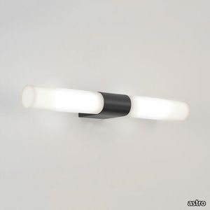
astro > Wall lamp
Mounted above a mirror, this neatly proportioned wall light brings an elegant symmetry to any bathroom. It diffuses a bright, even illumination, making it effective as task lighting, while the frosted glass finish eliminates glare. The design is distinguished by its streamlined fitting.
Ombre Lilac Mosaic
artistictile > Floor tile-stone
Ombré Stone Grey arranges a host of classic and beautiful marbles into a cascading wave, sweeping through the legendary white stones from pure white Thassos, to creamy Bianco Dolomiti, into Statuary’s trademark grey on white and the classic grey of Bardiglio Nuvolato, and ending with deep, dark China Black. Each stone is polished for a consistent finish. Extenders are offered in Thassos and China Black, to elongate either end of the Ombré range. Ombré Lilac also begins with Thassos and Bianco Dolomiti, then sweeps into Lilac marble, from soft veins against white to deep purple, all polished. The Thassos extender modulates with Ombré Lilac as well. The design possibilities offered by Ombré Stone and its extenders are extraordinary and promise outstanding results.
Matrice Aura
florim > Wallcovering
An atlas of modular signs to be combined in a wide variety of layouts. «We love concrete as a material, its versatility and its plain, austere look. We have completed our carefully designed surfaces with graphic patterning inspired by the human actions of weaving and embroidering.» Barbara Brondi & Marco Rainò To appreciate the profundity of the design project undertaken by Barbara Brondi and Marco Rainò for Cedit, it is both necessary and explanatory to start from the title the collection bears. In modern usage the term Matrice, in Italian, refers to a die or mould used to reproduce an object, but its origins are much more remote, with a meaning closer to the English “matrix”, meaning the underlying basis of something. The root of the word is related to Mater or mother: the name Matrice thus relates to the origin or cause of something. This dichotomy is expressed in several levels within the work of these architects, who study the world from a sophisticated conceptual approach and then transform it into a design. Starting from the idea of ceramic coverings, which have always been a tool not so much of architecture as of interior design, the artists work back to the origin of the surface and its decoration within their own discipline: they look at what we used to call the modern age, where modernity has also brought an uncompromising brutality, and where the use of bare concrete became the statement of an attitude to life with no time to spare for manners. Concrete is originally a liquid material, intended for shaping, which can therefore absorb and retain any type of mark created by the material and mould used to form it. Architects midway between rationalism and brutalism have used the rough-and-ready language of concrete combined with a last, elegant, anthropic decorative motif impressed on the material, that makes the concept of covering superfluous, because its place, in its older meaning of decoration rather than functional cladding, is taken by the regular patterning created in the material itself. There are therefore various grounds for believing that, in this collection, the artists are once again working in architectural terms. Firstly, with a simplicity typical of BRH+, they reduce the initial concepts to their minimal terms. So although this is a collection of coverings for walls, indoor floors, outdoor pavings and curtain walls, a great deal of time was spent on destructuring the idea of the ceramic covering itself. Unfortunately, nowadays there is no space in the contemporary construction sector for the radical approach of the past, so the cladding designed for the building actually lays bare the interior, using the choice of material – accurately interpreted (with shade variation) on the basis of an assortment of various types – to restore visual elegance and a fundamental severity. Attention to scale is another architectural feature: Matrice offers modules with architectural dimensions and different sizes through the development of “large slabs”, eliminating the visual regular grid effect. Thanks to this visual reset, geographic forms are perceived to emerge from dense, grey concrete surfaces decorated as in bygone days by special processes and by weathering during drying. The various types of slab, each an atlas of subtle, vibrant signs on the surfaces, comprise finishes that reproduce the visual effect of reinforced concrete – with the aggregates in the cement more clearly visible, of formwork – with the signs impressed on the concrete by the timber used, of a structured surface resembling bare cement plaster, of ridged and streaked surfaces – with patterning resembling some kinds of linear surface finishing processes – and finally a smooth, or basic version, over which Matrice exercises the dichotomy referred to earlier. It is on these surfaces that Brondi and Rainò have imagined additional design reverberations, a figurative code that rejects the concept of the grid, previously inseparable from that of the module: by means of a vocabulary of graphic marks cut into the slabs with a depth of 3 mm (the width of the gap left between modules during installation), they provide a framework for infinite combinations of possible dialogues. Just as in embroidery, which is based on grids of stitches and geometric repetitions, and where every stitch is at right-angles to another one to construct forms and decorations. Also taken from embroidery is the idea of introducing a degree of “softness” to reduce the stiffness of intentionally deaf surfaces. There is the impression of patterns that can continue for infinity, as in textile weaving, and a scale that, unlike the surface being worked on, is imagined as suspended and lightweight. They may not admit it, but BRH+ know a lot about music, including electronic music, and it appears to me that this organised tangle of infinite signs – unidentifiable without an overview – is rather like the representations of synthesized sounds. Sounds that are produced by machines, and thus “woven” by sampling and overlapping sounds of the most unlikely origins, combined to form jingles which, once heard, are imprinted indelibly on the brain. This may be why I am so interested in the space between this “melodic film” and its deaf, damp substrate. The eyes can navigate this suspended reality without fear of disturbance. So we are faced with different surfaces, different sizes and different graphic signs. But only one colour (surprise!) to prevent a cacophony not just of signs but also of possible interpretations: the artists retain their radical principles (and their generosity), and as curators, a role in which they are skilled, they leave the players (architects and installers) to add their own interpretations. In their hands this colour, expressed in Matrice, will produce motifs on surfaces in living spaces for someone else. This stylish covering and its workmanship will be left to the hands of someone who will probably never read this, but will be on a building site, with the radio playing on a stereo system, concentrating on installing the very pieces we describe. So a radical, apparently silent, design project like this has repercussions for the real world we live in. Matrice has no form of its own but merely acquires the ornamentation drawn on its surfaces by a second group of artists. And here this routine action, standardised by the form approved for production and workmanlike efficiency, is the origin and cause of change, generating a variability of choices and interpretations, on that dusty building site where music plays and mortar flows.
Compatta Argilla
florim > Wall tile-stone-brick
<p>A passion for earth as a natural material and for rammed earth, an ancient construction technique.</p> <p>The combination of these patterns evolves into the concept of Pisé Inserti, more slabs of immense decorative impact, generated by the two-dimensional criss-crossing of exquisite, rounded geometrical forms: the designer combines the natural earthen shades with apparently random curved lines that evoke the uneven trapezia with rounded corners used by Gio Ponti.</p> <p>These are also available in the large 120x280 cm size and 6 mm thickness in three variants: Pisé Inserti A, Pisé Inserti B and Pisé Inserti C. COMPATTA’s potential is further enhanced by three-dimensional subjects of varying shapes, which can be built up into mesh-backed mosaics to create sculptural forms on walls. These extensions to the collection are called Inserti Melange, Inserti Sabbia-Argilla and Inserti Limo-Ghiaia and are produced in 9 mm thickness and 30x30 cm size.</p> <p>The collection is born from a sustainable and virtuous approach and is part of <a href="https://www.florim.com/en/company/sustainability/carbonzero-florim/">CarbonZero</a>, Florim's range of Carbon Neutral surfaces.</p> <p>The COMPATTA collection, designed by Federico Peri, combines a passion for earth as a natural material and an interest in a very ancient construction technique.<br>The primary inspiration derives from close observation of the many strata within the ground and the mixtures of elementary particles of which it consists. The design concept is completed by reference to the age-old rammed earth construction technique, used in northern Jordan since the eighth millennium BCE and widely applied in Yemen in many other desert or rural settings until the mid 19thC.<br>In this method, the raw earth is compacted inside wooden formwork to construct continuous structural walls, bearing walls or partitions inside homes, with a natural decorative effect due to the layering of the different shades of clay used. When creating his project for CEDIT, Peri was also influenced by several design inputs: from rural African homes to the clear, simple geometric forms and curved lines typical of the work of Gio Ponti, the curves central to the modernist gardens of Brazilian landscape artist Roberto Burle Marx, and the three-dimensional mosaics of English sculptor William Mitchell. In his murals in concrete, glass and recycled materials, Mitchell seems to combine some of the typical features of a variety of artistic movements, from Modernism to Brutalism, and also shows awareness of the issues concerning the structure of the landscape and the relationship with nature at the heart of Land Art. COMPATTA thus embodies strong links to the world of art and architecture, while bringing natural impressions with a remote, primitive flavour into modern living-spaces.</p>
Ombre Grey Mosaic
artistictile > Floor tile-stone
Ombré Stone Grey arranges a host of classic and beautiful marbles into a cascading wave, sweeping through the legendary white stones from pure white Thassos, to creamy Bianco Dolomiti, into Statuary’s trademark grey on white and the classic grey of Bardiglio Nuvolato, and ending with deep, dark China Black. Each stone is polished for a consistent finish. Extenders are offered in Thassos and China Black, to elongate either end of the Ombré range. Ombré Lilac also begins with Thassos and Bianco Dolomiti, then sweeps into Lilac marble, from soft veins against white to deep purple, all polished. The Thassos extender modulates with Ombré Lilac as well. The design possibilities offered by Ombré Stone and its extenders are extraordinary and promise outstanding results.
curve

poliform > Chair
Light and elegant, behind its apparent simplicity this chair hides an intricate crafting of solid wood. In all three variants—wood, wood with upholstered seat and wood with upholstered seat and backrest—the material is the protagonist. Soft curves and tapering slender lines are inspired by modern design. The result is a classic yet contemporary chair, ideally combined with the table by the same name.
N°5 High Chair
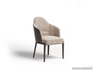
paolocastelli > Chair
Enveloping and fluid lines for this collection of highly comfortable upholstered chairs of optimal refinement. Available in two versions: with low and high back. Dark stained ash structure, dark-stained ash backrest seat, padded seat and back in different density expanded polyurethane, upholstered in fabric or sample leather. The design is enhanced by a high-quality decorative handle in opaque brass and leather positioned on the back of the back. Not removable.
Record Contract
infinitidesign > Coffee table
Record contract is the perfect coffee table for bars, restaurants, cafeterias and meeting places. Thanks to the two heights and the numerous combinations of tops available, it is possible to have a table made to measure for the client, always characterised by the design that distinguishes the family. For every type of chair or armchair, there is a Record Contract table to suit.
Matrice Essenza
florim > Wallcovering
An atlas of modular signs to be combined in a wide variety of layouts. «We love concrete as a material, its versatility and its plain, austere look. We have completed our carefully designed surfaces with graphic patterning inspired by the human actions of weaving and embroidering.» Barbara Brondi & Marco Rainò To appreciate the profundity of the design project undertaken by Barbara Brondi and Marco Rainò for Cedit, it is both necessary and explanatory to start from the title the collection bears. In modern usage the term Matrice, in Italian, refers to a die or mould used to reproduce an object, but its origins are much more remote, with a meaning closer to the English “matrix”, meaning the underlying basis of something. The root of the word is related to Mater or mother: the name Matrice thus relates to the origin or cause of something. This dichotomy is expressed in several levels within the work of these architects, who study the world from a sophisticated conceptual approach and then transform it into a design. Starting from the idea of ceramic coverings, which have always been a tool not so much of architecture as of interior design, the artists work back to the origin of the surface and its decoration within their own discipline: they look at what we used to call the modern age, where modernity has also brought an uncompromising brutality, and where the use of bare concrete became the statement of an attitude to life with no time to spare for manners. Concrete is originally a liquid material, intended for shaping, which can therefore absorb and retain any type of mark created by the material and mould used to form it. Architects midway between rationalism and brutalism have used the rough-and-ready language of concrete combined with a last, elegant, anthropic decorative motif impressed on the material, that makes the concept of covering superfluous, because its place, in its older meaning of decoration rather than functional cladding, is taken by the regular patterning created in the material itself. There are therefore various grounds for believing that, in this collection, the artists are once again working in architectural terms. Firstly, with a simplicity typical of BRH+, they reduce the initial concepts to their minimal terms. So although this is a collection of coverings for walls, indoor floors, outdoor pavings and curtain walls, a great deal of time was spent on destructuring the idea of the ceramic covering itself. Unfortunately, nowadays there is no space in the contemporary construction sector for the radical approach of the past, so the cladding designed for the building actually lays bare the interior, using the choice of material – accurately interpreted (with shade variation) on the basis of an assortment of various types – to restore visual elegance and a fundamental severity. Attention to scale is another architectural feature: Matrice offers modules with architectural dimensions and different sizes through the development of “large slabs”, eliminating the visual regular grid effect. Thanks to this visual reset, geographic forms are perceived to emerge from dense, grey concrete surfaces decorated as in bygone days by special processes and by weathering during drying. The various types of slab, each an atlas of subtle, vibrant signs on the surfaces, comprise finishes that reproduce the visual effect of reinforced concrete – with the aggregates in the cement more clearly visible, of formwork – with the signs impressed on the concrete by the timber used, of a structured surface resembling bare cement plaster, of ridged and streaked surfaces – with patterning resembling some kinds of linear surface finishing processes – and finally a smooth, or basic version, over which Matrice exercises the dichotomy referred to earlier. It is on these surfaces that Brondi and Rainò have imagined additional design reverberations, a figurative code that rejects the concept of the grid, previously inseparable from that of the module: by means of a vocabulary of graphic marks cut into the slabs with a depth of 3 mm (the width of the gap left between modules during installation), they provide a framework for infinite combinations of possible dialogues. Just as in embroidery, which is based on grids of stitches and geometric repetitions, and where every stitch is at right-angles to another one to construct forms and decorations. Also taken from embroidery is the idea of introducing a degree of “softness” to reduce the stiffness of intentionally deaf surfaces. There is the impression of patterns that can continue for infinity, as in textile weaving, and a scale that, unlike the surface being worked on, is imagined as suspended and lightweight. They may not admit it, but BRH+ know a lot about music, including electronic music, and it appears to me that this organised tangle of infinite signs – unidentifiable without an overview – is rather like the representations of synthesized sounds. Sounds that are produced by machines, and thus “woven” by sampling and overlapping sounds of the most unlikely origins, combined to form jingles which, once heard, are imprinted indelibly on the brain. This may be why I am so interested in the space between this “melodic film” and its deaf, damp substrate. The eyes can navigate this suspended reality without fear of disturbance. So we are faced with different surfaces, different sizes and different graphic signs. But only one colour (surprise!) to prevent a cacophony not just of signs but also of possible interpretations: the artists retain their radical principles (and their generosity), and as curators, a role in which they are skilled, they leave the players (architects and installers) to add their own interpretations. In their hands this colour, expressed in Matrice, will produce motifs on surfaces in living spaces for someone else. This stylish covering and its workmanship will be left to the hands of someone who will probably never read this, but will be on a building site, with the radio playing on a stereo system, concentrating on installing the very pieces we describe. So a radical, apparently silent, design project like this has repercussions for the real world we live in. Matrice has no form of its own but merely acquires the ornamentation drawn on its surfaces by a second group of artists. And here this routine action, standardised by the form approved for production and workmanlike efficiency, is the origin and cause of change, generating a variability of choices and interpretations, on that dusty building site where music plays and mortar flows.
Display cabinet Broadway
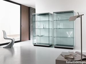
tonellidesign > Cabinet
The display cabinet Broadway, features a structure in transparent tempered glass top and base are in lacquered wood, matt white or black. The external profiles of top and base are in grey aluminium. Castors are located hidden underneath the lower part, useful for easy displacement. Conceived by Bartoli Design, the display cabinet Broadways results ideal to decorate living rooms and dining rooms. Available in two sizes, with the possibility to add a lighting kit inside.
Matrice Struttura
florim > Wallcovering
An atlas of modular signs to be combined in a wide variety of layouts. «We love concrete as a material, its versatility and its plain, austere look. We have completed our carefully designed surfaces with graphic patterning inspired by the human actions of weaving and embroidering.» Barbara Brondi & Marco Rainò To appreciate the profundity of the design project undertaken by Barbara Brondi and Marco Rainò for Cedit, it is both necessary and explanatory to start from the title the collection bears. In modern usage the term Matrice, in Italian, refers to a die or mould used to reproduce an object, but its origins are much more remote, with a meaning closer to the English “matrix”, meaning the underlying basis of something. The root of the word is related to Mater or mother: the name Matrice thus relates to the origin or cause of something. This dichotomy is expressed in several levels within the work of these architects, who study the world from a sophisticated conceptual approach and then transform it into a design. Starting from the idea of ceramic coverings, which have always been a tool not so much of architecture as of interior design, the artists work back to the origin of the surface and its decoration within their own discipline: they look at what we used to call the modern age, where modernity has also brought an uncompromising brutality, and where the use of bare concrete became the statement of an attitude to life with no time to spare for manners. Concrete is originally a liquid material, intended for shaping, which can therefore absorb and retain any type of mark created by the material and mould used to form it. Architects midway between rationalism and brutalism have used the rough-and-ready language of concrete combined with a last, elegant, anthropic decorative motif impressed on the material, that makes the concept of covering superfluous, because its place, in its older meaning of decoration rather than functional cladding, is taken by the regular patterning created in the material itself. There are therefore various grounds for believing that, in this collection, the artists are once again working in architectural terms. Firstly, with a simplicity typical of BRH+, they reduce the initial concepts to their minimal terms. So although this is a collection of coverings for walls, indoor floors, outdoor pavings and curtain walls, a great deal of time was spent on destructuring the idea of the ceramic covering itself. Unfortunately, nowadays there is no space in the contemporary construction sector for the radical approach of the past, so the cladding designed for the building actually lays bare the interior, using the choice of material – accurately interpreted (with shade variation) on the basis of an assortment of various types – to restore visual elegance and a fundamental severity. Attention to scale is another architectural feature: Matrice offers modules with architectural dimensions and different sizes through the development of “large slabs”, eliminating the visual regular grid effect. Thanks to this visual reset, geographic forms are perceived to emerge from dense, grey concrete surfaces decorated as in bygone days by special processes and by weathering during drying. The various types of slab, each an atlas of subtle, vibrant signs on the surfaces, comprise finishes that reproduce the visual effect of reinforced concrete – with the aggregates in the cement more clearly visible, of formwork – with the signs impressed on the concrete by the timber used, of a structured surface resembling bare cement plaster, of ridged and streaked surfaces – with patterning resembling some kinds of linear surface finishing processes – and finally a smooth, or basic version, over which Matrice exercises the dichotomy referred to earlier. It is on these surfaces that Brondi and Rainò have imagined additional design reverberations, a figurative code that rejects the concept of the grid, previously inseparable from that of the module: by means of a vocabulary of graphic marks cut into the slabs with a depth of 3 mm (the width of the gap left between modules during installation), they provide a framework for infinite combinations of possible dialogues. Just as in embroidery, which is based on grids of stitches and geometric repetitions, and where every stitch is at right-angles to another one to construct forms and decorations. Also taken from embroidery is the idea of introducing a degree of “softness” to reduce the stiffness of intentionally deaf surfaces. There is the impression of patterns that can continue for infinity, as in textile weaving, and a scale that, unlike the surface being worked on, is imagined as suspended and lightweight. They may not admit it, but BRH+ know a lot about music, including electronic music, and it appears to me that this organised tangle of infinite signs – unidentifiable without an overview – is rather like the representations of synthesized sounds. Sounds that are produced by machines, and thus “woven” by sampling and overlapping sounds of the most unlikely origins, combined to form jingles which, once heard, are imprinted indelibly on the brain. This may be why I am so interested in the space between this “melodic film” and its deaf, damp substrate. The eyes can navigate this suspended reality without fear of disturbance. So we are faced with different surfaces, different sizes and different graphic signs. But only one colour (surprise!) to prevent a cacophony not just of signs but also of possible interpretations: the artists retain their radical principles (and their generosity), and as curators, a role in which they are skilled, they leave the players (architects and installers) to add their own interpretations. In their hands this colour, expressed in Matrice, will produce motifs on surfaces in living spaces for someone else. This stylish covering and its workmanship will be left to the hands of someone who will probably never read this, but will be on a building site, with the radio playing on a stereo system, concentrating on installing the very pieces we describe. So a radical, apparently silent, design project like this has repercussions for the real world we live in. Matrice has no form of its own but merely acquires the ornamentation drawn on its surfaces by a second group of artists. And here this routine action, standardised by the form approved for production and workmanlike efficiency, is the origin and cause of change, generating a variability of choices and interpretations, on that dusty building site where music plays and mortar flows.
Compatta Pisé Limo
florim > Wall tile-stone-brick
<p>A passion for earth as a natural material and for rammed earth, an ancient construction technique.</p> <p>The combination of these patterns evolves into the concept of Pisé Inserti, more slabs of immense decorative impact, generated by the two-dimensional criss-crossing of exquisite, rounded geometrical forms: the designer combines the natural earthen shades with apparently random curved lines that evoke the uneven trapezia with rounded corners used by Gio Ponti.</p> <p>These are also available in the large 120x280 cm size and 6 mm thickness in three variants: Pisé Inserti A, Pisé Inserti B and Pisé Inserti C. COMPATTA’s potential is further enhanced by three-dimensional subjects of varying shapes, which can be built up into mesh-backed mosaics to create sculptural forms on walls. These extensions to the collection are called Inserti Melange, Inserti Sabbia-Argilla and Inserti Limo-Ghiaia and are produced in 9 mm thickness and 30x30 cm size.</p> <p>The collection is born from a sustainable and virtuous approach and is part of <a href="https://www.florim.com/en/company/sustainability/carbonzero-florim/">CarbonZero</a>, Florim's range of Carbon Neutral surfaces.</p> <p>The COMPATTA collection, designed by Federico Peri, combines a passion for earth as a natural material and an interest in a very ancient construction technique.<br>The primary inspiration derives from close observation of the many strata within the ground and the mixtures of elementary particles of which it consists. The design concept is completed by reference to the age-old rammed earth construction technique, used in northern Jordan since the eighth millennium BCE and widely applied in Yemen in many other desert or rural settings until the mid 19thC.<br>In this method, the raw earth is compacted inside wooden formwork to construct continuous structural walls, bearing walls or partitions inside homes, with a natural decorative effect due to the layering of the different shades of clay used. When creating his project for CEDIT, Peri was also influenced by several design inputs: from rural African homes to the clear, simple geometric forms and curved lines typical of the work of Gio Ponti, the curves central to the modernist gardens of Brazilian landscape artist Roberto Burle Marx, and the three-dimensional mosaics of English sculptor William Mitchell. In his murals in concrete, glass and recycled materials, Mitchell seems to combine some of the typical features of a variety of artistic movements, from Modernism to Brutalism, and also shows awareness of the issues concerning the structure of the landscape and the relationship with nature at the heart of Land Art. COMPATTA thus embodies strong links to the world of art and architecture, while bringing natural impressions with a remote, primitive flavour into modern living-spaces.</p>
Ombre Extender White Marble Mosaic
artistictile > Floor tile-stone
Ombré Stone Grey arranges a host of classic and beautiful marbles into a cascading wave, sweeping through the legendary white stones from pure white Thassos, to creamy Bianco Dolomiti, into Statuary’s trademark grey on white and the classic grey of Bardiglio Nuvolato, and ending with deep, dark China Black. Each stone is polished for a consistent finish. Extenders are offered in Thassos and China Black, to elongate either end of the Ombré range. Ombré Lilac also begins with Thassos and Bianco Dolomiti, then sweeps into Lilac marble, from soft veins against white to deep purple, all polished. The Thassos extender modulates with Ombré Lilac as well. The design possibilities offered by Ombré Stone and its extenders are extraordinary and promise outstanding results.
Ombre Extender Black Marble Mosaic
artistictile > Floor tile-stone
Ombré Stone Grey arranges a host of classic and beautiful marbles into a cascading wave, sweeping through the legendary white stones from pure white Thassos, to creamy Bianco Dolomiti, into Statuary’s trademark grey on white and the classic grey of Bardiglio Nuvolato, and ending with deep, dark China Black. Each stone is polished for a consistent finish. Extenders are offered in Thassos and China Black, to elongate either end of the Ombré range. Ombré Lilac also begins with Thassos and Bianco Dolomiti, then sweeps into Lilac marble, from soft veins against white to deep purple, all polished. The Thassos extender modulates with Ombré Lilac as well. The design possibilities offered by Ombré Stone and its extenders are extraordinary and promise outstanding results.
Touch Comfort
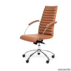
scansorlie > Chair
The even backrest pipes encreases the comfort, and makes the look more modern too. The chair has swing and tilt, and either wheels combined with heigths adjustment, or gliders combined with autoreturn. The cross is 5-star in both options, and comes in alu, black or chrome. So do the armrest frame. The vhair is fully upholstered, and can come without armrests, if that is preferred. It is a guaranteed winner either way! This is the latest Touch Chair model, and a winner, for sure! The elegant an classic design is emphasized by the even, slim pipes in the backrest.
E021 Embrace Lounge Table
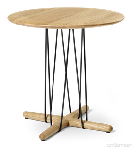
carlhansen > Coffee table
The Embrace Lounge Table E021 is available in two heights – as a low coffee table and a slightly taller and slimmer side table. Both versions highlight the light expression of the Embrace Series, where the circular wooden tabletops seem to float on stabilizing steel structures inspired by kites blowing in the wind. Designed by Austrian design trio EOOS for Carl Hansen & Søn, the Embrace Lounge Table fits with any interior, both public, private and corporate.
Compatta Ghiaia
florim > Wall tile-stone-brick
<p>A passion for earth as a natural material and for rammed earth, an ancient construction technique.</p> <p>The combination of these patterns evolves into the concept of Pisé Inserti, more slabs of immense decorative impact, generated by the two-dimensional criss-crossing of exquisite, rounded geometrical forms: the designer combines the natural earthen shades with apparently random curved lines that evoke the uneven trapezia with rounded corners used by Gio Ponti.</p> <p>These are also available in the large 120x280 cm size and 6 mm thickness in three variants: Pisé Inserti A, Pisé Inserti B and Pisé Inserti C. COMPATTA’s potential is further enhanced by three-dimensional subjects of varying shapes, which can be built up into mesh-backed mosaics to create sculptural forms on walls. These extensions to the collection are called Inserti Melange, Inserti Sabbia-Argilla and Inserti Limo-Ghiaia and are produced in 9 mm thickness and 30x30 cm size.</p> <p>The collection is born from a sustainable and virtuous approach and is part of <a href="https://www.florim.com/en/company/sustainability/carbonzero-florim/">CarbonZero</a>, Florim's range of Carbon Neutral surfaces.</p> <p>The COMPATTA collection, designed by Federico Peri, combines a passion for earth as a natural material and an interest in a very ancient construction technique.<br>The primary inspiration derives from close observation of the many strata within the ground and the mixtures of elementary particles of which it consists. The design concept is completed by reference to the age-old rammed earth construction technique, used in northern Jordan since the eighth millennium BCE and widely applied in Yemen in many other desert or rural settings until the mid 19thC.<br>In this method, the raw earth is compacted inside wooden formwork to construct continuous structural walls, bearing walls or partitions inside homes, with a natural decorative effect due to the layering of the different shades of clay used. When creating his project for CEDIT, Peri was also influenced by several design inputs: from rural African homes to the clear, simple geometric forms and curved lines typical of the work of Gio Ponti, the curves central to the modernist gardens of Brazilian landscape artist Roberto Burle Marx, and the three-dimensional mosaics of English sculptor William Mitchell. In his murals in concrete, glass and recycled materials, Mitchell seems to combine some of the typical features of a variety of artistic movements, from Modernism to Brutalism, and also shows awareness of the issues concerning the structure of the landscape and the relationship with nature at the heart of Land Art. COMPATTA thus embodies strong links to the world of art and architecture, while bringing natural impressions with a remote, primitive flavour into modern living-spaces.</p>
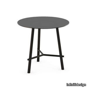
Record Contract 450

infinitidesign > Side table
Record contract is the perfect coffee table for bars, restaurants, cafeterias and meeting places. Thanks to the numerous combinations of tops available, it is possible to have a table made to measure for the client, always characterised by the design that distinguishes the family. For every type of chair or armchair, there is a Record Contract table to suit: those with the smallest height, from 450 mm, are the perfect complement for lounge chairs.
Boxplay ottoman
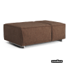
swedese > Pouf
The Boxplay Ottoman is part of the Boxplay family and is a nice complement to the sofas, an extra seat or something to rest your legs on. Boxplay becomes the obvious centerpiece of the room, with its elegance and character regardless of its surroundings. Designed by the design trio Claesson Koivisto Rune. Boxplay is robust and stands elegantly on discrete legs in brushed aluminium, and its asymmetry gives the furniture a modern and playful character. Boxplay Ottoman is freestanding and has dimensions 109x74 cm, height 39 cm. Boxplay is offered in several fabrics and leathers and has padding with pocket springs and cold foam, which gives it exceptional sitting comfort.
Compatta Pisé Ghiaia
florim > Wall tile-stone-brick
<p>A passion for earth as a natural material and for rammed earth, an ancient construction technique.</p> <p>The combination of these patterns evolves into the concept of Pisé Inserti, more slabs of immense decorative impact, generated by the two-dimensional criss-crossing of exquisite, rounded geometrical forms: the designer combines the natural earthen shades with apparently random curved lines that evoke the uneven trapezia with rounded corners used by Gio Ponti.</p> <p>These are also available in the large 120x280 cm size and 6 mm thickness in three variants: Pisé Inserti A, Pisé Inserti B and Pisé Inserti C. COMPATTA’s potential is further enhanced by three-dimensional subjects of varying shapes, which can be built up into mesh-backed mosaics to create sculptural forms on walls. These extensions to the collection are called Inserti Melange, Inserti Sabbia-Argilla and Inserti Limo-Ghiaia and are produced in 9 mm thickness and 30x30 cm size.</p> <p>The collection is born from a sustainable and virtuous approach and is part of <a href="https://www.florim.com/en/company/sustainability/carbonzero-florim/">CarbonZero</a>, Florim's range of Carbon Neutral surfaces.</p> <p>The COMPATTA collection, designed by Federico Peri, combines a passion for earth as a natural material and an interest in a very ancient construction technique.<br>The primary inspiration derives from close observation of the many strata within the ground and the mixtures of elementary particles of which it consists. The design concept is completed by reference to the age-old rammed earth construction technique, used in northern Jordan since the eighth millennium BCE and widely applied in Yemen in many other desert or rural settings until the mid 19thC.<br>In this method, the raw earth is compacted inside wooden formwork to construct continuous structural walls, bearing walls or partitions inside homes, with a natural decorative effect due to the layering of the different shades of clay used. When creating his project for CEDIT, Peri was also influenced by several design inputs: from rural African homes to the clear, simple geometric forms and curved lines typical of the work of Gio Ponti, the curves central to the modernist gardens of Brazilian landscape artist Roberto Burle Marx, and the three-dimensional mosaics of English sculptor William Mitchell. In his murals in concrete, glass and recycled materials, Mitchell seems to combine some of the typical features of a variety of artistic movements, from Modernism to Brutalism, and also shows awareness of the issues concerning the structure of the landscape and the relationship with nature at the heart of Land Art. COMPATTA thus embodies strong links to the world of art and architecture, while bringing natural impressions with a remote, primitive flavour into modern living-spaces.</p>
Compatta Pisé Sabbia
florim > Wall tile-stone-brick
<p>A passion for earth as a natural material and for rammed earth, an ancient construction technique.</p> <p>The combination of these patterns evolves into the concept of Pisé Inserti, more slabs of immense decorative impact, generated by the two-dimensional criss-crossing of exquisite, rounded geometrical forms: the designer combines the natural earthen shades with apparently random curved lines that evoke the uneven trapezia with rounded corners used by Gio Ponti.</p> <p>These are also available in the large 120x280 cm size and 6 mm thickness in three variants: Pisé Inserti A, Pisé Inserti B and Pisé Inserti C. COMPATTA’s potential is further enhanced by three-dimensional subjects of varying shapes, which can be built up into mesh-backed mosaics to create sculptural forms on walls. These extensions to the collection are called Inserti Melange, Inserti Sabbia-Argilla and Inserti Limo-Ghiaia and are produced in 9 mm thickness and 30x30 cm size.</p> <p>The collection is born from a sustainable and virtuous approach and is part of <a href="https://www.florim.com/en/company/sustainability/carbonzero-florim/">CarbonZero</a>, Florim's range of Carbon Neutral surfaces.</p> <p>The COMPATTA collection, designed by Federico Peri, combines a passion for earth as a natural material and an interest in a very ancient construction technique.<br>The primary inspiration derives from close observation of the many strata within the ground and the mixtures of elementary particles of which it consists. The design concept is completed by reference to the age-old rammed earth construction technique, used in northern Jordan since the eighth millennium BCE and widely applied in Yemen in many other desert or rural settings until the mid 19thC.<br>In this method, the raw earth is compacted inside wooden formwork to construct continuous structural walls, bearing walls or partitions inside homes, with a natural decorative effect due to the layering of the different shades of clay used. When creating his project for CEDIT, Peri was also influenced by several design inputs: from rural African homes to the clear, simple geometric forms and curved lines typical of the work of Gio Ponti, the curves central to the modernist gardens of Brazilian landscape artist Roberto Burle Marx, and the three-dimensional mosaics of English sculptor William Mitchell. In his murals in concrete, glass and recycled materials, Mitchell seems to combine some of the typical features of a variety of artistic movements, from Modernism to Brutalism, and also shows awareness of the issues concerning the structure of the landscape and the relationship with nature at the heart of Land Art. COMPATTA thus embodies strong links to the world of art and architecture, while bringing natural impressions with a remote, primitive flavour into modern living-spaces.</p>
Compatta Sabbia
florim > Wall tile-stone-brick
<p>A passion for earth as a natural material and for rammed earth, an ancient construction technique.</p> <p>The combination of these patterns evolves into the concept of Pisé Inserti, more slabs of immense decorative impact, generated by the two-dimensional criss-crossing of exquisite, rounded geometrical forms: the designer combines the natural earthen shades with apparently random curved lines that evoke the uneven trapezia with rounded corners used by Gio Ponti.</p> <p>These are also available in the large 120x280 cm size and 6 mm thickness in three variants: Pisé Inserti A, Pisé Inserti B and Pisé Inserti C. COMPATTA’s potential is further enhanced by three-dimensional subjects of varying shapes, which can be built up into mesh-backed mosaics to create sculptural forms on walls. These extensions to the collection are called Inserti Melange, Inserti Sabbia-Argilla and Inserti Limo-Ghiaia and are produced in 9 mm thickness and 30x30 cm size.</p> <p>The collection is born from a sustainable and virtuous approach and is part of <a href="https://www.florim.com/en/company/sustainability/carbonzero-florim/">CarbonZero</a>, Florim's range of Carbon Neutral surfaces.</p> <p>The COMPATTA collection, designed by Federico Peri, combines a passion for earth as a natural material and an interest in a very ancient construction technique.<br>The primary inspiration derives from close observation of the many strata within the ground and the mixtures of elementary particles of which it consists. The design concept is completed by reference to the age-old rammed earth construction technique, used in northern Jordan since the eighth millennium BCE and widely applied in Yemen in many other desert or rural settings until the mid 19thC.<br>In this method, the raw earth is compacted inside wooden formwork to construct continuous structural walls, bearing walls or partitions inside homes, with a natural decorative effect due to the layering of the different shades of clay used. When creating his project for CEDIT, Peri was also influenced by several design inputs: from rural African homes to the clear, simple geometric forms and curved lines typical of the work of Gio Ponti, the curves central to the modernist gardens of Brazilian landscape artist Roberto Burle Marx, and the three-dimensional mosaics of English sculptor William Mitchell. In his murals in concrete, glass and recycled materials, Mitchell seems to combine some of the typical features of a variety of artistic movements, from Modernism to Brutalism, and also shows awareness of the issues concerning the structure of the landscape and the relationship with nature at the heart of Land Art. COMPATTA thus embodies strong links to the world of art and architecture, while bringing natural impressions with a remote, primitive flavour into modern living-spaces.</p>
Light Blue Vintage Farahan Wool Rug
abchome > Carpet
This multicolored Farahan Vintage Rug - 7'9" x 9'9" from Central Asia. This ornate carpet showcases intricate patterns and motifs in muted blues, beiges, and reds, giving it a vintage appeal. Hand-knotted with high-quality wool, its diamond-like central design is framed by symmetrical patterns. The detailed border complements the overall aesthetic. Add warmth and artistic flair to your space with this sophisticated decorative piece for home or office.
E021 Embrace Lounge Table
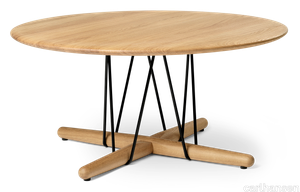
carlhansen > Coffee table
The Embrace Lounge Table E021 is available in two heights – as a low coffee table and a slightly taller and slimmer side table. Both versions highlight the light expression of the Embrace Series, where the circular wooden tabletops seem to float on stabilizing steel structures inspired by kites blowing in the wind. Designed by Austrian design trio EOOS for Carl Hansen & Søn, the Embrace Lounge Table fits with any interior, both public, private and corporate.
BIG EYE
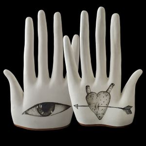
Elica Studio > Styling
BIG EYE Material Porcelain, glaze, oxides Finishing Matte Sizes (cm) 27 X 10 X 41 Weight (g) 2150 Designed in 2019 Collection Anatomika Lead Time: 30 days What Makes Mano Grande Con Occhio (BIG EYE) Special Mano Grande Con Occhio—or BIG EYE, as it’s affectionately known—is a real showstopper. This isn’t just another decorative piece; it’s a sculpture that grabs attention and sparks conversation. Inspired by the human body, BIG EYE features a large hand with a bold, open eye in the palm. It’s modern, expressive, and full of personality, making it a favorite for designers and stylists who want to make a statement. Materials and Craftsmanship BIG EYE is made from high-quality porcelain, known for its smooth, strong, and timeless look. The use of engobes—a special clay slip—adds texture and subtle color changes, making the surface interesting to look at and touch. Depending on the model, BIG EYE can have a soft matte finish or a shiny, glossy look. Both options are stylish, but they create different moods. The matte finish feels calm and natural, while the glossy one is bold and eye-catching. The Design: Hand and Eye The design of BIG EYE is all about expression and connection. The large hand is open and welcoming, with a striking eye in the palm. This eye adds a sense of mystery and depth, making the piece feel alive and engaging. The lines are smooth and flowing, so it looks good from every angle. With dimensions of 38 × 19 × 15 cm and a weight of 2,800 grams, BIG EYE is substantial enough to be a real centerpiece, but not so heavy that it’s hard to move. How to Use BIG EYE in Your Space BIG EYE is super versatile. Its neutral colors and expressive design mean it fits in with almost any style. If your space is modern and minimal, BIG EYE adds a touch of drama without being too much. If your style is more eclectic or artistic, it blends in nicely and gives you a focal point that’s full of personality. Try pairing BIG EYE with other natural materials, like wood or stone, for a relaxed, earthy look. Or, mix it with metallic accents for a more glamorous vibe. It also works well in photo shoots and displays, where its unique shape and expressive eye can really shine. Because of its size—38 × 19 × 15 cm—BIG EYE is perfect for placing on a console table, a sideboard, or as a centerpiece on a large dining table. Its weight—2,800 grams—means it’s solid and stable, so it won’t tip over easily. Made to Order, Always Ready in 30 Days Every BIG EYE is made just for you. That means each piece is crafted with care and attention to detail. The lead time is always 30 days, so you can plan your projects and know exactly when your order will arrive. This is perfect for designers and stylists who need to stick to a schedule. Who Should Get BIG EYE? If you want to add a bit of drama and personality to your interiors, BIG EYE is a great pick. It’s not just a decoration—it’s a statement about expression, connection, and creativity. It works in homes, offices, hotels, and shops. Wherever you put it, it adds a modern, artistic touch. Why Choose BIG EYE? In short, it’s beautiful, well-made, and easy to style. It’s not fussy or hard to work with. It’s just a great piece that makes any space feel more lively and interesting. Whether you want to make a statement or just add a little something special, BIG EYE is a smart choice. Wrapping Up Mano Grande Con Occhio (BIG EYE) by Elica Design Studio is a standout piece for anyone who loves modern design with a twist. It’s made from top-quality materials, looks amazing, and fits in with all kinds of styles. With its generous size (38 × 19 × 15 cm) and solid weight (2,800 grams), it’s a real presence in any room. For the exact year it was designed, check the product page. With a 30-day lead time, you can count on it to be ready when you need it.
AddOn Ceiling
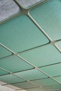
amacoustics > Panels
ADDON CEILING is a unique profile system for both new and existing T-24 frameworks. With just a few clicks, the profiles create a cozy impression. A new unique profile system that dresses T-24 framework systems, adding character to a room and creating an exciting impression that flirts with both traditional and modern architecture. It can be used to update an existing ceiling system or in new construction. AddOn is compatible with all commonly used T-24 framework systems in their standard formats. Choose a color, click into place. Nothing more is needed. It can be combined with Tiles Nova ) for a matching color on the ceiling tile. AddOn is also available in other RAL colors upon request. Akustikmiljö AddOn Ceiling in RAL (choice). Ceiling profile system for T-24 frameworks. For dimensions: 600x600mm, 1200x600mm, 1200x1200mm. Growth weight: 1200x1200 = 194gr/m2, 1200x600 = 276gr/m2, 600x600 = 373gr/m2. Designed by o4i Design Studio.
BLUE EYE
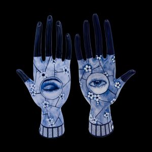
Elica Studio > Styling
BLUE EYE Material Porcelain, engobes, oxides Finishing Matte Sizes (cm) 17 X8 X 37 Weight (g) 1020 Designed in 2020 Collection Anatomika What Makes BLUE EYE Special BLUE EYE is a sculptural piece that stands out for its bold color and unique, organic form. Designed in 2020 as part of the Anatomika collection, this piece is all about making a statement. With its eye motif and striking blue hue, BLUE EYE is more than just a decoration—it’s a work of art that adds drama and personality to any space. Materials and Craftsmanship BLUE EYE is crafted from high-quality porcelain, a material known for its smoothness and strength. The use of engobes and oxides gives the piece its rich, deep blue color and adds subtle texture to the surface. The matte finish creates a soft, modern look that feels calm and sophisticated. Every BLUE EYE is made with care and attention to detail. The result is a piece that is both beautiful and durable, perfect for display in homes, offices, hotels, or shops. The Design: Eye and Color The design of BLUE EYE is inspired by the human eye and natural forms. The sculpture features a large, expressive eye in a vivid blue, with smooth, flowing lines that make it look good from every angle. The eye motif adds a sense of mystery and connection, making the piece feel alive and engaging. The exact size is listed on the product page, so you can check if it fits your space. With a weight of 1020 grams, BLUE EYE is substantial enough to be a real presence, but not so heavy that it’s hard to move. How to Use BLUE EYE in Your Space BLUE EYE is very versatile. Its bold color and unique shape mean it can be the star of any room. If your style is modern and minimal, this piece adds a pop of color and art without being too much. If your style is more eclectic or artistic, it blends right in and gives you a focal point that’s full of personality. Try pairing BLUE EYE with neutral colors for a dramatic contrast. Or, mix it with other bold colors and metallic accents for a more playful, glamorous look. It also works well in photo shoots and displays, where its unique shape and color can really shine. Made to Order, Always Ready in 30 Days Every BLUE EYE is made just for you. That means each piece is crafted with care and attention to detail. The lead time is always 30 days, so you can plan your projects and know exactly when your order will arrive. This is perfect for designers and stylists who need to stick to a schedule. Who Should Get BLUE EYE? If you want to add a bit of drama and color to your interiors, BLUE EYE is a great pick. It’s not just a decoration—it’s a statement about expression, connection, and creativity. It works in homes, offices, hotels, and shops. Wherever you put it, it adds a modern, artistic touch. Why Choose BLUE EYE? In short, it’s beautiful, well-made, and easy to style. It’s not fussy or hard to work with. It’s just a great piece that makes any space feel more lively and interesting. Whether you want to make a statement or just add a little something special, BLUE EYE is a smart choice. Wrapping Up BLUE EYE by Elica Design Studio is a standout piece for anyone who loves modern design with a twist. It’s made from top-quality materials, looks amazing, and fits in with all kinds of styles. With a weight of 1020 grams and a design that’s sure to catch the eye, it’s a real presence in any room. For the exact size, check the product page. With a 30-day lead time, you can count on it to be ready when you need it.
JUJUBE P-BSX - Metal armchair _ CHAIRS & MORE

CHAIRS & MORE > Armchair
Here’s a refined and expanded version of your product description, along with a concise supplier overview and mention of the 3D file availability: --- **Jujube**, designed by **4P1B Design Studio**, is a versatile collection of sofas, armchairs, ottomans, and chairs characterized by its striking graphic-inspired aesthetic. The signature tubular metal back serves as a defining decorative element, varying in prominence across different designs. Available in numerous configurations, the collection allows for customization through a mix of finishes and modular combinations, transforming it into a dynamic seating system. Whether as a two-seater sofa, an asymmetrical lounge piece, or an outdoor-ready setup, Jujube adapts to diverse spaces and styles, with accessories and layouts that can be updated anytime. A **3D file of the product is available for download**, enabling seamless integration into design projects. For more details, explore **JUJUBE P-BSX | Armchair** on **CHAIRS & MORE**—an Italian design supplier renowned for its innovative, high-quality furniture since 2005. --- This keeps the focus on the product while succinctly highlighting the supplier’s credibility and the 3D file option. Let me know if you'd like any further adjustments!
HEM BY G.T. DESIGN - Handmade silk rug _ Molteni & C.
Molteni & C. > Carpet
HEM BY G.T. DESIGN, a collaboration between Molteni&C and Patricia Urquiola, is a luxurious rectangular rug meticulously handcrafted from silk, also available in a round version. Designed to serve as serene islands or gathering spaces, these rugs invite people to come together and momentarily escape the stresses of daily life. Combining the pinnacle of Western creativity with the rich heritage of Asian craftsmanship, each piece is unique, reflecting a harmonious blend of tradition and innovation. The collection, which includes HEM and Loop & Cut, showcases natural materials and timeless elegance, making it a standout addition to any interior. A 3D file of the product is available for download, allowing for seamless integration into design projects. Molteni & C., the esteemed Italian design house behind this collection, has been a leader in the global design industry since 1934, renowned for its high-quality, versatile furniture and interior solutions that cater to both residential and commercial spaces.
HEM BY G.T. DESIGN - Round handmade rug _ Molteni & C.
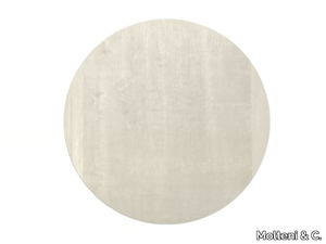
Molteni & C. > Carpet
HEM BY G.T. DESIGN, a collaboration between Molteni&C and Patricia Urquiola, is a luxurious round rug meticulously handcrafted from silk, also available in a rectangular version. This collection reimagines rugs as serene islands or gathering spaces where people come together to unwind and escape the stresses of daily life. Combining the pinnacle of Western creativity with the rich heritage of Asian craftsmanship, HEM is part of an exclusive collection that includes the Loop & Cut rug, both crafted from natural materials to create a harmonious and elegant design. A 3D file of the product is available for download, allowing for seamless integration into design projects. Molteni & C., the esteemed Italian supplier behind this creation, has been a leader in the international design industry since 1934, offering timeless, high-quality furniture and bespoke interior solutions for both residential and commercial spaces.
LOOP&CUT BY G.T. DESIGN - Rectangular handmade rug _ Molteni & C.
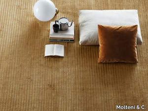
Molteni & C. > Carpet
The **LOOP&CUT BY G.T. DESIGN** is a beautifully crafted rectangular rug made from bamboo silk and linen, inspired by knitting techniques, particularly the ribbing found on pullover cuffs, which adds a unique and original touch to its edging. This rug is part of an exclusive collection born from the enduring collaboration between Molteni&C and renowned Spanish designer Patricia Urquiola, blending Western creativity with the timeless artistry of Asian craftsmanship. Each piece is handmade, with subtle variations that reflect the personal touch of skilled weavers, embodying the refined elegance and attention to detail that Molteni&C is known for. A 3D file of the product is available for download, allowing for a closer look at its intricate design. Molteni&C, founded in 1934 in Giussano, Italy, is a globally recognized leader in high-quality furniture and interior design solutions, celebrated for its timeless elegance, versatility, and commitment to craftsmanship.