Vetro Iridescente
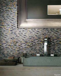
florim > Floor tile-stone
Each tile is unique and extremely precious Vetro allows recognizable and attractive decorations to be created, expressing a timeless design. The Vetro collection is available in seven solid, warm, soft and enchanting colors, in two finishes - matt and lux - and in two sizes or in the metallic variation with varying reflections in a single size. VETRO can be applied as a floor and wall application on any surface in dry or damp areas using special sealants and adhesives.
Vetro Melange Chiaro
florim > Floor tile-stone
Each tile is unique and extremely precious Vetro allows recognizable and attractive decorations to be created, expressing a timeless design. The Vetro collection is available in seven solid, warm, soft and enchanting colors, in two finishes - matt and lux - and in two sizes or in the metallic variation with varying reflections in a single size. VETRO can be applied as a floor and wall application on any surface in dry or damp areas using special sealants and adhesives.
Vetro Melange Medio
florim > Floor tile-stone
Each tile is unique and extremely precious Vetro allows recognizable and attractive decorations to be created, expressing a timeless design. The Vetro collection is available in seven solid, warm, soft and enchanting colors, in two finishes - matt and lux - and in two sizes or in the metallic variation with varying reflections in a single size. VETRO can be applied as a floor and wall application on any surface in dry or damp areas using special sealants and adhesives.
Vetro Melange Scuro
florim > Floor tile-stone
Each tile is unique and extremely precious Vetro allows recognizable and attractive decorations to be created, expressing a timeless design. The Vetro collection is available in seven solid, warm, soft and enchanting colors, in two finishes - matt and lux - and in two sizes or in the metallic variation with varying reflections in a single size. VETRO can be applied as a floor and wall application on any surface in dry or damp areas using special sealants and adhesives.
Vetro 05 Cemento
florim > Floor tile-stone
Each tile is unique and extremely precious Vetro allows recognizable and attractive decorations to be created, expressing a timeless design. The Vetro collection is available in seven solid, warm, soft and enchanting colors, in two finishes - matt and lux - and in two sizes or in the metallic variation with varying reflections in a single size. VETRO can be applied as a floor and wall application on any surface in dry or damp areas using special sealants and adhesives.
Vetro 03 Silver
florim > Floor tile-stone
Each tile is unique and extremely precious Vetro allows recognizable and attractive decorations to be created, expressing a timeless design. The Vetro collection is available in seven solid, warm, soft and enchanting colors, in two finishes - matt and lux - and in two sizes or in the metallic variation with varying reflections in a single size. VETRO can be applied as a floor and wall application on any surface in dry or damp areas using special sealants and adhesives.
Vetro 02 Avorio
florim > Floor tile-stone
Each tile is unique and extremely precious Vetro allows recognizable and attractive decorations to be created, expressing a timeless design. The Vetro collection is available in seven solid, warm, soft and enchanting colors, in two finishes - matt and lux - and in two sizes or in the metallic variation with varying reflections in a single size. VETRO can be applied as a floor and wall application on any surface in dry or damp areas using special sealants and adhesives.
Walks/1.0 BLACK

florim > Wall tile-stone-brick
<p>Walks/1.0 represents a non-conventional simplicity</p> The natural aspect of the surface and the texture of the hewn effect combine perfectly with the enhancement of graphics, colors and structures to interpret interior architectures and exterior spaces in harmony with one another and with the surrounding landscape.
Walks/1.0 Beige
florim > Wall tile-stone-brick
<p>Walks/1.0 represents a non-conventional simplicity</p> The natural aspect of the surface and the texture of the hewn effect combine perfectly with the enhancement of graphics, colors and structures to interpret interior architectures and exterior spaces in harmony with one another and with the surrounding landscape.
Walks/1.0 GRAY
florim > Wall tile-stone-brick
<p>Walks/1.0 represents a non-conventional simplicity</p> The natural aspect of the surface and the texture of the hewn effect combine perfectly with the enhancement of graphics, colors and structures to interpret interior architectures and exterior spaces in harmony with one another and with the surrounding landscape.
Walks/1.0 WHITE
florim > Wall tile-stone-brick
<p>Walks/1.0 represents a non-conventional simplicity</p> The natural aspect of the surface and the texture of the hewn effect combine perfectly with the enhancement of graphics, colors and structures to interpret interior architectures and exterior spaces in harmony with one another and with the surrounding landscape.
Wooden Tile wooden Brown

florim > Floor tile-stone
Neutral colors with a delicate, Nordic inspired design, but also reclaimed wood with strong chromatic contrasts Each location transforms into a refined space capable of recounting stories and emotions. The lightest shades favor timeless styles, providing soft light, whereas the darker shade finishes come out to impress a bold style, playing between combinations of simple geometric lines and new color schemes.
Wooden Tile wooden Walnut
florim > Floor tile-stone
Neutral colors with a delicate, Nordic inspired design, but also reclaimed wood with strong chromatic contrasts Each location transforms into a refined space capable of recounting stories and emotions. The lightest shades favor timeless styles, providing soft light, whereas the darker shade finishes come out to impress a bold style, playing between combinations of simple geometric lines and new color schemes.
Wooden Tile wooden Almond
florim > Floor tile-stone
Neutral colors with a delicate, Nordic inspired design, but also reclaimed wood with strong chromatic contrasts Each location transforms into a refined space capable of recounting stories and emotions. The lightest shades favor timeless styles, providing soft light, whereas the darker shade finishes come out to impress a bold style, playing between combinations of simple geometric lines and new color schemes.
Wooden Tile wooden Gray
florim > Floor tile-stone
Neutral colors with a delicate, Nordic inspired design, but also reclaimed wood with strong chromatic contrasts Each location transforms into a refined space capable of recounting stories and emotions. The lightest shades favor timeless styles, providing soft light, whereas the darker shade finishes come out to impress a bold style, playing between combinations of simple geometric lines and new color schemes.
Wooden Tile wooden White
florim > Floor tile-stone
Neutral colors with a delicate, Nordic inspired design, but also reclaimed wood with strong chromatic contrasts Each location transforms into a refined space capable of recounting stories and emotions. The lightest shades favor timeless styles, providing soft light, whereas the darker shade finishes come out to impress a bold style, playing between combinations of simple geometric lines and new color schemes.
Woodslate Life BARK
florim > Wall tile-stone-brick
<p>A rustic look combined with a clean, modern sensibility. </p> <p>The collection toys with the native materials of slate and oak wood, interpreted on a versatile and appealing color scale, from gray to hazelnut, allowing different natural inspirations to be combined with ease. The clean simplicity of wood-effect planks can thus become the perfect backdrop against which to enhance the material texture of slate-effect surfaces, or become a distinctive element of the space thanks to the herringbone decorations. The delicate grain of the slate and the gentle knots of the wood then fit easily into the interior, blending with different furniture styles, from the most modern and minimalist lacquered surfaces to elements with a rough, industrial feel in painted metal or stainless steel. Whether used in a cozy retail space or in a modern domestic context, the surfaces of the Woodslate Life collection will add an authentic and, at the same time, contemporary touch to any environment, without disregarding the functionality of Made in Florim porcelain stoneware products.</p>
Woodslate Life WOODCHUNK
florim > Floor tile-stone
<p>A rustic look combined with a clean, modern sensibility. </p> <p>The collection toys with the native materials of slate and oak wood, interpreted on a versatile and appealing color scale, from gray to hazelnut, allowing different natural inspirations to be combined with ease. The clean simplicity of wood-effect planks can thus become the perfect backdrop against which to enhance the material texture of slate-effect surfaces, or become a distinctive element of the space thanks to the herringbone decorations. The delicate grain of the slate and the gentle knots of the wood then fit easily into the interior, blending with different furniture styles, from the most modern and minimalist lacquered surfaces to elements with a rough, industrial feel in painted metal or stainless steel. Whether used in a cozy retail space or in a modern domestic context, the surfaces of the Woodslate Life collection will add an authentic and, at the same time, contemporary touch to any environment, without disregarding the functionality of Made in Florim porcelain stoneware products.</p>
Woodslate Life NUTMEG
florim > Floor tile-stone
<p>A rustic look combined with a clean, modern sensibility. </p> <p>The collection toys with the native materials of slate and oak wood, interpreted on a versatile and appealing color scale, from gray to hazelnut, allowing different natural inspirations to be combined with ease. The clean simplicity of wood-effect planks can thus become the perfect backdrop against which to enhance the material texture of slate-effect surfaces, or become a distinctive element of the space thanks to the herringbone decorations. The delicate grain of the slate and the gentle knots of the wood then fit easily into the interior, blending with different furniture styles, from the most modern and minimalist lacquered surfaces to elements with a rough, industrial feel in painted metal or stainless steel. Whether used in a cozy retail space or in a modern domestic context, the surfaces of the Woodslate Life collection will add an authentic and, at the same time, contemporary touch to any environment, without disregarding the functionality of Made in Florim porcelain stoneware products.</p>
Woodslate Life DOVE
florim > Wall tile-stone-brick
<p>A rustic look combined with a clean, modern sensibility. </p> <p>The collection toys with the native materials of slate and oak wood, interpreted on a versatile and appealing color scale, from gray to hazelnut, allowing different natural inspirations to be combined with ease. The clean simplicity of wood-effect planks can thus become the perfect backdrop against which to enhance the material texture of slate-effect surfaces, or become a distinctive element of the space thanks to the herringbone decorations. The delicate grain of the slate and the gentle knots of the wood then fit easily into the interior, blending with different furniture styles, from the most modern and minimalist lacquered surfaces to elements with a rough, industrial feel in painted metal or stainless steel. Whether used in a cozy retail space or in a modern domestic context, the surfaces of the Woodslate Life collection will add an authentic and, at the same time, contemporary touch to any environment, without disregarding the functionality of Made in Florim porcelain stoneware products.</p>
Woodslate Life Champagne
florim > Floor tile-stone
<p>A rustic look combined with a clean, modern sensibility. </p> <p>The collection toys with the native materials of slate and oak wood, interpreted on a versatile and appealing color scale, from gray to hazelnut, allowing different natural inspirations to be combined with ease. The clean simplicity of wood-effect planks can thus become the perfect backdrop against which to enhance the material texture of slate-effect surfaces, or become a distinctive element of the space thanks to the herringbone decorations. The delicate grain of the slate and the gentle knots of the wood then fit easily into the interior, blending with different furniture styles, from the most modern and minimalist lacquered surfaces to elements with a rough, industrial feel in painted metal or stainless steel. Whether used in a cozy retail space or in a modern domestic context, the surfaces of the Woodslate Life collection will add an authentic and, at the same time, contemporary touch to any environment, without disregarding the functionality of Made in Florim porcelain stoneware products.</p>
Woodslate Life Dune
florim > Floor tile-stone
<p>A rustic look combined with a clean, modern sensibility. </p> <p>The collection toys with the native materials of slate and oak wood, interpreted on a versatile and appealing color scale, from gray to hazelnut, allowing different natural inspirations to be combined with ease. The clean simplicity of wood-effect planks can thus become the perfect backdrop against which to enhance the material texture of slate-effect surfaces, or become a distinctive element of the space thanks to the herringbone decorations. The delicate grain of the slate and the gentle knots of the wood then fit easily into the interior, blending with different furniture styles, from the most modern and minimalist lacquered surfaces to elements with a rough, industrial feel in painted metal or stainless steel. Whether used in a cozy retail space or in a modern domestic context, the surfaces of the Woodslate Life collection will add an authentic and, at the same time, contemporary touch to any environment, without disregarding the functionality of Made in Florim porcelain stoneware products.</p>
Woodslate Life STORM
florim > Wall tile-stone-brick
<p>A rustic look combined with a clean, modern sensibility. </p> <p>The collection toys with the native materials of slate and oak wood, interpreted on a versatile and appealing color scale, from gray to hazelnut, allowing different natural inspirations to be combined with ease. The clean simplicity of wood-effect planks can thus become the perfect backdrop against which to enhance the material texture of slate-effect surfaces, or become a distinctive element of the space thanks to the herringbone decorations. The delicate grain of the slate and the gentle knots of the wood then fit easily into the interior, blending with different furniture styles, from the most modern and minimalist lacquered surfaces to elements with a rough, industrial feel in painted metal or stainless steel. Whether used in a cozy retail space or in a modern domestic context, the surfaces of the Woodslate Life collection will add an authentic and, at the same time, contemporary touch to any environment, without disregarding the functionality of Made in Florim porcelain stoneware products.</p>
Woodslate Life Cotton
florim > Wall tile-stone-brick
<p>A rustic look combined with a clean, modern sensibility. </p> <p>The collection toys with the native materials of slate and oak wood, interpreted on a versatile and appealing color scale, from gray to hazelnut, allowing different natural inspirations to be combined with ease. The clean simplicity of wood-effect planks can thus become the perfect backdrop against which to enhance the material texture of slate-effect surfaces, or become a distinctive element of the space thanks to the herringbone decorations. The delicate grain of the slate and the gentle knots of the wood then fit easily into the interior, blending with different furniture styles, from the most modern and minimalist lacquered surfaces to elements with a rough, industrial feel in painted metal or stainless steel. Whether used in a cozy retail space or in a modern domestic context, the surfaces of the Woodslate Life collection will add an authentic and, at the same time, contemporary touch to any environment, without disregarding the functionality of Made in Florim porcelain stoneware products.</p>
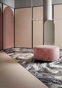
Storie Castello

florim > Wall Paint
The faded wall fresco, damp stains in plaster. «Technological innovation enables us to reproduce on large-sized ceramic materials all the effects of wear and stratification that normally only time is able to create.» Giorgia Zanellato & Daniele Bortotto Children stare at the walls of a farmhouse, wondering what the cracks are, and whether every mark is a path and every path is a story. They think that miniature beings live in the air pockets that have formed, and the detaching plaster is like an avalanche cascading from a glacier. They don't ask why the colours are as they are, because they just had to be like that. And every square centimetre becomes the first page of an adventure that restarts at every break in the pattern. Could this be why we say that both textures and plots have twists, and stories are woven? As even children know, walls are tales. Not only do they contain adventures, emotions, moments, loves and hates and record them on their surfaces; their uneven, active surfaces generate new imaginary worlds, in which one can literally get lost. The "Storie" collection by Giorgia Zanellato and Daniele Bortotto brings this metaphor to three-dimensional life by expressing the moods, loves and hates and moments that the walls and floors of old Italian homes conserve, and capturing them in a frozen instant. The theme of time and the changes wrought in matter by the passing seasons, weather and human action have always been a strong source of inspiration for architects: some have tried to freeze it, while others have used sleight of hand to embrace it while resisting its effects, and yet others have accelerated, anticipated, directed and re-created it.<br /> Zanellato and Bortotto do all these things at once, engaging in a duel with History with a capital H, in which it is never clear who is winning: design or object, man or nature, culture or time. And it is probably this unresolved tension which makes the "Storie" designs so universal and meaningful, so intimate and yet familiar. The floor is the only thing we can be certain that everyone entering our home will touch, and at the same time it is the most intimate part, the most steeped in private happenings. They talk about having your "feet firmly on the ground". This image stands for common sense, but also a recognition of how things are, how things work. The wall is a synecdoche, too: it is the part of the home that expresses an idea of solidity, the layering of time, the passage of lives. "Storie" gives form to this metaphor by drawing a line that links the most classical of taste to a sophisticated modernity of taste and style. The two designers did a great deal of background work for this project: old Italian homes, country villas, noble palazzos, farmhouses and old factors, which become an unlimited source of motifs, colours, textures and materials. But, perhaps unconsciously, literature also re-emerges from this survey of locations, with its blend of aestheticism and decadence, with echoes of Wilde and D'Annunzio, Ruskin and Huysmans. "Storie" would be the ideal backdrop for Des Esseintes, the dandy in "A Rebours". And in fact the collection clearly has strong theatrical connections, arising partly from its storytelling connotations but also from its scene-setting potential.<br /> It represents life, which we are, have been and wish to continue to be. And it is thrilling to realise that this vision comes from the youngest designers in CEDIT's new era, who have successfully taken a confident, cultured, astute, sidelong approach to the most ancient of topics, with a persuasive effect which appears, at least, to be not at all intimidated by the many stories, the type of product they are dealing with, the catalogue in which they are included, the designers who have gone before them or, naturally, the adventures that lie concealed in the historic dwellings they reproduce. The reference to Italy, on the other hand, is in perfect harmony with the work of the brand and its past and present designers: it is intrinsic to the perfection of the production process that underlies the collection, the relationship with the brand's tradition and its local roots, and the intelligent, strategic use of its innovations in the treatment of this complex material.Child's play? Yes, but with the integrity and ability to enchant unique to specific designs, capable of an immediacy of vision and feeling that makes them little novels written in cement.
Storie Cascina
florim > Wall Paint
The faded wall fresco, damp stains in plaster. «Technological innovation enables us to reproduce on large-sized ceramic materials all the effects of wear and stratification that normally only time is able to create.» Giorgia Zanellato & Daniele Bortotto Children stare at the walls of a farmhouse, wondering what the cracks are, and whether every mark is a path and every path is a story. They think that miniature beings live in the air pockets that have formed, and the detaching plaster is like an avalanche cascading from a glacier. They don't ask why the colours are as they are, because they just had to be like that. And every square centimetre becomes the first page of an adventure that restarts at every break in the pattern. Could this be why we say that both textures and plots have twists, and stories are woven? As even children know, walls are tales. Not only do they contain adventures, emotions, moments, loves and hates and record them on their surfaces; their uneven, active surfaces generate new imaginary worlds, in which one can literally get lost. The "Storie" collection by Giorgia Zanellato and Daniele Bortotto brings this metaphor to three-dimensional life by expressing the moods, loves and hates and moments that the walls and floors of old Italian homes conserve, and capturing them in a frozen instant. The theme of time and the changes wrought in matter by the passing seasons, weather and human action have always been a strong source of inspiration for architects: some have tried to freeze it, while others have used sleight of hand to embrace it while resisting its effects, and yet others have accelerated, anticipated, directed and re-created it.<br /> Zanellato and Bortotto do all these things at once, engaging in a duel with History with a capital H, in which it is never clear who is winning: design or object, man or nature, culture or time. And it is probably this unresolved tension which makes the "Storie" designs so universal and meaningful, so intimate and yet familiar. The floor is the only thing we can be certain that everyone entering our home will touch, and at the same time it is the most intimate part, the most steeped in private happenings. They talk about having your "feet firmly on the ground". This image stands for common sense, but also a recognition of how things are, how things work. The wall is a synecdoche, too: it is the part of the home that expresses an idea of solidity, the layering of time, the passage of lives. "Storie" gives form to this metaphor by drawing a line that links the most classical of taste to a sophisticated modernity of taste and style. The two designers did a great deal of background work for this project: old Italian homes, country villas, noble palazzos, farmhouses and old factors, which become an unlimited source of motifs, colours, textures and materials. But, perhaps unconsciously, literature also re-emerges from this survey of locations, with its blend of aestheticism and decadence, with echoes of Wilde and D'Annunzio, Ruskin and Huysmans. "Storie" would be the ideal backdrop for Des Esseintes, the dandy in "A Rebours". And in fact the collection clearly has strong theatrical connections, arising partly from its storytelling connotations but also from its scene-setting potential.<br /> It represents life, which we are, have been and wish to continue to be. And it is thrilling to realise that this vision comes from the youngest designers in CEDIT's new era, who have successfully taken a confident, cultured, astute, sidelong approach to the most ancient of topics, with a persuasive effect which appears, at least, to be not at all intimidated by the many stories, the type of product they are dealing with, the catalogue in which they are included, the designers who have gone before them or, naturally, the adventures that lie concealed in the historic dwellings they reproduce. The reference to Italy, on the other hand, is in perfect harmony with the work of the brand and its past and present designers: it is intrinsic to the perfection of the production process that underlies the collection, the relationship with the brand's tradition and its local roots, and the intelligent, strategic use of its innovations in the treatment of this complex material.Child's play? Yes, but with the integrity and ability to enchant unique to specific designs, capable of an immediacy of vision and feeling that makes them little novels written in cement.
Storie Palazzo
florim > Wall Paint
The faded wall fresco, damp stains in plaster. «Technological innovation enables us to reproduce on large-sized ceramic materials all the effects of wear and stratification that normally only time is able to create.» Giorgia Zanellato & Daniele Bortotto Children stare at the walls of a farmhouse, wondering what the cracks are, and whether every mark is a path and every path is a story. They think that miniature beings live in the air pockets that have formed, and the detaching plaster is like an avalanche cascading from a glacier. They don't ask why the colours are as they are, because they just had to be like that. And every square centimetre becomes the first page of an adventure that restarts at every break in the pattern. Could this be why we say that both textures and plots have twists, and stories are woven? As even children know, walls are tales. Not only do they contain adventures, emotions, moments, loves and hates and record them on their surfaces; their uneven, active surfaces generate new imaginary worlds, in which one can literally get lost. The "Storie" collection by Giorgia Zanellato and Daniele Bortotto brings this metaphor to three-dimensional life by expressing the moods, loves and hates and moments that the walls and floors of old Italian homes conserve, and capturing them in a frozen instant. The theme of time and the changes wrought in matter by the passing seasons, weather and human action have always been a strong source of inspiration for architects: some have tried to freeze it, while others have used sleight of hand to embrace it while resisting its effects, and yet others have accelerated, anticipated, directed and re-created it.<br /> Zanellato and Bortotto do all these things at once, engaging in a duel with History with a capital H, in which it is never clear who is winning: design or object, man or nature, culture or time. And it is probably this unresolved tension which makes the "Storie" designs so universal and meaningful, so intimate and yet familiar. The floor is the only thing we can be certain that everyone entering our home will touch, and at the same time it is the most intimate part, the most steeped in private happenings. They talk about having your "feet firmly on the ground". This image stands for common sense, but also a recognition of how things are, how things work. The wall is a synecdoche, too: it is the part of the home that expresses an idea of solidity, the layering of time, the passage of lives. "Storie" gives form to this metaphor by drawing a line that links the most classical of taste to a sophisticated modernity of taste and style. The two designers did a great deal of background work for this project: old Italian homes, country villas, noble palazzos, farmhouses and old factors, which become an unlimited source of motifs, colours, textures and materials. But, perhaps unconsciously, literature also re-emerges from this survey of locations, with its blend of aestheticism and decadence, with echoes of Wilde and D'Annunzio, Ruskin and Huysmans. "Storie" would be the ideal backdrop for Des Esseintes, the dandy in "A Rebours". And in fact the collection clearly has strong theatrical connections, arising partly from its storytelling connotations but also from its scene-setting potential.<br /> It represents life, which we are, have been and wish to continue to be. And it is thrilling to realise that this vision comes from the youngest designers in CEDIT's new era, who have successfully taken a confident, cultured, astute, sidelong approach to the most ancient of topics, with a persuasive effect which appears, at least, to be not at all intimidated by the many stories, the type of product they are dealing with, the catalogue in which they are included, the designers who have gone before them or, naturally, the adventures that lie concealed in the historic dwellings they reproduce. The reference to Italy, on the other hand, is in perfect harmony with the work of the brand and its past and present designers: it is intrinsic to the perfection of the production process that underlies the collection, the relationship with the brand's tradition and its local roots, and the intelligent, strategic use of its innovations in the treatment of this complex material.Child's play? Yes, but with the integrity and ability to enchant unique to specific designs, capable of an immediacy of vision and feeling that makes them little novels written in cement.
Storie Masseria
florim > Wall Paint
The faded wall fresco, damp stains in plaster. «Technological innovation enables us to reproduce on large-sized ceramic materials all the effects of wear and stratification that normally only time is able to create.» Giorgia Zanellato & Daniele Bortotto Children stare at the walls of a farmhouse, wondering what the cracks are, and whether every mark is a path and every path is a story. They think that miniature beings live in the air pockets that have formed, and the detaching plaster is like an avalanche cascading from a glacier. They don't ask why the colours are as they are, because they just had to be like that. And every square centimetre becomes the first page of an adventure that restarts at every break in the pattern. Could this be why we say that both textures and plots have twists, and stories are woven? As even children know, walls are tales. Not only do they contain adventures, emotions, moments, loves and hates and record them on their surfaces; their uneven, active surfaces generate new imaginary worlds, in which one can literally get lost. The "Storie" collection by Giorgia Zanellato and Daniele Bortotto brings this metaphor to three-dimensional life by expressing the moods, loves and hates and moments that the walls and floors of old Italian homes conserve, and capturing them in a frozen instant. The theme of time and the changes wrought in matter by the passing seasons, weather and human action have always been a strong source of inspiration for architects: some have tried to freeze it, while others have used sleight of hand to embrace it while resisting its effects, and yet others have accelerated, anticipated, directed and re-created it.<br /> Zanellato and Bortotto do all these things at once, engaging in a duel with History with a capital H, in which it is never clear who is winning: design or object, man or nature, culture or time. And it is probably this unresolved tension which makes the "Storie" designs so universal and meaningful, so intimate and yet familiar. The floor is the only thing we can be certain that everyone entering our home will touch, and at the same time it is the most intimate part, the most steeped in private happenings. They talk about having your "feet firmly on the ground". This image stands for common sense, but also a recognition of how things are, how things work. The wall is a synecdoche, too: it is the part of the home that expresses an idea of solidity, the layering of time, the passage of lives. "Storie" gives form to this metaphor by drawing a line that links the most classical of taste to a sophisticated modernity of taste and style. The two designers did a great deal of background work for this project: old Italian homes, country villas, noble palazzos, farmhouses and old factors, which become an unlimited source of motifs, colours, textures and materials. But, perhaps unconsciously, literature also re-emerges from this survey of locations, with its blend of aestheticism and decadence, with echoes of Wilde and D'Annunzio, Ruskin and Huysmans. "Storie" would be the ideal backdrop for Des Esseintes, the dandy in "A Rebours". And in fact the collection clearly has strong theatrical connections, arising partly from its storytelling connotations but also from its scene-setting potential.<br /> It represents life, which we are, have been and wish to continue to be. And it is thrilling to realise that this vision comes from the youngest designers in CEDIT's new era, who have successfully taken a confident, cultured, astute, sidelong approach to the most ancient of topics, with a persuasive effect which appears, at least, to be not at all intimidated by the many stories, the type of product they are dealing with, the catalogue in which they are included, the designers who have gone before them or, naturally, the adventures that lie concealed in the historic dwellings they reproduce. The reference to Italy, on the other hand, is in perfect harmony with the work of the brand and its past and present designers: it is intrinsic to the perfection of the production process that underlies the collection, the relationship with the brand's tradition and its local roots, and the intelligent, strategic use of its innovations in the treatment of this complex material.Child's play? Yes, but with the integrity and ability to enchant unique to specific designs, capable of an immediacy of vision and feeling that makes them little novels written in cement.
Storie Villa
florim > Wall Paint
The faded wall fresco, damp stains in plaster. «Technological innovation enables us to reproduce on large-sized ceramic materials all the effects of wear and stratification that normally only time is able to create.» Giorgia Zanellato & Daniele Bortotto Children stare at the walls of a farmhouse, wondering what the cracks are, and whether every mark is a path and every path is a story. They think that miniature beings live in the air pockets that have formed, and the detaching plaster is like an avalanche cascading from a glacier. They don't ask why the colours are as they are, because they just had to be like that. And every square centimetre becomes the first page of an adventure that restarts at every break in the pattern. Could this be why we say that both textures and plots have twists, and stories are woven? As even children know, walls are tales. Not only do they contain adventures, emotions, moments, loves and hates and record them on their surfaces; their uneven, active surfaces generate new imaginary worlds, in which one can literally get lost. The "Storie" collection by Giorgia Zanellato and Daniele Bortotto brings this metaphor to three-dimensional life by expressing the moods, loves and hates and moments that the walls and floors of old Italian homes conserve, and capturing them in a frozen instant. The theme of time and the changes wrought in matter by the passing seasons, weather and human action have always been a strong source of inspiration for architects: some have tried to freeze it, while others have used sleight of hand to embrace it while resisting its effects, and yet others have accelerated, anticipated, directed and re-created it.<br /> Zanellato and Bortotto do all these things at once, engaging in a duel with History with a capital H, in which it is never clear who is winning: design or object, man or nature, culture or time. And it is probably this unresolved tension which makes the "Storie" designs so universal and meaningful, so intimate and yet familiar. The floor is the only thing we can be certain that everyone entering our home will touch, and at the same time it is the most intimate part, the most steeped in private happenings. They talk about having your "feet firmly on the ground". This image stands for common sense, but also a recognition of how things are, how things work. The wall is a synecdoche, too: it is the part of the home that expresses an idea of solidity, the layering of time, the passage of lives. "Storie" gives form to this metaphor by drawing a line that links the most classical of taste to a sophisticated modernity of taste and style. The two designers did a great deal of background work for this project: old Italian homes, country villas, noble palazzos, farmhouses and old factors, which become an unlimited source of motifs, colours, textures and materials. But, perhaps unconsciously, literature also re-emerges from this survey of locations, with its blend of aestheticism and decadence, with echoes of Wilde and D'Annunzio, Ruskin and Huysmans. "Storie" would be the ideal backdrop for Des Esseintes, the dandy in "A Rebours". And in fact the collection clearly has strong theatrical connections, arising partly from its storytelling connotations but also from its scene-setting potential.<br /> It represents life, which we are, have been and wish to continue to be. And it is thrilling to realise that this vision comes from the youngest designers in CEDIT's new era, who have successfully taken a confident, cultured, astute, sidelong approach to the most ancient of topics, with a persuasive effect which appears, at least, to be not at all intimidated by the many stories, the type of product they are dealing with, the catalogue in which they are included, the designers who have gone before them or, naturally, the adventures that lie concealed in the historic dwellings they reproduce. The reference to Italy, on the other hand, is in perfect harmony with the work of the brand and its past and present designers: it is intrinsic to the perfection of the production process that underlies the collection, the relationship with the brand's tradition and its local roots, and the intelligent, strategic use of its innovations in the treatment of this complex material.Child's play? Yes, but with the integrity and ability to enchant unique to specific designs, capable of an immediacy of vision and feeling that makes them little novels written in cement.
Storie Casale
florim > Wall Paint
The faded wall fresco, damp stains in plaster. «Technological innovation enables us to reproduce on large-sized ceramic materials all the effects of wear and stratification that normally only time is able to create.» Giorgia Zanellato & Daniele Bortotto Children stare at the walls of a farmhouse, wondering what the cracks are, and whether every mark is a path and every path is a story. They think that miniature beings live in the air pockets that have formed, and the detaching plaster is like an avalanche cascading from a glacier. They don't ask why the colours are as they are, because they just had to be like that. And every square centimetre becomes the first page of an adventure that restarts at every break in the pattern. Could this be why we say that both textures and plots have twists, and stories are woven? As even children know, walls are tales. Not only do they contain adventures, emotions, moments, loves and hates and record them on their surfaces; their uneven, active surfaces generate new imaginary worlds, in which one can literally get lost. The "Storie" collection by Giorgia Zanellato and Daniele Bortotto brings this metaphor to three-dimensional life by expressing the moods, loves and hates and moments that the walls and floors of old Italian homes conserve, and capturing them in a frozen instant. The theme of time and the changes wrought in matter by the passing seasons, weather and human action have always been a strong source of inspiration for architects: some have tried to freeze it, while others have used sleight of hand to embrace it while resisting its effects, and yet others have accelerated, anticipated, directed and re-created it.<br /> Zanellato and Bortotto do all these things at once, engaging in a duel with History with a capital H, in which it is never clear who is winning: design or object, man or nature, culture or time. And it is probably this unresolved tension which makes the "Storie" designs so universal and meaningful, so intimate and yet familiar. The floor is the only thing we can be certain that everyone entering our home will touch, and at the same time it is the most intimate part, the most steeped in private happenings. They talk about having your "feet firmly on the ground". This image stands for common sense, but also a recognition of how things are, how things work. The wall is a synecdoche, too: it is the part of the home that expresses an idea of solidity, the layering of time, the passage of lives. "Storie" gives form to this metaphor by drawing a line that links the most classical of taste to a sophisticated modernity of taste and style. The two designers did a great deal of background work for this project: old Italian homes, country villas, noble palazzos, farmhouses and old factors, which become an unlimited source of motifs, colours, textures and materials. But, perhaps unconsciously, literature also re-emerges from this survey of locations, with its blend of aestheticism and decadence, with echoes of Wilde and D'Annunzio, Ruskin and Huysmans. "Storie" would be the ideal backdrop for Des Esseintes, the dandy in "A Rebours". And in fact the collection clearly has strong theatrical connections, arising partly from its storytelling connotations but also from its scene-setting potential.<br /> It represents life, which we are, have been and wish to continue to be. And it is thrilling to realise that this vision comes from the youngest designers in CEDIT's new era, who have successfully taken a confident, cultured, astute, sidelong approach to the most ancient of topics, with a persuasive effect which appears, at least, to be not at all intimidated by the many stories, the type of product they are dealing with, the catalogue in which they are included, the designers who have gone before them or, naturally, the adventures that lie concealed in the historic dwellings they reproduce. The reference to Italy, on the other hand, is in perfect harmony with the work of the brand and its past and present designers: it is intrinsic to the perfection of the production process that underlies the collection, the relationship with the brand's tradition and its local roots, and the intelligent, strategic use of its innovations in the treatment of this complex material.Child's play? Yes, but with the integrity and ability to enchant unique to specific designs, capable of an immediacy of vision and feeling that makes them little novels written in cement.
Rilievi Nebbia
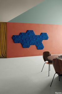
florim > Wall Paint
The alternation and symbiosis between concave and convex, recessed and raised. <p>Rilievi is a work of design balanced between different historic periods: while the volumetric relief tile modules are inspired by artistic experiments conducted in Italy during the Sixties and Seventies, the large slabs are the outcome of research into materials and technology that has only come to fruition in very recent times. The shadow effects generated on the surfaces of the slabs by the light striking the projecting parts of the modules create an unusual impression of architectural depth found virtually nowhere else in ceramic coverings, laying the bases for a new decoration interior design language.</p> This project simply embodies perfection - a term which certainly sets the bar high in a description of a new product for launch on the market. But when an enlightened manufacturer is capable of encapsulating a designer's personal research in a product to be added to its range, the outcome is a perfect synthesis. A perfect synthesis between untrammelled creativity and market trends. CEDIT had the insight needed to perceive, identify and rework the immense potential of Practice Practice Practice "“ a self-produced project by Zaven (Enrica Cavarzan and Marco Zavagno "“ and realised that its sophisticated design, originated by pure, pristine input (unadulterated by external factors except the noblest of them all, research) could provide the basis for an innovative, successful collection. I might add, a collection unique of its kind. Zaven is also a name that comes with guarantees; the two partners are good at what they do. Their work always starts from personal curiosity and investigations, the study of other stories (as in this case inspiration was drawn from the output of artist and activist Nino Caruso) and individual interests, which are broken down, developed, optimised and prepared for transformation into something fresh.Enrica Cavarzan and Marco Zavagno have a masterly ability to transform their own wishes and passions into design work of the greatest breadth and, as we see here, the widest, richest application. Their use of ceramics as a material is clearly outstanding and reflects a method precisely founded on the desire to look at things from an unusual viewpoint, under a different light. And to be daring. Zaven have an unconventional approach to convention. In the specific case of the Rilievi collection, the "modules" created for CEDIT seem to explode off the walls; in fact, they are constructed by combining the two-dimensional slab with its three-dimensional decor.Rilievi seems to be seeking space. More space. Even though these modules have actually established a dialogue with the wall from which they are born. At the same time, they hypnotise us with their tight sequence of lines, the pattern that is always different although its root is the same, and the intriguing, unusual colours that add another vital factor to the finished product. Their firm grounding in graphic design (and here we have come back to two-dimensional effects, of the kind most often associated with a wall covering) easily evolves into a facade which seems to have been carved with a chisel - although this is not the case. These modules are conceived to convey an impression of movement, and the three models, in seven colour combinations, create a powerful effect on a surface, which is never passive but rather an organic contributor to the forms and colours involved in the fascinating combinations. The slab is very much present and has the same worth and status as the relief pattern associated to it. In the light of this dichotomy between the linear and the sculpted, expressed through the skilfully balanced visual expedients, the use of repetition adds vigour to the module's intrinsic meaning. As we have seen, a rejection of facile, superficial creative dynamics in favour of an investigation reaching above and beyond has always been a central, clearly recognisable feature of this Venice-based duo, who already have impressive international partnerships to their credit, including the London Design Festival, the Kalmar Konstmuseum, the Paris Designer Days, Ca' Foscari University, the Venice Biennale, the Sandretto Re Rebaudengo Foundation, the Sindika Dokolo Foundation and the V-A-C Foundation, and also won the 2018 Wallpaper Design Award. Graphics, advertising and product design: the pair have always opted for a type of design closely linked to the observation of everyday items, followed by their reinterpretation in a version applied to experimentation with materials. This duality, combined with their energetic yet elegant visual language, forms Enrica and Marco's primary code, experienced in this specific context through serial carvings. On walls.
Rilievi Sabbia
florim > Wall Paint
The alternation and symbiosis between concave and convex, recessed and raised. <p>Rilievi is a work of design balanced between different historic periods: while the volumetric relief tile modules are inspired by artistic experiments conducted in Italy during the Sixties and Seventies, the large slabs are the outcome of research into materials and technology that has only come to fruition in very recent times. The shadow effects generated on the surfaces of the slabs by the light striking the projecting parts of the modules create an unusual impression of architectural depth found virtually nowhere else in ceramic coverings, laying the bases for a new decoration interior design language.</p> This project simply embodies perfection - a term which certainly sets the bar high in a description of a new product for launch on the market. But when an enlightened manufacturer is capable of encapsulating a designer's personal research in a product to be added to its range, the outcome is a perfect synthesis. A perfect synthesis between untrammelled creativity and market trends. CEDIT had the insight needed to perceive, identify and rework the immense potential of Practice Practice Practice "“ a self-produced project by Zaven (Enrica Cavarzan and Marco Zavagno "“ and realised that its sophisticated design, originated by pure, pristine input (unadulterated by external factors except the noblest of them all, research) could provide the basis for an innovative, successful collection. I might add, a collection unique of its kind. Zaven is also a name that comes with guarantees; the two partners are good at what they do. Their work always starts from personal curiosity and investigations, the study of other stories (as in this case inspiration was drawn from the output of artist and activist Nino Caruso) and individual interests, which are broken down, developed, optimised and prepared for transformation into something fresh.Enrica Cavarzan and Marco Zavagno have a masterly ability to transform their own wishes and passions into design work of the greatest breadth and, as we see here, the widest, richest application. Their use of ceramics as a material is clearly outstanding and reflects a method precisely founded on the desire to look at things from an unusual viewpoint, under a different light. And to be daring. Zaven have an unconventional approach to convention. In the specific case of the Rilievi collection, the "modules" created for CEDIT seem to explode off the walls; in fact, they are constructed by combining the two-dimensional slab with its three-dimensional decor.Rilievi seems to be seeking space. More space. Even though these modules have actually established a dialogue with the wall from which they are born. At the same time, they hypnotise us with their tight sequence of lines, the pattern that is always different although its root is the same, and the intriguing, unusual colours that add another vital factor to the finished product. Their firm grounding in graphic design (and here we have come back to two-dimensional effects, of the kind most often associated with a wall covering) easily evolves into a facade which seems to have been carved with a chisel - although this is not the case. These modules are conceived to convey an impression of movement, and the three models, in seven colour combinations, create a powerful effect on a surface, which is never passive but rather an organic contributor to the forms and colours involved in the fascinating combinations. The slab is very much present and has the same worth and status as the relief pattern associated to it. In the light of this dichotomy between the linear and the sculpted, expressed through the skilfully balanced visual expedients, the use of repetition adds vigour to the module's intrinsic meaning. As we have seen, a rejection of facile, superficial creative dynamics in favour of an investigation reaching above and beyond has always been a central, clearly recognisable feature of this Venice-based duo, who already have impressive international partnerships to their credit, including the London Design Festival, the Kalmar Konstmuseum, the Paris Designer Days, Ca' Foscari University, the Venice Biennale, the Sandretto Re Rebaudengo Foundation, the Sindika Dokolo Foundation and the V-A-C Foundation, and also won the 2018 Wallpaper Design Award. Graphics, advertising and product design: the pair have always opted for a type of design closely linked to the observation of everyday items, followed by their reinterpretation in a version applied to experimentation with materials. This duality, combined with their energetic yet elegant visual language, forms Enrica and Marco's primary code, experienced in this specific context through serial carvings. On walls.
Rilievi Salvia
florim > Wall Paint
The alternation and symbiosis between concave and convex, recessed and raised. <p>Rilievi is a work of design balanced between different historic periods: while the volumetric relief tile modules are inspired by artistic experiments conducted in Italy during the Sixties and Seventies, the large slabs are the outcome of research into materials and technology that has only come to fruition in very recent times. The shadow effects generated on the surfaces of the slabs by the light striking the projecting parts of the modules create an unusual impression of architectural depth found virtually nowhere else in ceramic coverings, laying the bases for a new decoration interior design language.</p> This project simply embodies perfection - a term which certainly sets the bar high in a description of a new product for launch on the market. But when an enlightened manufacturer is capable of encapsulating a designer's personal research in a product to be added to its range, the outcome is a perfect synthesis. A perfect synthesis between untrammelled creativity and market trends. CEDIT had the insight needed to perceive, identify and rework the immense potential of Practice Practice Practice "“ a self-produced project by Zaven (Enrica Cavarzan and Marco Zavagno "“ and realised that its sophisticated design, originated by pure, pristine input (unadulterated by external factors except the noblest of them all, research) could provide the basis for an innovative, successful collection. I might add, a collection unique of its kind. Zaven is also a name that comes with guarantees; the two partners are good at what they do. Their work always starts from personal curiosity and investigations, the study of other stories (as in this case inspiration was drawn from the output of artist and activist Nino Caruso) and individual interests, which are broken down, developed, optimised and prepared for transformation into something fresh.Enrica Cavarzan and Marco Zavagno have a masterly ability to transform their own wishes and passions into design work of the greatest breadth and, as we see here, the widest, richest application. Their use of ceramics as a material is clearly outstanding and reflects a method precisely founded on the desire to look at things from an unusual viewpoint, under a different light. And to be daring. Zaven have an unconventional approach to convention. In the specific case of the Rilievi collection, the "modules" created for CEDIT seem to explode off the walls; in fact, they are constructed by combining the two-dimensional slab with its three-dimensional decor.Rilievi seems to be seeking space. More space. Even though these modules have actually established a dialogue with the wall from which they are born. At the same time, they hypnotise us with their tight sequence of lines, the pattern that is always different although its root is the same, and the intriguing, unusual colours that add another vital factor to the finished product. Their firm grounding in graphic design (and here we have come back to two-dimensional effects, of the kind most often associated with a wall covering) easily evolves into a facade which seems to have been carved with a chisel - although this is not the case. These modules are conceived to convey an impression of movement, and the three models, in seven colour combinations, create a powerful effect on a surface, which is never passive but rather an organic contributor to the forms and colours involved in the fascinating combinations. The slab is very much present and has the same worth and status as the relief pattern associated to it. In the light of this dichotomy between the linear and the sculpted, expressed through the skilfully balanced visual expedients, the use of repetition adds vigour to the module's intrinsic meaning. As we have seen, a rejection of facile, superficial creative dynamics in favour of an investigation reaching above and beyond has always been a central, clearly recognisable feature of this Venice-based duo, who already have impressive international partnerships to their credit, including the London Design Festival, the Kalmar Konstmuseum, the Paris Designer Days, Ca' Foscari University, the Venice Biennale, the Sandretto Re Rebaudengo Foundation, the Sindika Dokolo Foundation and the V-A-C Foundation, and also won the 2018 Wallpaper Design Award. Graphics, advertising and product design: the pair have always opted for a type of design closely linked to the observation of everyday items, followed by their reinterpretation in a version applied to experimentation with materials. This duality, combined with their energetic yet elegant visual language, forms Enrica and Marco's primary code, experienced in this specific context through serial carvings. On walls.
Rilievi Terra
florim > Wall Paint
The alternation and symbiosis between concave and convex, recessed and raised. <p>Rilievi is a work of design balanced between different historic periods: while the volumetric relief tile modules are inspired by artistic experiments conducted in Italy during the Sixties and Seventies, the large slabs are the outcome of research into materials and technology that has only come to fruition in very recent times. The shadow effects generated on the surfaces of the slabs by the light striking the projecting parts of the modules create an unusual impression of architectural depth found virtually nowhere else in ceramic coverings, laying the bases for a new decoration interior design language.</p> This project simply embodies perfection - a term which certainly sets the bar high in a description of a new product for launch on the market. But when an enlightened manufacturer is capable of encapsulating a designer's personal research in a product to be added to its range, the outcome is a perfect synthesis. A perfect synthesis between untrammelled creativity and market trends. CEDIT had the insight needed to perceive, identify and rework the immense potential of Practice Practice Practice "“ a self-produced project by Zaven (Enrica Cavarzan and Marco Zavagno "“ and realised that its sophisticated design, originated by pure, pristine input (unadulterated by external factors except the noblest of them all, research) could provide the basis for an innovative, successful collection. I might add, a collection unique of its kind. Zaven is also a name that comes with guarantees; the two partners are good at what they do. Their work always starts from personal curiosity and investigations, the study of other stories (as in this case inspiration was drawn from the output of artist and activist Nino Caruso) and individual interests, which are broken down, developed, optimised and prepared for transformation into something fresh.Enrica Cavarzan and Marco Zavagno have a masterly ability to transform their own wishes and passions into design work of the greatest breadth and, as we see here, the widest, richest application. Their use of ceramics as a material is clearly outstanding and reflects a method precisely founded on the desire to look at things from an unusual viewpoint, under a different light. And to be daring. Zaven have an unconventional approach to convention. In the specific case of the Rilievi collection, the "modules" created for CEDIT seem to explode off the walls; in fact, they are constructed by combining the two-dimensional slab with its three-dimensional decor.Rilievi seems to be seeking space. More space. Even though these modules have actually established a dialogue with the wall from which they are born. At the same time, they hypnotise us with their tight sequence of lines, the pattern that is always different although its root is the same, and the intriguing, unusual colours that add another vital factor to the finished product. Their firm grounding in graphic design (and here we have come back to two-dimensional effects, of the kind most often associated with a wall covering) easily evolves into a facade which seems to have been carved with a chisel - although this is not the case. These modules are conceived to convey an impression of movement, and the three models, in seven colour combinations, create a powerful effect on a surface, which is never passive but rather an organic contributor to the forms and colours involved in the fascinating combinations. The slab is very much present and has the same worth and status as the relief pattern associated to it. In the light of this dichotomy between the linear and the sculpted, expressed through the skilfully balanced visual expedients, the use of repetition adds vigour to the module's intrinsic meaning. As we have seen, a rejection of facile, superficial creative dynamics in favour of an investigation reaching above and beyond has always been a central, clearly recognisable feature of this Venice-based duo, who already have impressive international partnerships to their credit, including the London Design Festival, the Kalmar Konstmuseum, the Paris Designer Days, Ca' Foscari University, the Venice Biennale, the Sandretto Re Rebaudengo Foundation, the Sindika Dokolo Foundation and the V-A-C Foundation, and also won the 2018 Wallpaper Design Award. Graphics, advertising and product design: the pair have always opted for a type of design closely linked to the observation of everyday items, followed by their reinterpretation in a version applied to experimentation with materials. This duality, combined with their energetic yet elegant visual language, forms Enrica and Marco's primary code, experienced in this specific context through serial carvings. On walls.
Rilievi Lido
florim > Wall Paint
The alternation and symbiosis between concave and convex, recessed and raised. <p>Rilievi is a work of design balanced between different historic periods: while the volumetric relief tile modules are inspired by artistic experiments conducted in Italy during the Sixties and Seventies, the large slabs are the outcome of research into materials and technology that has only come to fruition in very recent times. The shadow effects generated on the surfaces of the slabs by the light striking the projecting parts of the modules create an unusual impression of architectural depth found virtually nowhere else in ceramic coverings, laying the bases for a new decoration interior design language.</p> This project simply embodies perfection - a term which certainly sets the bar high in a description of a new product for launch on the market. But when an enlightened manufacturer is capable of encapsulating a designer's personal research in a product to be added to its range, the outcome is a perfect synthesis. A perfect synthesis between untrammelled creativity and market trends. CEDIT had the insight needed to perceive, identify and rework the immense potential of Practice Practice Practice "“ a self-produced project by Zaven (Enrica Cavarzan and Marco Zavagno "“ and realised that its sophisticated design, originated by pure, pristine input (unadulterated by external factors except the noblest of them all, research) could provide the basis for an innovative, successful collection. I might add, a collection unique of its kind. Zaven is also a name that comes with guarantees; the two partners are good at what they do. Their work always starts from personal curiosity and investigations, the study of other stories (as in this case inspiration was drawn from the output of artist and activist Nino Caruso) and individual interests, which are broken down, developed, optimised and prepared for transformation into something fresh.Enrica Cavarzan and Marco Zavagno have a masterly ability to transform their own wishes and passions into design work of the greatest breadth and, as we see here, the widest, richest application. Their use of ceramics as a material is clearly outstanding and reflects a method precisely founded on the desire to look at things from an unusual viewpoint, under a different light. And to be daring. Zaven have an unconventional approach to convention. In the specific case of the Rilievi collection, the "modules" created for CEDIT seem to explode off the walls; in fact, they are constructed by combining the two-dimensional slab with its three-dimensional decor.Rilievi seems to be seeking space. More space. Even though these modules have actually established a dialogue with the wall from which they are born. At the same time, they hypnotise us with their tight sequence of lines, the pattern that is always different although its root is the same, and the intriguing, unusual colours that add another vital factor to the finished product. Their firm grounding in graphic design (and here we have come back to two-dimensional effects, of the kind most often associated with a wall covering) easily evolves into a facade which seems to have been carved with a chisel - although this is not the case. These modules are conceived to convey an impression of movement, and the three models, in seven colour combinations, create a powerful effect on a surface, which is never passive but rather an organic contributor to the forms and colours involved in the fascinating combinations. The slab is very much present and has the same worth and status as the relief pattern associated to it. In the light of this dichotomy between the linear and the sculpted, expressed through the skilfully balanced visual expedients, the use of repetition adds vigour to the module's intrinsic meaning. As we have seen, a rejection of facile, superficial creative dynamics in favour of an investigation reaching above and beyond has always been a central, clearly recognisable feature of this Venice-based duo, who already have impressive international partnerships to their credit, including the London Design Festival, the Kalmar Konstmuseum, the Paris Designer Days, Ca' Foscari University, the Venice Biennale, the Sandretto Re Rebaudengo Foundation, the Sindika Dokolo Foundation and the V-A-C Foundation, and also won the 2018 Wallpaper Design Award. Graphics, advertising and product design: the pair have always opted for a type of design closely linked to the observation of everyday items, followed by their reinterpretation in a version applied to experimentation with materials. This duality, combined with their energetic yet elegant visual language, forms Enrica and Marco's primary code, experienced in this specific context through serial carvings. On walls.
Rilievi Cielo
florim > Wall Paint
The alternation and symbiosis between concave and convex, recessed and raised. <p>Rilievi is a work of design balanced between different historic periods: while the volumetric relief tile modules are inspired by artistic experiments conducted in Italy during the Sixties and Seventies, the large slabs are the outcome of research into materials and technology that has only come to fruition in very recent times. The shadow effects generated on the surfaces of the slabs by the light striking the projecting parts of the modules create an unusual impression of architectural depth found virtually nowhere else in ceramic coverings, laying the bases for a new decoration interior design language.</p> This project simply embodies perfection - a term which certainly sets the bar high in a description of a new product for launch on the market. But when an enlightened manufacturer is capable of encapsulating a designer's personal research in a product to be added to its range, the outcome is a perfect synthesis. A perfect synthesis between untrammelled creativity and market trends. CEDIT had the insight needed to perceive, identify and rework the immense potential of Practice Practice Practice "“ a self-produced project by Zaven (Enrica Cavarzan and Marco Zavagno "“ and realised that its sophisticated design, originated by pure, pristine input (unadulterated by external factors except the noblest of them all, research) could provide the basis for an innovative, successful collection. I might add, a collection unique of its kind. Zaven is also a name that comes with guarantees; the two partners are good at what they do. Their work always starts from personal curiosity and investigations, the study of other stories (as in this case inspiration was drawn from the output of artist and activist Nino Caruso) and individual interests, which are broken down, developed, optimised and prepared for transformation into something fresh.Enrica Cavarzan and Marco Zavagno have a masterly ability to transform their own wishes and passions into design work of the greatest breadth and, as we see here, the widest, richest application. Their use of ceramics as a material is clearly outstanding and reflects a method precisely founded on the desire to look at things from an unusual viewpoint, under a different light. And to be daring. Zaven have an unconventional approach to convention. In the specific case of the Rilievi collection, the "modules" created for CEDIT seem to explode off the walls; in fact, they are constructed by combining the two-dimensional slab with its three-dimensional decor.Rilievi seems to be seeking space. More space. Even though these modules have actually established a dialogue with the wall from which they are born. At the same time, they hypnotise us with their tight sequence of lines, the pattern that is always different although its root is the same, and the intriguing, unusual colours that add another vital factor to the finished product. Their firm grounding in graphic design (and here we have come back to two-dimensional effects, of the kind most often associated with a wall covering) easily evolves into a facade which seems to have been carved with a chisel - although this is not the case. These modules are conceived to convey an impression of movement, and the three models, in seven colour combinations, create a powerful effect on a surface, which is never passive but rather an organic contributor to the forms and colours involved in the fascinating combinations. The slab is very much present and has the same worth and status as the relief pattern associated to it. In the light of this dichotomy between the linear and the sculpted, expressed through the skilfully balanced visual expedients, the use of repetition adds vigour to the module's intrinsic meaning. As we have seen, a rejection of facile, superficial creative dynamics in favour of an investigation reaching above and beyond has always been a central, clearly recognisable feature of this Venice-based duo, who already have impressive international partnerships to their credit, including the London Design Festival, the Kalmar Konstmuseum, the Paris Designer Days, Ca' Foscari University, the Venice Biennale, the Sandretto Re Rebaudengo Foundation, the Sindika Dokolo Foundation and the V-A-C Foundation, and also won the 2018 Wallpaper Design Award. Graphics, advertising and product design: the pair have always opted for a type of design closely linked to the observation of everyday items, followed by their reinterpretation in a version applied to experimentation with materials. This duality, combined with their energetic yet elegant visual language, forms Enrica and Marco's primary code, experienced in this specific context through serial carvings. On walls.
Policroma Lichene
florim > Wall Paint
Recurring geometries, combinations of figures. Marble and marmorino plaster: comparison and dialogue. The collection is completed by a linear listello tile with the motif of a sequence of vertical rectangular blocks, which can be combined with the slabs to further enrich compositions involving continuous ceramic surfaces cladding.<br /><br />"Another reference is the use of Italian marbles on the verge of extinction, rare marbles such as Rosa Valtoce, the marble used in Milan Cathedral."<br />Cristina Celestino Cristina Celestino's smartphone contains a folder of images entitled "Milan". Photographs that are more like notes. Photographs of architectural features, materials or details of shapes encountered by chance during a walk, but they cannot be described as merely a vague "source of inspiration". This filing system, created in response to a fleeting instinct, is an integral part of the method of work adopted by the architect and designer, who starts off without preconceptions "“ or "free", as she puts it before drawing inputs from a vast world of references, from Hermès scarves to the works of the great Masters (in the specific case of Policroma). This accumulation, partly spontaneous and party the outcome of in-depth historical knowledge and study, naturally activates a process of synthesis and personal interpretation common to all Cristina Celestino's output.<br /><br /><br />The wall covering collection designed for Cedit was no exception, although in this case the designer was dealing with a project with variable dimensions, reaching up even to the architectural scale. In her own distinctive way, she combined a variety of references. Adolf Loos's passion for coloured types of marble, and Cipollino in particular. Carlo Scarpa's angular metal frames and Marmorino plaster in Venice. The French fashion house's square silk scarves. The entrance halls of Milan palazzos, Gio Ponti, the city's Cathedral. All expressed in the designer's own language: well balanced geometrical forms, subtle colours (shades similar to those of Scarpa himself), an effortless, almost restrained, playful elegance. The mood is that of the homes of the enlightened bourgeoisie who shaped the history of Milan, Celestino's adoptive city and an endless source of inputs. She has worked its interiors, including some of the least expected a 1928 tram, the historic Cucchi confectionery store hybridising her own style with the existing context. An imitative effect which is also the key to the meaning of the new Policroma collection: the marble varieties replicated using the Cedit technology are all from Italian quarries that are virtually "worked out". This revives an increasingly rare material as a "living" presence, in a different form which makes no claim to replace the natural original. Quite the contrary, Celestino immediately states her intention to imitate, by combining marble and Marmorino plaster in some variants with a contrasting frame (a typical feature for her, just as it was for Scarpa), and evoking the centuries-old marble-imitating scagliola plasterwork with a contemporary formula.<br /><br /><br />The types of marble chosen are central to the project's character. Verde Alpi, a favourite with Gio Ponti and often found in Milan entrance halls, features tightly packed patterning. Breccia Capraia, still found in a very few places in Tuscany, has a white background with just a few veins. Cipollino, in the special Ondulato variety in green and red, is patterned with spirals. Rosa Valtoce, on the other hand, was used by the "Veneranda Fabbrica" guild to build Milan Cathedral. It is an iconic stone with dramatic stripes, popular in the past; it is now sourced from one very small quarry in Piedmont which has been virtually abandoned.<br /> The many different elements that make up the Policroma collection all reflect the importance of craftsmanship to Cristina Celestino's design style: the modules can be freely mixed and combined, for example to create a concave or convex semicircle, or for the large-scale replication of small features initially conceived as trims, functional details transformed into a dominant motif.There is a return to the theme of the interior, a large or small protected space, conceived as suspended in space and time yet also reassuring and protective. It is designed through its coverings in a stark yet not minimalist way, with intelligence and with no overreaching artistic ambitions. An understated space and an extremely stylish declaration. In Milan style, of course.
Policroma Cipria
florim > Wall Paint
Recurring geometries, combinations of figures. Marble and marmorino plaster: comparison and dialogue. The collection is completed by a linear listello tile with the motif of a sequence of vertical rectangular blocks, which can be combined with the slabs to further enrich compositions involving continuous ceramic surfaces cladding.<br /><br />"Another reference is the use of Italian marbles on the verge of extinction, rare marbles such as Rosa Valtoce, the marble used in Milan Cathedral."<br />Cristina Celestino Cristina Celestino's smartphone contains a folder of images entitled "Milan". Photographs that are more like notes. Photographs of architectural features, materials or details of shapes encountered by chance during a walk, but they cannot be described as merely a vague "source of inspiration". This filing system, created in response to a fleeting instinct, is an integral part of the method of work adopted by the architect and designer, who starts off without preconceptions "“ or "free", as she puts it before drawing inputs from a vast world of references, from Hermès scarves to the works of the great Masters (in the specific case of Policroma). This accumulation, partly spontaneous and party the outcome of in-depth historical knowledge and study, naturally activates a process of synthesis and personal interpretation common to all Cristina Celestino's output.<br /><br /><br />The wall covering collection designed for Cedit was no exception, although in this case the designer was dealing with a project with variable dimensions, reaching up even to the architectural scale. In her own distinctive way, she combined a variety of references. Adolf Loos's passion for coloured types of marble, and Cipollino in particular. Carlo Scarpa's angular metal frames and Marmorino plaster in Venice. The French fashion house's square silk scarves. The entrance halls of Milan palazzos, Gio Ponti, the city's Cathedral. All expressed in the designer's own language: well balanced geometrical forms, subtle colours (shades similar to those of Scarpa himself), an effortless, almost restrained, playful elegance. The mood is that of the homes of the enlightened bourgeoisie who shaped the history of Milan, Celestino's adoptive city and an endless source of inputs. She has worked its interiors, including some of the least expected a 1928 tram, the historic Cucchi confectionery store hybridising her own style with the existing context. An imitative effect which is also the key to the meaning of the new Policroma collection: the marble varieties replicated using the Cedit technology are all from Italian quarries that are virtually "worked out". This revives an increasingly rare material as a "living" presence, in a different form which makes no claim to replace the natural original. Quite the contrary, Celestino immediately states her intention to imitate, by combining marble and Marmorino plaster in some variants with a contrasting frame (a typical feature for her, just as it was for Scarpa), and evoking the centuries-old marble-imitating scagliola plasterwork with a contemporary formula.<br /><br /><br />The types of marble chosen are central to the project's character. Verde Alpi, a favourite with Gio Ponti and often found in Milan entrance halls, features tightly packed patterning. Breccia Capraia, still found in a very few places in Tuscany, has a white background with just a few veins. Cipollino, in the special Ondulato variety in green and red, is patterned with spirals. Rosa Valtoce, on the other hand, was used by the "Veneranda Fabbrica" guild to build Milan Cathedral. It is an iconic stone with dramatic stripes, popular in the past; it is now sourced from one very small quarry in Piedmont which has been virtually abandoned.<br /> The many different elements that make up the Policroma collection all reflect the importance of craftsmanship to Cristina Celestino's design style: the modules can be freely mixed and combined, for example to create a concave or convex semicircle, or for the large-scale replication of small features initially conceived as trims, functional details transformed into a dominant motif.There is a return to the theme of the interior, a large or small protected space, conceived as suspended in space and time yet also reassuring and protective. It is designed through its coverings in a stark yet not minimalist way, with intelligence and with no overreaching artistic ambitions. An understated space and an extremely stylish declaration. In Milan style, of course.
Araldica Base Blu
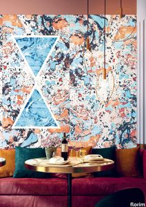
florim > Wall Paint
The miscellany of bright, contrasting, pure colours. The manifest extroversion of decor. The solutions provided to complete the range are in a different tone: reflecting the desire to "stage" a clear contrast with the multicolour ceramic wall coverings, these slabs are in completely neutral shades, in the grey frequencies of concrete.<br /><br />«The collection is intended to create a struggle, a fight. Between something very stiff, which sees itself as governed by clear rules, and a variable, marbled paper, which aims to be completely free.»<br />Federico Pepe "Once upon a time, there was a Roman emperor who lived on a huge splinter in space, a spaceship of multi-coloured marble, where techno music played incessantly. That day he left his spaceship to go to dinner at the Sun King's home, riding his sinuous golden dragon with blood-red eyes."If there were a book with these opening words, Federico Pepe would have designed its cover. And if the book were made into a film, he would definitely be its writer and director. Federico is not an author, director or screenwriter, but this does not prevent him from drawing on his natural ability to create stories through flashes of imagination.Federico Pepe's career started in advertising, a family tradition, which he gradually transformed and built into many other things, in a constant, inevitable investigation of creativity in all its possible forms. He very soon understood that commission work was not enough for him, and he began to explore further afield. The first of these other fields was art, but the consolidated mechanisms on which galleries and gallery owners operate soon became a new limit from which he had to break free: this apparently expanding horizon turned out to be a restrictive cage, more a defining label than an infinite learning opportunity. And definitions are one of the things which least describe Federico: anyone trying to distil his work into two words would find its essence disappearing before their own eyes. He has occupied many roles and engaged in many professions to give shape to his ideas, and in all of them he has excelled, created and led teams, and won awards. Adman, creative director, graphic designer, printer, gallery owner, publisher, curator, performer, painter, designer, director: Pepe does, rather than is, all these.<br /> He works, builds and makes things happen because he is not led by instinct alone and does not succumb to idle whim; he does not rush aimlessly around and does not simply await the inspiration or idea of the century. Quite the opposite. His work comes about and produces results only thanks to strict self-discipline, a design method made up of constant verification, the precise sharing of tasks and roles, the compulsive exploration of unknown contexts, daily physical exercise, the carefully measured use of social media, and occasional spells of isolation in the mountains he loves. It is no coincidence that he created Le Dictateur, a dual-faced entity which may be both his child and his spiritual guide, both friend and boss, part madness and part dictator. Le Dictateur is not Federico's alter ego: it is his superpower. It is not a mask, since in it he actually transforms himself into an artistic project.Le Dictateur is both result and origin of Federico Pepe's work. "I think ideas are born from predisposition," Federico explained to me in 2014. "Not in the sense that "˜we are born predisposed,' but for daily preparation. In this domain I believe that discipline is pivotal. The real talents today are very rigorous people, those who work hard, exchange a lot, think a lot, and know how to apply and balance many different things." An approach which has made him the best-kept secret on the Italian creative scene, a fact well known not only to Pierpaolo Ferrari, Maurizio Cattelan, Nico Vascellari, Jacopo Benassi and Patricia Urquiola, but also to the companies, both large and small, which have turned to him over the years. He has worked and continues to work with them all, designing by laying the foundations of designs naturally expressed in episodes, in a serial pattern which not only gradually builds up Federico's own creative story, but also offers his clients designs so special that they would be virtually impossible without him.<br /> This self-discipline generates heat and energy in such quantities that "“ if it were not imprisoned within the geometrical grids of graphic design "“ it might generate a thermonuclear reaction. The blood running through the veins of his images is black as ink, red as sealing-wax, white as plaster and golden as lava. But there is more, too. His crystal-clear visions are able to break down the slender membrane which separates analogue from digital. He sees matter as absolutely central, but he makes it vibrate with an unusual two-dimensional quality. This can be seen in the way he carves marble with coloured squiggles, recollections of faces briefly sketched as vectors. It is discovered in the skill with which he invades plates and bowls of the finest, monitor-shiny porcelain with geometrical patterns. It becomes tangible in the love with which he brings to life the paper of his publishing projects, peopled with highly elegant, powerfully symmetrical, often kaleidoscopic graphics. It can be admired in the precision with which a metallic factory flooring becomes fabric on an ancient loom, after its resolution is decreased from 300 dpi to 8 bits. It is enjoyed in the hyperbolic repetition of faces and hands in acrylic on canvas in his painting studio, in which every work conserves copy and paste reminders of its predecessor. It amazes in the doors of exquisite metal sideboards, profane glass panels, hand-made but born through the glass of a screen.<br /> A career which has led almost naturally to an encounter with CEDIT, with whom he has created an aesthetically courageous collection, part punk and part aristocratic austerity. The Araldica project's very name evokes strength and nobility, and it is grounded in a past whose weight does not drag it backwards but rather catapults it forwards into the future. Here, Federico's digital geometries become the most solid of materials, taking shape in a graphic object, condensing stories and images into three or two dimensions. In Pepe's and CEDIT's space, Euclidean geometrical forms encounter the marble of Phidias, the intricate patterns of the floor of Milan Cathedral merge into the Baroque images of the marbles found in Roman art galleries, and private space opens out to the infinite space of a thousand possible universal histories.
Araldica Base Azzurro
florim > Wall Paint
The miscellany of bright, contrasting, pure colours. The manifest extroversion of decor. The solutions provided to complete the range are in a different tone: reflecting the desire to "stage" a clear contrast with the multicolour ceramic wall coverings, these slabs are in completely neutral shades, in the grey frequencies of concrete.<br /><br />«The collection is intended to create a struggle, a fight. Between something very stiff, which sees itself as governed by clear rules, and a variable, marbled paper, which aims to be completely free.»<br />Federico Pepe "Once upon a time, there was a Roman emperor who lived on a huge splinter in space, a spaceship of multi-coloured marble, where techno music played incessantly. That day he left his spaceship to go to dinner at the Sun King's home, riding his sinuous golden dragon with blood-red eyes."If there were a book with these opening words, Federico Pepe would have designed its cover. And if the book were made into a film, he would definitely be its writer and director. Federico is not an author, director or screenwriter, but this does not prevent him from drawing on his natural ability to create stories through flashes of imagination.Federico Pepe's career started in advertising, a family tradition, which he gradually transformed and built into many other things, in a constant, inevitable investigation of creativity in all its possible forms. He very soon understood that commission work was not enough for him, and he began to explore further afield. The first of these other fields was art, but the consolidated mechanisms on which galleries and gallery owners operate soon became a new limit from which he had to break free: this apparently expanding horizon turned out to be a restrictive cage, more a defining label than an infinite learning opportunity. And definitions are one of the things which least describe Federico: anyone trying to distil his work into two words would find its essence disappearing before their own eyes. He has occupied many roles and engaged in many professions to give shape to his ideas, and in all of them he has excelled, created and led teams, and won awards. Adman, creative director, graphic designer, printer, gallery owner, publisher, curator, performer, painter, designer, director: Pepe does, rather than is, all these.<br /> He works, builds and makes things happen because he is not led by instinct alone and does not succumb to idle whim; he does not rush aimlessly around and does not simply await the inspiration or idea of the century. Quite the opposite. His work comes about and produces results only thanks to strict self-discipline, a design method made up of constant verification, the precise sharing of tasks and roles, the compulsive exploration of unknown contexts, daily physical exercise, the carefully measured use of social media, and occasional spells of isolation in the mountains he loves. It is no coincidence that he created Le Dictateur, a dual-faced entity which may be both his child and his spiritual guide, both friend and boss, part madness and part dictator. Le Dictateur is not Federico's alter ego: it is his superpower. It is not a mask, since in it he actually transforms himself into an artistic project.Le Dictateur is both result and origin of Federico Pepe's work. "I think ideas are born from predisposition," Federico explained to me in 2014. "Not in the sense that "˜we are born predisposed,' but for daily preparation. In this domain I believe that discipline is pivotal. The real talents today are very rigorous people, those who work hard, exchange a lot, think a lot, and know how to apply and balance many different things." An approach which has made him the best-kept secret on the Italian creative scene, a fact well known not only to Pierpaolo Ferrari, Maurizio Cattelan, Nico Vascellari, Jacopo Benassi and Patricia Urquiola, but also to the companies, both large and small, which have turned to him over the years. He has worked and continues to work with them all, designing by laying the foundations of designs naturally expressed in episodes, in a serial pattern which not only gradually builds up Federico's own creative story, but also offers his clients designs so special that they would be virtually impossible without him.<br /> This self-discipline generates heat and energy in such quantities that "“ if it were not imprisoned within the geometrical grids of graphic design "“ it might generate a thermonuclear reaction. The blood running through the veins of his images is black as ink, red as sealing-wax, white as plaster and golden as lava. But there is more, too. His crystal-clear visions are able to break down the slender membrane which separates analogue from digital. He sees matter as absolutely central, but he makes it vibrate with an unusual two-dimensional quality. This can be seen in the way he carves marble with coloured squiggles, recollections of faces briefly sketched as vectors. It is discovered in the skill with which he invades plates and bowls of the finest, monitor-shiny porcelain with geometrical patterns. It becomes tangible in the love with which he brings to life the paper of his publishing projects, peopled with highly elegant, powerfully symmetrical, often kaleidoscopic graphics. It can be admired in the precision with which a metallic factory flooring becomes fabric on an ancient loom, after its resolution is decreased from 300 dpi to 8 bits. It is enjoyed in the hyperbolic repetition of faces and hands in acrylic on canvas in his painting studio, in which every work conserves copy and paste reminders of its predecessor. It amazes in the doors of exquisite metal sideboards, profane glass panels, hand-made but born through the glass of a screen.<br /> A career which has led almost naturally to an encounter with CEDIT, with whom he has created an aesthetically courageous collection, part punk and part aristocratic austerity. The Araldica project's very name evokes strength and nobility, and it is grounded in a past whose weight does not drag it backwards but rather catapults it forwards into the future. Here, Federico's digital geometries become the most solid of materials, taking shape in a graphic object, condensing stories and images into three or two dimensions. In Pepe's and CEDIT's space, Euclidean geometrical forms encounter the marble of Phidias, the intricate patterns of the floor of Milan Cathedral merge into the Baroque images of the marbles found in Roman art galleries, and private space opens out to the infinite space of a thousand possible universal histories.
Araldica Base Corallo
florim > Wall Paint
The miscellany of bright, contrasting, pure colours. The manifest extroversion of decor. The solutions provided to complete the range are in a different tone: reflecting the desire to "stage" a clear contrast with the multicolour ceramic wall coverings, these slabs are in completely neutral shades, in the grey frequencies of concrete.<br /><br />«The collection is intended to create a struggle, a fight. Between something very stiff, which sees itself as governed by clear rules, and a variable, marbled paper, which aims to be completely free.»<br />Federico Pepe "Once upon a time, there was a Roman emperor who lived on a huge splinter in space, a spaceship of multi-coloured marble, where techno music played incessantly. That day he left his spaceship to go to dinner at the Sun King's home, riding his sinuous golden dragon with blood-red eyes."If there were a book with these opening words, Federico Pepe would have designed its cover. And if the book were made into a film, he would definitely be its writer and director. Federico is not an author, director or screenwriter, but this does not prevent him from drawing on his natural ability to create stories through flashes of imagination.Federico Pepe's career started in advertising, a family tradition, which he gradually transformed and built into many other things, in a constant, inevitable investigation of creativity in all its possible forms. He very soon understood that commission work was not enough for him, and he began to explore further afield. The first of these other fields was art, but the consolidated mechanisms on which galleries and gallery owners operate soon became a new limit from which he had to break free: this apparently expanding horizon turned out to be a restrictive cage, more a defining label than an infinite learning opportunity. And definitions are one of the things which least describe Federico: anyone trying to distil his work into two words would find its essence disappearing before their own eyes. He has occupied many roles and engaged in many professions to give shape to his ideas, and in all of them he has excelled, created and led teams, and won awards. Adman, creative director, graphic designer, printer, gallery owner, publisher, curator, performer, painter, designer, director: Pepe does, rather than is, all these.<br /> He works, builds and makes things happen because he is not led by instinct alone and does not succumb to idle whim; he does not rush aimlessly around and does not simply await the inspiration or idea of the century. Quite the opposite. His work comes about and produces results only thanks to strict self-discipline, a design method made up of constant verification, the precise sharing of tasks and roles, the compulsive exploration of unknown contexts, daily physical exercise, the carefully measured use of social media, and occasional spells of isolation in the mountains he loves. It is no coincidence that he created Le Dictateur, a dual-faced entity which may be both his child and his spiritual guide, both friend and boss, part madness and part dictator. Le Dictateur is not Federico's alter ego: it is his superpower. It is not a mask, since in it he actually transforms himself into an artistic project.Le Dictateur is both result and origin of Federico Pepe's work. "I think ideas are born from predisposition," Federico explained to me in 2014. "Not in the sense that "˜we are born predisposed,' but for daily preparation. In this domain I believe that discipline is pivotal. The real talents today are very rigorous people, those who work hard, exchange a lot, think a lot, and know how to apply and balance many different things." An approach which has made him the best-kept secret on the Italian creative scene, a fact well known not only to Pierpaolo Ferrari, Maurizio Cattelan, Nico Vascellari, Jacopo Benassi and Patricia Urquiola, but also to the companies, both large and small, which have turned to him over the years. He has worked and continues to work with them all, designing by laying the foundations of designs naturally expressed in episodes, in a serial pattern which not only gradually builds up Federico's own creative story, but also offers his clients designs so special that they would be virtually impossible without him.<br /> This self-discipline generates heat and energy in such quantities that "“ if it were not imprisoned within the geometrical grids of graphic design "“ it might generate a thermonuclear reaction. The blood running through the veins of his images is black as ink, red as sealing-wax, white as plaster and golden as lava. But there is more, too. His crystal-clear visions are able to break down the slender membrane which separates analogue from digital. He sees matter as absolutely central, but he makes it vibrate with an unusual two-dimensional quality. This can be seen in the way he carves marble with coloured squiggles, recollections of faces briefly sketched as vectors. It is discovered in the skill with which he invades plates and bowls of the finest, monitor-shiny porcelain with geometrical patterns. It becomes tangible in the love with which he brings to life the paper of his publishing projects, peopled with highly elegant, powerfully symmetrical, often kaleidoscopic graphics. It can be admired in the precision with which a metallic factory flooring becomes fabric on an ancient loom, after its resolution is decreased from 300 dpi to 8 bits. It is enjoyed in the hyperbolic repetition of faces and hands in acrylic on canvas in his painting studio, in which every work conserves copy and paste reminders of its predecessor. It amazes in the doors of exquisite metal sideboards, profane glass panels, hand-made but born through the glass of a screen.<br /> A career which has led almost naturally to an encounter with CEDIT, with whom he has created an aesthetically courageous collection, part punk and part aristocratic austerity. The Araldica project's very name evokes strength and nobility, and it is grounded in a past whose weight does not drag it backwards but rather catapults it forwards into the future. Here, Federico's digital geometries become the most solid of materials, taking shape in a graphic object, condensing stories and images into three or two dimensions. In Pepe's and CEDIT's space, Euclidean geometrical forms encounter the marble of Phidias, the intricate patterns of the floor of Milan Cathedral merge into the Baroque images of the marbles found in Roman art galleries, and private space opens out to the infinite space of a thousand possible universal histories.
Araldica Base Grigio
florim > Wall Paint
The miscellany of bright, contrasting, pure colours. The manifest extroversion of decor. The solutions provided to complete the range are in a different tone: reflecting the desire to "stage" a clear contrast with the multicolour ceramic wall coverings, these slabs are in completely neutral shades, in the grey frequencies of concrete.<br /><br />«The collection is intended to create a struggle, a fight. Between something very stiff, which sees itself as governed by clear rules, and a variable, marbled paper, which aims to be completely free.»<br />Federico Pepe "Once upon a time, there was a Roman emperor who lived on a huge splinter in space, a spaceship of multi-coloured marble, where techno music played incessantly. That day he left his spaceship to go to dinner at the Sun King's home, riding his sinuous golden dragon with blood-red eyes."If there were a book with these opening words, Federico Pepe would have designed its cover. And if the book were made into a film, he would definitely be its writer and director. Federico is not an author, director or screenwriter, but this does not prevent him from drawing on his natural ability to create stories through flashes of imagination.Federico Pepe's career started in advertising, a family tradition, which he gradually transformed and built into many other things, in a constant, inevitable investigation of creativity in all its possible forms. He very soon understood that commission work was not enough for him, and he began to explore further afield. The first of these other fields was art, but the consolidated mechanisms on which galleries and gallery owners operate soon became a new limit from which he had to break free: this apparently expanding horizon turned out to be a restrictive cage, more a defining label than an infinite learning opportunity. And definitions are one of the things which least describe Federico: anyone trying to distil his work into two words would find its essence disappearing before their own eyes. He has occupied many roles and engaged in many professions to give shape to his ideas, and in all of them he has excelled, created and led teams, and won awards. Adman, creative director, graphic designer, printer, gallery owner, publisher, curator, performer, painter, designer, director: Pepe does, rather than is, all these.<br /> He works, builds and makes things happen because he is not led by instinct alone and does not succumb to idle whim; he does not rush aimlessly around and does not simply await the inspiration or idea of the century. Quite the opposite. His work comes about and produces results only thanks to strict self-discipline, a design method made up of constant verification, the precise sharing of tasks and roles, the compulsive exploration of unknown contexts, daily physical exercise, the carefully measured use of social media, and occasional spells of isolation in the mountains he loves. It is no coincidence that he created Le Dictateur, a dual-faced entity which may be both his child and his spiritual guide, both friend and boss, part madness and part dictator. Le Dictateur is not Federico's alter ego: it is his superpower. It is not a mask, since in it he actually transforms himself into an artistic project.Le Dictateur is both result and origin of Federico Pepe's work. "I think ideas are born from predisposition," Federico explained to me in 2014. "Not in the sense that "˜we are born predisposed,' but for daily preparation. In this domain I believe that discipline is pivotal. The real talents today are very rigorous people, those who work hard, exchange a lot, think a lot, and know how to apply and balance many different things." An approach which has made him the best-kept secret on the Italian creative scene, a fact well known not only to Pierpaolo Ferrari, Maurizio Cattelan, Nico Vascellari, Jacopo Benassi and Patricia Urquiola, but also to the companies, both large and small, which have turned to him over the years. He has worked and continues to work with them all, designing by laying the foundations of designs naturally expressed in episodes, in a serial pattern which not only gradually builds up Federico's own creative story, but also offers his clients designs so special that they would be virtually impossible without him.<br /> This self-discipline generates heat and energy in such quantities that "“ if it were not imprisoned within the geometrical grids of graphic design "“ it might generate a thermonuclear reaction. The blood running through the veins of his images is black as ink, red as sealing-wax, white as plaster and golden as lava. But there is more, too. His crystal-clear visions are able to break down the slender membrane which separates analogue from digital. He sees matter as absolutely central, but he makes it vibrate with an unusual two-dimensional quality. This can be seen in the way he carves marble with coloured squiggles, recollections of faces briefly sketched as vectors. It is discovered in the skill with which he invades plates and bowls of the finest, monitor-shiny porcelain with geometrical patterns. It becomes tangible in the love with which he brings to life the paper of his publishing projects, peopled with highly elegant, powerfully symmetrical, often kaleidoscopic graphics. It can be admired in the precision with which a metallic factory flooring becomes fabric on an ancient loom, after its resolution is decreased from 300 dpi to 8 bits. It is enjoyed in the hyperbolic repetition of faces and hands in acrylic on canvas in his painting studio, in which every work conserves copy and paste reminders of its predecessor. It amazes in the doors of exquisite metal sideboards, profane glass panels, hand-made but born through the glass of a screen.<br /> A career which has led almost naturally to an encounter with CEDIT, with whom he has created an aesthetically courageous collection, part punk and part aristocratic austerity. The Araldica project's very name evokes strength and nobility, and it is grounded in a past whose weight does not drag it backwards but rather catapults it forwards into the future. Here, Federico's digital geometries become the most solid of materials, taking shape in a graphic object, condensing stories and images into three or two dimensions. In Pepe's and CEDIT's space, Euclidean geometrical forms encounter the marble of Phidias, the intricate patterns of the floor of Milan Cathedral merge into the Baroque images of the marbles found in Roman art galleries, and private space opens out to the infinite space of a thousand possible universal histories.
Archeologie Archeologie Grigio

florim > Wall Paint
The poetics of the wall. The forgotten wall. «A wall is like a book to be opened, a journey into the interior, revealing the experiences, memories, signs and symbols which this fragment of masonry has absorbed over the centuries.» Franco Guerzoni <p>It is difficult to resist the beauty of Franco Guerzoni's art, created by a rare harmony of feeling and intellect, poetry and mind. The artist expresses this through paintings which, although complex in structure, are joyous and sensual, with bright colours made, like those of the great masters of the past, from choice powdered ingredients. A painter with a technique rich in traditional skills, Guerzoni offers a version of modernity involving an intense fundamental relationship with his images and with space. In fact, the dialectic between painting and space, form and architecture, time and memory seems to be essential to his art. As his works specifically created for CEDIT clearly express, his creations achieve a perfect balance between the spatial dimension and intensely lyrical use of colour, which here becomes a soft, liquid form of matter, wandering across the surface of a dazzling lime-plaster white. White, metaphor for the clear light of day, as it was in the large, complex canvases exhibited in his personal exhibition at the 1990 Venice Biennale, is the background for forms of colour which renew the pleasure to be had from painting and the memory of an image glimpsed on the vast expanse of the surface. In the more recent works, these voluptuous shades are transformed into subtle shadows of colour that delicately caress the surface.</p> <p> </p> <p> All it takes is one wall, the only surviving wall of what was once a house, on which time has recorded its own, unavoidable passing, leaving traces of colour that is still vibrant, although faded in places, to allow the memory of the image to transpire, fragile and uncertain, in the physicality of the surface, to bear tangible witness to the existence of history, a mysterious visual memory, the extension into the present of the life of things. A memory of the past on a contemporary wall. The idea of memory is central to Franco Guerzoni's poetics: private, secret memory and the collective memory of the past. Fragmentary and indecipherable, perceived by the artist with the aid of what is left of the images, the fragment. A relic of a totality which can no longer be reconstructed but only imagined in poetic terms, the fragment, a fraction of an image conserved by time, guides the artist's fantastic archaeological journey in search of the world's memory. However, this journey takes him in the opposite direction to the archaeologist, for whom the fragment - fundamental because it reveals a trace of the past is the starting-point for an attempt to reconstruct history. For Guerzoni, the fragment is the endpoint of his work, the goal for which he strives in his investigation of the surface, as he digs deep down, leafing through the deposits of time and memory.</p> <p> </p> <p>Like the large pages of a book traced with fragile sketches, embryonic forms whose meaning has been lost in time, leaving only fleeting traces, uncertain, ambiguous, mysterious morphologies. It marks the start of a journey into the mind of the artist-archaeologist, an adventurous journey into the inextricable labyrinth of the mind, to unearth what is hidden, shuffling the cards in a perennial contamination of images, memory, signs and traces, in search of a meaning, which no sooner appears than it is lost, merging into time and once again becoming a dream, an imaginary journey into fantasy and wonder. And this is the case in the tryptic created for CEDIT, which placed a new challenge before the artist: to transfer "his" image, the remains and fragments of a forgotten wall onto a new material for him “stunning, large-sized ceramic slabs“ and a real wall, without this tautology betraying the painting's deep meaning, its fertile magic of lines and colours, from which the image is born. And the artist is fully aware of this. Guerzoni describes his art as a "gamble": a gamble that is a critical test, an act of daring, dangerous and risky. This is the challenge he sets himself. It is a challenge he easily overcomes, expressing himself on these large walls with a rediscovered pleasure in painting, no longer restrained and apparently absorbed by the dense, uneven coloured surface but set free and almost luxuriously accentuated. In his large, demanding works for CEDIT, Guerzoni achieves a new, consummate mode of painting, in which the architecture of the surfaces provides a poetic meeting-point between the two founding components of his style, the complex, well thought-out composition and the lyricism of colour.</p>
Archeologie Archeologie Bianco
florim > Wall Paint
The poetics of the wall. The forgotten wall. «A wall is like a book to be opened, a journey into the interior, revealing the experiences, memories, signs and symbols which this fragment of masonry has absorbed over the centuries.» Franco Guerzoni <p>It is difficult to resist the beauty of Franco Guerzoni's art, created by a rare harmony of feeling and intellect, poetry and mind. The artist expresses this through paintings which, although complex in structure, are joyous and sensual, with bright colours made, like those of the great masters of the past, from choice powdered ingredients. A painter with a technique rich in traditional skills, Guerzoni offers a version of modernity involving an intense fundamental relationship with his images and with space. In fact, the dialectic between painting and space, form and architecture, time and memory seems to be essential to his art. As his works specifically created for CEDIT clearly express, his creations achieve a perfect balance between the spatial dimension and intensely lyrical use of colour, which here becomes a soft, liquid form of matter, wandering across the surface of a dazzling lime-plaster white. White, metaphor for the clear light of day, as it was in the large, complex canvases exhibited in his personal exhibition at the 1990 Venice Biennale, is the background for forms of colour which renew the pleasure to be had from painting and the memory of an image glimpsed on the vast expanse of the surface. In the more recent works, these voluptuous shades are transformed into subtle shadows of colour that delicately caress the surface.</p> <p> </p> <p> All it takes is one wall, the only surviving wall of what was once a house, on which time has recorded its own, unavoidable passing, leaving traces of colour that is still vibrant, although faded in places, to allow the memory of the image to transpire, fragile and uncertain, in the physicality of the surface, to bear tangible witness to the existence of history, a mysterious visual memory, the extension into the present of the life of things. A memory of the past on a contemporary wall. The idea of memory is central to Franco Guerzoni's poetics: private, secret memory and the collective memory of the past. Fragmentary and indecipherable, perceived by the artist with the aid of what is left of the images, the fragment. A relic of a totality which can no longer be reconstructed but only imagined in poetic terms, the fragment, a fraction of an image conserved by time, guides the artist's fantastic archaeological journey in search of the world's memory. However, this journey takes him in the opposite direction to the archaeologist, for whom the fragment - fundamental because it reveals a trace of the past is the starting-point for an attempt to reconstruct history. For Guerzoni, the fragment is the endpoint of his work, the goal for which he strives in his investigation of the surface, as he digs deep down, leafing through the deposits of time and memory.</p> <p> </p> <p>Like the large pages of a book traced with fragile sketches, embryonic forms whose meaning has been lost in time, leaving only fleeting traces, uncertain, ambiguous, mysterious morphologies. It marks the start of a journey into the mind of the artist-archaeologist, an adventurous journey into the inextricable labyrinth of the mind, to unearth what is hidden, shuffling the cards in a perennial contamination of images, memory, signs and traces, in search of a meaning, which no sooner appears than it is lost, merging into time and once again becoming a dream, an imaginary journey into fantasy and wonder. And this is the case in the tryptic created for CEDIT, which placed a new challenge before the artist: to transfer "his" image, the remains and fragments of a forgotten wall onto a new material for him “stunning, large-sized ceramic slabs“ and a real wall, without this tautology betraying the painting's deep meaning, its fertile magic of lines and colours, from which the image is born. And the artist is fully aware of this. Guerzoni describes his art as a "gamble": a gamble that is a critical test, an act of daring, dangerous and risky. This is the challenge he sets himself. It is a challenge he easily overcomes, expressing himself on these large walls with a rediscovered pleasure in painting, no longer restrained and apparently absorbed by the dense, uneven coloured surface but set free and almost luxuriously accentuated. In his large, demanding works for CEDIT, Guerzoni achieves a new, consummate mode of painting, in which the architecture of the surfaces provides a poetic meeting-point between the two founding components of his style, the complex, well thought-out composition and the lyricism of colour.</p>
B&W_Marble BLACK
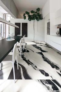
florim > Wall Paint
Nature's sheer strength comes to life, white and black find new forms of expression Inspired by the different morphologies formed by the visceral movement of the earth, the collection's large slabs embrace and explore the concept of light-absence of light by presenting a chromatic gradient based on white and black in a multi-faceted graphic proposal that joins the two monochromatic surfaces, White and Black. Soft, sinuous shapes contrast with those more rigid and geometric, coming to life from the different proportions with which the white and black combine on the surface.
B&W_Marble WHITE
florim > Wall Paint
Nature's sheer strength comes to life, white and black find new forms of expression Inspired by the different morphologies formed by the visceral movement of the earth, the collection's large slabs embrace and explore the concept of light-absence of light by presenting a chromatic gradient based on white and black in a multi-faceted graphic proposal that joins the two monochromatic surfaces, White and Black. Soft, sinuous shapes contrast with those more rigid and geometric, coming to life from the different proportions with which the white and black combine on the surface.
Chimera Colore Grigio
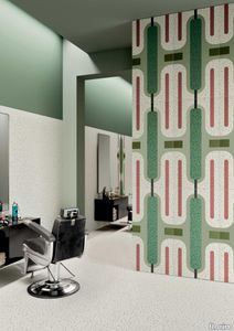
florim > Wall Paint
In <em>Chimera,</em> Elena Salmistraro merges rigour with self-expression, in a graphic grammar laden with symbolic meaning. <em>Empatia </em>speaks to the emotions with graphics that interpret, through a highly individual abstract code, the stage make-up of a clown, with the aid of superimposed geometric forms and images. <em>Radici </em>is a tribal statement, a tribute to primitive ritual custom, evoked by the interplay between a sequence of triangles and rectangles and a set of figurative fragments. <em>Ritmo</em> is inspired by fabrics, suggesting the rhythmic alternation of woven yarns through a largely linear pattern. In <em>Colore, </em>the upheaval of a background of small isolated spots generated by a parametric digital program is combined with densely packed repeated forms. "The Chimera collection is rather like a book with four different chapters: I set out to differentiate these graphic motifs to create four totally different stories."<br></br>Elena Salmistraro It all starts with drawing. A <em>passion</em> for drawing. An <em>obsession</em> with drawing. Drawings like spider-webs, obsessively filling spaces, in a kind of manual choreography or gymnastics, a continuous flow. Elena Salmistraro draws all the time. She draws everywhere. Mostly on loose sheets or random surfaces. First and foremost with pen and pencil. Her drawings only acquire colour at a later stage. Often - just like Alessandro Mendini used to do - she draws "monsters": fascinating yet disturbing, subversive forms. The denser, more contorted the shape, the more obvious its underlying truth. For Elena, drawing is an intimate act. It is relaxing. And therapeutic. With an unrivalled communicative strength. Because drawing gives shape to ideas: you both give form to the world and reveal yourself. This passion, combined with natural graphic talent, has guided Elena Salmistraro in her project for Cedit: an experimental series of ceramic slabs produced using a high-definition 3D decorative technique. The explicit aim is to transform surfaces beyond their original flatness so that a new, visual and tactile, three-dimensional personality emerges, sweeping aside the coldness and uniformity that ceramic objects often inevitably convey.Elena Salmistraro has always viewed ceramics as a democratic material, in view of their accessibility, and the infinite potentials for shaping matter that they provide. She began working and experimenting with ceramics very early in her career, just after she graduated from the Milan Politecnico in 2008. She came into contact with small artistic craft firms specialising in smallproduction lots, and cut her teeth on projects that demanded the hand-processing of every detail, and finishes of high artistic value, for the high end of the market. The large corporations and galleries came later, but here again Elena kept faith with her desire to make mass-produced pieces unique, and to combine artistic value with specifically industrial characteristics. The monkey-shaped <em>Primates</em> vases reflect this method and intention, aiming to excite, surprise and charm. Antiminimalist and hyper-figurative, playful, ironic and a rich image-maker, often drawing on anthropology and magic, over the years Salmistraro has built up her own fantastic universe, inhabited by ceramic bestiaries, painted jungles and a cabinet like a one-eyed cyclops , always finding inspiration and inputs in nature and always aiming to reveal the extraordinary in the everyday. Given this background, it was almost inevitable she would work with Cedit: constantly seeking new talents and new approaches, as well as designs that break down the boundaries of ceramics and release them into the realm of art and innovation, the Modena company has recognised Elena Salmistraro as a leading contemporary creative spirit and involved her in a project intended to experiment with fresh ideas in materials and synaesthetics.Salmistraro's collection for Cedit is entitled <em>Chimera</em> and consists of large ceramic slabs, which can be enjoyed not only visually, through their patterns and colours, but also on a tactile level. Like the chimera in the "grotesque" tradition, monstrous in the etymological sense of the word with its merging of hybrid animal and vegetable shapes, the Cedit project attempts to originate a synaesthetic form of ceramics, through a three-dimensional development that exactly reproduces the texture of leathers and fabrics, creating an absolutely new kind of layered effect, with a tactile awareness that recalls the passion of grand master Ettore Sottsass for "surfaces that talk". And the surfaces of the slabs Salmistraro has created really seem to talk: in <em>Empatia </em>clown faces add theatricality to the cold gleam of marbles, interspersed with references to Art Déco graphics; <em>Radici</em> uses the textures of leathers and hide as if to re-establish a link between ceramics and other materials at the origins of human activity and creativity; in <em>Ritmo</em> the texture of cloth dialogues with pottery, almost in homage to the tactile rationalism of warp and weft, of which Bauhaus pioneer Anni Albers was one of the most expressive past interpreters ; finally, <em>Colore</em> has a spotted base generated by computer to underline the contrast between analogue and digital, the graphic sign and the matter into which it is impressed. It is an aesthetic of superimposition and mixing, and especially of synaesthesia: as in her drawings, in the <em>Chimera </em>slabs Elena Salmistraro's art is one of movement and acceleration. A process not of representation but of exploration. Of the world and of oneself. Almost a kind of Zen, for distancing oneself from the world to understand it more fully. In every sense.
Chimera Colore Bianco
florim > Wall Paint
In <em>Chimera,</em> Elena Salmistraro merges rigour with self-expression, in a graphic grammar laden with symbolic meaning. <em>Empatia </em>speaks to the emotions with graphics that interpret, through a highly individual abstract code, the stage make-up of a clown, with the aid of superimposed geometric forms and images. <em>Radici </em>is a tribal statement, a tribute to primitive ritual custom, evoked by the interplay between a sequence of triangles and rectangles and a set of figurative fragments. <em>Ritmo</em> is inspired by fabrics, suggesting the rhythmic alternation of woven yarns through a largely linear pattern. In <em>Colore, </em>the upheaval of a background of small isolated spots generated by a parametric digital program is combined with densely packed repeated forms. "The Chimera collection is rather like a book with four different chapters: I set out to differentiate these graphic motifs to create four totally different stories."<br></br>Elena Salmistraro It all starts with drawing. A <em>passion</em> for drawing. An <em>obsession</em> with drawing. Drawings like spider-webs, obsessively filling spaces, in a kind of manual choreography or gymnastics, a continuous flow. Elena Salmistraro draws all the time. She draws everywhere. Mostly on loose sheets or random surfaces. First and foremost with pen and pencil. Her drawings only acquire colour at a later stage. Often - just like Alessandro Mendini used to do - she draws "monsters": fascinating yet disturbing, subversive forms. The denser, more contorted the shape, the more obvious its underlying truth. For Elena, drawing is an intimate act. It is relaxing. And therapeutic. With an unrivalled communicative strength. Because drawing gives shape to ideas: you both give form to the world and reveal yourself. This passion, combined with natural graphic talent, has guided Elena Salmistraro in her project for Cedit: an experimental series of ceramic slabs produced using a high-definition 3D decorative technique. The explicit aim is to transform surfaces beyond their original flatness so that a new, visual and tactile, three-dimensional personality emerges, sweeping aside the coldness and uniformity that ceramic objects often inevitably convey.Elena Salmistraro has always viewed ceramics as a democratic material, in view of their accessibility, and the infinite potentials for shaping matter that they provide. She began working and experimenting with ceramics very early in her career, just after she graduated from the Milan Politecnico in 2008. She came into contact with small artistic craft firms specialising in smallproduction lots, and cut her teeth on projects that demanded the hand-processing of every detail, and finishes of high artistic value, for the high end of the market. The large corporations and galleries came later, but here again Elena kept faith with her desire to make mass-produced pieces unique, and to combine artistic value with specifically industrial characteristics. The monkey-shaped <em>Primates</em> vases reflect this method and intention, aiming to excite, surprise and charm. Antiminimalist and hyper-figurative, playful, ironic and a rich image-maker, often drawing on anthropology and magic, over the years Salmistraro has built up her own fantastic universe, inhabited by ceramic bestiaries, painted jungles and a cabinet like a one-eyed cyclops , always finding inspiration and inputs in nature and always aiming to reveal the extraordinary in the everyday. Given this background, it was almost inevitable she would work with Cedit: constantly seeking new talents and new approaches, as well as designs that break down the boundaries of ceramics and release them into the realm of art and innovation, the Modena company has recognised Elena Salmistraro as a leading contemporary creative spirit and involved her in a project intended to experiment with fresh ideas in materials and synaesthetics.Salmistraro's collection for Cedit is entitled <em>Chimera</em> and consists of large ceramic slabs, which can be enjoyed not only visually, through their patterns and colours, but also on a tactile level. Like the chimera in the "grotesque" tradition, monstrous in the etymological sense of the word with its merging of hybrid animal and vegetable shapes, the Cedit project attempts to originate a synaesthetic form of ceramics, through a three-dimensional development that exactly reproduces the texture of leathers and fabrics, creating an absolutely new kind of layered effect, with a tactile awareness that recalls the passion of grand master Ettore Sottsass for "surfaces that talk". And the surfaces of the slabs Salmistraro has created really seem to talk: in <em>Empatia </em>clown faces add theatricality to the cold gleam of marbles, interspersed with references to Art Déco graphics; <em>Radici</em> uses the textures of leathers and hide as if to re-establish a link between ceramics and other materials at the origins of human activity and creativity; in <em>Ritmo</em> the texture of cloth dialogues with pottery, almost in homage to the tactile rationalism of warp and weft, of which Bauhaus pioneer Anni Albers was one of the most expressive past interpreters ; finally, <em>Colore</em> has a spotted base generated by computer to underline the contrast between analogue and digital, the graphic sign and the matter into which it is impressed. It is an aesthetic of superimposition and mixing, and especially of synaesthesia: as in her drawings, in the <em>Chimera </em>slabs Elena Salmistraro's art is one of movement and acceleration. A process not of representation but of exploration. Of the world and of oneself. Almost a kind of Zen, for distancing oneself from the world to understand it more fully. In every sense.
Cromatica Gradiente grigio-verde
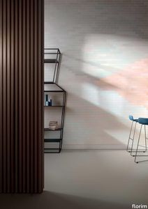
florim > Wall Paint
A lexicon of colour shades for mixing. A large size and its submultiples. «This work represents a reflection on colour, and above all a proposal on how to transfer the multiplicity of shades typical of a hand-crafted piece into a project produced on a large scale.» Andrea Trimarchi & Simone Farresin Studio Formafantasma base their work in the design world on a strong vocation for research. Simone Farresin and Andrea Trimarchi view every project as an opportunity for study and the acquisition of new knowledge, and their love of speculation establishes a dialectic rapport with the situations offered by each new client. Whether it involves a material, a type or a production method, the first phase of their design process is the mapping of what the specific case places at their disposal. With Cedit, an analysis of the company's past and present was central to the inputs. Inevitably, since "Looking back to look forward" has been the design duo's mission statement for years. In this case, in particular, the company's history was a real treasure trove, a fine blend of memory and technology: on the one hand, the excellence of production technologies now extended with the added potential arising from the engineering of large-sized ceramic tiles, and on the other a wealth of experience build up with great designers of the past, from Zanuso to Noorda, through to <strong>Ettore Sottsass</strong>. Andrea and Simone decided to focus on Sottsass - who started designing for Cedit back in the late Seventies - and made an in-depth study of one of the colour charts he developed towards the end of the Nineties. A spread of colours which gave its name to the "41 Colors" collection, included in the catalogue of the period as a real alphabet for what has proved to be a lasting design language. Colour was much more than just a compulsory step in the dialogue between designer and producer, since Sottsass had already discovered the power of the mystery intrinsic to this universe of invention.<br /><br />With Cedit the master-designer, a long-established lover of ceramics and their crafted unpredictability, found a way of transferring his personal feeling for colour to a wide audience, through industrial mass production. And this assumption is another factor Formafantasma have inherited, interpreting it today with new, even more efficient technical resources just as capable of expressing the secrets of colour. «The concept of colour "in isolation" - Sottsass explained in a 1992 text - classified colour, Pantone, as they call it now, "scientific" colour, is something I still refuse to accept. (...) Colours, the idea of colour, are always intangible, they slip slowly away like words, that run through your fingers, like poetry, which you can never keep hold of, like a good story.» And Formafantasma seem to have chosen that distinction between colour "in isolation" and "intangible" yet ever-present colour as the basis of their work. However, their approach draws on their unique vocation for research and the technical resources of the third millennium. «This work - they explain to us - is a reflection on colour, and above all on <strong>how to bring the multiplicity of shades typical of a hand-crafted piece into a large-scale project</strong>.» The designers look at large, monochrome slabs and turn to the engineers for details of their secrets, their processing stages, the phases in their production. They appreciate that the colour of ceramic material, its ineffable secret, can still be present in the series and large tile sizes in which Cedit leads the way. They understand that this is, in itself, an expressive power which does not need channelling into forms, motifs and signs. But above all, they treat the surface as a large canvas on which they spread pure colour, which tends to be uniform but in fact is never really a "scientific", totally monochrome hue: it is not a Pantone. And this is the source of the fundamental insight, which only children of the transition from the analogue to the digital era could achieve, the reward for those who draw on the past to look to the future.<br /><br />The designers cut the slab into lots of regular pieces, not necessarily of the same size. They restore its identity as a "tile", a familiar name with something ancient about it, but which stands for a module, a unit of measurement, a building block. There is nothing nostalgic about this - on the contrary, the vision is completely new, and the portions of slab created can be reassembled with no restrictions, breaking down the unity of the whole and reviving its essence starting from its structure. As the cards in the pack are shuffled, what emerges is not a figure or motif but the representation of colour itself and its physical nature. It is live matter, born from the meeting of vibrating forces, the mixing of ever-varying percentages of the basic ingredients. And Formafantasma present us with the corpuscular, fragmented essence of these small frames of space and crystallised time, which reveal the code and formula of their composition. So Cromatica is a collection made up of six colours which actually have an infinite number of declinations and compositional possibilities. It is a "discrete" combination in the mathematical sense of the term, capable of generating multiple, variable subsets. At the same time, each slab can be used in its entirety, leaving the impression of analogue continuity unchanged. But what really amazes is the comparison and dialogue between the two approaches: a stroke of genius, laying clear the mysterious appeal the artificial reproduction of colour has always held for mankind. Because, as Sottsass said, «colours are language, a powerful, magical, intangible, flexible, continuous material, in which existence is made manifest, the existence that lives in time and space».
Cromatica Gradiente bianco-rosa
florim > Wall Paint
A lexicon of colour shades for mixing. A large size and its submultiples. «This work represents a reflection on colour, and above all a proposal on how to transfer the multiplicity of shades typical of a hand-crafted piece into a project produced on a large scale.» Andrea Trimarchi & Simone Farresin Studio Formafantasma base their work in the design world on a strong vocation for research. Simone Farresin and Andrea Trimarchi view every project as an opportunity for study and the acquisition of new knowledge, and their love of speculation establishes a dialectic rapport with the situations offered by each new client. Whether it involves a material, a type or a production method, the first phase of their design process is the mapping of what the specific case places at their disposal. With Cedit, an analysis of the company's past and present was central to the inputs. Inevitably, since "Looking back to look forward" has been the design duo's mission statement for years. In this case, in particular, the company's history was a real treasure trove, a fine blend of memory and technology: on the one hand, the excellence of production technologies now extended with the added potential arising from the engineering of large-sized ceramic tiles, and on the other a wealth of experience build up with great designers of the past, from Zanuso to Noorda, through to <strong>Ettore Sottsass</strong>. Andrea and Simone decided to focus on Sottsass - who started designing for Cedit back in the late Seventies - and made an in-depth study of one of the colour charts he developed towards the end of the Nineties. A spread of colours which gave its name to the "41 Colors" collection, included in the catalogue of the period as a real alphabet for what has proved to be a lasting design language. Colour was much more than just a compulsory step in the dialogue between designer and producer, since Sottsass had already discovered the power of the mystery intrinsic to this universe of invention.<br /><br />With Cedit the master-designer, a long-established lover of ceramics and their crafted unpredictability, found a way of transferring his personal feeling for colour to a wide audience, through industrial mass production. And this assumption is another factor Formafantasma have inherited, interpreting it today with new, even more efficient technical resources just as capable of expressing the secrets of colour. «The concept of colour "in isolation" - Sottsass explained in a 1992 text - classified colour, Pantone, as they call it now, "scientific" colour, is something I still refuse to accept. (...) Colours, the idea of colour, are always intangible, they slip slowly away like words, that run through your fingers, like poetry, which you can never keep hold of, like a good story.» And Formafantasma seem to have chosen that distinction between colour "in isolation" and "intangible" yet ever-present colour as the basis of their work. However, their approach draws on their unique vocation for research and the technical resources of the third millennium. «This work - they explain to us - is a reflection on colour, and above all on <strong>how to bring the multiplicity of shades typical of a hand-crafted piece into a large-scale project</strong>.» The designers look at large, monochrome slabs and turn to the engineers for details of their secrets, their processing stages, the phases in their production. They appreciate that the colour of ceramic material, its ineffable secret, can still be present in the series and large tile sizes in which Cedit leads the way. They understand that this is, in itself, an expressive power which does not need channelling into forms, motifs and signs. But above all, they treat the surface as a large canvas on which they spread pure colour, which tends to be uniform but in fact is never really a "scientific", totally monochrome hue: it is not a Pantone. And this is the source of the fundamental insight, which only children of the transition from the analogue to the digital era could achieve, the reward for those who draw on the past to look to the future.<br /><br />The designers cut the slab into lots of regular pieces, not necessarily of the same size. They restore its identity as a "tile", a familiar name with something ancient about it, but which stands for a module, a unit of measurement, a building block. There is nothing nostalgic about this - on the contrary, the vision is completely new, and the portions of slab created can be reassembled with no restrictions, breaking down the unity of the whole and reviving its essence starting from its structure. As the cards in the pack are shuffled, what emerges is not a figure or motif but the representation of colour itself and its physical nature. It is live matter, born from the meeting of vibrating forces, the mixing of ever-varying percentages of the basic ingredients. And Formafantasma present us with the corpuscular, fragmented essence of these small frames of space and crystallised time, which reveal the code and formula of their composition. So Cromatica is a collection made up of six colours which actually have an infinite number of declinations and compositional possibilities. It is a "discrete" combination in the mathematical sense of the term, capable of generating multiple, variable subsets. At the same time, each slab can be used in its entirety, leaving the impression of analogue continuity unchanged. But what really amazes is the comparison and dialogue between the two approaches: a stroke of genius, laying clear the mysterious appeal the artificial reproduction of colour has always held for mankind. Because, as Sottsass said, «colours are language, a powerful, magical, intangible, flexible, continuous material, in which existence is made manifest, the existence that lives in time and space».