Quadrado

minotti > Sofa
Inspired by the classic teak duckboard used in the yachting industry to facilitate the outflow of water, the Brazilian architect Marcio Kogan developed Quadrado, a modular system consisting of suspended square platforms that furnish outdoor spaces with exceptional lightness and flexibility. A flexible and dynamic furnishing, of undisputed quality and comfort, which perfectly dialogues with the surrounding environment: a young and contemporary proposal that invites informal and original solutions. The wooden bases welcome comfortable padded cushions with backrests in a special fibre woven with wicker-effect, available in Mud colour or plain Liquorice colour. The sitting elements are interspersed with wooden surfaces that feature trays or candle holders, that can be arranged as desired with a surprising interlocking effect. A circular armchair joins this outdoor landscape characterized by its broad compositional freedom. For the concept, Kogan was inspired by the Japanese Metabolist architecture of the Fifties and Sixties, defined by modular volumes. Originally conceived for large living areas with 102x102 cm modules, Quadrado also integrates within its range a more compact version with 87x87 cm modules that can be combined together to adapt to more limited urban, residential and Hospitality contexts. The Quadrado double daybed, with its substantial proportions - 242x180 cm - creates an extracomfy nest in which to sit back, relax and dream. It is designed in the form of a niche, with alcove marked out by the teak duckboard backrest and armrests, and it is completed by a large mattress and soft, enveloping cushions. The double daybed sits on two metal crosspieces in Bronze.
Cromatica Gradiente bianco-rosa
florim > Wall Paint
A lexicon of colour shades for mixing. A large size and its submultiples. «This work represents a reflection on colour, and above all a proposal on how to transfer the multiplicity of shades typical of a hand-crafted piece into a project produced on a large scale.» Andrea Trimarchi & Simone Farresin Studio Formafantasma base their work in the design world on a strong vocation for research. Simone Farresin and Andrea Trimarchi view every project as an opportunity for study and the acquisition of new knowledge, and their love of speculation establishes a dialectic rapport with the situations offered by each new client. Whether it involves a material, a type or a production method, the first phase of their design process is the mapping of what the specific case places at their disposal. With Cedit, an analysis of the company's past and present was central to the inputs. Inevitably, since "Looking back to look forward" has been the design duo's mission statement for years. In this case, in particular, the company's history was a real treasure trove, a fine blend of memory and technology: on the one hand, the excellence of production technologies now extended with the added potential arising from the engineering of large-sized ceramic tiles, and on the other a wealth of experience build up with great designers of the past, from Zanuso to Noorda, through to <strong>Ettore Sottsass</strong>. Andrea and Simone decided to focus on Sottsass - who started designing for Cedit back in the late Seventies - and made an in-depth study of one of the colour charts he developed towards the end of the Nineties. A spread of colours which gave its name to the "41 Colors" collection, included in the catalogue of the period as a real alphabet for what has proved to be a lasting design language. Colour was much more than just a compulsory step in the dialogue between designer and producer, since Sottsass had already discovered the power of the mystery intrinsic to this universe of invention.<br /><br />With Cedit the master-designer, a long-established lover of ceramics and their crafted unpredictability, found a way of transferring his personal feeling for colour to a wide audience, through industrial mass production. And this assumption is another factor Formafantasma have inherited, interpreting it today with new, even more efficient technical resources just as capable of expressing the secrets of colour. «The concept of colour "in isolation" - Sottsass explained in a 1992 text - classified colour, Pantone, as they call it now, "scientific" colour, is something I still refuse to accept. (...) Colours, the idea of colour, are always intangible, they slip slowly away like words, that run through your fingers, like poetry, which you can never keep hold of, like a good story.» And Formafantasma seem to have chosen that distinction between colour "in isolation" and "intangible" yet ever-present colour as the basis of their work. However, their approach draws on their unique vocation for research and the technical resources of the third millennium. «This work - they explain to us - is a reflection on colour, and above all on <strong>how to bring the multiplicity of shades typical of a hand-crafted piece into a large-scale project</strong>.» The designers look at large, monochrome slabs and turn to the engineers for details of their secrets, their processing stages, the phases in their production. They appreciate that the colour of ceramic material, its ineffable secret, can still be present in the series and large tile sizes in which Cedit leads the way. They understand that this is, in itself, an expressive power which does not need channelling into forms, motifs and signs. But above all, they treat the surface as a large canvas on which they spread pure colour, which tends to be uniform but in fact is never really a "scientific", totally monochrome hue: it is not a Pantone. And this is the source of the fundamental insight, which only children of the transition from the analogue to the digital era could achieve, the reward for those who draw on the past to look to the future.<br /><br />The designers cut the slab into lots of regular pieces, not necessarily of the same size. They restore its identity as a "tile", a familiar name with something ancient about it, but which stands for a module, a unit of measurement, a building block. There is nothing nostalgic about this - on the contrary, the vision is completely new, and the portions of slab created can be reassembled with no restrictions, breaking down the unity of the whole and reviving its essence starting from its structure. As the cards in the pack are shuffled, what emerges is not a figure or motif but the representation of colour itself and its physical nature. It is live matter, born from the meeting of vibrating forces, the mixing of ever-varying percentages of the basic ingredients. And Formafantasma present us with the corpuscular, fragmented essence of these small frames of space and crystallised time, which reveal the code and formula of their composition. So Cromatica is a collection made up of six colours which actually have an infinite number of declinations and compositional possibilities. It is a "discrete" combination in the mathematical sense of the term, capable of generating multiple, variable subsets. At the same time, each slab can be used in its entirety, leaving the impression of analogue continuity unchanged. But what really amazes is the comparison and dialogue between the two approaches: a stroke of genius, laying clear the mysterious appeal the artificial reproduction of colour has always held for mankind. Because, as Sottsass said, «colours are language, a powerful, magical, intangible, flexible, continuous material, in which existence is made manifest, the existence that lives in time and space».
Cromatica Grigio
florim > Wall Paint
A lexicon of colour shades for mixing. A large size and its submultiples. «This work represents a reflection on colour, and above all a proposal on how to transfer the multiplicity of shades typical of a hand-crafted piece into a project produced on a large scale.» Andrea Trimarchi & Simone Farresin Studio Formafantasma base their work in the design world on a strong vocation for research. Simone Farresin and Andrea Trimarchi view every project as an opportunity for study and the acquisition of new knowledge, and their love of speculation establishes a dialectic rapport with the situations offered by each new client. Whether it involves a material, a type or a production method, the first phase of their design process is the mapping of what the specific case places at their disposal. With Cedit, an analysis of the company's past and present was central to the inputs. Inevitably, since "Looking back to look forward" has been the design duo's mission statement for years. In this case, in particular, the company's history was a real treasure trove, a fine blend of memory and technology: on the one hand, the excellence of production technologies now extended with the added potential arising from the engineering of large-sized ceramic tiles, and on the other a wealth of experience build up with great designers of the past, from Zanuso to Noorda, through to <strong>Ettore Sottsass</strong>. Andrea and Simone decided to focus on Sottsass - who started designing for Cedit back in the late Seventies - and made an in-depth study of one of the colour charts he developed towards the end of the Nineties. A spread of colours which gave its name to the "41 Colors" collection, included in the catalogue of the period as a real alphabet for what has proved to be a lasting design language. Colour was much more than just a compulsory step in the dialogue between designer and producer, since Sottsass had already discovered the power of the mystery intrinsic to this universe of invention.<br /><br />With Cedit the master-designer, a long-established lover of ceramics and their crafted unpredictability, found a way of transferring his personal feeling for colour to a wide audience, through industrial mass production. And this assumption is another factor Formafantasma have inherited, interpreting it today with new, even more efficient technical resources just as capable of expressing the secrets of colour. «The concept of colour "in isolation" - Sottsass explained in a 1992 text - classified colour, Pantone, as they call it now, "scientific" colour, is something I still refuse to accept. (...) Colours, the idea of colour, are always intangible, they slip slowly away like words, that run through your fingers, like poetry, which you can never keep hold of, like a good story.» And Formafantasma seem to have chosen that distinction between colour "in isolation" and "intangible" yet ever-present colour as the basis of their work. However, their approach draws on their unique vocation for research and the technical resources of the third millennium. «This work - they explain to us - is a reflection on colour, and above all on <strong>how to bring the multiplicity of shades typical of a hand-crafted piece into a large-scale project</strong>.» The designers look at large, monochrome slabs and turn to the engineers for details of their secrets, their processing stages, the phases in their production. They appreciate that the colour of ceramic material, its ineffable secret, can still be present in the series and large tile sizes in which Cedit leads the way. They understand that this is, in itself, an expressive power which does not need channelling into forms, motifs and signs. But above all, they treat the surface as a large canvas on which they spread pure colour, which tends to be uniform but in fact is never really a "scientific", totally monochrome hue: it is not a Pantone. And this is the source of the fundamental insight, which only children of the transition from the analogue to the digital era could achieve, the reward for those who draw on the past to look to the future.<br /><br />The designers cut the slab into lots of regular pieces, not necessarily of the same size. They restore its identity as a "tile", a familiar name with something ancient about it, but which stands for a module, a unit of measurement, a building block. There is nothing nostalgic about this - on the contrary, the vision is completely new, and the portions of slab created can be reassembled with no restrictions, breaking down the unity of the whole and reviving its essence starting from its structure. As the cards in the pack are shuffled, what emerges is not a figure or motif but the representation of colour itself and its physical nature. It is live matter, born from the meeting of vibrating forces, the mixing of ever-varying percentages of the basic ingredients. And Formafantasma present us with the corpuscular, fragmented essence of these small frames of space and crystallised time, which reveal the code and formula of their composition. So Cromatica is a collection made up of six colours which actually have an infinite number of declinations and compositional possibilities. It is a "discrete" combination in the mathematical sense of the term, capable of generating multiple, variable subsets. At the same time, each slab can be used in its entirety, leaving the impression of analogue continuity unchanged. But what really amazes is the comparison and dialogue between the two approaches: a stroke of genius, laying clear the mysterious appeal the artificial reproduction of colour has always held for mankind. Because, as Sottsass said, «colours are language, a powerful, magical, intangible, flexible, continuous material, in which existence is made manifest, the existence that lives in time and space».
Cromatica Cobalto
florim > Wall Paint
A lexicon of colour shades for mixing. A large size and its submultiples. «This work represents a reflection on colour, and above all a proposal on how to transfer the multiplicity of shades typical of a hand-crafted piece into a project produced on a large scale.» Andrea Trimarchi & Simone Farresin Studio Formafantasma base their work in the design world on a strong vocation for research. Simone Farresin and Andrea Trimarchi view every project as an opportunity for study and the acquisition of new knowledge, and their love of speculation establishes a dialectic rapport with the situations offered by each new client. Whether it involves a material, a type or a production method, the first phase of their design process is the mapping of what the specific case places at their disposal. With Cedit, an analysis of the company's past and present was central to the inputs. Inevitably, since "Looking back to look forward" has been the design duo's mission statement for years. In this case, in particular, the company's history was a real treasure trove, a fine blend of memory and technology: on the one hand, the excellence of production technologies now extended with the added potential arising from the engineering of large-sized ceramic tiles, and on the other a wealth of experience build up with great designers of the past, from Zanuso to Noorda, through to <strong>Ettore Sottsass</strong>. Andrea and Simone decided to focus on Sottsass - who started designing for Cedit back in the late Seventies - and made an in-depth study of one of the colour charts he developed towards the end of the Nineties. A spread of colours which gave its name to the "41 Colors" collection, included in the catalogue of the period as a real alphabet for what has proved to be a lasting design language. Colour was much more than just a compulsory step in the dialogue between designer and producer, since Sottsass had already discovered the power of the mystery intrinsic to this universe of invention.<br /><br />With Cedit the master-designer, a long-established lover of ceramics and their crafted unpredictability, found a way of transferring his personal feeling for colour to a wide audience, through industrial mass production. And this assumption is another factor Formafantasma have inherited, interpreting it today with new, even more efficient technical resources just as capable of expressing the secrets of colour. «The concept of colour "in isolation" - Sottsass explained in a 1992 text - classified colour, Pantone, as they call it now, "scientific" colour, is something I still refuse to accept. (...) Colours, the idea of colour, are always intangible, they slip slowly away like words, that run through your fingers, like poetry, which you can never keep hold of, like a good story.» And Formafantasma seem to have chosen that distinction between colour "in isolation" and "intangible" yet ever-present colour as the basis of their work. However, their approach draws on their unique vocation for research and the technical resources of the third millennium. «This work - they explain to us - is a reflection on colour, and above all on <strong>how to bring the multiplicity of shades typical of a hand-crafted piece into a large-scale project</strong>.» The designers look at large, monochrome slabs and turn to the engineers for details of their secrets, their processing stages, the phases in their production. They appreciate that the colour of ceramic material, its ineffable secret, can still be present in the series and large tile sizes in which Cedit leads the way. They understand that this is, in itself, an expressive power which does not need channelling into forms, motifs and signs. But above all, they treat the surface as a large canvas on which they spread pure colour, which tends to be uniform but in fact is never really a "scientific", totally monochrome hue: it is not a Pantone. And this is the source of the fundamental insight, which only children of the transition from the analogue to the digital era could achieve, the reward for those who draw on the past to look to the future.<br /><br />The designers cut the slab into lots of regular pieces, not necessarily of the same size. They restore its identity as a "tile", a familiar name with something ancient about it, but which stands for a module, a unit of measurement, a building block. There is nothing nostalgic about this - on the contrary, the vision is completely new, and the portions of slab created can be reassembled with no restrictions, breaking down the unity of the whole and reviving its essence starting from its structure. As the cards in the pack are shuffled, what emerges is not a figure or motif but the representation of colour itself and its physical nature. It is live matter, born from the meeting of vibrating forces, the mixing of ever-varying percentages of the basic ingredients. And Formafantasma present us with the corpuscular, fragmented essence of these small frames of space and crystallised time, which reveal the code and formula of their composition. So Cromatica is a collection made up of six colours which actually have an infinite number of declinations and compositional possibilities. It is a "discrete" combination in the mathematical sense of the term, capable of generating multiple, variable subsets. At the same time, each slab can be used in its entirety, leaving the impression of analogue continuity unchanged. But what really amazes is the comparison and dialogue between the two approaches: a stroke of genius, laying clear the mysterious appeal the artificial reproduction of colour has always held for mankind. Because, as Sottsass said, «colours are language, a powerful, magical, intangible, flexible, continuous material, in which existence is made manifest, the existence that lives in time and space».
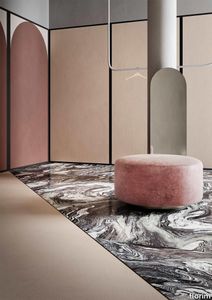
Policroma Cipria
florim > Wall Paint
Recurring geometries, combinations of figures. Marble and marmorino plaster: comparison and dialogue. The collection is completed by a linear listello tile with the motif of a sequence of vertical rectangular blocks, which can be combined with the slabs to further enrich compositions involving continuous ceramic surfaces cladding.<br /><br />"Another reference is the use of Italian marbles on the verge of extinction, rare marbles such as Rosa Valtoce, the marble used in Milan Cathedral."<br />Cristina Celestino Cristina Celestino's smartphone contains a folder of images entitled "Milan". Photographs that are more like notes. Photographs of architectural features, materials or details of shapes encountered by chance during a walk, but they cannot be described as merely a vague "source of inspiration". This filing system, created in response to a fleeting instinct, is an integral part of the method of work adopted by the architect and designer, who starts off without preconceptions "“ or "free", as she puts it before drawing inputs from a vast world of references, from Hermès scarves to the works of the great Masters (in the specific case of Policroma). This accumulation, partly spontaneous and party the outcome of in-depth historical knowledge and study, naturally activates a process of synthesis and personal interpretation common to all Cristina Celestino's output.<br /><br /><br />The wall covering collection designed for Cedit was no exception, although in this case the designer was dealing with a project with variable dimensions, reaching up even to the architectural scale. In her own distinctive way, she combined a variety of references. Adolf Loos's passion for coloured types of marble, and Cipollino in particular. Carlo Scarpa's angular metal frames and Marmorino plaster in Venice. The French fashion house's square silk scarves. The entrance halls of Milan palazzos, Gio Ponti, the city's Cathedral. All expressed in the designer's own language: well balanced geometrical forms, subtle colours (shades similar to those of Scarpa himself), an effortless, almost restrained, playful elegance. The mood is that of the homes of the enlightened bourgeoisie who shaped the history of Milan, Celestino's adoptive city and an endless source of inputs. She has worked its interiors, including some of the least expected a 1928 tram, the historic Cucchi confectionery store hybridising her own style with the existing context. An imitative effect which is also the key to the meaning of the new Policroma collection: the marble varieties replicated using the Cedit technology are all from Italian quarries that are virtually "worked out". This revives an increasingly rare material as a "living" presence, in a different form which makes no claim to replace the natural original. Quite the contrary, Celestino immediately states her intention to imitate, by combining marble and Marmorino plaster in some variants with a contrasting frame (a typical feature for her, just as it was for Scarpa), and evoking the centuries-old marble-imitating scagliola plasterwork with a contemporary formula.<br /><br /><br />The types of marble chosen are central to the project's character. Verde Alpi, a favourite with Gio Ponti and often found in Milan entrance halls, features tightly packed patterning. Breccia Capraia, still found in a very few places in Tuscany, has a white background with just a few veins. Cipollino, in the special Ondulato variety in green and red, is patterned with spirals. Rosa Valtoce, on the other hand, was used by the "Veneranda Fabbrica" guild to build Milan Cathedral. It is an iconic stone with dramatic stripes, popular in the past; it is now sourced from one very small quarry in Piedmont which has been virtually abandoned.<br /> The many different elements that make up the Policroma collection all reflect the importance of craftsmanship to Cristina Celestino's design style: the modules can be freely mixed and combined, for example to create a concave or convex semicircle, or for the large-scale replication of small features initially conceived as trims, functional details transformed into a dominant motif.There is a return to the theme of the interior, a large or small protected space, conceived as suspended in space and time yet also reassuring and protective. It is designed through its coverings in a stark yet not minimalist way, with intelligence and with no overreaching artistic ambitions. An understated space and an extremely stylish declaration. In Milan style, of course.
Cromatica Cenere
florim > Synthetic Floor
A lexicon of colour shades for mixing. A large size and its submultiples. «This work represents a reflection on colour, and above all a proposal on how to transfer the multiplicity of shades typical of a hand-crafted piece into a project produced on a large scale.» Andrea Trimarchi & Simone Farresin Studio Formafantasma base their work in the design world on a strong vocation for research. Simone Farresin and Andrea Trimarchi view every project as an opportunity for study and the acquisition of new knowledge, and their love of speculation establishes a dialectic rapport with the situations offered by each new client. Whether it involves a material, a type or a production method, the first phase of their design process is the mapping of what the specific case places at their disposal. With Cedit, an analysis of the company's past and present was central to the inputs. Inevitably, since "Looking back to look forward" has been the design duo's mission statement for years. In this case, in particular, the company's history was a real treasure trove, a fine blend of memory and technology: on the one hand, the excellence of production technologies now extended with the added potential arising from the engineering of large-sized ceramic tiles, and on the other a wealth of experience build up with great designers of the past, from Zanuso to Noorda, through to <strong>Ettore Sottsass</strong>. Andrea and Simone decided to focus on Sottsass - who started designing for Cedit back in the late Seventies - and made an in-depth study of one of the colour charts he developed towards the end of the Nineties. A spread of colours which gave its name to the "41 Colors" collection, included in the catalogue of the period as a real alphabet for what has proved to be a lasting design language. Colour was much more than just a compulsory step in the dialogue between designer and producer, since Sottsass had already discovered the power of the mystery intrinsic to this universe of invention.<br /><br />With Cedit the master-designer, a long-established lover of ceramics and their crafted unpredictability, found a way of transferring his personal feeling for colour to a wide audience, through industrial mass production. And this assumption is another factor Formafantasma have inherited, interpreting it today with new, even more efficient technical resources just as capable of expressing the secrets of colour. «The concept of colour "in isolation" - Sottsass explained in a 1992 text - classified colour, Pantone, as they call it now, "scientific" colour, is something I still refuse to accept. (...) Colours, the idea of colour, are always intangible, they slip slowly away like words, that run through your fingers, like poetry, which you can never keep hold of, like a good story.» And Formafantasma seem to have chosen that distinction between colour "in isolation" and "intangible" yet ever-present colour as the basis of their work. However, their approach draws on their unique vocation for research and the technical resources of the third millennium. «This work - they explain to us - is a reflection on colour, and above all on <strong>how to bring the multiplicity of shades typical of a hand-crafted piece into a large-scale project</strong>.» The designers look at large, monochrome slabs and turn to the engineers for details of their secrets, their processing stages, the phases in their production. They appreciate that the colour of ceramic material, its ineffable secret, can still be present in the series and large tile sizes in which Cedit leads the way. They understand that this is, in itself, an expressive power which does not need channelling into forms, motifs and signs. But above all, they treat the surface as a large canvas on which they spread pure colour, which tends to be uniform but in fact is never really a "scientific", totally monochrome hue: it is not a Pantone. And this is the source of the fundamental insight, which only children of the transition from the analogue to the digital era could achieve, the reward for those who draw on the past to look to the future.<br /><br />The designers cut the slab into lots of regular pieces, not necessarily of the same size. They restore its identity as a "tile", a familiar name with something ancient about it, but which stands for a module, a unit of measurement, a building block. There is nothing nostalgic about this - on the contrary, the vision is completely new, and the portions of slab created can be reassembled with no restrictions, breaking down the unity of the whole and reviving its essence starting from its structure. As the cards in the pack are shuffled, what emerges is not a figure or motif but the representation of colour itself and its physical nature. It is live matter, born from the meeting of vibrating forces, the mixing of ever-varying percentages of the basic ingredients. And Formafantasma present us with the corpuscular, fragmented essence of these small frames of space and crystallised time, which reveal the code and formula of their composition. So Cromatica is a collection made up of six colours which actually have an infinite number of declinations and compositional possibilities. It is a "discrete" combination in the mathematical sense of the term, capable of generating multiple, variable subsets. At the same time, each slab can be used in its entirety, leaving the impression of analogue continuity unchanged. But what really amazes is the comparison and dialogue between the two approaches: a stroke of genius, laying clear the mysterious appeal the artificial reproduction of colour has always held for mankind. Because, as Sottsass said, «colours are language, a powerful, magical, intangible, flexible, continuous material, in which existence is made manifest, the existence that lives in time and space».
Policroma Valtoce
florim > Wall tile-stone-brick
Recurring geometries, combinations of figures. Marble and marmorino plaster: comparison and dialogue. The collection is completed by a linear listello tile with the motif of a sequence of vertical rectangular blocks, which can be combined with the slabs to further enrich compositions involving continuous ceramic surfaces cladding.<br /><br />"Another reference is the use of Italian marbles on the verge of extinction, rare marbles such as Rosa Valtoce, the marble used in Milan Cathedral."<br />Cristina Celestino Cristina Celestino's smartphone contains a folder of images entitled "Milan". Photographs that are more like notes. Photographs of architectural features, materials or details of shapes encountered by chance during a walk, but they cannot be described as merely a vague "source of inspiration". This filing system, created in response to a fleeting instinct, is an integral part of the method of work adopted by the architect and designer, who starts off without preconceptions "“ or "free", as she puts it before drawing inputs from a vast world of references, from Hermès scarves to the works of the great Masters (in the specific case of Policroma). This accumulation, partly spontaneous and party the outcome of in-depth historical knowledge and study, naturally activates a process of synthesis and personal interpretation common to all Cristina Celestino's output.<br /><br /><br />The wall covering collection designed for Cedit was no exception, although in this case the designer was dealing with a project with variable dimensions, reaching up even to the architectural scale. In her own distinctive way, she combined a variety of references. Adolf Loos's passion for coloured types of marble, and Cipollino in particular. Carlo Scarpa's angular metal frames and Marmorino plaster in Venice. The French fashion house's square silk scarves. The entrance halls of Milan palazzos, Gio Ponti, the city's Cathedral. All expressed in the designer's own language: well balanced geometrical forms, subtle colours (shades similar to those of Scarpa himself), an effortless, almost restrained, playful elegance. The mood is that of the homes of the enlightened bourgeoisie who shaped the history of Milan, Celestino's adoptive city and an endless source of inputs. She has worked its interiors, including some of the least expected a 1928 tram, the historic Cucchi confectionery store hybridising her own style with the existing context. An imitative effect which is also the key to the meaning of the new Policroma collection: the marble varieties replicated using the Cedit technology are all from Italian quarries that are virtually "worked out". This revives an increasingly rare material as a "living" presence, in a different form which makes no claim to replace the natural original. Quite the contrary, Celestino immediately states her intention to imitate, by combining marble and Marmorino plaster in some variants with a contrasting frame (a typical feature for her, just as it was for Scarpa), and evoking the centuries-old marble-imitating scagliola plasterwork with a contemporary formula.<br /><br /><br />The types of marble chosen are central to the project's character. Verde Alpi, a favourite with Gio Ponti and often found in Milan entrance halls, features tightly packed patterning. Breccia Capraia, still found in a very few places in Tuscany, has a white background with just a few veins. Cipollino, in the special Ondulato variety in green and red, is patterned with spirals. Rosa Valtoce, on the other hand, was used by the "Veneranda Fabbrica" guild to build Milan Cathedral. It is an iconic stone with dramatic stripes, popular in the past; it is now sourced from one very small quarry in Piedmont which has been virtually abandoned.<br /> The many different elements that make up the Policroma collection all reflect the importance of craftsmanship to Cristina Celestino's design style: the modules can be freely mixed and combined, for example to create a concave or convex semicircle, or for the large-scale replication of small features initially conceived as trims, functional details transformed into a dominant motif.There is a return to the theme of the interior, a large or small protected space, conceived as suspended in space and time yet also reassuring and protective. It is designed through its coverings in a stark yet not minimalist way, with intelligence and with no overreaching artistic ambitions. An understated space and an extremely stylish declaration. In Milan style, of course.
Cromatica Verde
florim > Wall Paint
A lexicon of colour shades for mixing. A large size and its submultiples. «This work represents a reflection on colour, and above all a proposal on how to transfer the multiplicity of shades typical of a hand-crafted piece into a project produced on a large scale.» Andrea Trimarchi & Simone Farresin Studio Formafantasma base their work in the design world on a strong vocation for research. Simone Farresin and Andrea Trimarchi view every project as an opportunity for study and the acquisition of new knowledge, and their love of speculation establishes a dialectic rapport with the situations offered by each new client. Whether it involves a material, a type or a production method, the first phase of their design process is the mapping of what the specific case places at their disposal. With Cedit, an analysis of the company's past and present was central to the inputs. Inevitably, since "Looking back to look forward" has been the design duo's mission statement for years. In this case, in particular, the company's history was a real treasure trove, a fine blend of memory and technology: on the one hand, the excellence of production technologies now extended with the added potential arising from the engineering of large-sized ceramic tiles, and on the other a wealth of experience build up with great designers of the past, from Zanuso to Noorda, through to <strong>Ettore Sottsass</strong>. Andrea and Simone decided to focus on Sottsass - who started designing for Cedit back in the late Seventies - and made an in-depth study of one of the colour charts he developed towards the end of the Nineties. A spread of colours which gave its name to the "41 Colors" collection, included in the catalogue of the period as a real alphabet for what has proved to be a lasting design language. Colour was much more than just a compulsory step in the dialogue between designer and producer, since Sottsass had already discovered the power of the mystery intrinsic to this universe of invention.<br /><br />With Cedit the master-designer, a long-established lover of ceramics and their crafted unpredictability, found a way of transferring his personal feeling for colour to a wide audience, through industrial mass production. And this assumption is another factor Formafantasma have inherited, interpreting it today with new, even more efficient technical resources just as capable of expressing the secrets of colour. «The concept of colour "in isolation" - Sottsass explained in a 1992 text - classified colour, Pantone, as they call it now, "scientific" colour, is something I still refuse to accept. (...) Colours, the idea of colour, are always intangible, they slip slowly away like words, that run through your fingers, like poetry, which you can never keep hold of, like a good story.» And Formafantasma seem to have chosen that distinction between colour "in isolation" and "intangible" yet ever-present colour as the basis of their work. However, their approach draws on their unique vocation for research and the technical resources of the third millennium. «This work - they explain to us - is a reflection on colour, and above all on <strong>how to bring the multiplicity of shades typical of a hand-crafted piece into a large-scale project</strong>.» The designers look at large, monochrome slabs and turn to the engineers for details of their secrets, their processing stages, the phases in their production. They appreciate that the colour of ceramic material, its ineffable secret, can still be present in the series and large tile sizes in which Cedit leads the way. They understand that this is, in itself, an expressive power which does not need channelling into forms, motifs and signs. But above all, they treat the surface as a large canvas on which they spread pure colour, which tends to be uniform but in fact is never really a "scientific", totally monochrome hue: it is not a Pantone. And this is the source of the fundamental insight, which only children of the transition from the analogue to the digital era could achieve, the reward for those who draw on the past to look to the future.<br /><br />The designers cut the slab into lots of regular pieces, not necessarily of the same size. They restore its identity as a "tile", a familiar name with something ancient about it, but which stands for a module, a unit of measurement, a building block. There is nothing nostalgic about this - on the contrary, the vision is completely new, and the portions of slab created can be reassembled with no restrictions, breaking down the unity of the whole and reviving its essence starting from its structure. As the cards in the pack are shuffled, what emerges is not a figure or motif but the representation of colour itself and its physical nature. It is live matter, born from the meeting of vibrating forces, the mixing of ever-varying percentages of the basic ingredients. And Formafantasma present us with the corpuscular, fragmented essence of these small frames of space and crystallised time, which reveal the code and formula of their composition. So Cromatica is a collection made up of six colours which actually have an infinite number of declinations and compositional possibilities. It is a "discrete" combination in the mathematical sense of the term, capable of generating multiple, variable subsets. At the same time, each slab can be used in its entirety, leaving the impression of analogue continuity unchanged. But what really amazes is the comparison and dialogue between the two approaches: a stroke of genius, laying clear the mysterious appeal the artificial reproduction of colour has always held for mankind. Because, as Sottsass said, «colours are language, a powerful, magical, intangible, flexible, continuous material, in which existence is made manifest, the existence that lives in time and space».
Policroma Breccia
florim > Wall tile-stone-brick
Recurring geometries, combinations of figures. Marble and marmorino plaster: comparison and dialogue. The collection is completed by a linear listello tile with the motif of a sequence of vertical rectangular blocks, which can be combined with the slabs to further enrich compositions involving continuous ceramic surfaces cladding.<br /><br />"Another reference is the use of Italian marbles on the verge of extinction, rare marbles such as Rosa Valtoce, the marble used in Milan Cathedral."<br />Cristina Celestino Cristina Celestino's smartphone contains a folder of images entitled "Milan". Photographs that are more like notes. Photographs of architectural features, materials or details of shapes encountered by chance during a walk, but they cannot be described as merely a vague "source of inspiration". This filing system, created in response to a fleeting instinct, is an integral part of the method of work adopted by the architect and designer, who starts off without preconceptions "“ or "free", as she puts it before drawing inputs from a vast world of references, from Hermès scarves to the works of the great Masters (in the specific case of Policroma). This accumulation, partly spontaneous and party the outcome of in-depth historical knowledge and study, naturally activates a process of synthesis and personal interpretation common to all Cristina Celestino's output.<br /><br /><br />The wall covering collection designed for Cedit was no exception, although in this case the designer was dealing with a project with variable dimensions, reaching up even to the architectural scale. In her own distinctive way, she combined a variety of references. Adolf Loos's passion for coloured types of marble, and Cipollino in particular. Carlo Scarpa's angular metal frames and Marmorino plaster in Venice. The French fashion house's square silk scarves. The entrance halls of Milan palazzos, Gio Ponti, the city's Cathedral. All expressed in the designer's own language: well balanced geometrical forms, subtle colours (shades similar to those of Scarpa himself), an effortless, almost restrained, playful elegance. The mood is that of the homes of the enlightened bourgeoisie who shaped the history of Milan, Celestino's adoptive city and an endless source of inputs. She has worked its interiors, including some of the least expected a 1928 tram, the historic Cucchi confectionery store hybridising her own style with the existing context. An imitative effect which is also the key to the meaning of the new Policroma collection: the marble varieties replicated using the Cedit technology are all from Italian quarries that are virtually "worked out". This revives an increasingly rare material as a "living" presence, in a different form which makes no claim to replace the natural original. Quite the contrary, Celestino immediately states her intention to imitate, by combining marble and Marmorino plaster in some variants with a contrasting frame (a typical feature for her, just as it was for Scarpa), and evoking the centuries-old marble-imitating scagliola plasterwork with a contemporary formula.<br /><br /><br />The types of marble chosen are central to the project's character. Verde Alpi, a favourite with Gio Ponti and often found in Milan entrance halls, features tightly packed patterning. Breccia Capraia, still found in a very few places in Tuscany, has a white background with just a few veins. Cipollino, in the special Ondulato variety in green and red, is patterned with spirals. Rosa Valtoce, on the other hand, was used by the "Veneranda Fabbrica" guild to build Milan Cathedral. It is an iconic stone with dramatic stripes, popular in the past; it is now sourced from one very small quarry in Piedmont which has been virtually abandoned.<br /> The many different elements that make up the Policroma collection all reflect the importance of craftsmanship to Cristina Celestino's design style: the modules can be freely mixed and combined, for example to create a concave or convex semicircle, or for the large-scale replication of small features initially conceived as trims, functional details transformed into a dominant motif.There is a return to the theme of the interior, a large or small protected space, conceived as suspended in space and time yet also reassuring and protective. It is designed through its coverings in a stark yet not minimalist way, with intelligence and with no overreaching artistic ambitions. An understated space and an extremely stylish declaration. In Milan style, of course.
Cromatica Opale
florim > Wall Paint
A lexicon of colour shades for mixing. A large size and its submultiples. «This work represents a reflection on colour, and above all a proposal on how to transfer the multiplicity of shades typical of a hand-crafted piece into a project produced on a large scale.» Andrea Trimarchi & Simone Farresin Studio Formafantasma base their work in the design world on a strong vocation for research. Simone Farresin and Andrea Trimarchi view every project as an opportunity for study and the acquisition of new knowledge, and their love of speculation establishes a dialectic rapport with the situations offered by each new client. Whether it involves a material, a type or a production method, the first phase of their design process is the mapping of what the specific case places at their disposal. With Cedit, an analysis of the company's past and present was central to the inputs. Inevitably, since "Looking back to look forward" has been the design duo's mission statement for years. In this case, in particular, the company's history was a real treasure trove, a fine blend of memory and technology: on the one hand, the excellence of production technologies now extended with the added potential arising from the engineering of large-sized ceramic tiles, and on the other a wealth of experience build up with great designers of the past, from Zanuso to Noorda, through to <strong>Ettore Sottsass</strong>. Andrea and Simone decided to focus on Sottsass - who started designing for Cedit back in the late Seventies - and made an in-depth study of one of the colour charts he developed towards the end of the Nineties. A spread of colours which gave its name to the "41 Colors" collection, included in the catalogue of the period as a real alphabet for what has proved to be a lasting design language. Colour was much more than just a compulsory step in the dialogue between designer and producer, since Sottsass had already discovered the power of the mystery intrinsic to this universe of invention.<br /><br />With Cedit the master-designer, a long-established lover of ceramics and their crafted unpredictability, found a way of transferring his personal feeling for colour to a wide audience, through industrial mass production. And this assumption is another factor Formafantasma have inherited, interpreting it today with new, even more efficient technical resources just as capable of expressing the secrets of colour. «The concept of colour "in isolation" - Sottsass explained in a 1992 text - classified colour, Pantone, as they call it now, "scientific" colour, is something I still refuse to accept. (...) Colours, the idea of colour, are always intangible, they slip slowly away like words, that run through your fingers, like poetry, which you can never keep hold of, like a good story.» And Formafantasma seem to have chosen that distinction between colour "in isolation" and "intangible" yet ever-present colour as the basis of their work. However, their approach draws on their unique vocation for research and the technical resources of the third millennium. «This work - they explain to us - is a reflection on colour, and above all on <strong>how to bring the multiplicity of shades typical of a hand-crafted piece into a large-scale project</strong>.» The designers look at large, monochrome slabs and turn to the engineers for details of their secrets, their processing stages, the phases in their production. They appreciate that the colour of ceramic material, its ineffable secret, can still be present in the series and large tile sizes in which Cedit leads the way. They understand that this is, in itself, an expressive power which does not need channelling into forms, motifs and signs. But above all, they treat the surface as a large canvas on which they spread pure colour, which tends to be uniform but in fact is never really a "scientific", totally monochrome hue: it is not a Pantone. And this is the source of the fundamental insight, which only children of the transition from the analogue to the digital era could achieve, the reward for those who draw on the past to look to the future.<br /><br />The designers cut the slab into lots of regular pieces, not necessarily of the same size. They restore its identity as a "tile", a familiar name with something ancient about it, but which stands for a module, a unit of measurement, a building block. There is nothing nostalgic about this - on the contrary, the vision is completely new, and the portions of slab created can be reassembled with no restrictions, breaking down the unity of the whole and reviving its essence starting from its structure. As the cards in the pack are shuffled, what emerges is not a figure or motif but the representation of colour itself and its physical nature. It is live matter, born from the meeting of vibrating forces, the mixing of ever-varying percentages of the basic ingredients. And Formafantasma present us with the corpuscular, fragmented essence of these small frames of space and crystallised time, which reveal the code and formula of their composition. So Cromatica is a collection made up of six colours which actually have an infinite number of declinations and compositional possibilities. It is a "discrete" combination in the mathematical sense of the term, capable of generating multiple, variable subsets. At the same time, each slab can be used in its entirety, leaving the impression of analogue continuity unchanged. But what really amazes is the comparison and dialogue between the two approaches: a stroke of genius, laying clear the mysterious appeal the artificial reproduction of colour has always held for mankind. Because, as Sottsass said, «colours are language, a powerful, magical, intangible, flexible, continuous material, in which existence is made manifest, the existence that lives in time and space».
Cromatica Bianco
florim > Wall Paint
A lexicon of colour shades for mixing. A large size and its submultiples. «This work represents a reflection on colour, and above all a proposal on how to transfer the multiplicity of shades typical of a hand-crafted piece into a project produced on a large scale.» Andrea Trimarchi & Simone Farresin Studio Formafantasma base their work in the design world on a strong vocation for research. Simone Farresin and Andrea Trimarchi view every project as an opportunity for study and the acquisition of new knowledge, and their love of speculation establishes a dialectic rapport with the situations offered by each new client. Whether it involves a material, a type or a production method, the first phase of their design process is the mapping of what the specific case places at their disposal. With Cedit, an analysis of the company's past and present was central to the inputs. Inevitably, since "Looking back to look forward" has been the design duo's mission statement for years. In this case, in particular, the company's history was a real treasure trove, a fine blend of memory and technology: on the one hand, the excellence of production technologies now extended with the added potential arising from the engineering of large-sized ceramic tiles, and on the other a wealth of experience build up with great designers of the past, from Zanuso to Noorda, through to <strong>Ettore Sottsass</strong>. Andrea and Simone decided to focus on Sottsass - who started designing for Cedit back in the late Seventies - and made an in-depth study of one of the colour charts he developed towards the end of the Nineties. A spread of colours which gave its name to the "41 Colors" collection, included in the catalogue of the period as a real alphabet for what has proved to be a lasting design language. Colour was much more than just a compulsory step in the dialogue between designer and producer, since Sottsass had already discovered the power of the mystery intrinsic to this universe of invention.<br /><br />With Cedit the master-designer, a long-established lover of ceramics and their crafted unpredictability, found a way of transferring his personal feeling for colour to a wide audience, through industrial mass production. And this assumption is another factor Formafantasma have inherited, interpreting it today with new, even more efficient technical resources just as capable of expressing the secrets of colour. «The concept of colour "in isolation" - Sottsass explained in a 1992 text - classified colour, Pantone, as they call it now, "scientific" colour, is something I still refuse to accept. (...) Colours, the idea of colour, are always intangible, they slip slowly away like words, that run through your fingers, like poetry, which you can never keep hold of, like a good story.» And Formafantasma seem to have chosen that distinction between colour "in isolation" and "intangible" yet ever-present colour as the basis of their work. However, their approach draws on their unique vocation for research and the technical resources of the third millennium. «This work - they explain to us - is a reflection on colour, and above all on <strong>how to bring the multiplicity of shades typical of a hand-crafted piece into a large-scale project</strong>.» The designers look at large, monochrome slabs and turn to the engineers for details of their secrets, their processing stages, the phases in their production. They appreciate that the colour of ceramic material, its ineffable secret, can still be present in the series and large tile sizes in which Cedit leads the way. They understand that this is, in itself, an expressive power which does not need channelling into forms, motifs and signs. But above all, they treat the surface as a large canvas on which they spread pure colour, which tends to be uniform but in fact is never really a "scientific", totally monochrome hue: it is not a Pantone. And this is the source of the fundamental insight, which only children of the transition from the analogue to the digital era could achieve, the reward for those who draw on the past to look to the future.<br /><br />The designers cut the slab into lots of regular pieces, not necessarily of the same size. They restore its identity as a "tile", a familiar name with something ancient about it, but which stands for a module, a unit of measurement, a building block. There is nothing nostalgic about this - on the contrary, the vision is completely new, and the portions of slab created can be reassembled with no restrictions, breaking down the unity of the whole and reviving its essence starting from its structure. As the cards in the pack are shuffled, what emerges is not a figure or motif but the representation of colour itself and its physical nature. It is live matter, born from the meeting of vibrating forces, the mixing of ever-varying percentages of the basic ingredients. And Formafantasma present us with the corpuscular, fragmented essence of these small frames of space and crystallised time, which reveal the code and formula of their composition. So Cromatica is a collection made up of six colours which actually have an infinite number of declinations and compositional possibilities. It is a "discrete" combination in the mathematical sense of the term, capable of generating multiple, variable subsets. At the same time, each slab can be used in its entirety, leaving the impression of analogue continuity unchanged. But what really amazes is the comparison and dialogue between the two approaches: a stroke of genius, laying clear the mysterious appeal the artificial reproduction of colour has always held for mankind. Because, as Sottsass said, «colours are language, a powerful, magical, intangible, flexible, continuous material, in which existence is made manifest, the existence that lives in time and space».
Policroma Lichene
florim > Wall Paint
Recurring geometries, combinations of figures. Marble and marmorino plaster: comparison and dialogue. The collection is completed by a linear listello tile with the motif of a sequence of vertical rectangular blocks, which can be combined with the slabs to further enrich compositions involving continuous ceramic surfaces cladding.<br /><br />"Another reference is the use of Italian marbles on the verge of extinction, rare marbles such as Rosa Valtoce, the marble used in Milan Cathedral."<br />Cristina Celestino Cristina Celestino's smartphone contains a folder of images entitled "Milan". Photographs that are more like notes. Photographs of architectural features, materials or details of shapes encountered by chance during a walk, but they cannot be described as merely a vague "source of inspiration". This filing system, created in response to a fleeting instinct, is an integral part of the method of work adopted by the architect and designer, who starts off without preconceptions "“ or "free", as she puts it before drawing inputs from a vast world of references, from Hermès scarves to the works of the great Masters (in the specific case of Policroma). This accumulation, partly spontaneous and party the outcome of in-depth historical knowledge and study, naturally activates a process of synthesis and personal interpretation common to all Cristina Celestino's output.<br /><br /><br />The wall covering collection designed for Cedit was no exception, although in this case the designer was dealing with a project with variable dimensions, reaching up even to the architectural scale. In her own distinctive way, she combined a variety of references. Adolf Loos's passion for coloured types of marble, and Cipollino in particular. Carlo Scarpa's angular metal frames and Marmorino plaster in Venice. The French fashion house's square silk scarves. The entrance halls of Milan palazzos, Gio Ponti, the city's Cathedral. All expressed in the designer's own language: well balanced geometrical forms, subtle colours (shades similar to those of Scarpa himself), an effortless, almost restrained, playful elegance. The mood is that of the homes of the enlightened bourgeoisie who shaped the history of Milan, Celestino's adoptive city and an endless source of inputs. She has worked its interiors, including some of the least expected a 1928 tram, the historic Cucchi confectionery store hybridising her own style with the existing context. An imitative effect which is also the key to the meaning of the new Policroma collection: the marble varieties replicated using the Cedit technology are all from Italian quarries that are virtually "worked out". This revives an increasingly rare material as a "living" presence, in a different form which makes no claim to replace the natural original. Quite the contrary, Celestino immediately states her intention to imitate, by combining marble and Marmorino plaster in some variants with a contrasting frame (a typical feature for her, just as it was for Scarpa), and evoking the centuries-old marble-imitating scagliola plasterwork with a contemporary formula.<br /><br /><br />The types of marble chosen are central to the project's character. Verde Alpi, a favourite with Gio Ponti and often found in Milan entrance halls, features tightly packed patterning. Breccia Capraia, still found in a very few places in Tuscany, has a white background with just a few veins. Cipollino, in the special Ondulato variety in green and red, is patterned with spirals. Rosa Valtoce, on the other hand, was used by the "Veneranda Fabbrica" guild to build Milan Cathedral. It is an iconic stone with dramatic stripes, popular in the past; it is now sourced from one very small quarry in Piedmont which has been virtually abandoned.<br /> The many different elements that make up the Policroma collection all reflect the importance of craftsmanship to Cristina Celestino's design style: the modules can be freely mixed and combined, for example to create a concave or convex semicircle, or for the large-scale replication of small features initially conceived as trims, functional details transformed into a dominant motif.There is a return to the theme of the interior, a large or small protected space, conceived as suspended in space and time yet also reassuring and protective. It is designed through its coverings in a stark yet not minimalist way, with intelligence and with no overreaching artistic ambitions. An understated space and an extremely stylish declaration. In Milan style, of course.
Policroma Cipollino
florim > Wall tile-stone-brick
Recurring geometries, combinations of figures. Marble and marmorino plaster: comparison and dialogue. The collection is completed by a linear listello tile with the motif of a sequence of vertical rectangular blocks, which can be combined with the slabs to further enrich compositions involving continuous ceramic surfaces cladding.<br /><br />"Another reference is the use of Italian marbles on the verge of extinction, rare marbles such as Rosa Valtoce, the marble used in Milan Cathedral."<br />Cristina Celestino Cristina Celestino's smartphone contains a folder of images entitled "Milan". Photographs that are more like notes. Photographs of architectural features, materials or details of shapes encountered by chance during a walk, but they cannot be described as merely a vague "source of inspiration". This filing system, created in response to a fleeting instinct, is an integral part of the method of work adopted by the architect and designer, who starts off without preconceptions "“ or "free", as she puts it before drawing inputs from a vast world of references, from Hermès scarves to the works of the great Masters (in the specific case of Policroma). This accumulation, partly spontaneous and party the outcome of in-depth historical knowledge and study, naturally activates a process of synthesis and personal interpretation common to all Cristina Celestino's output.<br /><br /><br />The wall covering collection designed for Cedit was no exception, although in this case the designer was dealing with a project with variable dimensions, reaching up even to the architectural scale. In her own distinctive way, she combined a variety of references. Adolf Loos's passion for coloured types of marble, and Cipollino in particular. Carlo Scarpa's angular metal frames and Marmorino plaster in Venice. The French fashion house's square silk scarves. The entrance halls of Milan palazzos, Gio Ponti, the city's Cathedral. All expressed in the designer's own language: well balanced geometrical forms, subtle colours (shades similar to those of Scarpa himself), an effortless, almost restrained, playful elegance. The mood is that of the homes of the enlightened bourgeoisie who shaped the history of Milan, Celestino's adoptive city and an endless source of inputs. She has worked its interiors, including some of the least expected a 1928 tram, the historic Cucchi confectionery store hybridising her own style with the existing context. An imitative effect which is also the key to the meaning of the new Policroma collection: the marble varieties replicated using the Cedit technology are all from Italian quarries that are virtually "worked out". This revives an increasingly rare material as a "living" presence, in a different form which makes no claim to replace the natural original. Quite the contrary, Celestino immediately states her intention to imitate, by combining marble and Marmorino plaster in some variants with a contrasting frame (a typical feature for her, just as it was for Scarpa), and evoking the centuries-old marble-imitating scagliola plasterwork with a contemporary formula.<br /><br /><br />The types of marble chosen are central to the project's character. Verde Alpi, a favourite with Gio Ponti and often found in Milan entrance halls, features tightly packed patterning. Breccia Capraia, still found in a very few places in Tuscany, has a white background with just a few veins. Cipollino, in the special Ondulato variety in green and red, is patterned with spirals. Rosa Valtoce, on the other hand, was used by the "Veneranda Fabbrica" guild to build Milan Cathedral. It is an iconic stone with dramatic stripes, popular in the past; it is now sourced from one very small quarry in Piedmont which has been virtually abandoned.<br /> The many different elements that make up the Policroma collection all reflect the importance of craftsmanship to Cristina Celestino's design style: the modules can be freely mixed and combined, for example to create a concave or convex semicircle, or for the large-scale replication of small features initially conceived as trims, functional details transformed into a dominant motif.There is a return to the theme of the interior, a large or small protected space, conceived as suspended in space and time yet also reassuring and protective. It is designed through its coverings in a stark yet not minimalist way, with intelligence and with no overreaching artistic ambitions. An understated space and an extremely stylish declaration. In Milan style, of course.
Policroma Alpi
florim > Wall tile-stone-brick
Recurring geometries, combinations of figures. Marble and marmorino plaster: comparison and dialogue. The collection is completed by a linear listello tile with the motif of a sequence of vertical rectangular blocks, which can be combined with the slabs to further enrich compositions involving continuous ceramic surfaces cladding.<br /><br />"Another reference is the use of Italian marbles on the verge of extinction, rare marbles such as Rosa Valtoce, the marble used in Milan Cathedral."<br />Cristina Celestino Cristina Celestino's smartphone contains a folder of images entitled "Milan". Photographs that are more like notes. Photographs of architectural features, materials or details of shapes encountered by chance during a walk, but they cannot be described as merely a vague "source of inspiration". This filing system, created in response to a fleeting instinct, is an integral part of the method of work adopted by the architect and designer, who starts off without preconceptions "“ or "free", as she puts it before drawing inputs from a vast world of references, from Hermès scarves to the works of the great Masters (in the specific case of Policroma). This accumulation, partly spontaneous and party the outcome of in-depth historical knowledge and study, naturally activates a process of synthesis and personal interpretation common to all Cristina Celestino's output.<br /><br /><br />The wall covering collection designed for Cedit was no exception, although in this case the designer was dealing with a project with variable dimensions, reaching up even to the architectural scale. In her own distinctive way, she combined a variety of references. Adolf Loos's passion for coloured types of marble, and Cipollino in particular. Carlo Scarpa's angular metal frames and Marmorino plaster in Venice. The French fashion house's square silk scarves. The entrance halls of Milan palazzos, Gio Ponti, the city's Cathedral. All expressed in the designer's own language: well balanced geometrical forms, subtle colours (shades similar to those of Scarpa himself), an effortless, almost restrained, playful elegance. The mood is that of the homes of the enlightened bourgeoisie who shaped the history of Milan, Celestino's adoptive city and an endless source of inputs. She has worked its interiors, including some of the least expected a 1928 tram, the historic Cucchi confectionery store hybridising her own style with the existing context. An imitative effect which is also the key to the meaning of the new Policroma collection: the marble varieties replicated using the Cedit technology are all from Italian quarries that are virtually "worked out". This revives an increasingly rare material as a "living" presence, in a different form which makes no claim to replace the natural original. Quite the contrary, Celestino immediately states her intention to imitate, by combining marble and Marmorino plaster in some variants with a contrasting frame (a typical feature for her, just as it was for Scarpa), and evoking the centuries-old marble-imitating scagliola plasterwork with a contemporary formula.<br /><br /><br />The types of marble chosen are central to the project's character. Verde Alpi, a favourite with Gio Ponti and often found in Milan entrance halls, features tightly packed patterning. Breccia Capraia, still found in a very few places in Tuscany, has a white background with just a few veins. Cipollino, in the special Ondulato variety in green and red, is patterned with spirals. Rosa Valtoce, on the other hand, was used by the "Veneranda Fabbrica" guild to build Milan Cathedral. It is an iconic stone with dramatic stripes, popular in the past; it is now sourced from one very small quarry in Piedmont which has been virtually abandoned.<br /> The many different elements that make up the Policroma collection all reflect the importance of craftsmanship to Cristina Celestino's design style: the modules can be freely mixed and combined, for example to create a concave or convex semicircle, or for the large-scale replication of small features initially conceived as trims, functional details transformed into a dominant motif.There is a return to the theme of the interior, a large or small protected space, conceived as suspended in space and time yet also reassuring and protective. It is designed through its coverings in a stark yet not minimalist way, with intelligence and with no overreaching artistic ambitions. An understated space and an extremely stylish declaration. In Milan style, of course.
Cromatica Gradiente grigio-verde
florim > Wall Paint
A lexicon of colour shades for mixing. A large size and its submultiples. «This work represents a reflection on colour, and above all a proposal on how to transfer the multiplicity of shades typical of a hand-crafted piece into a project produced on a large scale.» Andrea Trimarchi & Simone Farresin Studio Formafantasma base their work in the design world on a strong vocation for research. Simone Farresin and Andrea Trimarchi view every project as an opportunity for study and the acquisition of new knowledge, and their love of speculation establishes a dialectic rapport with the situations offered by each new client. Whether it involves a material, a type or a production method, the first phase of their design process is the mapping of what the specific case places at their disposal. With Cedit, an analysis of the company's past and present was central to the inputs. Inevitably, since "Looking back to look forward" has been the design duo's mission statement for years. In this case, in particular, the company's history was a real treasure trove, a fine blend of memory and technology: on the one hand, the excellence of production technologies now extended with the added potential arising from the engineering of large-sized ceramic tiles, and on the other a wealth of experience build up with great designers of the past, from Zanuso to Noorda, through to <strong>Ettore Sottsass</strong>. Andrea and Simone decided to focus on Sottsass - who started designing for Cedit back in the late Seventies - and made an in-depth study of one of the colour charts he developed towards the end of the Nineties. A spread of colours which gave its name to the "41 Colors" collection, included in the catalogue of the period as a real alphabet for what has proved to be a lasting design language. Colour was much more than just a compulsory step in the dialogue between designer and producer, since Sottsass had already discovered the power of the mystery intrinsic to this universe of invention.<br /><br />With Cedit the master-designer, a long-established lover of ceramics and their crafted unpredictability, found a way of transferring his personal feeling for colour to a wide audience, through industrial mass production. And this assumption is another factor Formafantasma have inherited, interpreting it today with new, even more efficient technical resources just as capable of expressing the secrets of colour. «The concept of colour "in isolation" - Sottsass explained in a 1992 text - classified colour, Pantone, as they call it now, "scientific" colour, is something I still refuse to accept. (...) Colours, the idea of colour, are always intangible, they slip slowly away like words, that run through your fingers, like poetry, which you can never keep hold of, like a good story.» And Formafantasma seem to have chosen that distinction between colour "in isolation" and "intangible" yet ever-present colour as the basis of their work. However, their approach draws on their unique vocation for research and the technical resources of the third millennium. «This work - they explain to us - is a reflection on colour, and above all on <strong>how to bring the multiplicity of shades typical of a hand-crafted piece into a large-scale project</strong>.» The designers look at large, monochrome slabs and turn to the engineers for details of their secrets, their processing stages, the phases in their production. They appreciate that the colour of ceramic material, its ineffable secret, can still be present in the series and large tile sizes in which Cedit leads the way. They understand that this is, in itself, an expressive power which does not need channelling into forms, motifs and signs. But above all, they treat the surface as a large canvas on which they spread pure colour, which tends to be uniform but in fact is never really a "scientific", totally monochrome hue: it is not a Pantone. And this is the source of the fundamental insight, which only children of the transition from the analogue to the digital era could achieve, the reward for those who draw on the past to look to the future.<br /><br />The designers cut the slab into lots of regular pieces, not necessarily of the same size. They restore its identity as a "tile", a familiar name with something ancient about it, but which stands for a module, a unit of measurement, a building block. There is nothing nostalgic about this - on the contrary, the vision is completely new, and the portions of slab created can be reassembled with no restrictions, breaking down the unity of the whole and reviving its essence starting from its structure. As the cards in the pack are shuffled, what emerges is not a figure or motif but the representation of colour itself and its physical nature. It is live matter, born from the meeting of vibrating forces, the mixing of ever-varying percentages of the basic ingredients. And Formafantasma present us with the corpuscular, fragmented essence of these small frames of space and crystallised time, which reveal the code and formula of their composition. So Cromatica is a collection made up of six colours which actually have an infinite number of declinations and compositional possibilities. It is a "discrete" combination in the mathematical sense of the term, capable of generating multiple, variable subsets. At the same time, each slab can be used in its entirety, leaving the impression of analogue continuity unchanged. But what really amazes is the comparison and dialogue between the two approaches: a stroke of genius, laying clear the mysterious appeal the artificial reproduction of colour has always held for mankind. Because, as Sottsass said, «colours are language, a powerful, magical, intangible, flexible, continuous material, in which existence is made manifest, the existence that lives in time and space».
Cromatica Rosa
florim > Wall Paint
A lexicon of colour shades for mixing. A large size and its submultiples. «This work represents a reflection on colour, and above all a proposal on how to transfer the multiplicity of shades typical of a hand-crafted piece into a project produced on a large scale.» Andrea Trimarchi & Simone Farresin Studio Formafantasma base their work in the design world on a strong vocation for research. Simone Farresin and Andrea Trimarchi view every project as an opportunity for study and the acquisition of new knowledge, and their love of speculation establishes a dialectic rapport with the situations offered by each new client. Whether it involves a material, a type or a production method, the first phase of their design process is the mapping of what the specific case places at their disposal. With Cedit, an analysis of the company's past and present was central to the inputs. Inevitably, since "Looking back to look forward" has been the design duo's mission statement for years. In this case, in particular, the company's history was a real treasure trove, a fine blend of memory and technology: on the one hand, the excellence of production technologies now extended with the added potential arising from the engineering of large-sized ceramic tiles, and on the other a wealth of experience build up with great designers of the past, from Zanuso to Noorda, through to <strong>Ettore Sottsass</strong>. Andrea and Simone decided to focus on Sottsass - who started designing for Cedit back in the late Seventies - and made an in-depth study of one of the colour charts he developed towards the end of the Nineties. A spread of colours which gave its name to the "41 Colors" collection, included in the catalogue of the period as a real alphabet for what has proved to be a lasting design language. Colour was much more than just a compulsory step in the dialogue between designer and producer, since Sottsass had already discovered the power of the mystery intrinsic to this universe of invention.<br /><br />With Cedit the master-designer, a long-established lover of ceramics and their crafted unpredictability, found a way of transferring his personal feeling for colour to a wide audience, through industrial mass production. And this assumption is another factor Formafantasma have inherited, interpreting it today with new, even more efficient technical resources just as capable of expressing the secrets of colour. «The concept of colour "in isolation" - Sottsass explained in a 1992 text - classified colour, Pantone, as they call it now, "scientific" colour, is something I still refuse to accept. (...) Colours, the idea of colour, are always intangible, they slip slowly away like words, that run through your fingers, like poetry, which you can never keep hold of, like a good story.» And Formafantasma seem to have chosen that distinction between colour "in isolation" and "intangible" yet ever-present colour as the basis of their work. However, their approach draws on their unique vocation for research and the technical resources of the third millennium. «This work - they explain to us - is a reflection on colour, and above all on <strong>how to bring the multiplicity of shades typical of a hand-crafted piece into a large-scale project</strong>.» The designers look at large, monochrome slabs and turn to the engineers for details of their secrets, their processing stages, the phases in their production. They appreciate that the colour of ceramic material, its ineffable secret, can still be present in the series and large tile sizes in which Cedit leads the way. They understand that this is, in itself, an expressive power which does not need channelling into forms, motifs and signs. But above all, they treat the surface as a large canvas on which they spread pure colour, which tends to be uniform but in fact is never really a "scientific", totally monochrome hue: it is not a Pantone. And this is the source of the fundamental insight, which only children of the transition from the analogue to the digital era could achieve, the reward for those who draw on the past to look to the future.<br /><br />The designers cut the slab into lots of regular pieces, not necessarily of the same size. They restore its identity as a "tile", a familiar name with something ancient about it, but which stands for a module, a unit of measurement, a building block. There is nothing nostalgic about this - on the contrary, the vision is completely new, and the portions of slab created can be reassembled with no restrictions, breaking down the unity of the whole and reviving its essence starting from its structure. As the cards in the pack are shuffled, what emerges is not a figure or motif but the representation of colour itself and its physical nature. It is live matter, born from the meeting of vibrating forces, the mixing of ever-varying percentages of the basic ingredients. And Formafantasma present us with the corpuscular, fragmented essence of these small frames of space and crystallised time, which reveal the code and formula of their composition. So Cromatica is a collection made up of six colours which actually have an infinite number of declinations and compositional possibilities. It is a "discrete" combination in the mathematical sense of the term, capable of generating multiple, variable subsets. At the same time, each slab can be used in its entirety, leaving the impression of analogue continuity unchanged. But what really amazes is the comparison and dialogue between the two approaches: a stroke of genius, laying clear the mysterious appeal the artificial reproduction of colour has always held for mankind. Because, as Sottsass said, «colours are language, a powerful, magical, intangible, flexible, continuous material, in which existence is made manifest, the existence that lives in time and space».
CONVEX - LED pendant lamp _ BROKIS

BROKIS > Ceiling lamp
**Product Description:** The *Convex* is an elegant LED pendant lamp crafted from high-quality glass and metal, featuring a striking convex lens design that highlights the unique properties of *BROKISGLASS*. Available in two sizes, it offers versatile lighting with options for triplex opal or a gradient combination of grey and clear triplex opal glass, seamlessly blending darker edges with a luminous center. The minimalist metal body is finished in a matte black powder coating with a subtle textured structure, ensuring a refined yet understated aesthetic. With energy-efficient LED modules, the pendant provides adjustable brightness (3624-5843 lm for the small size, 7430-11987 lm for the large) and tunable color temperatures (1800-6500K), making it dimmable and adaptable to various moods and settings. A fixed 2700K warm white option is also available. Both versions boast a high CRI of 90 for exceptional color rendering, ideal for residential and commercial spaces. Part of a broader collection that includes wall-mounted variants, the *Convex* merges functional illumination with artistic expression, enhancing interiors with its sculptural form and premium materials. A downloadable 3D file of the design is available for visualization and planning purposes. **Supplier Description:** *BROKIS* is a Czech-based design leader renowned for its innovative lighting solutions, blending traditional glass craftsmanship with contemporary aesthetics.