Rilievi Salvia
florim > Wall Paint
The alternation and symbiosis between concave and convex, recessed and raised. <p>Rilievi is a work of design balanced between different historic periods: while the volumetric relief tile modules are inspired by artistic experiments conducted in Italy during the Sixties and Seventies, the large slabs are the outcome of research into materials and technology that has only come to fruition in very recent times. The shadow effects generated on the surfaces of the slabs by the light striking the projecting parts of the modules create an unusual impression of architectural depth found virtually nowhere else in ceramic coverings, laying the bases for a new decoration interior design language.</p> This project simply embodies perfection - a term which certainly sets the bar high in a description of a new product for launch on the market. But when an enlightened manufacturer is capable of encapsulating a designer's personal research in a product to be added to its range, the outcome is a perfect synthesis. A perfect synthesis between untrammelled creativity and market trends. CEDIT had the insight needed to perceive, identify and rework the immense potential of Practice Practice Practice "“ a self-produced project by Zaven (Enrica Cavarzan and Marco Zavagno "“ and realised that its sophisticated design, originated by pure, pristine input (unadulterated by external factors except the noblest of them all, research) could provide the basis for an innovative, successful collection. I might add, a collection unique of its kind. Zaven is also a name that comes with guarantees; the two partners are good at what they do. Their work always starts from personal curiosity and investigations, the study of other stories (as in this case inspiration was drawn from the output of artist and activist Nino Caruso) and individual interests, which are broken down, developed, optimised and prepared for transformation into something fresh.Enrica Cavarzan and Marco Zavagno have a masterly ability to transform their own wishes and passions into design work of the greatest breadth and, as we see here, the widest, richest application. Their use of ceramics as a material is clearly outstanding and reflects a method precisely founded on the desire to look at things from an unusual viewpoint, under a different light. And to be daring. Zaven have an unconventional approach to convention. In the specific case of the Rilievi collection, the "modules" created for CEDIT seem to explode off the walls; in fact, they are constructed by combining the two-dimensional slab with its three-dimensional decor.Rilievi seems to be seeking space. More space. Even though these modules have actually established a dialogue with the wall from which they are born. At the same time, they hypnotise us with their tight sequence of lines, the pattern that is always different although its root is the same, and the intriguing, unusual colours that add another vital factor to the finished product. Their firm grounding in graphic design (and here we have come back to two-dimensional effects, of the kind most often associated with a wall covering) easily evolves into a facade which seems to have been carved with a chisel - although this is not the case. These modules are conceived to convey an impression of movement, and the three models, in seven colour combinations, create a powerful effect on a surface, which is never passive but rather an organic contributor to the forms and colours involved in the fascinating combinations. The slab is very much present and has the same worth and status as the relief pattern associated to it. In the light of this dichotomy between the linear and the sculpted, expressed through the skilfully balanced visual expedients, the use of repetition adds vigour to the module's intrinsic meaning. As we have seen, a rejection of facile, superficial creative dynamics in favour of an investigation reaching above and beyond has always been a central, clearly recognisable feature of this Venice-based duo, who already have impressive international partnerships to their credit, including the London Design Festival, the Kalmar Konstmuseum, the Paris Designer Days, Ca' Foscari University, the Venice Biennale, the Sandretto Re Rebaudengo Foundation, the Sindika Dokolo Foundation and the V-A-C Foundation, and also won the 2018 Wallpaper Design Award. Graphics, advertising and product design: the pair have always opted for a type of design closely linked to the observation of everyday items, followed by their reinterpretation in a version applied to experimentation with materials. This duality, combined with their energetic yet elegant visual language, forms Enrica and Marco's primary code, experienced in this specific context through serial carvings. On walls.
Archeologie Archeologie Bianco
florim > Wall Paint
The poetics of the wall. The forgotten wall. «A wall is like a book to be opened, a journey into the interior, revealing the experiences, memories, signs and symbols which this fragment of masonry has absorbed over the centuries.» Franco Guerzoni <p>It is difficult to resist the beauty of Franco Guerzoni's art, created by a rare harmony of feeling and intellect, poetry and mind. The artist expresses this through paintings which, although complex in structure, are joyous and sensual, with bright colours made, like those of the great masters of the past, from choice powdered ingredients. A painter with a technique rich in traditional skills, Guerzoni offers a version of modernity involving an intense fundamental relationship with his images and with space. In fact, the dialectic between painting and space, form and architecture, time and memory seems to be essential to his art. As his works specifically created for CEDIT clearly express, his creations achieve a perfect balance between the spatial dimension and intensely lyrical use of colour, which here becomes a soft, liquid form of matter, wandering across the surface of a dazzling lime-plaster white. White, metaphor for the clear light of day, as it was in the large, complex canvases exhibited in his personal exhibition at the 1990 Venice Biennale, is the background for forms of colour which renew the pleasure to be had from painting and the memory of an image glimpsed on the vast expanse of the surface. In the more recent works, these voluptuous shades are transformed into subtle shadows of colour that delicately caress the surface.</p> <p> </p> <p> All it takes is one wall, the only surviving wall of what was once a house, on which time has recorded its own, unavoidable passing, leaving traces of colour that is still vibrant, although faded in places, to allow the memory of the image to transpire, fragile and uncertain, in the physicality of the surface, to bear tangible witness to the existence of history, a mysterious visual memory, the extension into the present of the life of things. A memory of the past on a contemporary wall. The idea of memory is central to Franco Guerzoni's poetics: private, secret memory and the collective memory of the past. Fragmentary and indecipherable, perceived by the artist with the aid of what is left of the images, the fragment. A relic of a totality which can no longer be reconstructed but only imagined in poetic terms, the fragment, a fraction of an image conserved by time, guides the artist's fantastic archaeological journey in search of the world's memory. However, this journey takes him in the opposite direction to the archaeologist, for whom the fragment - fundamental because it reveals a trace of the past is the starting-point for an attempt to reconstruct history. For Guerzoni, the fragment is the endpoint of his work, the goal for which he strives in his investigation of the surface, as he digs deep down, leafing through the deposits of time and memory.</p> <p> </p> <p>Like the large pages of a book traced with fragile sketches, embryonic forms whose meaning has been lost in time, leaving only fleeting traces, uncertain, ambiguous, mysterious morphologies. It marks the start of a journey into the mind of the artist-archaeologist, an adventurous journey into the inextricable labyrinth of the mind, to unearth what is hidden, shuffling the cards in a perennial contamination of images, memory, signs and traces, in search of a meaning, which no sooner appears than it is lost, merging into time and once again becoming a dream, an imaginary journey into fantasy and wonder. And this is the case in the tryptic created for CEDIT, which placed a new challenge before the artist: to transfer "his" image, the remains and fragments of a forgotten wall onto a new material for him “stunning, large-sized ceramic slabs“ and a real wall, without this tautology betraying the painting's deep meaning, its fertile magic of lines and colours, from which the image is born. And the artist is fully aware of this. Guerzoni describes his art as a "gamble": a gamble that is a critical test, an act of daring, dangerous and risky. This is the challenge he sets himself. It is a challenge he easily overcomes, expressing himself on these large walls with a rediscovered pleasure in painting, no longer restrained and apparently absorbed by the dense, uneven coloured surface but set free and almost luxuriously accentuated. In his large, demanding works for CEDIT, Guerzoni achieves a new, consummate mode of painting, in which the architecture of the surfaces provides a poetic meeting-point between the two founding components of his style, the complex, well thought-out composition and the lyricism of colour.</p>
LAB MEETING ZXLA - Height-adjustable fabric office chair _ Inno
Inno > Chair
Lab Meeting L ZXLA: An Ergonomic and Versatile Meeting Chair for Modern Workspaces Introduction The Lab Meeting L ZXLA is a meticulously designed meeting chair that combines ergonomic comfort with modern aesthetics, making it an ideal choice for contemporary work environments. Part of the renowned Lab product family by Inno, this chair is crafted to enhance comfort and functionality in meeting rooms, conference spaces, and multi-functional work areas. inno.fi Design and Aesthetics The Lab Meeting L ZXLA features a sleek and minimalist design characterized by clean lines and a refined silhouette. Its modern appearance is complemented by a soft quilted seat, adding a touch of sophistication while ensuring maximum comfort during extended meetings or work sessions. The chair's understated elegance allows it to integrate seamlessly into various interior design styles, from minimalist to industrial chic. Materials and Finishes Inno offers a diverse selection of materials and finishes for the Lab Meeting L ZXLA, enabling customization to suit specific aesthetic preferences and functional requirements. The upholstery options include high-quality fabrics such as Gabriel Step Melange, Fame, Crisp, and Europost 2, each available in a wide array of colors. These fabrics are known for their durability, soft texture, and vibrant hues, allowing designers to create a cohesive look that aligns with the overall interior theme. The chair's frame is available in several finishes, including: Crystal Aluminium: Offers a sleek, metallic appearance that complements modern interiors. Silver Aluminium: Provides a subtle sheen, adding a touch of elegance without overpowering the space. Metallic Grey: Introduces a contemporary and industrial feel, suitable for cutting-edge office designs. Effect White: Creates a clean and crisp look, ideal for minimalist environments. Matte White: Delivers a soft and understated finish, blending seamlessly with neutral palettes. Matte Black: Adds a bold and sophisticated touch, perfect for creating contrast in lighter settings. Effect Black: Features a textured finish that adds depth and interest to the chair's design. These finish options provide flexibility in achieving the desired aesthetic for any professional setting. Dimensions and Ergonomic Features While specific dimensions are not provided in the available information, the Lab Meeting L ZXLA is designed with ergonomics in mind. It features a 5-star cross base equipped with castors, facilitating smooth mobility across various floor surfaces. The chair also includes a height adjustment mechanism, allowing users to customize the seating position for optimal comfort and posture support during meetings or collaborative sessions. Suitable Environments The versatility and thoughtful design of the Lab Meeting L ZXLA make it suitable for a wide range of applications: Corporate Offices: Ideal for conference rooms, boardrooms, and executive offices where comfort and professionalism are paramount. Educational Institutions: Suitable for seminar rooms, lecture halls, and administrative offices, providing ergonomic support for extended periods. Hospitality Settings: Enhances guest experiences in hotel business centers, meeting rooms, and collaborative lounges. Co-Working Spaces: Fits seamlessly into modern co-working environments, offering flexibility and comfort to diverse users. Lab Product Family and Recognition The Lab Meeting L ZXLA is part of Inno's broader Lab product family, which includes a wide range of chairs, tables, and sofas designed to bring comfort and coziness into everyday working environments. This collection emphasizes versatility and cohesive design, allowing for the creation of harmonious interior landscapes. Notably, the Lab product family has been honored with the internationally recognized GOOD DESIGN™ 2015 Award, presented by The Chicago Athenaeum: Museum of Architecture and Design in collaboration with the European Centre for Architecture, Art, Design, and Urban Studies. This accolade underscores the collection's excellence in design, innovation, and functionality. Alternatives For those seeking alternative options within the Lab product family, Inno offers various configurations to suit different needs: Lab Meeting L ZXL: Similar to the L ZXLA model but without armrests, offering a more streamlined appearance. Lab Meeting L ZXC: Features a cantilever base, providing a different aesthetic and seating experience. Lab Lounge: A lower seating option with a more relaxed posture, suitable for lounge areas and informal meeting spaces. These alternatives allow for cohesive design across various areas within a workspace, maintaining a unified aesthetic while catering to different functional requirements. Conclusion The Lab Meeting L ZXLA by Inno exemplifies the fusion of modern design, ergonomic functionality, and customizable aesthetics. Its adaptability to various professional environments, coupled with the recognition from prestigious design awards, makes it a standout choice for those seeking to enhance their interiors with stylish and comfortable seating solutions.
RETICOLO
Elica Studio > Styling
RETICOLO Material Porcelain, engobes, oxides Finishing Matte Sizes (cm) 28 X 10 X 22 Weight (g) 900 Designed in 2020 Collection Anatomika Lead Time: 30 days RETICOLO is a sculptural porcelain piece that fuses figurative form with intricate graphic pattern. Standing at roughly 30 cm high, its shape resembles a stylized foot or boot—complete with expressive sculpted toes—rising into a rounded ankle topped by a network-like motif. This anatomical reference is abstracted through artistry, making it both whimsical and sculpturally compelling. Shape & Concept The base form evokes a human foot wearing a high-heeled boot, yet this familiarity is disrupted by the precision of the pattern that overlays the upper portion. The contrast between the organic sculptural foot and the structured mesh above creates a playful tension, alluding to ideas of support, fragility, and constructed identity. Colour & Surface The piece is coated in a matte finish, giving it a soft, tactile feel. The porcelain base is left a natural off-white, while oxides define the toes and heel in deep navy blue. The mesh—or “reticolo”—pattern is meticulously hand-painted in crisp blue lines and dots, giving a sense of modern graphic refinement over the handmade form. Pattern & Detailing The reticolo motif frames the ankle in a geometric grid of triangles and nodes, offering a stark counterpoint to the fluid foot sculpture below. The toes and sole are sculpted with expressive brush strokes—blue shading and slight surface imperfections—revealing the maker’s hand and adding depth to the figurative base. Interior Styling Recommendations Contemporary Minimalist Spaces: Set RETICOLO on a pedestal or console in neutral settings. The sculptural silhouette paired with the graphic mesh pattern generates visual curiosity while remaining effortlessly refined. Modern Eclectic Interiors: Place among curated objects—mirrored trays, linen cushions, natural fiber baskets. The contrasting textures and playful form add narrative and dialogue to layered interiors. Art-Focused or Gallery Style Interiors: Feature RETICOLO within a curated niche lit by a focused spotlight to highlight the interplay between shadowed toes and vibrant mesh above. Boutique Hospitality Lobbies: Use as a conversation-starting sculptural accent within seating clusters or console arrangements, where its humorous yet refined form complements contemporary décor. Why Designers Will Value RETICOLO Sculptural Wit: The foot-boot shape carries emotional and visual impact, while the mesh overlay adds sophistication. Form + Pattern Dialogue: Engages viewers through a layered experience — texture, anatomy, and graphic design together create visual interest.
D’OR
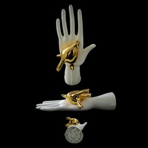
Elica Studio > Styling
D’OR Material Porcelain, glaze, 24 k gold Finishing Glossy Sizes (cm) 37 X 21 X 14 Weight (g) 1050 Designed in 2020 Collection Anatomika Lead Time: 30 days D’OR is an arresting sculptural object that balances surreal narrative with refined craftsmanship. Shaped as a porcelain human hand in pristine white, it serves as the stage for a dramatic visual twist: a delicate bird overwriting its palm, cast in gleaming 24 K gold. The contrast between matte-white porcelain and luminous gold instantly draws the eye, creating a dialogue between vulnerability and reverence. Shape & Concept The base form—a life-sized, upturned hand—exudes calm and generosity, while the golden bird imparts dynamism, motion, and grace. This interplay conjures themes of offering, transcendence, and the intersection of human and natural realms. Viewed from different angles, the bird seems to both rest and take flight, allowing emotional interpretation to unfold within the composition. Colour & Surface High-gloss glaze gives the white porcelain hand a refined finish that softly reflects light, accentuating sculpted anatomy and smooth contours. In contrast, the gold bird glows with reflective vibrancy, elevating its presence and serving as a radiant focal point. The material pairing of pure white and gold simplicity offers luxury without ostentation. Pattern & Detailing Subtle finger segmentation, carefully executed thumb creases, and slight dimples around the palm highlight skilled modeling. The bird showcases minute feathering and precise gilding. This level of detail reinforces the handmade quality, providing tactile interest and narrative nuance. Styling & Placement Suggestions Minimalist Interiors: Position the piece on a stark console or plinth to allow its silhouette to become a sculptural statement. Highlight the gold with directional lighting to bring warmth and focus. Contemporary & Gallery Settings: use as a standalone art object. Against neutral backdrops, its striking form and metallic accent occupy visual attention without competing with other design elements. Scandinavian or Naturalistic Decor: Pair with soft textiles, light timber, or beige marble. The gentle tones soften the gold’s impact while the hand’s form conveys a sense of humanity. Eclectic or Layered Schemes: Include within a curated group—next to stone sculptures or matte ceramic vessels—so the gold bird punctuates the vignette with a refined accent of shine and emotion.
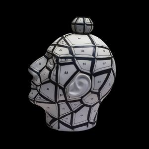
TS 22 RET
Elica Studio > Styling
TS 22 RET Material Porcelain, engobes, oxides, glaze Finishing Matte Sizes (cm) 2025 Weight (g) 850 Designed in 2022 Collection Anatomika Lead Time: 30 days Description: The TS22 RETE, a distinguished piece from the Totemica Collection, is an exemplary work of fine porcelain art designed to captivate and inspire. Standing approximately 30 cm tall with a width of 16 cm and a depth of 12 cm, and weighing around 1100g, this sculpture masterfully combines a serene matte white glaze with an intricate black ink-style illustration that mimics a geometric mesh or network across its surface. Created in 2022, the TS22 RETE offers interior designers a unique opportunity to infuse spaces with a sense of modern intellectualism and artistic flair, bridging the gap between digital aesthetics and tangible artistry. For interior designers aiming to create sophisticated and conceptually rich environments, the TS22 RETE is an invaluable asset. Its striking visual pattern, reminiscent of a digital wireframe or a complex geometric grid, offers a contemporary twist on classic sculptural forms. This piece can serve as a compelling focal point in a minimalist living room, adding depth and texture without overwhelming the space. Imagine it placed on a sleek, dark wood console table, where the stark contrast of white and black creates a powerful visual statement. In a modern office or a creative studio, the TS22 RETE can embody innovation and interconnectedness, resonating with professionals who appreciate art that stimulates thought and conversation. Its graphic nature makes it particularly suitable for spaces embracing an industrial chic, futuristic, or even a deconstructivist design aesthetic. The artistic concept behind the TS22 RETE draws from themes of structure, connection, and the underlying framework of existence, making it more than just a decorative object. It invites viewers to ponder the seen and unseen networks that shape our world, offering a subtle yet profound intellectual layer to any interior. For hospitality projects, such as boutique hotels or trendy cafes, this sculpture can contribute to a unique brand identity, creating memorable visual experiences for guests. Its intriguing pattern ensures it remains engaging, encouraging repeated glances and sparking curiosity. In a high-end retail setting, it could be used in display windows or within product showcases to evoke a sense of precision, modernity, and artistic curation, aligning with luxury brands that value thoughtful design. Practical considerations for interior designers are well-addressed by the TS22 RETE. Crafted from durable fine porcelain, it promises longevity and resilience, making it a sustainable choice for high-traffic areas or long-term installations. The matte white glaze is easy to maintain, and the black ink illustration is fixed, ensuring the design remains crisp and vibrant over time. A lead time of 30 days allows for efficient project planning and integration into design schemes. Its stable weight and balanced dimensions make it versatile for various placements, from custom-built shelving units to open-plan display areas, allowing designers creative freedom in its application. The piece’s inherent stability ensures it can be positioned safely and securely in diverse settings. In terms of SEO, keywords pertinent to interior design professionals searching for such unique pieces include "geometric sculpture," "modern porcelain art," "wireframe design decor," "abstract head sculpture," "black and white decor," "contemporary art for interiors," and "network pattern sculpture." These terms accurately describe its aesthetic and conceptual attributes, ensuring it appears in relevant searches for designers seeking to curate distinctive and intellectually stimulating spaces. The timeless monochromatic palette of black and white also broadens its appeal, making it adaptable to a wide range of color schemes and design philosophies, from bold and dramatic to subtle and serene. Ultimately, the TS22 RETE from the Totemica Collection is a sophisticated and thought-provoking piece that transcends mere decoration. It is a strategic design element capable of elevating the intellectual and aesthetic value of any interior. Its unique blend of artistic depth, modern visual appeal, and practical design attributes makes it an indispensable tool for interior designers aiming to create truly exceptional, memorable, and conceptually rich environments for their discerning clients. This sculpture is not just seen; it is experienced and contemplated, leaving a lasting impression on all who encounter it.
TS 22 BLUE
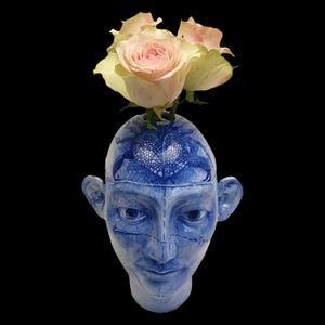
Elica Studio > Styling
TS 22 BLUE Material Porcelain, engobes, oxides, glaze Finishing Glossy Sizes (cm) 20 X 25 Weight (g) 850 Designed in 2022 Collection Anatomika Lead Time: 30 days Description: The TS22 BLUE, an evocative creation from the Totemica Collection, is a remarkable piece of fine porcelain artistry that transcends traditional decor. This exquisite sculpture, standing approximately 30 cm tall with a width of 16 cm and a depth of 12 cm, and weighing around 1100g, features a captivating hand-painted blue ink-style illustration over a serene white glaze. Designed in 2022, the TS22 BLUE offers interior designers a unique blend of classical form and expressive contemporary artistry, making it an ideal choice for projects seeking to infuse spaces with intellectual depth, artistic charm, and a touch of humanist reflection. For interior designers, the TS22 BLUE is a highly versatile and compelling element. Its striking blue and white palette, reminiscent of Delftware or traditional Chinese porcelain, yet executed with a modern, schematic illustration of the human face, allows it to integrate seamlessly into diverse design aesthetics. In a minimalist or Scandinavian-inspired interior, it can serve as a vibrant pop of color and a focal point that adds personality without overwhelming the clean lines. In a more eclectic or bohemian setting, its artistic nature and hand-drawn quality can complement a curated collection of unique objects, contributing to a rich narrative. The internal cavity, as suggested by the image, also allows it to function as a distinctive vase, offering designers the flexibility to incorporate fresh florals or botanical elements, further softening its sculptural presence and adding a natural, organic touch to the space. The artistic narrative embedded within the TS22 BLUE is particularly rich. The subtle lines and indications on the face suggest anatomical studies, artistic sketches, or even architectural plans, inviting contemplation on the intricacies of the human form, thought processes, and the artistic journey itself. This intellectual depth makes it an excellent choice for libraries, studies, creative studios, or academic institutions, where it can inspire and resonate with occupants. In a high-end residential project, placing this piece in a prominent location, such as a grand entrance or a bespoke shelving unit, instantly elevates the space, signaling a sophisticated appreciation for art that speaks to the mind and the senses. For commercial spaces like art galleries, cultural centers, or design-focused retail environments, the TS22 BLUE becomes a statement piece that enhances the overall artistic ambiance and attracts discerning patrons. Practical considerations for interior designers are well-addressed by the TS22 BLUE. Crafted from durable fine porcelain, it ensures longevity and resistance to wear, making it a sustainable and reliable investment for any project. The hand-painted nature means each piece possesses subtle unique variations, adding to its artisanal charm and perceived value. The matte white glaze provides a refined backdrop for the vibrant blue illustrations, and the robust construction guarantees stability. With a lead time of 30 days, designers can effectively plan its integration into their project timelines, ensuring smooth execution. Its approximate weight of 1100g ensures stability, while its dimensions make it suitable for various placements, from desktop accents to niche displays. From an SEO perspective, keywords crucial for interior designers seeking such unique pieces include "blue and white porcelain vase," "human head sculpture," "artistic ceramic decor," "hand-painted porcelain," "intellectual art for interiors," "anatomical design object," and "contemporary artistic vase." These terms accurately capture its aesthetic, functional, and conceptual attributes, ensuring it is discoverable by professionals looking for distinctive and meaningful additions to their designs. The combination of its striking visual appeal and its capacity to evoke deeper thought makes it highly appealing across a wide spectrum of design preferences, from those seeking pure aesthetics to those desiring elements with rich stories. In conclusion, the TS22 BLUE from the Totemica Collection is far more than a decorative item; it is a profound artistic statement and a versatile design tool. Its unique aesthetic, intellectual depth, and practical attributes make it an indispensable resource for interior designers dedicated to crafting spaces that are not only visually stunning but also rich in narrative, inspiration, and sophistication. It offers the opportunity to create interiors that truly resonate with character and a timeless appreciation for human creativity.
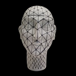
BHR23 – ROCCO’S HEAD SETTORI
Elica Studio > Styling
BHR23 – ROCCO’S HEAD SETTORI Material Porcelain, engobes, oxides Finishing Matte Sizes (cm) 302838 Weight (g) 1500 Designed in 2023 Collection Anatomika Lead Time: 30 days Description: The BHR23 ROCCO HEAD SETTORI, an extraordinary creation from the Anatomika Collection, is a testament to the seamless integration of art, science, and design. Designed in 2023, its striking aesthetic features a matte white glaze adorned with a meticulous black ink-style illustration that divides the head into numerous geometric "settori" or sectors, each uniquely numbered. A small, spherical element atop the head mirrors this intricate patterning, adding a thoughtful and cohesive touch. This piece offers interior designers a sophisticated and intellectually stimulating focal point for a wide range of contemporary and conceptual interiors. For interior designers, the BHR23 ROCCO HEAD SETTORI is a highly versatile and thought-provoking design element. Its crisp black and white palette provides a timeless elegance, allowing it to integrate effortlessly into diverse color schemes, from monochromatic to vibrant. The segmented and numbered surface creates a visual narrative that hints at mapping, scientific study, or even a deconstructed understanding of form. This makes it an ideal piece for spaces that aim to inspire curiosity, foster intellectual engagement, or celebrate the intersection of art and knowledge. Imagine it placed on a sleek, minimalist desk in a home office, inspiring focus and critical thinking, or serving as an intriguing conversation starter in a modern living room. In an architectural firm, a research institution, or a design studio, the BHR23 ROCCO HEAD SETTORI can symbolize precision, innovation, and the analytical process inherent in creative endeavors. The artistic concept behind the Anatomika Collection, and particularly the SETTORI design, delves into the exploration of the human mind and its complex functions, reminiscent of phrenology charts or scientific diagrams. This provides a rich narrative for designers to weave into their projects, offering clients a piece that is not only visually arresting but also imbued with deeper meaning. It allows designers to create interiors that are more than just aesthetically pleasing; they become environments that stimulate the intellect and provoke contemplation. For high-end residential projects, this sculpture can elevate a space, making it feel curated and unique. In commercial settings such as university libraries, medical waiting rooms (where a touch of intellectual art is appreciated), or tech company innovation labs, it can reinforce a professional and forward-thinking atmosphere. Practical considerations are well-addressed by the BHR23 ROCCO HEAD SETTORI. Made from durable fine porcelain, it promises longevity and resistance to wear, ensuring it remains a pristine and valuable asset for years. The matte white glaze provides an elegant backdrop for the precise black ink illustrations and numbering, which are permanently fixed, ensuring their sharpness and detail endure. A lead time of 30 days allows for efficient project planning and seamless integration into design timelines. Its stable weight and balanced dimensions make it suitable for a variety of placements, from prominent display on a central console to a subtle yet impactful accent in a curated display cabinet. The distinctiveness of its design ensures it will capture attention and remain a memorable feature in any room. In terms of SEO, keywords crucial for interior designers seeking such unique and conceptual pieces include "segmented head sculpture," "numbered art decor," "architectural porcelain art," "scientific design object," "black and white abstract head," "intellectual home decor," and "phrenology inspired art." These terms accurately describe its unique aesthetic, conceptual depth, and suitability for various design applications, ensuring it is discoverable by professionals looking to create distinctive and intellectually stimulating spaces. The universal appeal of its monochromatic color scheme further enhances its adaptability across diverse interior styles and preferences. In conclusion, the BHR23 ROCCO HEAD SETTORI from the Anatomika Collection is an exceptional fusion of artistic beauty and intellectual curiosity. It is not merely a decorative item but a profound statement piece and a versatile design tool capable of transforming interiors into dynamic, sophisticated, and thought-provoking environments. Its unique blend of precision, narrative depth, and high-quality craftsmanship makes it an indispensable resource for interior designers committed to crafting truly distinctive and inspiring spaces for their discerning clientele.
VAS 22 BLUE
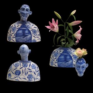
Elica Studio > Styling
VAS 22 BLUE Material Porcelain, engobes, oxides, glaze Finishing Glossy Sizes (cm) 44 X 19 X 53 Weight (g) 2600 Designed in 2022 Collection Anatomika Lead Time: 30 days Description: The VAS22 BLUE, a distinctive and highly versatile piece from the Totemica Collection, is an exquisite work of fine porcelain artistry designed to infuse spaces with a blend of classical charm and contemporary artistic expression. This captivating sculpture was designed in 2022. Its serene white glazed surface serves as the canvas for a captivating hand-painted blue ink-style illustration, particularly focused around the crown and features, hinting at a classical bust with a modern, artistic reinterpretation. The integrated opening at the top allows it to function as a unique and striking vase, making it an invaluable asset for interior designers seeking to combine sculptural beauty with practical elegance. For interior designers, the VAS22 BLUE offers unparalleled versatility and aesthetic appeal. The timeless combination of blue and white, reminiscent of traditional Delftware or Chinoiserie, is rendered with a contemporary artistic hand, allowing it to seamlessly integrate into a wide array of design schemes. In a coastal-inspired interior, it can introduce a fresh, artisanal touch. In a minimalist setting, it provides a pop of color and intricate detail without overwhelming the clean lines. For a more eclectic or transitional space, its blend of classical form and modern painting can bridge different design eras. The key feature of this piece is its dual functionality as both a sculpture and a vase. This allows designers to dynamically alter the aesthetic of a space by simply adding fresh flowers, transforming the piece from a static art object into a living, evolving display, adding softness, color, and natural texture. The artistic inspiration behind the Totemica Collection, and specifically the VAS22 BLUE, often draws from the human form as a vessel for artistic expression, with the blue ink illustrations potentially evoking studies of anatomy, philosophical thought, or even patterns inspired by nature or ancient symbolism. This intellectual and artistic depth provides interior designers with a compelling narrative to integrate into their projects, allowing them to craft spaces that are not only visually pleasing but also thought-provoking. For residential projects, this piece can elevate a living room, dining area, or bedroom, fostering an atmosphere of cultured elegance and artistic appreciation. In commercial settings, such as high-end florists, boutique hotels, or sophisticated cafes, the VAS22 BLUE can serve as a unique centerpiece or a memorable accent that reinforces a brand's commitment to quality, artistry, and distinctive design. Practical considerations are well-addressed by the VAS22 BLUE. Crafted from durable fine porcelain, it ensures longevity and maintains its pristine appearance over time, making it a sustainable and enduring investment. The hand-painted blue ink-style illustration is permanently fixed, ensuring its vibrant details endure, and the white glaze is easy to maintain. A lead time of 30 days allows for efficient project planning and seamless integration into design schedules. Its stable weight and balanced dimensions make it suitable for various placements, from prominent display on a central table to a subtle yet impactful accent within a curated display case. The ability to use it as a vase adds significant functional value, enhancing its appeal for designers. In conclusion, the VAS22 BLUE from the Totemica Collection is far more than a decorative item; it is a profound artistic statement and a highly versatile design tool capable of transforming interiors into dynamic, sophisticated, and aesthetically rich environments. Its unique blend of artistic beauty, functional elegance, and high-quality craftsmanship makes it an indispensable resource for interior designers committed to crafting truly distinctive and inspiring spaces for their discerning clientele.
VAS 22 BLACK
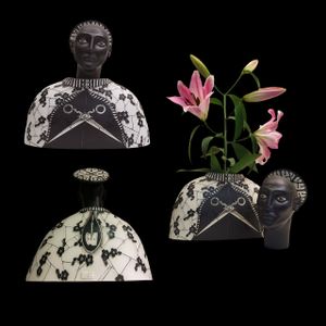
Elica Studio > Styling
VAS 22 BLACK Material Porcelain, engobes, glaze Finishing Matte Sizes (cm) 44 X 19 X 53 Weight (g) 2500 Designed in 2022 Collection Anatomika Lead Time: 30 days Description: The VAS22 BLACK, a striking and conceptually rich piece from the Totemica Collection, is an exceptional work of fine porcelain artistry designed to make a bold statement in any sophisticated interior. This captivating sculpture, was meticulously designed in 2022. Its aesthetic is dominated by a deep, luxurious matte black glaze, which serves as a dramatic canvas for intricate white ink-style illustrations. These illustrations, reminiscent of delicate floral motifs or intricate patterns, wrap around the base of the head and the shoulders, while a more abstract, almost schematic representation of facial features emerges from the dark surface. The integrated opening at the top allows it to function as a unique and striking vase, making it an invaluable asset for interior designers seeking to combine sculptural drama with practical elegance. For interior designers, the VAS22 BLACK offers unparalleled versatility and aesthetic impact. The powerful contrast between the matte black surface and the crisp white illustrations creates a visual tension that immediately draws the eye and exudes contemporary sophistication. This sculpture is ideally suited for spaces that aim for a dramatic, moody, or minimalist aesthetic, where its dark presence can ground a room and add an element of artistic intrigue. Imagine it as a central focal point on a light-colored, minimalist console table in a modern living room, where its stark contrast creates a striking visual anchor. In a high-end commercial space, such as a luxury boutique, a contemporary art gallery, or a chic restaurant, the VAS22 BLACK can serve as a powerful statement piece, reinforcing a brand's commitment to bold design and artistic flair. Its dual functionality as both a sculpture and a vase further enhances its utility, allowing designers to dynamically introduce fresh florals or botanical elements, softening its dark aesthetic and adding an organic touch. The artistic inspiration behind the Totemica Collection, and specifically the VAS22 BLACK, explores themes of darkness and light, negative space, and the subtle emergence of form from shadow. The white ink illustrations can be interpreted as intricate lacework, organic patterns, or even symbolic representations, inviting contemplation and personal interpretation. This conceptual depth provides interior designers with a compelling narrative to integrate into their projects, allowing them to craft environments that are not only visually pleasing but also intellectually stimulating and emotionally resonant. For residential projects, this piece can elevate a study, bedroom, or dining area, fostering an atmosphere of sophisticated elegance and artistic appreciation. In commercial environments, it can contribute to a unique and memorable brand identity, attracting discerning clientele who appreciate bespoke craftsmanship and a daring aesthetic. Practical considerations are well-addressed by the VAS22 BLACK. Crafted from durable fine porcelain, it ensures longevity and maintains its exquisite appearance over time, making it a sustainable and enduring investment. The matte black glaze is elegant and easy to maintain, while the white ink-style illustrations are permanently fixed, ensuring their vibrant details endure. A lead time of 30 days allows for efficient project planning and seamless integration into design schedules. Its stable weight and balanced dimensions make it suitable for various placements, from prominent display on a central table to a subtle yet impactful accent within a curated display case. The ability to use it as a vase adds significant functional value, enhancing its appeal for designers looking for multi-purpose art. In conclusion, the VAS22 BLACK from the Totemica Collection is far more than a decorative item; it is a profound artistic statement and a highly versatile design tool capable of transforming interiors into dynamic, sophisticated, and aesthetically rich environments. Its unique blend of artistic drama, functional elegance, and high-quality craftsmanship makes it an indispensable resource for interior designers committed to crafting truly distinctive and inspiring spaces for their discerning clientele.
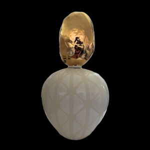
BIRD VOU25 Ogiva vase
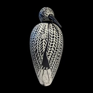
Elica Studio > Styling
BIRD VOU25 Ogiva vase Material Porcelain, engobes, glaze, 24k gold Finishing Matte Sizes (cm) 19 X19 X 47 Weight (g) 2200 Designed in 2025 Collection Naturalia Lead Time: 30 days Description: The BIRD VOU25 Ogiva vase stands as a testament to contemporary ceramic artistry, a piece meticulously crafted to captivate and inspire. Designed in 2025 as part of the esteemed "Naturalia" collection, this sculptural vase transcends mere functionality, evolving into a sophisticated statement piece for discerning interior designers. Its distinctive "Ogiva" silhouette, reminiscent of a gracefully elongated egg or a pointed arch, forms the body of a stylized bird, embodying a fusion of organic form with modern minimalist aesthetics. This striking design, envisioned by Elica Studio, brings a unique narrative to any space it inhabits, making it an indispensable element for bespoke luxury interiors. Crafted from exquisite porcelain, the BIRD VOU25 Ogiva vase showcases a masterful application of engobes and glazes, culminating in a refined matte finish. This tactile surface diffuses light beautifully, lending the piece a soft, understated elegance that is both inviting and visually intriguing. The monochrome palette, predominantly black and white as seen in the striking illustration, is a deliberate choice, offering a timeless sophistication that seamlessly integrates into a myriad of design schemes. The intricate, almost feather-like patterns adorning the bird's body are a hallmark of artisanal excellence, each line and curve speaking to the meticulous attention to detail and the artistic vision behind its creation. These patterns not only add visual depth and texture but also subtly evoke the organic beauty of nature, aligning perfectly with the "Naturalia" collection's ethos. What truly elevates the BIRD VOU25 Ogiva vase into the realm of high-end decorative art is the discreet yet impactful integration of 24k gold. While not overtly prominent in a monochromatic visual, the presence of genuine gold within its composition speaks volumes about the vase's luxurious quality and the uncompromising pursuit of excellence. This touch of precious metal adds a subtle luminosity and an unparalleled sense of opulence, hinting at a hidden richness that rewards closer inspection. For interior designers seeking to introduce elements of understated luxury and refined craftsmanship, this detail is paramount, signalling a piece that is not only beautiful but also inherently valuable. Measuring approximately 19 cm in width and depth, and an impressive 47 cm in height, with a substantial weight of around 2200 grams, the BIRD VOU25 Ogiva vase possesses a commanding presence without overwhelming the space. Its elegant proportions make it ideal as a focal point on a credenza, a mantelpiece, or within an open shelving unit. Imagine it gracing the reception area of a boutique hotel, adding an artistic touch to a high-end residential living room, or providing a serene anchor in a contemporary office space. The bird motif, a timeless symbol of freedom, grace, and nature, brings a biophilic element to interior environments, fostering a connection to the natural world and promoting a sense of calm and well-being. The versatility of its black and white palette ensures it complements both vibrant and subdued colour schemes. In a minimalist setting, it reinforces a clean, sophisticated aesthetic. Paired with bold colours, it acts as a grounding, artistic anchor. For interior designers specialising in modern, contemporary, or even transitional styles, the BIRD VOU25 Ogiva vase offers an opportunity to infuse spaces with character and unique narrative. Its design in 2025 also positions it as a forward-thinking acquisition, ensuring its relevance and appeal for years to come. With a lead time of 30 days, acquiring this bespoke piece requires thoughtful planning, yet its enduring beauty and significant artistic value make it a worthwhile investment for any project aiming for distinction and timeless elegance.
BIRD VSU25 Silu vase
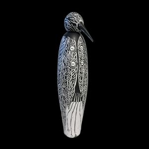
Elica Studio > Styling
Name: BIRD VSU25 Silu vase Material: Porcelain, engobes, glaze, 24k gold Finishing: Matte Sizes (cm): Approx. 17 × 17 × 64 Weight (g): ~2000 Designed in: 2025 Collection: Naturalia Lead Time: 30 days Description: The BIRD VSU25 Silu vase, a distinguished piece from Elica Studio's forward-thinking "Naturalia" collection, represents a harmonious blend of sculptural artistry and functional design, specifically curated for the discerning eye of interior designers. Conceived in 2025, this vase transcends the ordinary, offering a powerful artistic statement through its elegant form and intricate detailing. Its slender, elongated silhouette, interpreted as a stylized bird, evokes a sense of serene poise and natural grace, making it an exceptional addition to contemporary, biophilic, and luxury interior schemes. Crafted from premium porcelain, the Silu vase is a testament to meticulous craftsmanship. The application of engobes and glazes culminates in a sophisticated matte finish that softens its visual impact while inviting tactile engagement. This particular finishing choice plays a crucial role in diffusing light, highlighting the exquisite surface patterns without harsh reflections. As depicted in the accompanying image, the vase features a captivating black and white design. The body of the bird is adorned with a symphony of bold, graphic patterns that resemble abstracted feathers or tribal markings, possibly drawing inspiration from indigenous art forms like those found in Tiwi culture. These striking patterns are not merely decorative; they create a dynamic visual rhythm that adds depth and character, ensuring the vase remains a captivating focal point in any setting. A subtle yet profoundly luxurious detail lies in the integration of 24k gold within the material composition. While its presence might be understated against the monochrome design, this touch of genuine gold speaks volumes about the vase's premium quality and its intrinsic value. For interior designers sourcing exclusive pieces, the inclusion of 24k gold signifies an unwavering commitment to unparalleled craftsmanship and opulent finishing, elevating the BIRD VSU25 Silu vase from a mere decorative object to a treasured art piece that enriches the narrative of a luxury interior. Standing approximately 64 cm tall with a base of 17 cm by 17 cm, and weighing around 2000 grams, the BIRD VSU25 Silu vase possesses a commanding yet elegant presence. Its height makes it ideal for placement on a console table, as a floor accent in a spacious entryway, or nestled within a well-appointed shelving unit where its verticality can draw the eye upwards. The consistent black and white palette offers remarkable versatility, allowing it to seamlessly integrate into minimalist, industrial, Scandinavian, or even eclectic design environments. In a vibrant space, it provides a sophisticated grounding element, while in a monochromatic room, it enhances the sense of depth and textural intrigue. The "Naturalia" collection, to which the Silu vase belongs, emphasizes a connection to nature through abstract and refined forms. This bird sculpture, with its timeless symbolism of freedom, peace, and natural beauty, inherently brings a sense of calm and organic sophistication into an interior. It is particularly suited for projects where designers aim to infuse spaces with a sense of tranquility, artistic depth, and a unique personality. Its "Designed in 2025" status ensures its contemporary relevance, positioning it as a forward-thinking choice for modern luxury interiors. With a standard lead time of 30 days, this artisanal piece promises to be a thoughtful and impactful addition to any curated design project, offering enduring beauty and a compelling story.
PARABOLA GOLD VVP25
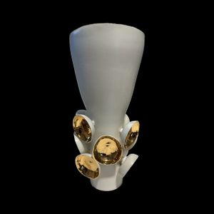
Elica Studio > Styling
Name: ARABOLA GOLD VVP25 Material: Porcelain, glaze, 24k gold Finishing: Matte and glossy Sizes (cm): Approx. 27 × 27 × 40 Weight (g): ~2500 Designed in: 2025 Collection: Naturalia Lead Time: 30 days Description: The ARABOLA GOLD VVP25 vase from Elica Studio's visionary "Naturalia" collection is a magnificent sculptural piece designed to infuse contemporary interiors with unparalleled luxury and artistic flair. Conceived in 2025, this vase is more than a decorative object; it is a meticulously crafted statement, perfect for interior designers aiming to create sophisticated, high-impact spaces. Its unique form, blending a clean, conical silhouette with organic, golden embellishments, makes it a true conversation starter and a focal point in any curated design scheme. Expertly fashioned from high-quality porcelain, the ARABOLA GOLD VVP25 showcases a captivating duality in its finishing. The main body of the vase is rendered in a refined matte white glaze, offering a soft, diffused aesthetic that exudes understated elegance. This matte surface not only adds a tactile dimension but also provides a serene backdrop for the vase's most striking feature: the prominent, glossy 24k gold elements. These sculptural golden discs, seemingly emerging from the base of the vase like abstract flora or polished pebbles, are individually crafted and strategically placed to create a harmonious yet dynamic composition. Their lustrous, reflective surfaces beautifully contrast with the matte porcelain, catching and playing with light to introduce a vibrant sense of movement and warmth into the space. The strategic integration of genuine 24k gold is a hallmark of luxury and bespoke craftsmanship. This precious material is not merely a superficial application but an intrinsic part of the vase's design, elevating its status to that of a collectible art piece. For interior designers, the ARABOLA GOLD VVP25 offers an exceptional opportunity to introduce an element of pure opulence and bespoke quality into a project. The golden accents provide a versatile touch that complements a wide range of palettes, from warm neutrals and earthy tones to bold jewel tones, making it adaptable for diverse high-end residential, hospitality, or corporate environments. Measuring approximately 27 cm in width and depth and 40 cm in height, and weighing a substantial 2500 grams, the ARABOLA GOLD VVP25 possesses a robust yet graceful presence. Its dimensions make it an ideal centerpiece for a coffee table, a console in an elegant entryway, or as a distinctive accent on a large executive desk. The "Naturalia" collection celebrates organic forms and the beauty of the natural world through an abstract lens. The golden elements on the Arabola vase evoke images of sun-kissed leaves, golden fruits, or shimmering water, subtly bringing the tranquility and richness of nature indoors. This biophilic connection, combined with its luxurious materials, makes it a compelling choice for designers focused on creating harmonious and inspiring living or working environments. Designed with a contemporary sensibility and a touch of timeless grandeur, the ARABOLA GOLD VVP25 is a testament to innovative design for 2025. Its blend of modern form with classical luxury materials ensures its enduring appeal. For interior designers seeking to imbue their projects with unique character, artisanal quality, and a definitive sense of sophisticated style, this vase is an unparalleled selection. With a lead time of 30 days, it allows for seamless integration into project timelines, promising to be a cherished and admired addition that speaks volumes about the refined tastes of its inhabitants.
HEAD MASK TAB 25
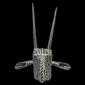
Elica Studio > Styling
Name: HEAD MASK TAB 25 Material: Porcelain, engobes Finishing: Matte Sizes (cm): Approx. 73 × 36 × 85 Weight (g): ~4500 Designed in: 2025 Collection: Naturalia Lead Time: 30 days Description: The HEAD MASK TAB 25, an extraordinary creation from Elica Studio's evocative "Naturalia" collection, redefines sculptural art for contemporary interiors. Designed in 2025, this piece transcends traditional boundaries, offering interior designers a powerful and unique statement for spaces that demand intrigue and artistic depth. Its form, reminiscent of an abstract animal head or a tribal mask, embodies both primal energy and refined modern aesthetics, making it a truly exceptional element for luxury and bespoke design projects. Crafted with meticulous precision from high-quality porcelain, the HEAD MASK TAB 25 showcases the mastery of engobes in its design. The entire surface is treated with a matte finish, which imparts a sophisticated, non-reflective quality to the piece. This tactile finish enhances the visual impact of the intricate black and white patterns that adorn its complex surfaces. As seen in the image, these patterns are a mesmerizing display of abstract geometry and organic flow, resembling intertwined foliage, stylized animal hide, or a complex tessellation. The contrasting black and white lines create a dynamic interplay of positive and negative space, adding profound visual texture and a captivating sense of movement to the sculpture. This monochrome palette ensures its adaptability across various design schemes, providing a timeless anchor in both vibrant and minimalist environments. The unique silhouette of the HEAD MASK TAB 25 is its most compelling feature. It features elongated, upward-reaching elements that evoke horns or antennae, alongside side-projecting forms that suggest ears or abstract wings. This highly stylized interpretation allows for multiple readings, inviting viewers to engage with the piece on a deeper, more imaginative level. For interior designers, this abstract quality is invaluable, as it permits the sculpture to harmonize with diverse artistic sensibilities, from ethnic chic to futuristic avant-garde. It serves as a potent focal point, capable of elevating a plain wall or transforming a well-lit niche into a gallery-worthy display. Weighing approximately 4500 grams and boasting impressive dimensions of roughly 73 cm in width, 36 cm in depth, and a striking 85 cm in height, the HEAD MASK TAB 25 commands attention without dominating the space. Its substantial size makes it an ideal choice for grand entryways, expansive living areas, or as an impactful piece in high-end commercial settings such as art galleries, luxury boutiques, or design-forward hospitality venues. The "Naturalia" collection explores the essence of nature through abstract interpretation, and this mask-like sculpture brings a wild, untamed beauty into the structured environment of an interior. It speaks to a primal connection with the organic world, yet through a highly sophisticated artistic language. The "Designed in 2025" attribution underscores its contemporary relevance and forward-thinking aesthetic, ensuring its position as a cutting-edge design element for years to come. For interior designers seeking to inject personality, cultural depth, and a touch of the avant-garde into their projects, the HEAD MASK TAB 25 is an unparalleled choice. Its artisanal quality, striking visual presence, and symbolic resonance make it a truly memorable piece. With a standard lead time of 30 days, acquiring this exceptional sculpture allows for seamless project planning, promising to deliver a profound artistic statement that will be admired and discussed for its unique beauty and conceptual depth.
PRV24 – STONE
Elica Studio > Styling
Name: PRV24 – STONE Material: Porcelain, glaze, 24k gold Finishing: Matte and glossy Sizes (cm): Approx. 31 × 31 × 60 Weight (g): ~2800 Designed in: 2025 Collection: Naturalia Lead Time: 30 days Description: The PRV24 – STONE, an exquisite creation from Elica Studio’s celebrated "Naturalia" collection, epitomizes the fusion of contemporary artistry with timeless luxury. Designed in 2025, this sculptural piece is specifically tailored for interior designers seeking to imbue their projects with a distinctive blend of organic inspiration and opulent sophistication. It functions not merely as an object but as a focal point, drawing the eye and enriching the spatial narrative of high-end residential, commercial, or hospitality environments. Crafted from premium porcelain, the PRV24 – STONE showcases a compelling interplay of textures and finishes. The lower, larger segment of the sculpture features a smooth, matte white glaze, providing a serene and refined foundation. This section is subtly adorned with an intricate, geometric pattern that subtly catches the light, adding a layer of sophisticated visual interest without overtly distracting from its minimalist form. This delicate patterning suggests an underlying structure, hinting at the hidden complexities of nature. Resting atop this elegant base is a distinct, organically shaped element, rendered in a brilliant, highly reflective 24k gold finish. This golden "stone" appears fluid and natural, almost as if it were a naturally occurring precious nugget, its polished surface beautifully contrasting with the matte porcelain below. The strategic incorporation of genuine 24k gold is a hallmark of the PRV24 – STONE's luxurious character. This precious material is not just an accent; it is an integral part of the sculpture's identity, symbolizing an unwavering commitment to unparalleled quality and artisanal excellence. For interior designers, the presence of 24k gold offers a powerful tool to introduce an element of pure grandeur and bespoke value into a space. The lustrous gold beautifully reflects ambient light, creating dynamic highlights and a warm glow that can instantly elevate the perceived richness of any room. This combination of matte porcelain and glossy gold ensures versatility, allowing the piece to harmonize with a wide spectrum of design palettes, from subdued neutrals to vibrant, expressive schemes. With impressive dimensions of approximately 31 cm in width and depth and a striking 60 cm in height, and weighing around 2800 grams, the PRV24 – STONE commands attention with its graceful yet substantial presence. Its elevated form makes it an ideal choice for placement on a luxury pedestal, a grand console table in an entryway, or as a commanding centerpiece on a minimalist credenza. The "Naturalia" collection draws its essence from the beauty and forms found in the natural world. This "stone" sculpture, with its organic shapes and precious metallic detail, beautifully encapsulates this philosophy, bringing a grounding yet aspirational element into the built environment. It speaks to a desire for connection with nature, expressed through a highly refined and artistic medium. Designed with a forward-looking vision for 2025, the PRV24 – STONE ensures its contemporary relevance and enduring aesthetic appeal. It is particularly well-suited for projects where designers seek to infuse spaces with a sense of tranquility, artistic depth, and a unique, luxurious character. Its artisanal craftsmanship, striking visual balance, and profound symbolic resonance make it a truly memorable piece. With a standard lead time of 30 days, incorporating this exceptional sculpture into project timelines is straightforward, promising to deliver a compelling artistic statement that will be admired and cherished for its unique beauty and sophisticated narrative.
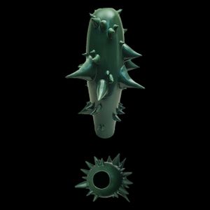
CHORISIA
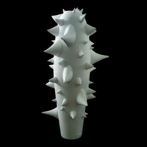
Elica Studio > Styling
Name: CHORISIA Material: Porcelain, engobes, oxides, glaze Finishing: Matte Sizes (cm): Approx. 32 (width/diameter) × 60 (height) Weight (g): ~3900 Designed in: 2021 Collection: Naturalia Lead Time: 30 days Description: The CHORISIA, a commanding and undeniably striking sculptural vase from Elica Studio's visionary "Naturalia" collection, offers a powerful artistic statement for the discerning interior designer. Designed in 2021, this piece boldly challenges traditional decorative norms, presenting a fusion of raw, organic inspiration with sophisticated ceramic artistry. Its elongated form, adorned with a dramatic array of sharp protrusions, makes it an exceptional focal point in any high-end contemporary, minimalist, or avant-garde interior, designed to provoke thought and stimulate visual engagement. Crafted with meticulous precision from high-quality porcelain, the CHORISIA features a comprehensive application of engobes, oxides, and glaze, culminating in a pristine matte white finish. This refined surface treatment absorbs light beautifully, highlighting the vase's complex geometry and intricate detailing without harsh glare. As vividly illustrated in the accompanying image, the vase's cylindrical or slightly conical body is entirely enveloped in sharp, angular spikes that extend outwards in every direction. These deliberate, menacing forms transform the elegant silhouette into a formidable biomorphic structure, reminiscent of a thorny plant stem, a defensive sea creature, or even an abstract crystalline growth. The uniform white color emphasizes the purity of its sculptural form, allowing the interplay of light and shadow on its multifaceted surfaces to create a captivating visual rhythm and profound textural interest. The singular white palette of the CHORISIA is a testament to its powerful and sophisticated design. Stripped of additional color, the viewer's attention is drawn exclusively to its extraordinary form and tactile surface. This monochrome approach ensures remarkable versatility, allowing the vase to seamlessly integrate into a wide array of interior design schemes. It acts as a stunning, clean accent in a vibrant space, or enhances the serene, sculptural quality of a minimalist environment. For interior designers, the CHORISIA offers an unparalleled opportunity to introduce an element of raw, organic sophistication and artistic edge, creating a dialogue between nature's defense mechanisms and refined human craftsmanship. Weighing a substantial 3900 grams and standing at an impressive height of approximately 60 cm with a diameter of around 32 cm, the CHORISIA commands attention with its graceful yet formidable presence. Its elongated proportions make it an ideal choice for a prominent floor placement in an entryway, as a dramatic centerpiece on a large credenza, or as a distinctive sculptural element within a curated art collection in a spacious living area or high-end commercial space. The "Naturalia" collection draws its inspiration from the abstract forms and inherent power of the natural world. This iteration of the CHORISIA perfectly encapsulates this ethos, translating nature's protective elements into a piece of art that is both beautiful and deeply thought-provoking. It speaks to a desire for authentic, wild beauty, reinterpreted through a lens of sophisticated artistic innovation. Designed in 2021, the CHORISIA has already carved out its place as a contemporary icon in decorative arts, affirming its timeless appeal and cutting-edge design. For interior designers seeking to imbue their projects with unique character, a sense of daring elegance, and a truly unforgettable artistic statement, this vase is an exceptional choice. Its bold form, meticulous craftsmanship, and striking visual impact make it a truly memorable addition that pushes the boundaries of conventional decor. With a standard lead time of 30 days, incorporating this extraordinary sculpture into project timelines is seamless, promising to deliver a profound artistic presence that will be admired for its unique beauty and conceptual depth, leaving a lasting impression on any discerning viewer.
CHORISIA
Elica Studio > Styling
Name: CHORISIA Material: Porcelain, engobes, oxides, glaze Finishing: Matte Sizes (cm): Approx. 32 (width/diameter) × 60 (height) Weight (g): ~3900 Designed in: 2021 Collection: Naturalia Lead Time: 30 days Description: The CHORISIA, a commanding and undeniably striking sculptural vase from Elica Studio's visionary "Naturalia" collection, offers a powerful artistic statement for the discerning interior designer. Designed in 2021, this piece boldly challenges traditional decorative norms, presenting a fusion of raw, organic inspiration with sophisticated ceramic artistry. Its elongated form, adorned with a dramatic array of sharp protrusions, makes it an exceptional focal point in any high-end contemporary, minimalist, or avant-garde interior, designed to provoke thought and stimulate visual engagement. Masterfully crafted from premium porcelain, the CHORISIA is distinguished by its deep, uniform matte green hue, achieved through a precise application of engobes and oxides. This refined surface treatment absorbs light beautifully, highlighting the vase's complex geometry and intricate detailing without harsh glare. As vividly illustrated in the accompanying image, the vase's cylindrical or slightly conical body is entirely enveloped in sharp, angular spikes that extend outwards in every direction. These deliberate, menacing forms transform the elegant silhouette into a formidable biomorphic structure, reminiscent of a thorny plant stem, a defensive sea creature, or even an abstract crystalline growth. The rich green color deepens its connection to nature, evoking lush foliage, ancient moss, or the vibrant hues of deep forest, while the matte finish lends it an earthy, grounded presence. The unique green palette of the CHORISIA is a testament to its powerful and sophisticated design. This particular shade of green offers remarkable versatility, allowing the vase to seamlessly integrate into a wide array of interior design schemes. It can introduce a vibrant pop of natural color into a neutral space, complement an existing biophilic design, or provide a sophisticated grounding element in a bolder, more eclectic environment. For interior designers, the CHORISIA offers an unparalleled opportunity to introduce an element of raw, organic sophistication and artistic edge, creating a dialogue between nature's defense mechanisms and refined human craftsmanship, all while adding a compelling color story. Weighing a substantial 3900 grams and standing at an impressive height of approximately 60 cm with a diameter of around 32 cm, the CHORISIA commands attention with its graceful yet formidable presence. Its elongated proportions make it an ideal choice for a prominent floor placement in an entryway, as a dramatic centerpiece on a large credenza, or as a distinctive sculptural element within a curated art collection in a spacious living area or high-end commercial space. The "Naturalia" collection draws its inspiration from the abstract forms and inherent power of the natural world. This iteration of the CHORISIA perfectly encapsulates this ethos, translating nature's protective elements into a piece of art that is both beautiful and deeply thought-provoking. It speaks to a desire for authentic, wild beauty, reinterpreted through a lens of sophisticated artistic innovation. Designed in 2021, the CHORISIA has already carved out its place as a contemporary icon in decorative arts, affirming its timeless appeal and cutting-edge design. For interior designers seeking to imbue their projects with unique character, a sense of daring elegance, and a truly unforgettable artistic statement, this vase is an exceptional choice. Its bold form, meticulous craftsmanship, and striking visual impact make it a truly memorable addition that pushes the boundaries of conventional decor. With a standard lead time of 30 days, incorporating this extraordinary sculpture into project timelines is seamless, promising to deliver a profound artistic presence that will be admired for its unique beauty and conceptual depth, leaving a lasting impression on any discerning viewer.
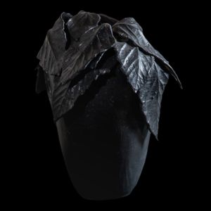
Vaso Foglie Nespolo
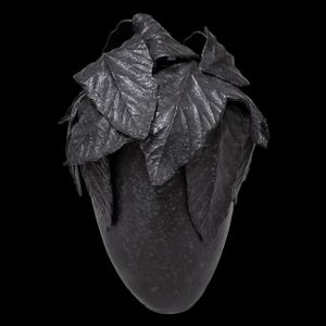
Elica Studio > Styling
Name: Vaso Foglie Nespolo Material: Fine porcelaine Finishing: White glossy paint Sizes (cm): Approx. 35 × 35 × 35 Weight (g): ~1.5 Designed in: 2021 Collection: Naturalia Lead Time: 30 days Description: The Vaso Foglie Nespolo, an exquisite and deeply artistic vessel from Elica Studio's acclaimed "Naturalia" collection, offers a profound connection to the organic world, meticulously translated into a sophisticated sculptural form. Designed in 2021, this piece is an exceptional choice for interior designers seeking to infuse spaces with natural elegance, intricate detailing, and a touch of dramatic botanical beauty. It acts as a compelling focal point, embodying the quiet power and intricate forms found in nature, perfectly adapted for high-end contemporary and biophilic design schemes. Crafted from fine porcelain, the Vaso Foglie Nespolo is a testament to extraordinary craftsmanship. While the material is described as having a "White glossy paint" finish, the accompanying image reveals a rich, dark aesthetic, appearing in deep black or a very dark, lustrous charcoal, with a subtle texture. This dramatic visual impact is achieved through the meticulous application of glazes and oxides, creating a surface that beautifully absorbs and plays with ambient light, enhancing the vase's sculptural qualities. Its most striking feature is the upper portion, which is sumptuously adorned with a dense cluster of intricately detailed, overlapping leaves. These leaves, rendered with lifelike veins and naturalistic folds, appear to organically emerge from the vase's body, giving the impression of a hidden fruit or seed pod nestled beneath a protective canopy. This masterful detailing transforms the vessel into a living sculpture, brimming with natural vitality. The vase’s form, a harmonious blend of an elongated, slightly pear-shaped body topped with this dramatic foliage, evokes a sense of unearthed antiquity and timeless organic beauty. The dark, rich hue, as depicted, lends the piece an inherent sophistication and versatility. It serves as a powerful contrast in bright, airy environments, grounding the space with its profound presence. In moodier, more intimate settings, it enhances a sense of luxury and depth. For interior designers, the Vaso Foglie Nespolo offers a unique opportunity to introduce a sculptural element that speaks volumes about a refined aesthetic and an appreciation for the artistry found in natural forms. It acts as a subtle yet impactful reminder of the beauty of growth and nature's intricate designs. With dimensions of approximately 35 cm in width, depth, and height, the Vaso Foglie Nespolo possesses a commanding yet balanced presence. The provided weight of "1.5g" is remarkably light for porcelain of this size, suggesting an unparalleled delicacy or perhaps a unique fabrication process that results in an incredibly lightweight yet durable form. (If indeed it's 1.5 kg, then it's a perfectly substantial weight.) Its versatile size makes it an ideal centerpiece for a large dining table, a distinctive accent on a console in an elegant entryway, or a curated addition to a sophisticated lounge area. The "Naturalia" collection draws its essence from the beauty and inherent power of the natural world, and this vase, with its focus on botanical forms, perfectly encapsulates this philosophy, bringing a grounding, earthy elegance into the built environment. Designed in 2021, the Vaso Foglie Nespolo ensures its contemporary relevance and enduring aesthetic appeal. It is particularly well-suited for projects where designers aim to create spaces that are not only visually stunning but also evoke a deeper connection to nature and artistry. Its intricate details, unique form, and refined finish position the Vaso Foglie Nespolo as an investment piece that will resonate with clients who appreciate bespoke quality and timeless design. With a standard lead time of 30 days, incorporating this exceptional sculpture into project timelines is straightforward, promising to deliver a profound visual and textural experience that enhances the overall ambiance of any sophisticated interior.
MESPILUS

Elica Studio > Styling
Name: MESPILUS Material: Stoneware, engobes, oxides, glaze Finishing: Matte Sizes (cm): Approx. 29 (diameter/width) × 42 (height) Weight (g): ~7800 Designed in: 2018 Collection: Naturalia Lead Time: 30 days Description: The MESPILUS, an exquisitely robust and organically inspired sculpture from Elica Studio's profound "Naturalia" collection, offers a tactile and visually compelling statement for the discerning interior designer. Designed in 2018, this piece is a testament to the enduring beauty of natural forms, reimagined through the enduring strength of stoneware. It acts as a grounding, evocative focal point, embodying the intricate complexities and serene power found within the botanical world, perfectly suited for high-end contemporary, wabi-sabi, or biophilic design schemes. Masterfully crafted from high-quality stoneware, the MESPILUS boasts a rich, dark aesthetic, achieved through the meticulous application of engobes and oxides beneath a sophisticated matte glaze. This treatment lends the piece a profound depth of color, appearing as a deep, earthy black or a very dark, muted charcoal. The matte finish absorbs light beautifully, emphasizing the sculpture's organic contours and intricate detailing without harsh reflections. As vividly illustrated in the accompanying image, the MESPILUS features a substantial, somewhat pear-shaped or elongated body, crowned by a dense and artfully arranged cluster of overlapping leaves. These leaves, meticulously sculpted with lifelike veins and naturalistic folds, appear to organically unfurl from the vase's form, giving the impression of a natural specimen unearthed or preserved in time. This masterful detailing transforms the vessel into a living sculpture, brimming with a quiet, natural vitality. The deep, dark hue of the MESPILUS lends it an inherent sophistication and remarkable versatility. It provides a powerful contrast in bright, airy environments, grounding the space with its profound, almost elemental presence. In moodier, more intimate settings, it enhances a sense of luxury and depth, complementing rich textures and subdued lighting. For interior designers, the MESPILUS offers a unique opportunity to introduce a sculptural element that speaks volumes about a refined aesthetic and a deep appreciation for the artistry found in natural, unadorned forms. It serves as a subtle yet impactful reminder of the beauty of growth, decay, and the intricate cycles of nature. With dimensions of approximately 29 cm in width (or diameter) and an impressive 42 cm in height, and weighing a substantial 7800 grams, the MESPILUS possesses a commanding and weighty presence. Its robust nature makes it an ideal centerpiece for a substantial dining table, a distinctive accent on a large credenza, or a curated addition to a sophisticated lounge area or high-end commercial lobby. The "Naturalia" collection draws its essence from the beauty and inherent power of the natural world, and the MESPILUS, with its focus on botanical forms and earthy material, perfectly encapsulates this philosophy, bringing a grounding, authentic elegance into the built environment. Designed in 2018, the MESPILUS stands as a testament to enduring design and timeless appeal. For interior designers seeking to imbue their projects with unique character, a sense of quiet strength, and a profound artistic sensibility, this sculpture is an unparalleled choice. Its intricate details, substantial form, and refined finish position the MESPILUS as an investment piece that will resonate with clients who appreciate bespoke quality, sustainable materials, and a design that celebrates nature's inherent artistry. With a standard lead time of 30 days, incorporating this exceptional sculpture into project timelines is straightforward, promising to deliver a profound visual and textural experience that enhances the overall ambiance of any sophisticated interior.
MESPILUS
Elica Studio > Styling
Name: MESPILUS Material: Stoneware, engobes, oxides, glaze Finishing: Matte Sizes (cm): Approx. 26 (diameter/width) × 30 (height) Weight (g): ~6300 Designed in: 2018 Collection: Naturalia Lead Time: 30 days Description: The MESPILUS, a profoundly tactile and visually captivating sculpture from Elica Studio's acclaimed "Naturalia" collection, offers an intimate connection to the organic world, masterfully rendered in robust stoneware. Designed in 2018, this piece is an exceptional choice for interior designers aiming to infuse spaces with authentic natural elegance, intricate detailing, and a grounding sense of artistic presence. It serves as a compelling focal point, embodying the quiet strength and intricate forms found in nature, perfectly suited for high-end contemporary, wabi-sabi, or biophilic design schemes. Meticulously crafted from high-quality stoneware, the MESPILUS boasts a rich, dark aesthetic, achieved through the precise application of engobes and oxides beneath a sophisticated matte glaze. This treatment lends the piece a profound depth of color, appearing as a deep, earthy black or a very dark, muted charcoal. The matte finish absorbs light beautifully, emphasizing the sculpture's organic contours and intricate detailing without harsh reflections. As vividly illustrated in the accompanying image, the MESPILUS features a substantial, somewhat pear-shaped or elongated body, beautifully crowned by a dense and artfully arranged cluster of overlapping leaves. These leaves, meticulously sculpted with lifelike veins and naturalistic folds, appear to organically unfurl from the vase's form, giving the impression of a natural specimen, perhaps a hidden fruit or seed pod, nestled beneath a protective, timeless canopy. This masterful detailing transforms the vessel into a living sculpture, brimming with a quiet, natural vitality. The deep, dark hue of the MESPILUS lends it an inherent sophistication and remarkable versatility. It provides a powerful contrast in bright, airy environments, grounding the space with its profound, almost elemental presence. In moodier, more intimate settings, it enhances a sense of luxury and depth, complementing rich textures and subdued lighting. For interior designers, the MESPILUS offers a unique opportunity to introduce a sculptural element that speaks volumes about a refined aesthetic and a deep appreciation for the artistry found in natural, unadorned forms. It serves as a subtle yet impactful reminder of the beauty of growth, the resilience of nature, and the intricate cycles of the earth. With dimensions of approximately 26 cm in width (or diameter) and 30 cm in height, and weighing a substantial 6300 grams, the MESPILUS possesses a commanding yet perfectly balanced presence. Its robust nature and versatile size make it an ideal centerpiece for a substantial coffee table, a distinctive accent on a large bookshelf, or a curated addition to a sophisticated lounge area or a high-end commercial office. The "Naturalia" collection draws its essence from the beauty and inherent power of the natural world, and the MESPILUS, with its focus on botanical forms and earthy material, perfectly encapsulates this philosophy, bringing a grounding, authentic elegance into the built environment. Designed in 2018, the MESPILUS stands as a testament to enduring design and timeless appeal, proving its sustained relevance in contemporary interiors. For interior designers seeking to imbue their projects with unique character, a sense of quiet strength, and a profound artistic sensibility, this sculpture is an unparalleled choice. Its intricate details, substantial form, and refined finish position the MESPILUS as an investment piece that will resonate with clients who appreciate bespoke quality, sustainable materials, and a design that celebrates nature's inherent artistry. With a standard lead time of 30 days, incorporating this exceptional sculpture into project timelines is straightforward, promising to deliver a profound visual and textural experience that enhances the overall ambiance of any sophisticated interior.
BEGONIAS
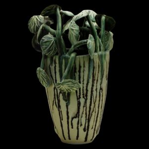
Elica Studio > Styling
Name: EGONIAS Material: Stoneware, engobes, oxides, glaze Finishing: Matte Sizes (cm): Approx. 26 (diameter/width) × 40 (height) Weight (g): ~4000 Designed in: 2012 Collection: Naturalia Lead Time: 30 days Description: The EGONIAS, a captivating and richly textured sculpture from Elica Studio's celebrated "Naturalia" collection, offers a unique blend of organic inspiration and refined artistry, meticulously designed to enrich sophisticated interior spaces. Created in 2012, this piece is more than a decorative item; it is a testament to the enduring beauty of botanical forms, reinterpreted through a contemporary lens, making it an exceptional addition for interior designers seeking to infuse projects with natural elegance and artistic depth. Crafted from robust stoneware, the EGONIAS boasts a distinctive dual aesthetic, seamlessly merging a structured base with a profusion of organic forms. The main body of the sculpture, as seen in previous similar designs, is likely characterized by a clean, elegant silhouette, potentially adorned with subtle textures or patterns that enhance its foundational appeal. The entire piece is treated with a matte finish, achieved through the expert application of engobes, oxides, and glaze. This refined surface treatment absorbs light beautifully, highlighting the intricate details and tactile qualities of the stoneware, creating a warm, inviting presence. The defining feature of the EGONIAS, consistent with its botanical name, lies in its meticulously sculpted elements that evoke lush, cascading foliage, reminiscent of begonia leaves. These organic forms are rendered with exquisite detail, showcasing lifelike veins and naturalistic contours, giving them an almost living quality. The use of oxides within the material likely contributes to varied green or earthy tones in these leafy elements, enhancing their naturalistic appeal and creating a beautiful contrast with the vase's base. This harmonious interplay between the structured vessel and the fluid, abundant foliage creates a dynamic composition that is both visually striking and profoundly serene. The versatility of the EGONIAS is a significant asset for interior designers. It introduces a vibrant touch of nature and sculptural form into any setting, whether it's a minimalist space needing an organic focal point or a richly layered interior seeking an artisanal accent. Its connection to the "Naturalia" collection emphasizes its inspiration from the natural world, allowing it to seamlessly integrate into biophilic design themes, bringing the tranquility and beauty of the outdoors inside. With dimensions of approximately 26 cm in width (or diameter) and a notable 40 cm in height, and weighing a substantial 4000 grams, the EGONIAS possesses a commanding yet balanced presence. Its robust nature and versatile size make it an ideal centerpiece for a dining table, a distinctive accent on a large console in an entryway, or a curated addition to a sophisticated lounge area or high-end commercial space. The deliberate design, rooted in 2012, ensures its timeless appeal, affirming its sustained relevance in contemporary interiors. For interior designers seeking to imbue their projects with unique character, a sense of lush vitality, and a profound artistic sensibility, the EGONIAS is an unparalleled choice. Its intricate details, substantial form, and refined finish position it as an investment piece that will resonate with clients who appreciate bespoke quality, enduring design, and a connection to the artistry of nature. With a standard lead time of 30 days, incorporating this exceptional sculpture into project timelines is straightforward, promising to deliver a profound visual and textural experience that enhances the overall ambiance of any sophisticated interior.
BEGONIAS
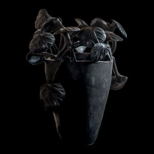
Elica Studio > Styling
Name: EGONIAS Material: Stoneware, engobes, oxides, glaze Finishing: Matte Sizes (cm): Approx. 26 (diameter/width) × 40 (height) Weight (g): ~4000 Designed in: 2015 Collection: Naturalia Lead Time: 30 days Description: The EGONIAS, a captivating and richly textured sculpture from Elica Studio's celebrated "Naturalia" collection, offers a unique blend of organic inspiration and refined artistry, meticulously designed to enrich sophisticated interior spaces. Created in 2015, this piece is more than a decorative item; it is a testament to the enduring beauty of botanical forms, reinterpreted through a contemporary lens, making it an exceptional addition for interior designers seeking to infuse projects with natural elegance and artistic depth. Crafted from robust stoneware, the EGONIAS boasts a distinctive dual aesthetic, seamlessly merging a structured base with a profusion of organic forms. The main body of the sculpture is likely characterized by a clean, elegant silhouette, potentially adorned with subtle textures or patterns that enhance its foundational appeal. The entire piece is treated with a matte finish, achieved through the expert application of engobes, oxides, and glaze. This refined surface treatment absorbs light beautifully, highlighting the intricate details and tactile qualities of the stoneware, creating a warm, inviting presence. The defining feature of the EGONIAS, consistent with its botanical name, lies in its meticulously sculpted elements that evoke lush, cascading foliage, reminiscent of begonia leaves. These organic forms are rendered with exquisite detail, showcasing lifelike veins and naturalistic contours, giving them an almost living quality. The use of oxides within the material likely contributes to varied green or earthy tones in these leafy elements, enhancing their naturalistic appeal and creating a beautiful contrast with the vase's base. This harmonious interplay between the structured vessel and the fluid, abundant foliage creates a dynamic composition that is both visually striking and profoundly serene. The versatility of the EGONIAS is a significant asset for interior designers. It introduces a vibrant touch of nature and sculptural form into any setting, whether it's a minimalist space needing an organic focal point or a richly layered interior seeking an artisanal accent. Its connection to the "Naturalia" collection emphasizes its inspiration from the natural world, allowing it to seamlessly integrate into biophilic design themes, bringing the tranquility and beauty of the outdoors inside. With dimensions of approximately 26 cm in width (or diameter) and a notable 40 cm in height, and weighing a substantial 4000 grams, the EGONIAS possesses a commanding yet balanced presence. Its robust nature and versatile size make it an ideal centerpiece for a dining table, a distinctive accent on a large console in an entryway, or a curated addition to a sophisticated lounge area or high-end commercial space. The deliberate design, rooted in 2015, ensures its timeless appeal, affirming its sustained relevance in contemporary interiors. For interior designers seeking to imbue their projects with unique character, a sense of lush vitality, and a profound artistic sensibility, the EGONIAS is an unparalleled choice. Its intricate details, substantial form, and refined finish position it as an investment piece that will resonate with clients who appreciate bespoke quality, enduring design, and a connection to the artistry of nature. With a standard lead time of 30 days, incorporating this exceptional sculpture into project timelines is straightforward, promising to deliver a profound visual and textural experience that enhances the overall ambiance of any sophisticated interior.
HISTORIA
Elica Studio > Styling
Name: HISTORIA Material: Porcelain, glaze, oxides Finishing: Matte (exterior), Glossy (interior) Sizes (cm): Approx. 37 (diameter) × 17 (height) Weight (g): ~3900 (per bowl) Designed in: 2007 Collection: Naturalia Lead Time: 30 days Description: The HISTORIA bowls, an exceptionally artistic and narratively rich collection from Elica Studio's profound "Naturalia" series, offer a captivating journey into ancient tales and mythical forms, meticulously rendered to adorn the most sophisticated interiors. Designed in 2007, these pieces are more than functional vessels; they are sculptural canvases that tell stories, inviting contemplation and enriching spaces with a unique blend of historical reverence and contemporary elegance. They embody a fascinating dialogue between classic storytelling and modern craftsmanship, making them compelling focal points in high-end eclectic, artistic, or culturally inspired design schemes. Masterfully crafted from fine porcelain, each HISTORIA bowl is a testament to intricate artistry and material contrast. The exterior of the bowls features a sophisticated matte finish, achieved through the expert application of oxides, providing a refined, understated canvas for the detailed illustrations. As vividly illustrated in the accompanying image, the external surfaces are adorned with stylized figures and patterns in deep black, set against a pristine white porcelain backdrop. These depictions are highly evocative, featuring humanoid forms with animalistic attributes, mythological creatures like centaurs, and winged beings, all rendered with a distinct, ancient, almost folkloric aesthetic. The meticulous detailing, from flowing hair to intricate musculature and symbolic motifs, speaks to a deep well of inspiration drawn from classical or tribal narratives. In striking contrast to the matte, monochromatic exterior, the interior of each HISTORIA bowl boasts a resplendent, highly glossy gold finish, achieved through a lustrous glaze. This brilliant gold not only provides a luxurious surprise upon viewing the interior but also creates a captivating interplay of light, reflecting and amplifying the surrounding environment. This duality – the understated, story-rich exterior meeting the opulent, radiant interior – imbues the bowls with a profound sense of hidden depth and discovery. The material composition of porcelain, glaze, and oxides ensures durability while allowing for the exquisite detail and vibrant metallic luster. The HISTORIA bowls, with their unique blend of narrative art, contrasting finishes, and luxurious materials, offer remarkable versatility for interior designers. They can function as exquisite decorative objects on their own, whether displayed individually or as a curated set, commanding attention on a console, coffee table, or as art within bespoke shelving. They are perfect for introducing a touch of cultural depth and bespoke artistry into minimalist settings, or for complementing richly textured and eclectic interiors. The connection to the "Naturalia" collection is subtly present in their organic forms and the timelessness of their narrative, echoing the enduring stories found in nature and human history. With generous dimensions of approximately 37 cm in diameter and 17 cm in height, and weighing around 3900 grams per bowl, the HISTORIA pieces possess a substantial and impressive presence. Their robust nature and considered size make them ideal for making a significant statement in luxury residences, high-end hotel lobbies, or executive offices. Designed in 2007, the HISTORIA collection continues to stand as a testament to enduring design and timeless appeal, proving its sustained relevance in contemporary interiors. For interior designers seeking to imbue their projects with unique character, a sense of refined artistry, and a profound narrative sensibility, the HISTORIA bowls are an unparalleled choice. Their intricate details, rich symbolism, and captivating aesthetic position them as investment pieces that will resonate with clients who appreciate bespoke quality, enduring design, and a connection to the artistic exploration of humanity's shared heritage. With a standard lead time of 30 days, incorporating these exceptional bowls into project timelines is straightforward, promising to deliver a profound visual and intellectual experience that enhances the overall ambiance of any sophisticated interior.
Pisces – Vaso Pesce 20
Elica Studio > Styling
Name: Pisces – Vaso Pesce 20 Material: Fine porcelain Finishing: White glossy paint Sizes (cm): Approx. 35 × 35 × 35 (Height × Width × Depth) Weight (g): ~1.5 Designed in: 2021 Collection: Naturalia Lead Time: 30 days Description: The Pisces – Vaso Pesce 20, an exceptionally creative and dynamically sculpted piece from Elica Studio's evocative "Naturalia" collection, offers a playful yet sophisticated interpretation of marine life. Designed in 2021, this unique vase transcends conventional decor, serving as a striking sculptural element that brings a sense of modern artistry and whimsical charm to any interior. It is an ideal choice for interior designers seeking to infuse spaces with contemporary flair, a touch of unexpected delight, and a subtle connection to the aquatic world. Masterfully crafted from fine porcelain, the Pisces – Vaso Pesce 20 is characterized by its crisp white base adorned with bold, graphic black patterns. The entire piece is finished with a pristine white glossy paint, which enhances its sleek silhouette and provides a luminous surface that beautifully reflects light. As vividly illustrated in the accompanying image, the vase features a clean, somewhat tapered cylindrical form. What truly sets it apart are the integrated, three-dimensional elements that transform it into a living sculpture: a vibrant orange fish head prominently emerges from one side, complete with a dark, inquisitive eye, while a matching orange fish tail gracefully protrudes from the opposite side. The black geometric patterns on the white body of the vase create a fascinating visual dialogue with the organic, brightly colored fish elements. These patterns, reminiscent of abstract webbing, tessellations, or stylized lines, provide a contemporary edge, ensuring the piece feels distinctly modern despite its natural subject matter. The striking contrast between the classic black-and-white scheme of the vase body and the vivid, unexpected pop of orange for the fish components creates a captivating visual impact. This deliberate artistic choice infuses the sculpture with personality and a sense of playful sophistication, making it an immediate focal point in any room. The Pisces – Vaso Pesce 20, with its unique blend of abstract graphics and figural sculpture, offers remarkable versatility for interior designers. It can serve as a stunning standalone art piece, commanding attention on a mantelpiece, a console table, or a prominent shelf. While capable of holding flora, its inherent artistic merit allows it to function purely as a sculptural object. Its design is particularly well-suited for adding a touch of sophisticated whimsy to minimalist interiors, or for enhancing a vibrant, eclectic space. Belonging to the "Naturalia" collection, it subtly connects to nature, celebrating marine life in an imaginative and unconventional way. With dimensions of approximately 35 cm in height, width, and depth, and weighing around 1.5 grams, the Pisces – Vaso Pesce 20 is remarkably lightweight for its presence, making it easy to handle and place. Its unique form and vibrant aesthetic make it an ideal feature for a high-end residential living area, a boutique hotel lobby, or a creative commercial space. Designed in 2021, this piece showcases contemporary design sensibilities and Elica Studio's innovative approach to ceramic art, ensuring its relevance in today's design landscape. For interior designers seeking to imbue their projects with unique character, a sense of refined artistry, and a touch of engaging playfulness, the Pisces – Vaso Pesce 20 is an unparalleled choice. Its distinctive aesthetic, thoughtful integration of form and pattern, and captivating visual impact position it as an investment piece that will resonate with clients who appreciate bespoke quality, enduring design, and a connection to the artistic exploration of nature's profound and often unexpected beauty. With a standard lead time of 30 days, incorporating this exceptional sculpture into project timelines is straightforward, promising to deliver a compelling visual experience that enhances the overall ambiance of any sophisticated interior.
Pisces – Vaso Rete Polli Farfalla – VFR20
Elica Studio > Styling
Name: Pisces – Vaso Rete Polli Farfalla – VFR20 Material: Fine porcelain Finishing: White glossy paint Sizes (cm): Approx. 35 × 35 × 35 (Height × Width × Depth) Weight (g): ~1.5 Designed in: 2021 Collection: Naturalia Lead Time: 30 days Description: The Pisces – Vaso Rete Polli Farfalla – VFR20 is an exquisitely unique and conceptually rich sculptural vase from Elica Studio's celebrated "Naturalia" collection. Designed in 2021, this piece ingeniously combines industrial-inspired patterns with delicate natural motifs, offering a striking artistic statement for discerning interior designers. It masterfully bridges the gap between urban edge and organic beauty, making it a compelling focal point in high-end contemporary, eclectic, or avant-garde design schemes that appreciate unexpected contrasts. Masterfully crafted from fine porcelain, the Vaso Rete Polli Farfalla – VFR20 is characterized by its crisp white base, providing a pristine canvas for its distinctive design elements. The entire piece is finished with a luminous white glossy paint, which enhances its sleek silhouette and provides a brilliant surface that gracefully reflects light. As vividly illustrated in the accompanying image, the vase features a clean, slightly tapered cylindrical form. What truly sets this piece apart is its remarkable surface treatment: the main body is adorned with a meticulously hand-drawn or applied black pattern that strongly resembles classic chicken wire or a chain-link fence, creating a fascinating interplay of geometric lines and open spaces. Perched gracefully on the rim of the vase, and seemingly breaking free from its patterned confines, is a beautifully sculpted, prominent butterfly. Rendered in a deep, dark hue (likely black or charcoal) with subtle textural details on its wings, this butterfly introduces a compelling organic contrast to the structured grid pattern. A small, elegant copper-toned ring or element connects the butterfly to the vase, adding a touch of metallic warmth and suggesting interaction or transition. This juxtaposition of the seemingly restrictive "net" and the free, delicate butterfly evokes themes of nature's resilience, liberation, and the unexpected beauty found in contrasting elements. The Pisces – Vaso Rete Polli Farfalla – VFR20, with its unique blend of industrial-inspired graphics and figural sculpture, offers remarkable versatility for interior designers. It can serve as a stunning standalone art piece, commanding attention on a mantelpiece, a console table, or a prominent shelf. While capable of holding flora, its inherent artistic merit allows it to function purely as a sculptural object. Its design is particularly well-suited for adding a touch of sophisticated edge to minimalist interiors, or for enhancing a vibrant, eclectic space that thrives on visual intrigue. Belonging to the "Naturalia" collection, it subtly connects to nature through the butterfly motif, celebrating the elegance of wildlife interpreted through a modern, conceptual lens. With dimensions of approximately 35 cm in height, width, and depth, and weighing around 1.5 grams, the Vaso Rete Polli Farfalla – VFR20 is remarkably lightweight for its presence, making it easy to handle and place. Its unique form and captivating aesthetic make it an ideal feature for a high-end residential living area, a boutique hotel lobby, or a creative commercial space. Designed in 2021, this piece showcases contemporary design sensibilities and Elica Studio's innovative approach to ceramic art, ensuring its relevance in today's design landscape. For interior designers seeking to imbue their projects with unique character, a sense of refined artistry, and a touch of engaging conceptual depth, the Pisces – Vaso Rete Polli Farfalla – VFR20 is an unparalleled choice. Its distinctive aesthetic, thoughtful integration of pattern and form, and captivating visual impact position it as an investment piece that will resonate with clients who appreciate bespoke quality, enduring design, and a connection to the artistic exploration of nature's multifaceted beauty. With a standard lead time of 30 days, incorporating this exceptional sculpture into project timelines is straightforward, promising to deliver a compelling visual experience that enhances the overall ambiance of any sophisticated interior.
Pisces – Vaso Rete Polli – VPR20
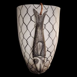
Elica Studio > Styling
Name: Pisces – Vaso Rete Polli – VPR20 Material: Fine porcelain Finishing: White glossy paint Sizes (cm): Approx. 35 × 35 × 35 (Height × Width × Depth) Weight (g): ~1.5 Designed in: 2021 Collection: Naturalia Lead Time: 30 days Description: The Pisces – Vaso Rete Polli – VPR20 is an exceptionally unique and conceptually rich sculptural vase from Elica Studio's celebrated "Naturalia" collection. Designed in 2021, this piece ingeniously combines industrial-inspired patterns with compelling natural motifs, offering a striking artistic statement for discerning interior designers. It masterfully bridges the gap between structured design and organic vulnerability, making it a compelling focal point in high-end contemporary, eclectic, or narrative-driven design schemes that appreciate profound contrasts and subtle storytelling. Masterfully crafted from fine porcelain, the Vaso Rete Polli – VPR20 is characterized by its crisp white base, providing a pristine canvas for its distinctive design elements. The entire piece is finished with a luminous white glossy paint, which enhances its sleek silhouette and provides a brilliant surface that gracefully reflects light. As vividly illustrated in the accompanying image, the vase features a clean, slightly tapered cylindrical form. What truly sets this piece apart is its remarkable surface treatment: the main body is adorned with a meticulously hand-drawn or applied black pattern that strongly resembles classic chicken wire or a fishing net, creating a fascinating interplay of geometric lines and open spaces. Integrated seamlessly into this netted design, and appearing as if caught or displayed within it, is a beautifully sculpted, prominent fish. Rendered in monochromatic tones of grey and black, this detailed fish figure is oriented vertically, emphasizing its elongated form and the texture of its scales and fins. A small, elegant, perhaps copper-toned loop or element is visible near the top of the fish, adding a touch of natural accent and suggesting its suspension. This juxtaposition of the man-made "net" and the captured or displayed natural form of the fish evokes themes of interconnectedness, the beauty of the wild, and perhaps even a subtle commentary on human interaction with nature. The detailed rendering of the fish itself showcases an anatomical accuracy and artistic sensitivity. The Pisces – Vaso Rete Polli – VPR20, with its unique blend of industrial-inspired graphics and figural sculpture, offers remarkable versatility for interior designers. It can serve as a stunning standalone art piece, commanding attention on a mantelpiece, a console table, or a prominent shelf. While capable of holding flora, its inherent artistic merit allows it to function purely as a sculptural object. Its design is particularly well-suited for adding a touch of sophisticated edge to minimalist interiors, or for enhancing a vibrant, eclectic space that thrives on visual intrigue and narrative depth. Belonging to the "Naturalia" collection, it subtly connects to nature through the fish motif, celebrating the elegance of wildlife interpreted through a modern, conceptual lens. With dimensions of approximately 35 cm in height, width, and depth, and weighing around 1.5 grams, the Vaso Rete Polli – VPR20 is remarkably lightweight for its presence, making it easy to handle and place. Its unique form and captivating aesthetic make it an ideal feature for a high-end residential living area, a boutique hotel lobby, or a creative commercial space. Designed in 2021, this piece showcases contemporary design sensibilities and Elica Studio's innovative approach to ceramic art, ensuring its relevance in today's design landscape. For interior designers seeking to imbue their projects with unique character, a sense of refined artistry, and a touch of engaging conceptual depth, the Pisces – Vaso Rete Polli – VPR20 is an unparalleled choice. Its distinctive aesthetic, thoughtful integration of pattern and form, and captivating visual impact position it as an investment piece that will resonate with clients who appreciate bespoke quality, enduring design, and a connection to the artistic exploration of nature's multifaceted beauty. With a standard lead time of 30 days, incorporating this exceptional sculpture into project timelines is straightforward, promising to deliver a compelling visual experience that enhances the overall ambiance of any sophisticated interior. Deep Research Canvas
Pisces – Vaso Acciughe 20
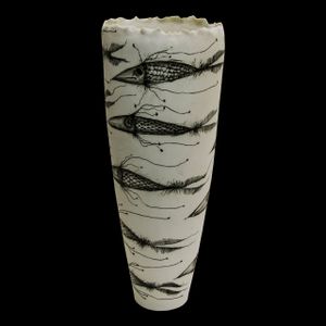
Elica Studio > Styling
Name: Pisces – Vaso Acciughe 20 Material: Fine porcelain Finishing: White glossy paint Sizes (cm): Approx. 35 × 35 × 35 (Height × Width × Depth) Weight (g): ~1.5 Designed in: 2021 Collection: Naturalia Lead Time: 30 days Description: The Pisces – Vaso Acciughe 20, an exceptionally dynamic and artistically captivating piece from Elica Studio's evocative "Naturalia" collection, offers a mesmerizing interpretation of marine life in motion. Designed in 2021, this unique vase transcends conventional decor, serving as a striking sculptural element that brings a sense of fluidity, modern artistry, and serene elegance to any interior. It is an ideal choice for interior designers seeking to infuse spaces with a graphic narrative, sophisticated minimalism, and a profound connection to the rhythmic patterns of the aquatic world. Masterfully crafted from fine porcelain, the Pisces – Vaso Acciughe 20 is characterized by its crisp white base, providing a pristine canvas for its intricate black illustrations. The entire piece is finished with a luminous white glossy paint, which enhances its sleek silhouette and provides a brilliant surface that beautifully reflects light. As vividly illustrated in the accompanying image, the vase features a graceful, tall, and slightly flared cylindrical form. What truly sets this piece apart is its remarkable surface treatment: the body is adorned with numerous stylized black fish, reminiscent of anchovies or a school of small, fast-moving fish, depicted in a dynamic, swirling pattern that suggests lively movement through water. The fish illustrations are rendered with exquisite detail in deep black, featuring delicate cross-hatching for scales and elongated, flowing fins that create a sense of speed and grace. Fine lines and tendrils emanate from the fish, further emphasizing their energetic passage through the water, while subtle shading adds depth and dimension. This repetitive yet varied motif creates a compelling visual rhythm, drawing the eye around the vase and inviting prolonged contemplation. The monochromatic palette of black on white enhances the graphic impact, ensuring the piece feels both contemporary and timeless. The subtle undulations on the rim of the vase add an organic touch, complementing the fluid lines of the fish. The Pisces – Vaso Acciughe 20, with its unique blend of abstract patterns and figural representation, offers remarkable versatility for interior designers. It can serve as a stunning standalone art piece, commanding attention on a mantelpiece, a console table, or a prominent shelf. While capable of holding flora, its inherent artistic merit allows it to function purely as a sculptural object, an art piece in its own right. Its design is particularly well-suited for adding a touch of sophisticated dynamism to minimalist interiors, or for enhancing a vibrant, eclectic space that thrives on visual intrigue and a connection to natural forms. Belonging to the "Naturalia" collection, it profoundly connects to nature, celebrating marine life in an imaginative and unconventional way. With dimensions of approximately 35 cm in height, width, and depth, and weighing around 1.5 grams, the Pisces – Vaso Acciughe 20 is remarkably lightweight for its presence, making it easy to handle and place. Its unique form and captivating aesthetic make it an ideal feature for a high-end residential living area, a boutique hotel lobby, or a creative commercial space. Designed in 2021, this piece showcases contemporary design sensibilities and Elica Studio's innovative approach to ceramic art, ensuring its relevance in today's design landscape. For interior designers seeking to imbue their projects with unique character, a sense of refined artistry, and a touch of engaging natural dynamism, the Pisces – Vaso Acciughe 20 is an unparalleled choice. Its distinctive aesthetic, thoughtful integration of form and pattern, and captivating visual impact position it as an investment piece that will resonate with clients who appreciate bespoke quality, enduring design, and a connection to the artistic exploration of nature's endless motion and beauty. With a standard lead time of 30 days, incorporating this exceptional sculpture into project timelines is straightforward, promising to deliver a compelling visual experience that enhances the overall ambiance of any sophisticated interior.
Araldica Base Corallo
florim > Wall Paint
The miscellany of bright, contrasting, pure colours. The manifest extroversion of decor. The solutions provided to complete the range are in a different tone: reflecting the desire to "stage" a clear contrast with the multicolour ceramic wall coverings, these slabs are in completely neutral shades, in the grey frequencies of concrete.<br /><br />«The collection is intended to create a struggle, a fight. Between something very stiff, which sees itself as governed by clear rules, and a variable, marbled paper, which aims to be completely free.»<br />Federico Pepe "Once upon a time, there was a Roman emperor who lived on a huge splinter in space, a spaceship of multi-coloured marble, where techno music played incessantly. That day he left his spaceship to go to dinner at the Sun King's home, riding his sinuous golden dragon with blood-red eyes."If there were a book with these opening words, Federico Pepe would have designed its cover. And if the book were made into a film, he would definitely be its writer and director. Federico is not an author, director or screenwriter, but this does not prevent him from drawing on his natural ability to create stories through flashes of imagination.Federico Pepe's career started in advertising, a family tradition, which he gradually transformed and built into many other things, in a constant, inevitable investigation of creativity in all its possible forms. He very soon understood that commission work was not enough for him, and he began to explore further afield. The first of these other fields was art, but the consolidated mechanisms on which galleries and gallery owners operate soon became a new limit from which he had to break free: this apparently expanding horizon turned out to be a restrictive cage, more a defining label than an infinite learning opportunity. And definitions are one of the things which least describe Federico: anyone trying to distil his work into two words would find its essence disappearing before their own eyes. He has occupied many roles and engaged in many professions to give shape to his ideas, and in all of them he has excelled, created and led teams, and won awards. Adman, creative director, graphic designer, printer, gallery owner, publisher, curator, performer, painter, designer, director: Pepe does, rather than is, all these.<br /> He works, builds and makes things happen because he is not led by instinct alone and does not succumb to idle whim; he does not rush aimlessly around and does not simply await the inspiration or idea of the century. Quite the opposite. His work comes about and produces results only thanks to strict self-discipline, a design method made up of constant verification, the precise sharing of tasks and roles, the compulsive exploration of unknown contexts, daily physical exercise, the carefully measured use of social media, and occasional spells of isolation in the mountains he loves. It is no coincidence that he created Le Dictateur, a dual-faced entity which may be both his child and his spiritual guide, both friend and boss, part madness and part dictator. Le Dictateur is not Federico's alter ego: it is his superpower. It is not a mask, since in it he actually transforms himself into an artistic project.Le Dictateur is both result and origin of Federico Pepe's work. "I think ideas are born from predisposition," Federico explained to me in 2014. "Not in the sense that "˜we are born predisposed,' but for daily preparation. In this domain I believe that discipline is pivotal. The real talents today are very rigorous people, those who work hard, exchange a lot, think a lot, and know how to apply and balance many different things." An approach which has made him the best-kept secret on the Italian creative scene, a fact well known not only to Pierpaolo Ferrari, Maurizio Cattelan, Nico Vascellari, Jacopo Benassi and Patricia Urquiola, but also to the companies, both large and small, which have turned to him over the years. He has worked and continues to work with them all, designing by laying the foundations of designs naturally expressed in episodes, in a serial pattern which not only gradually builds up Federico's own creative story, but also offers his clients designs so special that they would be virtually impossible without him.<br /> This self-discipline generates heat and energy in such quantities that "“ if it were not imprisoned within the geometrical grids of graphic design "“ it might generate a thermonuclear reaction. The blood running through the veins of his images is black as ink, red as sealing-wax, white as plaster and golden as lava. But there is more, too. His crystal-clear visions are able to break down the slender membrane which separates analogue from digital. He sees matter as absolutely central, but he makes it vibrate with an unusual two-dimensional quality. This can be seen in the way he carves marble with coloured squiggles, recollections of faces briefly sketched as vectors. It is discovered in the skill with which he invades plates and bowls of the finest, monitor-shiny porcelain with geometrical patterns. It becomes tangible in the love with which he brings to life the paper of his publishing projects, peopled with highly elegant, powerfully symmetrical, often kaleidoscopic graphics. It can be admired in the precision with which a metallic factory flooring becomes fabric on an ancient loom, after its resolution is decreased from 300 dpi to 8 bits. It is enjoyed in the hyperbolic repetition of faces and hands in acrylic on canvas in his painting studio, in which every work conserves copy and paste reminders of its predecessor. It amazes in the doors of exquisite metal sideboards, profane glass panels, hand-made but born through the glass of a screen.<br /> A career which has led almost naturally to an encounter with CEDIT, with whom he has created an aesthetically courageous collection, part punk and part aristocratic austerity. The Araldica project's very name evokes strength and nobility, and it is grounded in a past whose weight does not drag it backwards but rather catapults it forwards into the future. Here, Federico's digital geometries become the most solid of materials, taking shape in a graphic object, condensing stories and images into three or two dimensions. In Pepe's and CEDIT's space, Euclidean geometrical forms encounter the marble of Phidias, the intricate patterns of the floor of Milan Cathedral merge into the Baroque images of the marbles found in Roman art galleries, and private space opens out to the infinite space of a thousand possible universal histories.
Araldica Base Blu
florim > Wall Paint
The miscellany of bright, contrasting, pure colours. The manifest extroversion of decor. The solutions provided to complete the range are in a different tone: reflecting the desire to "stage" a clear contrast with the multicolour ceramic wall coverings, these slabs are in completely neutral shades, in the grey frequencies of concrete.<br /><br />«The collection is intended to create a struggle, a fight. Between something very stiff, which sees itself as governed by clear rules, and a variable, marbled paper, which aims to be completely free.»<br />Federico Pepe "Once upon a time, there was a Roman emperor who lived on a huge splinter in space, a spaceship of multi-coloured marble, where techno music played incessantly. That day he left his spaceship to go to dinner at the Sun King's home, riding his sinuous golden dragon with blood-red eyes."If there were a book with these opening words, Federico Pepe would have designed its cover. And if the book were made into a film, he would definitely be its writer and director. Federico is not an author, director or screenwriter, but this does not prevent him from drawing on his natural ability to create stories through flashes of imagination.Federico Pepe's career started in advertising, a family tradition, which he gradually transformed and built into many other things, in a constant, inevitable investigation of creativity in all its possible forms. He very soon understood that commission work was not enough for him, and he began to explore further afield. The first of these other fields was art, but the consolidated mechanisms on which galleries and gallery owners operate soon became a new limit from which he had to break free: this apparently expanding horizon turned out to be a restrictive cage, more a defining label than an infinite learning opportunity. And definitions are one of the things which least describe Federico: anyone trying to distil his work into two words would find its essence disappearing before their own eyes. He has occupied many roles and engaged in many professions to give shape to his ideas, and in all of them he has excelled, created and led teams, and won awards. Adman, creative director, graphic designer, printer, gallery owner, publisher, curator, performer, painter, designer, director: Pepe does, rather than is, all these.<br /> He works, builds and makes things happen because he is not led by instinct alone and does not succumb to idle whim; he does not rush aimlessly around and does not simply await the inspiration or idea of the century. Quite the opposite. His work comes about and produces results only thanks to strict self-discipline, a design method made up of constant verification, the precise sharing of tasks and roles, the compulsive exploration of unknown contexts, daily physical exercise, the carefully measured use of social media, and occasional spells of isolation in the mountains he loves. It is no coincidence that he created Le Dictateur, a dual-faced entity which may be both his child and his spiritual guide, both friend and boss, part madness and part dictator. Le Dictateur is not Federico's alter ego: it is his superpower. It is not a mask, since in it he actually transforms himself into an artistic project.Le Dictateur is both result and origin of Federico Pepe's work. "I think ideas are born from predisposition," Federico explained to me in 2014. "Not in the sense that "˜we are born predisposed,' but for daily preparation. In this domain I believe that discipline is pivotal. The real talents today are very rigorous people, those who work hard, exchange a lot, think a lot, and know how to apply and balance many different things." An approach which has made him the best-kept secret on the Italian creative scene, a fact well known not only to Pierpaolo Ferrari, Maurizio Cattelan, Nico Vascellari, Jacopo Benassi and Patricia Urquiola, but also to the companies, both large and small, which have turned to him over the years. He has worked and continues to work with them all, designing by laying the foundations of designs naturally expressed in episodes, in a serial pattern which not only gradually builds up Federico's own creative story, but also offers his clients designs so special that they would be virtually impossible without him.<br /> This self-discipline generates heat and energy in such quantities that "“ if it were not imprisoned within the geometrical grids of graphic design "“ it might generate a thermonuclear reaction. The blood running through the veins of his images is black as ink, red as sealing-wax, white as plaster and golden as lava. But there is more, too. His crystal-clear visions are able to break down the slender membrane which separates analogue from digital. He sees matter as absolutely central, but he makes it vibrate with an unusual two-dimensional quality. This can be seen in the way he carves marble with coloured squiggles, recollections of faces briefly sketched as vectors. It is discovered in the skill with which he invades plates and bowls of the finest, monitor-shiny porcelain with geometrical patterns. It becomes tangible in the love with which he brings to life the paper of his publishing projects, peopled with highly elegant, powerfully symmetrical, often kaleidoscopic graphics. It can be admired in the precision with which a metallic factory flooring becomes fabric on an ancient loom, after its resolution is decreased from 300 dpi to 8 bits. It is enjoyed in the hyperbolic repetition of faces and hands in acrylic on canvas in his painting studio, in which every work conserves copy and paste reminders of its predecessor. It amazes in the doors of exquisite metal sideboards, profane glass panels, hand-made but born through the glass of a screen.<br /> A career which has led almost naturally to an encounter with CEDIT, with whom he has created an aesthetically courageous collection, part punk and part aristocratic austerity. The Araldica project's very name evokes strength and nobility, and it is grounded in a past whose weight does not drag it backwards but rather catapults it forwards into the future. Here, Federico's digital geometries become the most solid of materials, taking shape in a graphic object, condensing stories and images into three or two dimensions. In Pepe's and CEDIT's space, Euclidean geometrical forms encounter the marble of Phidias, the intricate patterns of the floor of Milan Cathedral merge into the Baroque images of the marbles found in Roman art galleries, and private space opens out to the infinite space of a thousand possible universal histories.
Cromatica Gradiente bianco-rosa
florim > Wall Paint
A lexicon of colour shades for mixing. A large size and its submultiples. «This work represents a reflection on colour, and above all a proposal on how to transfer the multiplicity of shades typical of a hand-crafted piece into a project produced on a large scale.» Andrea Trimarchi & Simone Farresin Studio Formafantasma base their work in the design world on a strong vocation for research. Simone Farresin and Andrea Trimarchi view every project as an opportunity for study and the acquisition of new knowledge, and their love of speculation establishes a dialectic rapport with the situations offered by each new client. Whether it involves a material, a type or a production method, the first phase of their design process is the mapping of what the specific case places at their disposal. With Cedit, an analysis of the company's past and present was central to the inputs. Inevitably, since "Looking back to look forward" has been the design duo's mission statement for years. In this case, in particular, the company's history was a real treasure trove, a fine blend of memory and technology: on the one hand, the excellence of production technologies now extended with the added potential arising from the engineering of large-sized ceramic tiles, and on the other a wealth of experience build up with great designers of the past, from Zanuso to Noorda, through to <strong>Ettore Sottsass</strong>. Andrea and Simone decided to focus on Sottsass - who started designing for Cedit back in the late Seventies - and made an in-depth study of one of the colour charts he developed towards the end of the Nineties. A spread of colours which gave its name to the "41 Colors" collection, included in the catalogue of the period as a real alphabet for what has proved to be a lasting design language. Colour was much more than just a compulsory step in the dialogue between designer and producer, since Sottsass had already discovered the power of the mystery intrinsic to this universe of invention.<br /><br />With Cedit the master-designer, a long-established lover of ceramics and their crafted unpredictability, found a way of transferring his personal feeling for colour to a wide audience, through industrial mass production. And this assumption is another factor Formafantasma have inherited, interpreting it today with new, even more efficient technical resources just as capable of expressing the secrets of colour. «The concept of colour "in isolation" - Sottsass explained in a 1992 text - classified colour, Pantone, as they call it now, "scientific" colour, is something I still refuse to accept. (...) Colours, the idea of colour, are always intangible, they slip slowly away like words, that run through your fingers, like poetry, which you can never keep hold of, like a good story.» And Formafantasma seem to have chosen that distinction between colour "in isolation" and "intangible" yet ever-present colour as the basis of their work. However, their approach draws on their unique vocation for research and the technical resources of the third millennium. «This work - they explain to us - is a reflection on colour, and above all on <strong>how to bring the multiplicity of shades typical of a hand-crafted piece into a large-scale project</strong>.» The designers look at large, monochrome slabs and turn to the engineers for details of their secrets, their processing stages, the phases in their production. They appreciate that the colour of ceramic material, its ineffable secret, can still be present in the series and large tile sizes in which Cedit leads the way. They understand that this is, in itself, an expressive power which does not need channelling into forms, motifs and signs. But above all, they treat the surface as a large canvas on which they spread pure colour, which tends to be uniform but in fact is never really a "scientific", totally monochrome hue: it is not a Pantone. And this is the source of the fundamental insight, which only children of the transition from the analogue to the digital era could achieve, the reward for those who draw on the past to look to the future.<br /><br />The designers cut the slab into lots of regular pieces, not necessarily of the same size. They restore its identity as a "tile", a familiar name with something ancient about it, but which stands for a module, a unit of measurement, a building block. There is nothing nostalgic about this - on the contrary, the vision is completely new, and the portions of slab created can be reassembled with no restrictions, breaking down the unity of the whole and reviving its essence starting from its structure. As the cards in the pack are shuffled, what emerges is not a figure or motif but the representation of colour itself and its physical nature. It is live matter, born from the meeting of vibrating forces, the mixing of ever-varying percentages of the basic ingredients. And Formafantasma present us with the corpuscular, fragmented essence of these small frames of space and crystallised time, which reveal the code and formula of their composition. So Cromatica is a collection made up of six colours which actually have an infinite number of declinations and compositional possibilities. It is a "discrete" combination in the mathematical sense of the term, capable of generating multiple, variable subsets. At the same time, each slab can be used in its entirety, leaving the impression of analogue continuity unchanged. But what really amazes is the comparison and dialogue between the two approaches: a stroke of genius, laying clear the mysterious appeal the artificial reproduction of colour has always held for mankind. Because, as Sottsass said, «colours are language, a powerful, magical, intangible, flexible, continuous material, in which existence is made manifest, the existence that lives in time and space».
Cromatica Grigio
florim > Wall Paint
A lexicon of colour shades for mixing. A large size and its submultiples. «This work represents a reflection on colour, and above all a proposal on how to transfer the multiplicity of shades typical of a hand-crafted piece into a project produced on a large scale.» Andrea Trimarchi & Simone Farresin Studio Formafantasma base their work in the design world on a strong vocation for research. Simone Farresin and Andrea Trimarchi view every project as an opportunity for study and the acquisition of new knowledge, and their love of speculation establishes a dialectic rapport with the situations offered by each new client. Whether it involves a material, a type or a production method, the first phase of their design process is the mapping of what the specific case places at their disposal. With Cedit, an analysis of the company's past and present was central to the inputs. Inevitably, since "Looking back to look forward" has been the design duo's mission statement for years. In this case, in particular, the company's history was a real treasure trove, a fine blend of memory and technology: on the one hand, the excellence of production technologies now extended with the added potential arising from the engineering of large-sized ceramic tiles, and on the other a wealth of experience build up with great designers of the past, from Zanuso to Noorda, through to <strong>Ettore Sottsass</strong>. Andrea and Simone decided to focus on Sottsass - who started designing for Cedit back in the late Seventies - and made an in-depth study of one of the colour charts he developed towards the end of the Nineties. A spread of colours which gave its name to the "41 Colors" collection, included in the catalogue of the period as a real alphabet for what has proved to be a lasting design language. Colour was much more than just a compulsory step in the dialogue between designer and producer, since Sottsass had already discovered the power of the mystery intrinsic to this universe of invention.<br /><br />With Cedit the master-designer, a long-established lover of ceramics and their crafted unpredictability, found a way of transferring his personal feeling for colour to a wide audience, through industrial mass production. And this assumption is another factor Formafantasma have inherited, interpreting it today with new, even more efficient technical resources just as capable of expressing the secrets of colour. «The concept of colour "in isolation" - Sottsass explained in a 1992 text - classified colour, Pantone, as they call it now, "scientific" colour, is something I still refuse to accept. (...) Colours, the idea of colour, are always intangible, they slip slowly away like words, that run through your fingers, like poetry, which you can never keep hold of, like a good story.» And Formafantasma seem to have chosen that distinction between colour "in isolation" and "intangible" yet ever-present colour as the basis of their work. However, their approach draws on their unique vocation for research and the technical resources of the third millennium. «This work - they explain to us - is a reflection on colour, and above all on <strong>how to bring the multiplicity of shades typical of a hand-crafted piece into a large-scale project</strong>.» The designers look at large, monochrome slabs and turn to the engineers for details of their secrets, their processing stages, the phases in their production. They appreciate that the colour of ceramic material, its ineffable secret, can still be present in the series and large tile sizes in which Cedit leads the way. They understand that this is, in itself, an expressive power which does not need channelling into forms, motifs and signs. But above all, they treat the surface as a large canvas on which they spread pure colour, which tends to be uniform but in fact is never really a "scientific", totally monochrome hue: it is not a Pantone. And this is the source of the fundamental insight, which only children of the transition from the analogue to the digital era could achieve, the reward for those who draw on the past to look to the future.<br /><br />The designers cut the slab into lots of regular pieces, not necessarily of the same size. They restore its identity as a "tile", a familiar name with something ancient about it, but which stands for a module, a unit of measurement, a building block. There is nothing nostalgic about this - on the contrary, the vision is completely new, and the portions of slab created can be reassembled with no restrictions, breaking down the unity of the whole and reviving its essence starting from its structure. As the cards in the pack are shuffled, what emerges is not a figure or motif but the representation of colour itself and its physical nature. It is live matter, born from the meeting of vibrating forces, the mixing of ever-varying percentages of the basic ingredients. And Formafantasma present us with the corpuscular, fragmented essence of these small frames of space and crystallised time, which reveal the code and formula of their composition. So Cromatica is a collection made up of six colours which actually have an infinite number of declinations and compositional possibilities. It is a "discrete" combination in the mathematical sense of the term, capable of generating multiple, variable subsets. At the same time, each slab can be used in its entirety, leaving the impression of analogue continuity unchanged. But what really amazes is the comparison and dialogue between the two approaches: a stroke of genius, laying clear the mysterious appeal the artificial reproduction of colour has always held for mankind. Because, as Sottsass said, «colours are language, a powerful, magical, intangible, flexible, continuous material, in which existence is made manifest, the existence that lives in time and space».
Araldica Base Grigio
florim > Wall Paint
The miscellany of bright, contrasting, pure colours. The manifest extroversion of decor. The solutions provided to complete the range are in a different tone: reflecting the desire to "stage" a clear contrast with the multicolour ceramic wall coverings, these slabs are in completely neutral shades, in the grey frequencies of concrete.<br /><br />«The collection is intended to create a struggle, a fight. Between something very stiff, which sees itself as governed by clear rules, and a variable, marbled paper, which aims to be completely free.»<br />Federico Pepe "Once upon a time, there was a Roman emperor who lived on a huge splinter in space, a spaceship of multi-coloured marble, where techno music played incessantly. That day he left his spaceship to go to dinner at the Sun King's home, riding his sinuous golden dragon with blood-red eyes."If there were a book with these opening words, Federico Pepe would have designed its cover. And if the book were made into a film, he would definitely be its writer and director. Federico is not an author, director or screenwriter, but this does not prevent him from drawing on his natural ability to create stories through flashes of imagination.Federico Pepe's career started in advertising, a family tradition, which he gradually transformed and built into many other things, in a constant, inevitable investigation of creativity in all its possible forms. He very soon understood that commission work was not enough for him, and he began to explore further afield. The first of these other fields was art, but the consolidated mechanisms on which galleries and gallery owners operate soon became a new limit from which he had to break free: this apparently expanding horizon turned out to be a restrictive cage, more a defining label than an infinite learning opportunity. And definitions are one of the things which least describe Federico: anyone trying to distil his work into two words would find its essence disappearing before their own eyes. He has occupied many roles and engaged in many professions to give shape to his ideas, and in all of them he has excelled, created and led teams, and won awards. Adman, creative director, graphic designer, printer, gallery owner, publisher, curator, performer, painter, designer, director: Pepe does, rather than is, all these.<br /> He works, builds and makes things happen because he is not led by instinct alone and does not succumb to idle whim; he does not rush aimlessly around and does not simply await the inspiration or idea of the century. Quite the opposite. His work comes about and produces results only thanks to strict self-discipline, a design method made up of constant verification, the precise sharing of tasks and roles, the compulsive exploration of unknown contexts, daily physical exercise, the carefully measured use of social media, and occasional spells of isolation in the mountains he loves. It is no coincidence that he created Le Dictateur, a dual-faced entity which may be both his child and his spiritual guide, both friend and boss, part madness and part dictator. Le Dictateur is not Federico's alter ego: it is his superpower. It is not a mask, since in it he actually transforms himself into an artistic project.Le Dictateur is both result and origin of Federico Pepe's work. "I think ideas are born from predisposition," Federico explained to me in 2014. "Not in the sense that "˜we are born predisposed,' but for daily preparation. In this domain I believe that discipline is pivotal. The real talents today are very rigorous people, those who work hard, exchange a lot, think a lot, and know how to apply and balance many different things." An approach which has made him the best-kept secret on the Italian creative scene, a fact well known not only to Pierpaolo Ferrari, Maurizio Cattelan, Nico Vascellari, Jacopo Benassi and Patricia Urquiola, but also to the companies, both large and small, which have turned to him over the years. He has worked and continues to work with them all, designing by laying the foundations of designs naturally expressed in episodes, in a serial pattern which not only gradually builds up Federico's own creative story, but also offers his clients designs so special that they would be virtually impossible without him.<br /> This self-discipline generates heat and energy in such quantities that "“ if it were not imprisoned within the geometrical grids of graphic design "“ it might generate a thermonuclear reaction. The blood running through the veins of his images is black as ink, red as sealing-wax, white as plaster and golden as lava. But there is more, too. His crystal-clear visions are able to break down the slender membrane which separates analogue from digital. He sees matter as absolutely central, but he makes it vibrate with an unusual two-dimensional quality. This can be seen in the way he carves marble with coloured squiggles, recollections of faces briefly sketched as vectors. It is discovered in the skill with which he invades plates and bowls of the finest, monitor-shiny porcelain with geometrical patterns. It becomes tangible in the love with which he brings to life the paper of his publishing projects, peopled with highly elegant, powerfully symmetrical, often kaleidoscopic graphics. It can be admired in the precision with which a metallic factory flooring becomes fabric on an ancient loom, after its resolution is decreased from 300 dpi to 8 bits. It is enjoyed in the hyperbolic repetition of faces and hands in acrylic on canvas in his painting studio, in which every work conserves copy and paste reminders of its predecessor. It amazes in the doors of exquisite metal sideboards, profane glass panels, hand-made but born through the glass of a screen.<br /> A career which has led almost naturally to an encounter with CEDIT, with whom he has created an aesthetically courageous collection, part punk and part aristocratic austerity. The Araldica project's very name evokes strength and nobility, and it is grounded in a past whose weight does not drag it backwards but rather catapults it forwards into the future. Here, Federico's digital geometries become the most solid of materials, taking shape in a graphic object, condensing stories and images into three or two dimensions. In Pepe's and CEDIT's space, Euclidean geometrical forms encounter the marble of Phidias, the intricate patterns of the floor of Milan Cathedral merge into the Baroque images of the marbles found in Roman art galleries, and private space opens out to the infinite space of a thousand possible universal histories.
Araldica Base Azzurro
florim > Wall Paint
The miscellany of bright, contrasting, pure colours. The manifest extroversion of decor. The solutions provided to complete the range are in a different tone: reflecting the desire to "stage" a clear contrast with the multicolour ceramic wall coverings, these slabs are in completely neutral shades, in the grey frequencies of concrete.<br /><br />«The collection is intended to create a struggle, a fight. Between something very stiff, which sees itself as governed by clear rules, and a variable, marbled paper, which aims to be completely free.»<br />Federico Pepe "Once upon a time, there was a Roman emperor who lived on a huge splinter in space, a spaceship of multi-coloured marble, where techno music played incessantly. That day he left his spaceship to go to dinner at the Sun King's home, riding his sinuous golden dragon with blood-red eyes."If there were a book with these opening words, Federico Pepe would have designed its cover. And if the book were made into a film, he would definitely be its writer and director. Federico is not an author, director or screenwriter, but this does not prevent him from drawing on his natural ability to create stories through flashes of imagination.Federico Pepe's career started in advertising, a family tradition, which he gradually transformed and built into many other things, in a constant, inevitable investigation of creativity in all its possible forms. He very soon understood that commission work was not enough for him, and he began to explore further afield. The first of these other fields was art, but the consolidated mechanisms on which galleries and gallery owners operate soon became a new limit from which he had to break free: this apparently expanding horizon turned out to be a restrictive cage, more a defining label than an infinite learning opportunity. And definitions are one of the things which least describe Federico: anyone trying to distil his work into two words would find its essence disappearing before their own eyes. He has occupied many roles and engaged in many professions to give shape to his ideas, and in all of them he has excelled, created and led teams, and won awards. Adman, creative director, graphic designer, printer, gallery owner, publisher, curator, performer, painter, designer, director: Pepe does, rather than is, all these.<br /> He works, builds and makes things happen because he is not led by instinct alone and does not succumb to idle whim; he does not rush aimlessly around and does not simply await the inspiration or idea of the century. Quite the opposite. His work comes about and produces results only thanks to strict self-discipline, a design method made up of constant verification, the precise sharing of tasks and roles, the compulsive exploration of unknown contexts, daily physical exercise, the carefully measured use of social media, and occasional spells of isolation in the mountains he loves. It is no coincidence that he created Le Dictateur, a dual-faced entity which may be both his child and his spiritual guide, both friend and boss, part madness and part dictator. Le Dictateur is not Federico's alter ego: it is his superpower. It is not a mask, since in it he actually transforms himself into an artistic project.Le Dictateur is both result and origin of Federico Pepe's work. "I think ideas are born from predisposition," Federico explained to me in 2014. "Not in the sense that "˜we are born predisposed,' but for daily preparation. In this domain I believe that discipline is pivotal. The real talents today are very rigorous people, those who work hard, exchange a lot, think a lot, and know how to apply and balance many different things." An approach which has made him the best-kept secret on the Italian creative scene, a fact well known not only to Pierpaolo Ferrari, Maurizio Cattelan, Nico Vascellari, Jacopo Benassi and Patricia Urquiola, but also to the companies, both large and small, which have turned to him over the years. He has worked and continues to work with them all, designing by laying the foundations of designs naturally expressed in episodes, in a serial pattern which not only gradually builds up Federico's own creative story, but also offers his clients designs so special that they would be virtually impossible without him.<br /> This self-discipline generates heat and energy in such quantities that "“ if it were not imprisoned within the geometrical grids of graphic design "“ it might generate a thermonuclear reaction. The blood running through the veins of his images is black as ink, red as sealing-wax, white as plaster and golden as lava. But there is more, too. His crystal-clear visions are able to break down the slender membrane which separates analogue from digital. He sees matter as absolutely central, but he makes it vibrate with an unusual two-dimensional quality. This can be seen in the way he carves marble with coloured squiggles, recollections of faces briefly sketched as vectors. It is discovered in the skill with which he invades plates and bowls of the finest, monitor-shiny porcelain with geometrical patterns. It becomes tangible in the love with which he brings to life the paper of his publishing projects, peopled with highly elegant, powerfully symmetrical, often kaleidoscopic graphics. It can be admired in the precision with which a metallic factory flooring becomes fabric on an ancient loom, after its resolution is decreased from 300 dpi to 8 bits. It is enjoyed in the hyperbolic repetition of faces and hands in acrylic on canvas in his painting studio, in which every work conserves copy and paste reminders of its predecessor. It amazes in the doors of exquisite metal sideboards, profane glass panels, hand-made but born through the glass of a screen.<br /> A career which has led almost naturally to an encounter with CEDIT, with whom he has created an aesthetically courageous collection, part punk and part aristocratic austerity. The Araldica project's very name evokes strength and nobility, and it is grounded in a past whose weight does not drag it backwards but rather catapults it forwards into the future. Here, Federico's digital geometries become the most solid of materials, taking shape in a graphic object, condensing stories and images into three or two dimensions. In Pepe's and CEDIT's space, Euclidean geometrical forms encounter the marble of Phidias, the intricate patterns of the floor of Milan Cathedral merge into the Baroque images of the marbles found in Roman art galleries, and private space opens out to the infinite space of a thousand possible universal histories.
Cromatica Cobalto
florim > Wall Paint
A lexicon of colour shades for mixing. A large size and its submultiples. «This work represents a reflection on colour, and above all a proposal on how to transfer the multiplicity of shades typical of a hand-crafted piece into a project produced on a large scale.» Andrea Trimarchi & Simone Farresin Studio Formafantasma base their work in the design world on a strong vocation for research. Simone Farresin and Andrea Trimarchi view every project as an opportunity for study and the acquisition of new knowledge, and their love of speculation establishes a dialectic rapport with the situations offered by each new client. Whether it involves a material, a type or a production method, the first phase of their design process is the mapping of what the specific case places at their disposal. With Cedit, an analysis of the company's past and present was central to the inputs. Inevitably, since "Looking back to look forward" has been the design duo's mission statement for years. In this case, in particular, the company's history was a real treasure trove, a fine blend of memory and technology: on the one hand, the excellence of production technologies now extended with the added potential arising from the engineering of large-sized ceramic tiles, and on the other a wealth of experience build up with great designers of the past, from Zanuso to Noorda, through to <strong>Ettore Sottsass</strong>. Andrea and Simone decided to focus on Sottsass - who started designing for Cedit back in the late Seventies - and made an in-depth study of one of the colour charts he developed towards the end of the Nineties. A spread of colours which gave its name to the "41 Colors" collection, included in the catalogue of the period as a real alphabet for what has proved to be a lasting design language. Colour was much more than just a compulsory step in the dialogue between designer and producer, since Sottsass had already discovered the power of the mystery intrinsic to this universe of invention.<br /><br />With Cedit the master-designer, a long-established lover of ceramics and their crafted unpredictability, found a way of transferring his personal feeling for colour to a wide audience, through industrial mass production. And this assumption is another factor Formafantasma have inherited, interpreting it today with new, even more efficient technical resources just as capable of expressing the secrets of colour. «The concept of colour "in isolation" - Sottsass explained in a 1992 text - classified colour, Pantone, as they call it now, "scientific" colour, is something I still refuse to accept. (...) Colours, the idea of colour, are always intangible, they slip slowly away like words, that run through your fingers, like poetry, which you can never keep hold of, like a good story.» And Formafantasma seem to have chosen that distinction between colour "in isolation" and "intangible" yet ever-present colour as the basis of their work. However, their approach draws on their unique vocation for research and the technical resources of the third millennium. «This work - they explain to us - is a reflection on colour, and above all on <strong>how to bring the multiplicity of shades typical of a hand-crafted piece into a large-scale project</strong>.» The designers look at large, monochrome slabs and turn to the engineers for details of their secrets, their processing stages, the phases in their production. They appreciate that the colour of ceramic material, its ineffable secret, can still be present in the series and large tile sizes in which Cedit leads the way. They understand that this is, in itself, an expressive power which does not need channelling into forms, motifs and signs. But above all, they treat the surface as a large canvas on which they spread pure colour, which tends to be uniform but in fact is never really a "scientific", totally monochrome hue: it is not a Pantone. And this is the source of the fundamental insight, which only children of the transition from the analogue to the digital era could achieve, the reward for those who draw on the past to look to the future.<br /><br />The designers cut the slab into lots of regular pieces, not necessarily of the same size. They restore its identity as a "tile", a familiar name with something ancient about it, but which stands for a module, a unit of measurement, a building block. There is nothing nostalgic about this - on the contrary, the vision is completely new, and the portions of slab created can be reassembled with no restrictions, breaking down the unity of the whole and reviving its essence starting from its structure. As the cards in the pack are shuffled, what emerges is not a figure or motif but the representation of colour itself and its physical nature. It is live matter, born from the meeting of vibrating forces, the mixing of ever-varying percentages of the basic ingredients. And Formafantasma present us with the corpuscular, fragmented essence of these small frames of space and crystallised time, which reveal the code and formula of their composition. So Cromatica is a collection made up of six colours which actually have an infinite number of declinations and compositional possibilities. It is a "discrete" combination in the mathematical sense of the term, capable of generating multiple, variable subsets. At the same time, each slab can be used in its entirety, leaving the impression of analogue continuity unchanged. But what really amazes is the comparison and dialogue between the two approaches: a stroke of genius, laying clear the mysterious appeal the artificial reproduction of colour has always held for mankind. Because, as Sottsass said, «colours are language, a powerful, magical, intangible, flexible, continuous material, in which existence is made manifest, the existence that lives in time and space».
COSMO 1505 Armchair: A Modern Seating Solution
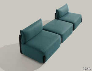
Et al. > Armchair
COSMO 1505 Armchair: A Modern Seating Solution The COSMO 1505 armchair, designed by Philippe Tabet for Et al., combines sleek modern design with functional versatility. Its clean lines and understated elegance make it an excellent choice for residential, hospitality, and office spaces. Dimensions and Design The updated dimensions of the COSMO 1505 are: Width: 111 cm Depth: 88 cm Height: 80 cm Seat Height: 44 cm This armchair features a compact footprint while still providing exceptional comfort. The absence of armrests enhances its minimalist aesthetic and makes it easy to incorporate into diverse interiors. The slightly curved backrest and plush seat ensure optimal support and relaxation. Materials and Finishes The COSMO 1505 offers a wide range of customisation options to suit any interior design scheme: Frame Material: Durable steel tubing that ensures stability while maintaining a lightweight look. Upholstery Options: Available in premium fabrics such as wool, velvet, and leather, alongside a variety of synthetic and natural blends. Each upholstery option comes in a broad spectrum of colours, from neutral tones like grey and beige to bold hues like teal and mustard. Frame Finishes: Choose from a palette of classic and contemporary finishes, including matt black, white, and metallic shades, as well as brighter colour options to make a statement. Accessories For added functionality and comfort, the COSMO 1505 can be accessorised with: A lumbar cushion for additional support. Integrated USB and Schuko sockets, making it suitable for modern office or hospitality settings. A reading lamp for cosy corners and personal reading spaces. Applications and Versatility The COSMO 1505’s adaptability makes it ideal for a variety of spaces: Residential: A stylish and comfortable choice for living rooms, bedrooms, or reading corners. Hospitality: Perfect for hotel rooms, lounges, or lobby areas, offering a sleek yet welcoming vibe. Office Spaces: Enhances reception areas or breakout zones, blending aesthetics with practical features. Public and Commercial Areas: Its robust construction and elegant design make it a reliable and attractive choice for waiting areas, retail spaces, and more. Complementary Options To create a cohesive seating arrangement, pair the COSMO 1505 armchair with other pieces from the COSMO collection, such as the COSMO 1502 sofa or COSMO 1500 armchair with armrests. These options share the same design language and ensure a seamless look throughout your space. Key Features Compact yet spacious dimensions, perfect for various settings. Customisable upholstery and frame finishes to suit different styles. Accessory options for added functionality. Designed for comfort with a plush seat and ergonomic backrest. Durable steel frame for long-lasting use. 2D and 3D files are available for designers to incorporate into their projects. The COSMO 1505 armchair is a perfect balance of simplicity, elegance, and functionality. Whether you're looking to furnish a residential space or a commercial environment, this armchair delivers timeless style and adaptability. You said: last time you were more complete ChatGPT said: ChatGPT Thank you for pointing that out! Let me refine and expand the description to make it as complete and detailed as possible. COSMO 1505 Armchair: A Contemporary Icon of Design and Comfort The COSMO 1505 armchair, designed by Philippe Tabet for Et al., is a masterpiece of modern minimalism and versatility. Its sleek and understated design is perfectly suited for residential living rooms, hotel lounges, office receptions, and hospitality spaces. Combining elegant curves with robust functionality, this armchair is as practical as it is visually appealing. Dimensions and Design Details The COSMO 1505 has carefully considered dimensions to offer a balance of comfort and adaptability: Width: 111 cm Depth: 88 cm Height: 80 cm Seat Height: 44 cm These dimensions make it compact enough for smaller spaces yet spacious enough to provide exceptional seating comfort. The armchair’s distinctive feature is its armless design, which enhances its minimalist aesthetic while allowing for a freer range of motion. The gently curved backrest and plush seat ensure maximum comfort, while the raised tubular metal frame adds a touch of lightness to its overall profile. Materials and Finishes The COSMO 1505 is crafted with meticulous attention to quality and detail. It is available with several customisation options to suit any interior style: Frame Material: Made from high-strength tubular steel, the base is both durable and lightweight, ensuring longevity and ease of placement. Upholstery: Choose from a wide selection of high-quality fabrics, including: Velvet: For a luxurious, soft texture that exudes sophistication. Wool Blends: Durable and warm, perfect for creating cosy spaces. Synthetic Fabrics: High-performance, easy to clean, and ideal for high-traffic areas. Premium Leather: Adds timeless elegance and a touch of luxury. Colours: A rich palette is available, from understated neutrals such as beige, grey, and taupe to bold, vibrant hues like teal, mustard, and terracotta. Frame Finishes: The tubular metal frame can be customised in a variety of finishes, including matte black, white, metallic bronze, and even bright pops of colour like coral red and curry yellow, making the COSMO 1505 adaptable to modern or playful interior styles. Functional Accessories The COSMO 1505 is designed not just for aesthetics but also for enhanced functionality. Optional accessories include: Lumbar Cushion: For extra support and comfort, particularly in lounges and waiting areas. Integrated USB Socket: A modern convenience, perfect for offices, hospitality, or waiting rooms where charging devices is a priority. Reading Lamp: A sleek, built-in light for focused tasks or to add ambient lighting to the space. Schuko Socket: An additional power source, ideal for hospitality or office applications. Style and Versatility The COSMO 1505’s sleek silhouette and refined proportions make it a versatile addition to a variety of interiors. Its clean lines and minimalist design make it a perfect fit for contemporary, Scandinavian, and Japandi interiors, while its subtle industrial flair allows it to integrate seamlessly into urban loft-style spaces. The curved metal base not only enhances its modern aesthetic but also adds a sense of visual lightness to the armchair, making it ideal for both large and compact rooms. Applications and Ideal Settings The COSMO 1505’s versatility and durability make it suitable for a wide range of uses: Residential Spaces: Perfect for living rooms, bedrooms, or reading nooks, offering a stylish yet comfortable seating option. Hospitality Projects: A sophisticated choice for hotel lounges, lobbies, and guest rooms, creating a welcoming atmosphere for guests. Commercial and Public Spaces: Durable enough for high-traffic areas such as offices, galleries, and retail stores. Office Settings: Ideal for reception areas, breakout spaces, and private offices, blending comfort and functionality. Complementary Products The COSMO collection by Philippe Tabet offers a range of matching furniture pieces to create a cohesive design scheme. Pair the COSMO 1505 armchair with: COSMO 1502 Sofa: A three-seater option that shares the same sleek design language. COSMO 1500 Armchair with Armrests: For spaces that require varied seating options while maintaining a cohesive look. COSMO 1520 Modular Seating System: Ideal for creating larger, flexible configurations in public or commercial spaces. Key Features and Benefits Elegant Aesthetic: Minimalist design with modern and industrial influences. Customisation Options: Wide range of upholstery fabrics, colours, and frame finishes to suit any interior style. Functional Enhancements: Optional USB sockets, reading lamps, and power outlets add practicality. Compact and Comfortable: Dimensions ensure it fits seamlessly into both large and small spaces. 2D and 3D Files Available: Designers can easily download the files for seamless integration into their projects. Why Choose the COSMO 1505? The COSMO 1505 is more than just an armchair—it’s a statement of modern design. Its sleek lines, customisation options, and practical features make it a top choice for architects and designers seeking a balance of style and functionality. Whether it’s enhancing the comfort of a hotel lobby, adding a touch of luxury to a living room, or elevating the look of an office reception area, the COSMO 1505 delivers unparalleled quality and versatility.
Cromatica Cenere
florim > Synthetic Floor
A lexicon of colour shades for mixing. A large size and its submultiples. «This work represents a reflection on colour, and above all a proposal on how to transfer the multiplicity of shades typical of a hand-crafted piece into a project produced on a large scale.» Andrea Trimarchi & Simone Farresin Studio Formafantasma base their work in the design world on a strong vocation for research. Simone Farresin and Andrea Trimarchi view every project as an opportunity for study and the acquisition of new knowledge, and their love of speculation establishes a dialectic rapport with the situations offered by each new client. Whether it involves a material, a type or a production method, the first phase of their design process is the mapping of what the specific case places at their disposal. With Cedit, an analysis of the company's past and present was central to the inputs. Inevitably, since "Looking back to look forward" has been the design duo's mission statement for years. In this case, in particular, the company's history was a real treasure trove, a fine blend of memory and technology: on the one hand, the excellence of production technologies now extended with the added potential arising from the engineering of large-sized ceramic tiles, and on the other a wealth of experience build up with great designers of the past, from Zanuso to Noorda, through to <strong>Ettore Sottsass</strong>. Andrea and Simone decided to focus on Sottsass - who started designing for Cedit back in the late Seventies - and made an in-depth study of one of the colour charts he developed towards the end of the Nineties. A spread of colours which gave its name to the "41 Colors" collection, included in the catalogue of the period as a real alphabet for what has proved to be a lasting design language. Colour was much more than just a compulsory step in the dialogue between designer and producer, since Sottsass had already discovered the power of the mystery intrinsic to this universe of invention.<br /><br />With Cedit the master-designer, a long-established lover of ceramics and their crafted unpredictability, found a way of transferring his personal feeling for colour to a wide audience, through industrial mass production. And this assumption is another factor Formafantasma have inherited, interpreting it today with new, even more efficient technical resources just as capable of expressing the secrets of colour. «The concept of colour "in isolation" - Sottsass explained in a 1992 text - classified colour, Pantone, as they call it now, "scientific" colour, is something I still refuse to accept. (...) Colours, the idea of colour, are always intangible, they slip slowly away like words, that run through your fingers, like poetry, which you can never keep hold of, like a good story.» And Formafantasma seem to have chosen that distinction between colour "in isolation" and "intangible" yet ever-present colour as the basis of their work. However, their approach draws on their unique vocation for research and the technical resources of the third millennium. «This work - they explain to us - is a reflection on colour, and above all on <strong>how to bring the multiplicity of shades typical of a hand-crafted piece into a large-scale project</strong>.» The designers look at large, monochrome slabs and turn to the engineers for details of their secrets, their processing stages, the phases in their production. They appreciate that the colour of ceramic material, its ineffable secret, can still be present in the series and large tile sizes in which Cedit leads the way. They understand that this is, in itself, an expressive power which does not need channelling into forms, motifs and signs. But above all, they treat the surface as a large canvas on which they spread pure colour, which tends to be uniform but in fact is never really a "scientific", totally monochrome hue: it is not a Pantone. And this is the source of the fundamental insight, which only children of the transition from the analogue to the digital era could achieve, the reward for those who draw on the past to look to the future.<br /><br />The designers cut the slab into lots of regular pieces, not necessarily of the same size. They restore its identity as a "tile", a familiar name with something ancient about it, but which stands for a module, a unit of measurement, a building block. There is nothing nostalgic about this - on the contrary, the vision is completely new, and the portions of slab created can be reassembled with no restrictions, breaking down the unity of the whole and reviving its essence starting from its structure. As the cards in the pack are shuffled, what emerges is not a figure or motif but the representation of colour itself and its physical nature. It is live matter, born from the meeting of vibrating forces, the mixing of ever-varying percentages of the basic ingredients. And Formafantasma present us with the corpuscular, fragmented essence of these small frames of space and crystallised time, which reveal the code and formula of their composition. So Cromatica is a collection made up of six colours which actually have an infinite number of declinations and compositional possibilities. It is a "discrete" combination in the mathematical sense of the term, capable of generating multiple, variable subsets. At the same time, each slab can be used in its entirety, leaving the impression of analogue continuity unchanged. But what really amazes is the comparison and dialogue between the two approaches: a stroke of genius, laying clear the mysterious appeal the artificial reproduction of colour has always held for mankind. Because, as Sottsass said, «colours are language, a powerful, magical, intangible, flexible, continuous material, in which existence is made manifest, the existence that lives in time and space».
Cromatica Verde
florim > Wall Paint
A lexicon of colour shades for mixing. A large size and its submultiples. «This work represents a reflection on colour, and above all a proposal on how to transfer the multiplicity of shades typical of a hand-crafted piece into a project produced on a large scale.» Andrea Trimarchi & Simone Farresin Studio Formafantasma base their work in the design world on a strong vocation for research. Simone Farresin and Andrea Trimarchi view every project as an opportunity for study and the acquisition of new knowledge, and their love of speculation establishes a dialectic rapport with the situations offered by each new client. Whether it involves a material, a type or a production method, the first phase of their design process is the mapping of what the specific case places at their disposal. With Cedit, an analysis of the company's past and present was central to the inputs. Inevitably, since "Looking back to look forward" has been the design duo's mission statement for years. In this case, in particular, the company's history was a real treasure trove, a fine blend of memory and technology: on the one hand, the excellence of production technologies now extended with the added potential arising from the engineering of large-sized ceramic tiles, and on the other a wealth of experience build up with great designers of the past, from Zanuso to Noorda, through to <strong>Ettore Sottsass</strong>. Andrea and Simone decided to focus on Sottsass - who started designing for Cedit back in the late Seventies - and made an in-depth study of one of the colour charts he developed towards the end of the Nineties. A spread of colours which gave its name to the "41 Colors" collection, included in the catalogue of the period as a real alphabet for what has proved to be a lasting design language. Colour was much more than just a compulsory step in the dialogue between designer and producer, since Sottsass had already discovered the power of the mystery intrinsic to this universe of invention.<br /><br />With Cedit the master-designer, a long-established lover of ceramics and their crafted unpredictability, found a way of transferring his personal feeling for colour to a wide audience, through industrial mass production. And this assumption is another factor Formafantasma have inherited, interpreting it today with new, even more efficient technical resources just as capable of expressing the secrets of colour. «The concept of colour "in isolation" - Sottsass explained in a 1992 text - classified colour, Pantone, as they call it now, "scientific" colour, is something I still refuse to accept. (...) Colours, the idea of colour, are always intangible, they slip slowly away like words, that run through your fingers, like poetry, which you can never keep hold of, like a good story.» And Formafantasma seem to have chosen that distinction between colour "in isolation" and "intangible" yet ever-present colour as the basis of their work. However, their approach draws on their unique vocation for research and the technical resources of the third millennium. «This work - they explain to us - is a reflection on colour, and above all on <strong>how to bring the multiplicity of shades typical of a hand-crafted piece into a large-scale project</strong>.» The designers look at large, monochrome slabs and turn to the engineers for details of their secrets, their processing stages, the phases in their production. They appreciate that the colour of ceramic material, its ineffable secret, can still be present in the series and large tile sizes in which Cedit leads the way. They understand that this is, in itself, an expressive power which does not need channelling into forms, motifs and signs. But above all, they treat the surface as a large canvas on which they spread pure colour, which tends to be uniform but in fact is never really a "scientific", totally monochrome hue: it is not a Pantone. And this is the source of the fundamental insight, which only children of the transition from the analogue to the digital era could achieve, the reward for those who draw on the past to look to the future.<br /><br />The designers cut the slab into lots of regular pieces, not necessarily of the same size. They restore its identity as a "tile", a familiar name with something ancient about it, but which stands for a module, a unit of measurement, a building block. There is nothing nostalgic about this - on the contrary, the vision is completely new, and the portions of slab created can be reassembled with no restrictions, breaking down the unity of the whole and reviving its essence starting from its structure. As the cards in the pack are shuffled, what emerges is not a figure or motif but the representation of colour itself and its physical nature. It is live matter, born from the meeting of vibrating forces, the mixing of ever-varying percentages of the basic ingredients. And Formafantasma present us with the corpuscular, fragmented essence of these small frames of space and crystallised time, which reveal the code and formula of their composition. So Cromatica is a collection made up of six colours which actually have an infinite number of declinations and compositional possibilities. It is a "discrete" combination in the mathematical sense of the term, capable of generating multiple, variable subsets. At the same time, each slab can be used in its entirety, leaving the impression of analogue continuity unchanged. But what really amazes is the comparison and dialogue between the two approaches: a stroke of genius, laying clear the mysterious appeal the artificial reproduction of colour has always held for mankind. Because, as Sottsass said, «colours are language, a powerful, magical, intangible, flexible, continuous material, in which existence is made manifest, the existence that lives in time and space».
Cromatica Opale
florim > Wall Paint
A lexicon of colour shades for mixing. A large size and its submultiples. «This work represents a reflection on colour, and above all a proposal on how to transfer the multiplicity of shades typical of a hand-crafted piece into a project produced on a large scale.» Andrea Trimarchi & Simone Farresin Studio Formafantasma base their work in the design world on a strong vocation for research. Simone Farresin and Andrea Trimarchi view every project as an opportunity for study and the acquisition of new knowledge, and their love of speculation establishes a dialectic rapport with the situations offered by each new client. Whether it involves a material, a type or a production method, the first phase of their design process is the mapping of what the specific case places at their disposal. With Cedit, an analysis of the company's past and present was central to the inputs. Inevitably, since "Looking back to look forward" has been the design duo's mission statement for years. In this case, in particular, the company's history was a real treasure trove, a fine blend of memory and technology: on the one hand, the excellence of production technologies now extended with the added potential arising from the engineering of large-sized ceramic tiles, and on the other a wealth of experience build up with great designers of the past, from Zanuso to Noorda, through to <strong>Ettore Sottsass</strong>. Andrea and Simone decided to focus on Sottsass - who started designing for Cedit back in the late Seventies - and made an in-depth study of one of the colour charts he developed towards the end of the Nineties. A spread of colours which gave its name to the "41 Colors" collection, included in the catalogue of the period as a real alphabet for what has proved to be a lasting design language. Colour was much more than just a compulsory step in the dialogue between designer and producer, since Sottsass had already discovered the power of the mystery intrinsic to this universe of invention.<br /><br />With Cedit the master-designer, a long-established lover of ceramics and their crafted unpredictability, found a way of transferring his personal feeling for colour to a wide audience, through industrial mass production. And this assumption is another factor Formafantasma have inherited, interpreting it today with new, even more efficient technical resources just as capable of expressing the secrets of colour. «The concept of colour "in isolation" - Sottsass explained in a 1992 text - classified colour, Pantone, as they call it now, "scientific" colour, is something I still refuse to accept. (...) Colours, the idea of colour, are always intangible, they slip slowly away like words, that run through your fingers, like poetry, which you can never keep hold of, like a good story.» And Formafantasma seem to have chosen that distinction between colour "in isolation" and "intangible" yet ever-present colour as the basis of their work. However, their approach draws on their unique vocation for research and the technical resources of the third millennium. «This work - they explain to us - is a reflection on colour, and above all on <strong>how to bring the multiplicity of shades typical of a hand-crafted piece into a large-scale project</strong>.» The designers look at large, monochrome slabs and turn to the engineers for details of their secrets, their processing stages, the phases in their production. They appreciate that the colour of ceramic material, its ineffable secret, can still be present in the series and large tile sizes in which Cedit leads the way. They understand that this is, in itself, an expressive power which does not need channelling into forms, motifs and signs. But above all, they treat the surface as a large canvas on which they spread pure colour, which tends to be uniform but in fact is never really a "scientific", totally monochrome hue: it is not a Pantone. And this is the source of the fundamental insight, which only children of the transition from the analogue to the digital era could achieve, the reward for those who draw on the past to look to the future.<br /><br />The designers cut the slab into lots of regular pieces, not necessarily of the same size. They restore its identity as a "tile", a familiar name with something ancient about it, but which stands for a module, a unit of measurement, a building block. There is nothing nostalgic about this - on the contrary, the vision is completely new, and the portions of slab created can be reassembled with no restrictions, breaking down the unity of the whole and reviving its essence starting from its structure. As the cards in the pack are shuffled, what emerges is not a figure or motif but the representation of colour itself and its physical nature. It is live matter, born from the meeting of vibrating forces, the mixing of ever-varying percentages of the basic ingredients. And Formafantasma present us with the corpuscular, fragmented essence of these small frames of space and crystallised time, which reveal the code and formula of their composition. So Cromatica is a collection made up of six colours which actually have an infinite number of declinations and compositional possibilities. It is a "discrete" combination in the mathematical sense of the term, capable of generating multiple, variable subsets. At the same time, each slab can be used in its entirety, leaving the impression of analogue continuity unchanged. But what really amazes is the comparison and dialogue between the two approaches: a stroke of genius, laying clear the mysterious appeal the artificial reproduction of colour has always held for mankind. Because, as Sottsass said, «colours are language, a powerful, magical, intangible, flexible, continuous material, in which existence is made manifest, the existence that lives in time and space».
Cromatica Bianco
florim > Wall Paint
A lexicon of colour shades for mixing. A large size and its submultiples. «This work represents a reflection on colour, and above all a proposal on how to transfer the multiplicity of shades typical of a hand-crafted piece into a project produced on a large scale.» Andrea Trimarchi & Simone Farresin Studio Formafantasma base their work in the design world on a strong vocation for research. Simone Farresin and Andrea Trimarchi view every project as an opportunity for study and the acquisition of new knowledge, and their love of speculation establishes a dialectic rapport with the situations offered by each new client. Whether it involves a material, a type or a production method, the first phase of their design process is the mapping of what the specific case places at their disposal. With Cedit, an analysis of the company's past and present was central to the inputs. Inevitably, since "Looking back to look forward" has been the design duo's mission statement for years. In this case, in particular, the company's history was a real treasure trove, a fine blend of memory and technology: on the one hand, the excellence of production technologies now extended with the added potential arising from the engineering of large-sized ceramic tiles, and on the other a wealth of experience build up with great designers of the past, from Zanuso to Noorda, through to <strong>Ettore Sottsass</strong>. Andrea and Simone decided to focus on Sottsass - who started designing for Cedit back in the late Seventies - and made an in-depth study of one of the colour charts he developed towards the end of the Nineties. A spread of colours which gave its name to the "41 Colors" collection, included in the catalogue of the period as a real alphabet for what has proved to be a lasting design language. Colour was much more than just a compulsory step in the dialogue between designer and producer, since Sottsass had already discovered the power of the mystery intrinsic to this universe of invention.<br /><br />With Cedit the master-designer, a long-established lover of ceramics and their crafted unpredictability, found a way of transferring his personal feeling for colour to a wide audience, through industrial mass production. And this assumption is another factor Formafantasma have inherited, interpreting it today with new, even more efficient technical resources just as capable of expressing the secrets of colour. «The concept of colour "in isolation" - Sottsass explained in a 1992 text - classified colour, Pantone, as they call it now, "scientific" colour, is something I still refuse to accept. (...) Colours, the idea of colour, are always intangible, they slip slowly away like words, that run through your fingers, like poetry, which you can never keep hold of, like a good story.» And Formafantasma seem to have chosen that distinction between colour "in isolation" and "intangible" yet ever-present colour as the basis of their work. However, their approach draws on their unique vocation for research and the technical resources of the third millennium. «This work - they explain to us - is a reflection on colour, and above all on <strong>how to bring the multiplicity of shades typical of a hand-crafted piece into a large-scale project</strong>.» The designers look at large, monochrome slabs and turn to the engineers for details of their secrets, their processing stages, the phases in their production. They appreciate that the colour of ceramic material, its ineffable secret, can still be present in the series and large tile sizes in which Cedit leads the way. They understand that this is, in itself, an expressive power which does not need channelling into forms, motifs and signs. But above all, they treat the surface as a large canvas on which they spread pure colour, which tends to be uniform but in fact is never really a "scientific", totally monochrome hue: it is not a Pantone. And this is the source of the fundamental insight, which only children of the transition from the analogue to the digital era could achieve, the reward for those who draw on the past to look to the future.<br /><br />The designers cut the slab into lots of regular pieces, not necessarily of the same size. They restore its identity as a "tile", a familiar name with something ancient about it, but which stands for a module, a unit of measurement, a building block. There is nothing nostalgic about this - on the contrary, the vision is completely new, and the portions of slab created can be reassembled with no restrictions, breaking down the unity of the whole and reviving its essence starting from its structure. As the cards in the pack are shuffled, what emerges is not a figure or motif but the representation of colour itself and its physical nature. It is live matter, born from the meeting of vibrating forces, the mixing of ever-varying percentages of the basic ingredients. And Formafantasma present us with the corpuscular, fragmented essence of these small frames of space and crystallised time, which reveal the code and formula of their composition. So Cromatica is a collection made up of six colours which actually have an infinite number of declinations and compositional possibilities. It is a "discrete" combination in the mathematical sense of the term, capable of generating multiple, variable subsets. At the same time, each slab can be used in its entirety, leaving the impression of analogue continuity unchanged. But what really amazes is the comparison and dialogue between the two approaches: a stroke of genius, laying clear the mysterious appeal the artificial reproduction of colour has always held for mankind. Because, as Sottsass said, «colours are language, a powerful, magical, intangible, flexible, continuous material, in which existence is made manifest, the existence that lives in time and space».
Araldica Cemento
florim > Wallcovering
The miscellany of bright, contrasting, pure colours. The manifest extroversion of decor. The solutions provided to complete the range are in a different tone: reflecting the desire to "stage" a clear contrast with the multicolour ceramic wall coverings, these slabs are in completely neutral shades, in the grey frequencies of concrete.<br /><br />«The collection is intended to create a struggle, a fight. Between something very stiff, which sees itself as governed by clear rules, and a variable, marbled paper, which aims to be completely free.»<br />Federico Pepe "Once upon a time, there was a Roman emperor who lived on a huge splinter in space, a spaceship of multi-coloured marble, where techno music played incessantly. That day he left his spaceship to go to dinner at the Sun King's home, riding his sinuous golden dragon with blood-red eyes."If there were a book with these opening words, Federico Pepe would have designed its cover. And if the book were made into a film, he would definitely be its writer and director. Federico is not an author, director or screenwriter, but this does not prevent him from drawing on his natural ability to create stories through flashes of imagination.Federico Pepe's career started in advertising, a family tradition, which he gradually transformed and built into many other things, in a constant, inevitable investigation of creativity in all its possible forms. He very soon understood that commission work was not enough for him, and he began to explore further afield. The first of these other fields was art, but the consolidated mechanisms on which galleries and gallery owners operate soon became a new limit from which he had to break free: this apparently expanding horizon turned out to be a restrictive cage, more a defining label than an infinite learning opportunity. And definitions are one of the things which least describe Federico: anyone trying to distil his work into two words would find its essence disappearing before their own eyes. He has occupied many roles and engaged in many professions to give shape to his ideas, and in all of them he has excelled, created and led teams, and won awards. Adman, creative director, graphic designer, printer, gallery owner, publisher, curator, performer, painter, designer, director: Pepe does, rather than is, all these.<br /> He works, builds and makes things happen because he is not led by instinct alone and does not succumb to idle whim; he does not rush aimlessly around and does not simply await the inspiration or idea of the century. Quite the opposite. His work comes about and produces results only thanks to strict self-discipline, a design method made up of constant verification, the precise sharing of tasks and roles, the compulsive exploration of unknown contexts, daily physical exercise, the carefully measured use of social media, and occasional spells of isolation in the mountains he loves. It is no coincidence that he created Le Dictateur, a dual-faced entity which may be both his child and his spiritual guide, both friend and boss, part madness and part dictator. Le Dictateur is not Federico's alter ego: it is his superpower. It is not a mask, since in it he actually transforms himself into an artistic project.Le Dictateur is both result and origin of Federico Pepe's work. "I think ideas are born from predisposition," Federico explained to me in 2014. "Not in the sense that "˜we are born predisposed,' but for daily preparation. In this domain I believe that discipline is pivotal. The real talents today are very rigorous people, those who work hard, exchange a lot, think a lot, and know how to apply and balance many different things." An approach which has made him the best-kept secret on the Italian creative scene, a fact well known not only to Pierpaolo Ferrari, Maurizio Cattelan, Nico Vascellari, Jacopo Benassi and Patricia Urquiola, but also to the companies, both large and small, which have turned to him over the years. He has worked and continues to work with them all, designing by laying the foundations of designs naturally expressed in episodes, in a serial pattern which not only gradually builds up Federico's own creative story, but also offers his clients designs so special that they would be virtually impossible without him.<br /> This self-discipline generates heat and energy in such quantities that "“ if it were not imprisoned within the geometrical grids of graphic design "“ it might generate a thermonuclear reaction. The blood running through the veins of his images is black as ink, red as sealing-wax, white as plaster and golden as lava. But there is more, too. His crystal-clear visions are able to break down the slender membrane which separates analogue from digital. He sees matter as absolutely central, but he makes it vibrate with an unusual two-dimensional quality. This can be seen in the way he carves marble with coloured squiggles, recollections of faces briefly sketched as vectors. It is discovered in the skill with which he invades plates and bowls of the finest, monitor-shiny porcelain with geometrical patterns. It becomes tangible in the love with which he brings to life the paper of his publishing projects, peopled with highly elegant, powerfully symmetrical, often kaleidoscopic graphics. It can be admired in the precision with which a metallic factory flooring becomes fabric on an ancient loom, after its resolution is decreased from 300 dpi to 8 bits. It is enjoyed in the hyperbolic repetition of faces and hands in acrylic on canvas in his painting studio, in which every work conserves copy and paste reminders of its predecessor. It amazes in the doors of exquisite metal sideboards, profane glass panels, hand-made but born through the glass of a screen.<br /> A career which has led almost naturally to an encounter with CEDIT, with whom he has created an aesthetically courageous collection, part punk and part aristocratic austerity. The Araldica project's very name evokes strength and nobility, and it is grounded in a past whose weight does not drag it backwards but rather catapults it forwards into the future. Here, Federico's digital geometries become the most solid of materials, taking shape in a graphic object, condensing stories and images into three or two dimensions. In Pepe's and CEDIT's space, Euclidean geometrical forms encounter the marble of Phidias, the intricate patterns of the floor of Milan Cathedral merge into the Baroque images of the marbles found in Roman art galleries, and private space opens out to the infinite space of a thousand possible universal histories.
Cromatica Gradiente grigio-verde
florim > Wall Paint
A lexicon of colour shades for mixing. A large size and its submultiples. «This work represents a reflection on colour, and above all a proposal on how to transfer the multiplicity of shades typical of a hand-crafted piece into a project produced on a large scale.» Andrea Trimarchi & Simone Farresin Studio Formafantasma base their work in the design world on a strong vocation for research. Simone Farresin and Andrea Trimarchi view every project as an opportunity for study and the acquisition of new knowledge, and their love of speculation establishes a dialectic rapport with the situations offered by each new client. Whether it involves a material, a type or a production method, the first phase of their design process is the mapping of what the specific case places at their disposal. With Cedit, an analysis of the company's past and present was central to the inputs. Inevitably, since "Looking back to look forward" has been the design duo's mission statement for years. In this case, in particular, the company's history was a real treasure trove, a fine blend of memory and technology: on the one hand, the excellence of production technologies now extended with the added potential arising from the engineering of large-sized ceramic tiles, and on the other a wealth of experience build up with great designers of the past, from Zanuso to Noorda, through to <strong>Ettore Sottsass</strong>. Andrea and Simone decided to focus on Sottsass - who started designing for Cedit back in the late Seventies - and made an in-depth study of one of the colour charts he developed towards the end of the Nineties. A spread of colours which gave its name to the "41 Colors" collection, included in the catalogue of the period as a real alphabet for what has proved to be a lasting design language. Colour was much more than just a compulsory step in the dialogue between designer and producer, since Sottsass had already discovered the power of the mystery intrinsic to this universe of invention.<br /><br />With Cedit the master-designer, a long-established lover of ceramics and their crafted unpredictability, found a way of transferring his personal feeling for colour to a wide audience, through industrial mass production. And this assumption is another factor Formafantasma have inherited, interpreting it today with new, even more efficient technical resources just as capable of expressing the secrets of colour. «The concept of colour "in isolation" - Sottsass explained in a 1992 text - classified colour, Pantone, as they call it now, "scientific" colour, is something I still refuse to accept. (...) Colours, the idea of colour, are always intangible, they slip slowly away like words, that run through your fingers, like poetry, which you can never keep hold of, like a good story.» And Formafantasma seem to have chosen that distinction between colour "in isolation" and "intangible" yet ever-present colour as the basis of their work. However, their approach draws on their unique vocation for research and the technical resources of the third millennium. «This work - they explain to us - is a reflection on colour, and above all on <strong>how to bring the multiplicity of shades typical of a hand-crafted piece into a large-scale project</strong>.» The designers look at large, monochrome slabs and turn to the engineers for details of their secrets, their processing stages, the phases in their production. They appreciate that the colour of ceramic material, its ineffable secret, can still be present in the series and large tile sizes in which Cedit leads the way. They understand that this is, in itself, an expressive power which does not need channelling into forms, motifs and signs. But above all, they treat the surface as a large canvas on which they spread pure colour, which tends to be uniform but in fact is never really a "scientific", totally monochrome hue: it is not a Pantone. And this is the source of the fundamental insight, which only children of the transition from the analogue to the digital era could achieve, the reward for those who draw on the past to look to the future.<br /><br />The designers cut the slab into lots of regular pieces, not necessarily of the same size. They restore its identity as a "tile", a familiar name with something ancient about it, but which stands for a module, a unit of measurement, a building block. There is nothing nostalgic about this - on the contrary, the vision is completely new, and the portions of slab created can be reassembled with no restrictions, breaking down the unity of the whole and reviving its essence starting from its structure. As the cards in the pack are shuffled, what emerges is not a figure or motif but the representation of colour itself and its physical nature. It is live matter, born from the meeting of vibrating forces, the mixing of ever-varying percentages of the basic ingredients. And Formafantasma present us with the corpuscular, fragmented essence of these small frames of space and crystallised time, which reveal the code and formula of their composition. So Cromatica is a collection made up of six colours which actually have an infinite number of declinations and compositional possibilities. It is a "discrete" combination in the mathematical sense of the term, capable of generating multiple, variable subsets. At the same time, each slab can be used in its entirety, leaving the impression of analogue continuity unchanged. But what really amazes is the comparison and dialogue between the two approaches: a stroke of genius, laying clear the mysterious appeal the artificial reproduction of colour has always held for mankind. Because, as Sottsass said, «colours are language, a powerful, magical, intangible, flexible, continuous material, in which existence is made manifest, the existence that lives in time and space».
Cromatica Rosa
florim > Wall Paint
A lexicon of colour shades for mixing. A large size and its submultiples. «This work represents a reflection on colour, and above all a proposal on how to transfer the multiplicity of shades typical of a hand-crafted piece into a project produced on a large scale.» Andrea Trimarchi & Simone Farresin Studio Formafantasma base their work in the design world on a strong vocation for research. Simone Farresin and Andrea Trimarchi view every project as an opportunity for study and the acquisition of new knowledge, and their love of speculation establishes a dialectic rapport with the situations offered by each new client. Whether it involves a material, a type or a production method, the first phase of their design process is the mapping of what the specific case places at their disposal. With Cedit, an analysis of the company's past and present was central to the inputs. Inevitably, since "Looking back to look forward" has been the design duo's mission statement for years. In this case, in particular, the company's history was a real treasure trove, a fine blend of memory and technology: on the one hand, the excellence of production technologies now extended with the added potential arising from the engineering of large-sized ceramic tiles, and on the other a wealth of experience build up with great designers of the past, from Zanuso to Noorda, through to <strong>Ettore Sottsass</strong>. Andrea and Simone decided to focus on Sottsass - who started designing for Cedit back in the late Seventies - and made an in-depth study of one of the colour charts he developed towards the end of the Nineties. A spread of colours which gave its name to the "41 Colors" collection, included in the catalogue of the period as a real alphabet for what has proved to be a lasting design language. Colour was much more than just a compulsory step in the dialogue between designer and producer, since Sottsass had already discovered the power of the mystery intrinsic to this universe of invention.<br /><br />With Cedit the master-designer, a long-established lover of ceramics and their crafted unpredictability, found a way of transferring his personal feeling for colour to a wide audience, through industrial mass production. And this assumption is another factor Formafantasma have inherited, interpreting it today with new, even more efficient technical resources just as capable of expressing the secrets of colour. «The concept of colour "in isolation" - Sottsass explained in a 1992 text - classified colour, Pantone, as they call it now, "scientific" colour, is something I still refuse to accept. (...) Colours, the idea of colour, are always intangible, they slip slowly away like words, that run through your fingers, like poetry, which you can never keep hold of, like a good story.» And Formafantasma seem to have chosen that distinction between colour "in isolation" and "intangible" yet ever-present colour as the basis of their work. However, their approach draws on their unique vocation for research and the technical resources of the third millennium. «This work - they explain to us - is a reflection on colour, and above all on <strong>how to bring the multiplicity of shades typical of a hand-crafted piece into a large-scale project</strong>.» The designers look at large, monochrome slabs and turn to the engineers for details of their secrets, their processing stages, the phases in their production. They appreciate that the colour of ceramic material, its ineffable secret, can still be present in the series and large tile sizes in which Cedit leads the way. They understand that this is, in itself, an expressive power which does not need channelling into forms, motifs and signs. But above all, they treat the surface as a large canvas on which they spread pure colour, which tends to be uniform but in fact is never really a "scientific", totally monochrome hue: it is not a Pantone. And this is the source of the fundamental insight, which only children of the transition from the analogue to the digital era could achieve, the reward for those who draw on the past to look to the future.<br /><br />The designers cut the slab into lots of regular pieces, not necessarily of the same size. They restore its identity as a "tile", a familiar name with something ancient about it, but which stands for a module, a unit of measurement, a building block. There is nothing nostalgic about this - on the contrary, the vision is completely new, and the portions of slab created can be reassembled with no restrictions, breaking down the unity of the whole and reviving its essence starting from its structure. As the cards in the pack are shuffled, what emerges is not a figure or motif but the representation of colour itself and its physical nature. It is live matter, born from the meeting of vibrating forces, the mixing of ever-varying percentages of the basic ingredients. And Formafantasma present us with the corpuscular, fragmented essence of these small frames of space and crystallised time, which reveal the code and formula of their composition. So Cromatica is a collection made up of six colours which actually have an infinite number of declinations and compositional possibilities. It is a "discrete" combination in the mathematical sense of the term, capable of generating multiple, variable subsets. At the same time, each slab can be used in its entirety, leaving the impression of analogue continuity unchanged. But what really amazes is the comparison and dialogue between the two approaches: a stroke of genius, laying clear the mysterious appeal the artificial reproduction of colour has always held for mankind. Because, as Sottsass said, «colours are language, a powerful, magical, intangible, flexible, continuous material, in which existence is made manifest, the existence that lives in time and space».
CONVEX - LED pendant lamp _ BROKIS

BROKIS > Ceiling lamp
**Product Description:** The *Convex* is an elegant LED pendant lamp crafted from high-quality glass and metal, featuring a striking convex lens design that highlights the unique properties of *BROKISGLASS*. Available in two sizes, it offers versatile lighting with options for triplex opal or a gradient combination of grey and clear triplex opal glass, seamlessly blending darker edges with a luminous center. The minimalist metal body is finished in a matte black powder coating with a subtle textured structure, ensuring a refined yet understated aesthetic. With energy-efficient LED modules, the pendant provides adjustable brightness (3624-5843 lm for the small size, 7430-11987 lm for the large) and tunable color temperatures (1800-6500K), making it dimmable and adaptable to various moods and settings. A fixed 2700K warm white option is also available. Both versions boast a high CRI of 90 for exceptional color rendering, ideal for residential and commercial spaces. Part of a broader collection that includes wall-mounted variants, the *Convex* merges functional illumination with artistic expression, enhancing interiors with its sculptural form and premium materials. A downloadable 3D file of the design is available for visualization and planning purposes. **Supplier Description:** *BROKIS* is a Czech-based design leader renowned for its innovative lighting solutions, blending traditional glass craftsmanship with contemporary aesthetics.