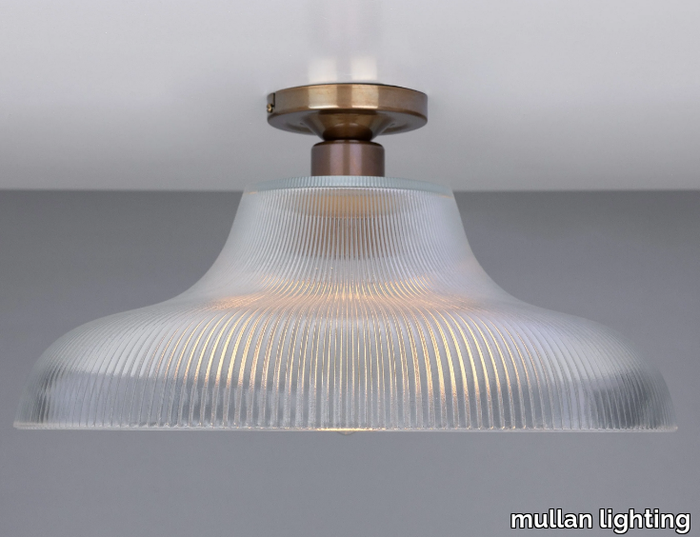
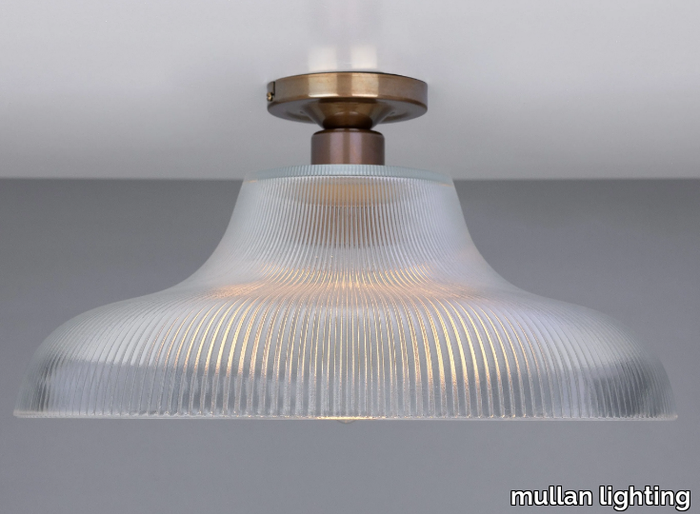
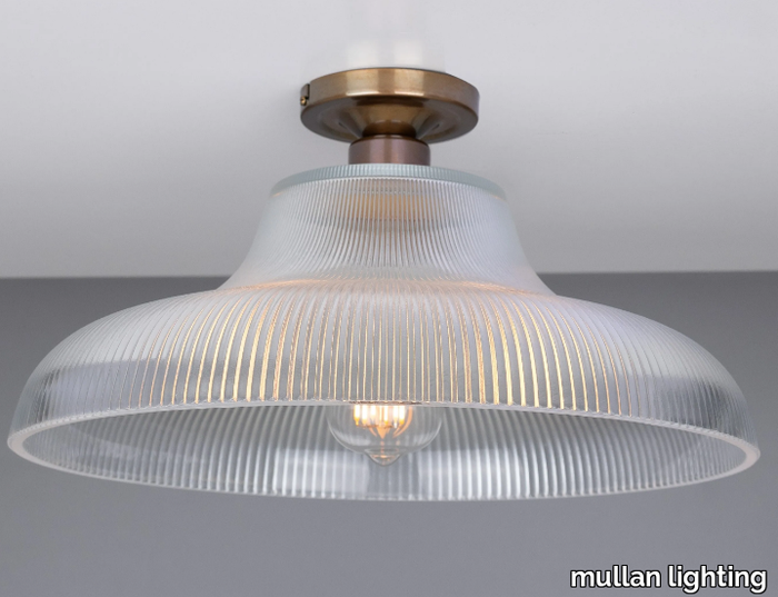
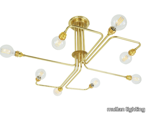
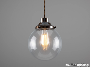
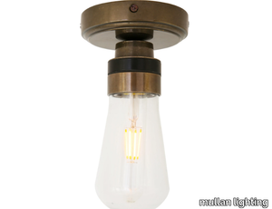
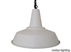
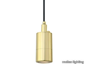
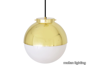
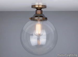
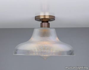
MONO INDUSTRIAL 40CM RAILWAY FLUSH - LED brass ceiling lamp _ mullan lighting - 2d files - 3d files


SUPPLIER: MULLAN LIGHTING
COLLECTION: MONO INDUSTRIAL
TYPE: LIGHTING
OTHER SUPPLIERS
A wide range of product from near to 3,000 suppliers around the world.


Other Products From This Supplier
A wide range of product from furniture to finishes to meet the desire of all designers.
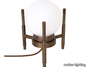
GENTRY OPAL GLASS GLOBE PENDANT LIGHT 30 - Handmade pendant lamp _ mullan lighting
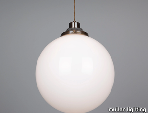
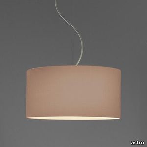
mullan lighting > Ceiling lamp
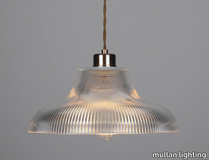
LONDON 40CM PRISMATIC RAILWAY PENDANT - Handmade pendant lamp _ mullan lighting
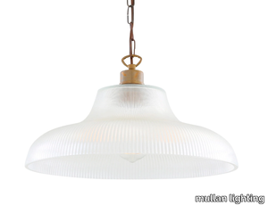
mullan lighting > Ceiling lamp
LONDON 30CM PRISMATIC RAILWAY PENDANT - Handmade blown glass pendant lamp _ mullan lighting
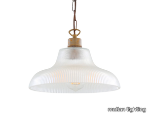
mullan lighting > Ceiling lamp
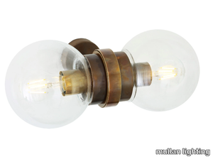
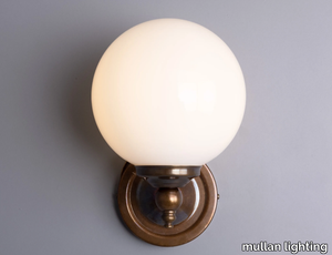
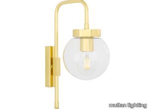
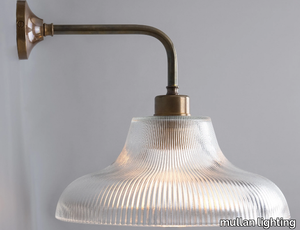
RIAD 250MM CLEAR GLOBE WALL LIGHT - Handmade wall lamp _ mullan lighting
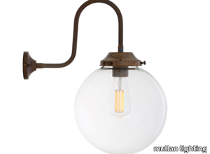
mullan lighting > Wall lamp
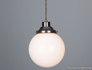
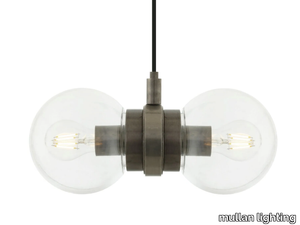
RIAD 30CM GLOBE CEILING LIGHT FITTING - LED handmade ceiling lamp _ mullan lighting
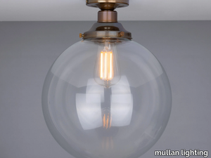
mullan lighting > Ceiling lamp
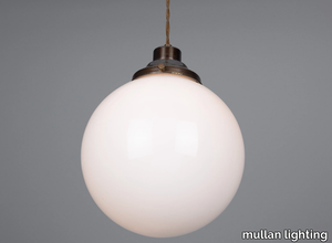
RIAD 25CM GLOBE CEILING LIGHT FITTING - LED handmade ceiling lamp _ mullan lighting
mullan lighting > Ceiling lamp
Recently Viewed Products
A wide range of product from furniture to finishes to meet the desire of all designers.
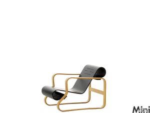
Miniatures Art. 41 "Paimio"
vitra > Styling
In his designs, Alvar Aalto combines the functional ideas of the Bauhaus with the Scandinavian crafts tradition and a strong sense of unity with Nature. This led to an exchange of ideas with Marcel Breuer and later influenced the work of both men. <br/><br/>Aalto designed Armchair No. 41 for the Sanatorium of the City of Paimio in Finland, a building for which he also created the plans and interior design. The armchair is of a simple, highly effective construction, because the rolled-up ends of the seat and back also function as springs – affording the sitter a degree of comfort hitherto unknown in wooden furniture. The armchair was also exceptionally well suited for series production, as it involves very few components and thus little assembly work.
Kendo Lap
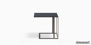
draenert > Coffee table
Kendo impresses with its elegant and almost graphic appearance. Distinctively shaped side table of slim rectangular profiles in 2 finishes combined with different wood finishes are the basis of this versatile series. The plate is available in dark oak stained and dark gray stained and a base of steel in black or dark bronze laminated.
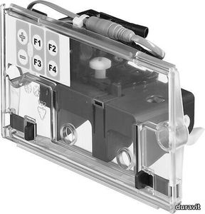
Universal Shower tray foot

duravit > Accessories
Suitable for series Stonetto, Tempano, Height: 100-150 mm
CURTAIN
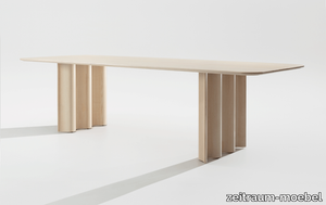
zeitraum-moebel > Table
The CURTAIN table resembles a fleeting snapshot of a moment in time: static in contrast to an organically flowing movement. Seemingly gravity-defiant drapery, thin-walled, supple and soft, yet precision-crafted from solid high-end wood that simultaneously supports a large-sized solid wood table top – inspiring a breathtaking moment.


Puro
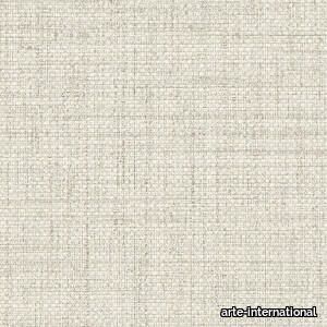
arte-international > Wallcovering
The monocoloured Puro has a slightly glossy finish. The woven grass structure with light colour nuances brings the tropics to mind. The somewhat rougher base lends this plain a natural touch.

Jade Bar/Chest On Stand
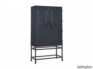
lexington > Cabinet
Every space needs a statement piece that draws the eye when one enters the room. The Jade bar, which also functions as a door chest or entertainment unit, is available in the Sandstone, Sailcloth, Marine or Seaglass finishes for exactly that purpose. Its hammered metal base, in an aged bronze finish, and custom door hardware are captivating. There is one full-extension self-closing drawer, above which is a stationary shelf and two adjustable shelves. Grommets in the back panel accommodate electronics and the doors open 270 degrees for media viewing.
Newport Natural 23"X23"

porcelanosa > Floor tile-stone
Matt-gloss beige concrete effect porcelain floor tiles. size 23 x 23 in, suitable for indoor wall or floor and outdoor walls.
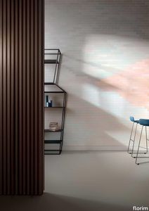
I Filati Goldfinger Rugiada
florim > Carpet
From the art of fabric, to enveloping spaces From lampas and jacquard, all the way to the simplest silk fabrics, from rich, baroque motifs to more optical, geometric patterns, all of these fabrics share an extremely natural look. The collection's nine surfaces are inspired by Rubelli's signature precious fabrics that, in turn, are born from the contemporary reworking of several decorative motifs coming from the noble Venetian heritage of weaving.<br />
Cromatica Cobalto
florim > Wall Paint
A lexicon of colour shades for mixing. A large size and its submultiples. «This work represents a reflection on colour, and above all a proposal on how to transfer the multiplicity of shades typical of a hand-crafted piece into a project produced on a large scale.» Andrea Trimarchi & Simone Farresin Studio Formafantasma base their work in the design world on a strong vocation for research. Simone Farresin and Andrea Trimarchi view every project as an opportunity for study and the acquisition of new knowledge, and their love of speculation establishes a dialectic rapport with the situations offered by each new client. Whether it involves a material, a type or a production method, the first phase of their design process is the mapping of what the specific case places at their disposal. With Cedit, an analysis of the company's past and present was central to the inputs. Inevitably, since "Looking back to look forward" has been the design duo's mission statement for years. In this case, in particular, the company's history was a real treasure trove, a fine blend of memory and technology: on the one hand, the excellence of production technologies now extended with the added potential arising from the engineering of large-sized ceramic tiles, and on the other a wealth of experience build up with great designers of the past, from Zanuso to Noorda, through to <strong>Ettore Sottsass</strong>. Andrea and Simone decided to focus on Sottsass - who started designing for Cedit back in the late Seventies - and made an in-depth study of one of the colour charts he developed towards the end of the Nineties. A spread of colours which gave its name to the "41 Colors" collection, included in the catalogue of the period as a real alphabet for what has proved to be a lasting design language. Colour was much more than just a compulsory step in the dialogue between designer and producer, since Sottsass had already discovered the power of the mystery intrinsic to this universe of invention.<br /><br />With Cedit the master-designer, a long-established lover of ceramics and their crafted unpredictability, found a way of transferring his personal feeling for colour to a wide audience, through industrial mass production. And this assumption is another factor Formafantasma have inherited, interpreting it today with new, even more efficient technical resources just as capable of expressing the secrets of colour. «The concept of colour "in isolation" - Sottsass explained in a 1992 text - classified colour, Pantone, as they call it now, "scientific" colour, is something I still refuse to accept. (...) Colours, the idea of colour, are always intangible, they slip slowly away like words, that run through your fingers, like poetry, which you can never keep hold of, like a good story.» And Formafantasma seem to have chosen that distinction between colour "in isolation" and "intangible" yet ever-present colour as the basis of their work. However, their approach draws on their unique vocation for research and the technical resources of the third millennium. «This work - they explain to us - is a reflection on colour, and above all on <strong>how to bring the multiplicity of shades typical of a hand-crafted piece into a large-scale project</strong>.» The designers look at large, monochrome slabs and turn to the engineers for details of their secrets, their processing stages, the phases in their production. They appreciate that the colour of ceramic material, its ineffable secret, can still be present in the series and large tile sizes in which Cedit leads the way. They understand that this is, in itself, an expressive power which does not need channelling into forms, motifs and signs. But above all, they treat the surface as a large canvas on which they spread pure colour, which tends to be uniform but in fact is never really a "scientific", totally monochrome hue: it is not a Pantone. And this is the source of the fundamental insight, which only children of the transition from the analogue to the digital era could achieve, the reward for those who draw on the past to look to the future.<br /><br />The designers cut the slab into lots of regular pieces, not necessarily of the same size. They restore its identity as a "tile", a familiar name with something ancient about it, but which stands for a module, a unit of measurement, a building block. There is nothing nostalgic about this - on the contrary, the vision is completely new, and the portions of slab created can be reassembled with no restrictions, breaking down the unity of the whole and reviving its essence starting from its structure. As the cards in the pack are shuffled, what emerges is not a figure or motif but the representation of colour itself and its physical nature. It is live matter, born from the meeting of vibrating forces, the mixing of ever-varying percentages of the basic ingredients. And Formafantasma present us with the corpuscular, fragmented essence of these small frames of space and crystallised time, which reveal the code and formula of their composition. So Cromatica is a collection made up of six colours which actually have an infinite number of declinations and compositional possibilities. It is a "discrete" combination in the mathematical sense of the term, capable of generating multiple, variable subsets. At the same time, each slab can be used in its entirety, leaving the impression of analogue continuity unchanged. But what really amazes is the comparison and dialogue between the two approaches: a stroke of genius, laying clear the mysterious appeal the artificial reproduction of colour has always held for mankind. Because, as Sottsass said, «colours are language, a powerful, magical, intangible, flexible, continuous material, in which existence is made manifest, the existence that lives in time and space».
Cromatica Verde
florim > Wall Paint
A lexicon of colour shades for mixing. A large size and its submultiples. «This work represents a reflection on colour, and above all a proposal on how to transfer the multiplicity of shades typical of a hand-crafted piece into a project produced on a large scale.» Andrea Trimarchi & Simone Farresin Studio Formafantasma base their work in the design world on a strong vocation for research. Simone Farresin and Andrea Trimarchi view every project as an opportunity for study and the acquisition of new knowledge, and their love of speculation establishes a dialectic rapport with the situations offered by each new client. Whether it involves a material, a type or a production method, the first phase of their design process is the mapping of what the specific case places at their disposal. With Cedit, an analysis of the company's past and present was central to the inputs. Inevitably, since "Looking back to look forward" has been the design duo's mission statement for years. In this case, in particular, the company's history was a real treasure trove, a fine blend of memory and technology: on the one hand, the excellence of production technologies now extended with the added potential arising from the engineering of large-sized ceramic tiles, and on the other a wealth of experience build up with great designers of the past, from Zanuso to Noorda, through to <strong>Ettore Sottsass</strong>. Andrea and Simone decided to focus on Sottsass - who started designing for Cedit back in the late Seventies - and made an in-depth study of one of the colour charts he developed towards the end of the Nineties. A spread of colours which gave its name to the "41 Colors" collection, included in the catalogue of the period as a real alphabet for what has proved to be a lasting design language. Colour was much more than just a compulsory step in the dialogue between designer and producer, since Sottsass had already discovered the power of the mystery intrinsic to this universe of invention.<br /><br />With Cedit the master-designer, a long-established lover of ceramics and their crafted unpredictability, found a way of transferring his personal feeling for colour to a wide audience, through industrial mass production. And this assumption is another factor Formafantasma have inherited, interpreting it today with new, even more efficient technical resources just as capable of expressing the secrets of colour. «The concept of colour "in isolation" - Sottsass explained in a 1992 text - classified colour, Pantone, as they call it now, "scientific" colour, is something I still refuse to accept. (...) Colours, the idea of colour, are always intangible, they slip slowly away like words, that run through your fingers, like poetry, which you can never keep hold of, like a good story.» And Formafantasma seem to have chosen that distinction between colour "in isolation" and "intangible" yet ever-present colour as the basis of their work. However, their approach draws on their unique vocation for research and the technical resources of the third millennium. «This work - they explain to us - is a reflection on colour, and above all on <strong>how to bring the multiplicity of shades typical of a hand-crafted piece into a large-scale project</strong>.» The designers look at large, monochrome slabs and turn to the engineers for details of their secrets, their processing stages, the phases in their production. They appreciate that the colour of ceramic material, its ineffable secret, can still be present in the series and large tile sizes in which Cedit leads the way. They understand that this is, in itself, an expressive power which does not need channelling into forms, motifs and signs. But above all, they treat the surface as a large canvas on which they spread pure colour, which tends to be uniform but in fact is never really a "scientific", totally monochrome hue: it is not a Pantone. And this is the source of the fundamental insight, which only children of the transition from the analogue to the digital era could achieve, the reward for those who draw on the past to look to the future.<br /><br />The designers cut the slab into lots of regular pieces, not necessarily of the same size. They restore its identity as a "tile", a familiar name with something ancient about it, but which stands for a module, a unit of measurement, a building block. There is nothing nostalgic about this - on the contrary, the vision is completely new, and the portions of slab created can be reassembled with no restrictions, breaking down the unity of the whole and reviving its essence starting from its structure. As the cards in the pack are shuffled, what emerges is not a figure or motif but the representation of colour itself and its physical nature. It is live matter, born from the meeting of vibrating forces, the mixing of ever-varying percentages of the basic ingredients. And Formafantasma present us with the corpuscular, fragmented essence of these small frames of space and crystallised time, which reveal the code and formula of their composition. So Cromatica is a collection made up of six colours which actually have an infinite number of declinations and compositional possibilities. It is a "discrete" combination in the mathematical sense of the term, capable of generating multiple, variable subsets. At the same time, each slab can be used in its entirety, leaving the impression of analogue continuity unchanged. But what really amazes is the comparison and dialogue between the two approaches: a stroke of genius, laying clear the mysterious appeal the artificial reproduction of colour has always held for mankind. Because, as Sottsass said, «colours are language, a powerful, magical, intangible, flexible, continuous material, in which existence is made manifest, the existence that lives in time and space».
REN - Solid wood bookcase _ Poltrona Frau
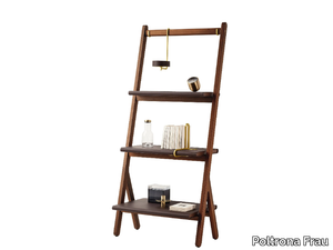
Poltrona Frau > Cabinet
The REN collection by Poltrona Frau has expanded with the addition of a bookcase, magazine rack, and table mirror, each embodying the iconic "ren" symbol that defines the series. Crafted with solid Canaletto walnut and adorned with brass accents, these accessories exude intimate elegance through their light, architectural designs inspired by oriental aesthetics. The magazine rack features Cuoio Saddle Extra leather suspended by brushed steel bars, while the bookcase showcases birch plywood shelves upholstered in leather and supported by slightly inclined uprights, available in both low and tall versions with optional brass-finished steel bookends. The table mirror, with its leather-upholstered frame and brass detailing, completes the collection. A 3D file of the product is available for download, allowing for a closer look at its intricate design. Poltrona Frau, an Italian luxury furniture brand founded in 1912, is renowned for its timeless craftsmanship, premium materials, and global presence, offering a range of high-end furniture and accessories that blend modern sophistication with artisanal tradition.
505 UP SYSTEM - Sectional wooden bookcase with built-in lights _ Molteni & C.
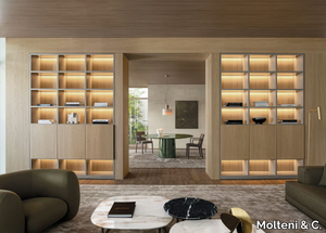
Molteni & C. > Cabinet
The 505 UP is a modern sectional wooden bookcase featuring built-in lighting, designed to meet the evolving needs of contemporary living spaces. This versatile piece combines functionality and style, offering innovative features such as a corner bar, bronzed mirror trays, and Ecoskin-covered shelves, blending aesthetic elegance with cutting-edge design. The 505 UP SYSTEM redefines traditional bookcase functions with its modular Display cabinet, allowing for customizable horizontal and vertical shelving configurations to suit diverse preferences. Crafted by Molteni & C., a prestigious Italian design company founded in 1934 and celebrated for its timeless, high-quality furniture and versatile solutions, the 505 UP is a testament to their commitment to innovation and craftsmanship. A downloadable 3D file of the product is available for further exploration and planning.
PASS-WORD EVOLUTION - Modular sideboard with drawers _ Molteni & C.
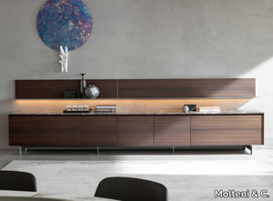
Molteni & C. > Cabinet
PASS-WORD, designed by Dante Bonuccelli, is a versatile living-room system tailored for modern homes, adapting to evolving lifestyles that blend multimedia entertainment, home office setups, and traditional storage needs for books and decor. The system features storage units with rounded edges, wing or tip-up doors, and wood or lacquered drawers, all equipped with flush metal handles for a sleek look. The interiors, available in classic cedarwood or a new melamine Batik finish in slate grey and beige, are designed for functionality and easy maintenance. The collection includes a new vertical open unit to balance open and closed storage spaces, complemented by marble, wood, or lacquered tops and stylish metal feet. A standout feature is the thick top with built-in wiring compartments, perfect for concealing cables while serving as a TV stand, media console, or home office desk. The tops can also integrate a concealed LED lighting system, adjustable via remote control, to create ambient indirect lighting. Additionally, the system offers vertical Stopsol H 120-finish glass storage units with four illuminated glass shelves, ideal for showcasing cherished items, and slim metal shelves that can be suspended at varying heights above the storage units for a dynamic display. For added convenience, a 3D file of the product is available for download, allowing for seamless integration into design plans. Molteni & C., the esteemed Italian supplier behind this collection, has been a leader in high-quality furniture and design solutions since its founding in 1934, offering timeless elegance and innovative craftsmanship for both residential and commercial spaces.
WISH S - Square wall-mounted framed mirror _ Cattelan Italia

Cattelan Italia > Accessories
The WISH S is a sophisticated wall mirror from the elegant Wish collection, featuring a frame available in titanium, black embossed lacquered steel, brushed bronze, or brushed grey finishes, designed to suit diverse interior styles. Equipped with plates for both horizontal and vertical installation, this mirror allows for versatile placement, while its refined design invites you to reflect on your aspirations—only you hold the power to make your wishes come true. The Wish family, including Wish, Wish Magnum, and Wish S, offers a harmonious blend of modern aesthetics, with steel frames adorned in premium finishes, enabling you to create custom compositions of round, square, vertical, or horizontal mirrors. A 3D file of the product is available for download, allowing you to visualize its integration into your space. Crafted by Cattelan Italia, a renowned Italian interior design supplier established in 1979, the WISH S reflects the brand’s commitment to innovative, high-quality, and contemporary furniture and accessories, blending Italian craftsmanship with modern luxury.
SAIGON - Landscape wallpaper _ Wall&decò
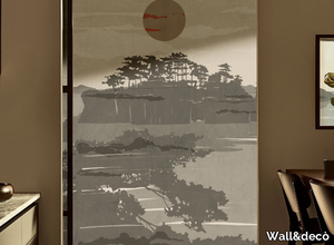
Wall&decò > Wallpaper
Here’s your rephrased and expanded product description, including the supplier details and mention of the 3D file: *"Contemporary Wallpaper 2019 transforms artistic expressions—from photographs and wall paintings to trompe-l'oeils and macro-designs on textured backgrounds—into striking vertical wall patterns, delivering truly unique visual effects. A 3D file of this product is available for download, allowing for seamless visualization and integration into design projects. For further details, explore the collection by Wall&decò, a renowned Italian interior design supplier celebrated for its innovative, high-quality wall coverings since 2005."* (Kept the supplier description concise while highlighting key points.)
KARUSELLI - Leather footstool _ Artek
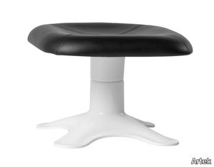
Artek > Pouf
Here’s the rephrased and expanded product description, including a concise supplier overview and mention of the 3D file: *The Karuselli Ottoman, designed by Yrjö Kukkapuro, serves as the perfect companion to the iconic Karuselli Lounge Chair, embodying the designer’s pursuit of ultimate comfort through a harmonious blend of ergonomics, functionality, and organic form. Featuring a plush leather-upholstered top with PU foam padding, it rests atop a sleek white fiberglass pedestal base, complemented by a steel brace, smooth swivel mechanism, and protective felt glides. Celebrating its 50th anniversary in 2014, this modern classic was born from Kukkapuro’s meticulous four-year experimentation, using his own body as a model to achieve its distinctive, human-centric shape. A 3D file of the product is available for download, offering designers and enthusiasts a closer look at its innovative construction. Artek, the Finnish design powerhouse founded in 1935 by Alvar and Aino Aalto, reintroduced this legendary piece, staying true to its legacy of merging timeless aesthetics with cutting-edge craftsmanship.*
BuzziBack - Felt Acoustic wall panel _ BuzziSpace
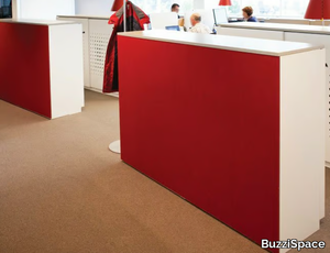
BuzziSpace > Screens
**Product Description:** Enhance the back of your cabinets or walls with the **BuzziBack**, a versatile and stylish acoustical wall panel featuring adhesive or magnetic tape on the back for easy installation. Fully customizable, this sound-absorbing panel is available in various colors and sizes to suit your space, while also doubling as a functional pin board. A downloadable 3D file of the product is available for design planning. **Supplier Description:** BuzziSpace is a Belgium-based design leader known for innovative, sustainable acoustic solutions that enhance modern workspaces and homes.
TOGO - Round fabric pouf _ DOM Edizioni
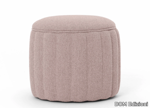
DOM Edizioni > Pouf
Here’s your rephrased and expanded product description, including a concise supplier overview and mention of the 3D file: *The Togo pouf is a versatile and stylish piece, featuring a softly upholstered round design that effortlessly blends functionality with modern elegance. Perfect as a footrest, extra seating, or even a small table when paired with a tray, it adds a touch of sophistication to any space—be it a home, office, or lounge. Available in a curated selection of colors and premium fabrics, each piece is crafted with meticulous attention to detail. For those seeking customization or technical details, a downloadable 3D file of the product is available. Manufactured by DOM Edizioni, a renowned Italian brand celebrated for its luxury furniture and timeless designs, the Togo pouf reflects their commitment to quality and craftsmanship. Explore more at www.domedizioni.com.*
ARCA MINI - Upholstered trestle-based chair _ True Design
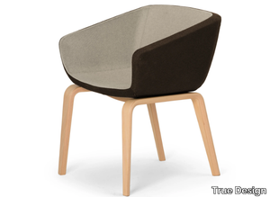
True Design > Chair
**Arca Mini** is a sleek and versatile chair featuring wooden legs and a sturdy steel internal frame, upholstered with durable, hard-injection-molded polyurethane foam and available in a variety of fabric or leather finishes (see color chart). Inspired by Studio Orlandini’s innovative vision, the Arca collection redefines seating for lounges and waiting areas, offering three adaptable declinations—lounge, small, and mini—that can be paired with multiple base styles to suit diverse environments, from quick-service waiting rooms to relaxed meeting spaces or conference settings. The collection’s signature two-tone upholstery and customizable bases allow for endless design possibilities, ensuring both aesthetic harmony and functional flexibility. A downloadable 3D file of the product is available for design planning. **True Design**, the Italian manufacturer behind Arca Mini, is a renowned name in contemporary furniture, crafting high-quality, modern pieces for residential and commercial interiors since 2002. For further details, explore **ARCA MINI by True Design**.
BASALTO BIANCO ACTIVE - Antibacterial porcelain stoneware wall/floor tiles with stone effect _ Fiandre Architectural Surfaces
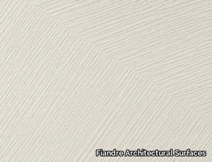
Fiandre Architectural Surfaces > Wall tile-stone-brick
Here’s the rephrased and expanded product description, including a concise supplier overview and mention of the 3D file availability: *"Active Surfaces® combine striking aesthetics with advanced functionality, safeguarding health and well-being in living and workspaces. Leveraging the photocatalytic power of titanium dioxide and silver, these ceramic tiles transform into eco-active materials with antibacterial, antiviral, anti-pollution, anti-odor, and self-cleaning properties. The Pietra di Basalto collection, inspired by the organic textures of sedimentary rocks, blends seamlessly into minimalist or elegant settings, evoking a timeless, natural ambiance. A 3D file of the product is available for download, enabling precise design integration. Supplied by Fiandre Architectural Surfaces—a renowned Italian manufacturer of premium porcelain stoneware—this innovative solution reflects their commitment to cutting-edge, sustainable design. For details on BASALTO BIANCO ACTIVE, visit www.granitifiandre.it."*
FLOWERS - Ecological nonwoven wallpaper _ WallPepper®/Group
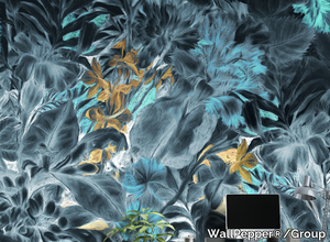
WallPepper®/Group > Wallpaper
Here’s your rephrased and expanded product description, including a concise supplier overview and mention of the 3D file availability: **"The Ambiente collection by WallPepper®/Group features stunning wallpapers that celebrate the beauty of nature, showcasing enchanting landscapes, seasonal wonders, and exotic flora through vibrant graphics and captivating colors. Crafted from eco-friendly materials, the WP/Smooth TNT non-woven wallpaper combines agave and cellulose for a soft-touch, breathable, and washable surface, perfect for elegant indoor spaces. The collection also includes specialized options like WP/Suede (recycled PET, stain-resistant), WP/Acoustic (sound-absorbing), WP/H2O (humidity-resistant), WP/Strong (durable), and WP/Off (for exterior use), all available with a premium CE-certified WALLSILK®ANTIBACTERIAL finish. As a pioneer in innovative wall coverings, WallPepper®/Group—a globally recognized Italian leader in high-end, customizable interiors—delivers PVC-free, fire-resistant, and sustainably crafted designs. A downloadable 3D file of the product is available for visualization. Explore the FLOWERS collection and more for versatile, artistic solutions tailored to any space."** *(Note: I condensed the supplier details to one sentence while preserving key branding and market positioning.)*
RIACE RI 110 - Indoor glass wall/floor tiles _ Vetrocolor

Vetrocolor > Wall tile-stone-brick
**Preziosi and Riace** are exquisite indoor glass wall and floor tiles, available in a variety of stunning color options. These unique tiles feature metallic finishes that create captivating glows and reflections, adding an emotional and luxurious touch to any space. The carefully crafted glass thickness enhances the brilliance of gold, silver, and copper accents, making them perfect for elegant glass floors, wall claddings, slabs, basins, and heaters. Part of the **PREZIOSI, HI-TECH, APOLLO, and RIACE** collections, these tiles deliver a sophisticated and timeless aesthetic for any design project. A 3D file of the product is also available for download, allowing for seamless integration into your planning process. For more details, refer to **RIACE RI 110 Vetrocolor**. **Vetrocolor**, a renowned Italian supplier specializing in high-quality glass mosaic and glass tiles, offers a diverse range of elegant and durable solutions for interior design projects worldwide. Explore their collections at [https://vetrocolor.it/](https://vetrocolor.it/).
SELFY - Marble coffee table for living room _ CTS SALOTTI
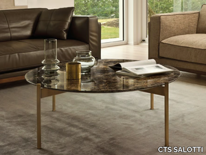
CTS SALOTTI > Coffee table
Here’s your rephrased and expanded product description, including a concise supplier overview and a note about the 3D file: *"The Selfy side tables embody refined elegance through a harmonious blend of premium materials, featuring a metal base available in two sophisticated finishes—painted dark bronze anodized or gold satin—paired with an upper top crafted from luxurious options like Calacatta marble, Emperador marble, Portoro marble, Sahara noir marble, or painted Ash veneer. A downloadable 3D file of the product is available for detailed visualization. Supplied by CTS SALOTTI, a renowned Italian furniture manufacturer with over 30 years of expertise in high-end residential and commercial design, the tables reflect their commitment to quality and timeless aesthetics."* (Note: I condensed the supplier details to one sentence while retaining key credibility points—origin, experience, and specialty.)
TULIP - Metal console table _ Adriani e Rossi edizioni
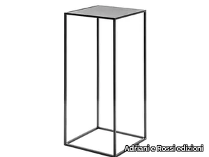
Adriani e Rossi edizioni > Console
Here’s the rephrased and expanded product description, including a concise supplier overview and mention of the 3D file: *The Tulip is a sleek, minimalist metallic console with a 10 mm thickness, featuring a discreet, no-visible-fixing design for a seamless aesthetic. It is finished with a durable epoxy powder coating in a rich anthracite (manganese) tone and is available in multiple sizes to suit diverse spaces. A downloadable 3D file of the product is available for visualization and planning. For further details, contact the manufacturer, Adriani e Rossi edizioni—a renowned Italian interior design supplier celebrated for its fusion of traditional craftsmanship and contemporary elegance.*


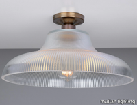
MONO INDUSTRIAL 40CM RAILWAY FLUSH - LED brass ceiling lamp _ mullan lighting

mullan lighting > Ceiling lamp
Vitality
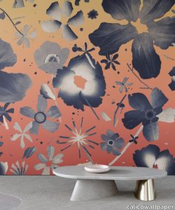
calicowallpaper > Wallpaper
– Panel pricing– Non-repeating mural– Class A fire-rating– Four-week lead time– International shipping
Dada
calicowallpaper > Wallpaper
– Panel pricing– Non-repeating mural– Class A fire-rating– Four-week lead time– International shipping
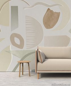
Cream Modern Wool Rug

abchome > Carpet
This Moroccan Style Berber Rug features a solid cream tone serving as a modern retelling of traditional Moroccan rugs. The Tarzi Rug Collection features Moroccan Berber-style rugs hand-knotted from durable wool that is hand-dyed from natural pigments. Originating from tribal designs in Morocco's Atlas Mountains, this one-of-a-kind rug reimagines large and oversized Moroccan rugs in modern sizes. A beautiful display of art and culture for the contemporary home.
Relief 4 star updown
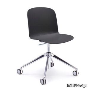
infinitidesign > Chair
Relief is a polypropylene monocoque chair collection, characterized by soft and comfortable lines. The shell has two high reliefs in different finishes, that recall virtual cushions on the seat and on the backrest, emphasizing the minimal but not trivial form. From this technical detail derives the name Relief. The chair has a polypropylene shell, which is assembled on different bases.Three versions are available: plastic, with upholstered seat or fully upholstered. The ergonomics of the shell make Relief perfect as a work, meeting or conference chair.
Sicla 4 legs
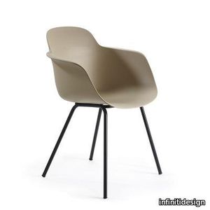
infinitidesign > Chair
Formal neatness, several basis available and great lightness: this is Sicla, a chair made of a lightweight and comfortable monocoque. A rib inserted on the back of the chair provides extreme stability to the backrest. The seat can be entirely upholstered or only provided with a seat panel. The colours of the polypropylene shell create a subtle play of light and shadow with the rib and armrests, showing all its stability in its lightness.
Products From the Same Collection
A wide range of product from furniture to finishes to meet the desire of all designers.
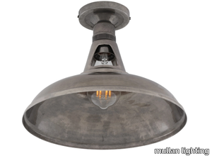
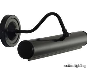
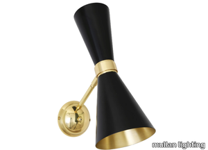
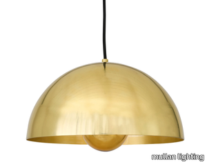
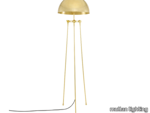
MONO INDUSTRIAL RAILWAY FLUSH FITTING - LED handmade ceiling lamp _ mullan lighting
mullan lighting > Ceiling lamp
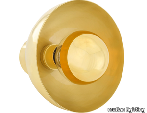
MONO INDUSTRIAL 40CM RAILWAY FLUSH - LED brass ceiling lamp _ mullan lighting
mullan lighting > Ceiling lamp
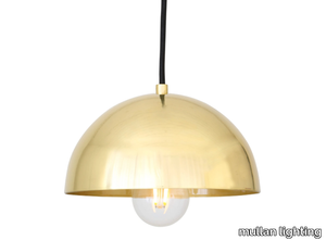
MONO INDUSTRIAL 30CM RAILWAY PENDANT - Handmade pendant lamp _ mullan lighting
mullan lighting > Ceiling lamp
MONO VINTAGE RAILWAY PENDANT LIGHT 40CM - Handmade pendant lamp _ mullan lighting

mullan lighting > Ceiling lamp
Recommended Products
A wide range of product from furniture to finishes to meet the desire of all designers.
Top Pendant Lamp
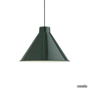
muuto > Ceiling lamp
With its universal and simple design, Top Pendant is a contemporary reinterpretation of the archetypical cone-shaped pendant. Its top is a striking feature designed to neatly fit its compact LED light source. Manufactured in spun steel with a graphic rolled hem, it is a versatile lighting family that offers an array of opportunities in color, size and function.
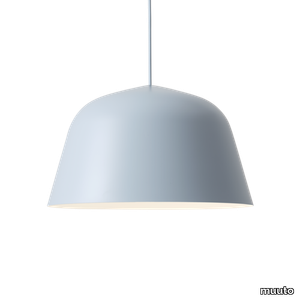
Ambit Rail Lamp
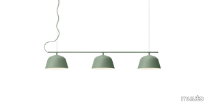
muuto > Ceiling lamp
The Ambit Rail Lamp is characterized by its simple lines and elegant shapes, bringing a refined light to any space. With its shades being made of handspun aluminum, the Ambit Rail Lamp features white interiors that provide a contrast to its outside shade while enhancing the light emitted into the room of any home, office or hospitality space.
Ambit Pendant Lamp
muuto > Ceiling lamp
Embodying the values of Scandinavian design, the Ambit Pendant Lamp is as timeless as it is contemporary. Made of hand-spun aluminum that has been hand-painted, the Ambit Pendant Lamp features clean lines and a white interior that heighten contrasts of its outside shade while enhancing the light emitted in any room of a home, office or commercial space. Use the design on its own or symmetric formations and vibrant clusters.
Fluid Pendant Lamp
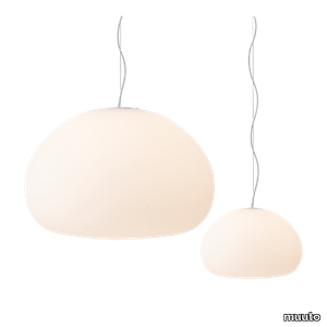
muuto > Ceiling lamp
Inspired by a resting drop of water, the Fluid Pendant Lamp shows how soft light can diffuse across a space for a cosy atmosphere. The frosted matte surface creates a glowing ambience that fits into any home or casual business setting. Present the design individually or in a group for an intimate atmosphere.
Khan metal
kartell > Ceiling lamp
Many different styles, from 18th century eclecticism to contemporary minimalism, come together in Philippe Starck’s KHAN chandelier to create a new icon of elegance and modernity. The symbolism of the design is complemented by the technological innovation of Kartell’s new polycarbonate 2.0 in the colours black, champagne and clear.
Small fl/y transparent
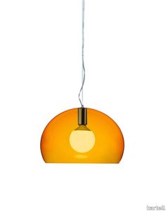
kartell > Ceiling lamp
FL/Y is an essentially-styled suspension lamp. The particular transparency of the material and the sheen of the colours recreate the idea of a soap bubble, shimmering iridiscently in the light. The shade is not perfectly hemispherical, with the cut-off falling just below the level of the diameter, offering greater concentration of the light. The lamp is available in three different sizes: Fl/Y (diameter 52cm, shade depth 33cm), Small Fl/Y (diameter 38cm, shade depth 28cm) and Big Fl/Y (diameter 83cm, shade depth 55cm).
Ge' metal
kartell > Ceiling lamp
Gè is a suspension lamp attached to the ceiling with a decorated rosette suggestive of antique Venetian chandeliers. It comes with a 37 cm diameter pleated lampshade. The cable can be adjusted in height from 45 to 230 cm.
Bloom hanging medium metal
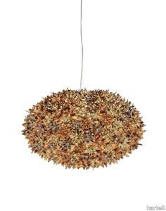
kartell > Ceiling lamp
Bloom is a tubular polycarbonate framework entirely covered by a structure of tiny transparent polycarbonate double corolla flowers. The result is an industrially produced lamp but with all the forms and stylistic complexity of a unique handcrafted piece.
Bloom hanging big
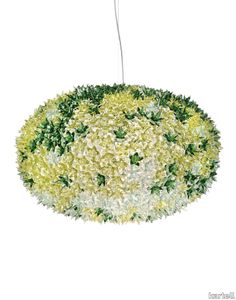
kartell > Ceiling lamp
Bloom is a tubular polycarbonate framework entirely covered by a structure of tiny transparent polycarbonate double corolla flowers. The result is an industrially produced lamp but with all the forms and stylistic complexity of a unique handcrafted piece.
Mist AP16
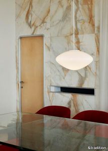
&tradition > Ceiling lamp
Mist is inspired by the warm, diffused light of morning rays shining through the haze, offering a modern take on the classic globe light silhouette. Crafted from mouth-blown opal glass with white coated aluminium details and a textile cord, the Mist pendant lamp is available in two sizes.
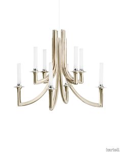
Taraxacum 88 Suspension 1
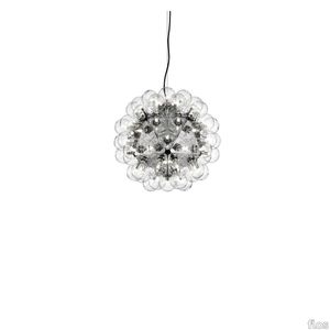
flos > Ceiling lamp
Suspension lamp providing direct and reflected lighting. Structure formed by 20 pressed, polished aluminum triangles. 60 clear Globolux lamps housed around the structure. Steel ceiling fitting and rose.
UPHOLSTERY
A wide range of Upholstery and materials provided by our suppliers to satisfy your needs.
auckland - 7071.18

Upholstery > vescom
auckland - 7071.28

Upholstery > vescom
harding - 7070.07

Upholstery > vescom
harding - 7070.08

Upholstery > vescom
furka plus - 7064.14

Upholstery > vescom
acton - 7062.20

Upholstery > vescom
leone plus - 7054.02

Upholstery > vescom
noss - 7058.13

Upholstery > vescom
lani - 7060.49

Upholstery > vescom
wolin - 7050.32

Upholstery > vescom
wolin - 7050.35

Upholstery > vescom
hestan - 7035.11

Upholstery > vescom
hestan - 7035.22

Upholstery > vescom
cyprus - 7038.15

Upholstery > vescom
lindau - 7028.01

Upholstery > vescom
lindau - 7028.09
Upholstery > vescom
dalma - 7024.13

Upholstery > vescom
dalma - 7024.14

Upholstery > vescom