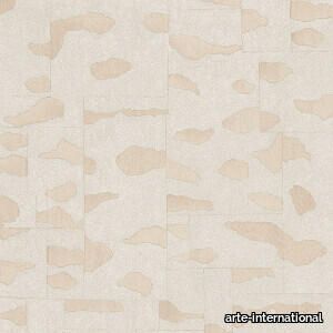
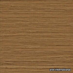
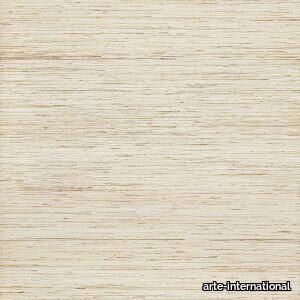
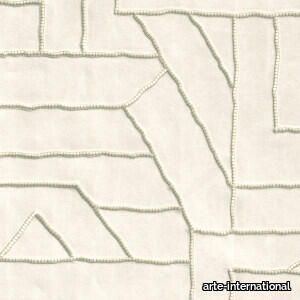
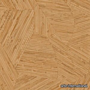
Puro - 2d files - 3d files


PRODUCT DESCRIPTION
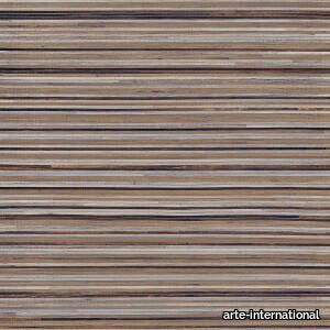
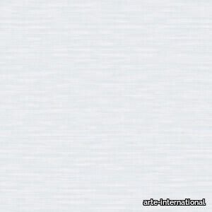
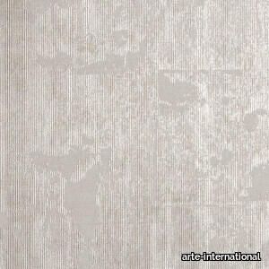
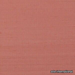
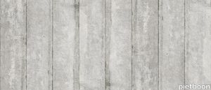
The monocoloured Puro has a slightly glossy finish. The woven grass structure with light colour nuances brings the tropics to mind. The somewhat rougher base lends this plain a natural touch.
SUPPLIER: ARTE-INTERNATIONAL
TYPE: FINISHES
LIST OF FILES:
Spec sheet - 27000A
Care & maintenance - 27000A
Fire certificate EU - 3.-Vinyl-wallcovering.pdf
Fire certificate US - US---Fire-Certificate---T3.pdf
Hanging instructions - Hanging-instructions-vinyl-wallcovering-on-non-woven.pdf
Declaration of Performance EU - DOP_Textura_EU.pdf
Declaration of Performance UK - DOP_Textura_UK.pdf
and more ...
OTHER SUPPLIERS
A wide range of product from near to 3,000 suppliers around the world.


Other Products From This Supplier
A wide range of product from furniture to finishes to meet the desire of all designers.


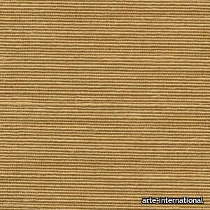
Agave
arte-international > Wallcovering
With craftsmanship, sisal fibres have been shaped into sturdy textile yarns. The cultivation of the Agave Sisalana plant, from which these fibres originate, primarily takes place in the Northeastern region of Brazil.
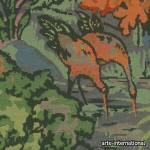
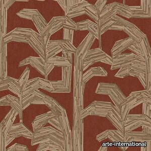
Riverbank
arte-international > Wallcovering
Inspired by classic tapestries, this woven jacquard wallcovering depicts a lush riverbank with a Japanese crane peeking out of the vegetation. This unique species symbolises good luck and longevity in Japan. The drawing is intentionally pixelated in a nod to the country's mid-century optimism.
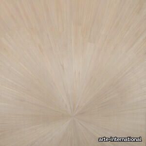
Sunburst
arte-international > Wallcovering
An evocative panoramic wallcovering depicting a rising, radiant sun in the sky using a very fine layer of wood veneer.
Alentejo Cork
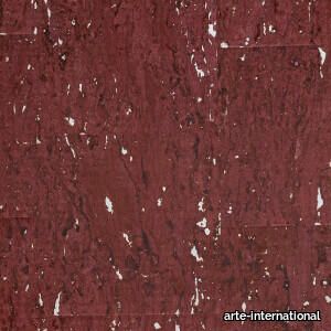
arte-international > Wallcovering
The cork in this design is very refined, with lots of detail and a glossy lacquer topcoat for a touch of glamour. The wallcovering takes its name from Alentejo, a region in Portugal renowned for its cork forests.
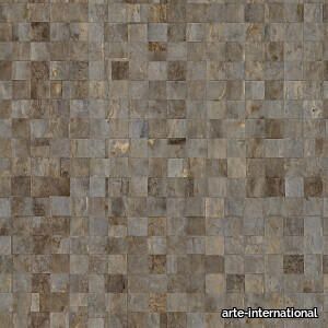
Canyon
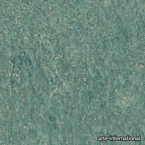
arte-international > Wallcovering
This plain wallcovering is an abstract representation of a canyon – a narrow, deep valley cut by a river through rock. The various colours and glossy layers, combined with the rough outline, evoke the different types of rocks in a canyon.
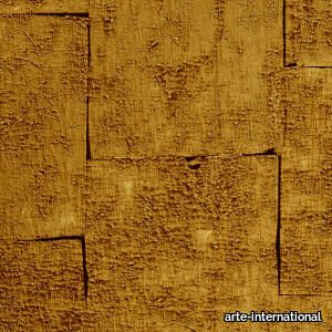
Glowing Patina
arte-international > Wallcovering
This elegant wallcovering has a warm, opulent sheen of gold and silver, combined with a weathered look. It exudes a sense of history, making it the perfect choice for anyone looking to add vintage charm and sophistication to their interior.
Gilded Heritage
arte-international > Wallcovering
This dazzling design in metallic colours, inspired by gold leaf, references the shiny materials that were all the rage in post-war Japan, as well as a heritage with a rich, intriguing history.
Papillon
arte-international > Wallcovering
This 100% Dupion silk is sourced from mulberry silkworms. The elegant fabric, with its lovely subtle sheen, is woven on high-tech looms, with the sophistication and weave setting this pure Dupion quality apart from other silks.
La Perle
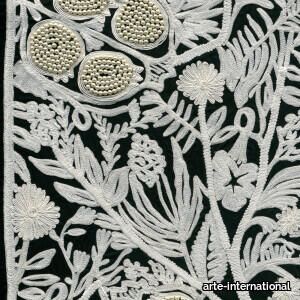
arte-international > Wallcovering
Delicate embroidery with a classic floral design. The black and white version has been finished with elegant pearls. Like in haute couture, pearls add a touch of sophistication.
Majesto
arte-international > Wallcovering
A stunning jacquard design, incorporating a sleek damier pattern in the weave of the fabric, with the loose threads creating a spectacular effect on the wall.
Franges
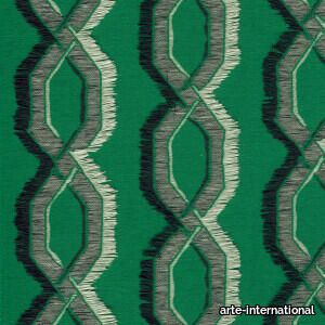
arte-international > Wallcovering
A stunning jacquard design, incorporating a whimsical zigzag pattern in the weave of the fabric, with the loose threads creating a spectacular effect on the wall.
La Dérive
arte-international > Wallcovering
Lose yourself in the magic of this enthralling design. In French, dérive is synonymous with a spontaneous journey, where the traveller leaves their ordinary life behind for some time, choosing instead to let the landscape and architecture be their guide – in the same way that you may be inspired by this embroidered wallcovering.
Kona
arte-international > Wallcovering
This cheerful design was inspired by the upbeat, relaxed atmosphere of Kona, the sunny district on Hawaii’s west coast. The playful, loose shapes were embroidered with raffia on linen before being transposed to the wall.
Puna
arte-international > Wallcovering
This refreshing semi-plain is an interpretation of hand-woven banana leaves. It was named after the more remote Hawaiian district of Puna, which is dotted with banana trees.
Maui
arte-international > Wallcovering
The island of Maui is a dream destination, with its lush waterfalls, rocky shores, sandy beaches and many palm trees inspiring this design, in which elegant palm leaves are embroidered on stylish linen using raffia. Our Maui wallpaper is a very realistic representation of this hand-crafted design.
Mauna
arte-international > Wallcovering
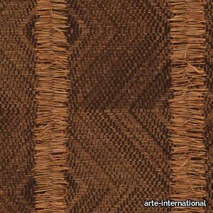
Small pieces of rattan were carefully inlaid by hand into a playful, seemingly random pattern, after which a machine-made version of this artisanal artwork was produced. The alternation of straight and curved lines lends this design a natural look. Mauna is named after Mauna Kea, the highest mountain in Hawaii and a dormant volcano.
Kailua
arte-international > Wallcovering
This design takes its name and inspiration from enchanting Kailua on the east side of Oahu, where palm trees reign supreme. For this wallpaper, swaying palms were inlaid using small pieces of rattan against a background of bark cloth, a fibrous cloth made from the bark of fig trees. This beautiful, realistic interpretation comes to life when transposed to the wall.
Shibumi
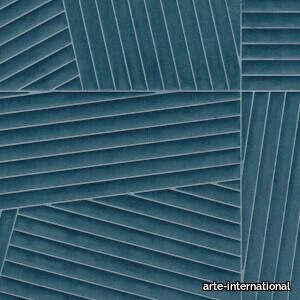
arte-international > Wallcovering
Inspired by the sophisticated Japanese concept of simplicity and complexity, Shibumi offers a visual experience that is never boring. In this unique wallcovering, the diagonal strips change direction to create an intriguing visual dynamic. This 3D wallcovering, finished with soft velvet fabric, enchants both the eye and the fingertips.
Recently Viewed Products
A wide range of product from furniture to finishes to meet the desire of all designers.
Miniatures Art. 41 "Paimio"
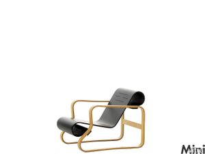
vitra > Styling
In his designs, Alvar Aalto combines the functional ideas of the Bauhaus with the Scandinavian crafts tradition and a strong sense of unity with Nature. This led to an exchange of ideas with Marcel Breuer and later influenced the work of both men. <br/><br/>Aalto designed Armchair No. 41 for the Sanatorium of the City of Paimio in Finland, a building for which he also created the plans and interior design. The armchair is of a simple, highly effective construction, because the rolled-up ends of the seat and back also function as springs – affording the sitter a degree of comfort hitherto unknown in wooden furniture. The armchair was also exceptionally well suited for series production, as it involves very few components and thus little assembly work.
Kendo Lap
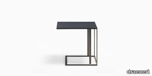
draenert > Coffee table
Kendo impresses with its elegant and almost graphic appearance. Distinctively shaped side table of slim rectangular profiles in 2 finishes combined with different wood finishes are the basis of this versatile series. The plate is available in dark oak stained and dark gray stained and a base of steel in black or dark bronze laminated.
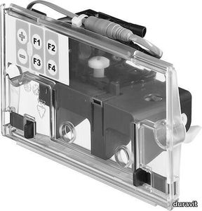
Universal Shower tray foot

duravit > Accessories
Suitable for series Stonetto, Tempano, Height: 100-150 mm
CURTAIN
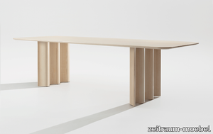
zeitraum-moebel > Table
The CURTAIN table resembles a fleeting snapshot of a moment in time: static in contrast to an organically flowing movement. Seemingly gravity-defiant drapery, thin-walled, supple and soft, yet precision-crafted from solid high-end wood that simultaneously supports a large-sized solid wood table top – inspiring a breathtaking moment.


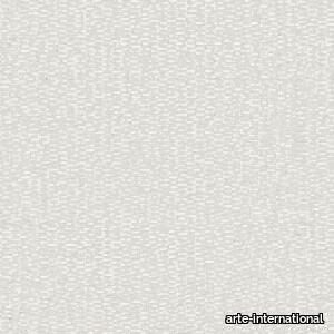
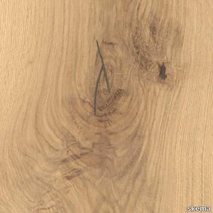
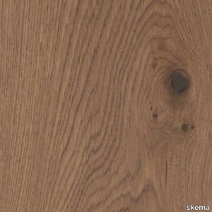
Puro
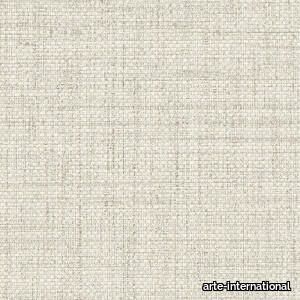
arte-international > Wallcovering
The monocoloured Puro has a slightly glossy finish. The woven grass structure with light colour nuances brings the tropics to mind. The somewhat rougher base lends this plain a natural touch.

Taipei Media Bookcase
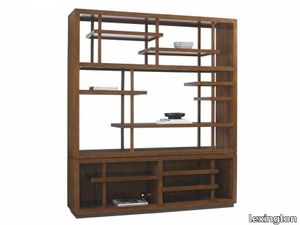
lexington > Cabinet
Configurable asymmetrical horizontal and vertical partitions make a grand statement without compromising function. The Pan-Asian styling consists of two main sections. The upper section consists of six stationary shelves and two removable shelves and posts. The lower section has three stationary shelves and grommets for electrical cords. A TV compartment can be created measuring 57.25 inches wide and 37.87 inches high.
Newport Natural 23"X23"

porcelanosa > Floor tile-stone
Matt-gloss beige concrete effect porcelain floor tiles. size 23 x 23 in, suitable for indoor wall or floor and outdoor walls.
I Filati Goldfinger Rugiada
florim > Carpet
From the art of fabric, to enveloping spaces From lampas and jacquard, all the way to the simplest silk fabrics, from rich, baroque motifs to more optical, geometric patterns, all of these fabrics share an extremely natural look. The collection's nine surfaces are inspired by Rubelli's signature precious fabrics that, in turn, are born from the contemporary reworking of several decorative motifs coming from the noble Venetian heritage of weaving.<br />
Cromatica Cobalto
florim > Wall Paint
A lexicon of colour shades for mixing. A large size and its submultiples. «This work represents a reflection on colour, and above all a proposal on how to transfer the multiplicity of shades typical of a hand-crafted piece into a project produced on a large scale.» Andrea Trimarchi & Simone Farresin Studio Formafantasma base their work in the design world on a strong vocation for research. Simone Farresin and Andrea Trimarchi view every project as an opportunity for study and the acquisition of new knowledge, and their love of speculation establishes a dialectic rapport with the situations offered by each new client. Whether it involves a material, a type or a production method, the first phase of their design process is the mapping of what the specific case places at their disposal. With Cedit, an analysis of the company's past and present was central to the inputs. Inevitably, since "Looking back to look forward" has been the design duo's mission statement for years. In this case, in particular, the company's history was a real treasure trove, a fine blend of memory and technology: on the one hand, the excellence of production technologies now extended with the added potential arising from the engineering of large-sized ceramic tiles, and on the other a wealth of experience build up with great designers of the past, from Zanuso to Noorda, through to <strong>Ettore Sottsass</strong>. Andrea and Simone decided to focus on Sottsass - who started designing for Cedit back in the late Seventies - and made an in-depth study of one of the colour charts he developed towards the end of the Nineties. A spread of colours which gave its name to the "41 Colors" collection, included in the catalogue of the period as a real alphabet for what has proved to be a lasting design language. Colour was much more than just a compulsory step in the dialogue between designer and producer, since Sottsass had already discovered the power of the mystery intrinsic to this universe of invention.<br /><br />With Cedit the master-designer, a long-established lover of ceramics and their crafted unpredictability, found a way of transferring his personal feeling for colour to a wide audience, through industrial mass production. And this assumption is another factor Formafantasma have inherited, interpreting it today with new, even more efficient technical resources just as capable of expressing the secrets of colour. «The concept of colour "in isolation" - Sottsass explained in a 1992 text - classified colour, Pantone, as they call it now, "scientific" colour, is something I still refuse to accept. (...) Colours, the idea of colour, are always intangible, they slip slowly away like words, that run through your fingers, like poetry, which you can never keep hold of, like a good story.» And Formafantasma seem to have chosen that distinction between colour "in isolation" and "intangible" yet ever-present colour as the basis of their work. However, their approach draws on their unique vocation for research and the technical resources of the third millennium. «This work - they explain to us - is a reflection on colour, and above all on <strong>how to bring the multiplicity of shades typical of a hand-crafted piece into a large-scale project</strong>.» The designers look at large, monochrome slabs and turn to the engineers for details of their secrets, their processing stages, the phases in their production. They appreciate that the colour of ceramic material, its ineffable secret, can still be present in the series and large tile sizes in which Cedit leads the way. They understand that this is, in itself, an expressive power which does not need channelling into forms, motifs and signs. But above all, they treat the surface as a large canvas on which they spread pure colour, which tends to be uniform but in fact is never really a "scientific", totally monochrome hue: it is not a Pantone. And this is the source of the fundamental insight, which only children of the transition from the analogue to the digital era could achieve, the reward for those who draw on the past to look to the future.<br /><br />The designers cut the slab into lots of regular pieces, not necessarily of the same size. They restore its identity as a "tile", a familiar name with something ancient about it, but which stands for a module, a unit of measurement, a building block. There is nothing nostalgic about this - on the contrary, the vision is completely new, and the portions of slab created can be reassembled with no restrictions, breaking down the unity of the whole and reviving its essence starting from its structure. As the cards in the pack are shuffled, what emerges is not a figure or motif but the representation of colour itself and its physical nature. It is live matter, born from the meeting of vibrating forces, the mixing of ever-varying percentages of the basic ingredients. And Formafantasma present us with the corpuscular, fragmented essence of these small frames of space and crystallised time, which reveal the code and formula of their composition. So Cromatica is a collection made up of six colours which actually have an infinite number of declinations and compositional possibilities. It is a "discrete" combination in the mathematical sense of the term, capable of generating multiple, variable subsets. At the same time, each slab can be used in its entirety, leaving the impression of analogue continuity unchanged. But what really amazes is the comparison and dialogue between the two approaches: a stroke of genius, laying clear the mysterious appeal the artificial reproduction of colour has always held for mankind. Because, as Sottsass said, «colours are language, a powerful, magical, intangible, flexible, continuous material, in which existence is made manifest, the existence that lives in time and space».
Cromatica Verde
florim > Wall Paint
A lexicon of colour shades for mixing. A large size and its submultiples. «This work represents a reflection on colour, and above all a proposal on how to transfer the multiplicity of shades typical of a hand-crafted piece into a project produced on a large scale.» Andrea Trimarchi & Simone Farresin Studio Formafantasma base their work in the design world on a strong vocation for research. Simone Farresin and Andrea Trimarchi view every project as an opportunity for study and the acquisition of new knowledge, and their love of speculation establishes a dialectic rapport with the situations offered by each new client. Whether it involves a material, a type or a production method, the first phase of their design process is the mapping of what the specific case places at their disposal. With Cedit, an analysis of the company's past and present was central to the inputs. Inevitably, since "Looking back to look forward" has been the design duo's mission statement for years. In this case, in particular, the company's history was a real treasure trove, a fine blend of memory and technology: on the one hand, the excellence of production technologies now extended with the added potential arising from the engineering of large-sized ceramic tiles, and on the other a wealth of experience build up with great designers of the past, from Zanuso to Noorda, through to <strong>Ettore Sottsass</strong>. Andrea and Simone decided to focus on Sottsass - who started designing for Cedit back in the late Seventies - and made an in-depth study of one of the colour charts he developed towards the end of the Nineties. A spread of colours which gave its name to the "41 Colors" collection, included in the catalogue of the period as a real alphabet for what has proved to be a lasting design language. Colour was much more than just a compulsory step in the dialogue between designer and producer, since Sottsass had already discovered the power of the mystery intrinsic to this universe of invention.<br /><br />With Cedit the master-designer, a long-established lover of ceramics and their crafted unpredictability, found a way of transferring his personal feeling for colour to a wide audience, through industrial mass production. And this assumption is another factor Formafantasma have inherited, interpreting it today with new, even more efficient technical resources just as capable of expressing the secrets of colour. «The concept of colour "in isolation" - Sottsass explained in a 1992 text - classified colour, Pantone, as they call it now, "scientific" colour, is something I still refuse to accept. (...) Colours, the idea of colour, are always intangible, they slip slowly away like words, that run through your fingers, like poetry, which you can never keep hold of, like a good story.» And Formafantasma seem to have chosen that distinction between colour "in isolation" and "intangible" yet ever-present colour as the basis of their work. However, their approach draws on their unique vocation for research and the technical resources of the third millennium. «This work - they explain to us - is a reflection on colour, and above all on <strong>how to bring the multiplicity of shades typical of a hand-crafted piece into a large-scale project</strong>.» The designers look at large, monochrome slabs and turn to the engineers for details of their secrets, their processing stages, the phases in their production. They appreciate that the colour of ceramic material, its ineffable secret, can still be present in the series and large tile sizes in which Cedit leads the way. They understand that this is, in itself, an expressive power which does not need channelling into forms, motifs and signs. But above all, they treat the surface as a large canvas on which they spread pure colour, which tends to be uniform but in fact is never really a "scientific", totally monochrome hue: it is not a Pantone. And this is the source of the fundamental insight, which only children of the transition from the analogue to the digital era could achieve, the reward for those who draw on the past to look to the future.<br /><br />The designers cut the slab into lots of regular pieces, not necessarily of the same size. They restore its identity as a "tile", a familiar name with something ancient about it, but which stands for a module, a unit of measurement, a building block. There is nothing nostalgic about this - on the contrary, the vision is completely new, and the portions of slab created can be reassembled with no restrictions, breaking down the unity of the whole and reviving its essence starting from its structure. As the cards in the pack are shuffled, what emerges is not a figure or motif but the representation of colour itself and its physical nature. It is live matter, born from the meeting of vibrating forces, the mixing of ever-varying percentages of the basic ingredients. And Formafantasma present us with the corpuscular, fragmented essence of these small frames of space and crystallised time, which reveal the code and formula of their composition. So Cromatica is a collection made up of six colours which actually have an infinite number of declinations and compositional possibilities. It is a "discrete" combination in the mathematical sense of the term, capable of generating multiple, variable subsets. At the same time, each slab can be used in its entirety, leaving the impression of analogue continuity unchanged. But what really amazes is the comparison and dialogue between the two approaches: a stroke of genius, laying clear the mysterious appeal the artificial reproduction of colour has always held for mankind. Because, as Sottsass said, «colours are language, a powerful, magical, intangible, flexible, continuous material, in which existence is made manifest, the existence that lives in time and space».
REN - Solid wood bookcase _ Poltrona Frau
Poltrona Frau > Cabinet
The REN collection by Poltrona Frau has expanded with the addition of a bookcase, magazine rack, and table mirror, each embodying the iconic "ren" symbol that defines the series. Crafted with solid Canaletto walnut and adorned with brass accents, these accessories exude intimate elegance through their light, architectural designs inspired by oriental aesthetics. The magazine rack features Cuoio Saddle Extra leather suspended by brushed steel bars, while the bookcase showcases birch plywood shelves upholstered in leather and supported by slightly inclined uprights, available in both low and tall versions with optional brass-finished steel bookends. The table mirror, with its leather-upholstered frame and brass detailing, completes the collection. A 3D file of the product is available for download, allowing for a closer look at its intricate design. Poltrona Frau, an Italian luxury furniture brand founded in 1912, is renowned for its timeless craftsmanship, premium materials, and global presence, offering a range of high-end furniture and accessories that blend modern sophistication with artisanal tradition.
505 UP SYSTEM - Sectional wooden bookcase with built-in lights _ Molteni & C.
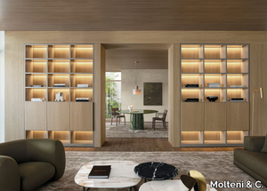
Molteni & C. > Cabinet
The 505 UP is a modern sectional wooden bookcase featuring built-in lighting, designed to meet the evolving needs of contemporary living spaces. This versatile piece combines functionality and style, offering innovative features such as a corner bar, bronzed mirror trays, and Ecoskin-covered shelves, blending aesthetic elegance with cutting-edge design. The 505 UP SYSTEM redefines traditional bookcase functions with its modular Display cabinet, allowing for customizable horizontal and vertical shelving configurations to suit diverse preferences. Crafted by Molteni & C., a prestigious Italian design company founded in 1934 and celebrated for its timeless, high-quality furniture and versatile solutions, the 505 UP is a testament to their commitment to innovation and craftsmanship. A downloadable 3D file of the product is available for further exploration and planning.
MCO5 CASSETTA - Ash jewel box _ Mattiazzi

Mattiazzi > Accessories
The Cassetta MCO5 is a beautifully crafted jewel box with an ash wood frame, available in four elegant finishes: natural, walnut stain, natural with a red top, and natural with a green top. Designed for both practicality and aesthetic appeal, this box draws inspiration from everyday shapes, making it instantly recognizable and versatile enough to be left on a table like a book, blending seamlessly into any space. Its design reflects simplicity and honesty, deriving its beauty from its surroundings, much like the ethos of Mattiazzi, the renowned Italian furniture manufacturer behind it. Founded in 1979 and headquartered in Udine, Italy, Mattiazzi is celebrated for its innovative, high-quality wooden furniture that combines modern, minimalist designs with exceptional craftsmanship. For those interested in customization or further exploration, a downloadable 3D file of the Cassetta MCO5 is available, allowing for a closer look at its intricate details and design.
SAIGON - Landscape wallpaper _ Wall&decò
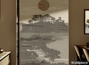
Wall&decò > Wallpaper
Here’s your rephrased and expanded product description, including the supplier details and mention of the 3D file: *"Contemporary Wallpaper 2019 transforms artistic expressions—from photographs and wall paintings to trompe-l'oeils and macro-designs on textured backgrounds—into striking vertical wall patterns, delivering truly unique visual effects. A 3D file of this product is available for download, allowing for seamless visualization and integration into design projects. For further details, explore the collection by Wall&decò, a renowned Italian interior design supplier celebrated for its innovative, high-quality wall coverings since 2005."* (Kept the supplier description concise while highlighting key points.)
KARUSELLI - Leather footstool _ Artek
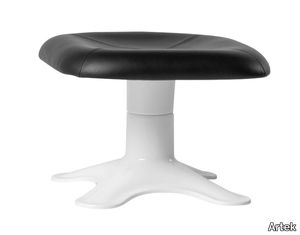
Artek > Pouf
Here’s the rephrased and expanded product description, including a concise supplier overview and mention of the 3D file: *The Karuselli Ottoman, designed by Yrjö Kukkapuro, serves as the perfect companion to the iconic Karuselli Lounge Chair, embodying the designer’s pursuit of ultimate comfort through a harmonious blend of ergonomics, functionality, and organic form. Featuring a plush leather-upholstered top with PU foam padding, it rests atop a sleek white fiberglass pedestal base, complemented by a steel brace, smooth swivel mechanism, and protective felt glides. Celebrating its 50th anniversary in 2014, this modern classic was born from Kukkapuro’s meticulous four-year experimentation, using his own body as a model to achieve its distinctive, human-centric shape. A 3D file of the product is available for download, offering designers and enthusiasts a closer look at its innovative construction. Artek, the Finnish design powerhouse founded in 1935 by Alvar and Aino Aalto, reintroduced this legendary piece, staying true to its legacy of merging timeless aesthetics with cutting-edge craftsmanship.*
PLAN - Wall-mounted Corian® washbasin _ Rexa

Rexa > Washbasin
**Product Description:** *Plan*, a sleek Corian® basin, features a minimalist design with slim, refined edges and seamless construction for a joint-free appearance. Available in multiple configurations, it includes a practical organizer with dedicated compartments to keep essentials neatly arranged. The two-basin version incorporates a central Corian® tray, which can be upgraded with an integrated dispenser for added functionality. Part of the *Unico Collection*, this basin is part of a fully customizable Corian® system that extends to vanity units and other bathroom furnishings, showcasing expert craftsmanship and seamless material integration. A downloadable 3D file of the product is available for design planning. For more details, visit the manufacturer’s page on *PLAN by Rexa*. **Supplier Description:** *Rexa*, an Italian design leader since 2009, specializes in innovative, sustainable bathroom solutions, blending functionality with modern and timeless aesthetics.
MUSA - Upholstered leather armchair with armrests _ Maxalto
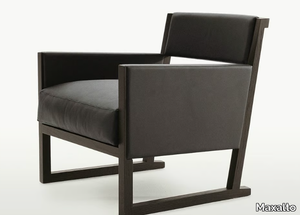
Maxalto > Armchair
The **Musa armchairs** are available in two elegant designs: the **lower and deeper SM65P version** and the **higher, less deep SM65T version**, both crafted with a solid wood frame and offered in brushed light or black oak, as well as grey or brown oak finishes. This versatile collection also includes a **classic chair, a petite armchair, and a tall stool**, making it ideal for modern kitchens or stylish dining spaces. For added convenience, the **3D file of the product is available for download**, allowing for seamless integration into design projects. **Maxalto**, the esteemed Italian supplier behind these pieces, is celebrated for its high-end, contemporary furniture and meticulous craftsmanship since its founding in 1975.
TOGO - Round fabric pouf _ DOM Edizioni
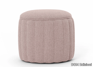
DOM Edizioni > Pouf
Here’s your rephrased and expanded product description, including a concise supplier overview and mention of the 3D file: *The Togo pouf is a versatile and stylish piece, featuring a softly upholstered round design that effortlessly blends functionality with modern elegance. Perfect as a footrest, extra seating, or even a small table when paired with a tray, it adds a touch of sophistication to any space—be it a home, office, or lounge. Available in a curated selection of colors and premium fabrics, each piece is crafted with meticulous attention to detail. For those seeking customization or technical details, a downloadable 3D file of the product is available. Manufactured by DOM Edizioni, a renowned Italian brand celebrated for its luxury furniture and timeless designs, the Togo pouf reflects their commitment to quality and craftsmanship. Explore more at www.domedizioni.com.*
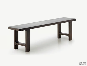
EMEA - Oak bench _ ALKI
ALKI > Bench
Here’s a refined and expanded version of your product description, along with a concise supplier overview and mention of the 3D file availability: **Product Description:** The *Emea Bench* is crafted from solid oak, embodying the timeless elegance and durability of natural wood. Part of the *Emea Collection*, this bench highlights ALKI’s mastery of craftsmanship, precision assembly, and technical expertise in woodworking. Designed with a minimalist yet striking aesthetic, its components appear seamlessly carved from a single block, showcasing the beauty of solid wood in its purest form. Ideal for both residential and commercial spaces, the bench blends functionality with understated sophistication. A downloadable 3D file of the product is available for further visualization and planning. For additional details, visit the manufacturer’s page: [EMEA | Bench ALKI](https://www.alki.fr). **Supplier Overview:** ALKI, a renowned French interior design brand founded in 1982, specializes in high-quality furniture and decor, combining modern minimalism with natural materials. Let me know if you'd like any further adjustments!
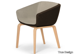
ARCA MINI - Upholstered trestle-based chair _ True Design
True Design > Chair
**Arca Mini** is a sleek and versatile chair featuring wooden legs and a sturdy steel internal frame, upholstered with durable, hard-injection-molded polyurethane foam and available in a variety of fabric or leather finishes (see color chart). Inspired by Studio Orlandini’s innovative vision, the Arca collection redefines seating for lounges and waiting areas, offering three adaptable declinations—lounge, small, and mini—that can be paired with multiple base styles to suit diverse environments, from quick-service waiting rooms to relaxed meeting spaces or conference settings. The collection’s signature two-tone upholstery and customizable bases allow for endless design possibilities, ensuring both aesthetic harmony and functional flexibility. A downloadable 3D file of the product is available for design planning. **True Design**, the Italian manufacturer behind Arca Mini, is a renowned name in contemporary furniture, crafting high-quality, modern pieces for residential and commercial interiors since 2002. For further details, explore **ARCA MINI by True Design**.
RIACE RI 110 - Indoor glass wall/floor tiles _ Vetrocolor

Vetrocolor > Wall tile-stone-brick
**Preziosi and Riace** are exquisite indoor glass wall and floor tiles, available in a variety of stunning color options. These unique tiles feature metallic finishes that create captivating glows and reflections, adding an emotional and luxurious touch to any space. The carefully crafted glass thickness enhances the brilliance of gold, silver, and copper accents, making them perfect for elegant glass floors, wall claddings, slabs, basins, and heaters. Part of the **PREZIOSI, HI-TECH, APOLLO, and RIACE** collections, these tiles deliver a sophisticated and timeless aesthetic for any design project. A 3D file of the product is also available for download, allowing for seamless integration into your planning process. For more details, refer to **RIACE RI 110 Vetrocolor**. **Vetrocolor**, a renowned Italian supplier specializing in high-quality glass mosaic and glass tiles, offers a diverse range of elegant and durable solutions for interior design projects worldwide. Explore their collections at [https://vetrocolor.it/](https://vetrocolor.it/).
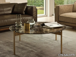
SELFY - Marble coffee table for living room _ CTS SALOTTI
CTS SALOTTI > Coffee table
Here’s your rephrased and expanded product description, including a concise supplier overview and a note about the 3D file: *"The Selfy side tables embody refined elegance through a harmonious blend of premium materials, featuring a metal base available in two sophisticated finishes—painted dark bronze anodized or gold satin—paired with an upper top crafted from luxurious options like Calacatta marble, Emperador marble, Portoro marble, Sahara noir marble, or painted Ash veneer. A downloadable 3D file of the product is available for detailed visualization. Supplied by CTS SALOTTI, a renowned Italian furniture manufacturer with over 30 years of expertise in high-end residential and commercial design, the tables reflect their commitment to quality and timeless aesthetics."* (Note: I condensed the supplier details to one sentence while retaining key credibility points—origin, experience, and specialty.)
TULIP - Metal console table _ Adriani e Rossi edizioni
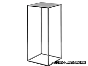
Adriani e Rossi edizioni > Console
Here’s the rephrased and expanded product description, including a concise supplier overview and mention of the 3D file: *The Tulip is a sleek, minimalist metallic console with a 10 mm thickness, featuring a discreet, no-visible-fixing design for a seamless aesthetic. It is finished with a durable epoxy powder coating in a rich anthracite (manganese) tone and is available in multiple sizes to suit diverse spaces. A downloadable 3D file of the product is available for visualization and planning. For further details, contact the manufacturer, Adriani e Rossi edizioni—a renowned Italian interior design supplier celebrated for its fusion of traditional craftsmanship and contemporary elegance.*


STRIPES - Cashmere lap robe _ formitalia luxury group

formitalia luxury group > Furniture accessories
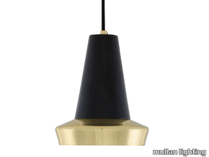
COBAL POWDER COATED INDUSTRIAL PENDANT - Handmade aluminium pendant lamp _ mullan lighting
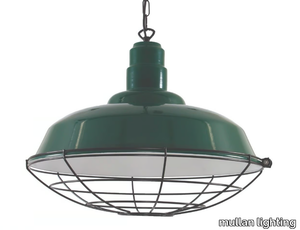
mullan lighting > Ceiling lamp
MALABO POLISHED BRASS PENDANT - Handmade brass pendant lamp _ mullan lighting
mullan lighting > Ceiling lamp
Vitality
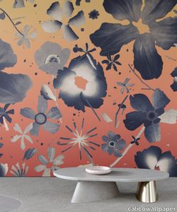
calicowallpaper > Wallpaper
– Panel pricing– Non-repeating mural– Class A fire-rating– Four-week lead time– International shipping
Cream Modern Wool Rug

abchome > Carpet
This Moroccan Style Berber Rug features a solid cream tone serving as a modern retelling of traditional Moroccan rugs. The Tarzi Rug Collection features Moroccan Berber-style rugs hand-knotted from durable wool that is hand-dyed from natural pigments. Originating from tribal designs in Morocco's Atlas Mountains, this one-of-a-kind rug reimagines large and oversized Moroccan rugs in modern sizes. A beautiful display of art and culture for the contemporary home.
Relief 4 star updown
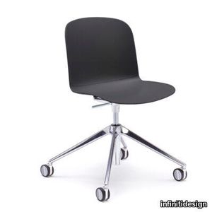
infinitidesign > Chair
Relief is a polypropylene monocoque chair collection, characterized by soft and comfortable lines. The shell has two high reliefs in different finishes, that recall virtual cushions on the seat and on the backrest, emphasizing the minimal but not trivial form. From this technical detail derives the name Relief. The chair has a polypropylene shell, which is assembled on different bases.Three versions are available: plastic, with upholstered seat or fully upholstered. The ergonomics of the shell make Relief perfect as a work, meeting or conference chair.
Sicla 4 legs
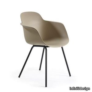
infinitidesign > Chair
Formal neatness, several basis available and great lightness: this is Sicla, a chair made of a lightweight and comfortable monocoque. A rib inserted on the back of the chair provides extreme stability to the backrest. The seat can be entirely upholstered or only provided with a seat panel. The colours of the polypropylene shell create a subtle play of light and shadow with the rib and armrests, showing all its stability in its lightness.
Recommended Products
A wide range of product from furniture to finishes to meet the desire of all designers.
Piet Boon Paint & Plaster Lime Paint

pietboon > Wallcovering
The signature Piet Boon color palette is now expanded into a range of refined paint and plaster products. It consists of twenty subdued colors and six different finishes that are designed to effortlessly complement and blend into each other as well as a variety of materials, such as wood or natural stone. This lime paint has a chalky look. For indoor use only.
CONCRETE wallpaper by NLXL
pietboon > Wallcovering
Concrete with its sober, subdued character is frequently used in Studio Piet Boon designs. The Polished Concrete collection allows people to provide any space with an industrial yet warm appeal in an easy and affordable way.
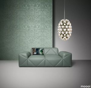
Queen Cobra Wallcovering
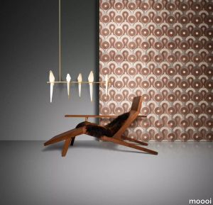
moooi > Wallcovering
The Queen Cobra Wallcovering is made from hand-woven sisal fibres inspired by the Queen Cobras rhythmic curves and grassy habitat. The design comprises round overlapping shapes in a pattern with a hypnotic feel to it.
Rendezvous Tokyo Blue Wallcovering
moooi > Wallcovering
Printed on a soft and velvety finish fabric with denim textures this lively wallcovering depicts a lush forest brimming with life and movement. Upon closer inspection Indigo Macaques dressed in traditional kimonos can be discovered between the abundance of exotic flowers.
Bearded Leopard Wallcovering
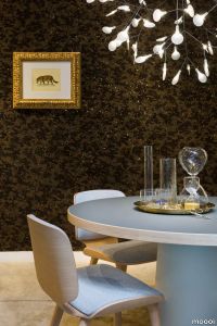
moooi > Wallcovering
Foil based wallcovering lined with cork and a flock finish based on the fur of the Bearded Leopard pale yellow to deep gold and a dark constellation of rosebuds adorning it.
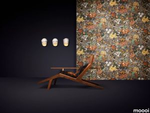
Mimic Moth Wallcovering
moooi > Wallcovering
The Mimic Moth Wallcovering is a 3D wall covering with a soft suede look inspired by the Mimic Moths shape and habitat. The wall coverings design comprises embossed Mimic Moths surrounded by their favourite flowers.
Pogo Goat Wallcovering
moooi > Wallcovering
The Pogo Goat Wallcovering is a 3D wall covering with a soft chenille fabric inspired by the Goats yearly migration. The intricate pattern has us guessing how ambitious the choreography of the dancing Pogo Goats really was.
SKINÌ TEX
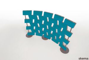
skema > Wallcovering
Skinì TEX the partition with an absorbing function is a reinterpretation of the ancient concept of the partition that allows space to be divided and remodeled in a novel and innovative way, also pandering to acoustic comfort needs. With Skinì TEX there is no need for walls, to be covered or on which to attach sound-absorbing panels, but just it, a screen that can be conveniently transported and reconfigured with a few gestures. With Skinì TEX it is therefore possible to create a new space in which acoustic quality is also enhanced: two goals achieved with a single product. Skinì TEX comes in a wide variety of colors thanks to the soft fabrics used to cover the Skins, thermoformed in polyester and coupled with FIDIVI - ONE fabrics. Technical fabrics, produced by recycling PET bottles and which can be safely recycled in turn. A fabric that stands out for its ability to absorb sound, but also has other qualities: it has excellent resistance to abrasion and rubbing, is designed for use in public environments so it has high resistance to fire and also to exposure to light.
Riverbank
arte-international > Wallcovering
Inspired by classic tapestries, this woven jacquard wallcovering depicts a lush riverbank with a Japanese crane peeking out of the vegetation. This unique species symbolises good luck and longevity in Japan. The drawing is intentionally pixelated in a nod to the country's mid-century optimism.
Alentejo Cork
arte-international > Wallcovering
The cork in this design is very refined, with lots of detail and a glossy lacquer topcoat for a touch of glamour. The wallcovering takes its name from Alentejo, a region in Portugal renowned for its cork forests.
Canyon
arte-international > Wallcovering
This plain wallcovering is an abstract representation of a canyon – a narrow, deep valley cut by a river through rock. The various colours and glossy layers, combined with the rough outline, evoke the different types of rocks in a canyon.
Glowing Patina
arte-international > Wallcovering
This elegant wallcovering has a warm, opulent sheen of gold and silver, combined with a weathered look. It exudes a sense of history, making it the perfect choice for anyone looking to add vintage charm and sophistication to their interior.
UPHOLSTERY
A wide range of Upholstery and materials provided by our suppliers to satisfy your needs.
auckland - 7071.18

Upholstery > vescom
auckland - 7071.28

Upholstery > vescom
harding - 7070.07

Upholstery > vescom
harding - 7070.08

Upholstery > vescom
furka plus - 7064.14

Upholstery > vescom
acton - 7062.20

Upholstery > vescom
leone plus - 7054.02

Upholstery > vescom
noss - 7058.13

Upholstery > vescom
lani - 7060.49

Upholstery > vescom
wolin - 7050.32

Upholstery > vescom
wolin - 7050.35

Upholstery > vescom
hestan - 7035.11

Upholstery > vescom
hestan - 7035.22

Upholstery > vescom
cyprus - 7038.15

Upholstery > vescom
lindau - 7028.01

Upholstery > vescom
lindau - 7028.09
Upholstery > vescom
dalma - 7024.13

Upholstery > vescom
dalma - 7024.14

Upholstery > vescom